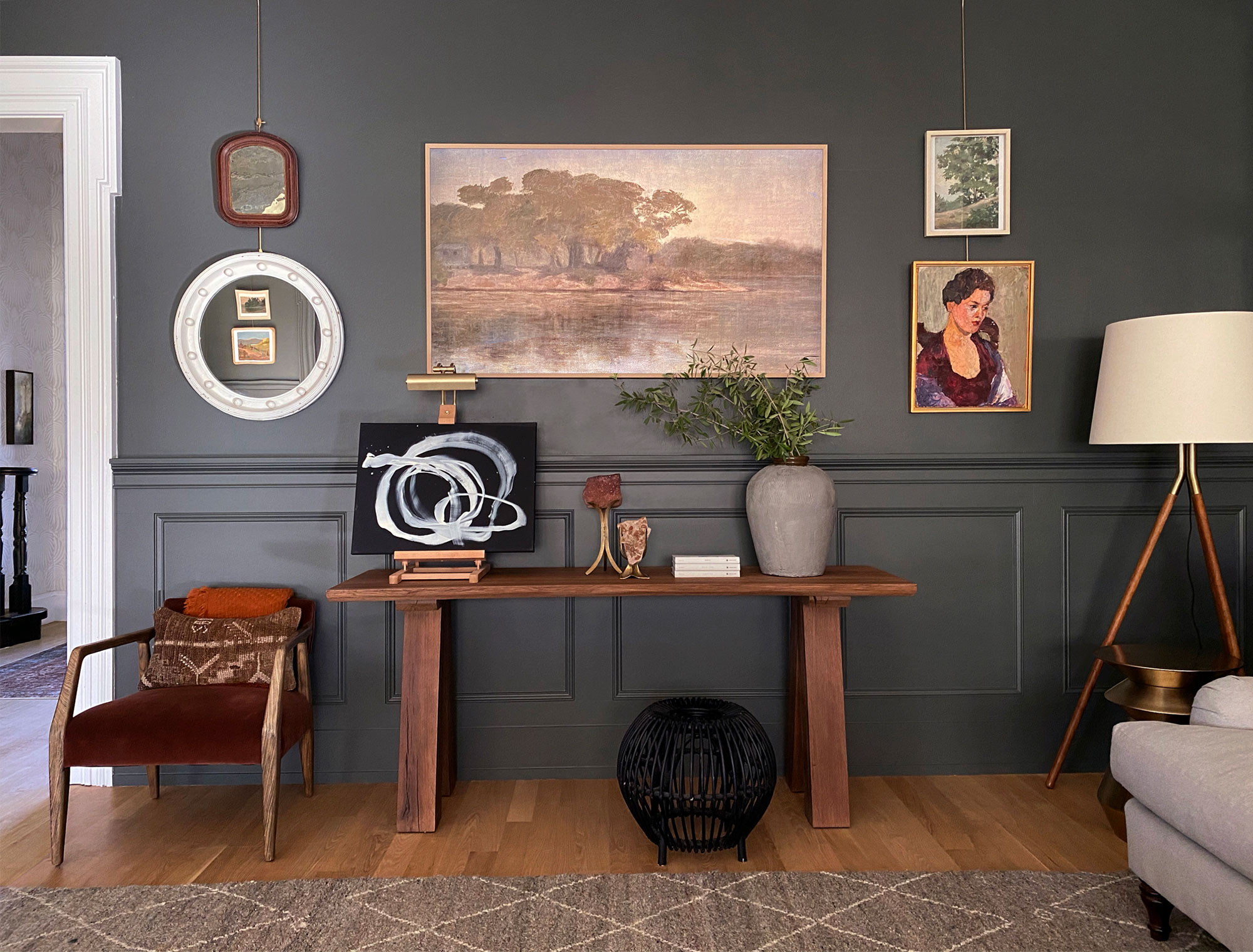
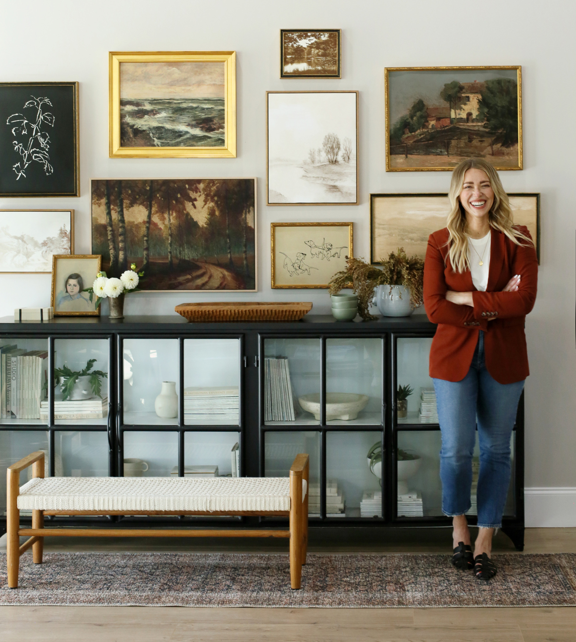
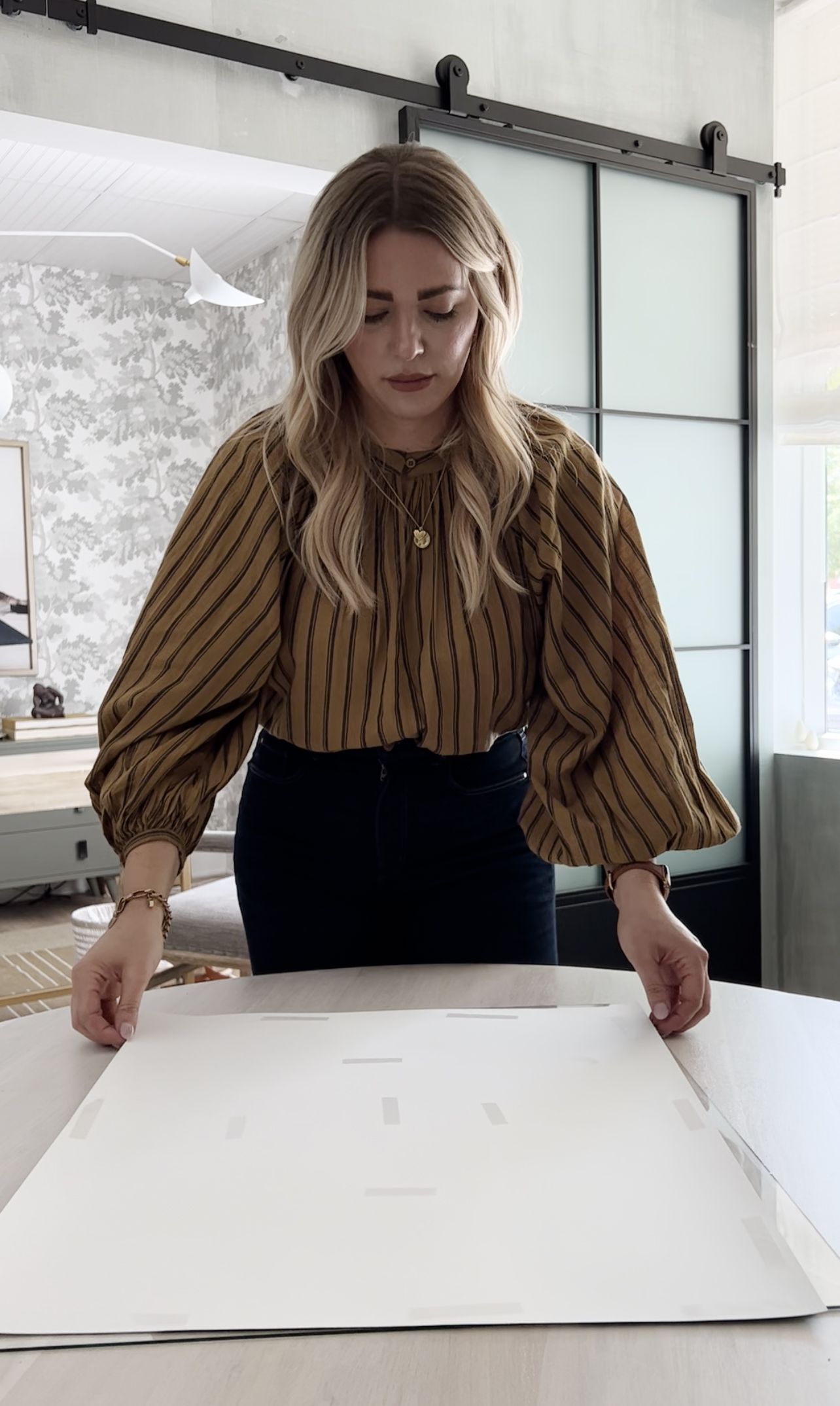
Hey everyone! Today the content team is taking over the blog! Our names are Jenna and Ramona, and between the two of us we create and produce most of the content you see on Juniper Print Shop & Jenny’s blog. We thought it would be fun to give you a behind the scenes look at how we style new Juniper prints in our studio space! We typically style between 3-10 prints a week, and those images are used for the print shop website, social media, and design content for Jenny’s blog. This week we are styling Vale by Laurel-Dawn Latshaw. She had 4 new prints hit the print shop this week!! You can shop her collection here.
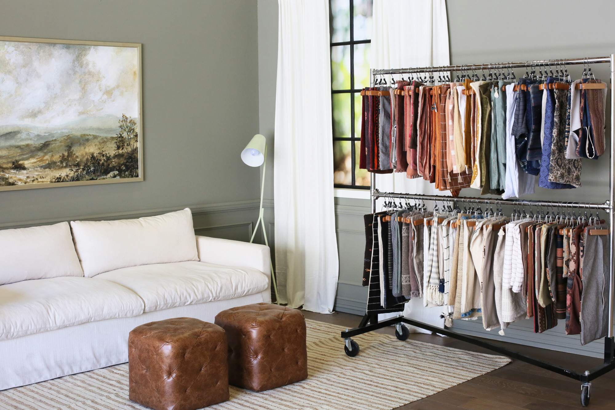
Before moving to our current office space, we had a bright and beautiful studio (check out a tour of our old space here) that was ideal for photography, and we grew really accustomed to styling most of our Juniper Print Shop content in-house. Our current space has more of a warehouse feel, which has made that a challenge! Last year we were able to have a few studio sets built in the back of one of our office spaces to give the look and feel of a real home. The sets are complete with moving walls, faux windows, changeable wall moldings and two different types of flooring, which means we can create totally unique rooms every time we style!
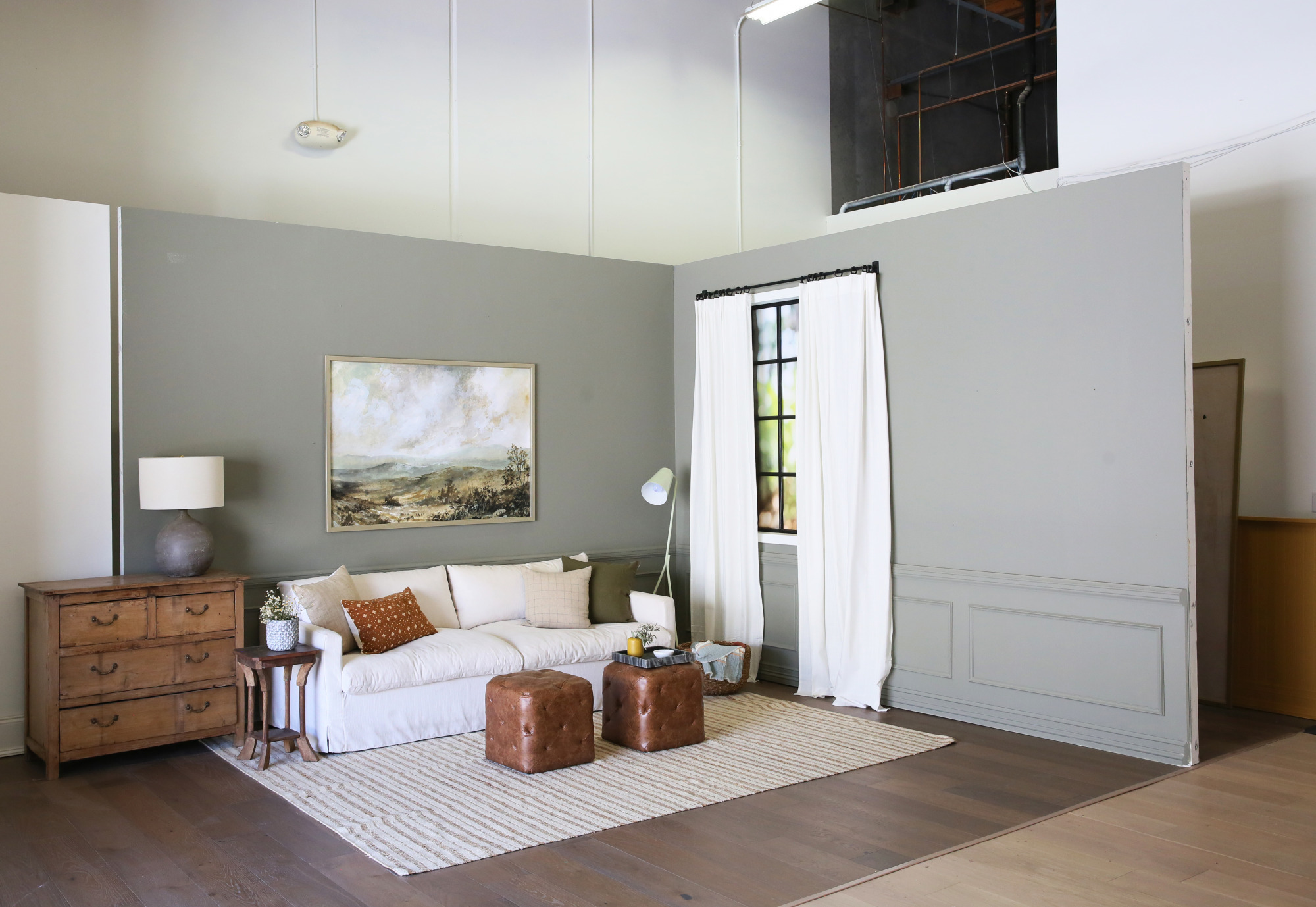
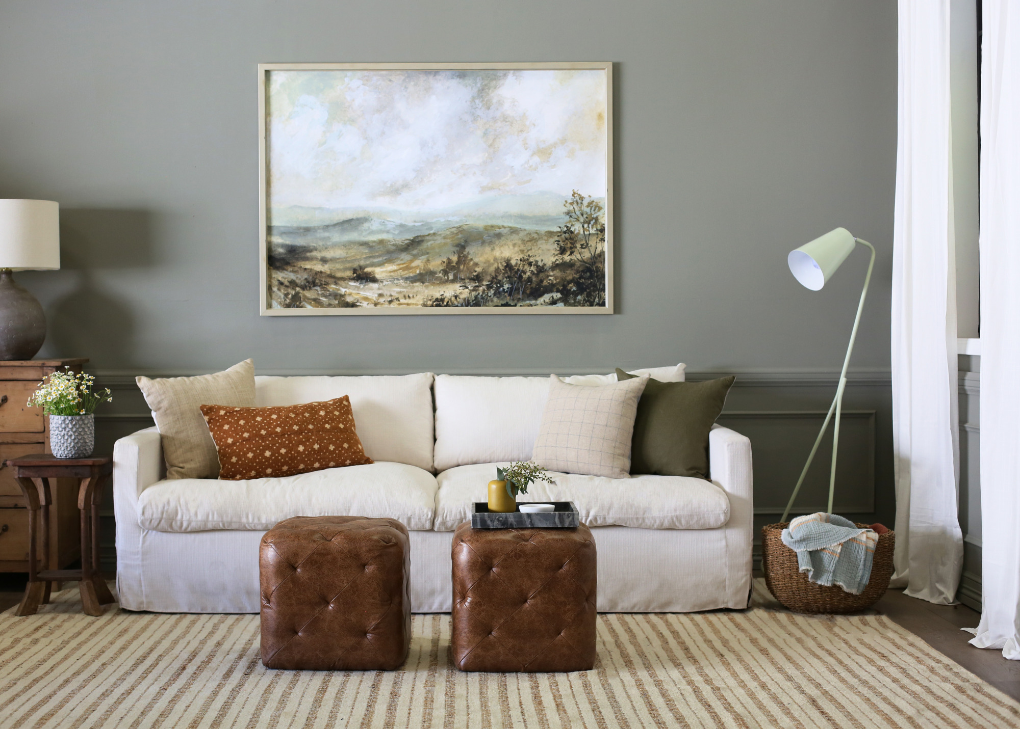
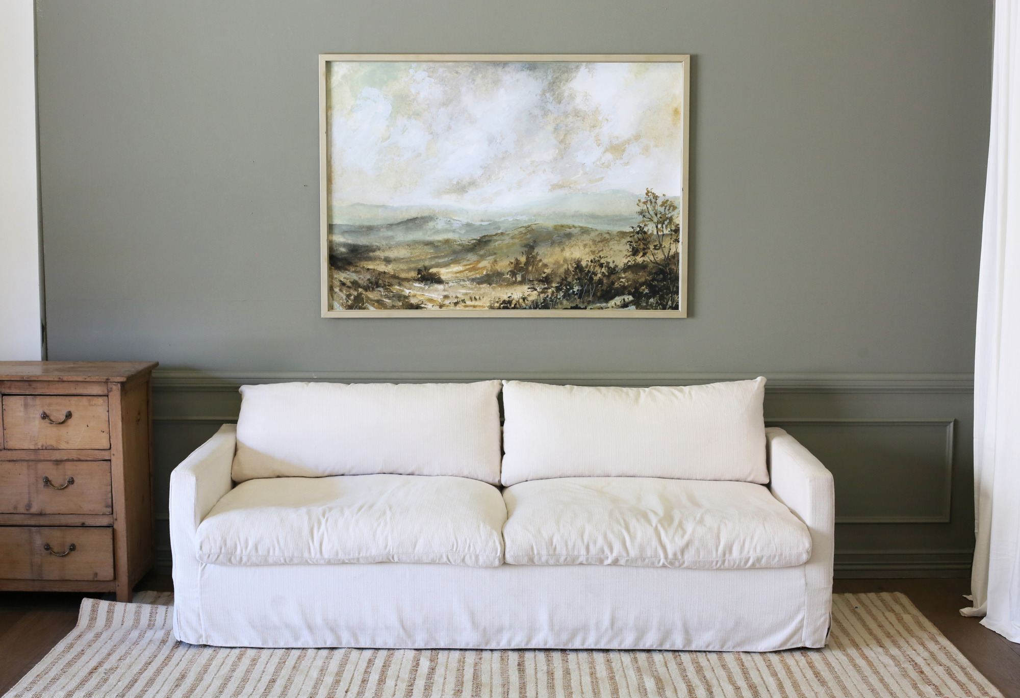
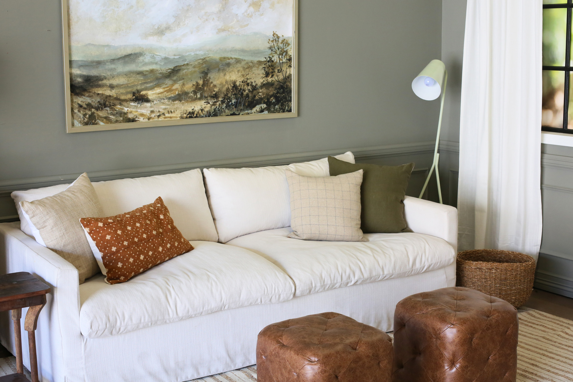
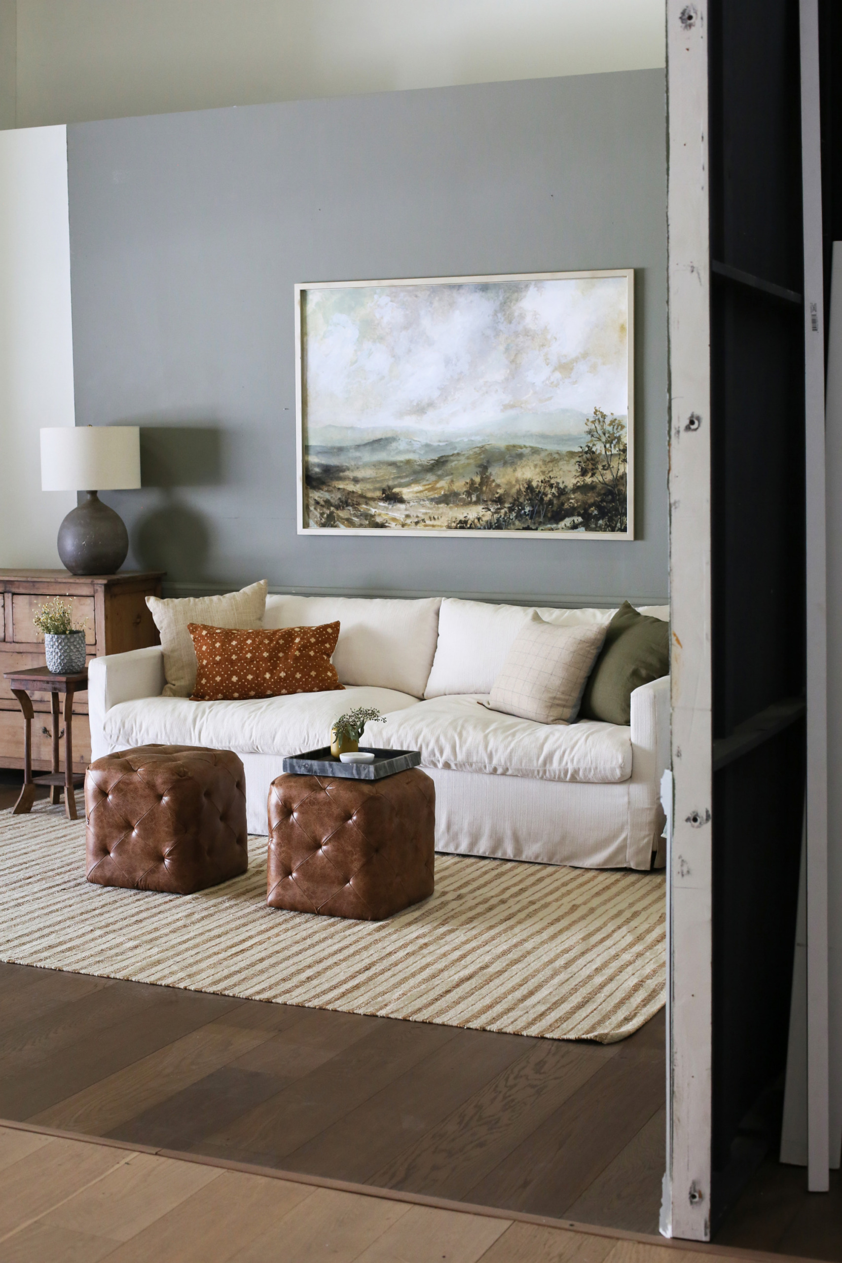
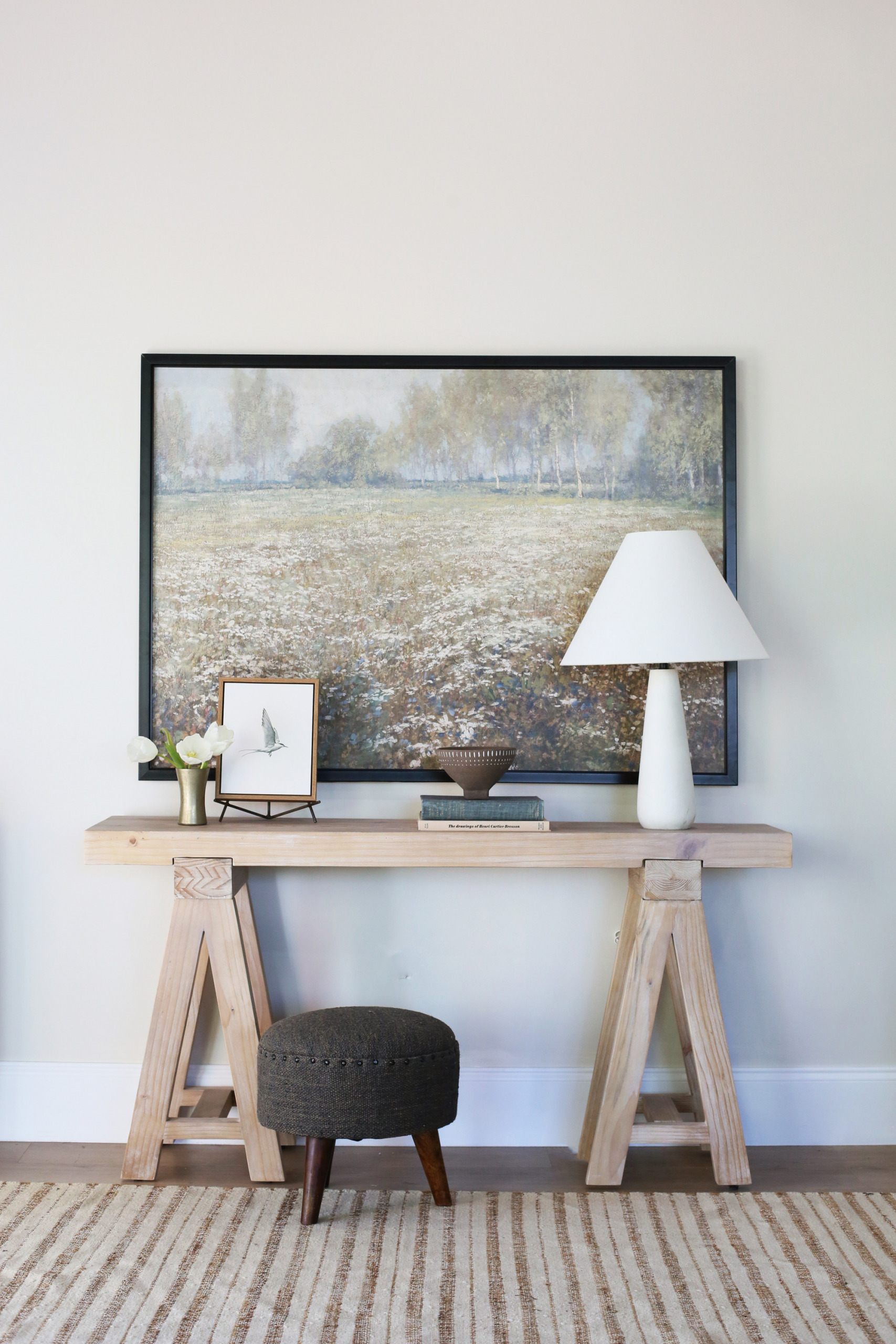
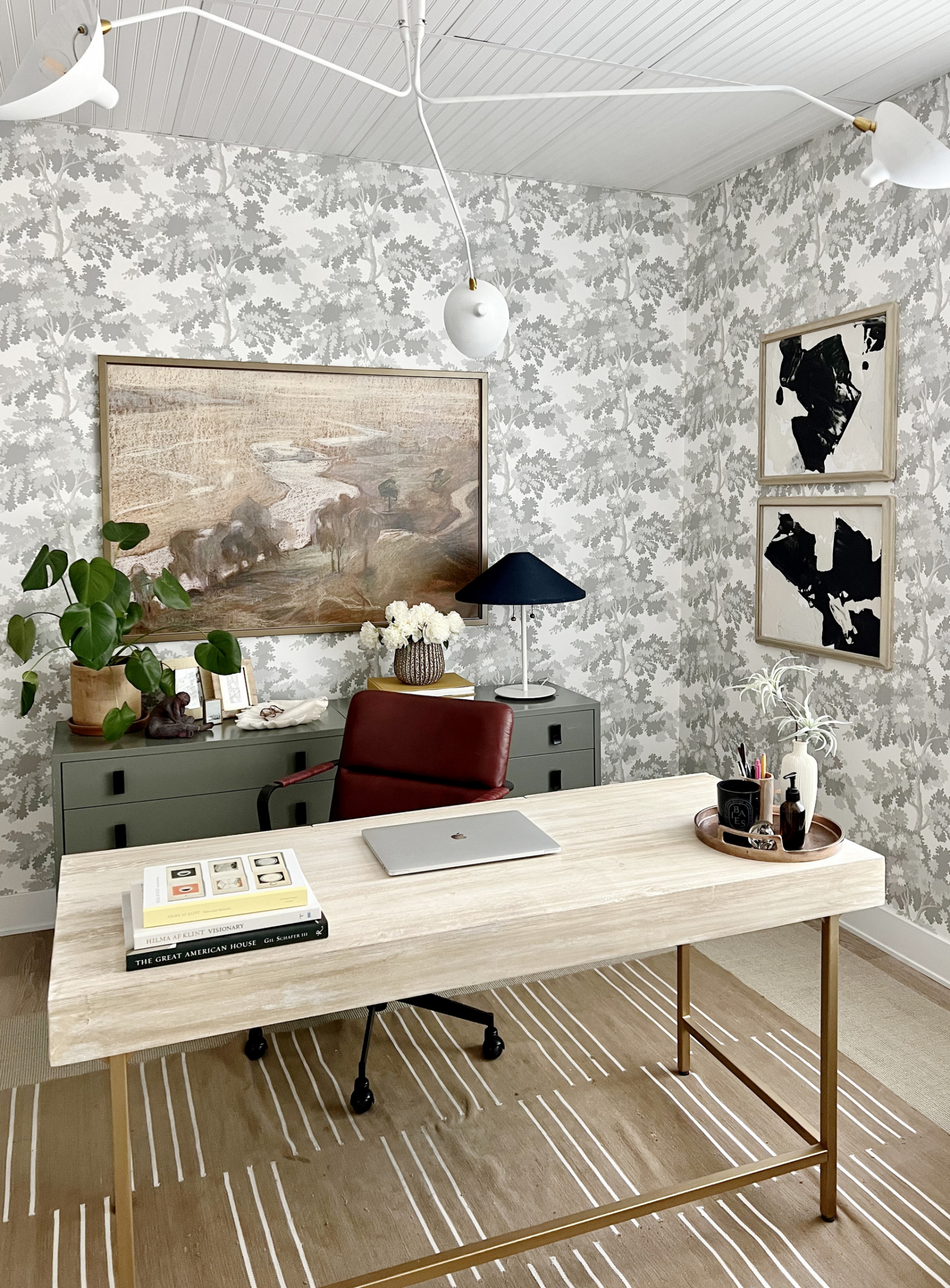
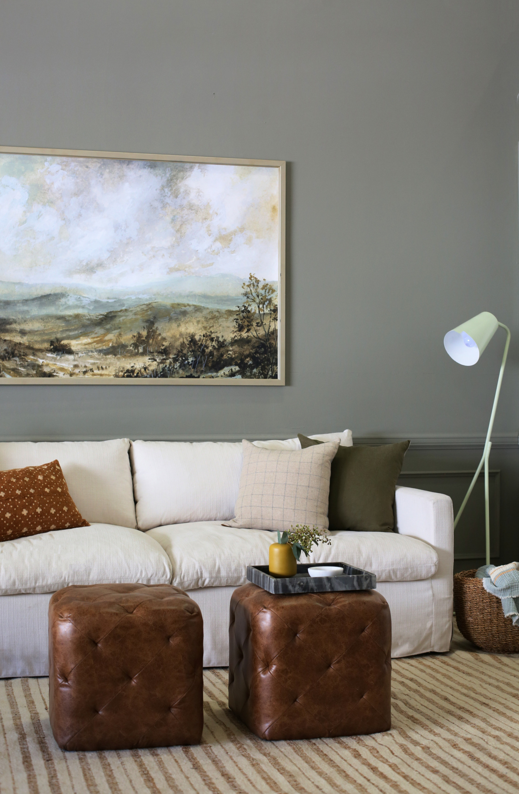
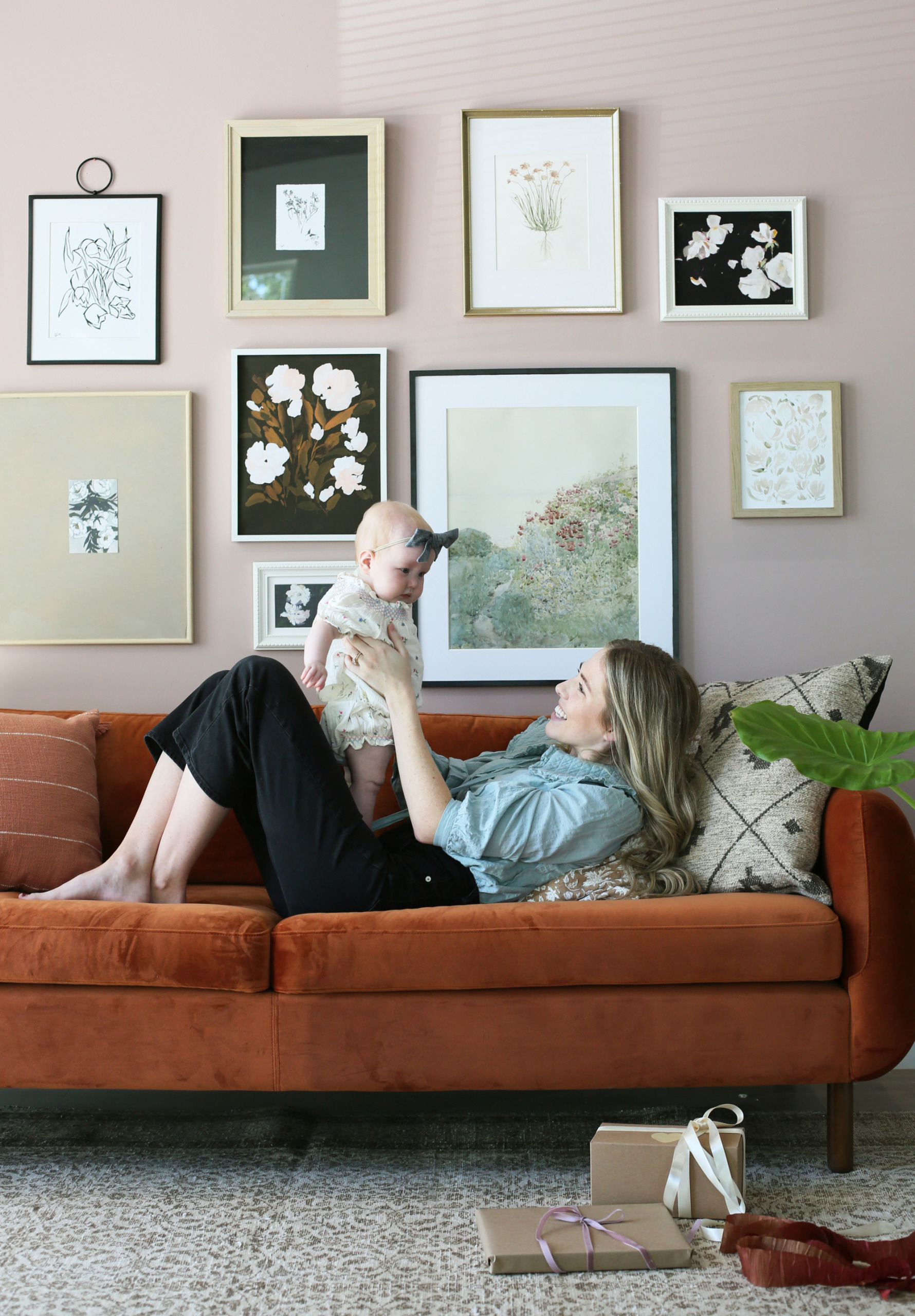
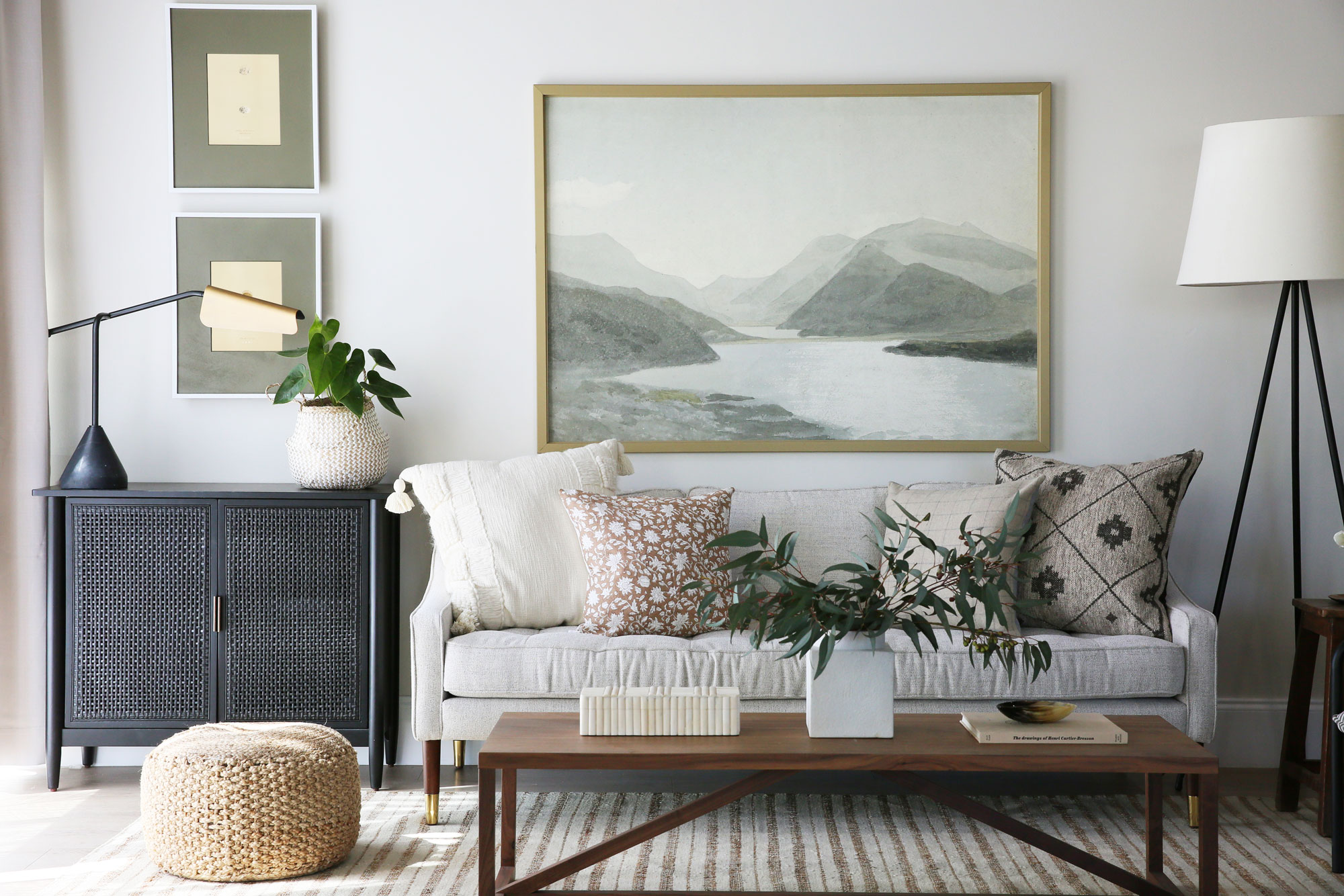
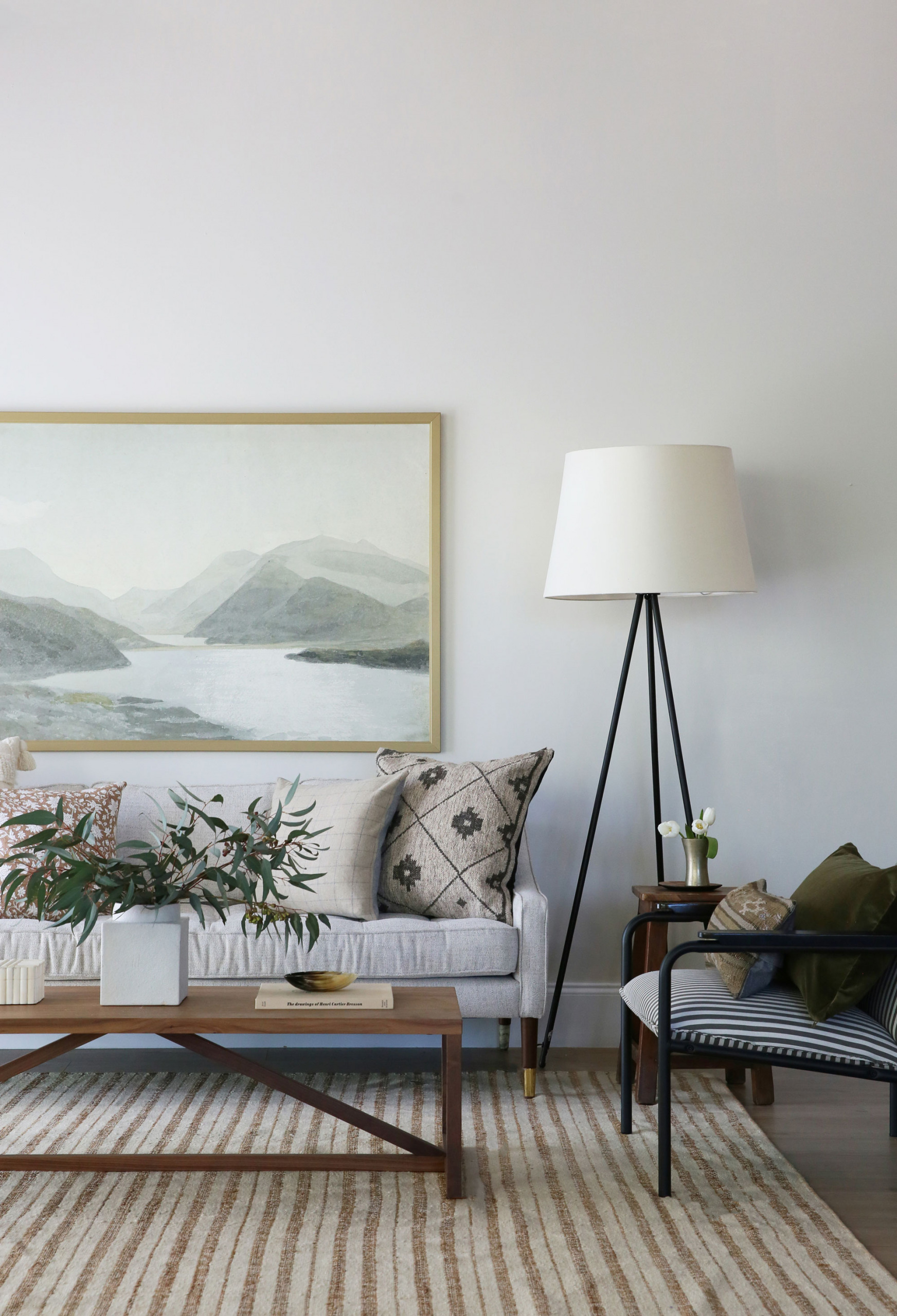
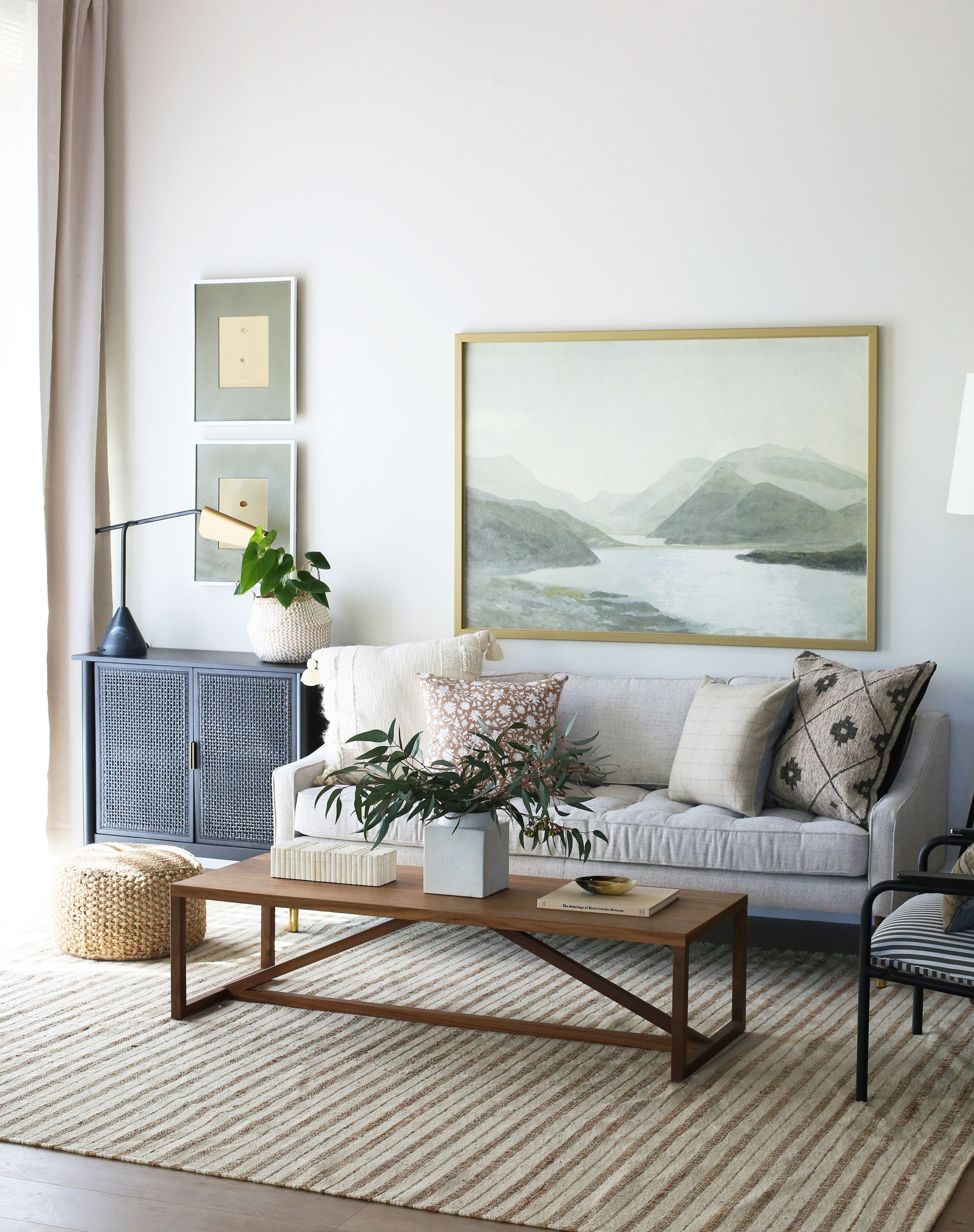
The first step is deciding what kind of space we want to create. We usually rotate between living rooms, bedrooms, or entry spaces. We knew we wanted this print to be oversized, so we decided on living room so we could hang it over a sofa. Our studio space has multiple wall molding options we can swap in and out to give each styled space a totally unique look, so we opted for a traditional wainscoting here.
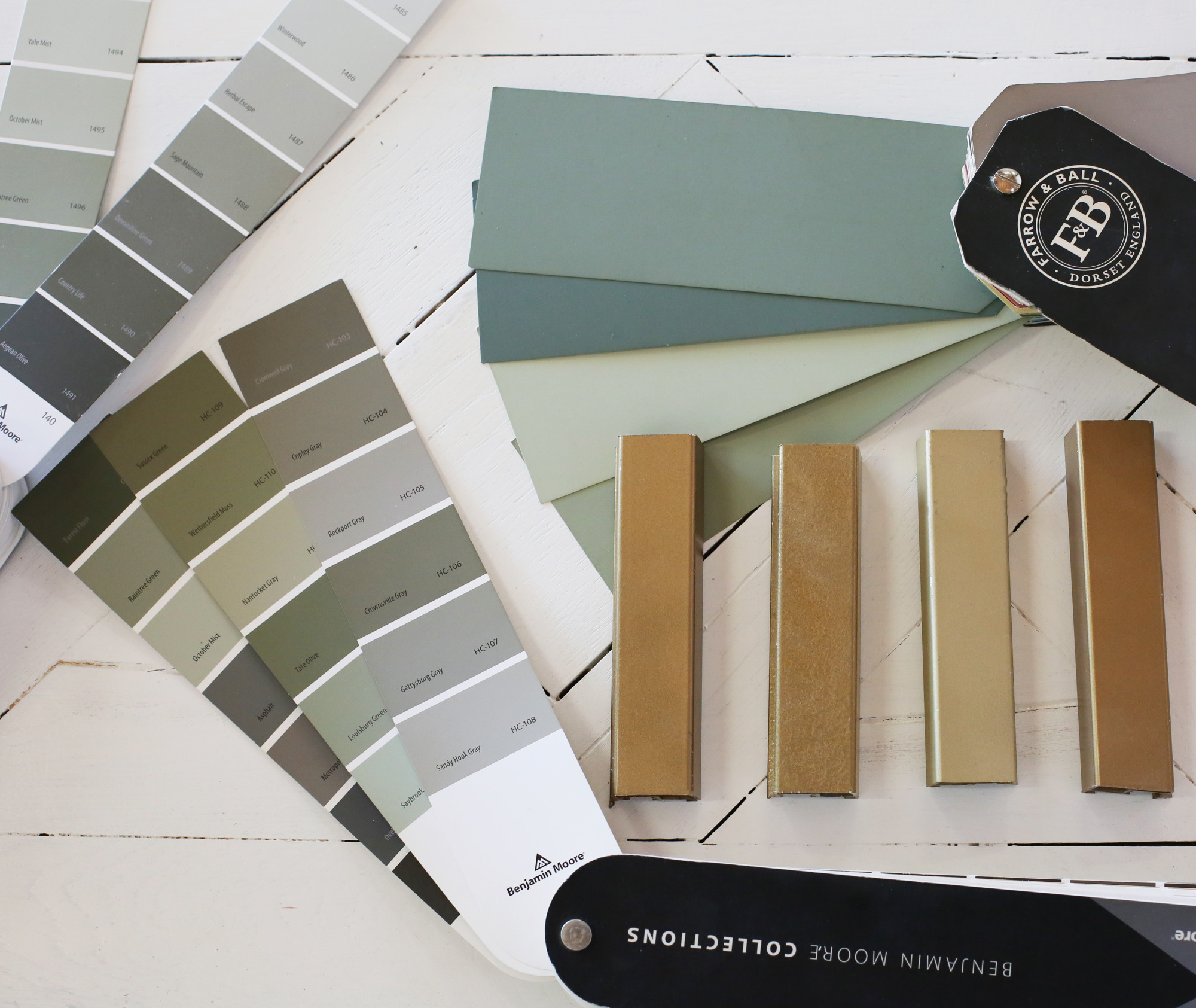
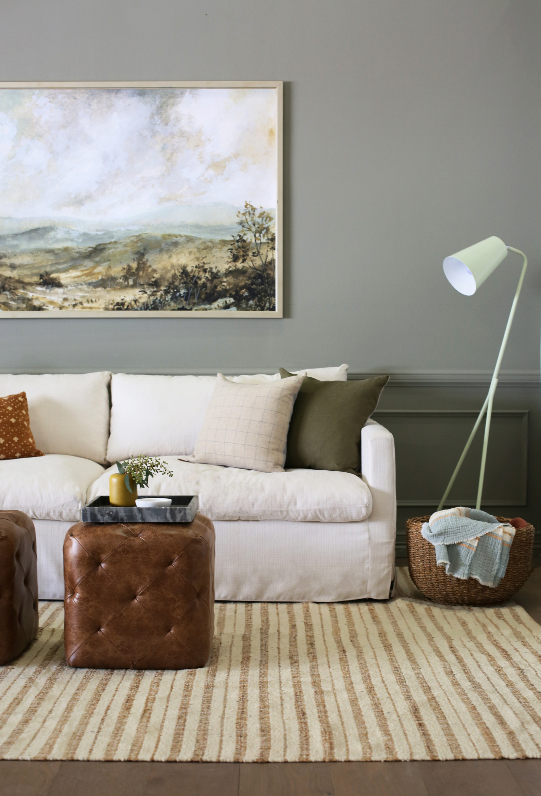
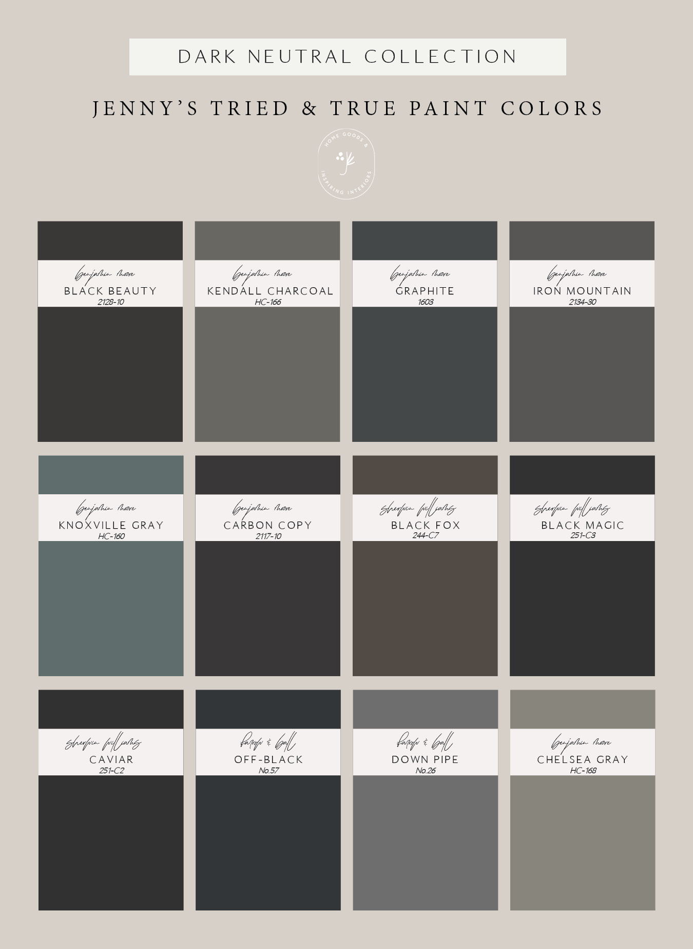
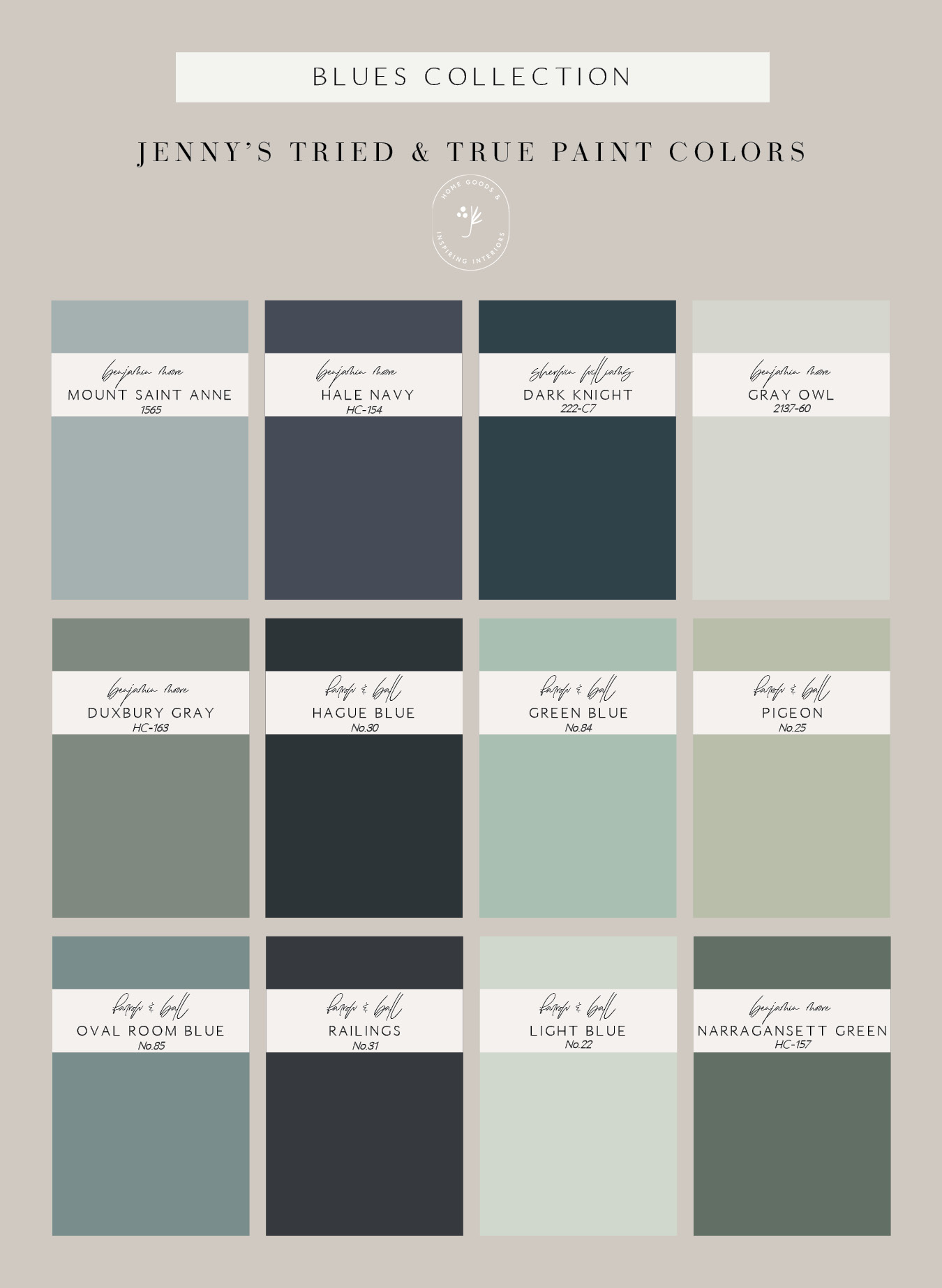
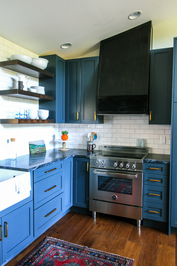
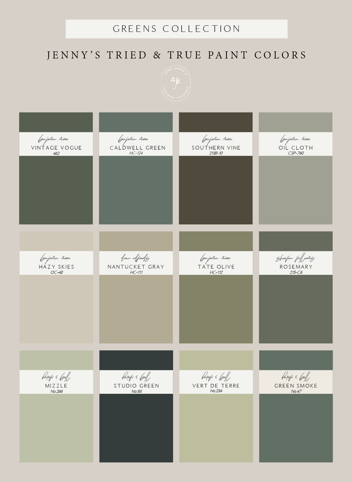
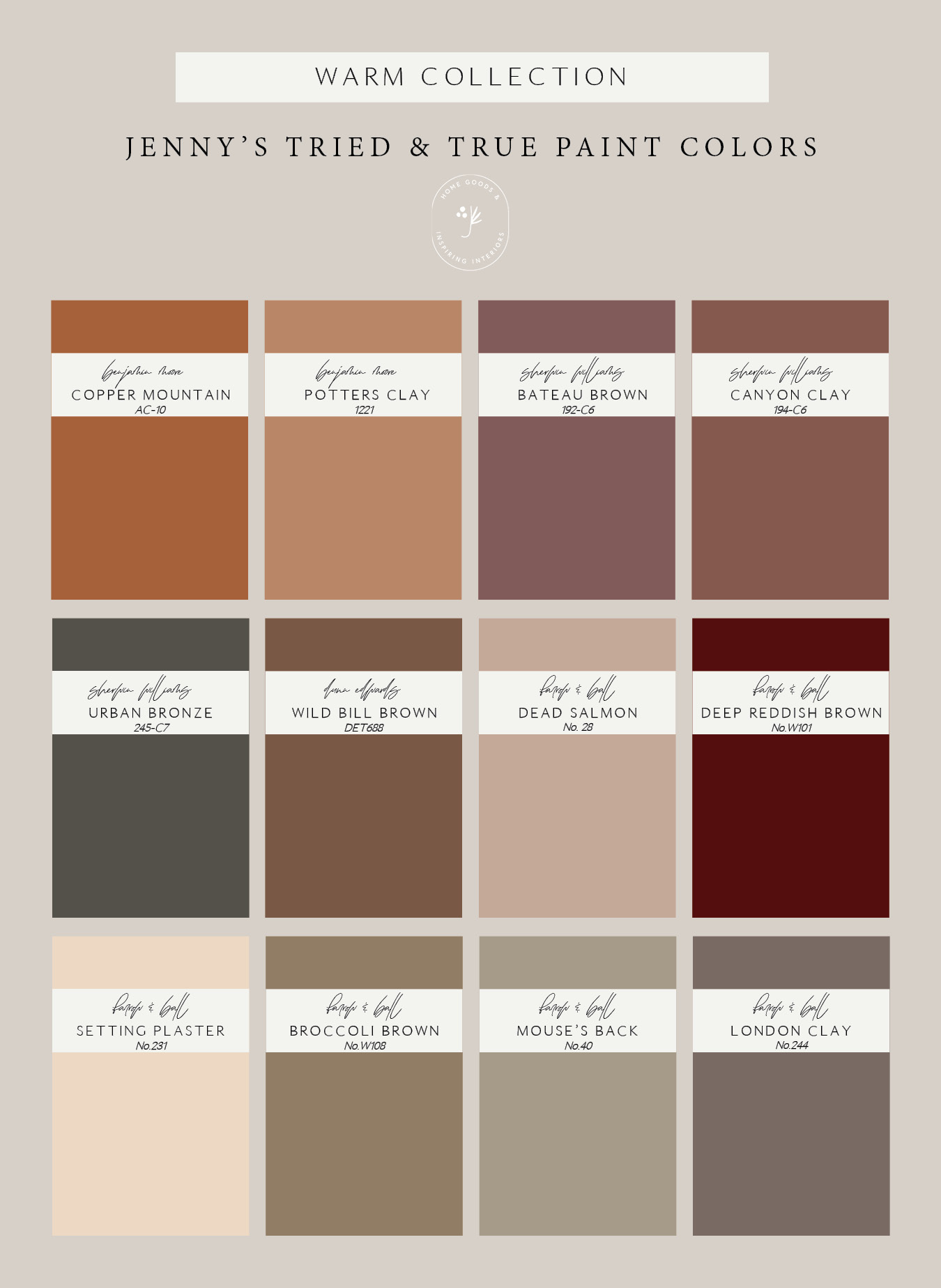
Next we decide on our color scheme. One of our favorite parts of styling on a set is getting to use fun, bold paint colors. While most people are typically drawn to a neutral palette for home interiors, our studio space is the perfect place to experiment with punchier hues. We rely heavily on our Benjamin Moore and Farrow & Ball paint decks. (Even if you aren’t a designer, a fan deck can be super useful to help visualize colors in your space!) We usually pick our wall color based on the tones of the print we are styling. We like to pull a lesser used tone in the art, or a complimentary shade. For this particular print, we chose a muted green by Benjamin Moore called Desert Twilight, that played really well the the muddy blue-green tones the artist used.
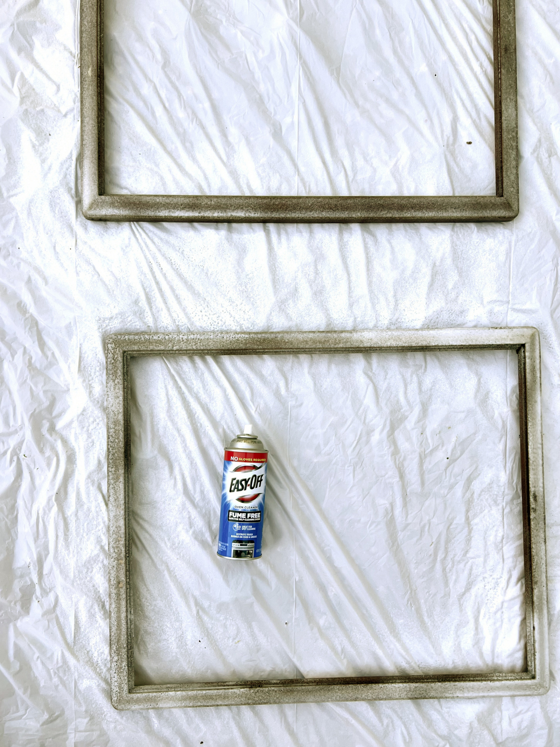
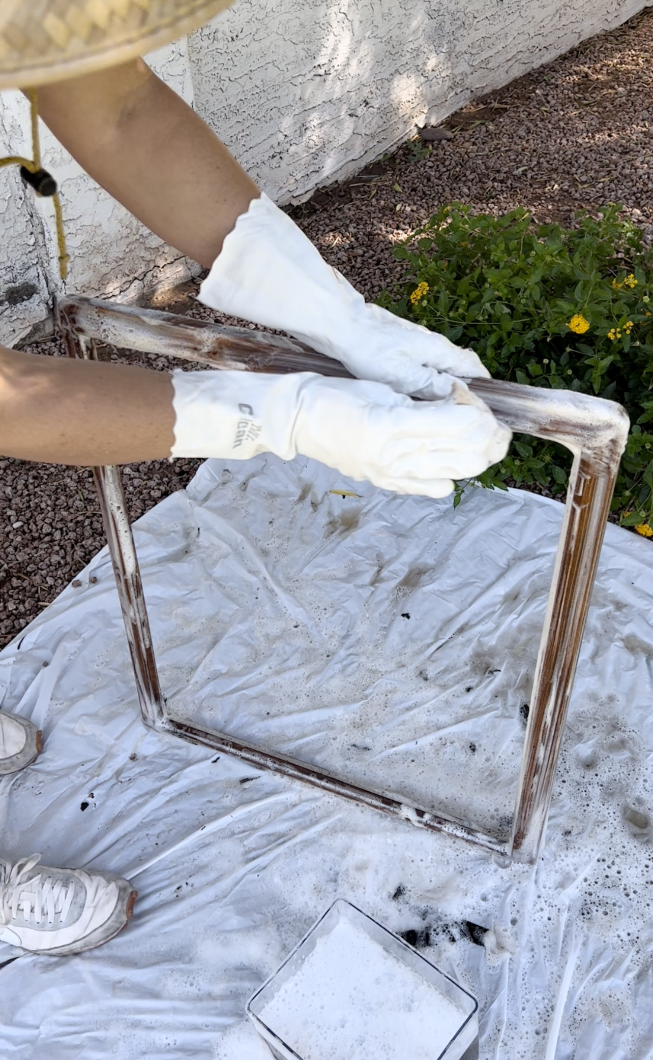
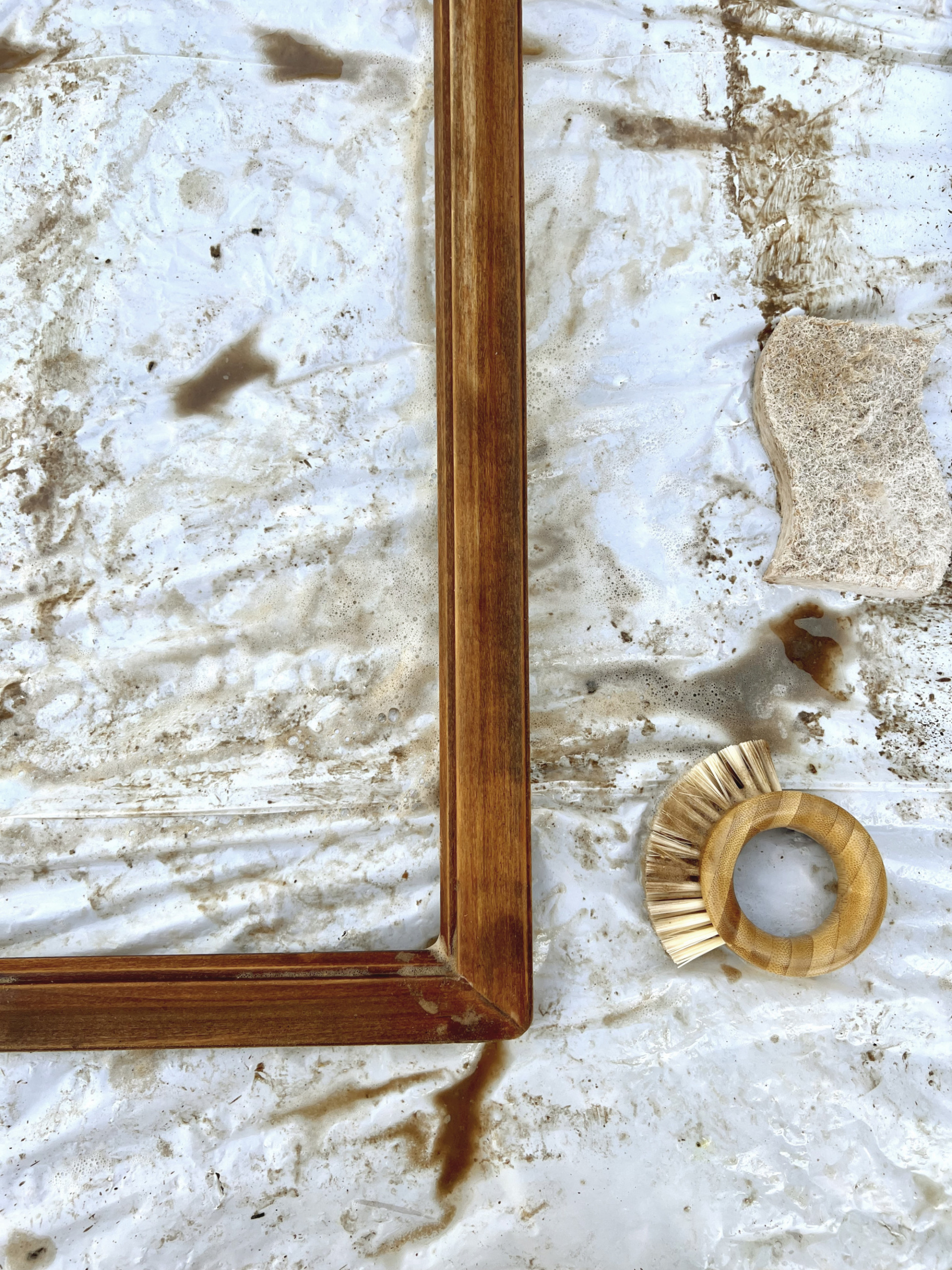
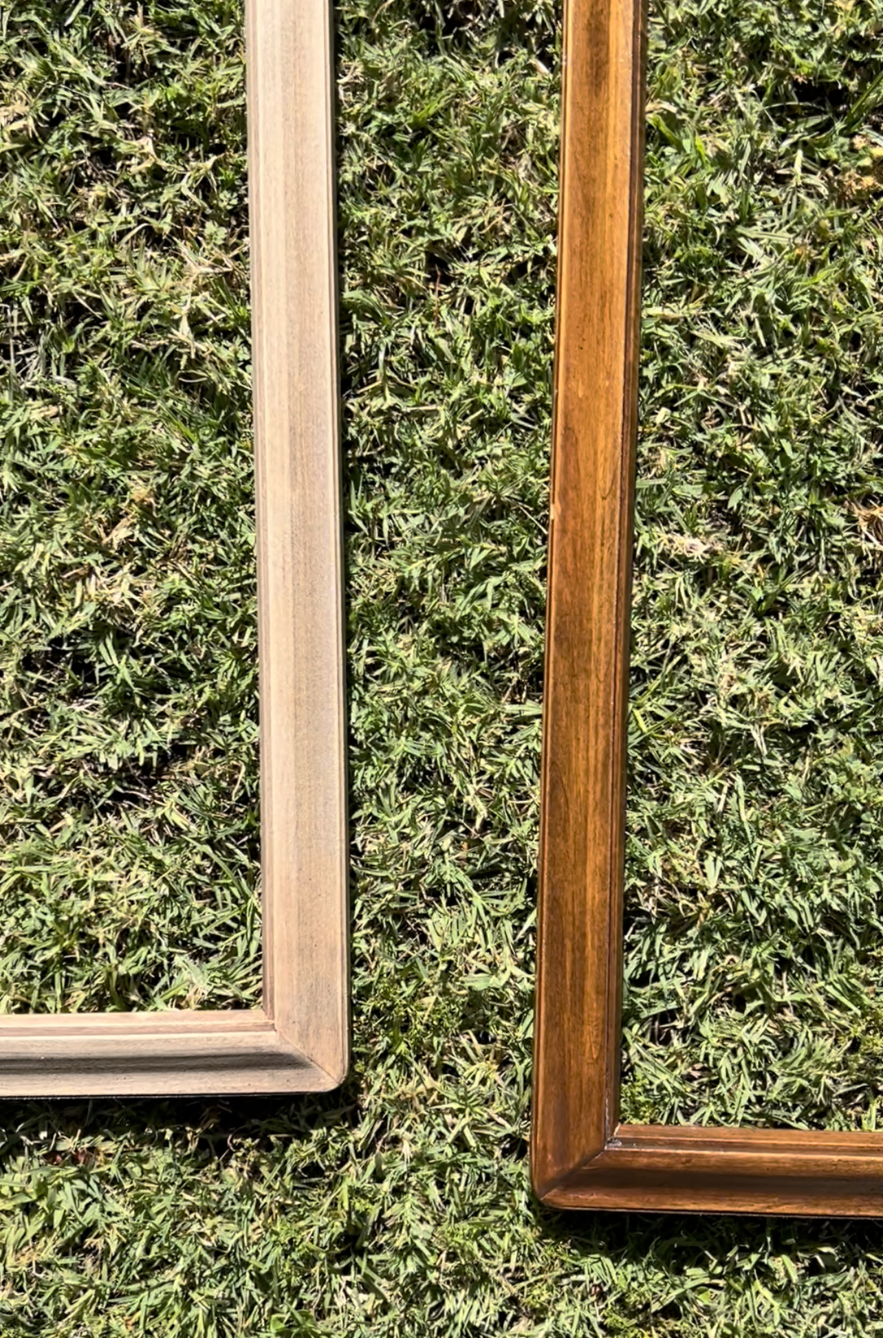
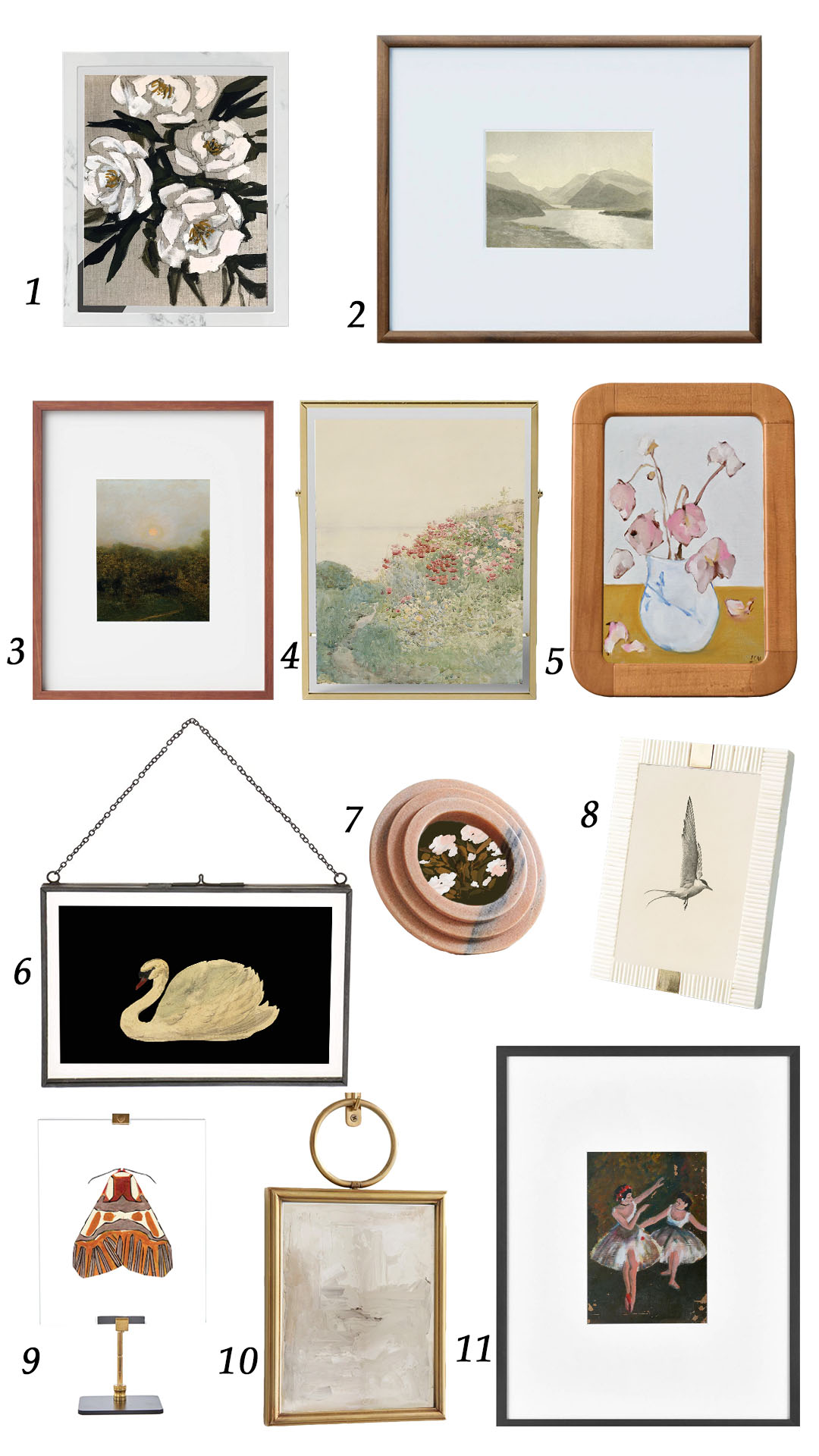
After settling on our paint, we choose a frame color. When styling smaller sized prints, we usually stick with ready-made frames in neutral shades like white, black, gold or wood. For this space we are going with an oversized print, which means using the Ikea Bjorksta frame. The Bjorksta frame only comes in black or silver, so we love to spray paint it to get a new look! Last year we wrote a really helpful post about our “Tried & True” spray paint colors and made these little sample frame pieces that we use to choose a frame color all the time. We knew we wanted to pair a gold or brass finish with this print, so we brought out a few favorites. We ended up settling on Rustoleum’s Satin Bronze.
 sofa // striped rug (similar) // dresser (similar)
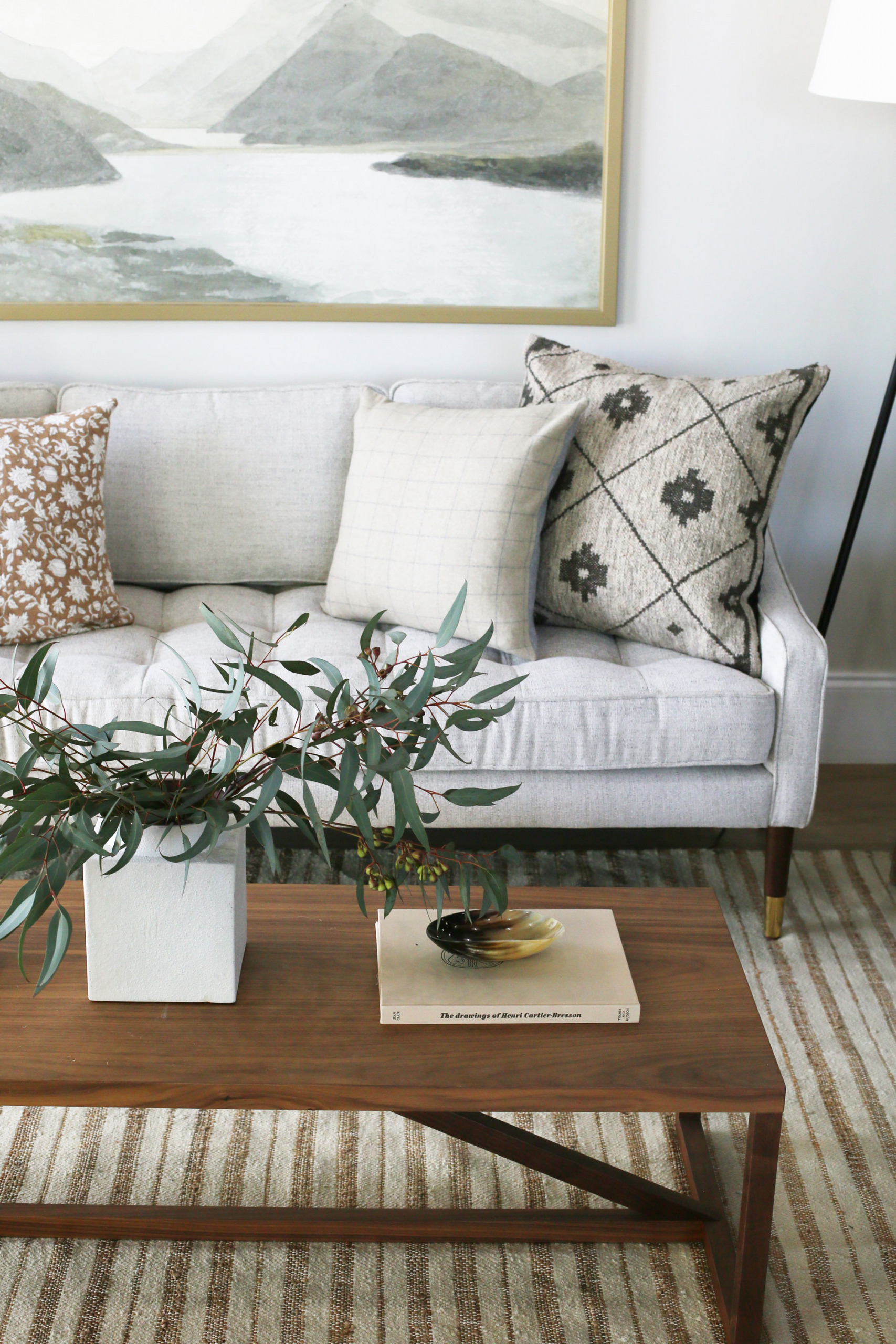
Once we finalize our color scheme, we decide on what furniture we want to use in the space. Since we went with a bold wall color, we decided to keep the sofa neutral. We really loved the way this white slip covered sofa popped against the green.
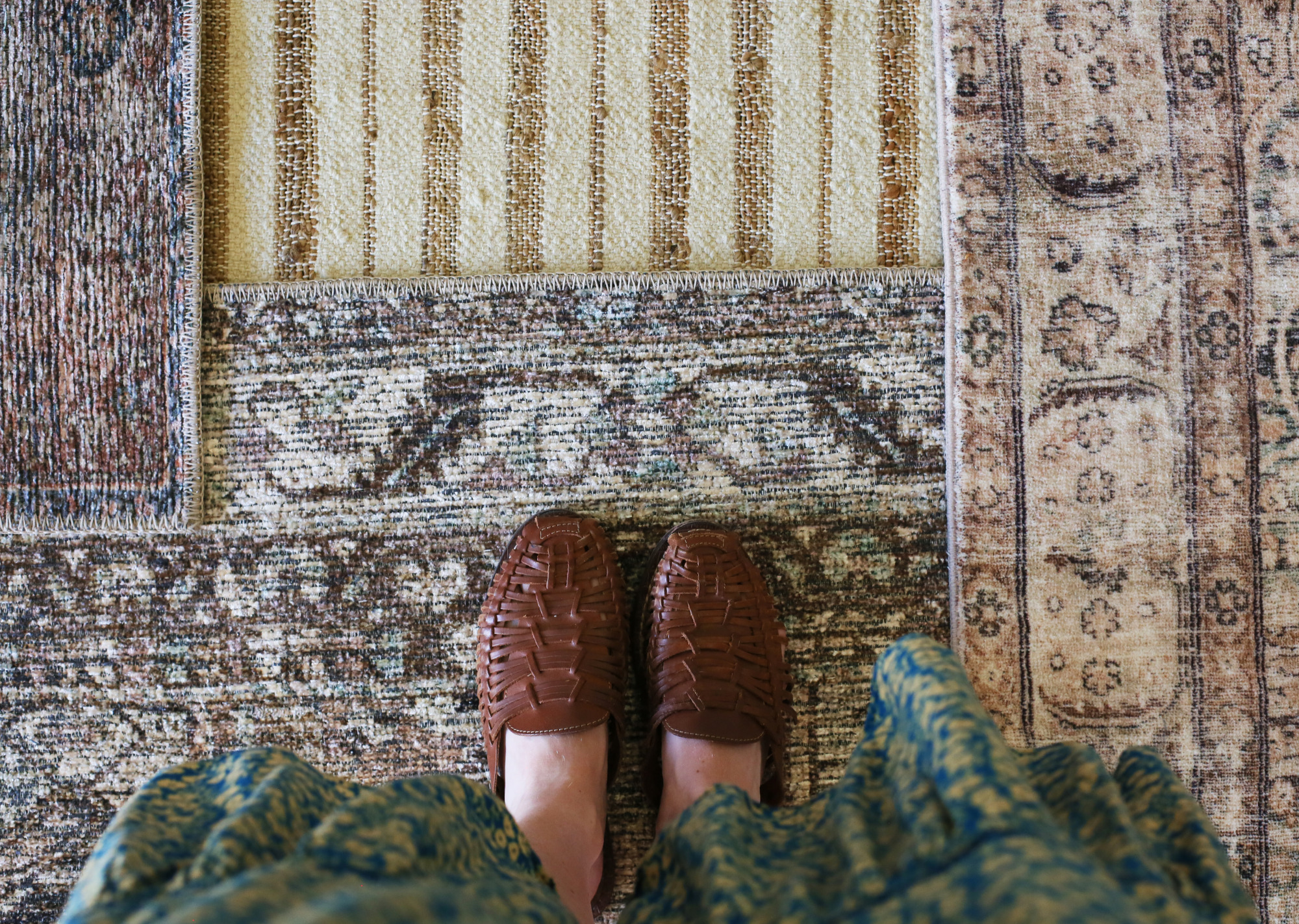
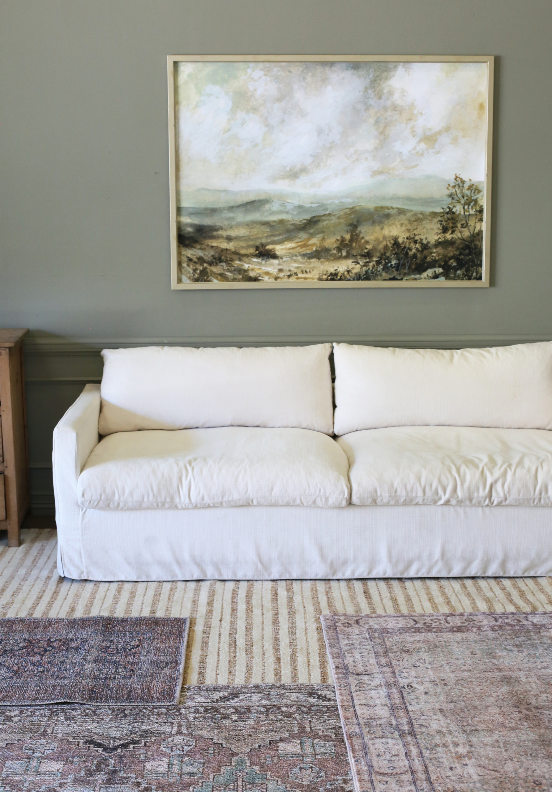
Next up is choosing a rug. Rugs can be tricky, so we always like to have something in mind early on in the design process. We weren’t sure if we wanted to use a bolder, striped option or something vintage inspired. We love Loloi rugs, so we pulled in three that we recently added to our prop collection. (If you are in the market we highly recommend the one on the right. It is SO unbelievably soft!)
 striped rug (similar) // top left vintage-look rug // bottom left vintage-look rug // right vintage look rug
Once we narrowed down our choices, we brought them into the space to see how they looked. While the three vintage-inspired rugs looked beautiful with the wall color, they all felt a little too pink for the print, so we decided on the stripe.
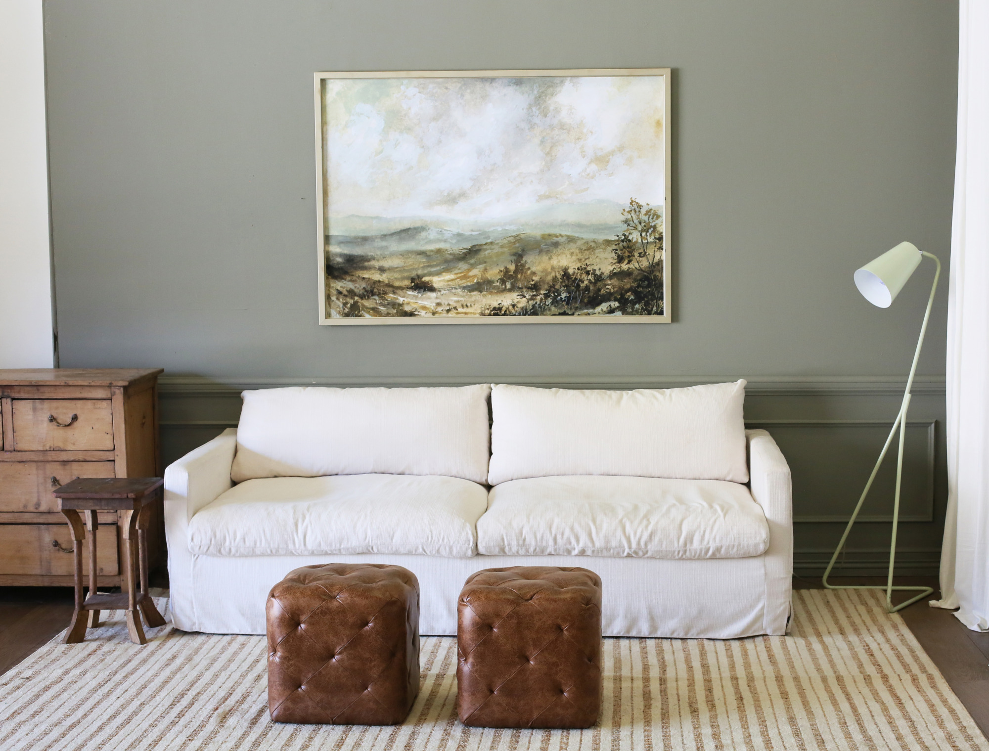
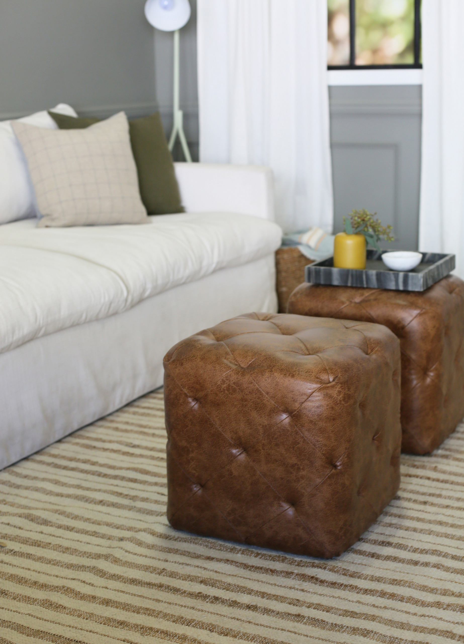
Next up is adding small furniture. Styling for a photo can be a lot different than styling for an actual living room. In your home you’d typically make choices based on how you live and function within the space. For a photo, we tend to focus more on scale, shape and visual balance. We decided on a wood dresser as an oversized side table. Having the extra height on this side of the frame gave the table lamp more visual balance with the floor lamp and curtains on the other side. We layered in an additional wood side table to create some dimension, and then tried a few different coffee tables, before ultimately deciding on two small ottomans. This helps the foreground of the frame to feel lighter and keeps your eye moving throughout the space.
 sofa // ottomans // dresser (similar) // side table (similar) // floor lamp (similar) // rug (similar)
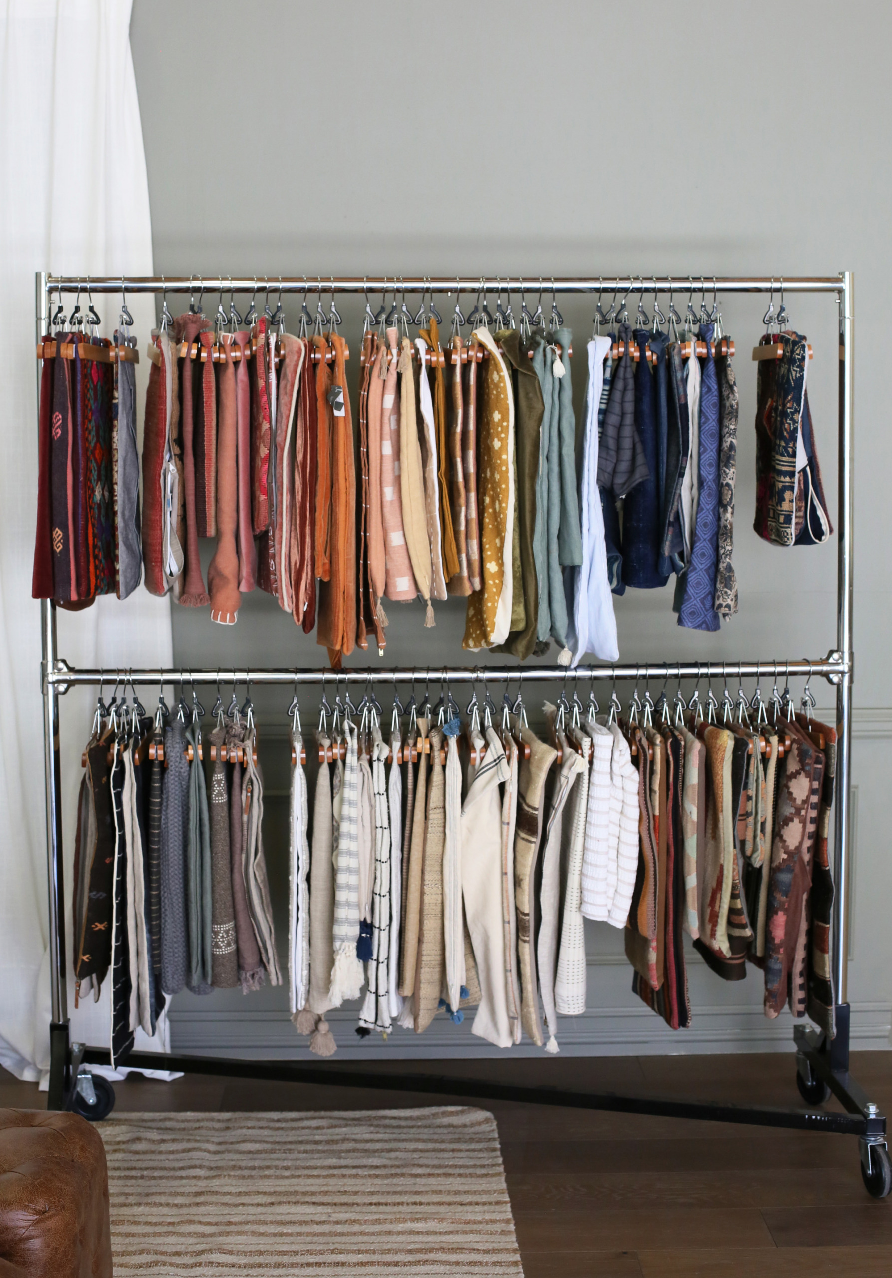
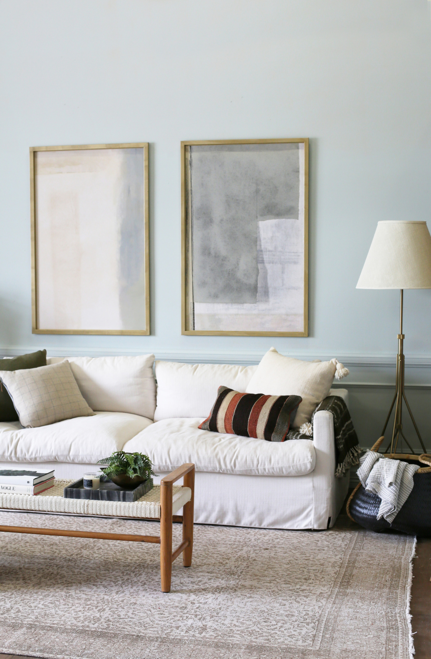
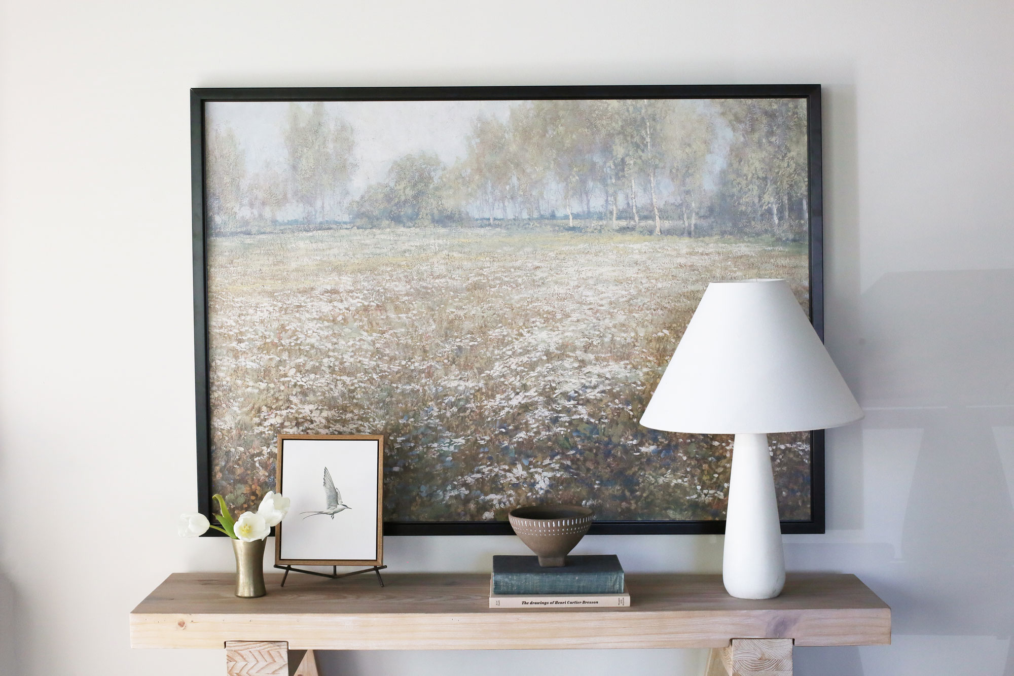
The next step (and sometimes the hardest) is selecting pillows. Pillows can quickly change the feel of a room, so it’s always good to have a color palette and style in mind. We’ve collected so many pillows over the years. We always find good picks at Target and other big box stores, but our absolute favorite place to source pillows is on Etsy!
Vintage Kilim pillows are a staple around here, and we love pairing them with modern prints. We always recommend using a high quality down insert, it will make such a huge difference in how your pillows look and feel! If you need help with your pillow selection, check out our “Recipe For The Perfect Pillow Combination” post! Don’t over-stress about getting it too “perfect”. If you choose colors and patterns that you love, it will feel perfect to you!
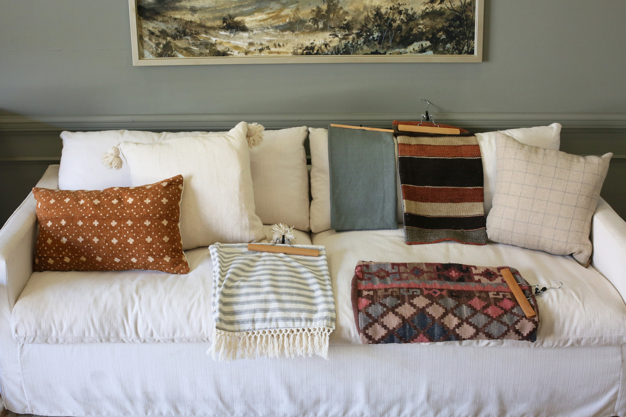 orange mudcloth pillow // white tassel pillow // striped fringe pillow // blue pillow
vintage kilim pillows // grid pillow
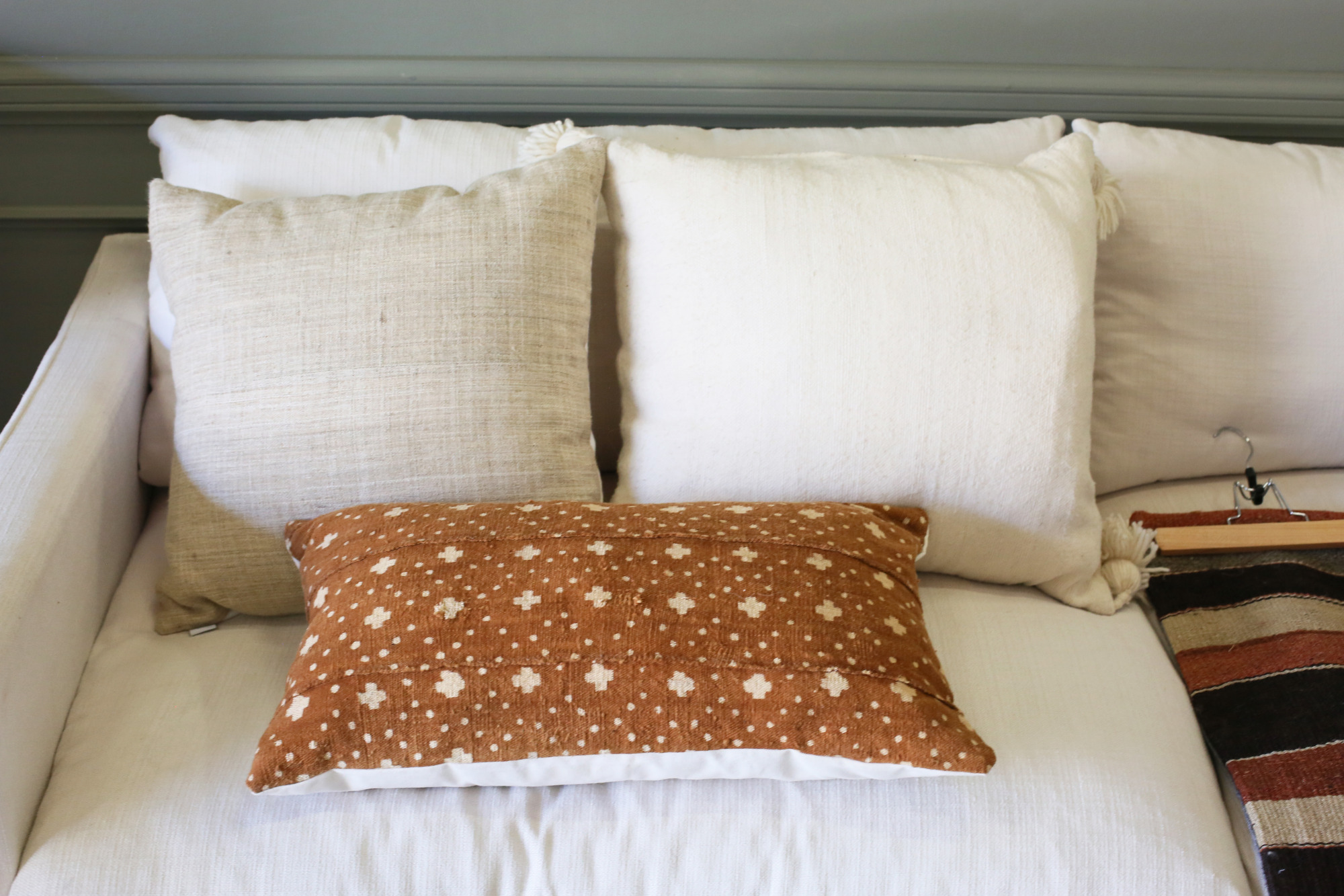
After some trial and error, we finally narrowed down our selections to just a few. Because we typically want the art to be the focus of our images, we try to pick pillows that play off the colors of the print without overpowering the space.
 beige pillow // orange mudcloth pillow // grid pillow // green pillow
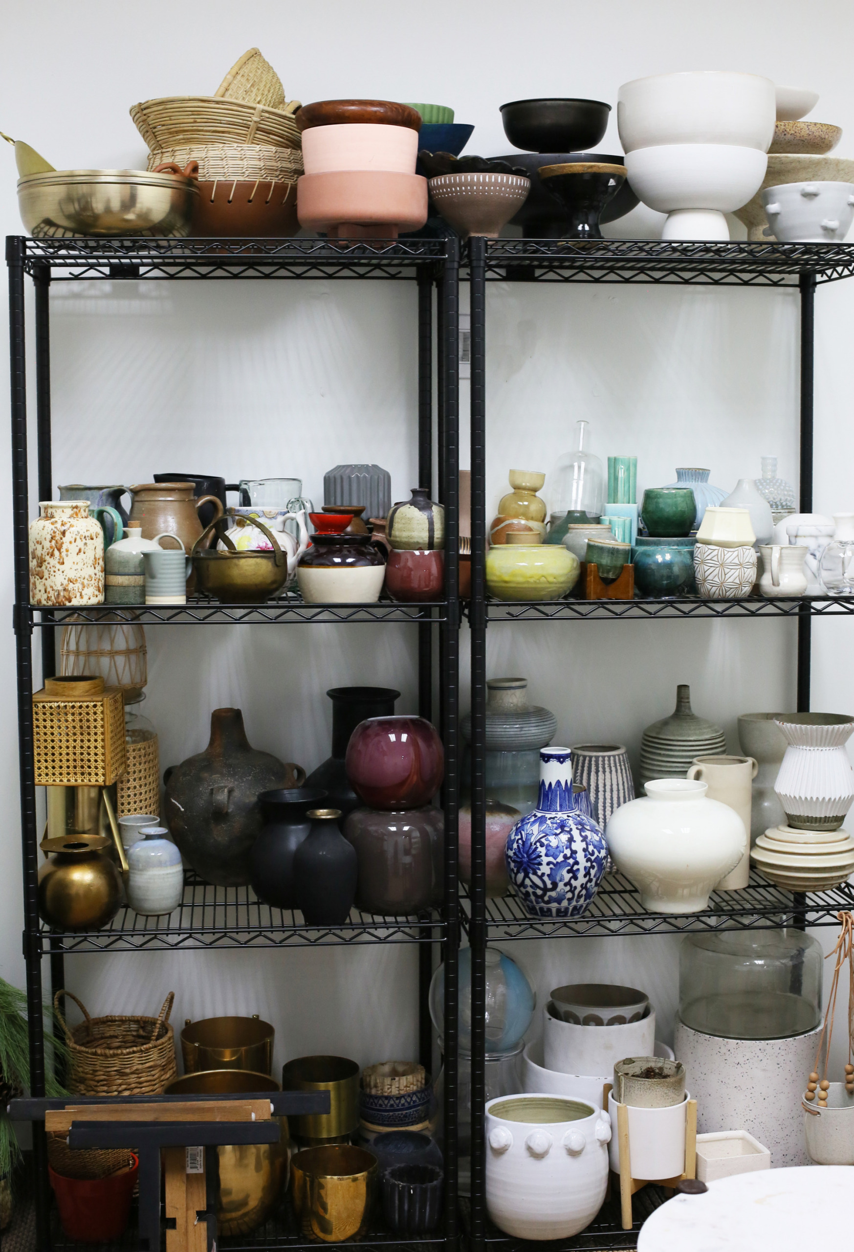
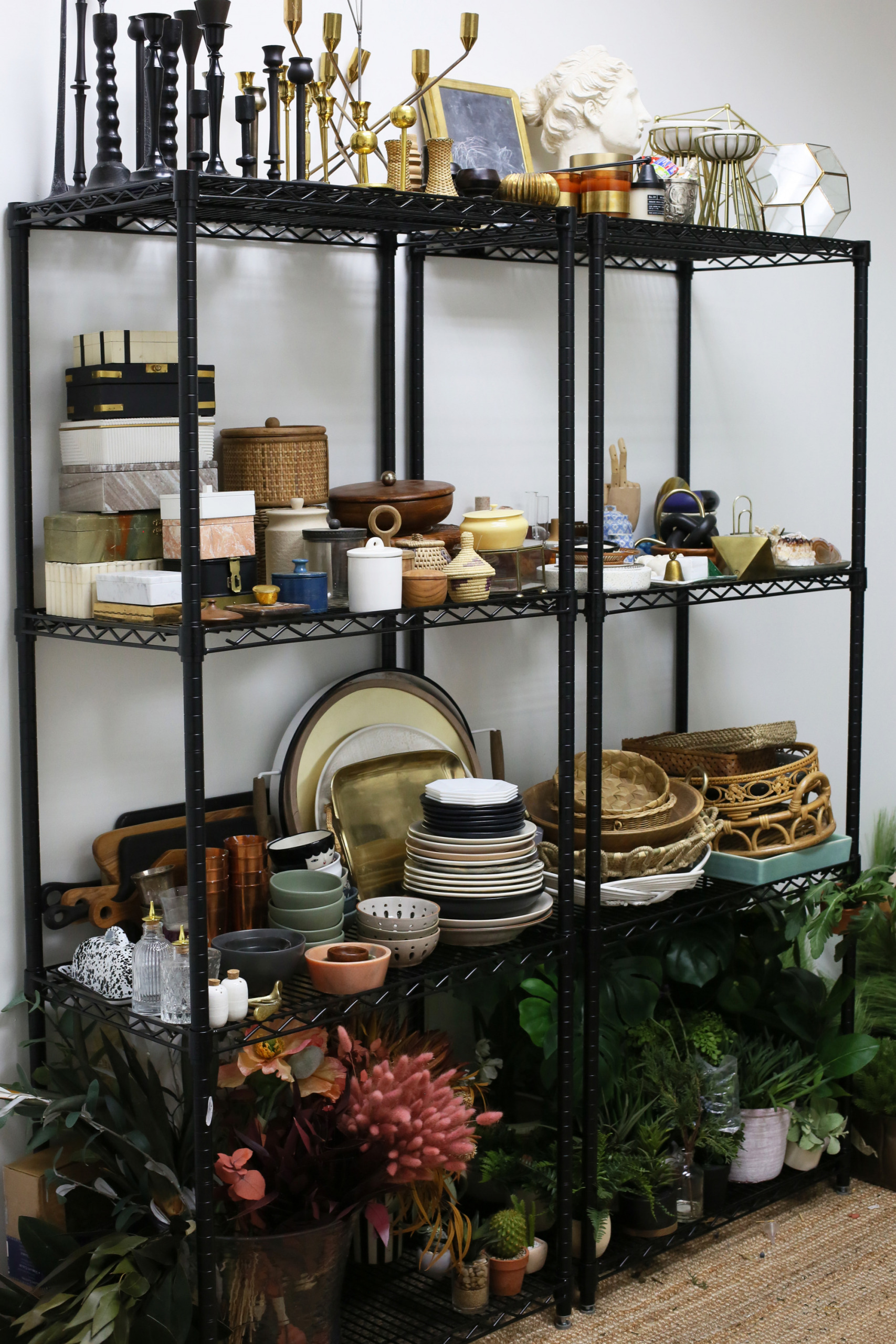
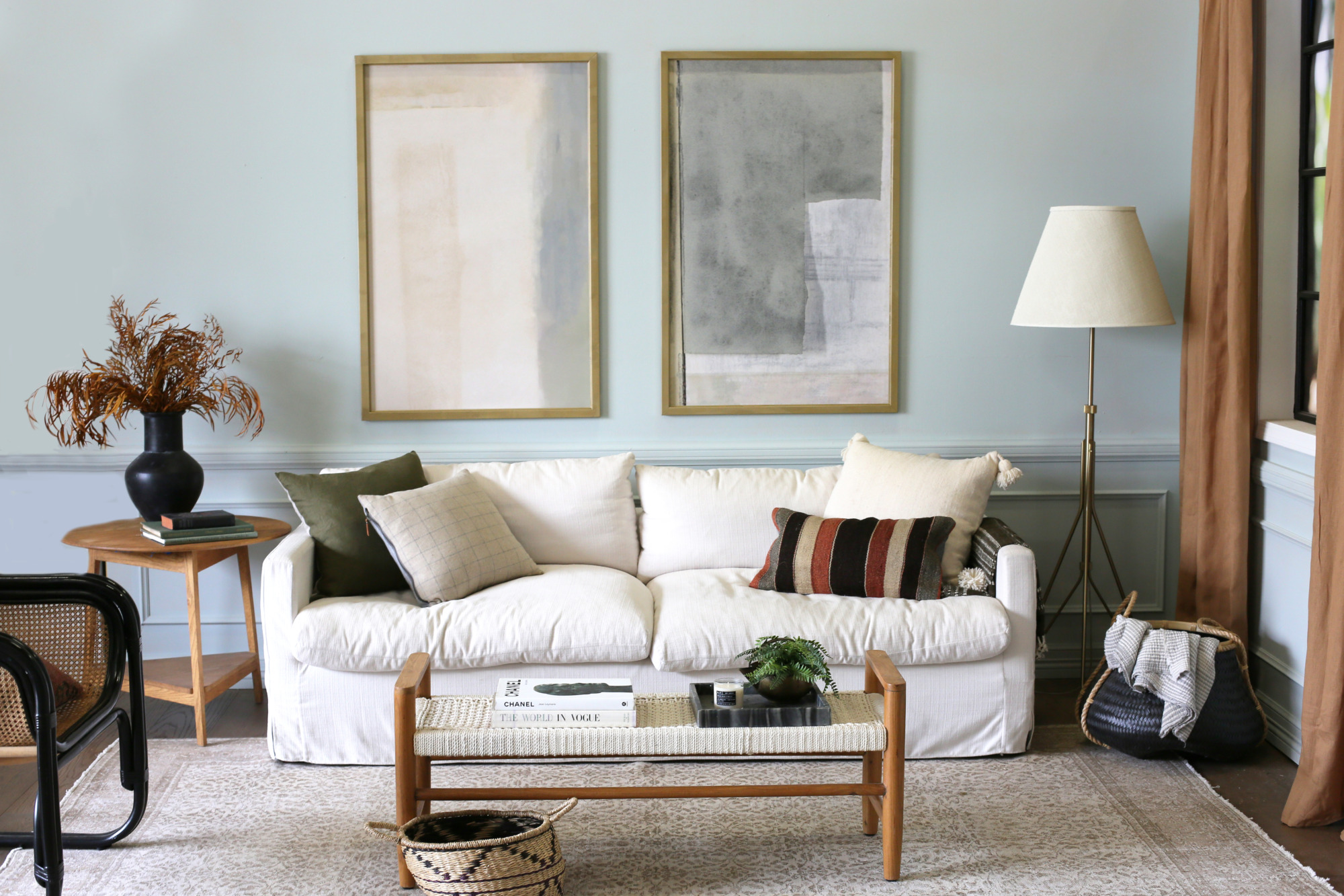
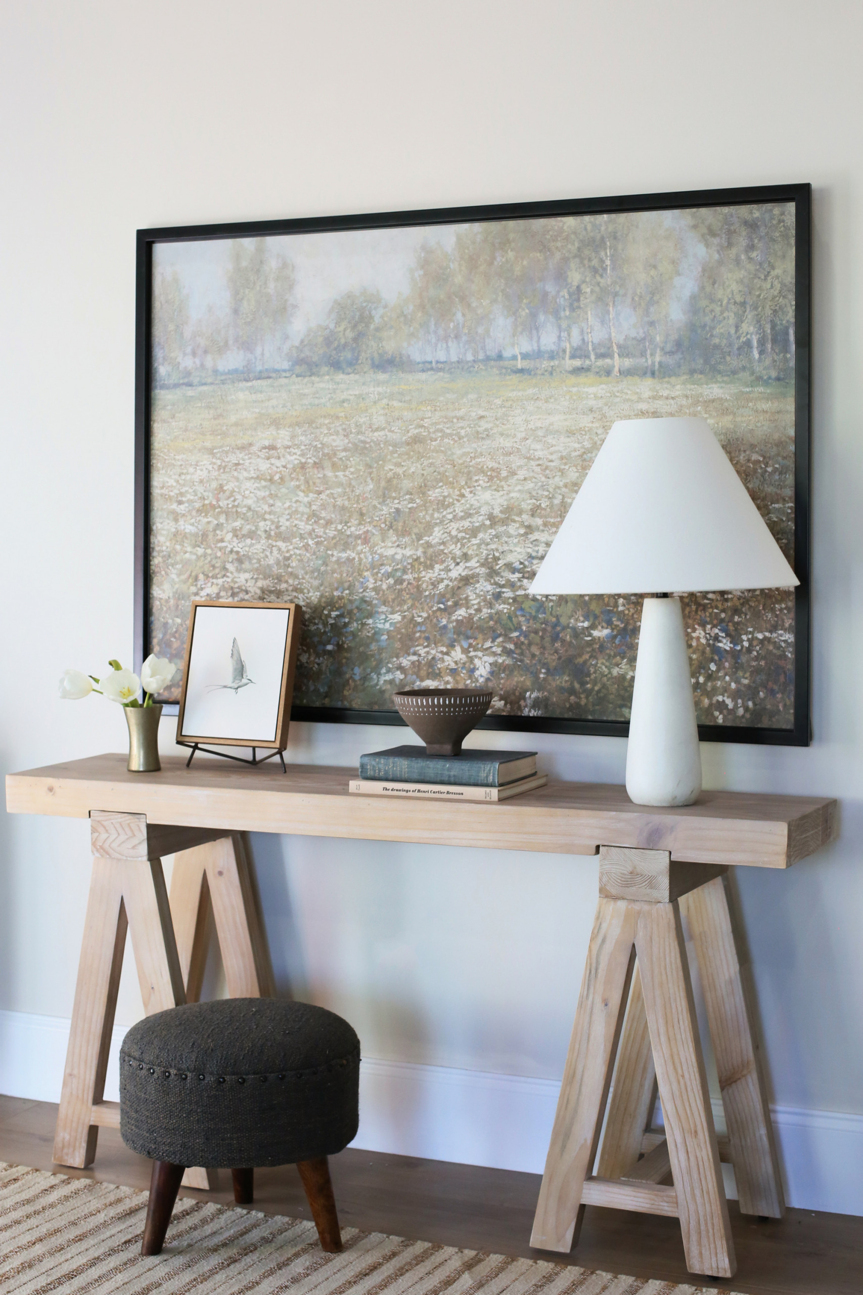
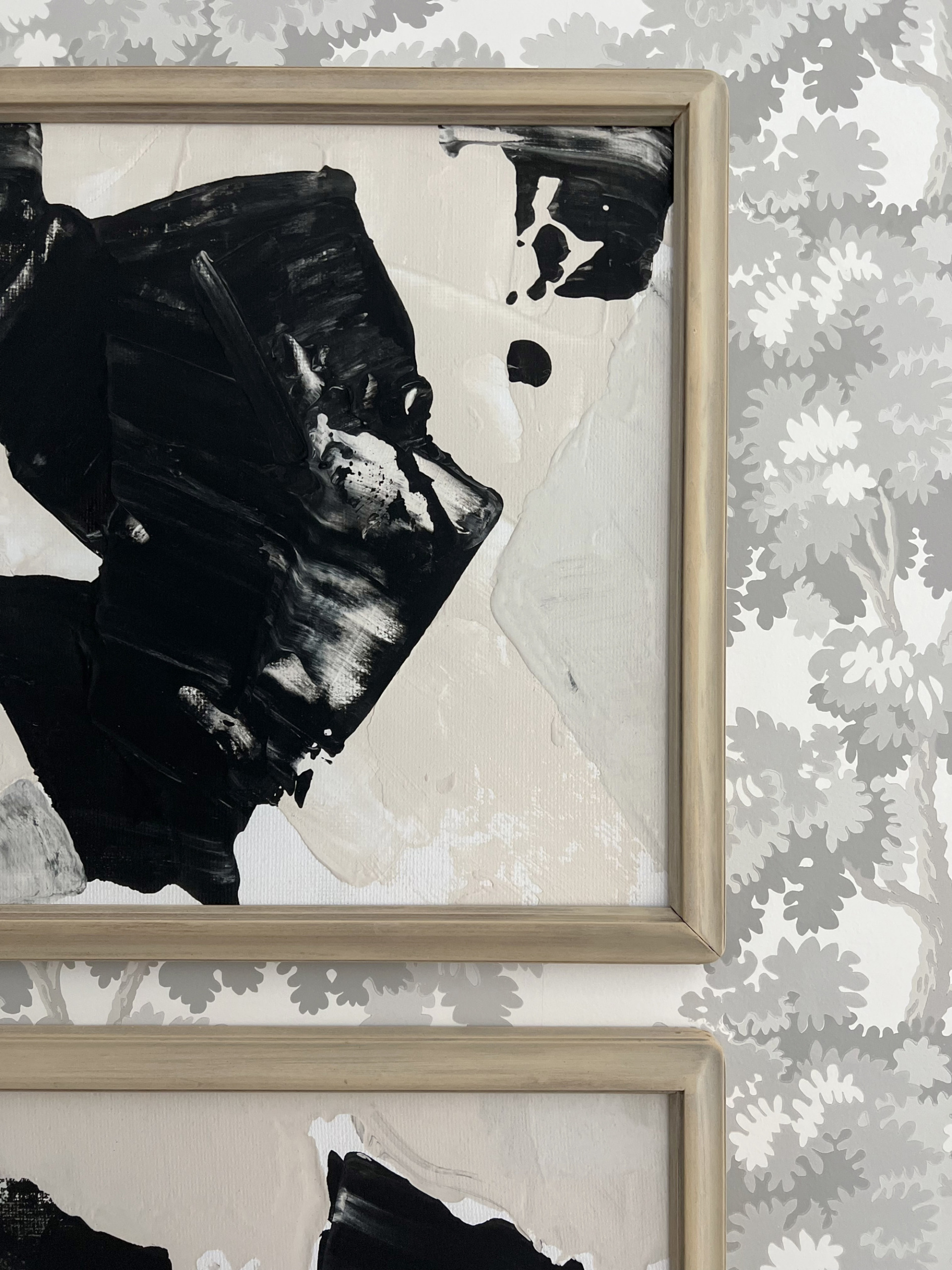
One of the last steps in the styling process is adding in a layer of decor. This can include baskets, vases, trays… really anything you love! We have a HUGE selection of styling pieces here in our studio. We love to mix colors, materials, and sometimes add in pieces that are a little bit funky or weird.
 black metal storage shelf
We are always on the hunt for new decorative pieces. We find a lot of our small decor at vintage stores and thrift shops. We also love to order new items to test out before adding them to the Shop Our Finds section of the site! Some decor items get used a few times before being donated or passed on to friends, family or coworkers, while others have been in our rotation for YEARS! Do you spot any pieces from past Juniper projects?!
 marble tray
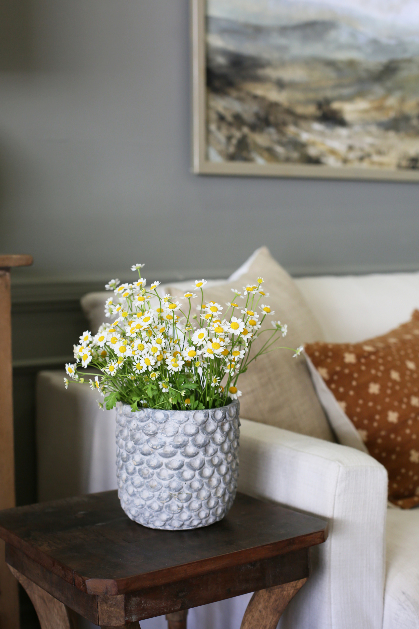
The final step is adding greenery and flowers. Even in a studio space, fresh florals are a must!!
 vase (similar)
We always try to stop by our local Trader Joes on photo shoot days, but we use regular grocery store flowers all the time and nobody is the wiser. As long as you know what you’re looking for, you can source beautiful flowers from almost anywhere! Some of our favorites are peonies, alstroemeria, ranunculus, chamomile, dahlias, mums, and we always love seeded eucalyptus for some greenery!
 sofa // rug (similar) // ottomans // dresser (similar) // table lamp // side table (similar)
We hope you loved this behind the scene look at our styling process, and a little day in the life of the Juniper content team! If you have any questions, leave them in the comments!
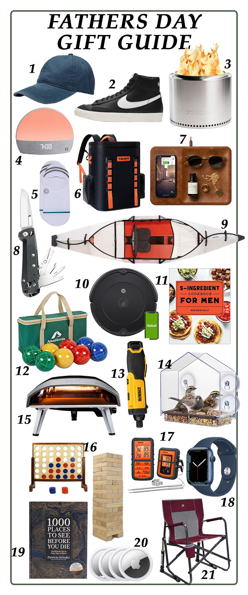
 I’ve done numerous cleaning posts over the years, and the one thing that always stays constant is my simple cleaning chart. I learned the basics of this years ago from a friend, and then adapted it to fit what I needed in my home. It has been my saving grace with 4 kids at home, and I’ve tweaked it a few times as my kids have grown. Luckily, they get to help with a majority if it now, but even if you’re a young mom doing it on your own, this will make your life SO much easier.
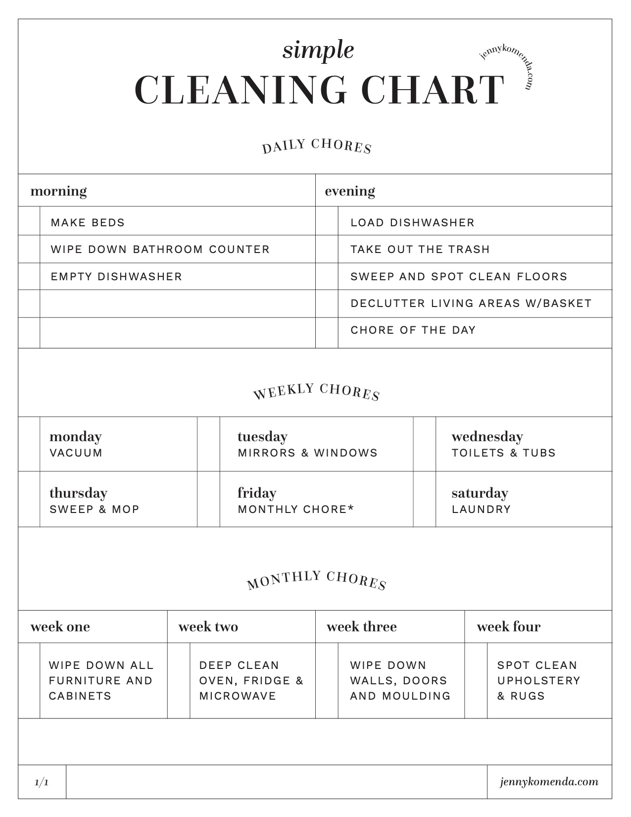 For example, right when I wake up I will make my bed, and I always wipe down my bathroom counter as soon as I’m done getting ready. I always unload the dishwasher as I’m making my kids breakfast, and then I squeeze my daily chore in sometime throughout the day. In the evenings, the girls help to clear the table and load the dishwasher, Michael does the trashes, and one of us (depends on who is home, who is happy, and how hectic the night is) will do a quick vacuum and spot clean of the floors. Ever since the invention of the cordless vacuum I don’t use a broom, and it has been life changing!


