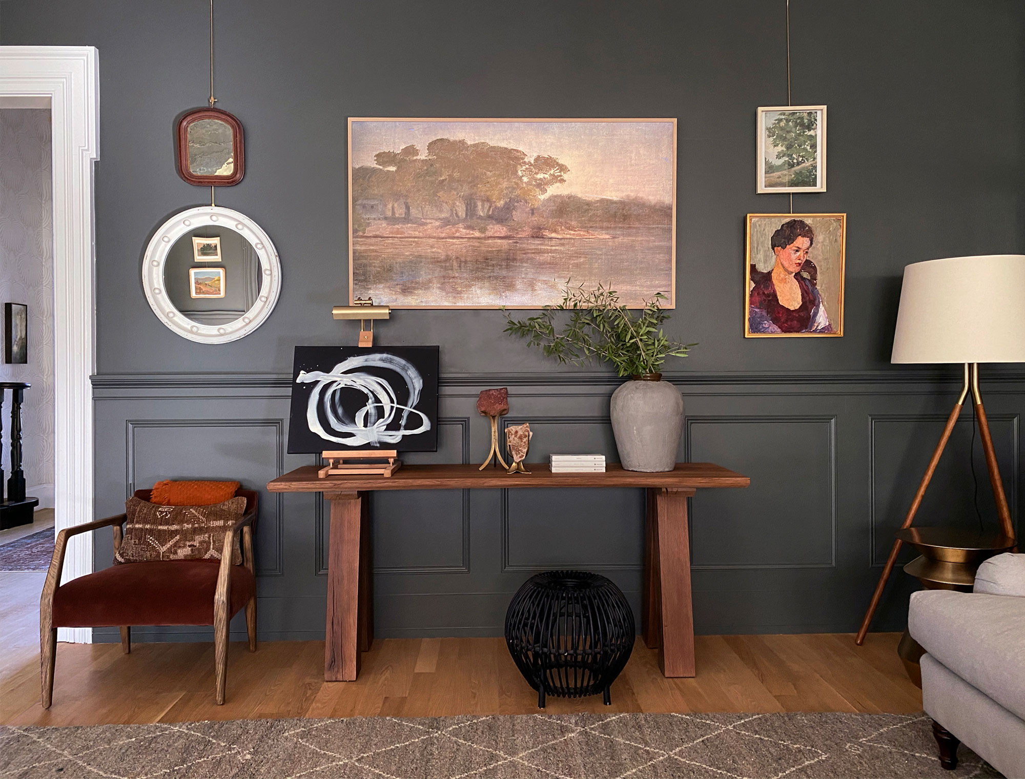
Picking a paint color is something that I get asked about constantly. I wish I could say there is an exact science to it, but the truth is- it can be hard! There is a fair amount of trial and error involved, but through the years I have found some favorite paint colors that I find myself coming back to time and time again.
While these are all colors that I have used and love, it is SO important to always sample your paints before committing to one! Paint a swatch and leave it up for at least 24 hours, that way you can ensure you are seeing the color in all different lights. Another thing to consider is the sheen of your paint- I typically go with eggshell or flat for walls, and satin or semi-gloss for trim, cabinets. etc. Last but not least, consider the texture of whatever surface you are painting. The same color will look very different on a textured wall vs. one that has a smooth coat finish!
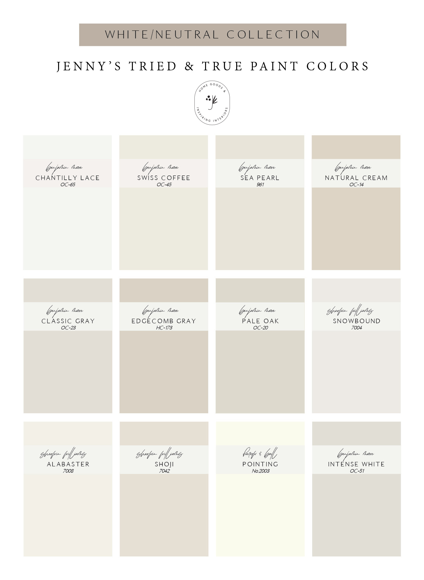
I probably get the most questions in regards to white paint, and all that I can say is not all white paints were created equally! Even the whitest of whites can pull different colors in different lights, and when it is around different finishes/decor. My go-to white is Benjamin Moore Chantilly Lace- I find that it pulls the truest white most often.
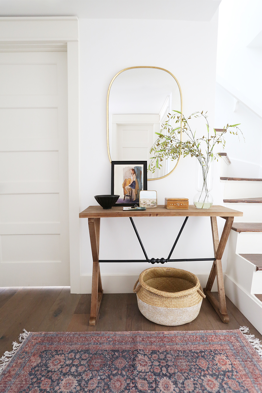
Walls: Benjamin Moore Chantilly Lace – Trim: Benjamin Moore Sea Pearl
Console Table // Mirror // Basket (similar) // Rug (similar)
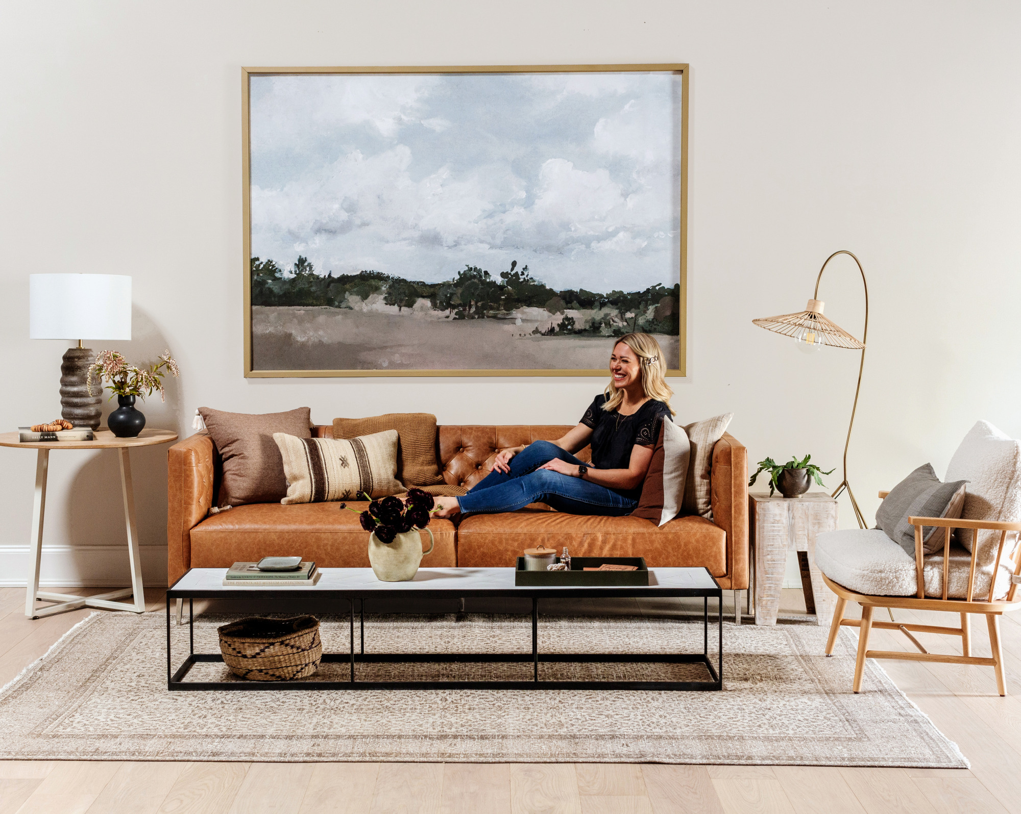
Walls: Benjamin Moore Pale Oak – Trim: Benjamin Moore Chantilly Lace
Sofa // Coffee Table (similar) // Chair (similar) // Lamp (similar)
Pasture Print // Vintage Stripe Pillow (similar)
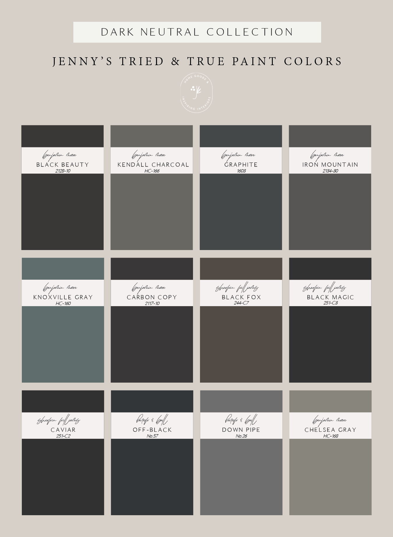
Dark neutrals are a great way to make a statement and create a moody look. Don’t let the term neutral fool you, there is a definite hue to all of these paints, but they’re fairly muted and will go with lots of different decor and finishes.
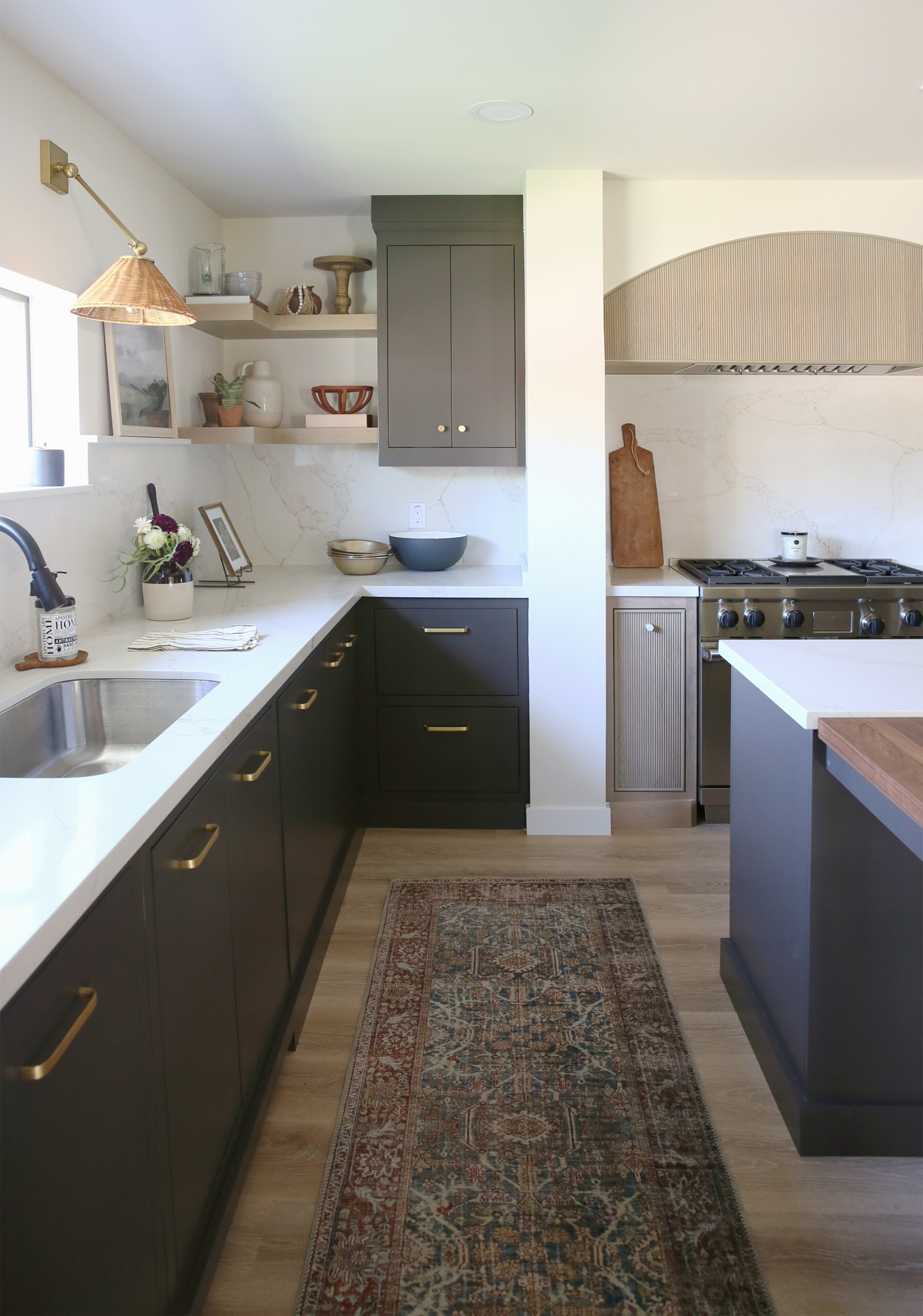
Cabinets: Sherman Williams Black Fox
Runner // Sconce // Cutting Board (similar)
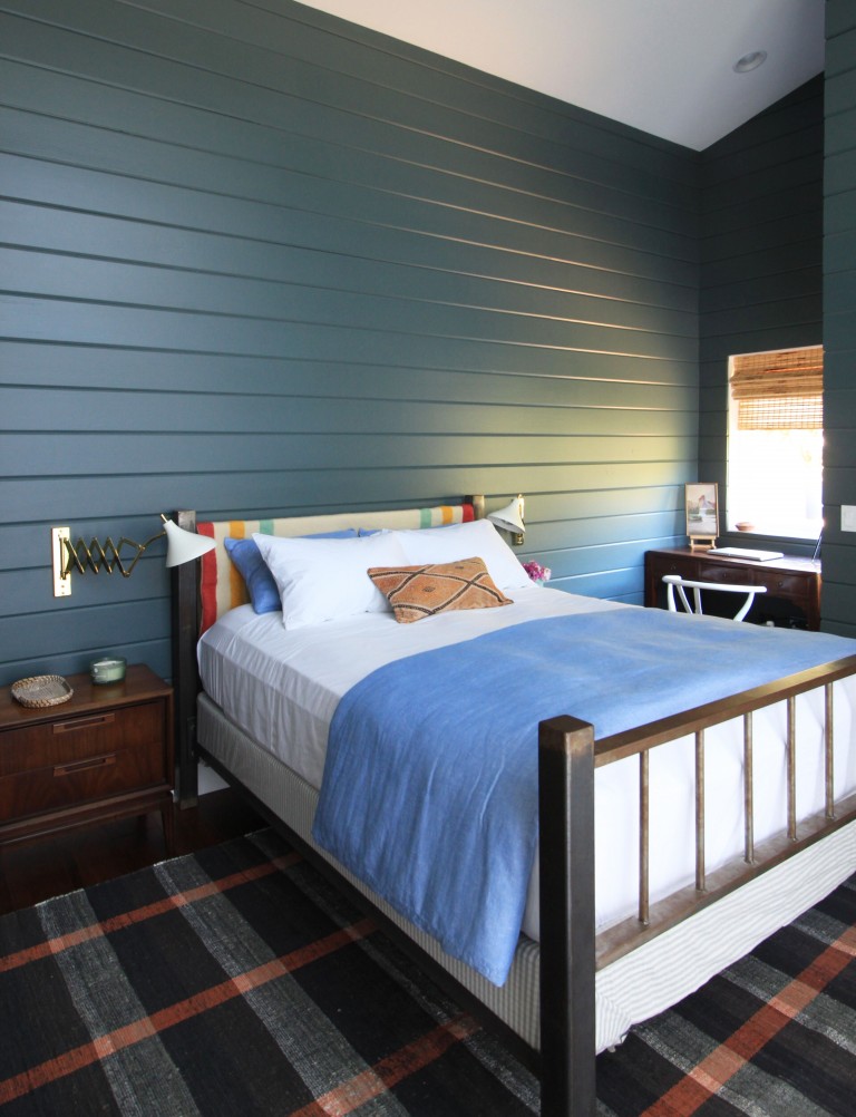
Walls: Benjamin Moore Knoxville Gray
Nightstand (similar) // Rug (similar) // Sconces (similar) // Vintage Pillow
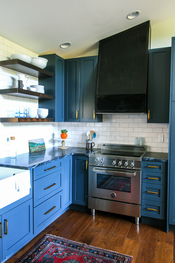
A common mistake with blues is thinking they are all cool tones, which could not be farther from the truth! Blues either have a red base, causing them to lean closer to a purple, or a little more yellow in them, causing them to pull more green. Lighting will obviously play a huge factor in which way these colors lean- and it’s impossible to pick a favorite!
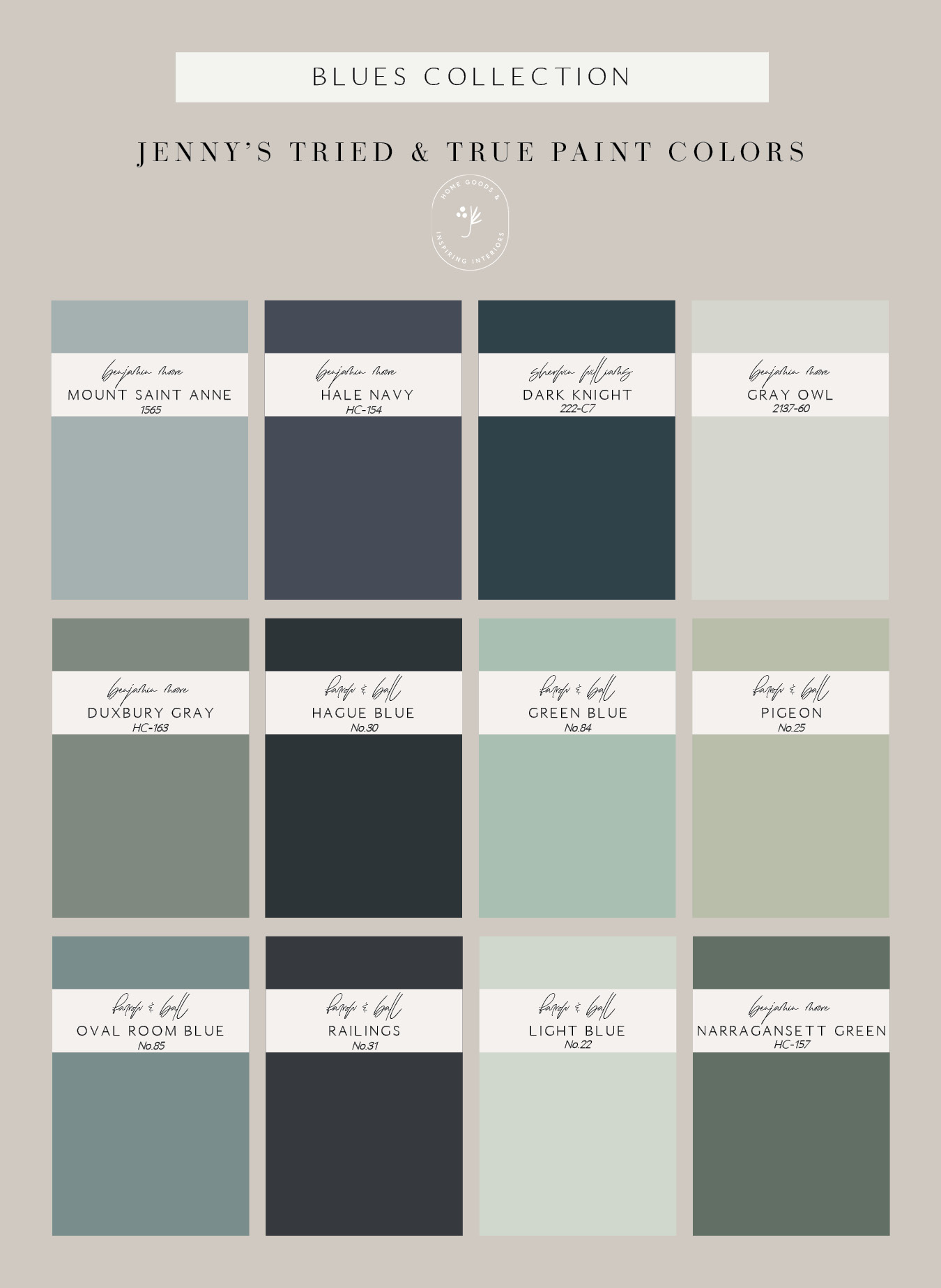
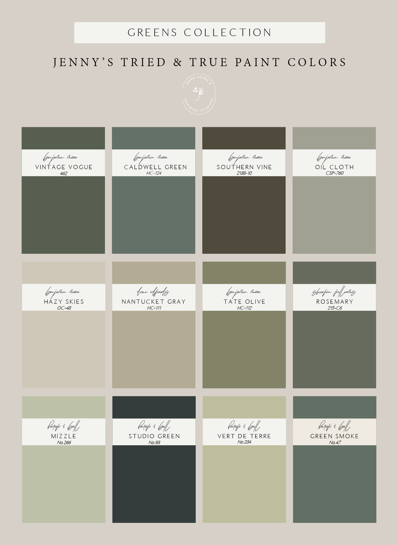
Green is very on trend right now, and I personally hope that never changes! Narrowing down this green list seemed impossible because there are SO many good hue to choose from. I promise the ones that made this list will not disappoint!
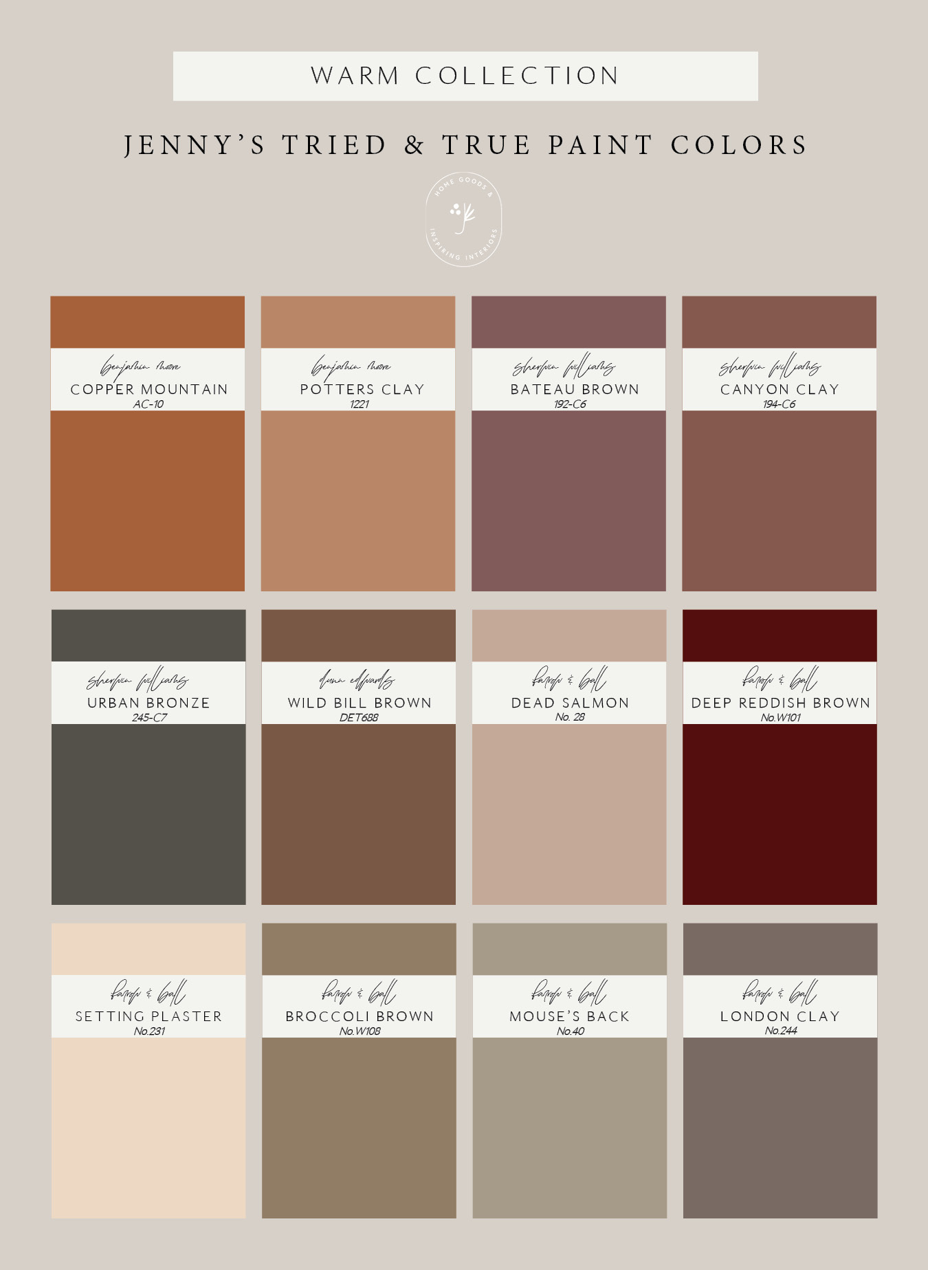
This warm collection was so fun to put together, because these are all colors that aren’t sued as often, but are so, so beautiful.



So thrilled to see new posts here- I have been so inspired over the years by your work, Jenny! Keep up the amazing work!
Thank you so much for being here!!
jyimse
twlgcf
esi0oz
9req00
s0bit1
nr49c8
k1vcvq
a7ucgc
qpwzeb
osd7ck
Appreciate the depth of knowledge in this post. Solar
Hi there,
Love your colour choices. Do you know what colour is on the walls in the first photo? Some sort of dark smokey blue
al9h53
x7kgvp
mgt76s
alu510
Elegant colors, harmonious and luxurious arrangement of objects. I love capybara clicker
sa7dm1
x1u92p
1c56q9
t9relo
The thoroughness of your analysis is truly impressive. grocery cashier
viagu1
lyutmj
I appreciate your post. I’ve studied several similar topics! I was impressed by your post, unlike others. Please keep creating interesting stuff like these for us and others to read! nytimes crossword
hdlvg1
bszo25
f3ow5p
xt0iu3