One of the spaces that changed the most at our Evergreen House project was the en suite bedroom in the upstairs addition!
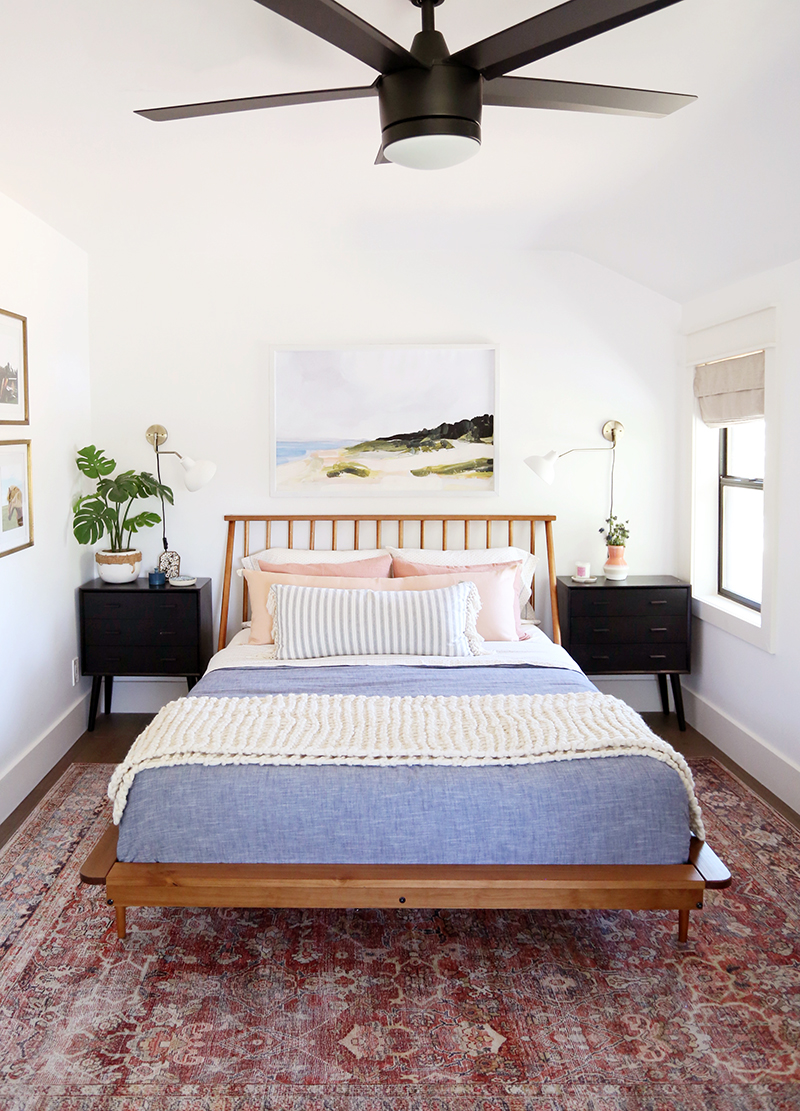
bed // nightstand // sconce // blue duvet // cream throw
chambray duvet // planter (similar) // faux monstera plant // fan
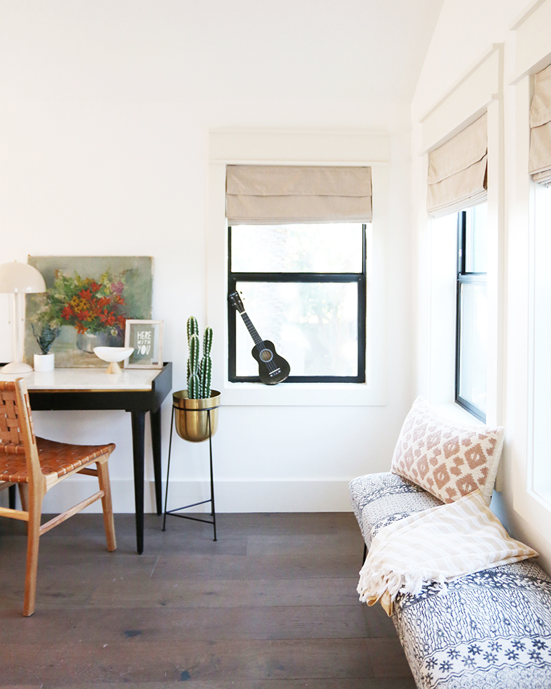
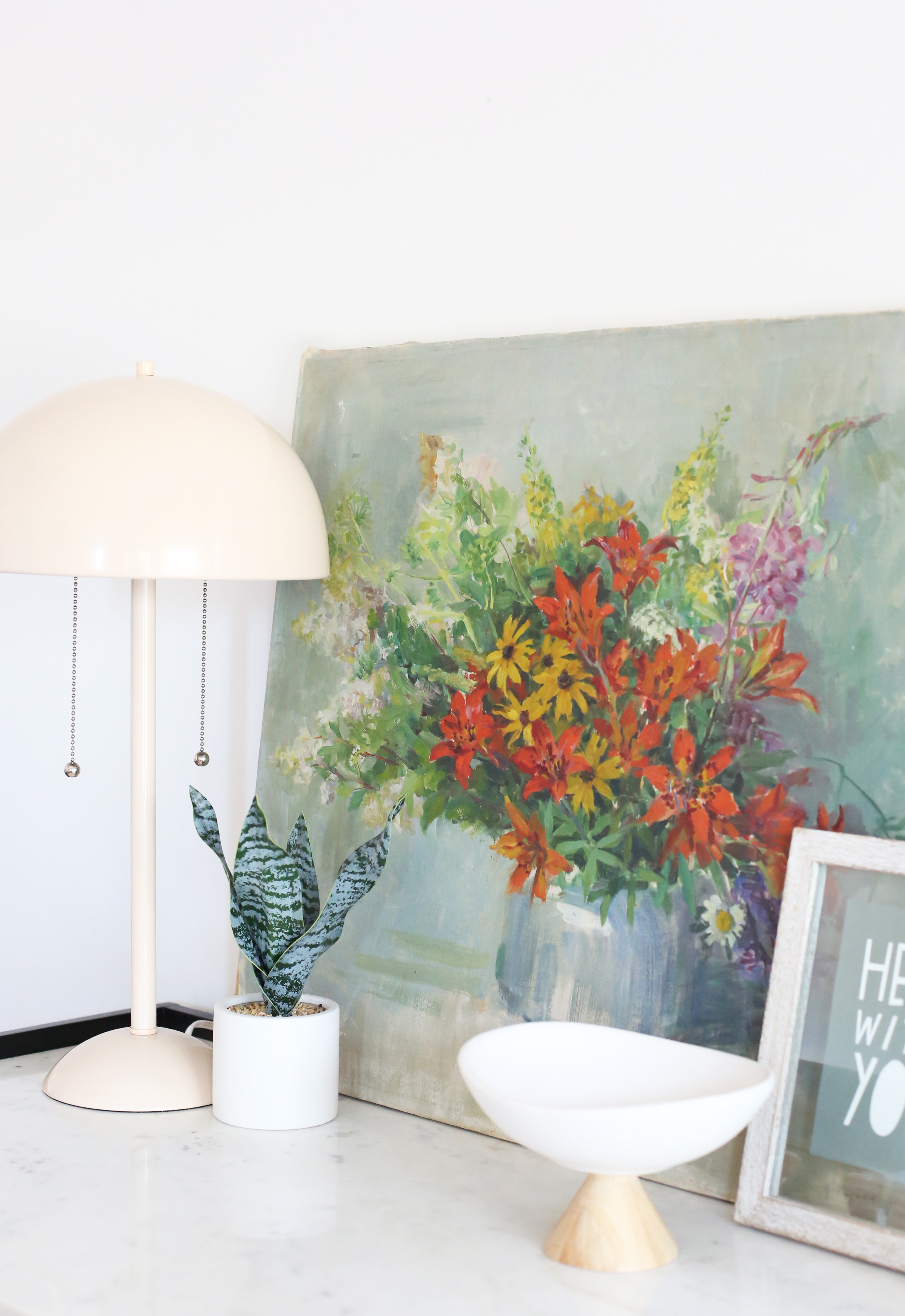
WILDFLOWER print // HERE WITH YOU print
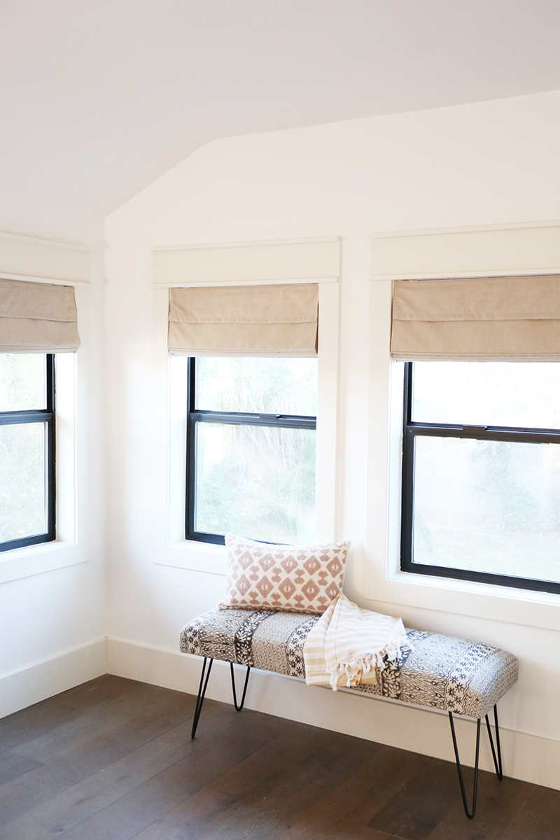
chair(similar) // pink lamp // bench(similar) // ukelele // brass planter(similar) // roman shades(similar) // desk (similar)
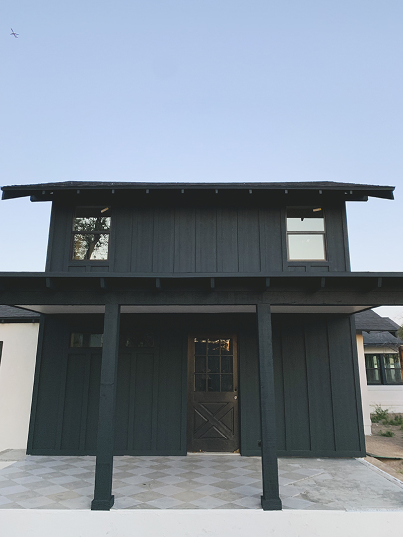
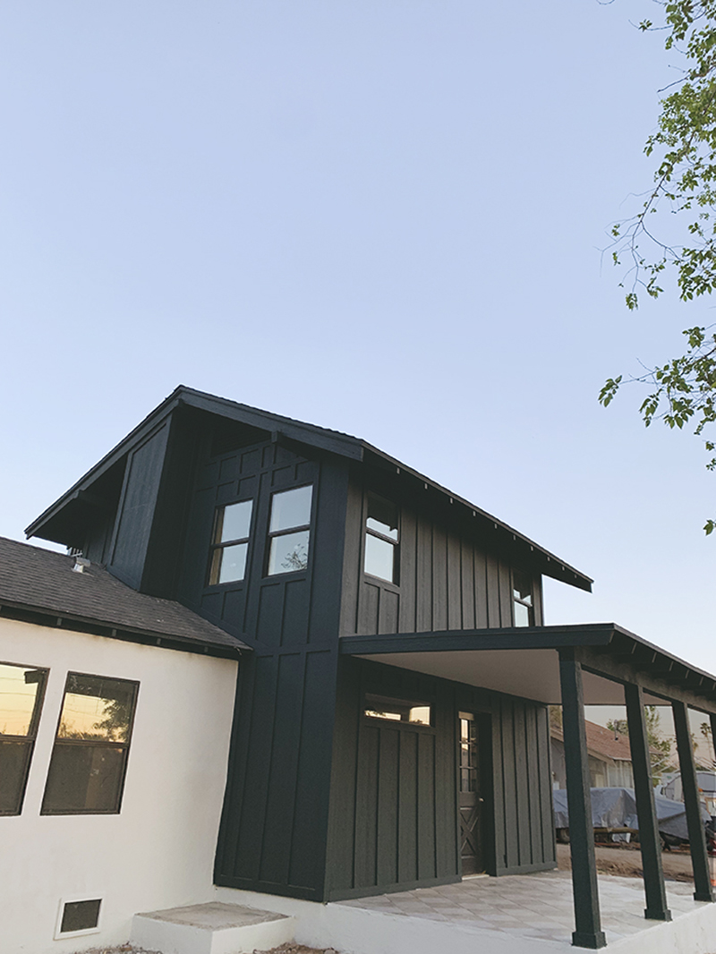
To give you a little more context, I want to show you what this room looked like from the exterior view first. The en suite bedroom takes up the whole upstairs area. At one point, a balcony with a door in the bedroom going out over the back porch had been added and then fell into disrepair over the years. When we started the renovation, we knew that it made the most sense to demo the falling down porch, close off that upstairs door and reconfigure the window placement in a way that looked balanced on the exterior and minimized harsh southern exposure light on the right side of the house.


Here’s where we landed! We came so far!
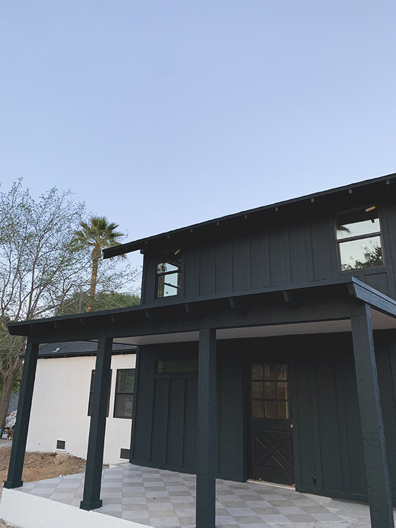
The long skinny window is in the master bathroom and the back door leads into the mudroom and on into the hallway before the kitchen.
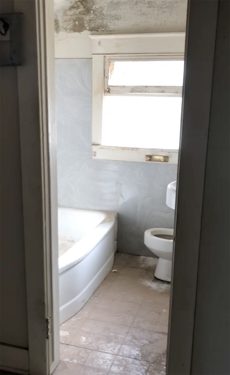
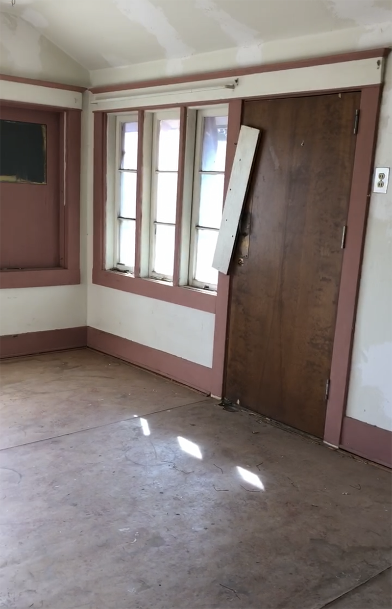
Here are a few photos of the inside of the bedroom, which was a pretty decent size. The old layout required you to walk through a large closet to get into the tiny bathroom. We reworked the floor plan a little and made separate doors to the walk-in closet and to the now-larger bathroom.
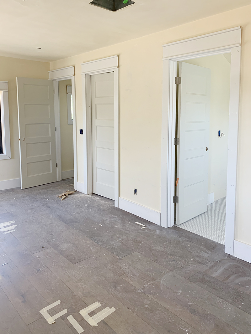
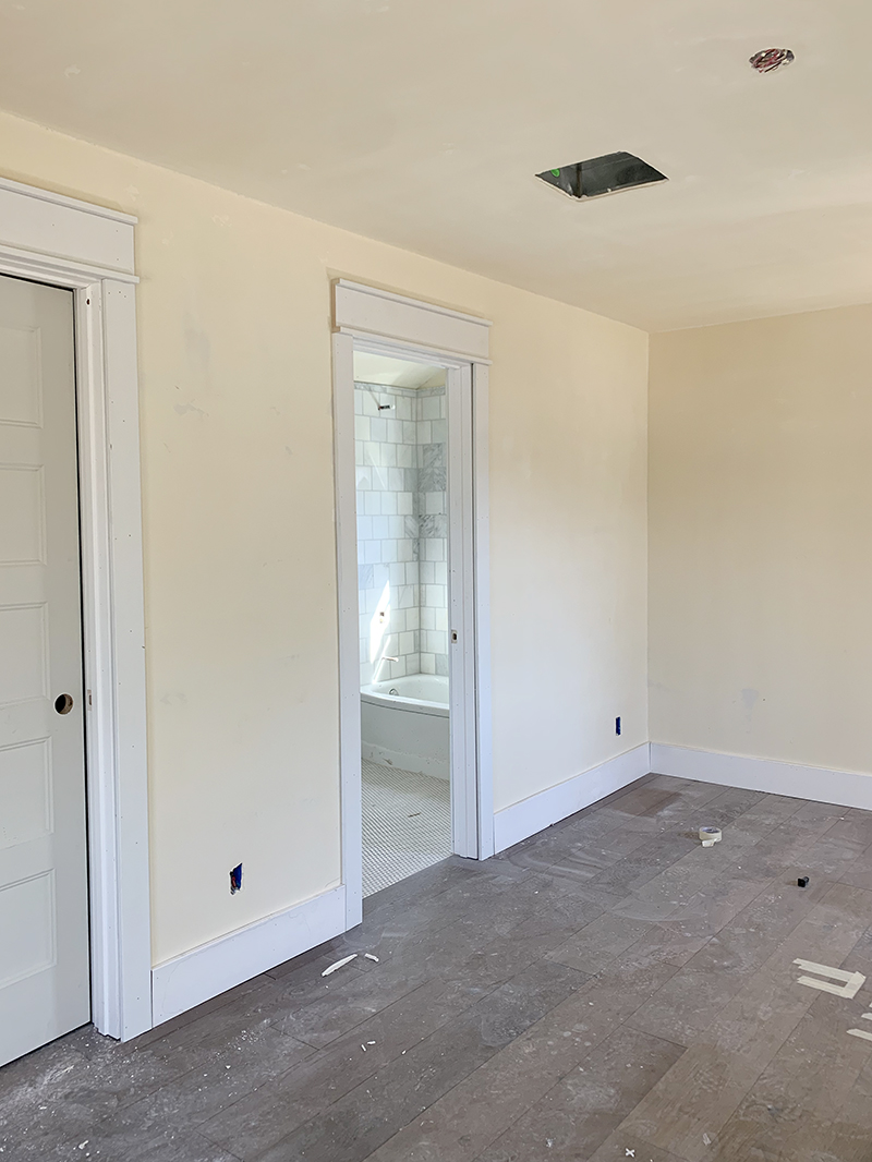
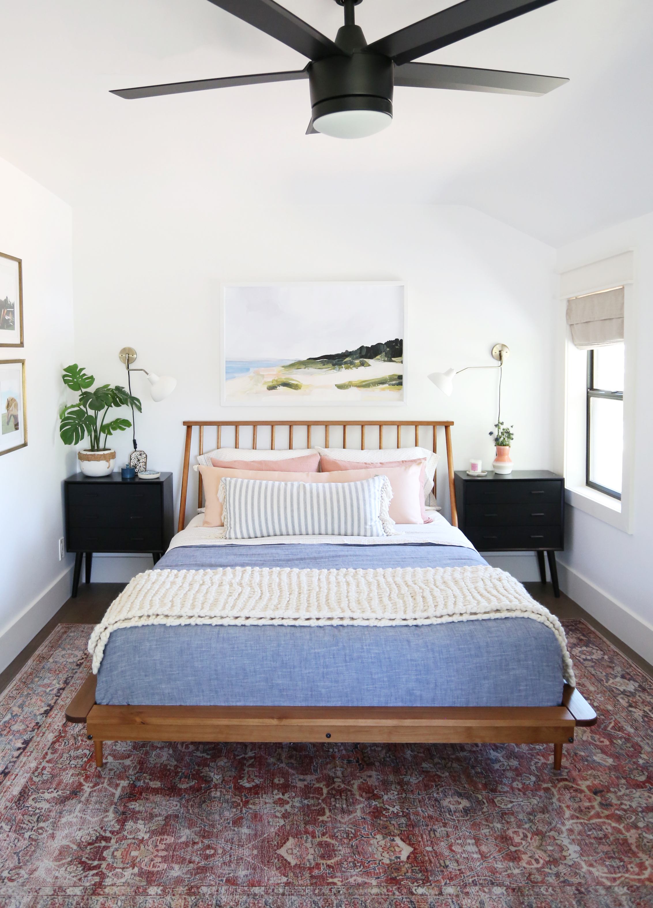
And here’s how the room turned out! We painted the walls Benjamin Moore Chantilly Lace and the trim is Seapearl. We styled this room as a teen girl’s room – a little more grown up, but still youthful. I love it!
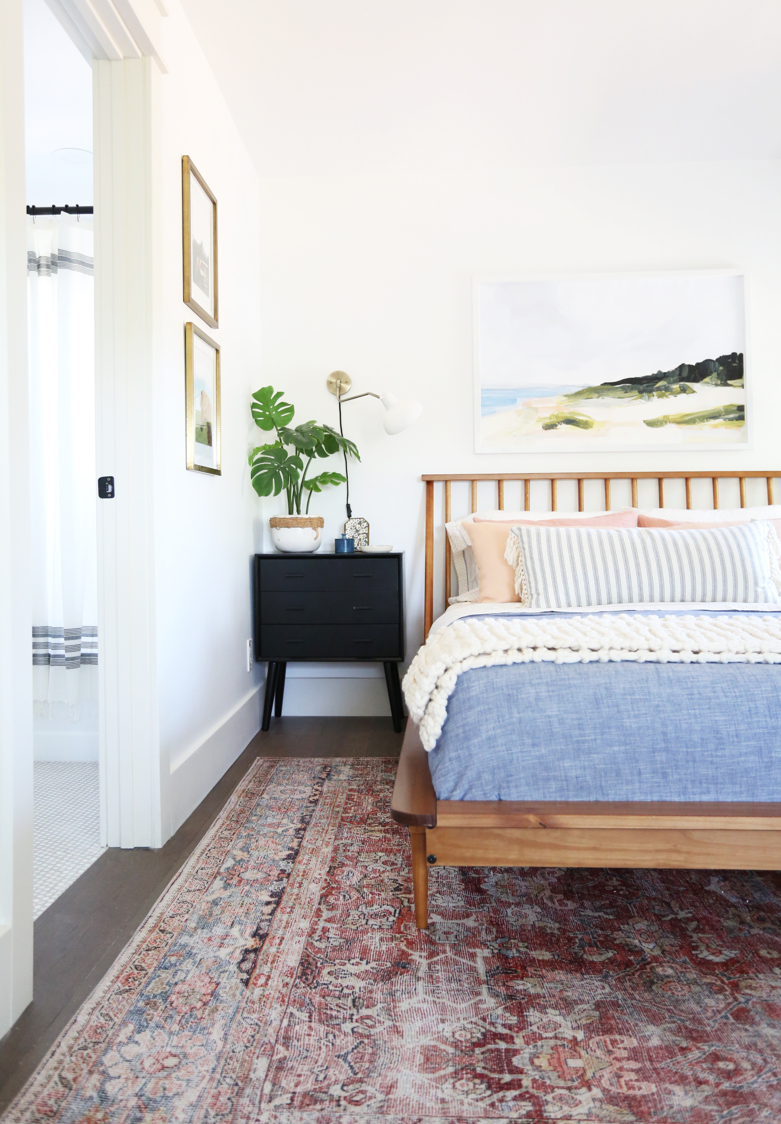
bed // nightstand(similar) // sconce // blue duvet // cream throw
chambray duvet // planter (similar) // faux monstera plant // fan
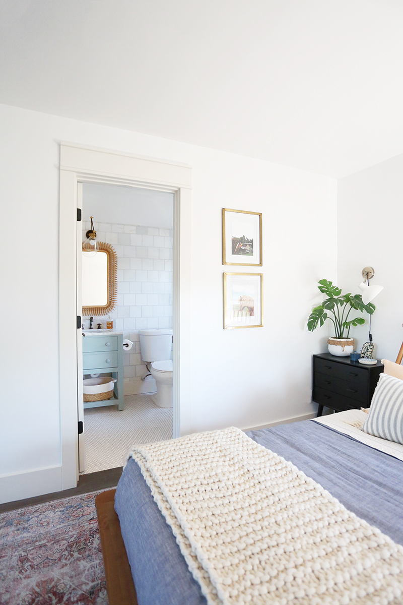
The bed was an amazing Amazon find. I can’t not mention though that it was a beast to put together with all of those spindles! :) That said, it was really sturdy when we got it assembled and the price is pretty unbeatable! I definitely recommend it!
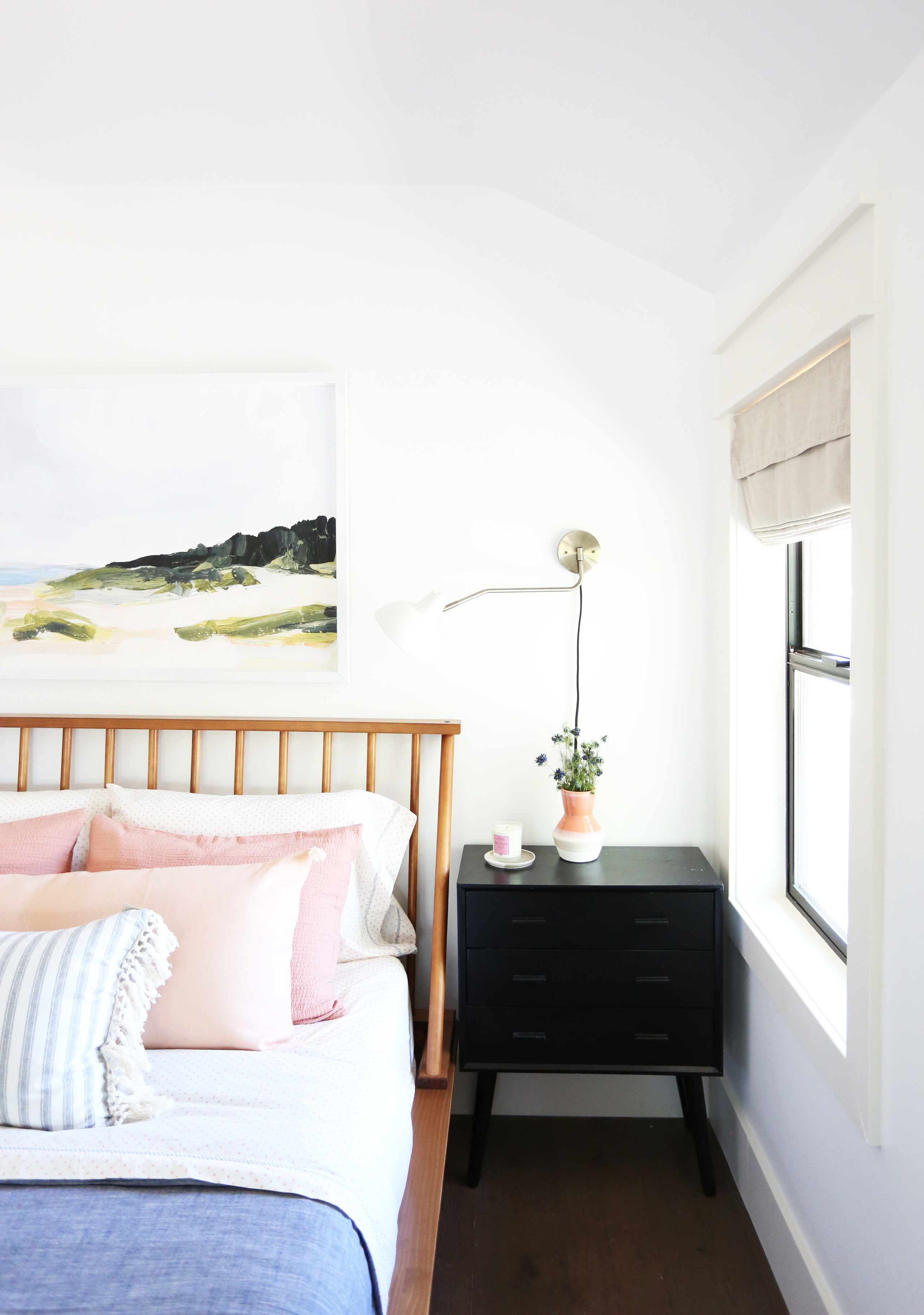
bed // nightstand(similar) // sconce // blue duvet // cream throw
chambray duvet // planter (similar) // faux monstera plant // fan
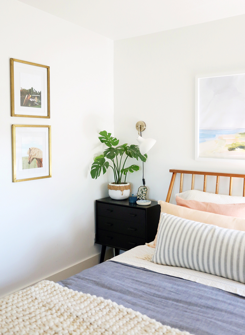
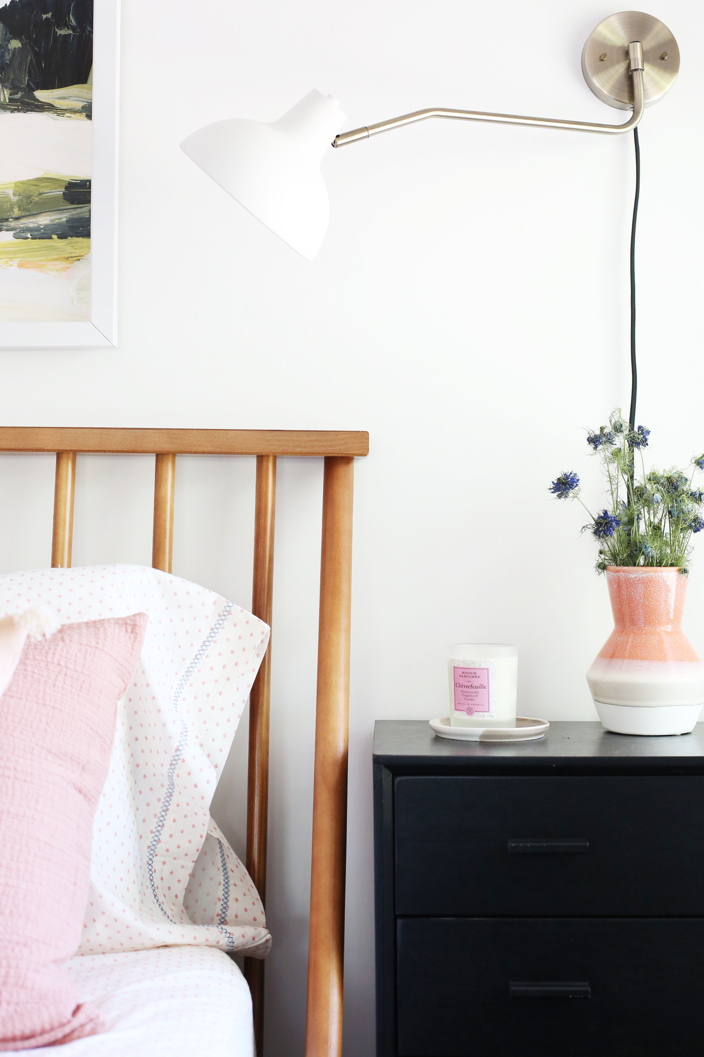
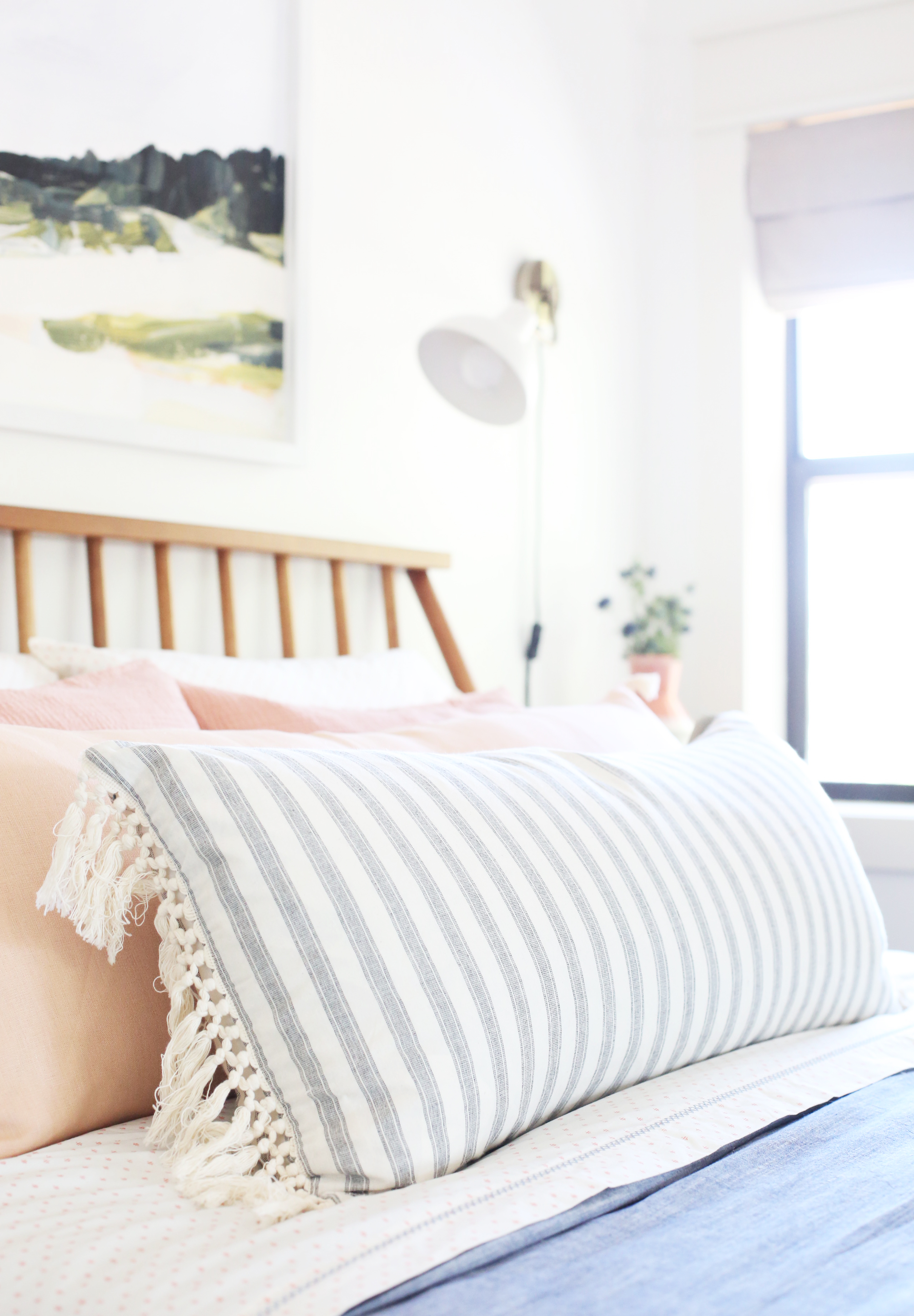
I love that even though we took out quite a few windows, this room still feels amazingly light and bright!
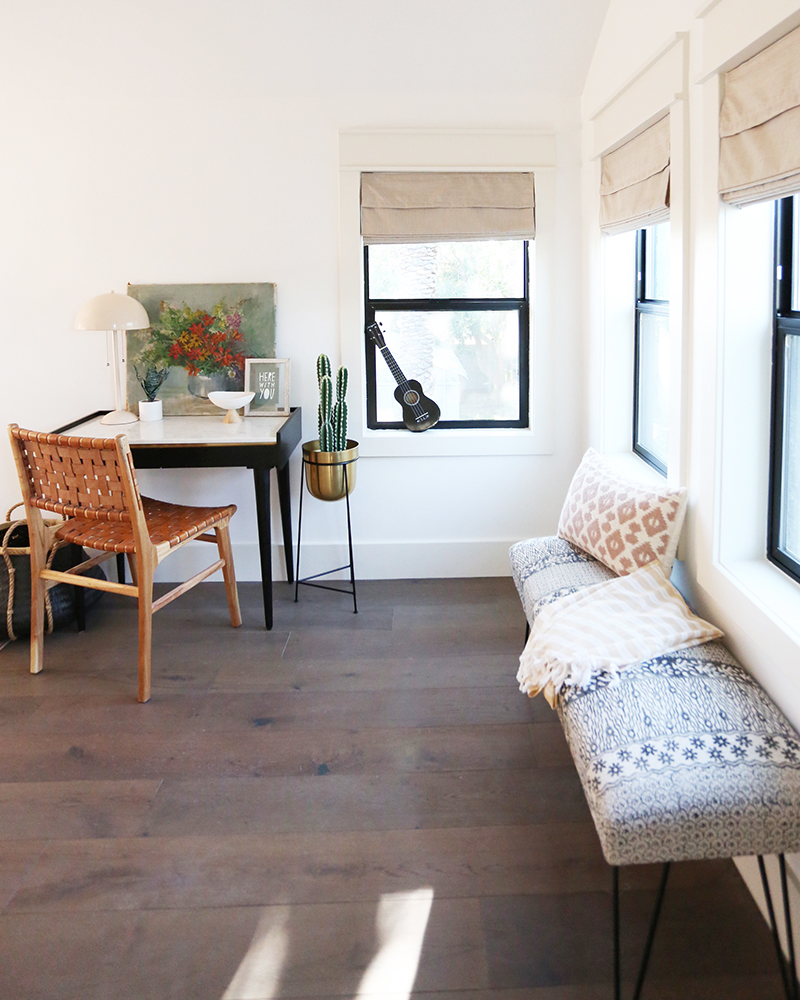
WILDFLOWER print // HERE WITH YOU print
chair(similar) // pink lamp // bench(similar) // ukelele // brass planter(similar) // roman shades(similar) // desk (similar)
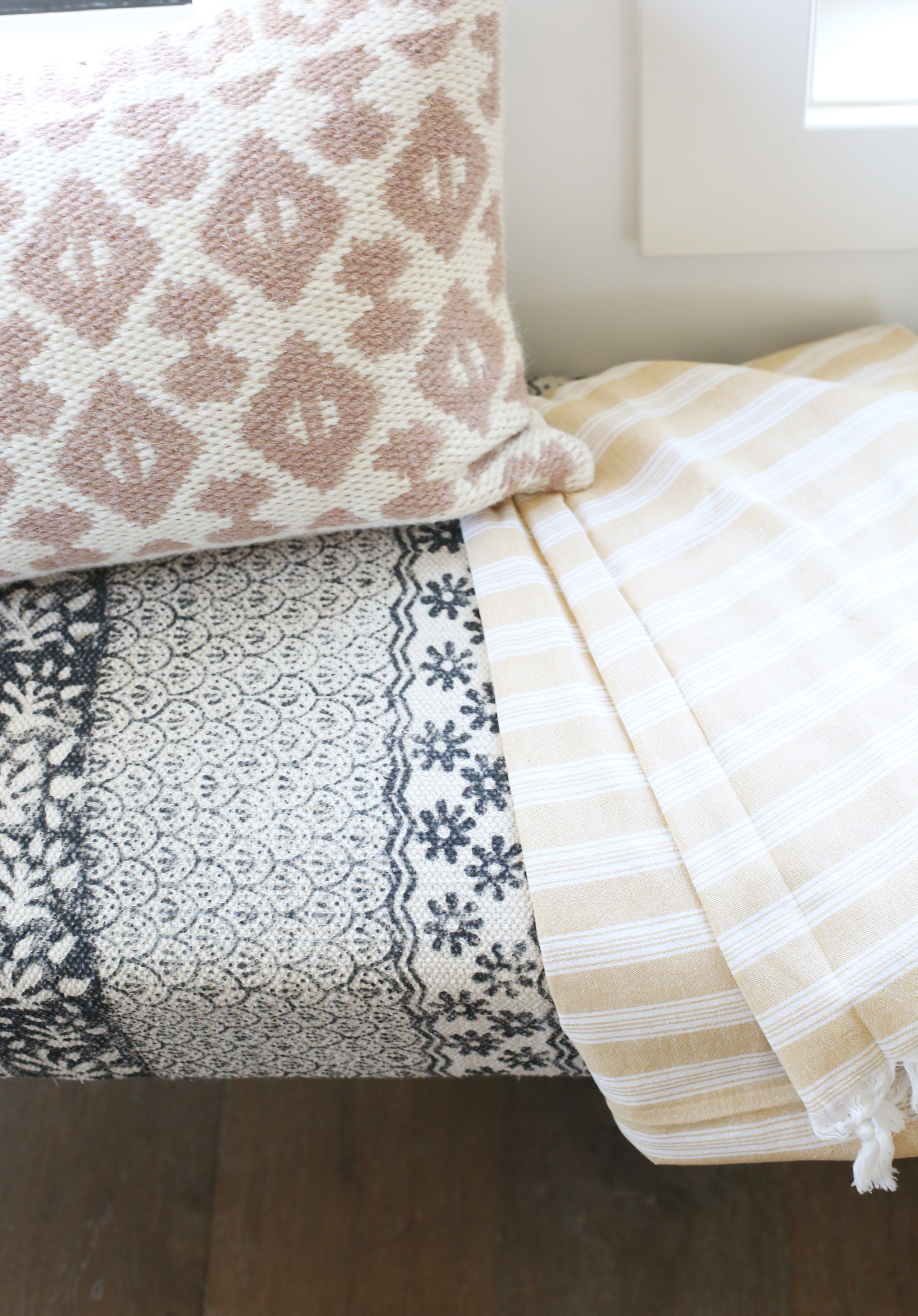
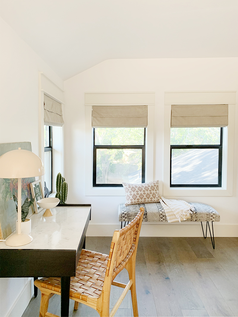
WILDFLOWER print // HERE WITH YOU print
chair(similar) // pink lamp // bench(similar) // ukelele // brass planter(similar) // roman shades(similar) // desk (similar)
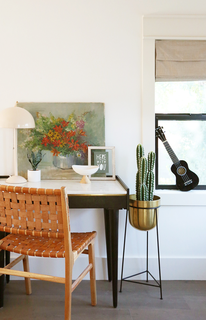
WILDFLOWER print // HERE WITH YOU print
chair(similar) // pink lamp // bench(similar) // ukelele // brass planter(similar) // roman shades(similar) // desk (similar)
WILDFLOWER print // HERE WITH YOU print
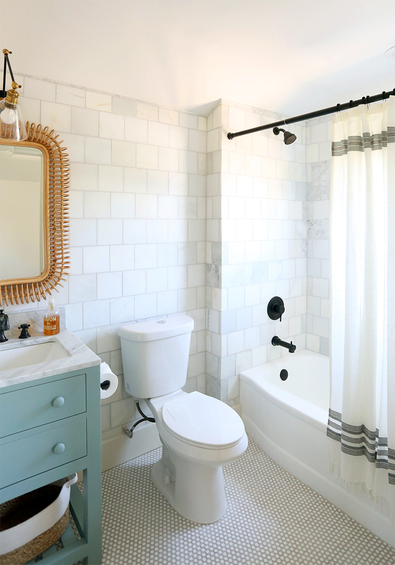
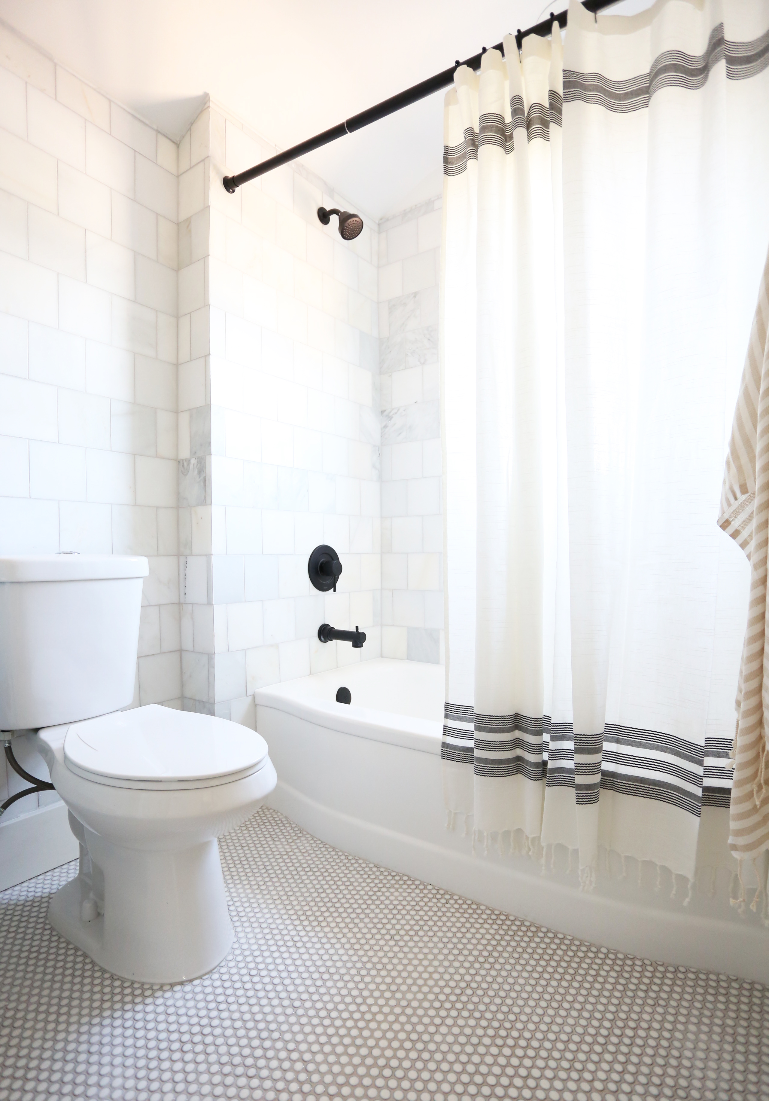
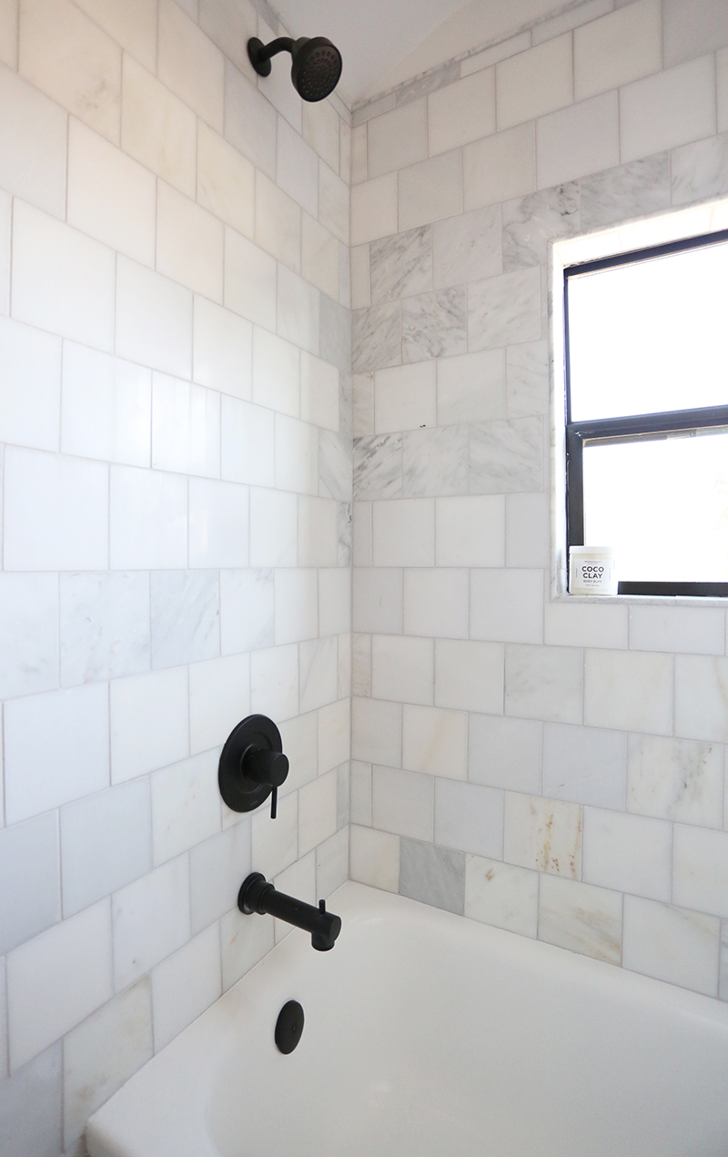
I chose a 5×5″ square honed marble tile for the walls and shower surround in the bathroom. I wanted something classic in a brick lay pattern, but I didn’t want to do subway tile in here. I was hoping for something with a little more movement and this marble tile did just the trick! I love this line of vanities because they come with a marble top and a sink for a VERY decent price! Once we had this vanity installed though, I knew I wanted to paint it blue and change the hardware! The white and chrome was feeling a little too cold in here.
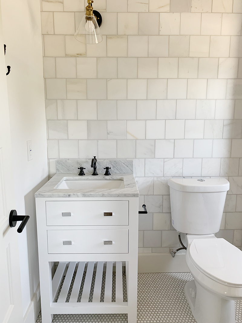
Before painting, I quickly cleaned the whole vanity with TSP, which is sort of like a liquid sander – it helps to degloss and prime the old paint. I went with a milk paint, which is a lot like a chalk or mineral paint in that it covers beautifully and has super smooth finish! I love this affordable line on Amazon and the pre-mixed colors are amazing! I chose a color called Persian Blue because I thought it would be pretty with the tones in the penny tile and marble!
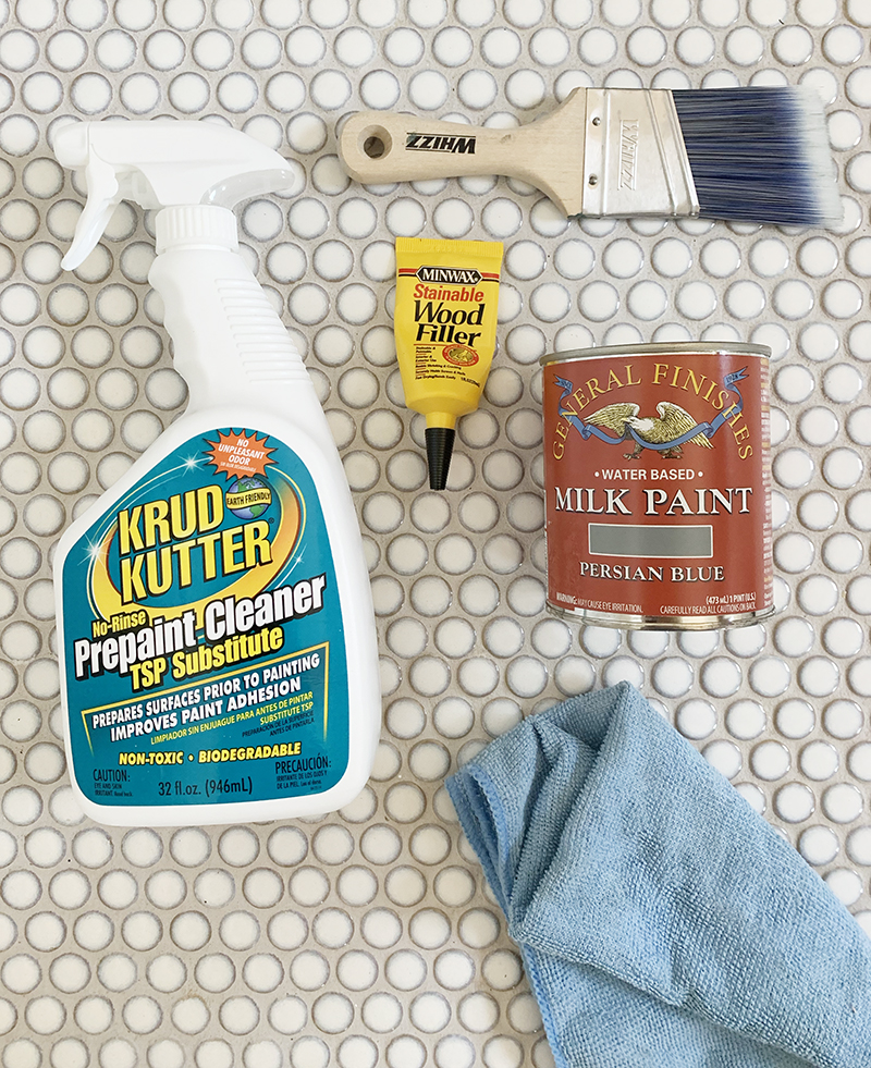
krud kutter tsp // milk paint in persian blue // wood filler // paint brush // microfiber cloth
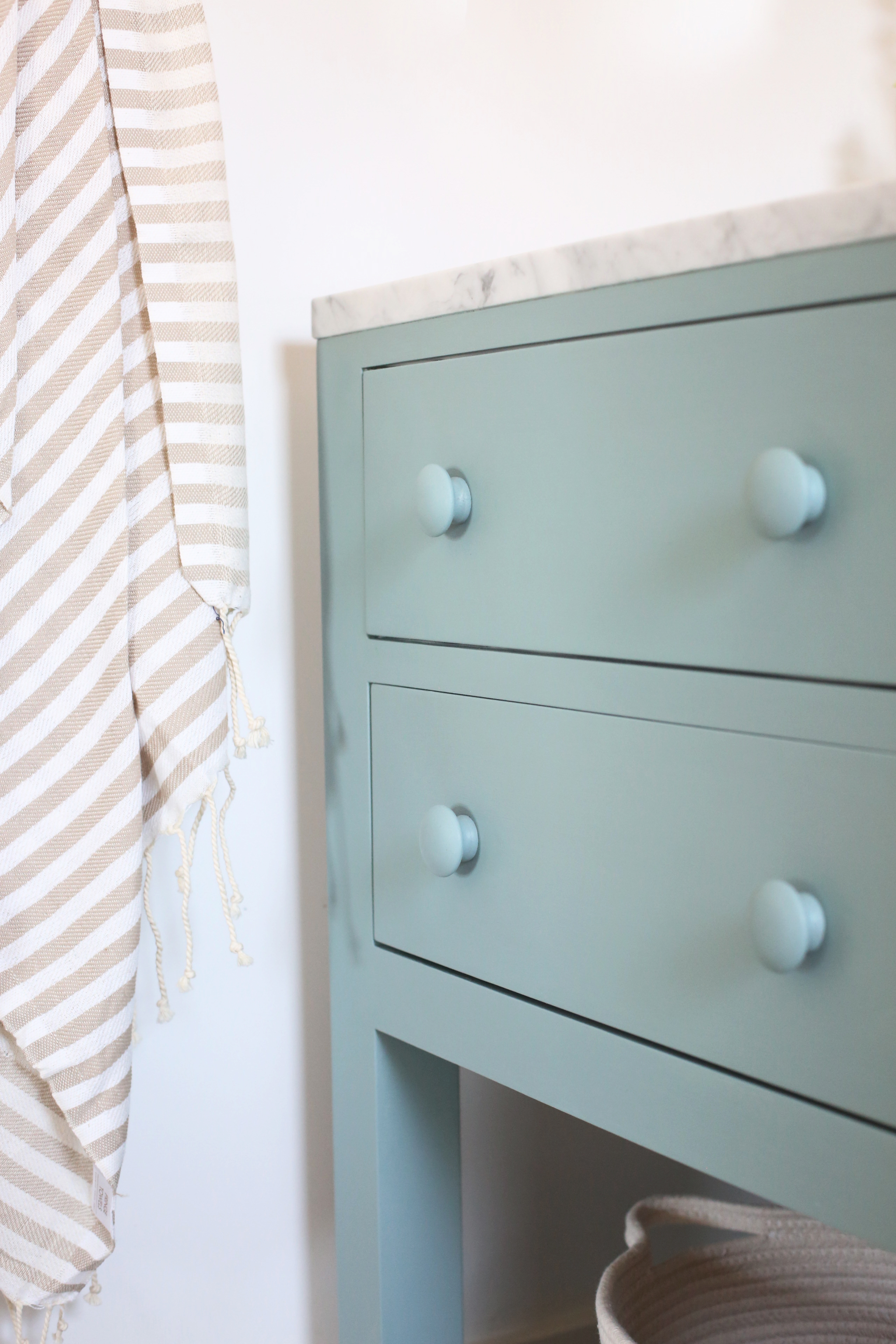
The old hardware had two holes, so I overfilled one side with wood filler, and sanded that down after it had fully dried and before painting. For a more traditional look and for a little wink to the hardware in kitchen, I chose a painted wood knob for the drawers. I’m still so obsessed with this look!
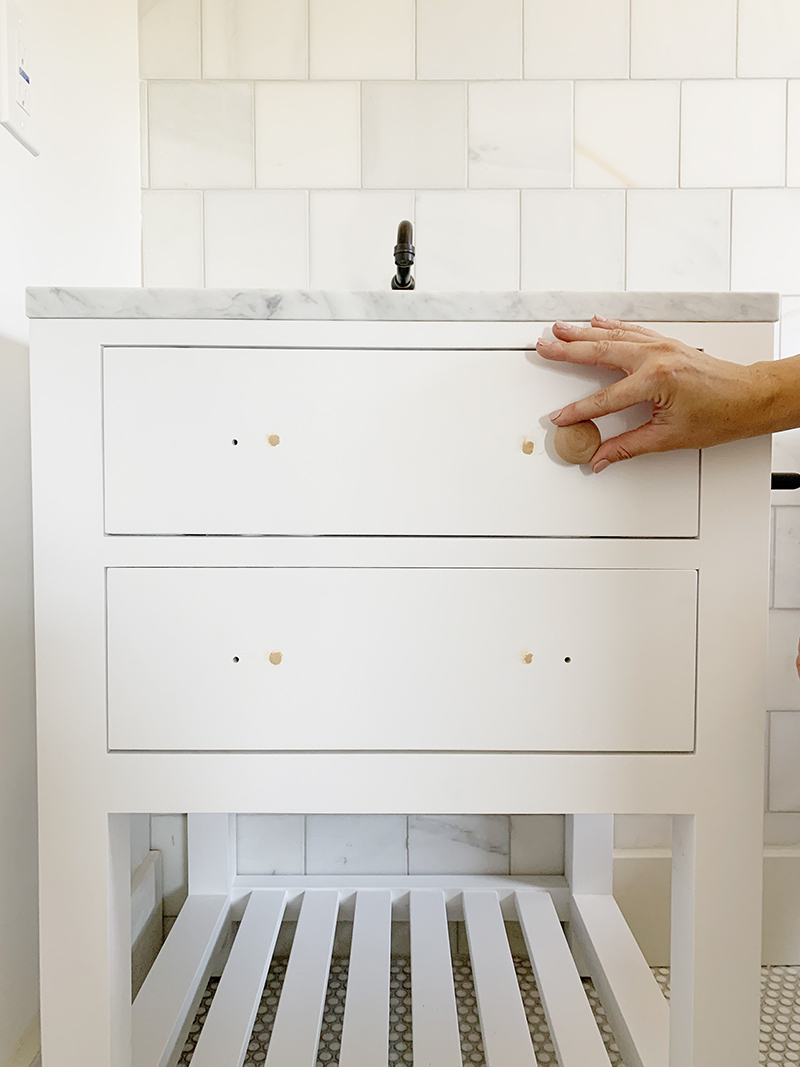
I love how this painted vanity looks with the veining in the marble! The blue-green color and painted wood knobs were such an easy change but really helped to add a custom feel.
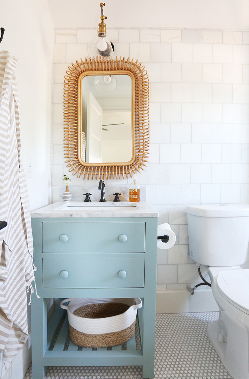
vanity // mirror(similar) // sconce // faucet // towel // wall hooks // basket (similar)
And isn’t this rattan mirror amazing?! It’s so sculptural and adds so much personality to this space!
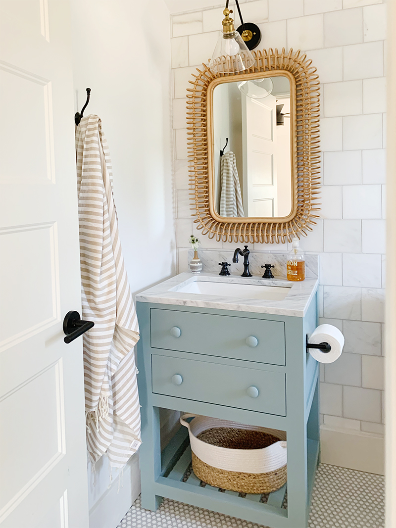
vanity // mirror(similar) // sconce // faucet // towel // wall hooks // basket (similar)
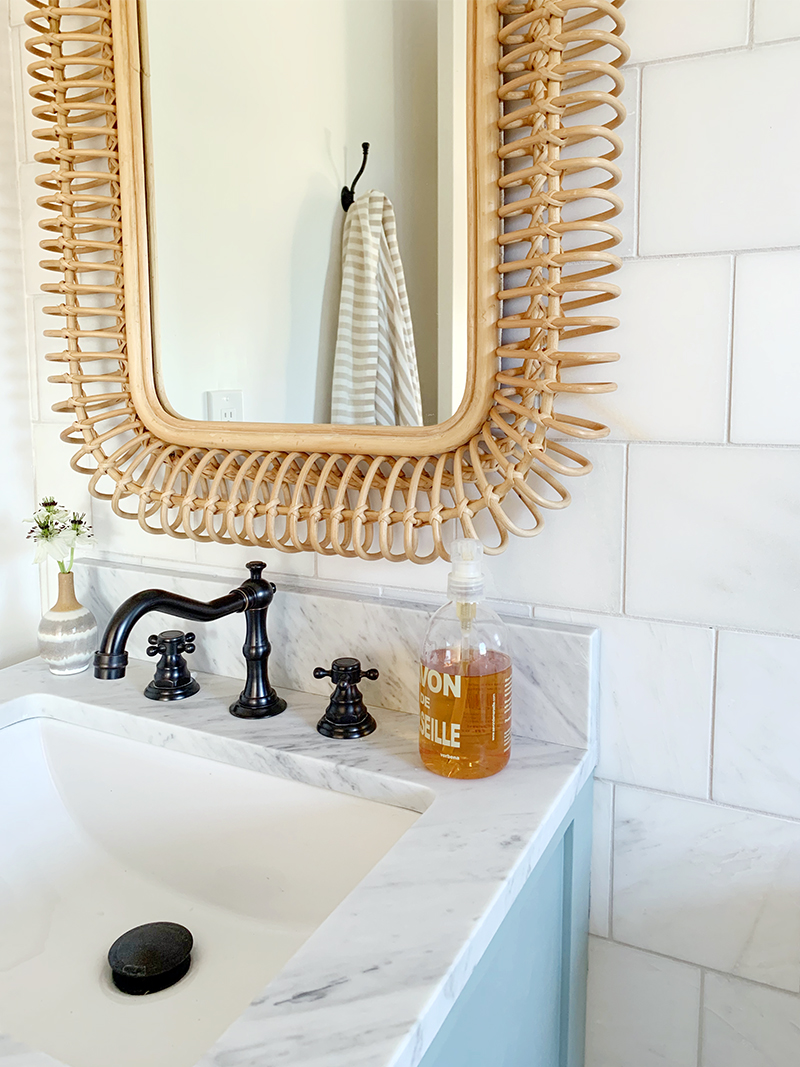
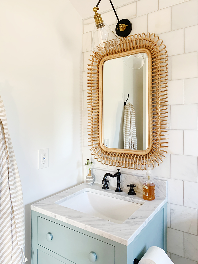
vanity // mirror(similar) // sconce // faucet // towel // wall hooks // basket (similar)


bed // nightstand(similar) // sconce // blue duvet // cream throw
chambray duvet // planter (similar) // faux monstera plant // fan
I hope you love this bedroom as much as we do! We will link to all the products we used here below, but as always, please let us know if you have any questions in the comments! And be sure to check out all the behind the scenes video footage in my instagram highlight!
SOURCES:
Paint Colors: Chantilly Lace and Seapearl
Wood floors: Grand Pacific engineered wood in color Sea Lion



Looks fantastic! Would you please provide a link for the square tile?
I don’t see the tile on the Floor and Decor site but we got them there!
I found the link, Megan! Here you go –
https://www.flooranddecor.com/stone-decoratives/carrara-white-honed-marble-tile-931100280.html
You nailed it! What a beautiful room. I adore the bathroom, those square marble tiles are gorgeous. I don’t usually prefer fully tiled bathrooms, but this one totally changes my mind! Stunning work
Sparkling writing!! Thanks buddy for such a great information!!
Turned out SO good, I love the way you are displaying the wildflower print, how did you print it?
Hi Jennifer! We sell prints at Juniper Print Shop! :)
Love the room! Everything you do is gold. Seriously so good. Question for you though, we have that same ceiling fan in white. I am curious if there is any “rules” about fans. I’m not even sure rules is the correct term, but I noticed you also had black nightstands. Is that to match the fan? If you had a white fan would you do white furniture or could you still do black and would the fan just disappear into the ceiling? I hope that all makes sense.
My teens are a looong time ago. But I would happily have this as my room. And those before photos shock me every time…
This room, and the whole Evergreen house are fantastic!! Thank you for sharing.
Two questions:
1) Did you find a big gap between this bed frame and the mattress? Some of the Amazon reviews suggest this, but your photos make me question that intel.
2) Is the Wildflower print in this room the original painting? It looks distressed and on canvas. Have you ever tried a DIY to print some of your print shop images on canvas?
Thanks so much for sharing your sources on everything. I’m sure it’s SO MUCH WORK. Your website/insta have been such a great resource for me as I design my new home. Best wishes!!
Hi Nadine! We didn’t notice a big gap at all, but I’m sure that all depends on your mattress thickness. We have definitely printed on canvas before but we find that it looks best to just use our matte flat paper, which displays the color variation and texture of the original canvas better with the vintage prints! Both are great options though! xo
I need to send you some DIY bathroom remodel pics b/c we were so inspired by your old post of your girls’ bath that we used the same tiles and we LOVE the cobblestone colored grout…not sure we would have known to choose that without you so I think of you when I admire it! :)
Anyway…did you use the cobblestone color again here with the glazed penny tiles? I have them spec’d for our next bathroom’s shower and plan to use our cobblestone standby, but thought I’d ask.
Thanks!
The color is Warm Gray from Mapei! So glad to hear the other post was helpful! xo
what penny tiles are these? they are exactly what I have been looking for. It looks like the grout you used is beige – do you think they would work with grey grout?
These are also from Floor and Decor! They would look great with gray grout!
Even when this space was *rough*, I thought it was magical! Far from a teenage girl, but I would take this room in a heartbeat! You are amazing.
You are a visionary!
Thank you for sharing about painting the vanity! I have a nana nightstand (seriously, from my husband’s grandma) that is great except for this bad news color that doesn’t play well with our natural cherry bed frame. NOW I KNOW WHAT TO DO! And I’m super excited about it. : o)
Good job from the team! I like the pastel colors, very relaxing.
I love the linen roman shades…could you provide a link?
Hi! Love this bathroom. I have been searching for a similar vintage looking penny tile for awhile. I tried searching in person and online at Floor and Decor, but have never found anything similar. Do you have a link for this tile? Thanks so much for posting such great content!
Hi Erica, I couldn’t find it on their site either! I wonder if they have recently discontinued it? I found the same or similar tile on another site here though – https://tilebar.com/eden-rimmed-winter-white-penny-round-polished-ceramic-tile.html?gclid=CjwKCAjw4MP5BRBtEiwASfwAL8sZuLG_6LSZQtA4Yv1df3LzZ1bmspMGKHao7CtMzo_7TqBMzjRZFBoCTk8QAvD_BwE&gclsrc=aw.ds
Hope that helps!