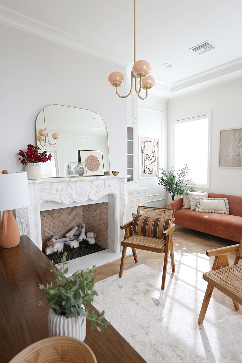
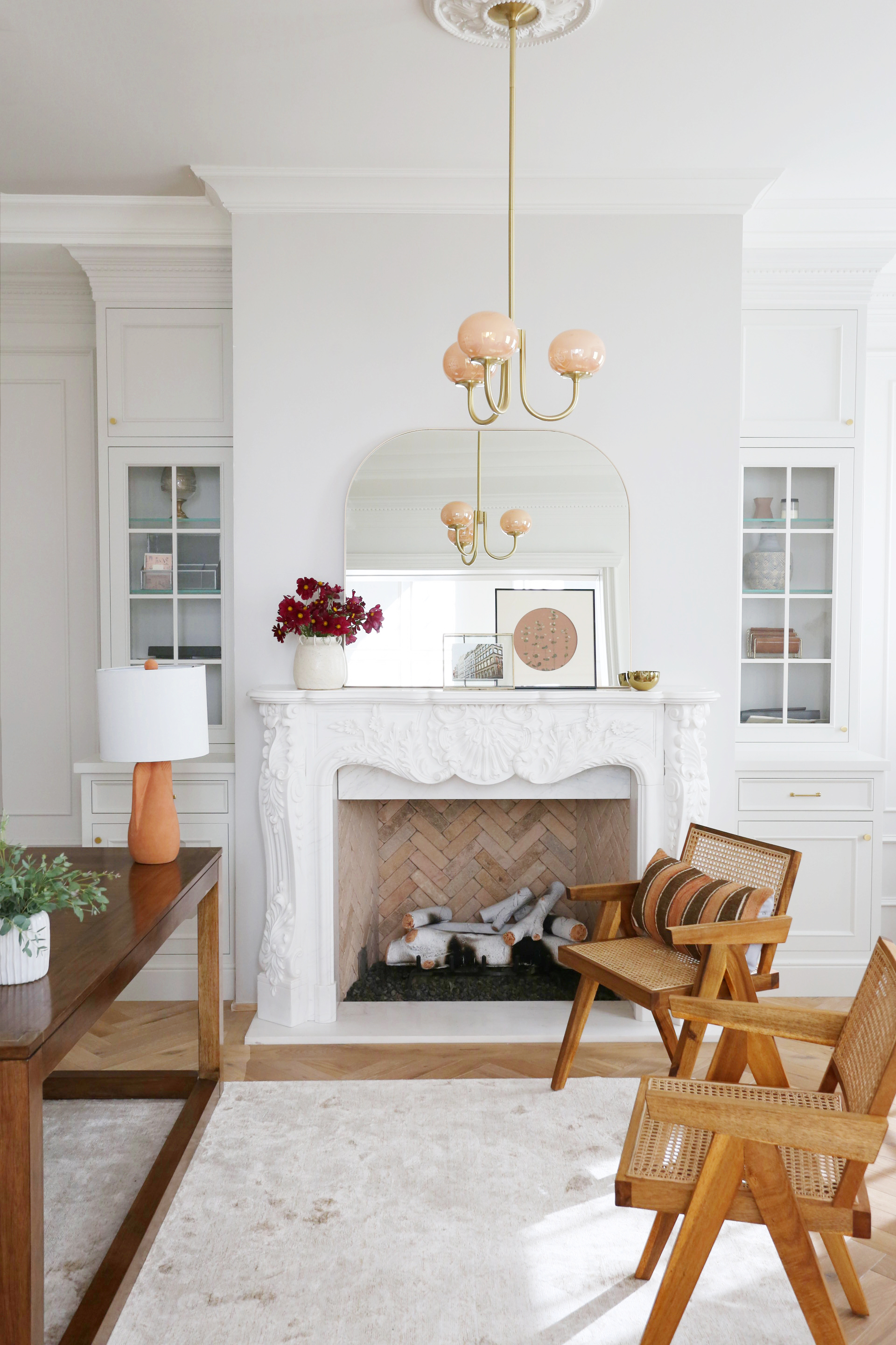
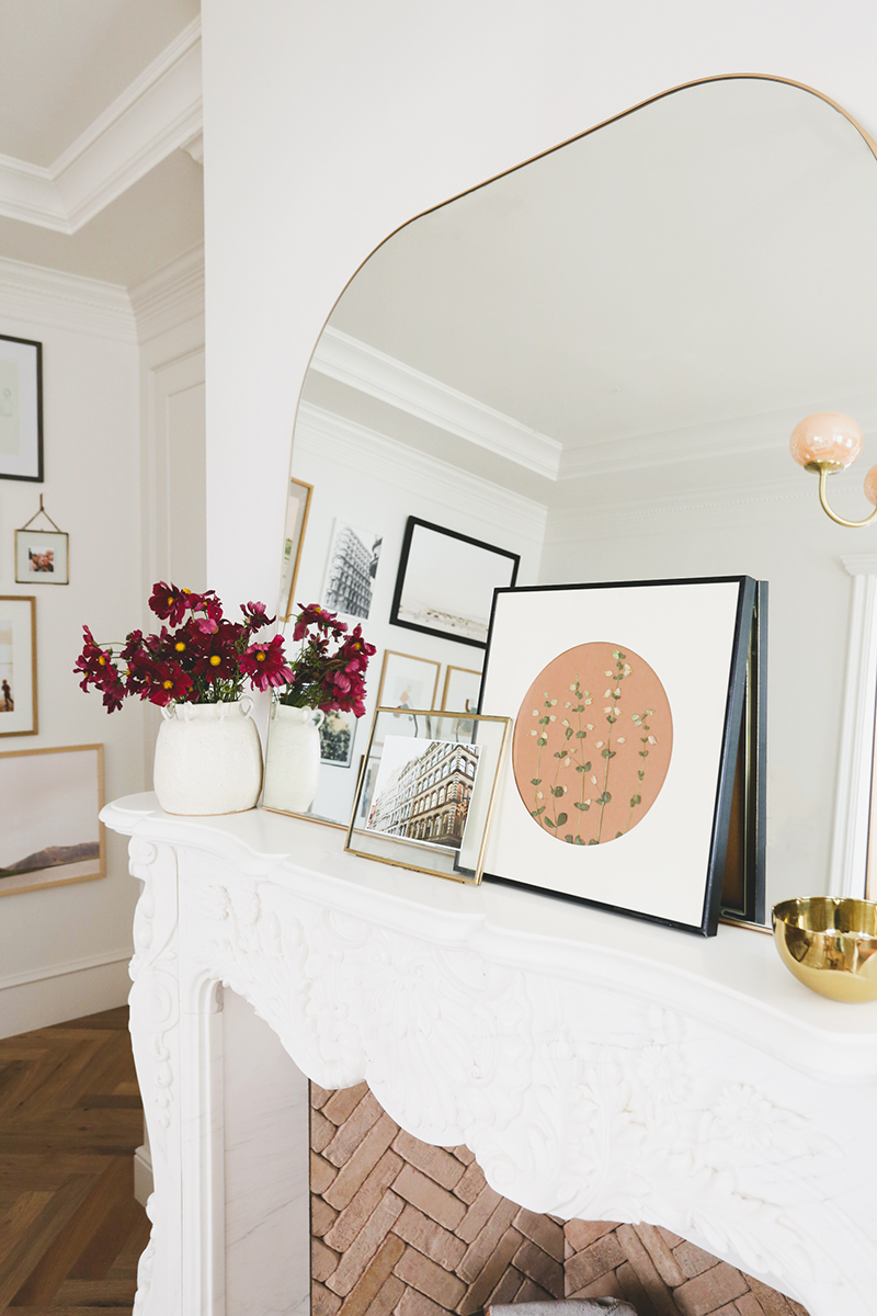
Putting the top layer of art and accessories in a space is pretty much my favorite type of project. I mean, I love tile shopping and space planning as much as the next designer, but there’s nothing like that near-instant gratification that comes with hanging a gallery wall and adding some throw pillows to finish off a space! The talented lifestyle blogger and entrepreneur Amber Fillerup Clark recently reached out about me coming over to help add some finishing touches (mostly art) to a couple of rooms in her beautiful new house. Amber worked with Becki Owens to design the finishes of this incredible home and she absolutely NAILED IT. (That fireplace!!!)
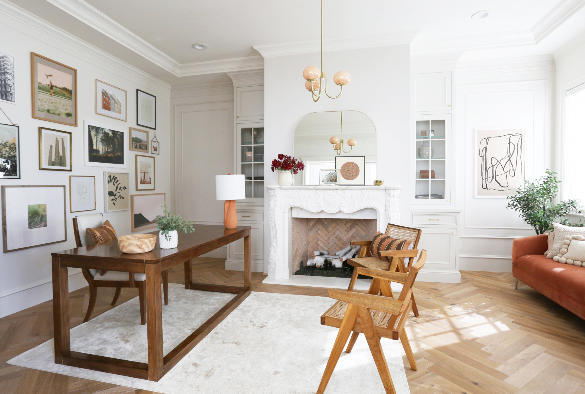
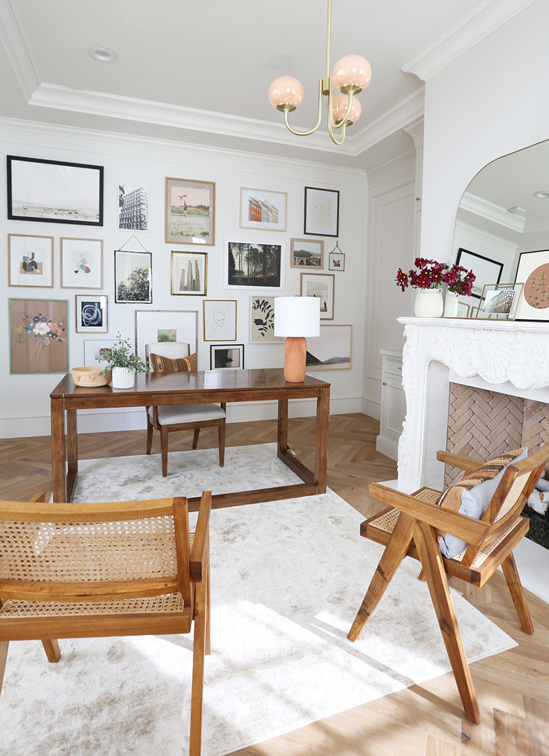

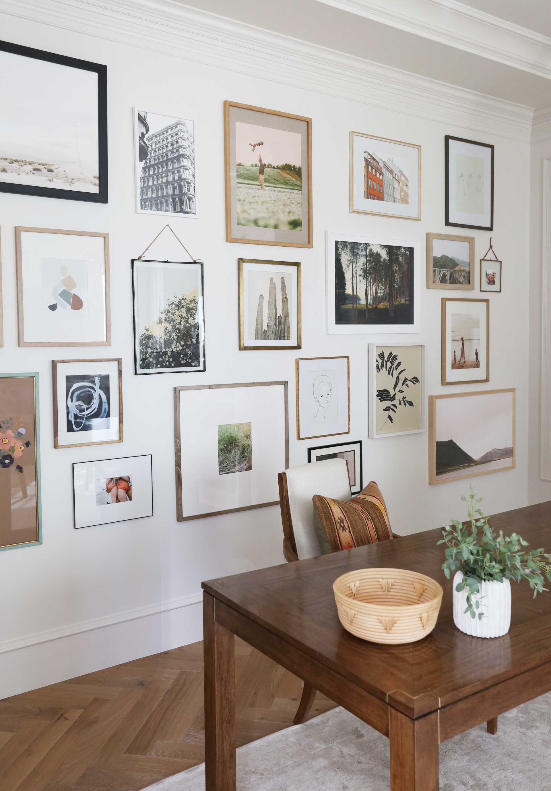
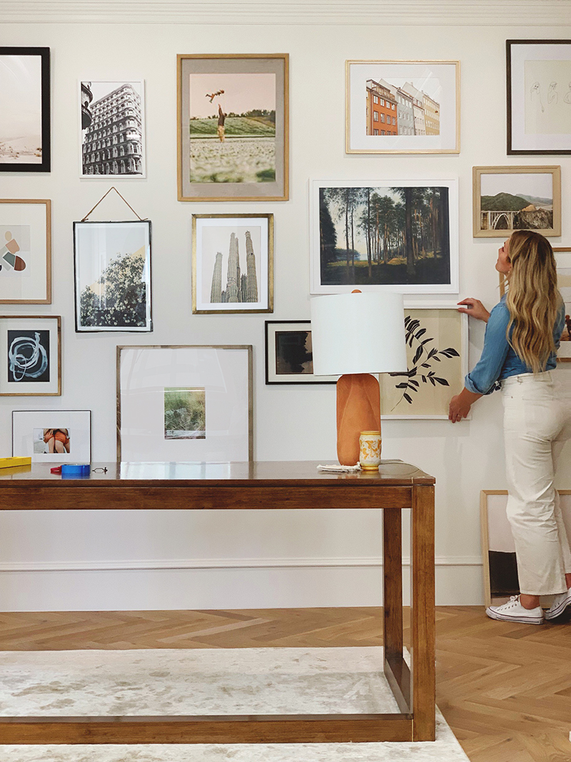
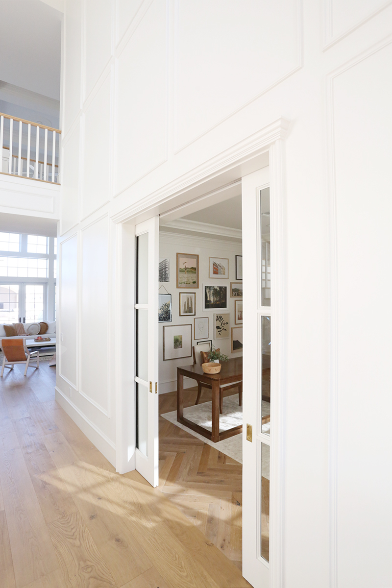
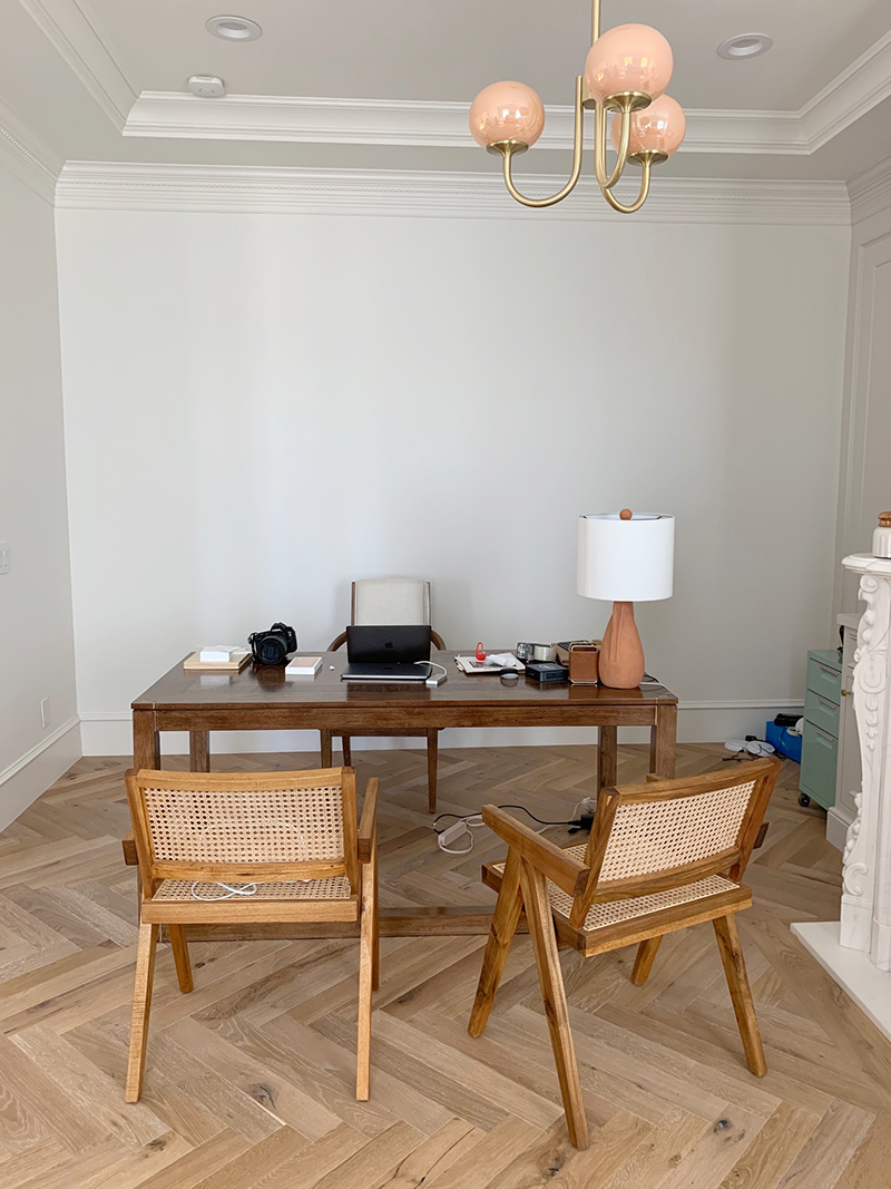
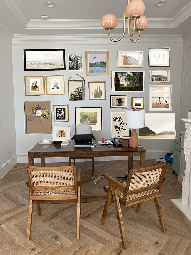
Amber was hoping we could put up a gallery wall in her office, which is always a fun project for me! I’ve probably hung a hundred gallery walls in my twelve years of blogging and client work, so I can basically do it in my sleep at this point. :) I thought it would be high time to share my best tips and take aways with you all! I’ll share a couple of photos of her new space first, and then let’s just jump right in to the tutorial!

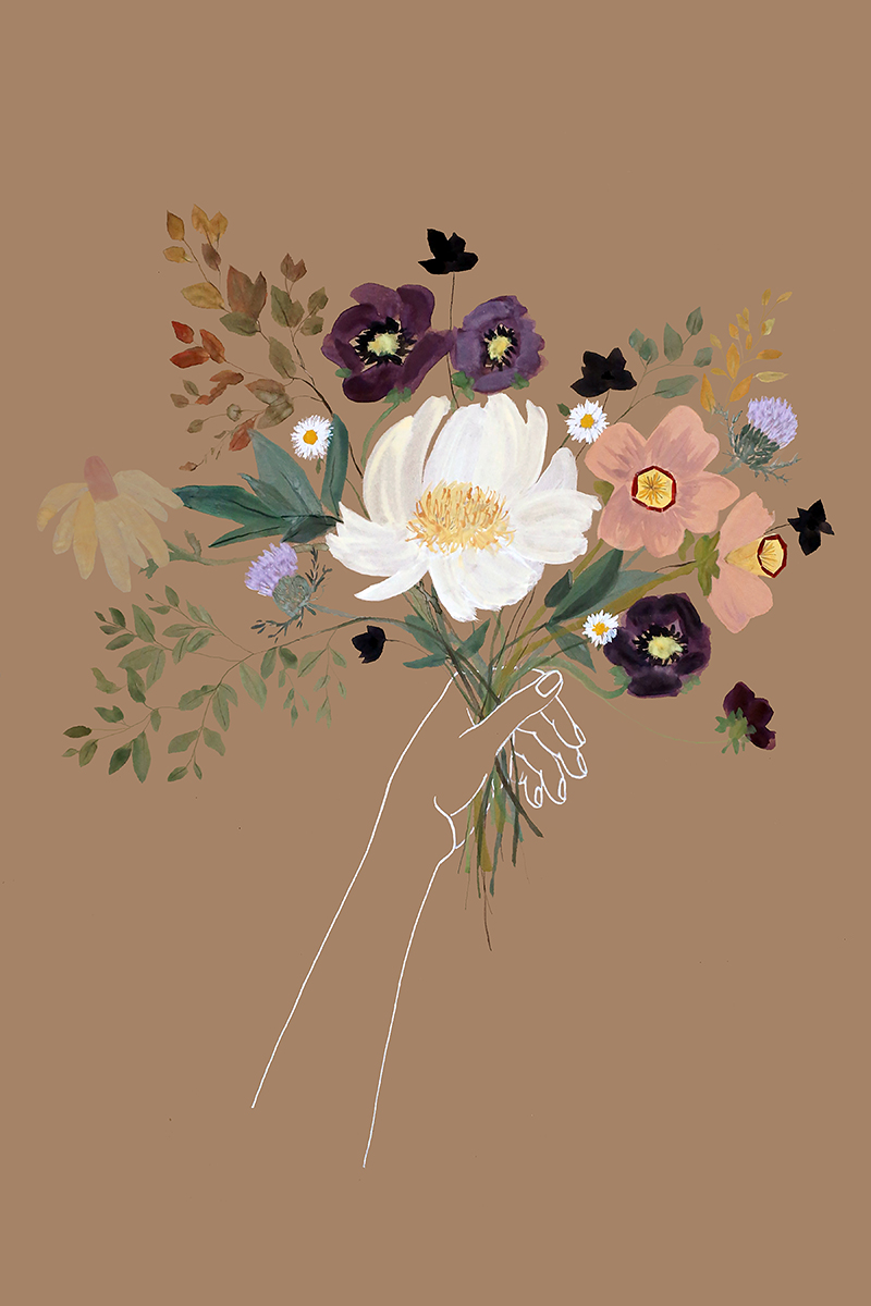
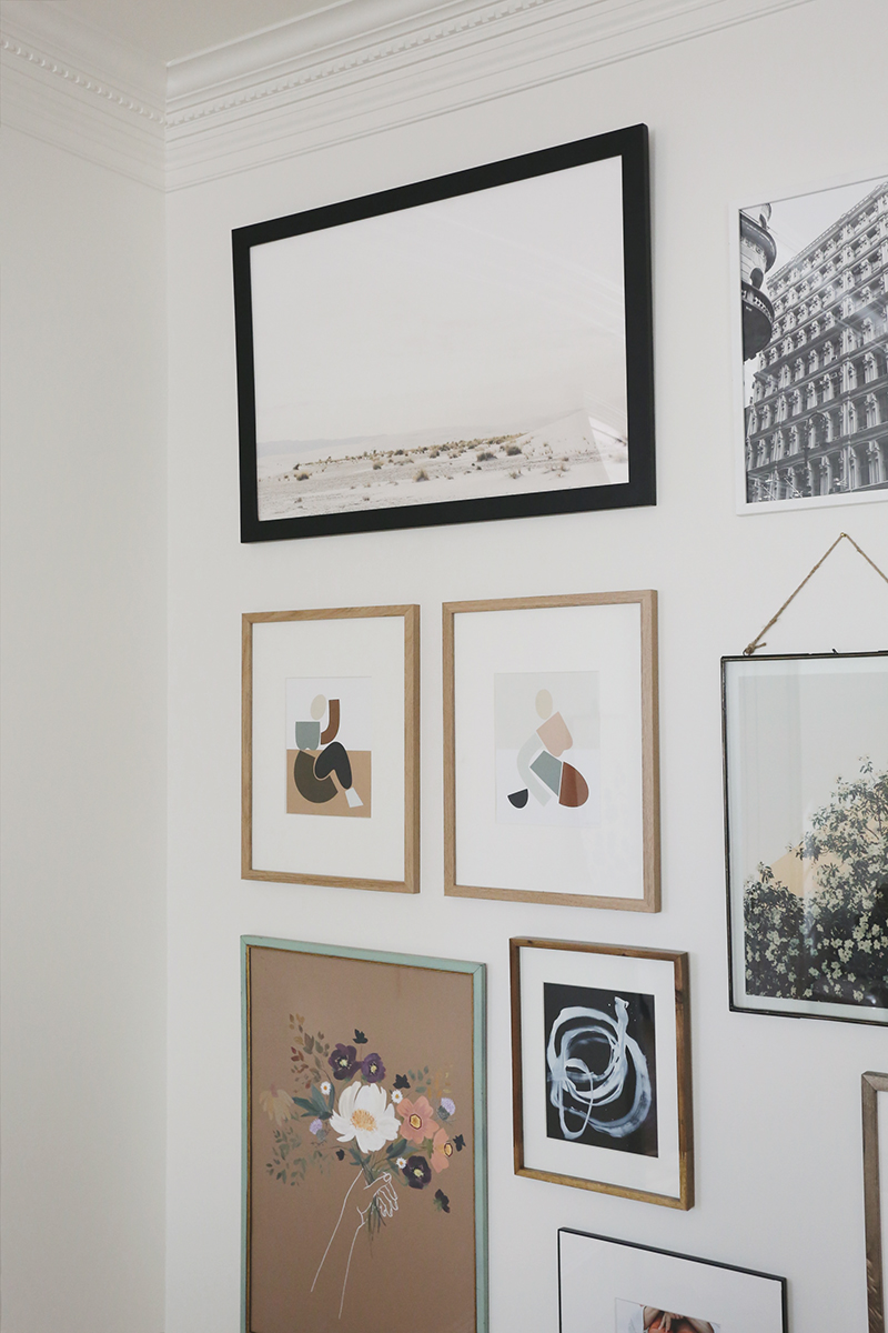
HIDDEN HEART print // SCARLETT print // BOSSEN print
BOTANICAL II print // SAHARA print
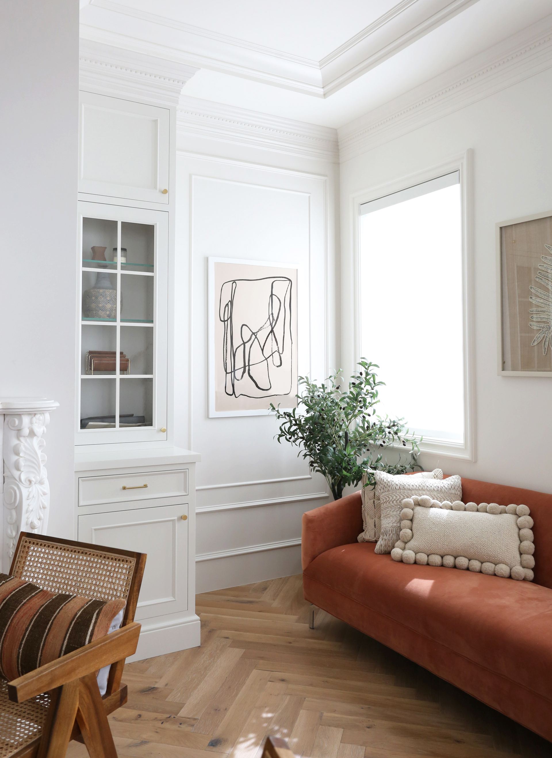
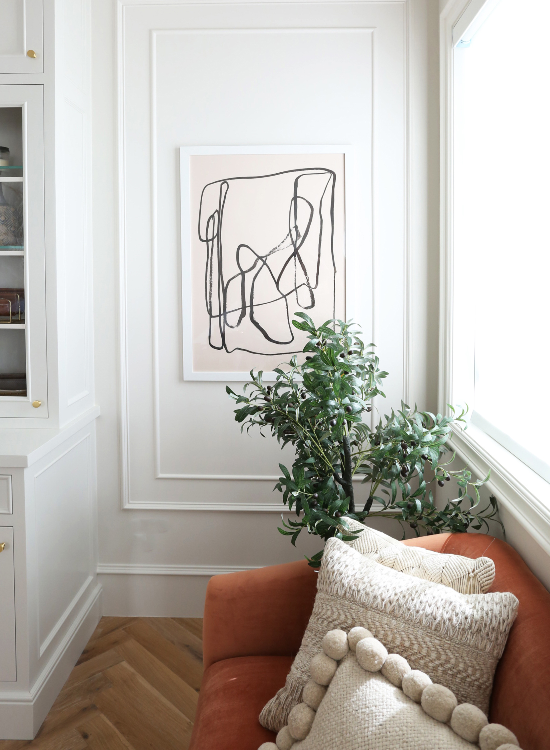
TRAILS print // faux olive tree (similar) // rust sofa (similar)
pom pom pillows // cream textured pillows
STEP 1: GET INSPIRED
We have lots of gallery wall inspiration saved in our Pinterest boards. When you’re ready to get started, I’d poke around and find a few images that show the vibe you’re going for. Take note of how many frames are in the arrangement. Seven frames? Or more like 25 frames? Does the arrangement go floor to ceiling or is it mostly at eye level? Is the arrangement dipping down and asymmetrical? Or is it centered and level? Figure out both what you’re drawn to and then get realistic about how you can make that work in your space and then use a tape measure to determine the space you want your arrangement to fit on your wall. We wanted Amber’s arrangement to be almost floor to ceiling in her office – about 7′ high x 9′ wide.
STEP 2: TAPE IT OUT
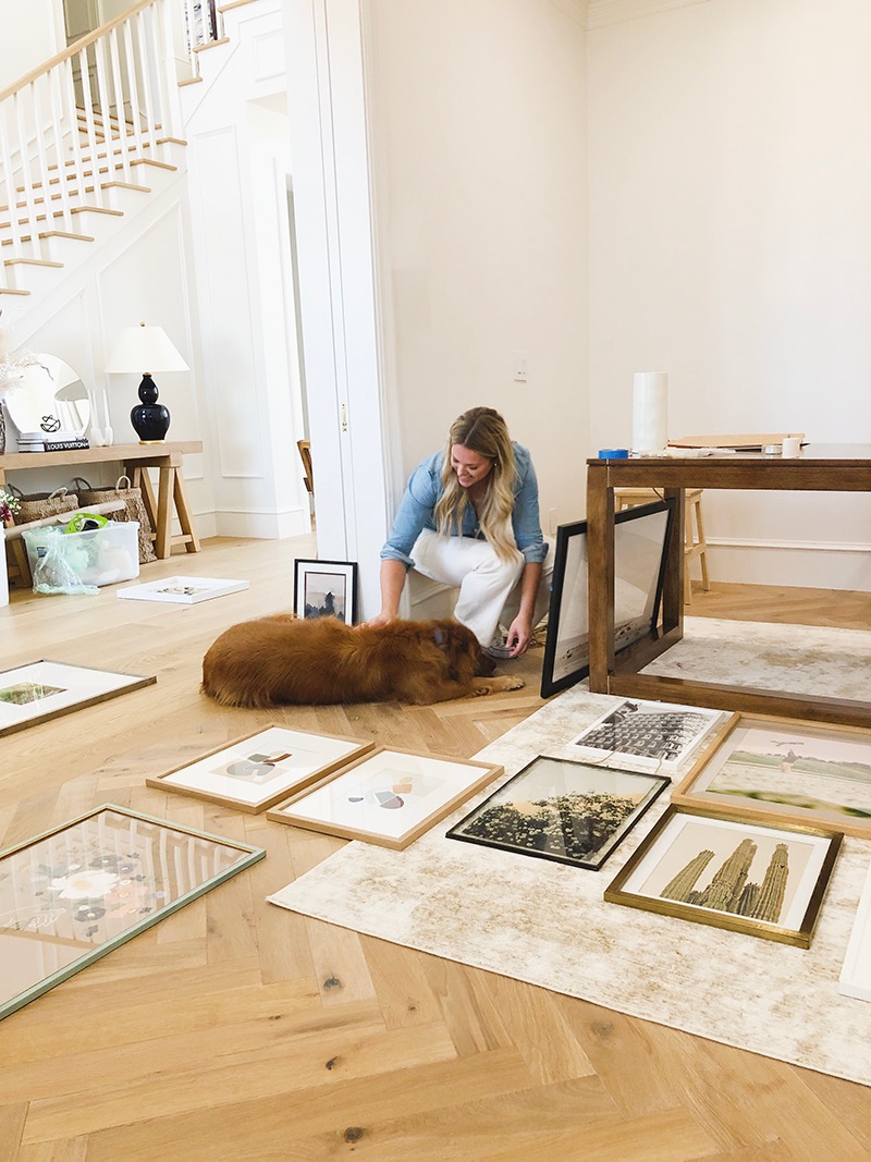
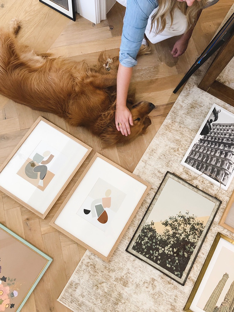
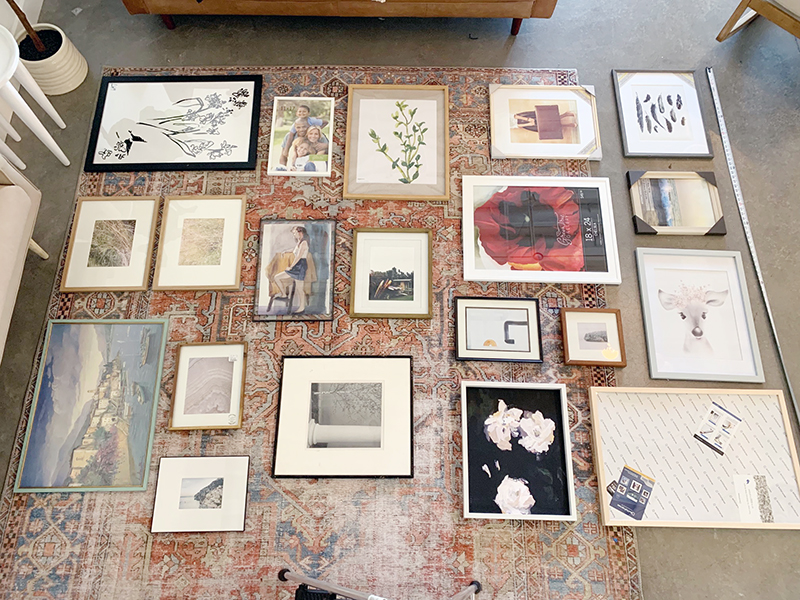
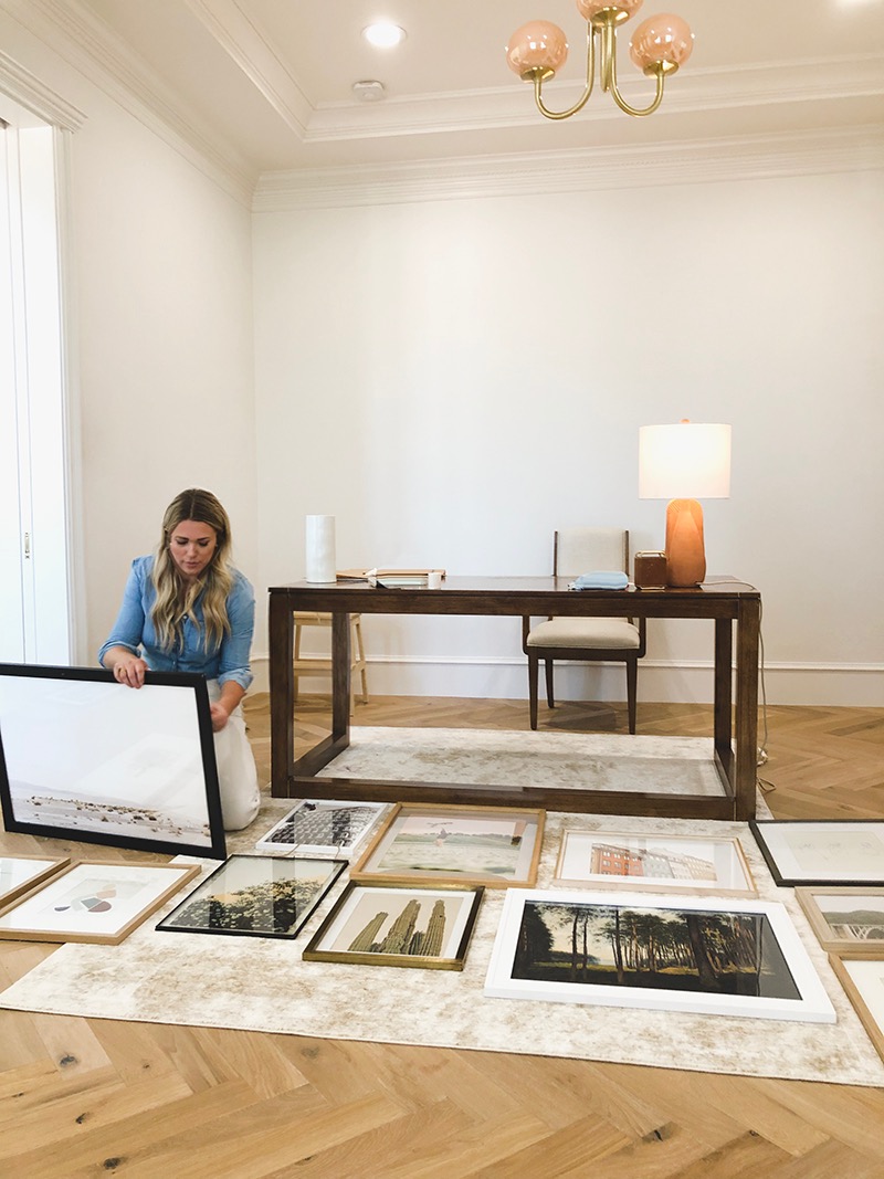
Use painter’s tape or two tape measures to create a rectangle on your floor to help you map out your arrangement. It’s easier and faster to lay out frames on the floor than to go with the trial and error approach on your walls! You’ll be glad you won’t have a million extra nail holes in your drywall too! I laid out her arrangement at the studio when I pulled frames the first time and then again as we were hanging the gallery wall at Amber’s house.
STEP 3: ARRANGE BY FRAME FIRST, NOT ART
Most people try to arrange their gallery wall by the art inside the frame first. While the art inside the frame is obviously very, VERY IMPORTANT, the frame and mat holding the art is also critical to the overall look! Gather up alllllll your frames and art (if you’re like me, you hoard piles of frames in a spare closet. Ha). If you need some additional options, check out our Shop Our Finds frame section, Michaels, Hobby Lobby, Target, and, my favorite option, your local thrift store! Some of my very favorite frames were Goodwill purchases that cost just a few dollars! Most of the Goodwill frames I’ve bought don’t hold art prints that are exciting to me, so I usually recycle those and keep the frame and glass!
I like to use at least 25% vintage frames in my gallery walls, and usually that means a few carved wood or gilt frames. These few special frames found at thrift stores, antique malls and flea markets add so much soul to a collection and instantly make the gallery wall feel collected and layered rather than cheap and purchased all new, all in one day.
Then arrange all your frame options by size, leaning up against a wall, so you can pull from them easily. Start with your largest pieces and spread them out across the arrangement. Fill in with medium and then small pieces. Be thoughtful about mixing frame materials, styles and thicknesses. The more varied, the better! And remember, if you get stuck while working on the frame layout, don’t be scared to pull everything out of your taped out mock up and just start fresh. That is the beauty of these floor practices, it’s easy to play and try a few different versions! I usually like the second fresh try the very best anyway!
(PS Obviously, if some of your pieces are antique or custom framed and you’ll want to keep the same frame, but so many of our prints and paintings can be moved to new frames! So remember that this first arranging exercise is all about the frame!)
STEP 4: SELECT ART FOR YOUR FRAME ARRANGEMENT
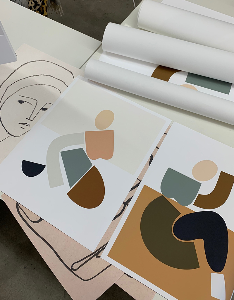
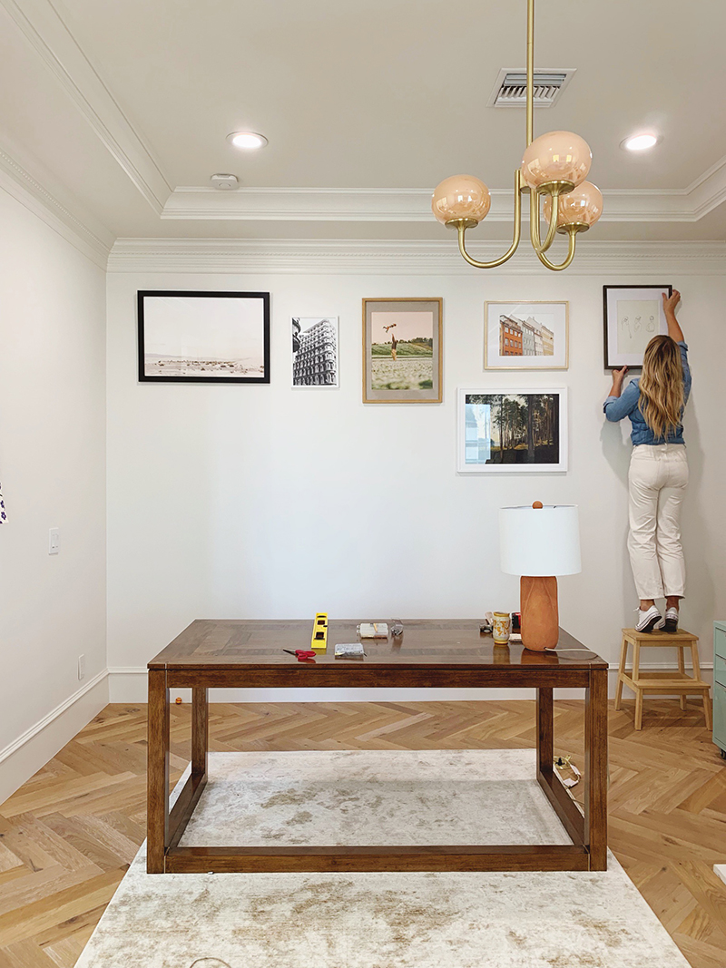
Once you have the frame layout you are happy with, it’s time to pick art for your frames! Like with all decorating projects, I suggest starting with what you love. Do you have treasured vintage oil painting? Or a favorite print that reminds you of a special trip? Put those pieces at eye level, so you can enjoy them often and see them up close. Save the bottom and top rows for prints and paintings that help convey an overall mood or help balance out the colors of your arrangement.
One tip that I think many people don’t think about is getting custom mats cut for your frames. That way, even if you have a beautiful 8×10 print that you’d like to put in a 20×30 frame, for only about $15 you can get a beautiful mat (in any number of colors and textures) cut at a craft store or custom frame shop – often while you wait! My very favorite frame pieces are prints in thrift store frames, with big custom mats and awesome prints or originals! This trick allows you more flexibility to lay out your art in a way that is firstly pleasing to the eye, has balance in color and texture and pattern and isn’t all about size.
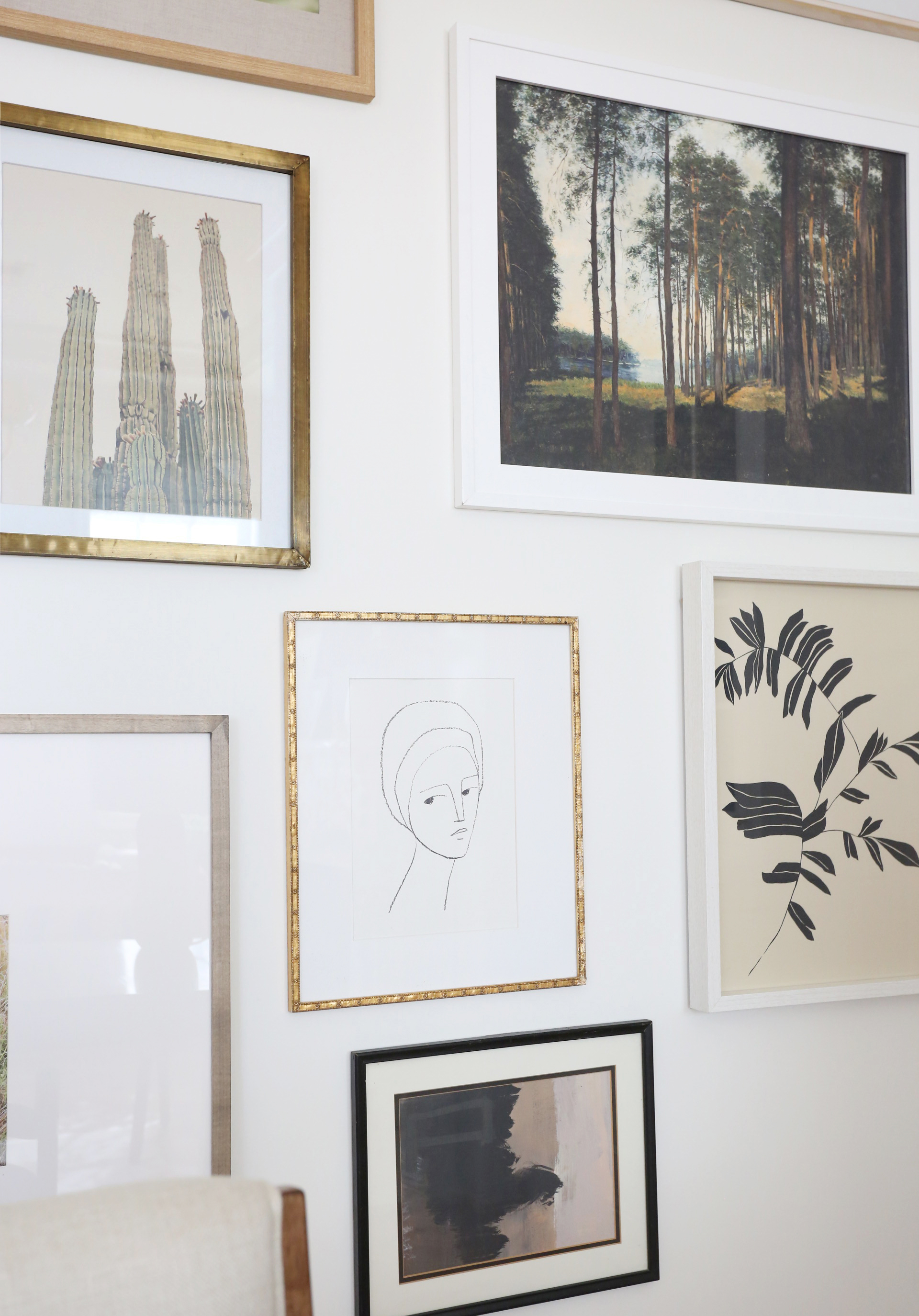
As you arrange your art, try to mix the medias. Put a traditional oil painting landscape next to a modern abstract, next to a travel photo. Hang a pressed flower arrangement next to a candid family snapshot. Throw in something unexpected that makes you smile like an old silhouette portrait from Disneyland or a drawing your three year old made for you at preschool!
Be careful about using both enough black and not too much of it in one part of your arrangement. Remember that black is SUPER important in every space. It keeps the eye moving around – so spread it around evenly in your gallery wall art and frames!
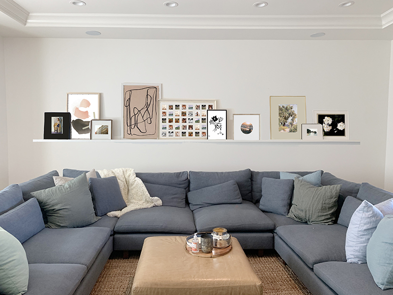
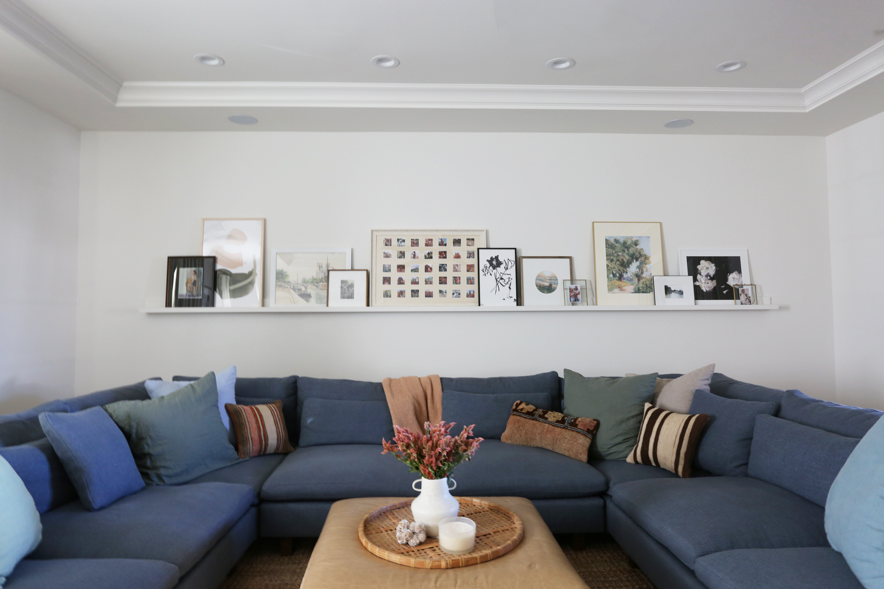
If you are at all tech savvy, I highly, highly recommend taking a photo of your frame arrangement and then using photoshop or even powerpoint to digitally try on prints in your frames! It’s not totally necessary, but it does help take a lot of the guesswork out of the thing! I used photoshop to help us lay out Amber’s office gallery wall and her family room art ledge. (PS these same rules for frame and art arranging work for art ledges as well as gallery walls!)
STEP 5: HANG YOUR ARRANGEMENT!
Before hanging your art, while you’re assembling each frame with the new art, do a quick assessment of the frame condition (and take a quick minute to windex the glass -front and back! Is there anything worse than putting a print and frame (especially a vintage one!) all the way together and then flipping it over to see finger prints on the inside of the glass?!
You can grab one of these kits that has extra D rings and other hanging hardware so you can make sure your frame goes up easily and stays put. I also keep these rubber and felt pads handy for putting on the bottom corners of frames. They help the frames to stay in place. I also like to use 3M picture hanging velco strips on the bottom corners of frames that are within reach of little hands. :)
I hang gallery walls starting at the top left. I usually work row by row on down to the bottom right. Use a level to make sure that first frame is hung straight and then you can generally hang the rest of your art off that piece as the anchor. This is where are your planning on the floor comes in handy. You’ll be able to hang a frame and know that the frame next to it is hung exactly X” to the right and Y” lower. No guessing and hoping that it looks good in the end! And no extra holes in the wall (or at least a LOT less of them!).
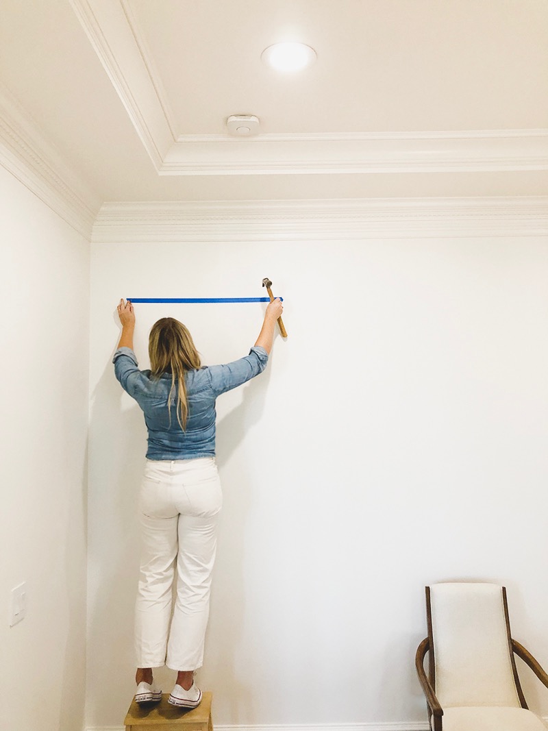
I have shared my painter’s tape trick for hanging art about a million times, and you can see the video on my stories for this post. But essentially when I’m hanging medium or large sized prints that have two hanging mechanisms (like D Rings or alligator teeth), on the floor, I stretch a piece of painter’s tape across the hanging hardware so it’s the exact width of the frame. I use a nail to make holes centered over the hardware pieces. I make a note of the distance from the top of the frame to the hanging hardware – this helps me know how far down to hang my tape on the wall. I use a level to put the tape up on the wall if I’m feeling fancy (tbh usually I just eyeball it!) and then I tap in nails through the holes I made in the tape. Et Voila! I would say a good 85% of the time, the nails are in the perfect spot and the frame is hanging exactly where I want it to on the first go! Every now and then, especially with cheaper frames, the hardware on the frame will not be installed evenly and so the frame hangs a little crooked and you have to adjust one of your nails. No biggie!
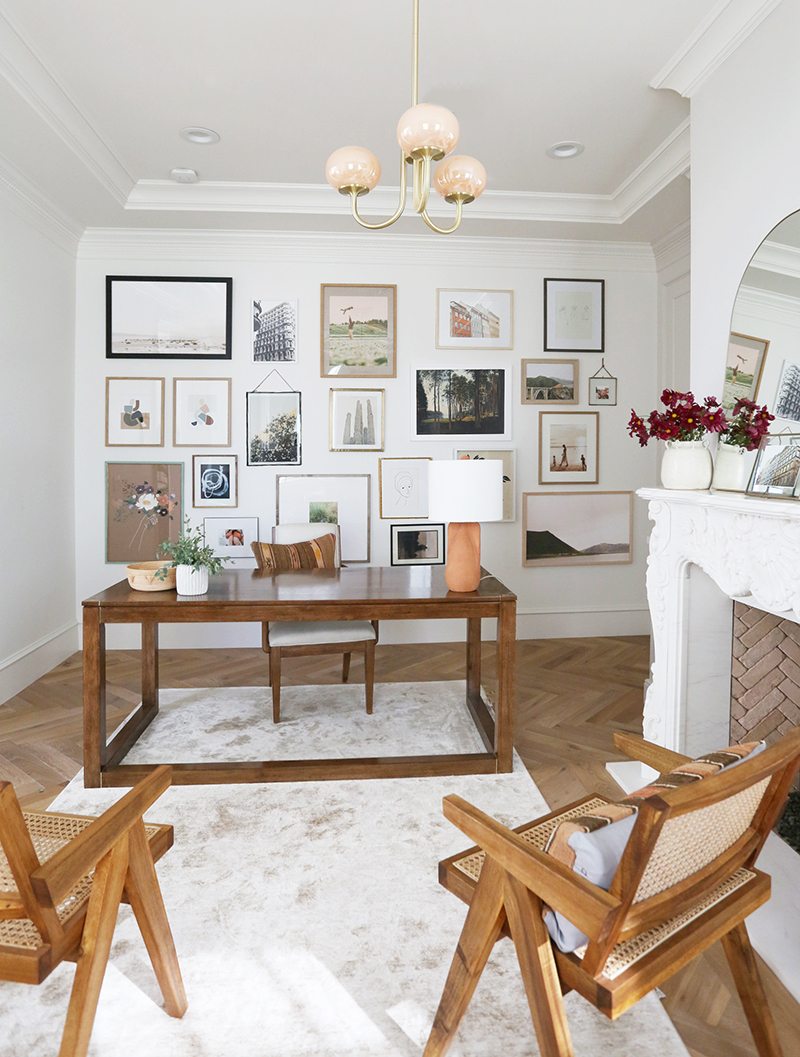
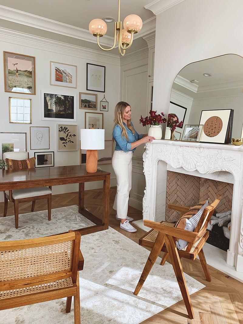
mirror // chandelier (similar) // chairs (similar) // lamp (similar)
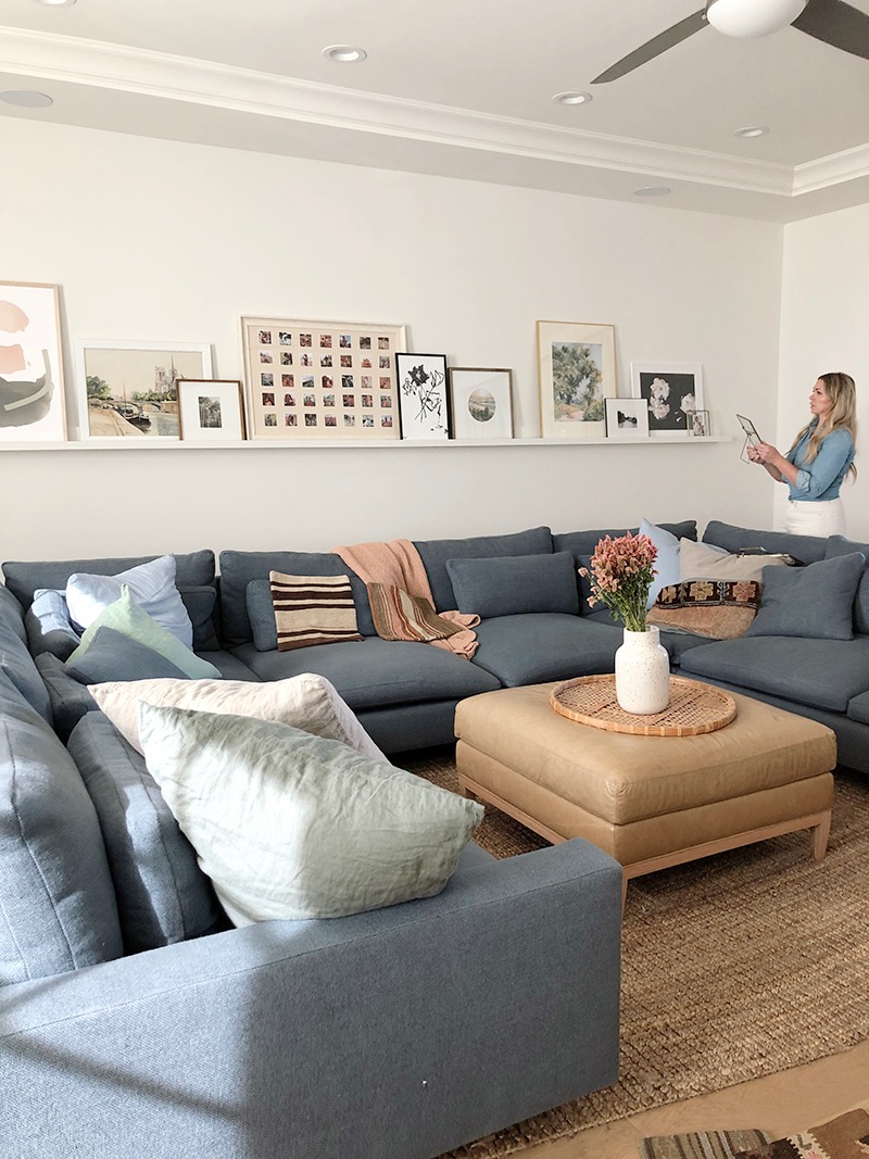
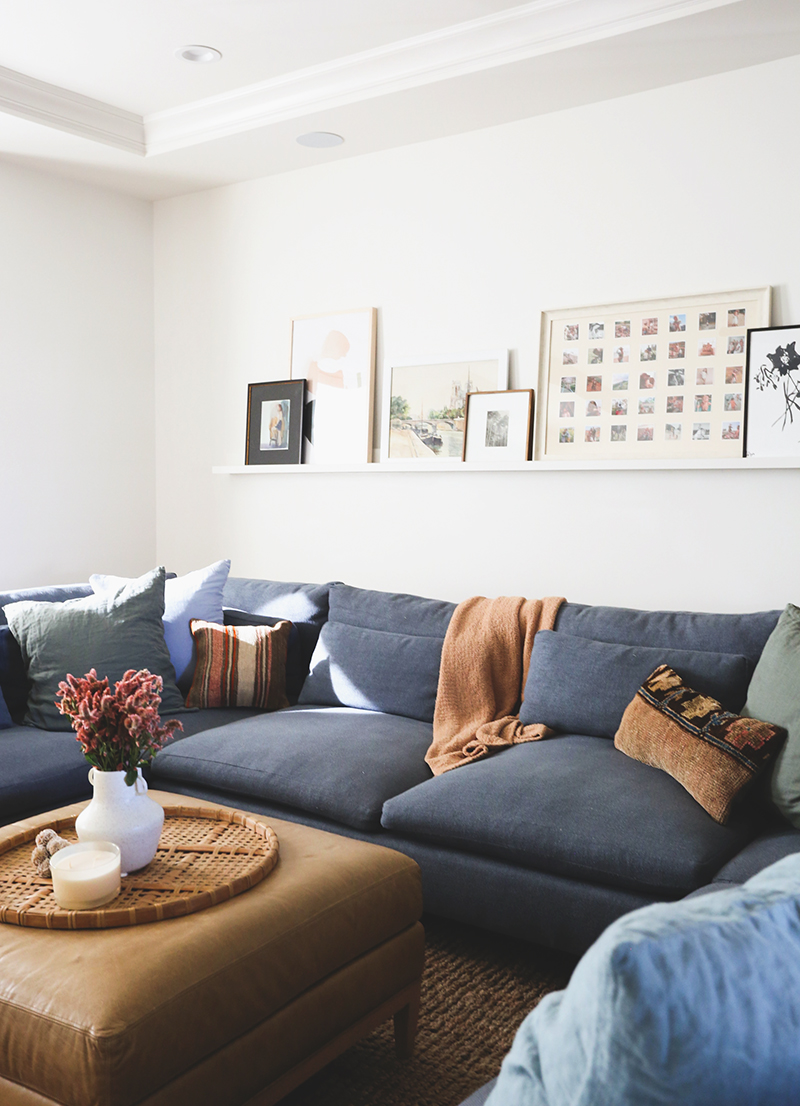
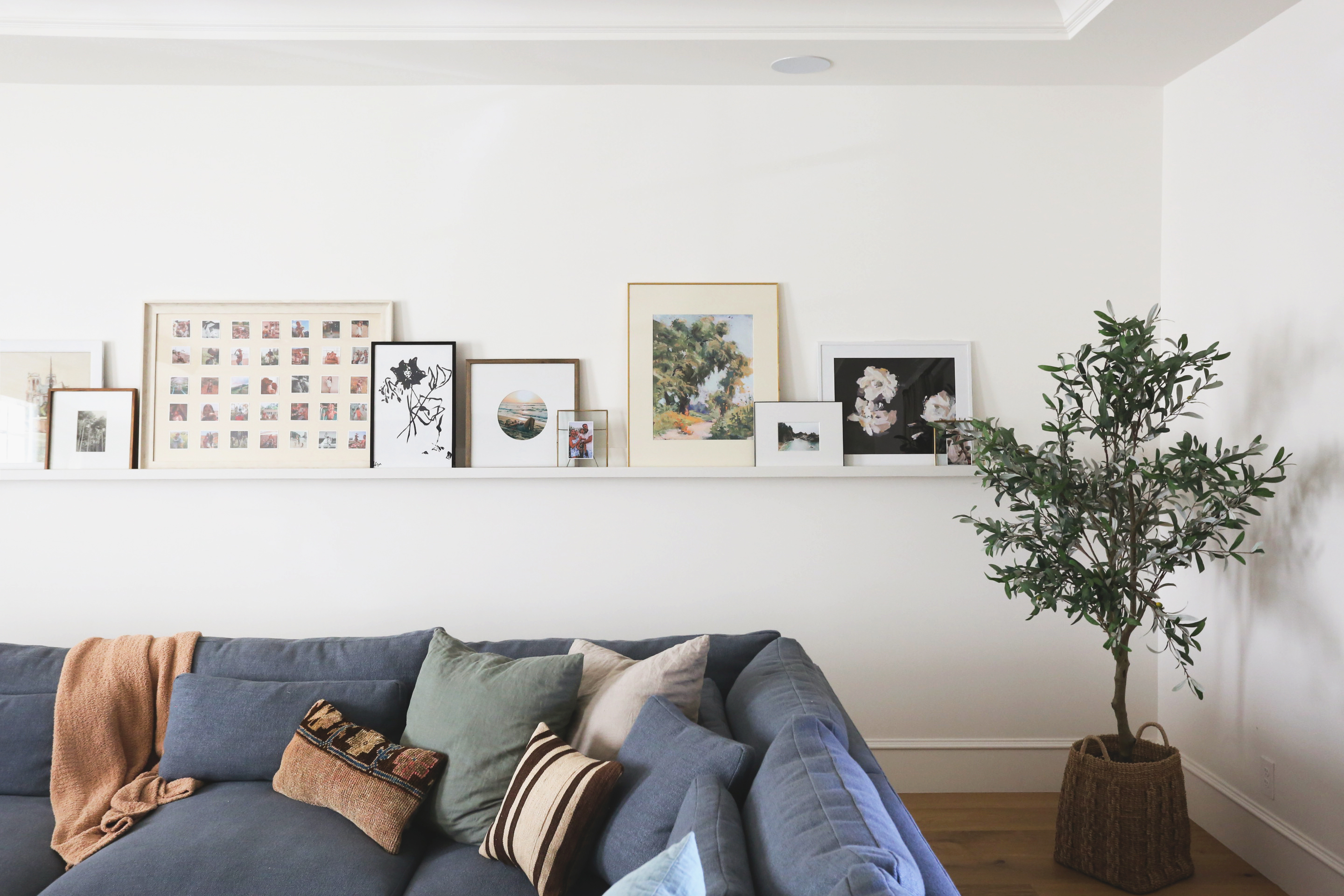
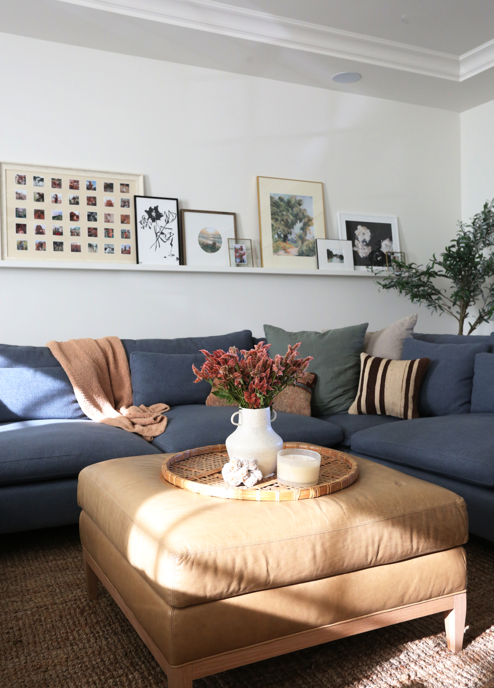
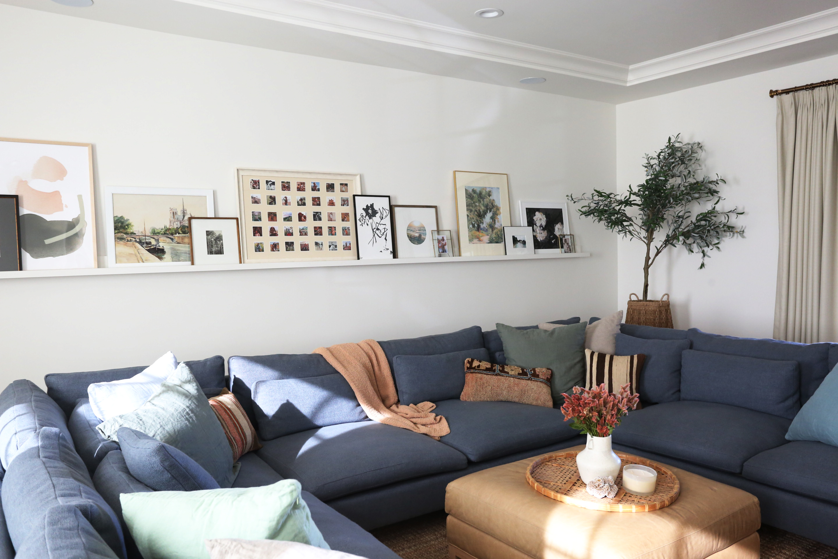
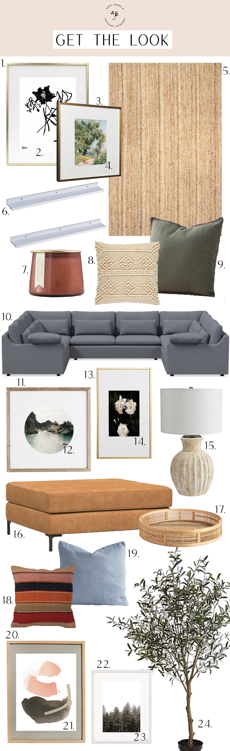
Here is another space we helped Amber style – her family room! We hung the 18′ long art ledge that my contractor made and arranged the art. I love that art ledges have a lot of the same visual benefits of a gallery wall, but are really easy to switch out!
sofa // leather ottoman (similar) // picture ledges (similar) // jute rug
blue linen pillow (similar) // basket tray (similar) // faux olive tree // kilim pillow (similar)
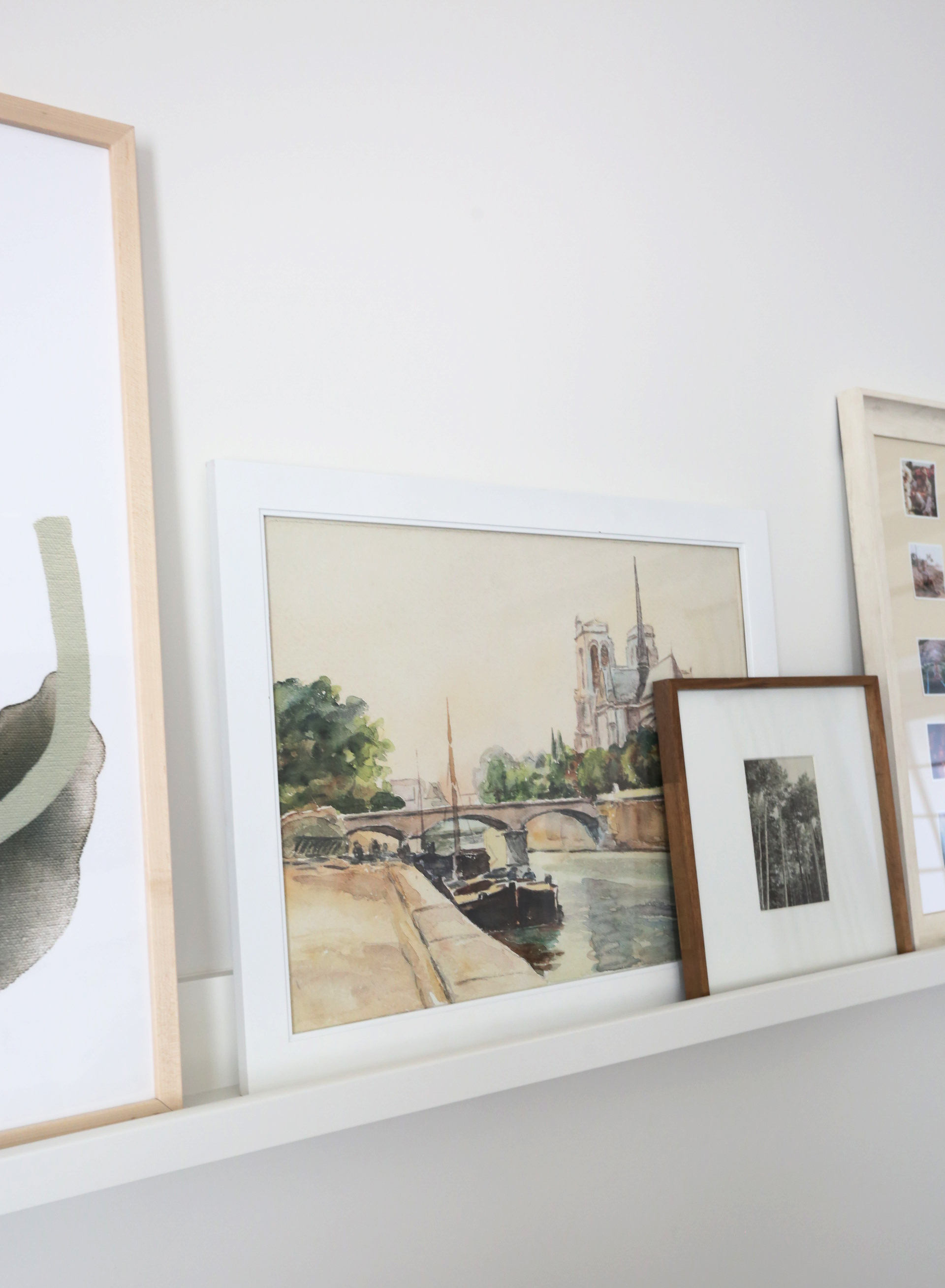
PEACHY III print // PARIS print // POPPIES print // WILD OAK print
PINES print // BIG SUR print // GARDEN ROSES II print
PEACHY III print // PARIS print // POPPIES print // WILD OAK print
PINES print // BIG SUR print // GARDEN ROSES II print
sofa // leather ottoman (similar) // picture ledges (similar) // jute rug
blue linen pillow (similar) // basket tray (similar) // faux olive tree // kilim pillow (similar)
sofa // leather ottoman (similar) // picture ledges (similar) // jute rug
blue linen pillow (similar) // basket tray (similar) // faux olive tree // kilim pillow (similar)
PEACHY III print // PARIS print // POPPIES print // WILD OAK print
PINES print // BIG SUR print // GARDEN ROSES II print
sofa // leather ottoman (similar) // picture ledges (similar) // jute rug
blue linen pillow (similar) // basket tray (similar) // faux olive tree
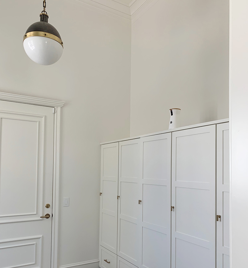
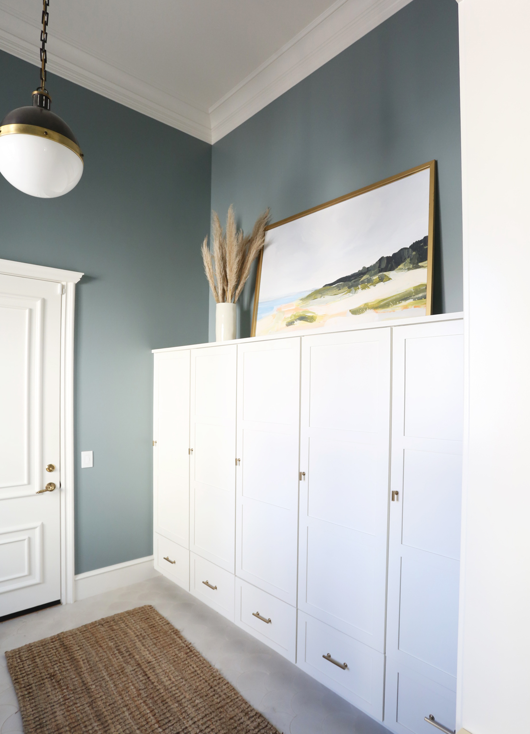
We also hung a 55″ MONTAUK print in Amber’s mudroom. We had the walls painted Benjamin Moore Templeton Gray so that the cabinets and trim would pop a bit more. We love this color and the print looks perfect in here!
Ten points to you if you made it all the way through this monster sized post! I hope you love this home refresh as much as I do. Here are some links to get the look sources below. As always, please let me know in the comments if you have any questions! xo
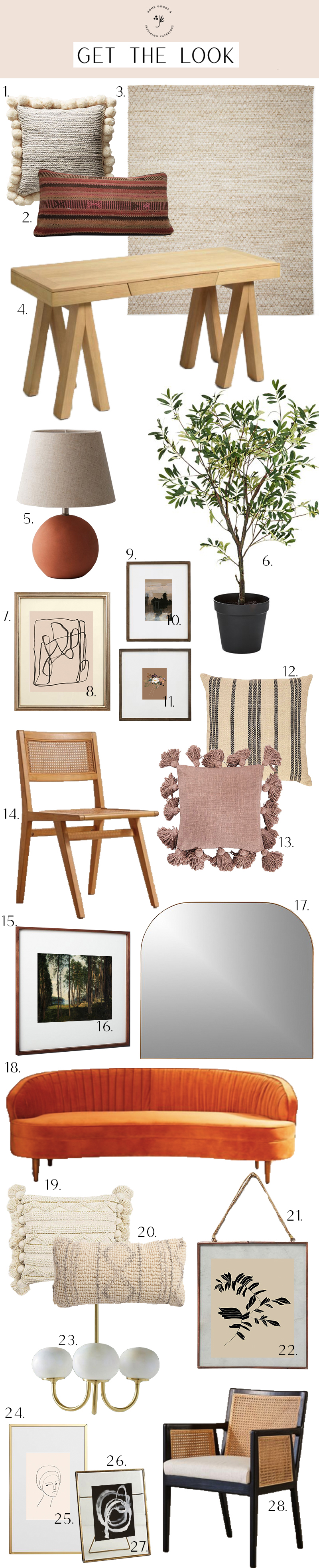
1 // 2 // 3 // 4 // 5 // 6 // 7 // 8 // 9 // 10
11 // 12 // 13 // 14 // 15 // 16 // 17 // 18 // 19
20 // 21 // 22 // 23 // 24 // 25 // 26 // 27 // 28
1 // 2 // 3 // 4 // 5 // 6 // 7 // 8 // 9
10 // 11 // 12 // 13 // 14 // 15 // 16 // 17
18 // 19 // 20 // 21 // 22 // 23 // 24


This is a VERY good post, Jenny! Long live the blogs! Such a beautiful space, such great helpful tips. And I will always love gallery walls done in a timeless, interesting way. Bravo!
The gallery wall looks lovely. I cannot get over how beautiful that peachy/pink light fixture is though–i want it! The source listed is not the same…is it an antique or custom?
Hi Kristin! It is the same fixture, but unfortunately they discontinued the pink color.
They also have a similar fixture (on sale!) at Anthropologie right now.
Beautiful! Would you share the mudroom wall color?
It’s Benjamin Moore Templeton Gray!
Just wanted to jot a note and say thanks so much for putting together long resources like this! I love to read them and mentally bookmark it for when me or a friend is planning a similar project. I know you probably imagine most of your blog readers to be older and younger folks on Instagram but I’m 27 and I follow on IG to find out about a new post and immeditely go check the blog! I love reading it on my laptop and clicking through to links, etc. Thanks for all the amazing content you put out, in both places!
Such a great post! I am so inspired to refresh a few of my spaces now. When I refreshed all the family areas over the summer, I raided my bedroom. Now I have a lot of empty walls….Ha! And yes, I think I have at least 3-4 very large boxes full of all sizes of frames. You never know what you’ll need. Am I right? Confessed frame hoarder I love you Jenny (not in a weird way)
Great piece! Love the juniper print shop stuff…
If only I had more room on my walls…
Where did she get that large pic of framed family photos in the family room?
We printed out family photos and mounted them on a mat cut at Michaels! I love how it turned out! :)
Thank you so much for sharing this! It is gorgeous and so inspirational! Would you follow the same guidelines for a gallery wall down a long hallway? I am wanting to just do family photos in this space but I’m not sure how big to go on the frames and also if I should vary the frame colors? I’m thinking of doing all white frames to keep it cohesive but not sure if this is boring. Also I have a 9 foot ceiling so how high and low can I hang the frames? Thank you SO much!!!
I like the idea of doing all white frames! I’d probebly keep the arrangment mostly at eye level in a hallway!
Absolutely LOVE LOVE LOVE! May I ask, what color white did you use in the living room and did you paint wall, ceiling and trim the same white color? xo
The walls are Benjamin Moore White Dove. I think the ceiling is pure white!
Thanks for a great post. Over here hoping that the round print on the mantel will also be from the printshop :-)
Keep growing!! You are doing great Job.
Slow. Clap. SUCH a gorgeous gallery wall. I always lay my prints on the ground before starting hanging too. But I love your tip about putting prints at the top and bottom to balance it out.
I love it! Any link for the desk?
Wonderful, as usual. I know this is about gallery walls but so much else here speaks to me, like the furniture and that ceramic lamp. I have a question about the leaning mirror over the mantle and the leaning print in the mudroom. How are they attached to the wall? Is that tricky? Thank you so much.
You can easily find attachments at the hardware store that work for securing heavy mirrors to the wall! It’s not hard at all!
I love this!! So helpful!! Do you know where that beautiful basket holding the olive tree is from?!
Beautiful! I see that you said the wall colour in the living room is white dove, is this the same colour as the kitchen cabinets and on the walls in the kitchen/dining room? Thanks!