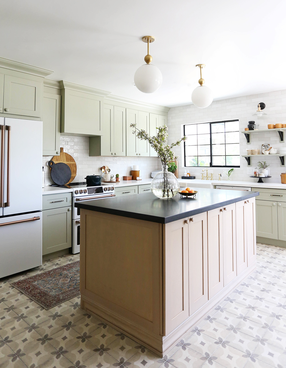
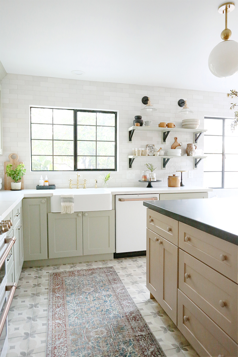
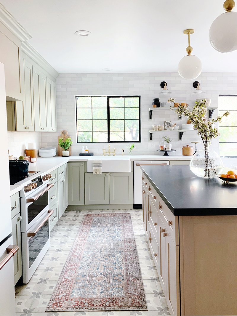
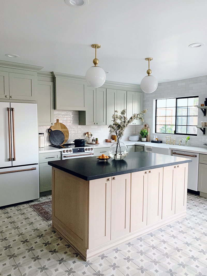
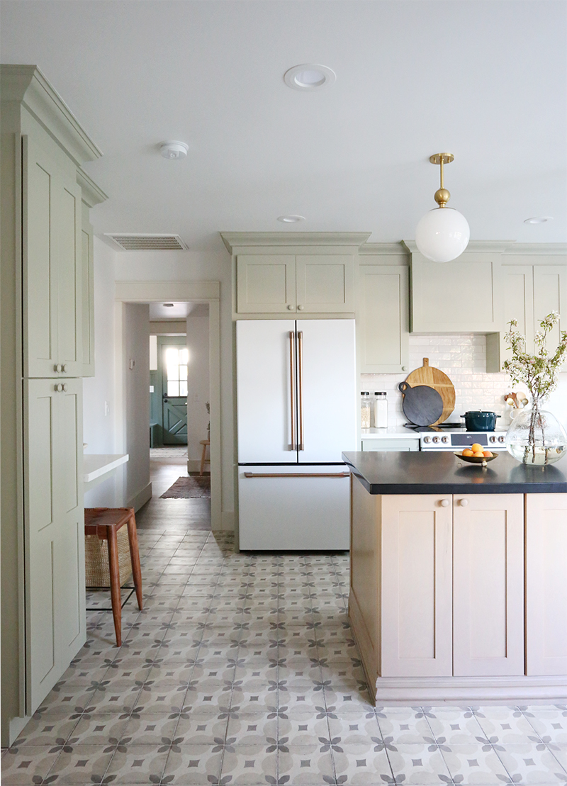
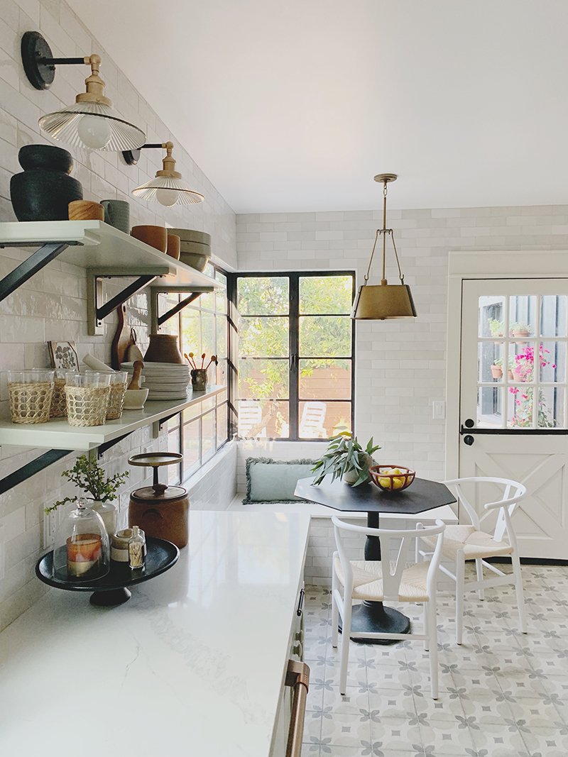
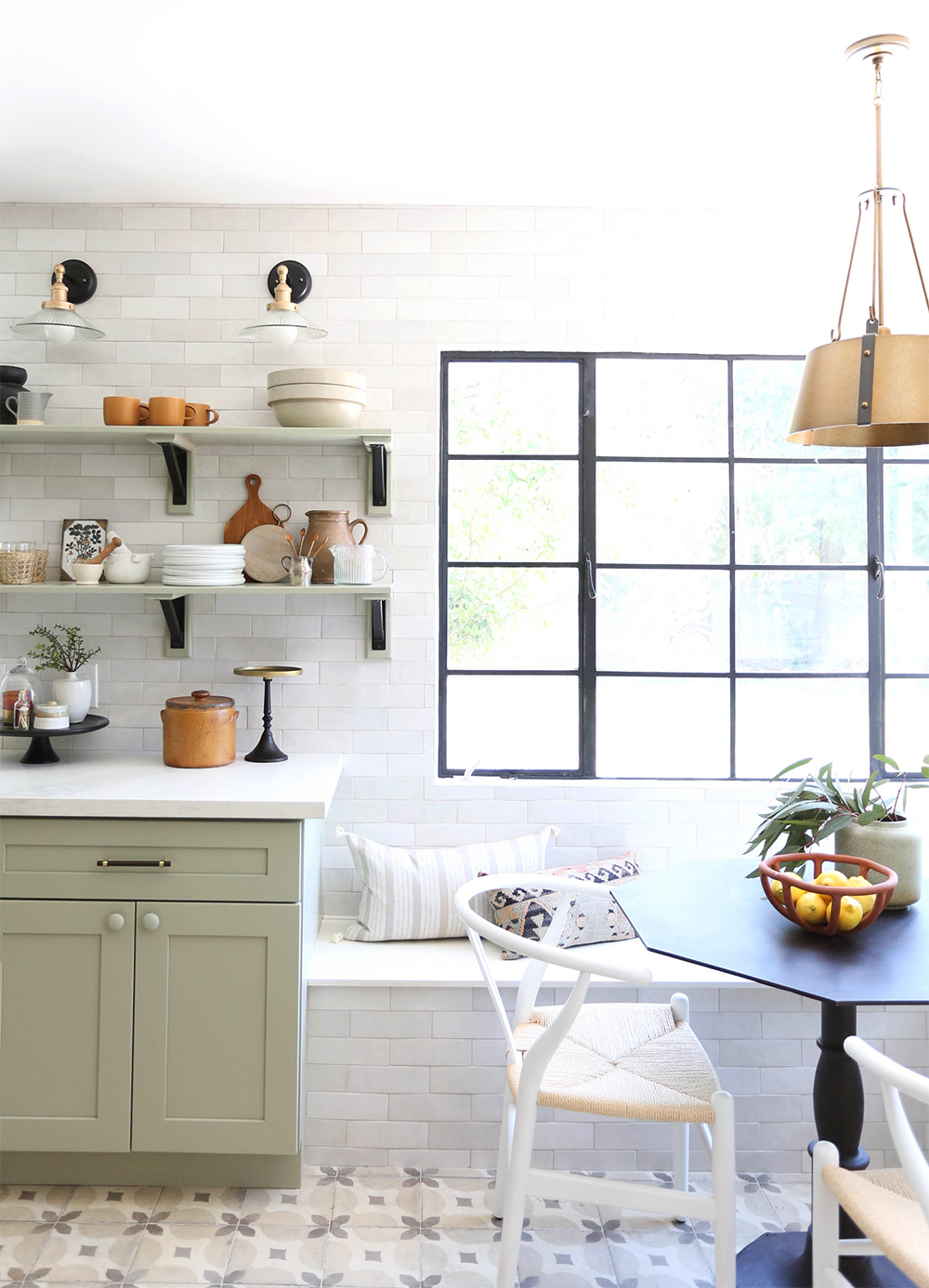
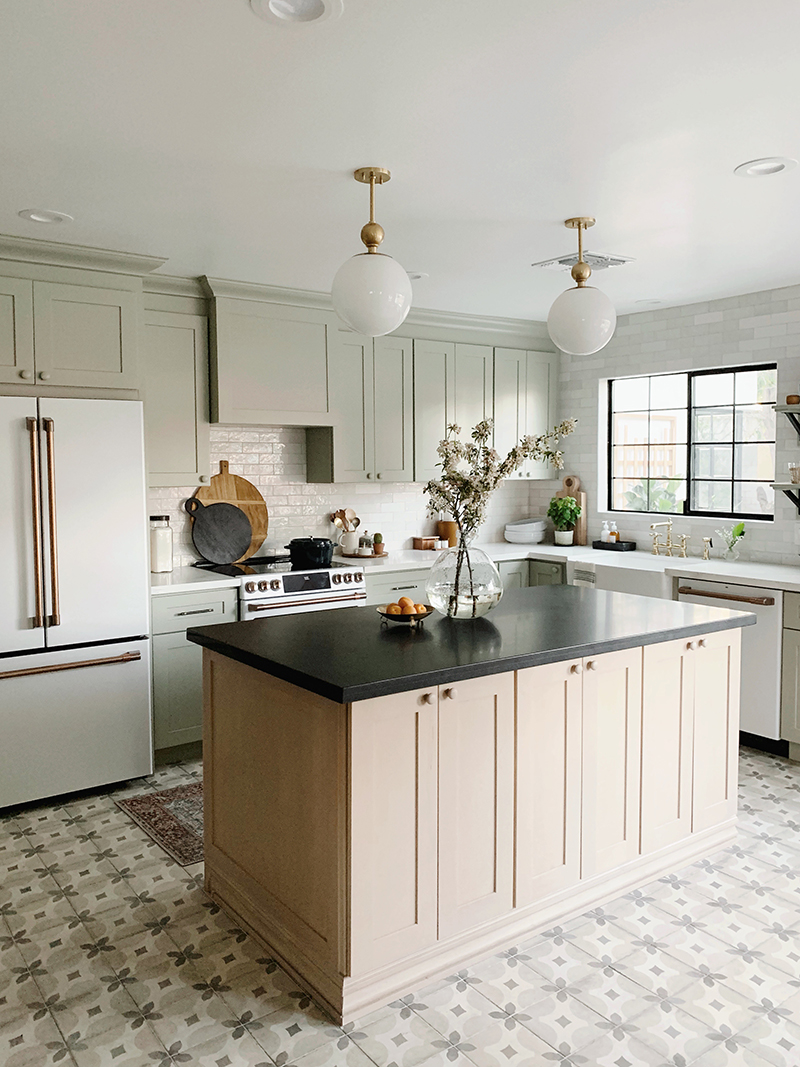
We are SO excited to reveal the kitchen today from our Evergreen flip project! We really wanted this space to feel more traditional and cottage-y with modern touches. I’m so happy with how it turned out! I love this sweet and functional space!
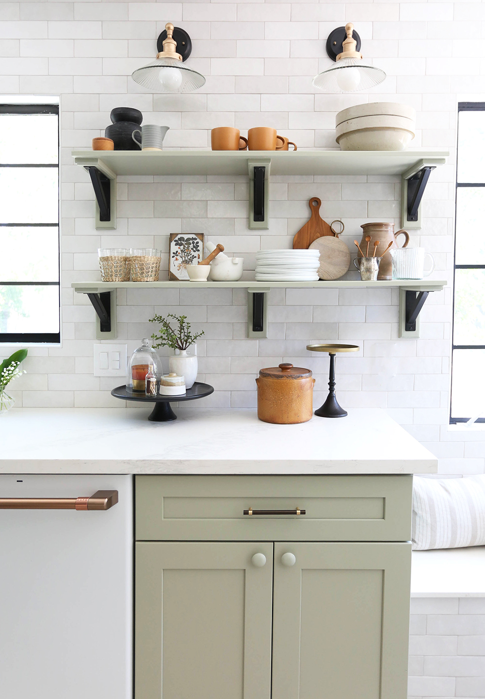
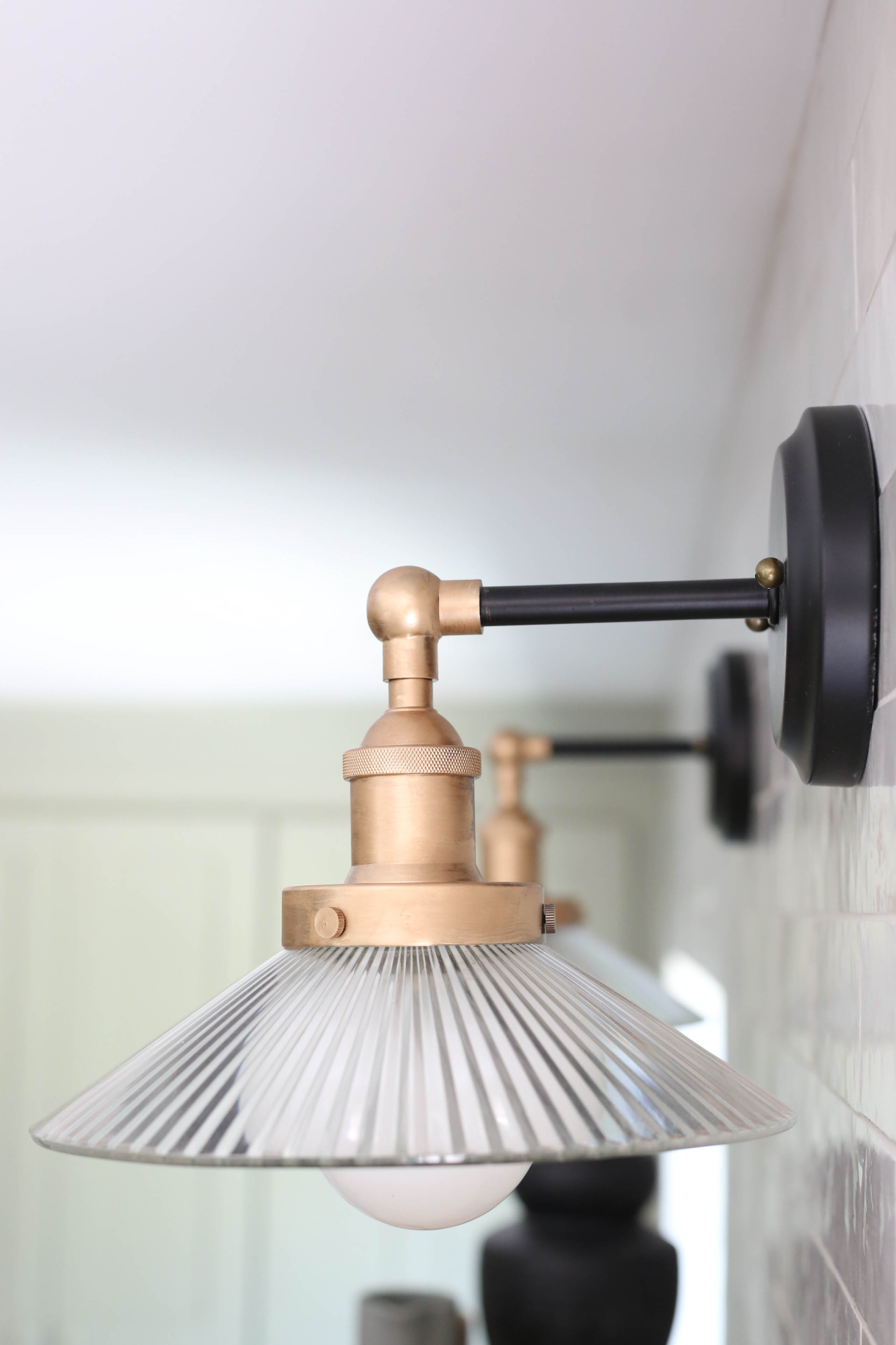
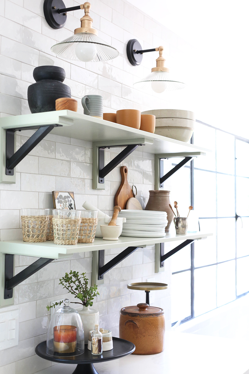
sconces // wall tile (similar) // black and brass handles
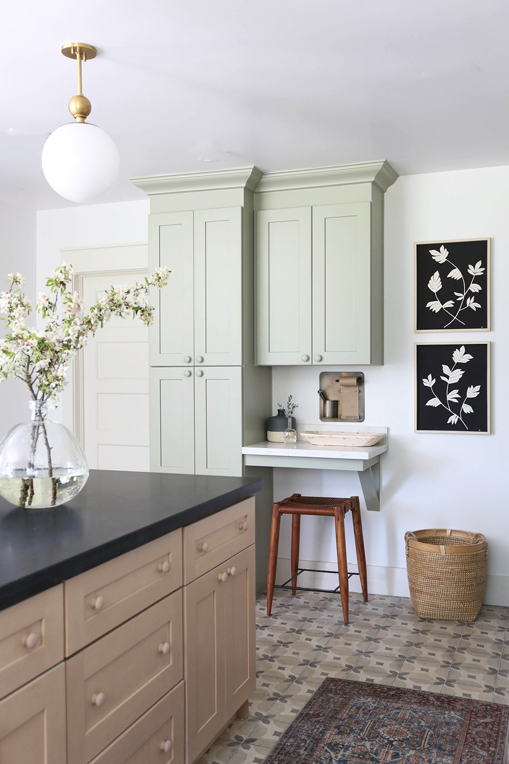
BOTANICAL III print // BOTANICAL IV print
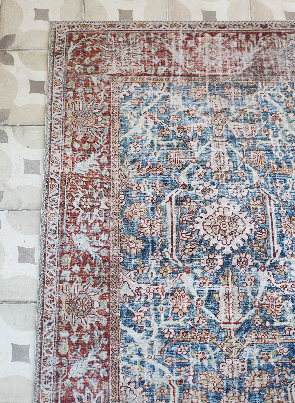
runner // pendant light (similar)
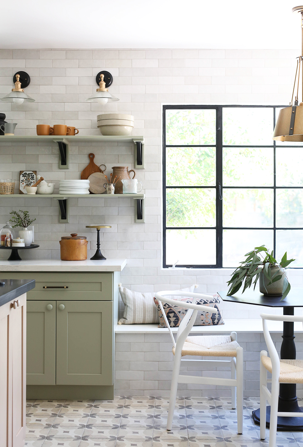
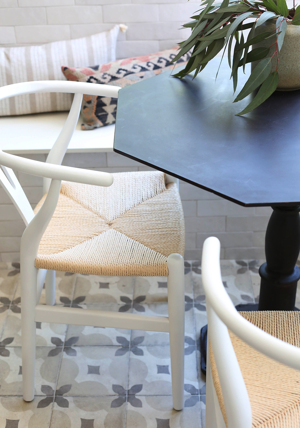
floor tile (similar) // chairs // bistro table (similar)
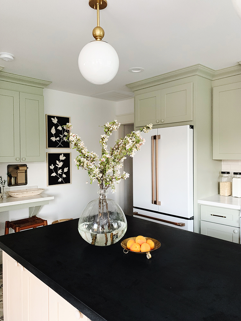
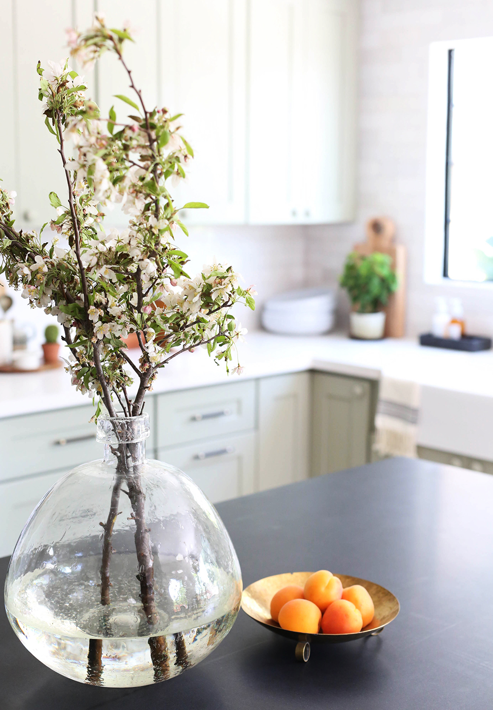
vase (similar) // refrigerator // brass bowl (similar)
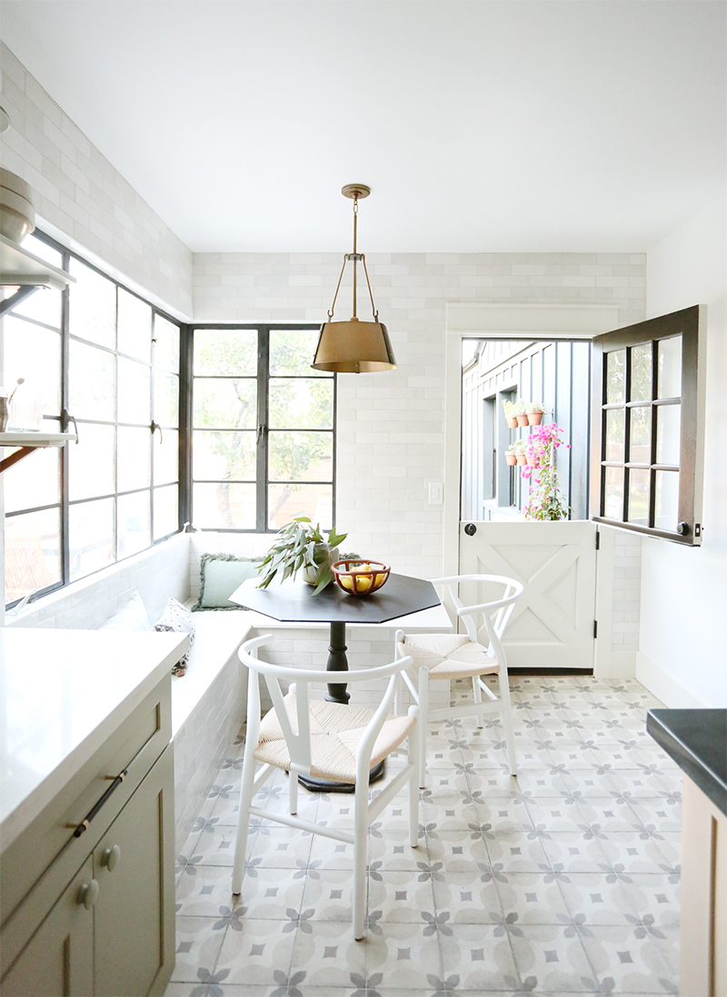
table (similar) // chairs // brass pendant light // vase (similar) // bowl
Ready for some crazy before photos? There were two sinks in here, some serious water damage and how about that carpet?!
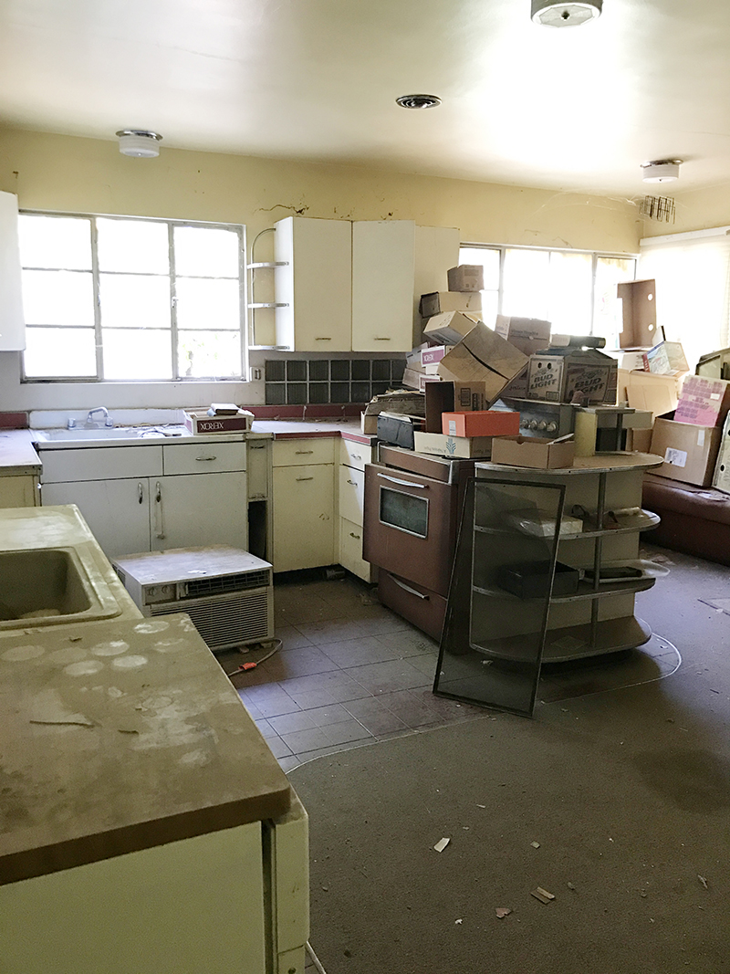
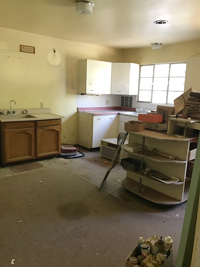
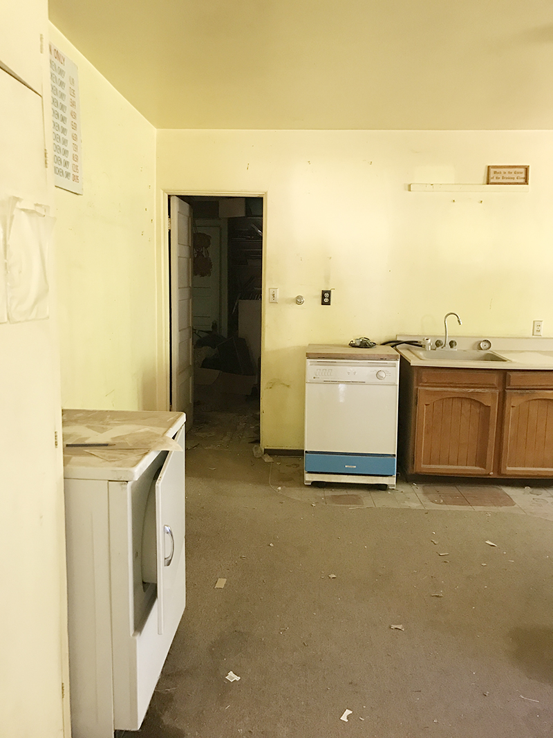
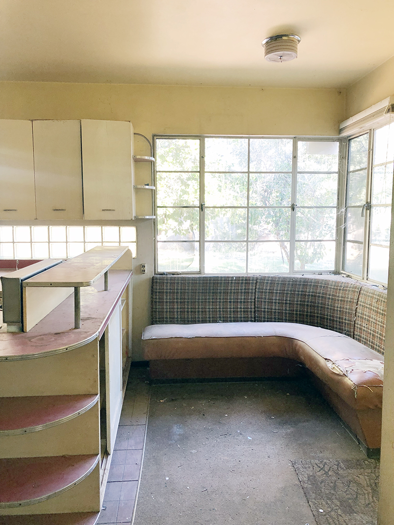
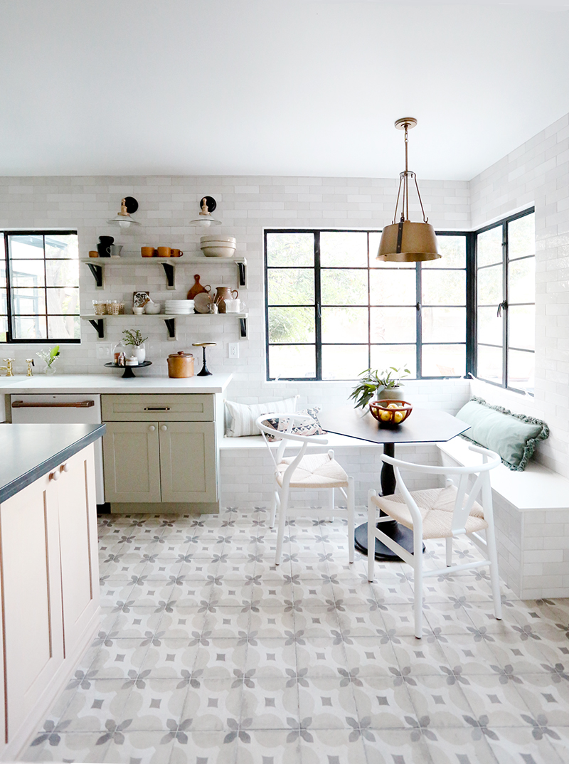
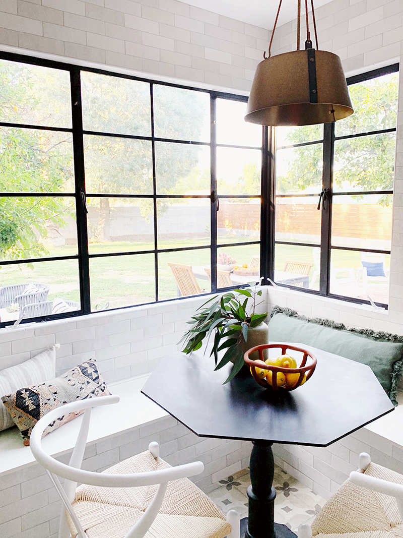
We were really lucky though that we didn’t have to change the footprint in here. I was actually pretty shocked when we first walked through that a 100 year-old house had such a large kitchen! We just needed to move a window a few inches and we opened up a few of the doorways, but that’s it for structural changes! I loved the original corner banquette concept and opted to recreate that space, which also allowed us to skip barstools at the island in favor of more storage (and a prettier view of the kitchen from the front rooms – it’s not fun to be a slave to straightening up barstools!).
Here are some wide shots to give you a sense of how the space flows:
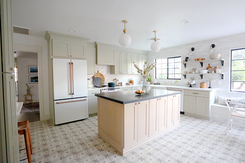
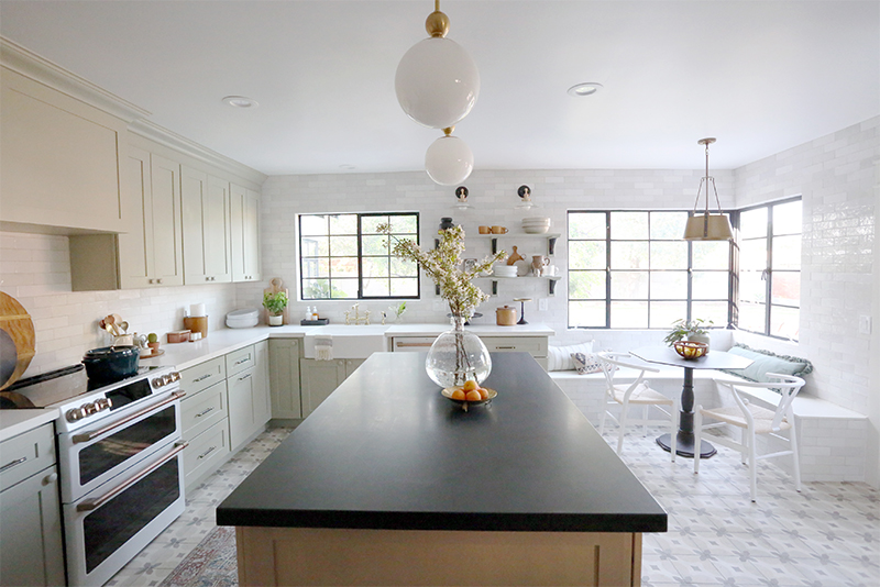
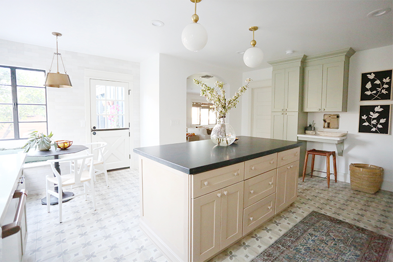
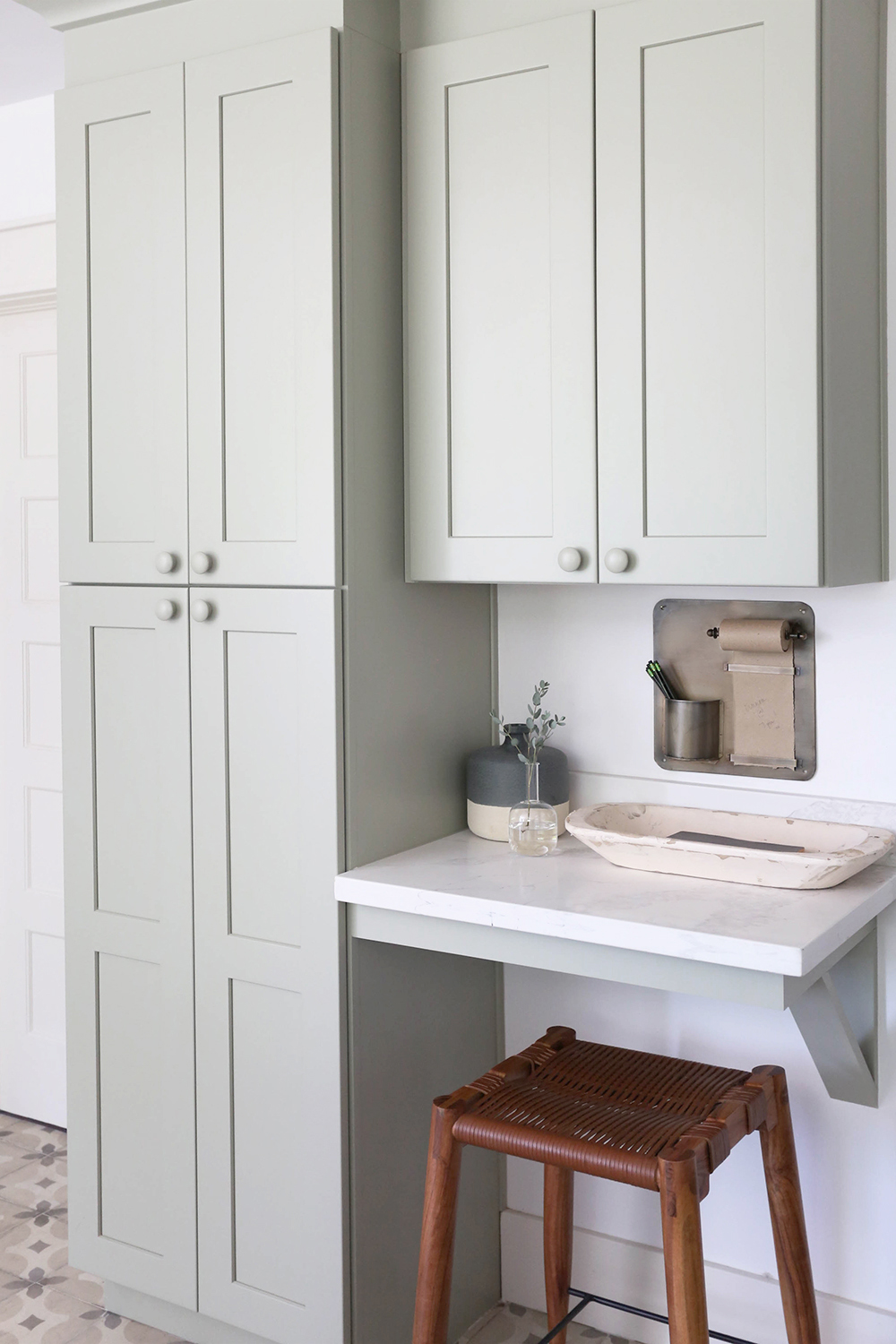
When designing a kitchen layout, I always like to have the sink in front of the window if at all possible and the range as the center focal point. I fill in the fridge wherever makes the most sense after that. In this space we also had room for a pantry hutch and little desk area to keep mail and cook books.
My biggest tip for selecting kitchen colors and finishes is to let your starting point be whatever is the hardest thing to source (or the hardest thing to change in the space if you’re not starting from scratch). For us, the trickiest selection was the floor tile, for sure. I wanted a patterned tile, but I wanted something more affordable and durable than cement tile. We totally scored with this neutral patterned porcelain tile (similar) that was only $5/ft! Once we figured out the tile, it was easy to pick cabinet colors, wall tile and and counter material from there. When you start with the tricky part, the rest of the design will fit together like puzzle pieces. Because we all see so many amazing kitchen designs on Pinterest all the time, it can be hard to narrow down a favorite color or material when it feels like there are infinite wonderful options! But this approach makes it easier to eliminate good options in favor of the right-for-the-house option.
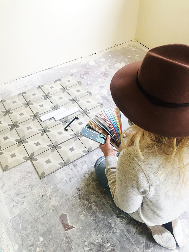
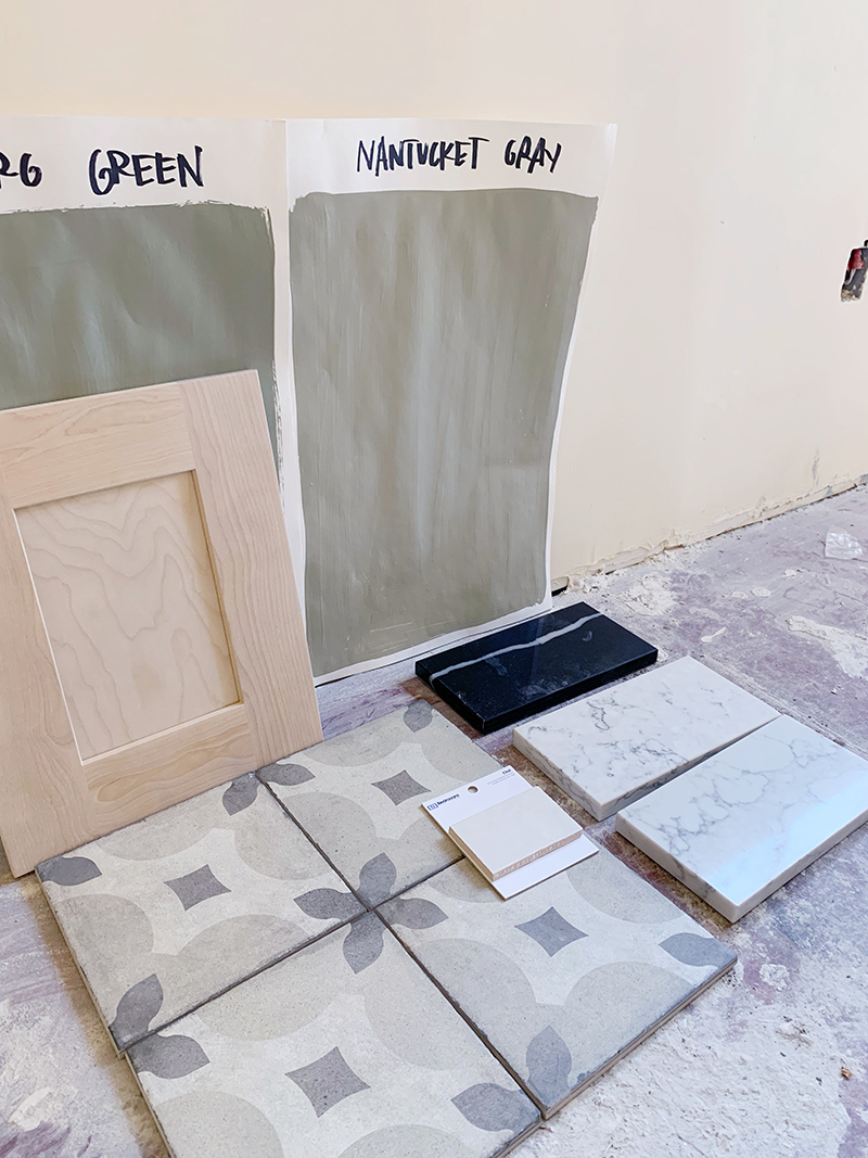
Once we got the floor tile samples in, we saw there were some green undertones in the tile and that gave me the idea of doing a sage green perimeter cabinet color. (See what I mean about how once you make the hardest decision first, it’s easier to narrow down options?!) Our cabinet company, CabCo Cabinets, offers unfinished maple cabinet options, so we went with a gray-blonde island to mix things up a little. We actually had our painter brush on a gray-beige acrylic paint wash on the raw wood cabinets and I really like how it turned out! It adds a lot of warmth to the room without darkening the space. And to add to the cottage/traditional look, I chose painted and stained wood knobs for the cupboard doors and all of the drawers on the island. I love, love, love this look!
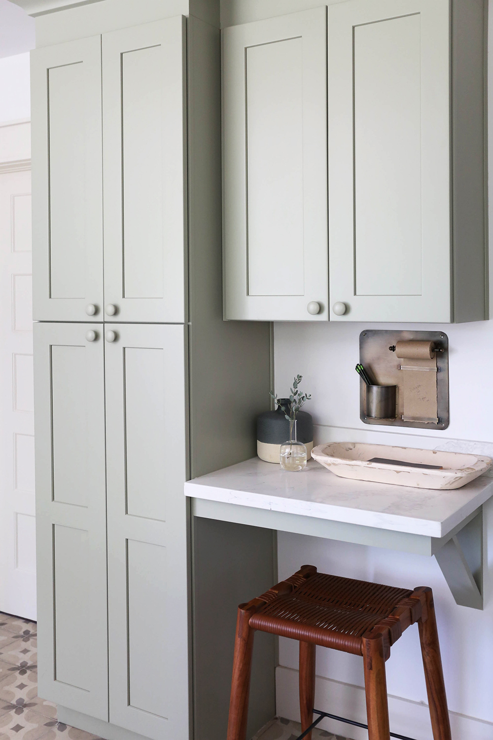
wood bowl // brass hanging note roll
Another way we worked to keep the space light was with the matte white Cafe Appliances. They are GORGEOUS and every single person who comes through the house has asked about these appliances! They come in a few different smudge-resistant matte finishes and the handles are customizable as well – I selected the Brushed Bronze option. I only wish this house had a gas line because I LOVE their gas burner range, but the double convection/induction ovens on our electric range are pretty amazing. The fridge is my absolute favorite – the proportions are perfect – and I love that it has a water dispenser on the inside for a solid front door! I couldn’t recommend the Cafe line more if you want a high end look at a more affordable price point.
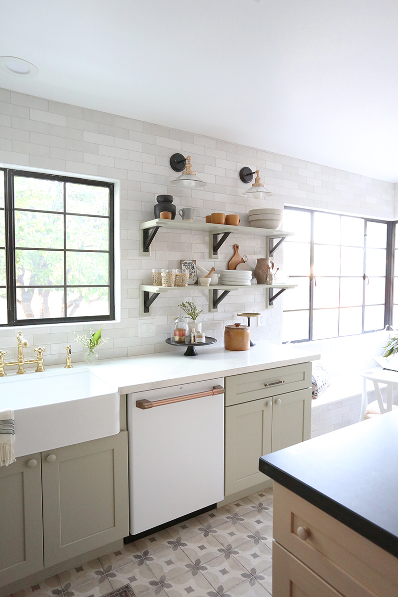
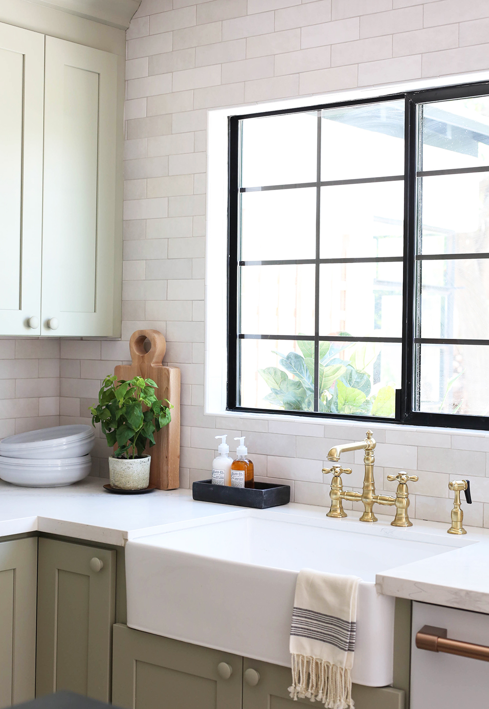
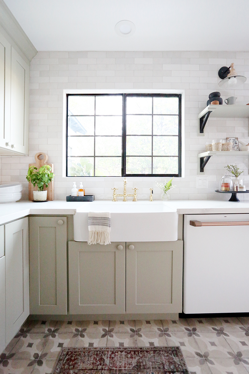
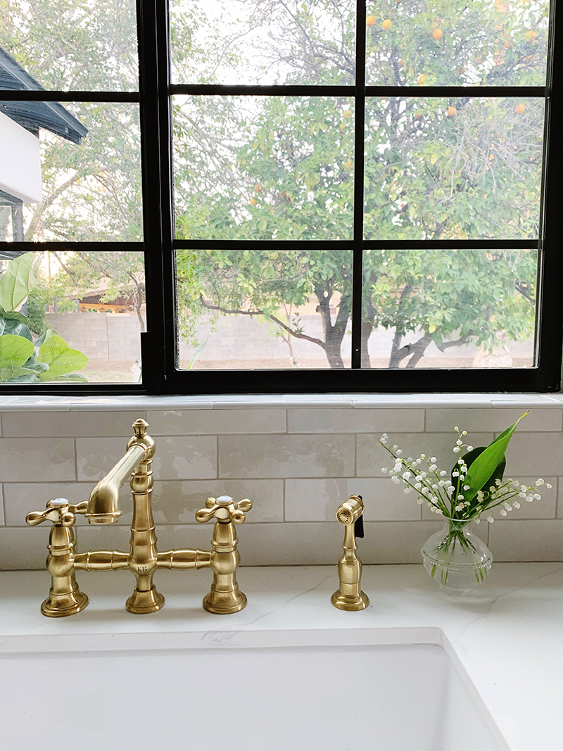
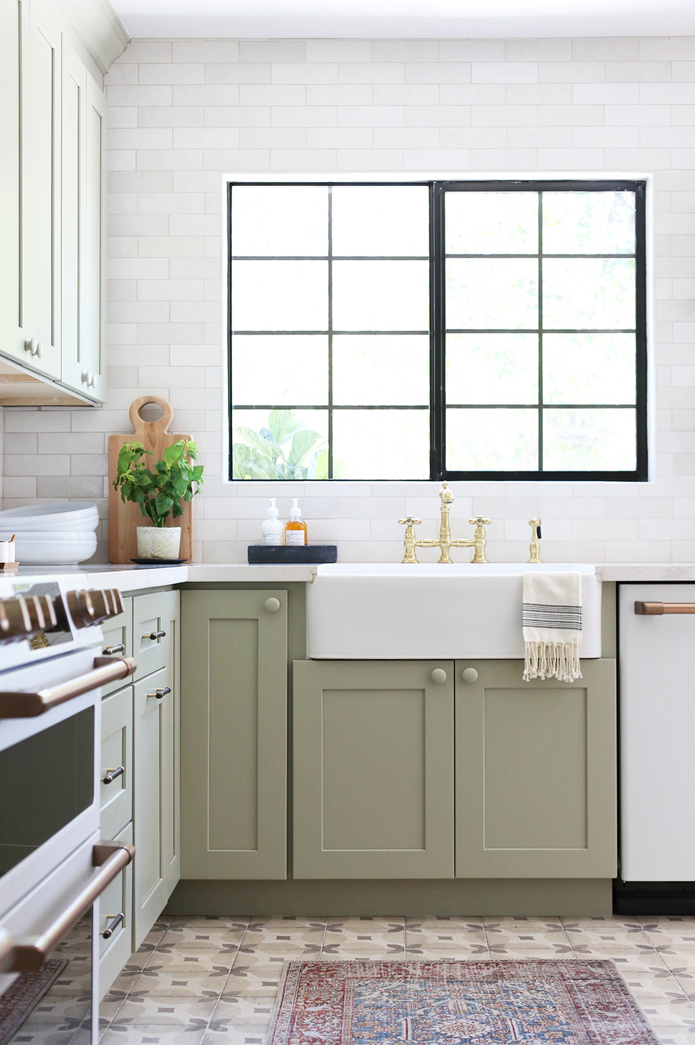
sink // brass faucet // sconces
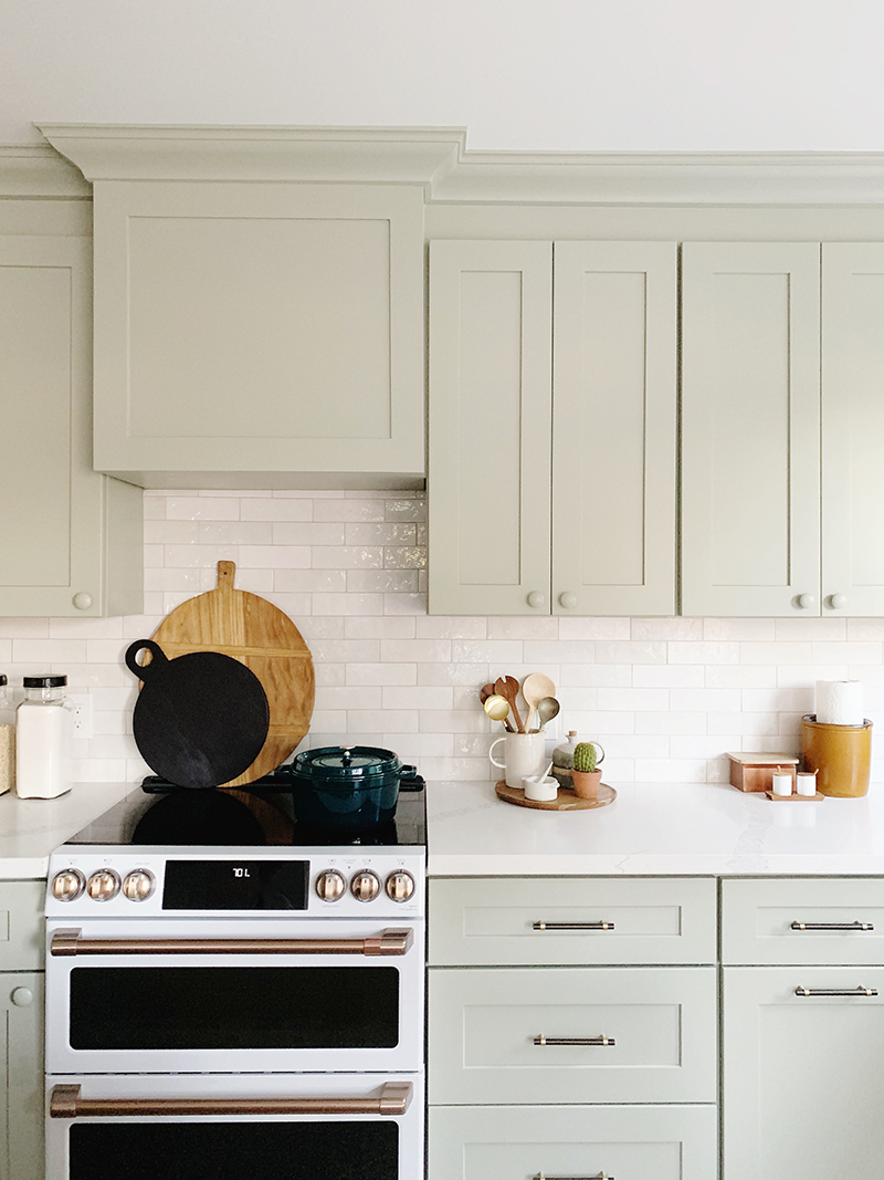
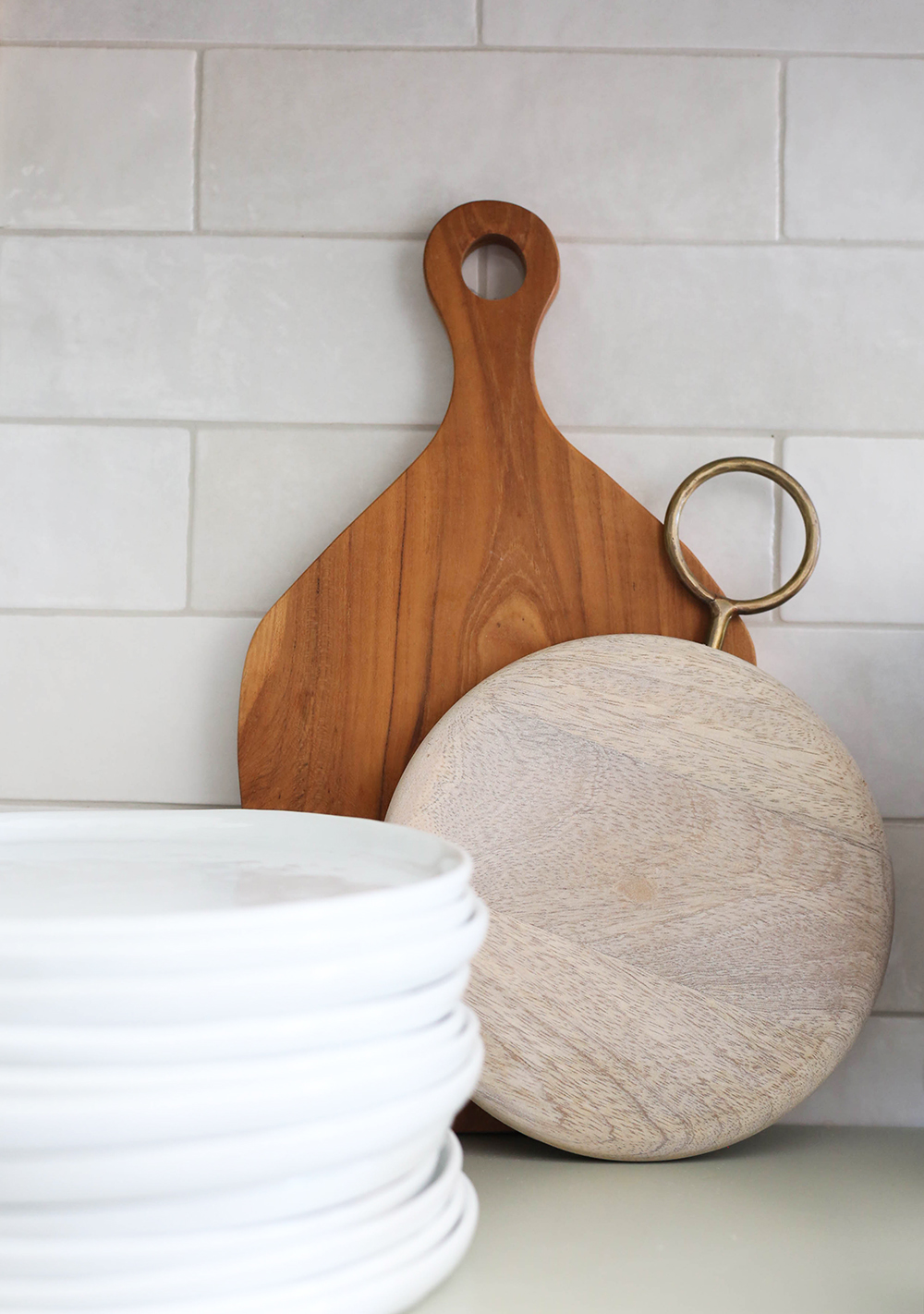
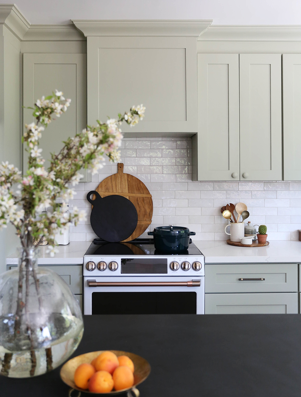
large bread board (similar) // black bread board (similar) // dutch oven
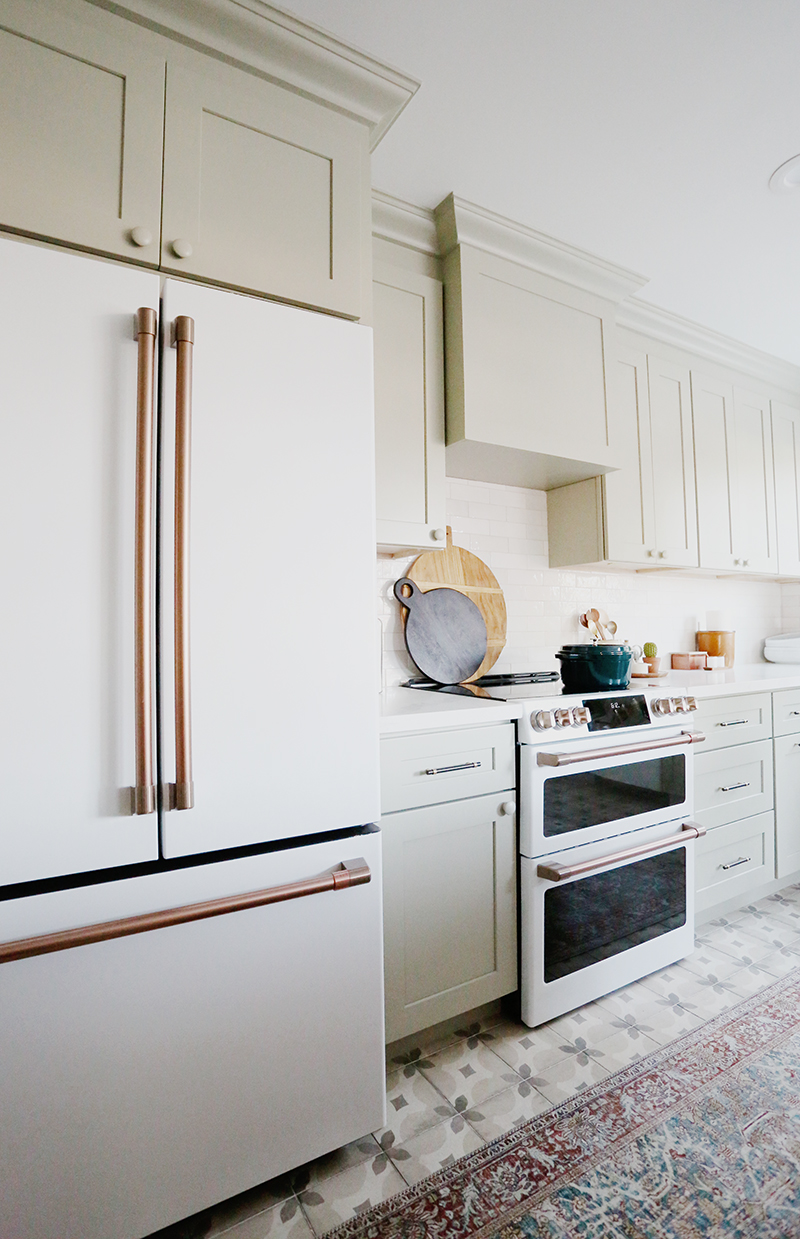
I love to mix metals and finishes in a kitchen – I think when it’s done right, it makes a kitchen look more custom and less cookie cutter. I used a lot of brass finishes in the lighting and on the appliances, and a little black/bronze in there too with the drawer pulls and shelf brackets. I think little hits of black keep the eye moving around a space and provides some good balance.
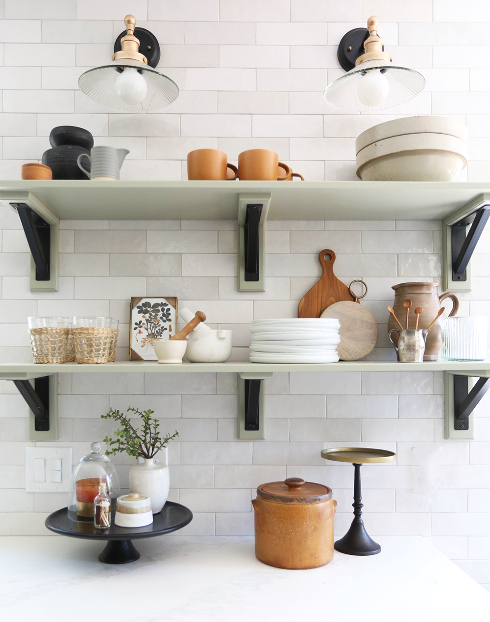
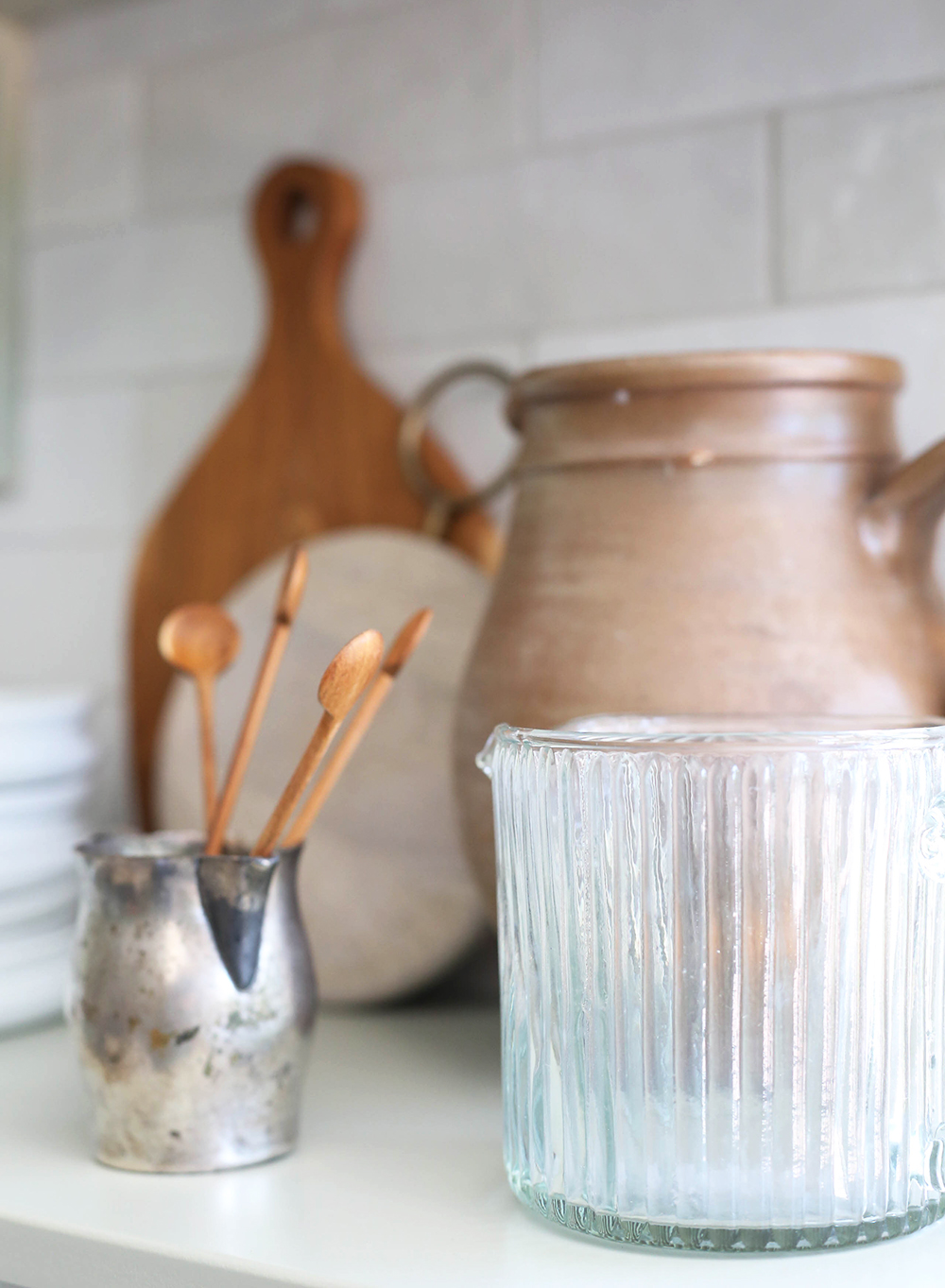
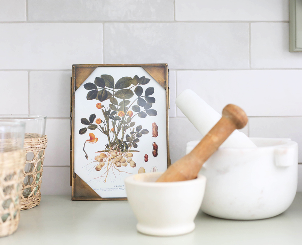
seagrass cups // mortar & pestle (similar) // white plates // mini wood spoons
candle // cloche // black & brass cake stand // sugar bowl (similar)
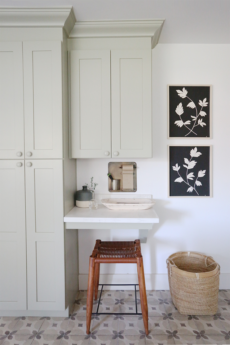
BOTANICAL III print // BOTANICAL IV print
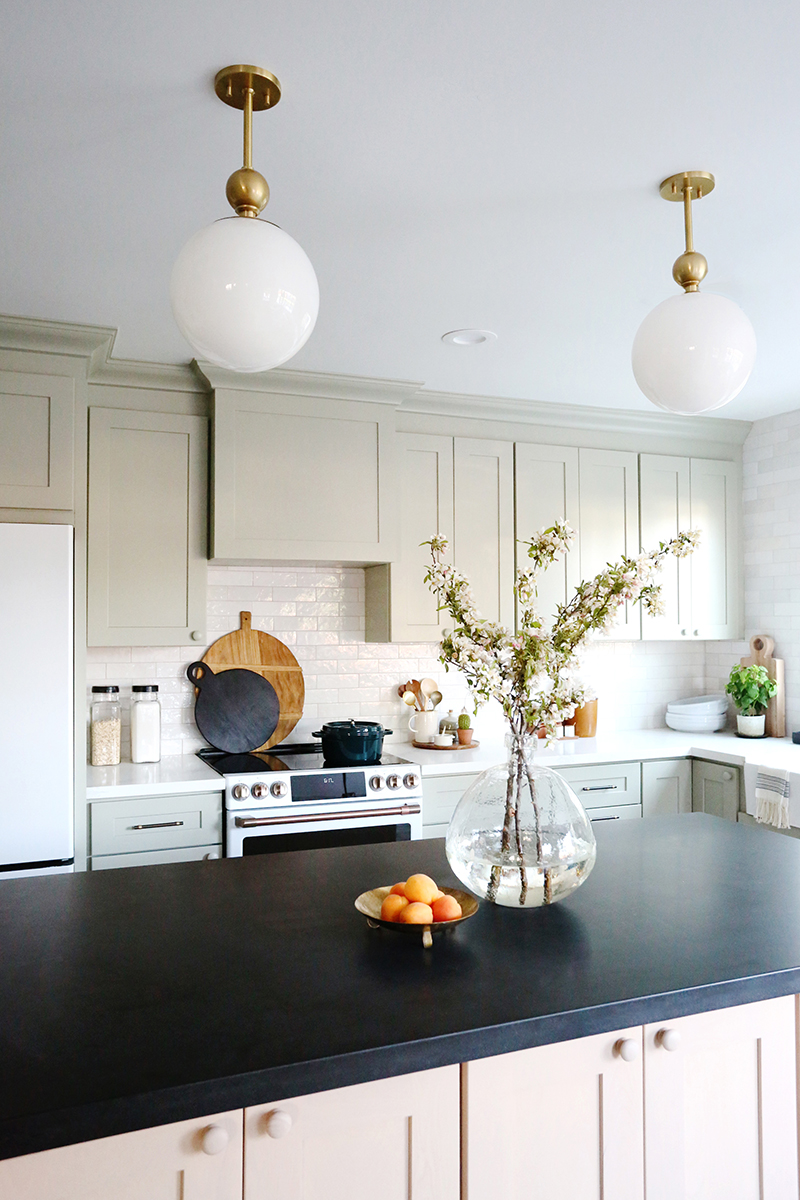
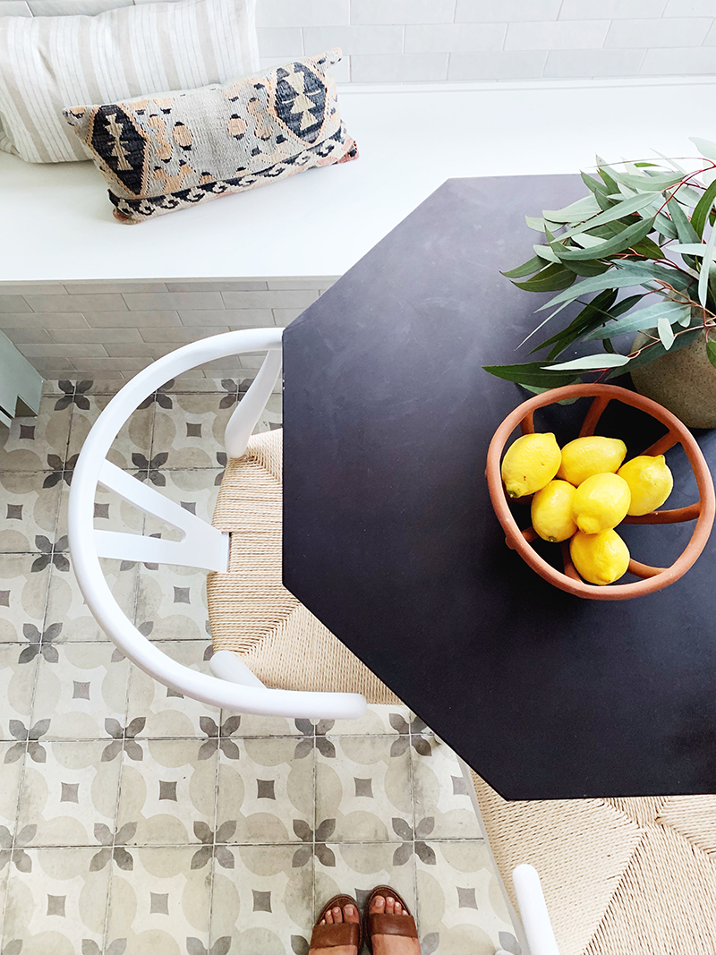
Speaking of black and high contrast, we went with white quartz from MSI called Calacatta Venice for the perimeter countertops. It’s affordable and much easier to maintain than marble but gives a similar look. I like the subtle veining in this one! For the island we found a black honed granite remnant and I love the mix of materials! Granite is a total workhorse in a kitchen, and I love honed jet black granite the most because it doesn’t have any speckles and can pass for soapstone or honed black marble, which are much more expensive materials.
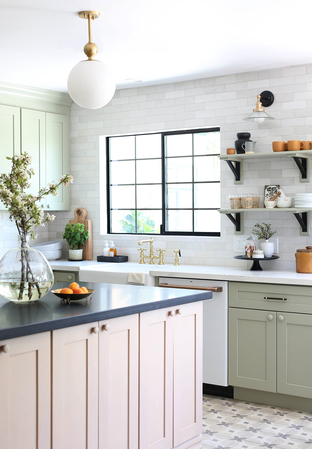
seagrass cups // mortar & pestle // white plates // mini wood spoons
candle // cloche // black & brass cake stand // sugar bowl (similar)
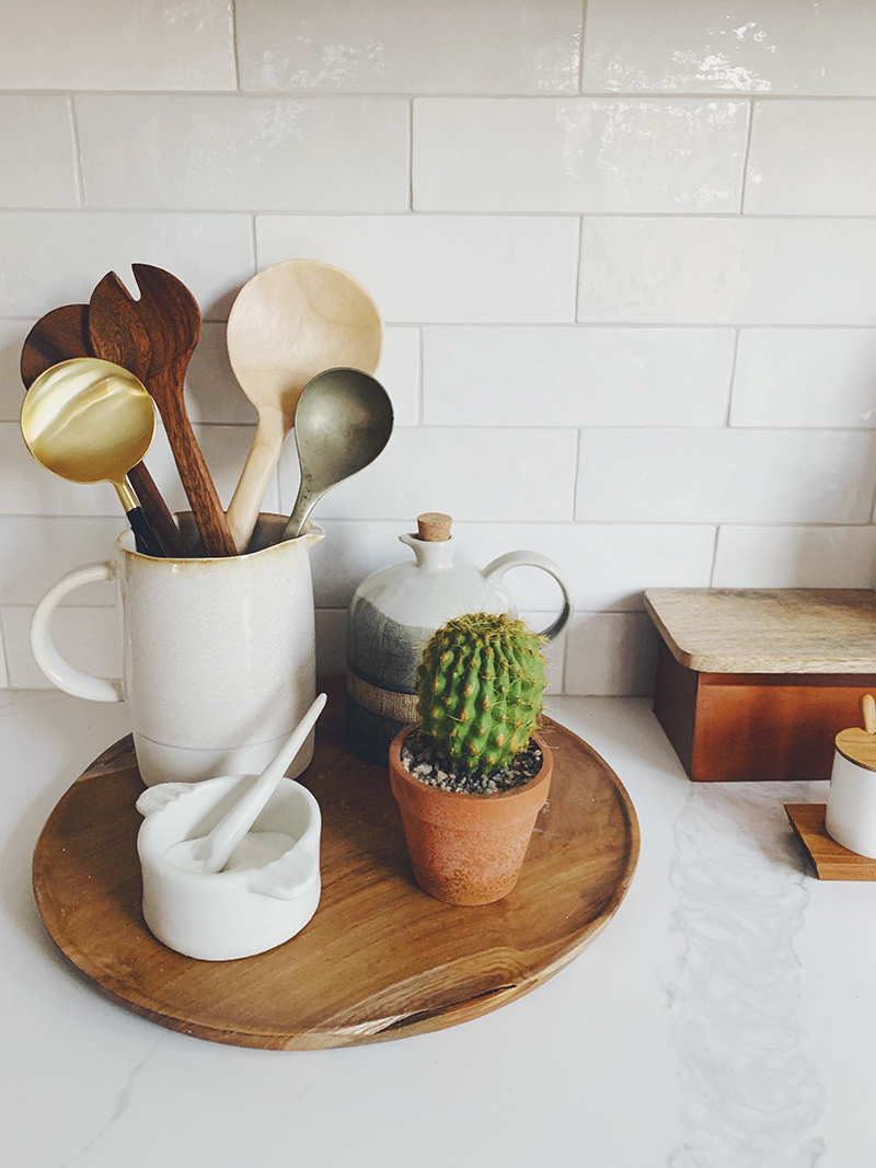
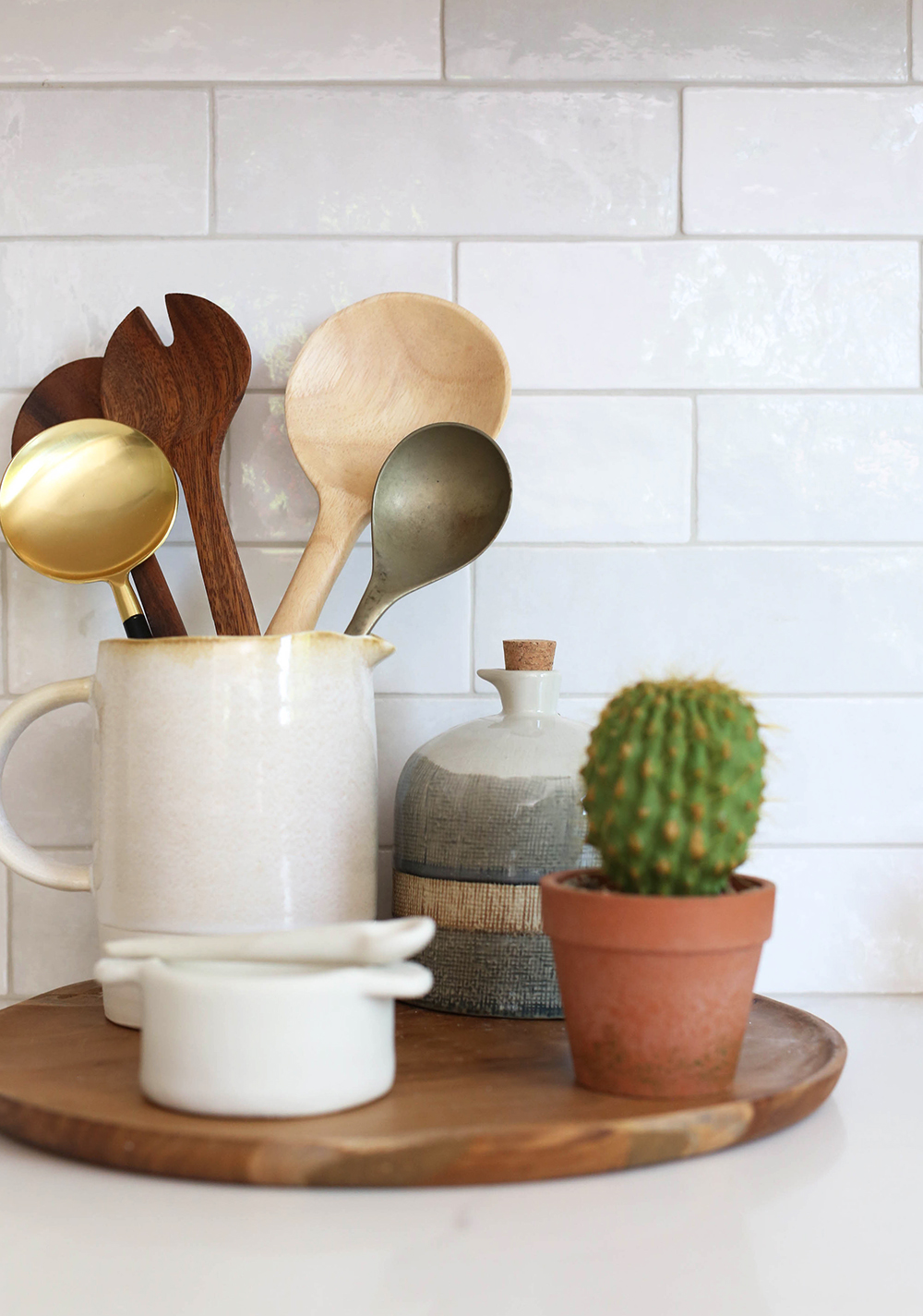
salt holder (similar) // copper box (similar)
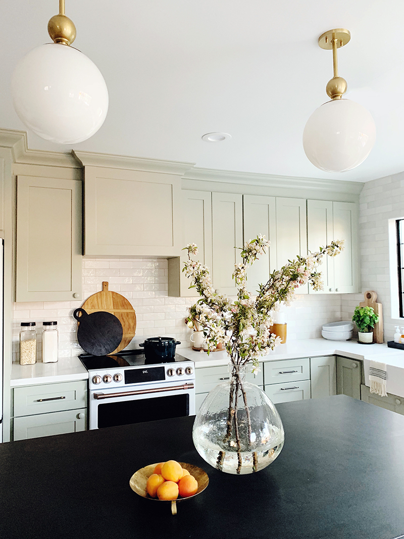
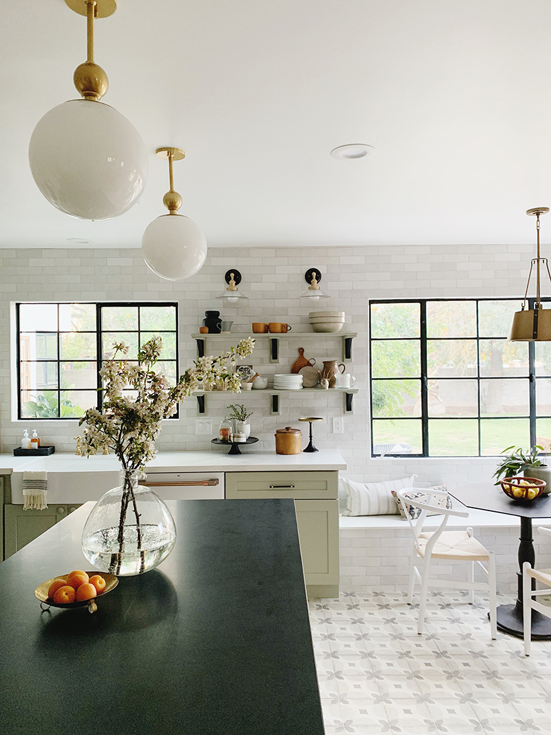
The backsplash is another favorite moment in the design for me. We opted for floor to ceiling handmade subway tiles from Bedrosians Tile. We even installed the tile on the front of the banquette bench! The tile is from Bedrosian’s Cloe line in White and we used Mapei Alabaster grout. The subtle color variation in the tiles is my absolute favorite. It adds such a beautiful, textural layer to this space. And the price is so, so reasonable at under $7/ft. I’m obsessed and can’t wait to use these tiles again in another project. Maybe the square size? And maybe the pink or the blue next time?!
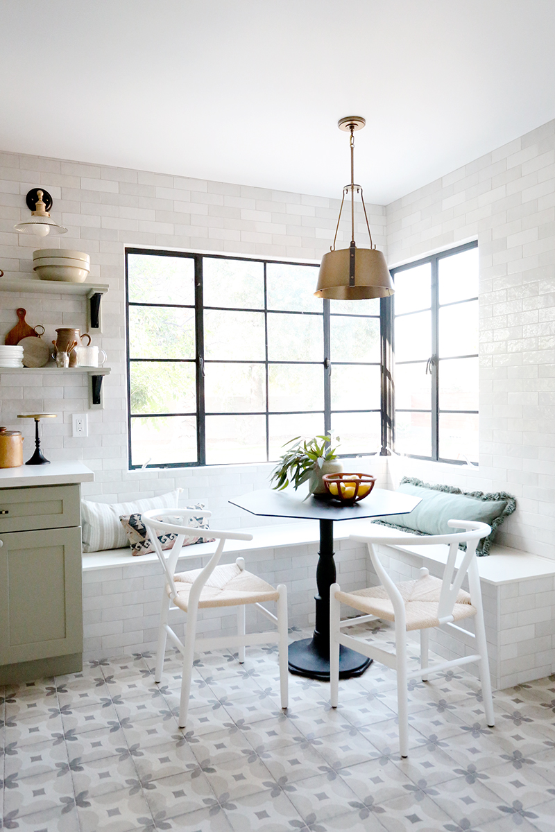
chairs // brass pendant light // vase (similar) // bowl // green lumbar (similar)
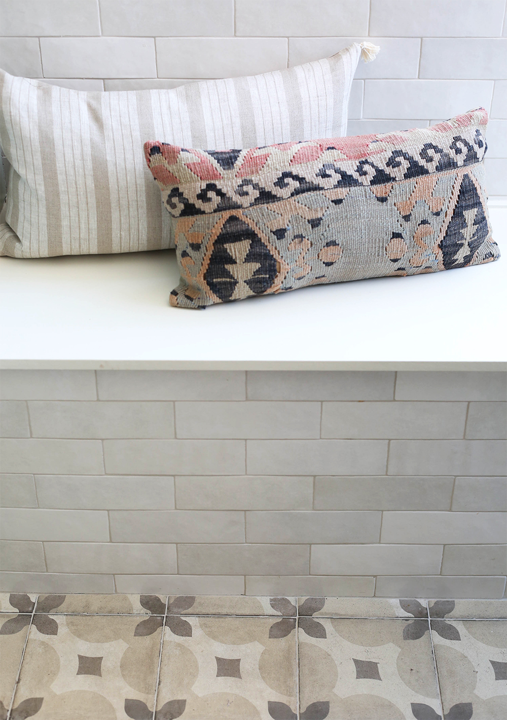
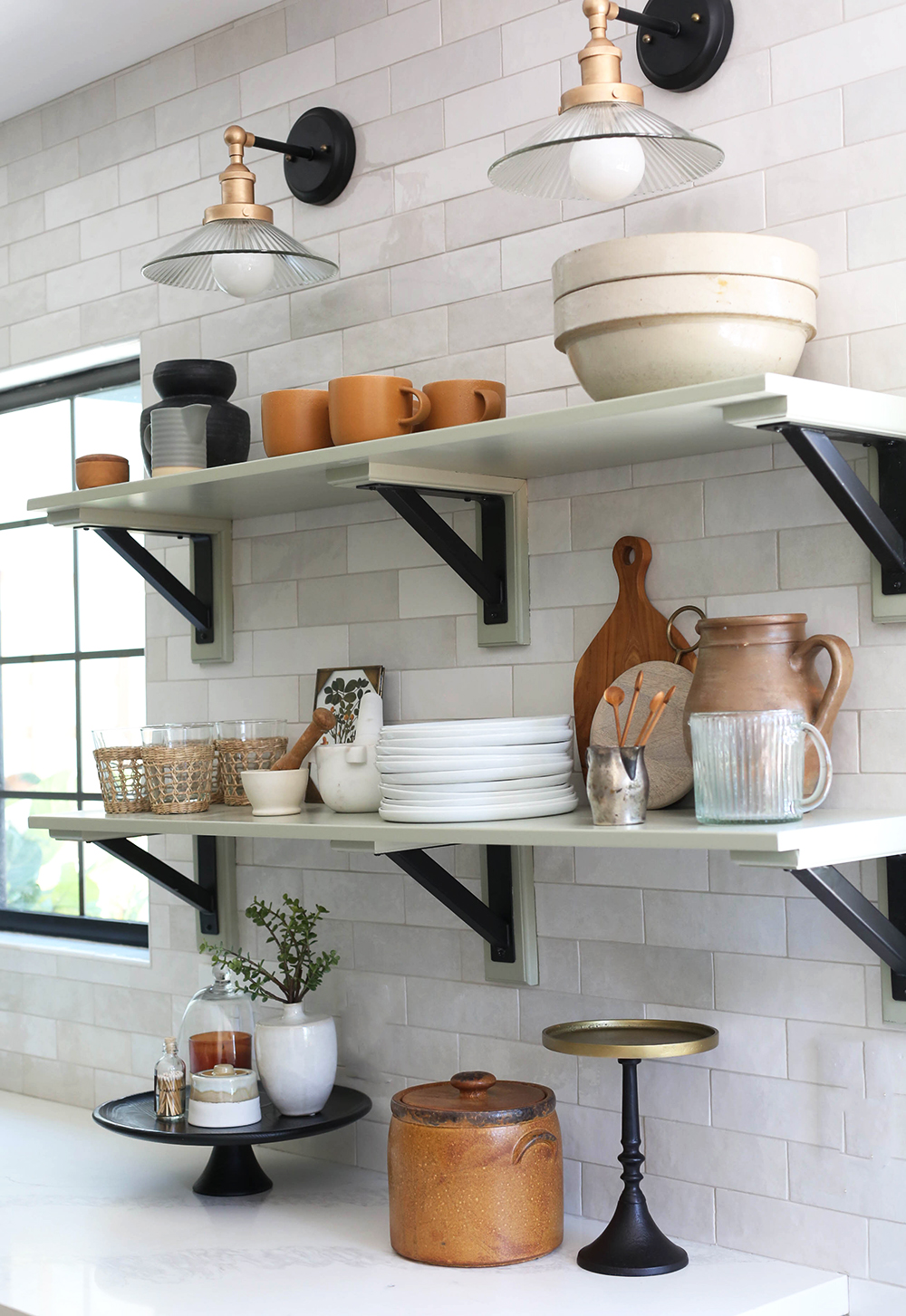
My final tip is to save some room in your kitchen reno budget for pretty organizational items and accessories for styling, which absolutely put the finishing touch on any kitchen! Even just a little bit of styling for your surfaces will help to cozy up your kitchen. We’ll be sharing more how-to’s for kitchen styling soon and on the @juniper.home instagram account, because heaven knows this post is loooooong enough already! :) We’ve tried to round up all of the sources for you here, but for sure let us know if we missed anything in the comments!
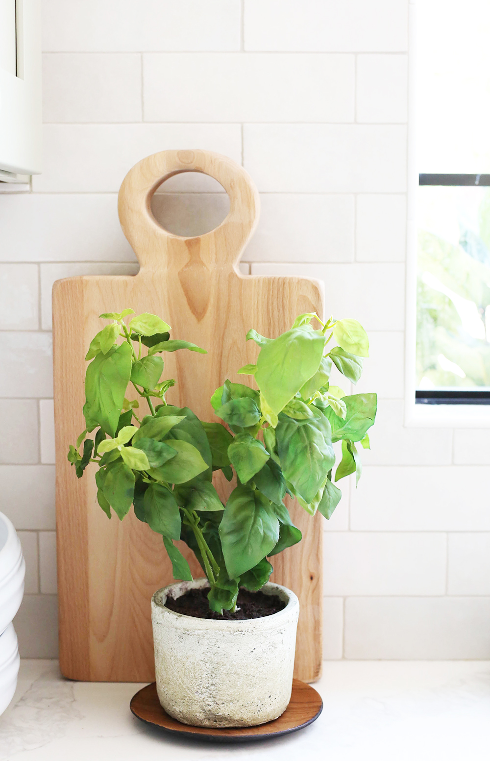
seagrass cups // mortar & pestle // white plates // mini wood spoons
candle // cloche // black & brass cake stand // sugar bowl (similar)
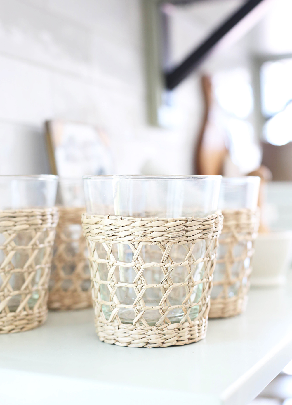
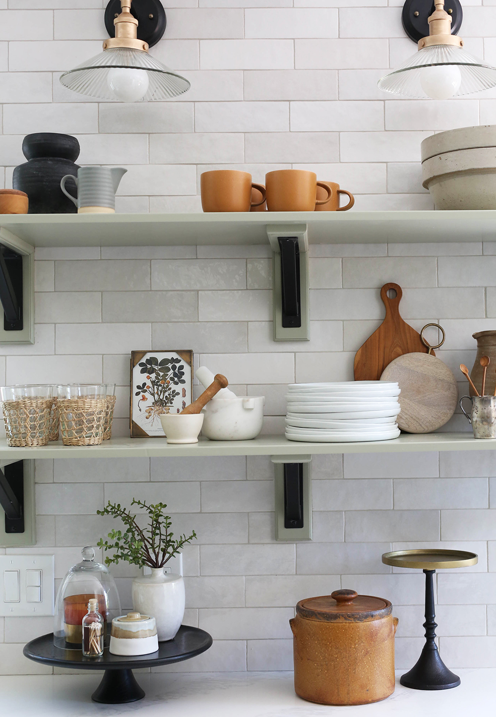
seagrass cups // mortar & pestle // white plates // mini wood spoons
candle // cloche // black & brass cake stand // sugar bowl (similar)

1 // 2 // 3 // 4 // 5 // 6 // 7 // 8 // 9 // 10 // 11
12 // 13 // 14 // 15 // 16 // 17 // 18 // 19 // 20 // 21


Wow, what an amazing transformation! Love a good before and after and this did not disappoint. And I love those tiles and how you took them all the way up to the ceiling and around the seating area.
One of my favorite details too! Thanks Suzanne! xo
Wow! It looks so amazing … every little detail.
Did I miss the sources for the pillows? I tried to look carefully, but maybe I missed it.
We’ll add them! The striped is from our collection (launching next week!), the kilim is vintage from Etsy and the green is from Amazon! xo
So pretty and unique! I love the colour of the cabinets with the bits of black and orangey-wood on the shelves. xoxo You are my favourite designer on the internet!
That means so much, Erin! xo
The kitchen beautiful, looks like a $100k + kitchen. It reminds me of a DeVol kitchen. I love the knobs you choose and the mix of everything.
WHAT! Best compliment ever! Thank you!
Every detail is so thought out and beautiful! What a lovely space! Will there still be a diy for the Dutch doors?
Yes! Coming soon! xo
New follower here and I’m just loving everything you do. This kitchen is gorgeous! Thanks for sharing all the sources and for the great tips!!
Welcome, Jill! So glad you’ve joined us! xo
I love how you explain your choices. It helps me to learn and develop my own style in my home. Much appreciated!
Thanks Sue! I’ll try to explain even more going forward! xo
Sigh….everything little thing you do is magic!
That is so nice of you to say! Thank you, Zoe!
This is a great kitchen that will endure and have appeal. It’s so nice to see color, but other-than-blue. Running cabinets all the way to the ceiling is so desirable. It looks like the grouting in the tiles will stand up to cooking and cleaning, and not show much discoloration. Lots of smart choices in finishes that will make this a truly usable space.
Thank you! It feels like the right kitchen for this house! :)
The shelves & brackets -love! Source ? DIY?
Hi Marly! The brackets are from Lowe’s! We painted out the wood to match the cabinets!
I love everything you did with this kitchen; it’s updated but classic. The two-tone shelf brackets are genius! I keep coming back to look through the picture again:)
Gosh darnity Jenny why is everything you do so damn beautiful? I already re-did my kitchen and now now now….sigh
Haha! I’m sure your’s is gorgeous though! xoxox
LOVE everything except…the desk! I voted a definite NO to this. I would’ve preferred a larger pantry. Other than this, PERFECTION!
Hi Kathy! I’m glad you stopped by to read to post and I love to hear you like the kitchen that we spent so much time and money on! While I’m assuming you didn’t mean to bee rude, I just wanted to let you know I didn’t love reading the part about the desk in your comment. I know not everything I design or post is going to be every reader’s cup of tea, but if I liked an idea enough to design it, photograph it and post it, you can bet it will hurt my feelings for you to take the time to let me know you don’t like it. Some people will say that it is just a part of a blogger’s job to accept negative criticism, but I think that mindset has created a situation where some readers forget that there is a real person, with real feelings behind the photos. It is not easy to share creative work publicly – it’s a very vulnerable feeling. I hope going forward you can ask yourself if the comment you’re leaving on a blog post or an instagram feed is one you would say to me in person, if you were walking around my projects with me. If it were me, I would point out the parts I loved best and skip over the parts that weren’t my style. xo
Your work has opened up a whole new world of design for me, and my goodness–THIS kitchen–it just filled me up with so much inspiration! You are truly a breath of fresh air and your passion and authenticity shine through in every detail–whether or not someone likes it. Please know that for every opinion about something like a desk, there’s a person like me who respects and values your work. Thank you for sharing this with us!!!
Thank you Ashley! I really appreciate your kind words! xo
Beautiful! I think your accessorizing is TOTALLY on point in this space!
I love how you elevated normal black metal shelf brackets with the matching wood behind! Such a simple yet genius idea. Gorgeous!
I love them too! They are so striking! It’s really hard to pick a favorite here, just gorgeous! Are you hoping someone buys all the little accessories as well? It all adds up to a nice chunk of change! Also, does your (flip) partner love it too?
Those tiles!! This is also a really good case study of the power of effective styling. I love all of the details. Well done! On a side note, I really like how you’re rolling out content from your projects. A few quick glimpses and live videos on social during the project and then more comprehensive reveals on the blog after the fact. And you keep the posts really easy to follow. I appreciate all of this so much.
This means so much! Thank you Jenny! xo
Amazing transformation! I believe you said at one point that the banquette window was original but can you share the source for the new kitchen window over the sink? Can’t wait to see what you do next! Keep up the great work.
Hi Wendy! The corner window is original but all the new black windows are from Jeld-Wen! xo
I mean….I’m probably going to gush on every Evergreen reveal post but…it’s like you went into my head and created something perfect for me, I love every detail SO MUCH! The banquette and desk are just the cherry on top, I love how it’s a communal space and has function beyond just a standard kitchen but isn’t an open house layout, you know? Seriously in my dreams you’d design a house for me, Jenny!
You’re the sweetest, Kara! Thank you!! xo
This is GLORIOUS!! So well done!! Bravo.
So, I triple checked, but couldn’t find mention of the wall and trim color. Would you mind sharing when you have a moment? (I’m currently hunting down “the perfect white”.) Thanks in advance!
PS. As a fellow blogger, your response to Kathy in the comments below was so beautifully said. Thank you for educating people! <3
Thank you Michael! The walls are Chantilly Lace (my favorite white!) and the trim is Seapearl, both by Benjamin Moore. xo
SO SO PRETTY! Love all of the details! Great job!!
Your work is so beautiful! I’m ready to rework those sconces into my current kitchen project. Do you think the Amazon picture, or the pictures you took, are more true on the actual color? Your pictures look a little more gold (which I love!)…
Hi Alex! You just reminded me that I touched up the sconces with gold enamel paint and I forgot to mention it on stories or in the post here! I’ll add it to the post.
It was a very quick project and I used this enamel and a 1/2″ artists brush! http://bit.ly/2R1EATq
Jenny,
This kitchen is divine, and I’ve read the whole post very carefully. Also — I love the little desk — and also wish readers would remember that different users have different dreams for their spaces. I’m particularly impressed with how many items you sourced that I clicked on expecting them to be much more expensive than they turned out to be! The light fixtures in particular look like they might be from Schoolhouse or a similar price point — and then they turn out to be from Amazon! Makes me more committed to searching for good bargains whenever possible, and saving the big bucks for custom work by good pros and artisans whose work is always worth the extra cost. Thanks for sharing this and for your enthusiasm and warmth, and the obvious pride you have in your work!
That means so much. Thank you, Julia! We tried to use mostly easy to source and affordable items in the staging! xo
BEAUTIFUL transformation!! Timeless appeal & so much inspiration. Love the creative design involved with the tile on the built-in bench seat. What did you use as the “topper” for the bench seat? Is is painted wood with molding attached to the back?
Hi – this is really beautiful! I followed the link from Ashley at The Gold Hive and I am glad I did. Lots of inspiration here.
One question I have is about what is above the stove. Can you explain what is there? It sort of looks like a hood, except on the bottom of it, which just looks solid (and painted the same as the cabinetry).
Thanks!
We just haven’t installed the liner yet! :)
Yes- just painted wood top!
JENNY. YOU. ARE. AMAZING!!! It’s so so so good!!! Living for every detail of these posts on the blog- and on the gram! I know you mentioned using the creamy-er off white on the trim (in your stories i think?) could you include that paint color in an upcoming post? I would NEVER have thought of that, but I just love how it’s giving all that white more dimension and depth.
Thanks Jamie! The walls are Chantilly Lace and the trim is Seapearl – both are Benjamin Moore colors! xo
Super, super design here Jenny. I also see, though not mentioned I think, a lot of ROUND items as a consistent choice! Love the Dutch door – so much better than the tired old Dutch door I had in my last kitchen/dining space, which led into a former patio that had been fully enclosed yet uninsulated, functioning as a catchall/sewing/storage room. (Luckily we had french doors right next to that which did lead outside.) Southwest indoor/outdoor living ftw!
TILE THE WORLD is my motto, especially after going to Lisbon a bit back. Love how it adds texture and reflects light (or can be matte!) and how great it is to just wipe/mop down. Love seeing how you went for it with the tile and the beauty it adds to an already warm and welcoming kitchen!
Just think of every adjective there is for the word LOVE and you will know how I feel about this kitchen. You have really out done yourself!
This kitchen is so absolutely perfect!! It’s got such a warmth about it—very homey but incredibly stylish!
So many beautiful details, but that little notepad and hanging cup on the brass, wowowow. I never, ever would have thought you would have sourced that from Amazon, was expecting an antique store gem that I’d never get my hands on! Inspired and adding to cart :). Love, love, love- well done!
Incredible! Every single detail is perfect. So many favorites, the Hinkley chandelier, the white tile and the overall color palette is just SOOO good!!
Jenny
I already made a comment here and on IG yet I just can’t stop thinking about this kitchen. It is so stinking great! The deep thought that went into every deet. Some of the accessories that I have never seen elsewhere are so fabulous. Such as the black breadboard , the coffee spoons one of the crocks. I wish you could get some kinda Academy Award in decorating. I think I will send off a letter to the Academy in your behalf. I am nominating you. Love your work needless to say.
Thank you so much, Karen! So many sweet compliments here! I really appreciate it and am so glad you stopped by to say so! xo
You have nailed it again! Wow! I’ve been eyeing those chairs on overstock for a while. I haven’t pulled the trigger because I can’t tell if they are comfy enough for a dining space. What do you think of them so far? Can’t wait to see the rest of this house. I hope it’s being shot for a big magazine. Xo
Was it difficult to paint the corner window to black? I see some UGLY windows and never thought paint was possible!
Nope, not at all! Just some painters paper and tape and metal enamel paint! It’s a great solution I think! :) We were so happy to save these special windows!
You’re a genius – thank you!
Sorry if I missed this already. But are all the windows old? Or were some replaced? Thanks again love this kitchen and the windows!!
Where is the tiny art print of peanuts from? Will you be adding that to the print shop?
Coming to the print shop this weekend! :)
Love these tiles so much we are using them in our bathroom remodel! Do you mind telling me if you used the trim pieces that coordinate or something else?
Yup, we used the Cloe trim pieces!
This kitchen is perfectly gorgeous! I dream of adding some of this type of personality to my builder grade kitchen. Although I have natural maple cabinets, I would love to paint them. I always have thought I would want white. But your color is so beautiful. Does it say anywhere in your post what the color is? I think I could maybe talk myself into that big of a change if I thought they could be as pretty as yours.
Thanks for your kind words, Marilyn! The color is Benjamin Moore Nantucket Gray!
This is stunning! I would love to know where those amazing windows came from!!
The corner window is original steel and the new windows in the house (like the one above the sink) are from Jeld-Wen!
Question: how do you deal with the transition from the tile to kitchen window above the sink – since there is no bullnose available in the selected tile? Did you just leave a “raw edge?” Thank you! I KEEP coming back to study this darling kitchen!
We just used the corner trim pieces to border the windows!
https://www.bedrosians.com/en/product/detail/cloe-trim/?itemNo=DECCLOBABJOLG
Beautiful, creative, budget conscious, and unique. Thank you, thank you! You are so talented. Question about shelf depth… what’s the depth on these open shelves? Tips for deciding on measurements and placement of shelves?
Hi Sarah! I like to match the lowest shelf with the bottom of the uppers, which is usually about 20″ above countertops for my kitchens. Shelf depth can vary but 10-12″ is standard depending on what type of dishes you want to store there! xo
Did you happen to mention the color of the cabinets? It is the most beautiful subtle green I’d love to search it for my master bathroom!
Hi Kacey! The color is Nantucket Gray by Benjamin Moore! It’s a beautiful sagey green! xo
You did such an amazing job on this whole project! I have weird question for you. The table you used was discontinued, were there any other tables you considered for the space? It’s the perfect size, and such a great unique shape, for a similar nook in my home.
Hi Bea! We used the Overstock and Wayfair sites to search by diameter since we didn’t have a lot of room here! There were quite a few good options! Also West Elm had some cute pedestal tables too!
Love your Cloe Tile so much I am doing it my kitchen right now! I’m struggling a bit with the grout line though…what size did you use? And how did you arrive at Alabaster over White? Thanks so much!
Hi! Love this kitchen. I remember you using craft paint to paint the sconces a different tone-what kind of paint did you use and what application?
I know this thread is a bit old but this kitchen is so amazing! I had a question about how you finished off the windows as we have the Cloe tile ready to be installed but our windows aren’t framed out. Is there just a trim piece around the edge and painted on the inside edges fo the window or is there tile on the inside wall edge of the windows? The finish looks so good and I want it!
I know this is a really specific tiling question but we are doing cloe tile with window that isn’t framed out like the windows in this kitchen. Does it just have a trim on the corner of the window or is their tile on the inside of the window as well? It looks so beautiful and perfect, all of it!