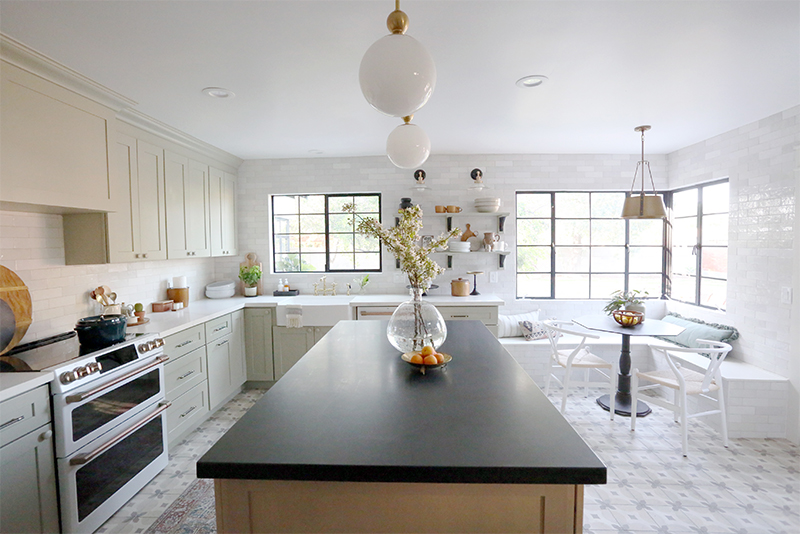
We are SO excited to reveal the kitchen today from our Evergreen flip project! We really wanted this space to feel more traditional and cottage-y with modern touches. I’m so happy with how it turned out! I love this sweet and functional space!

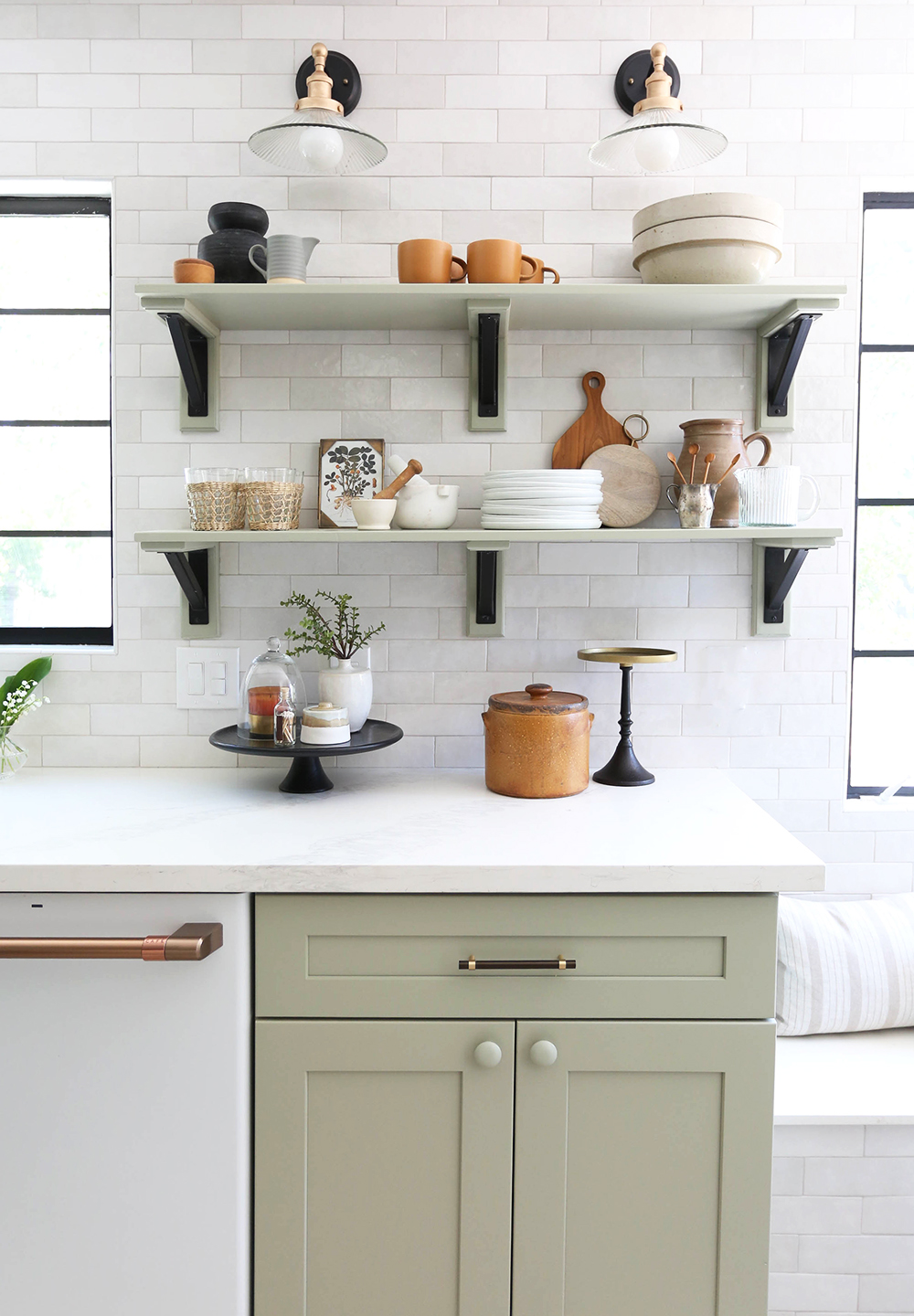
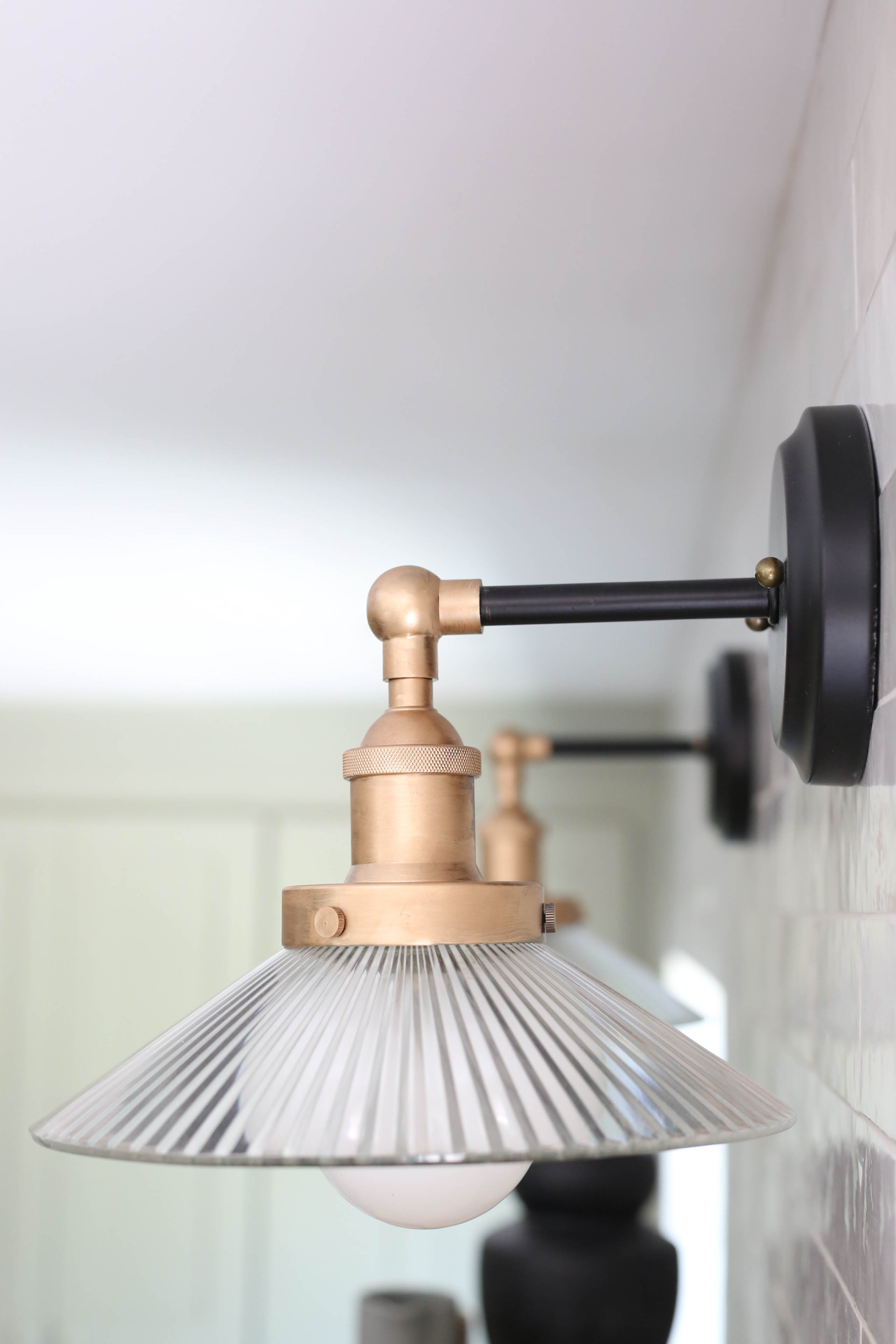
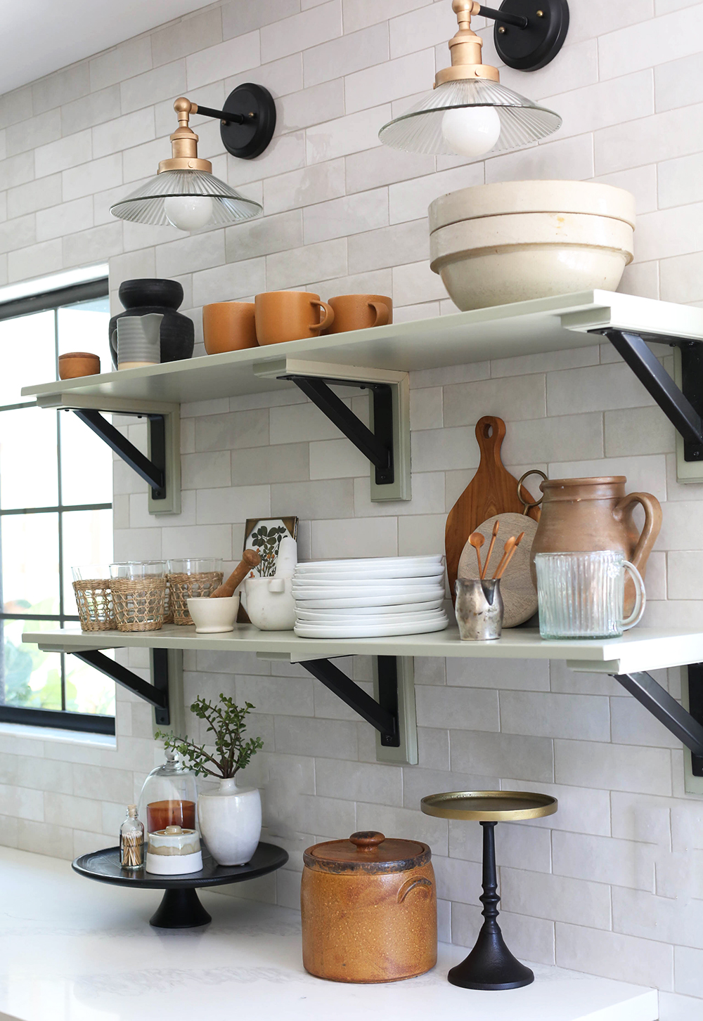
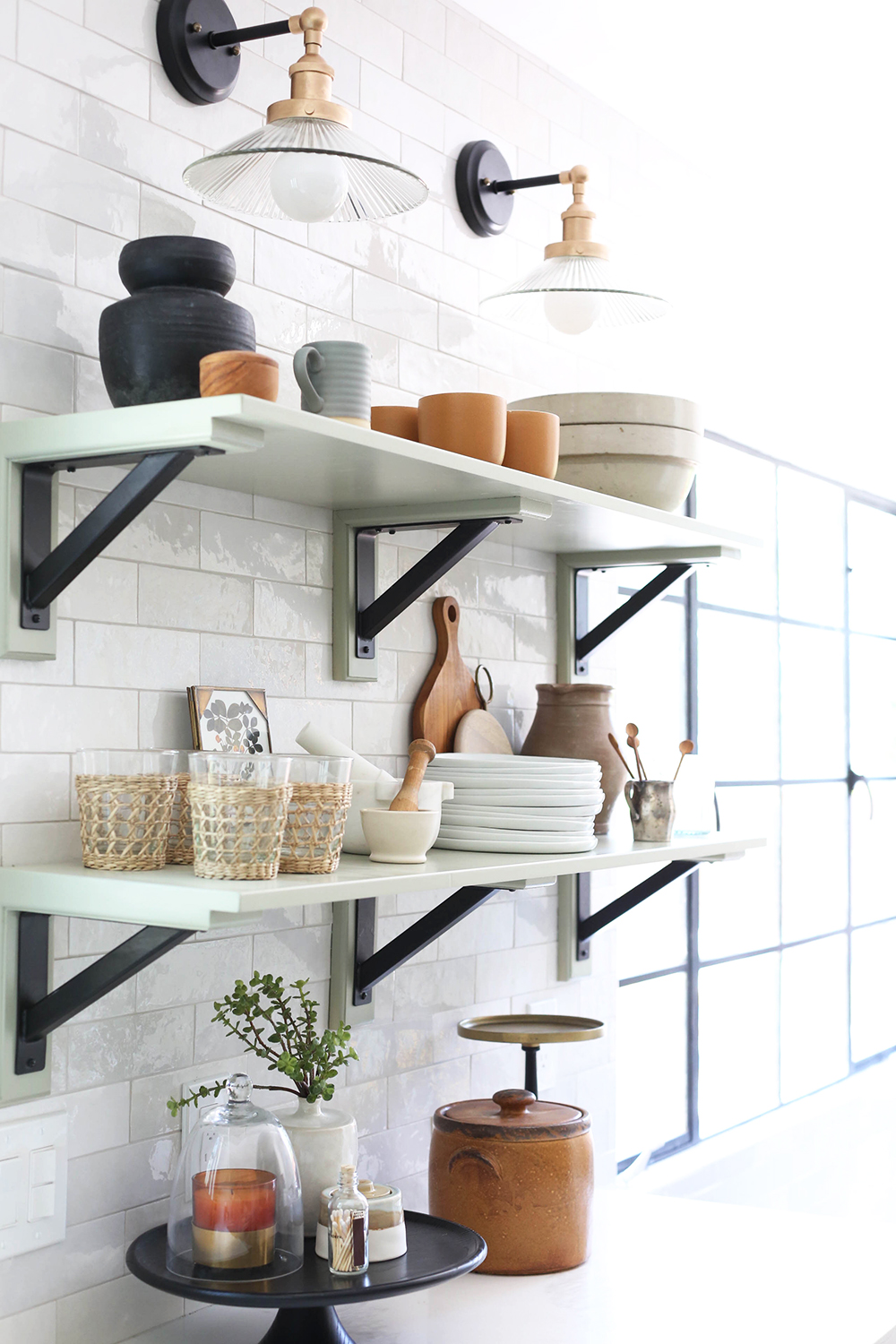
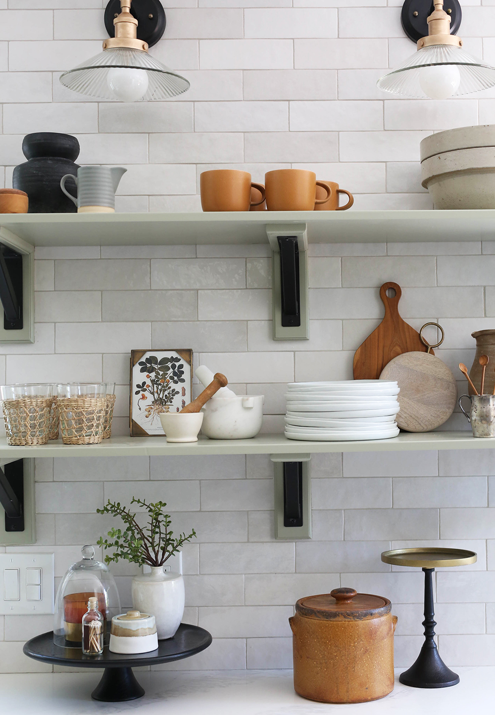
sconces // wall tile (similar) // black and brass handles
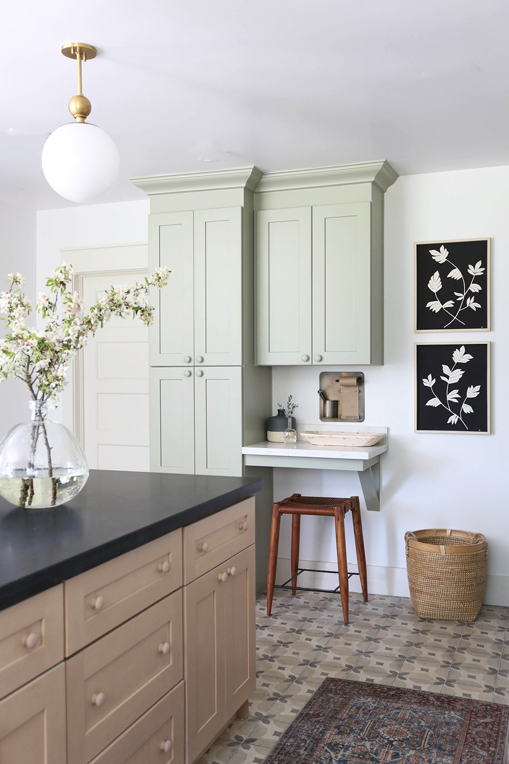
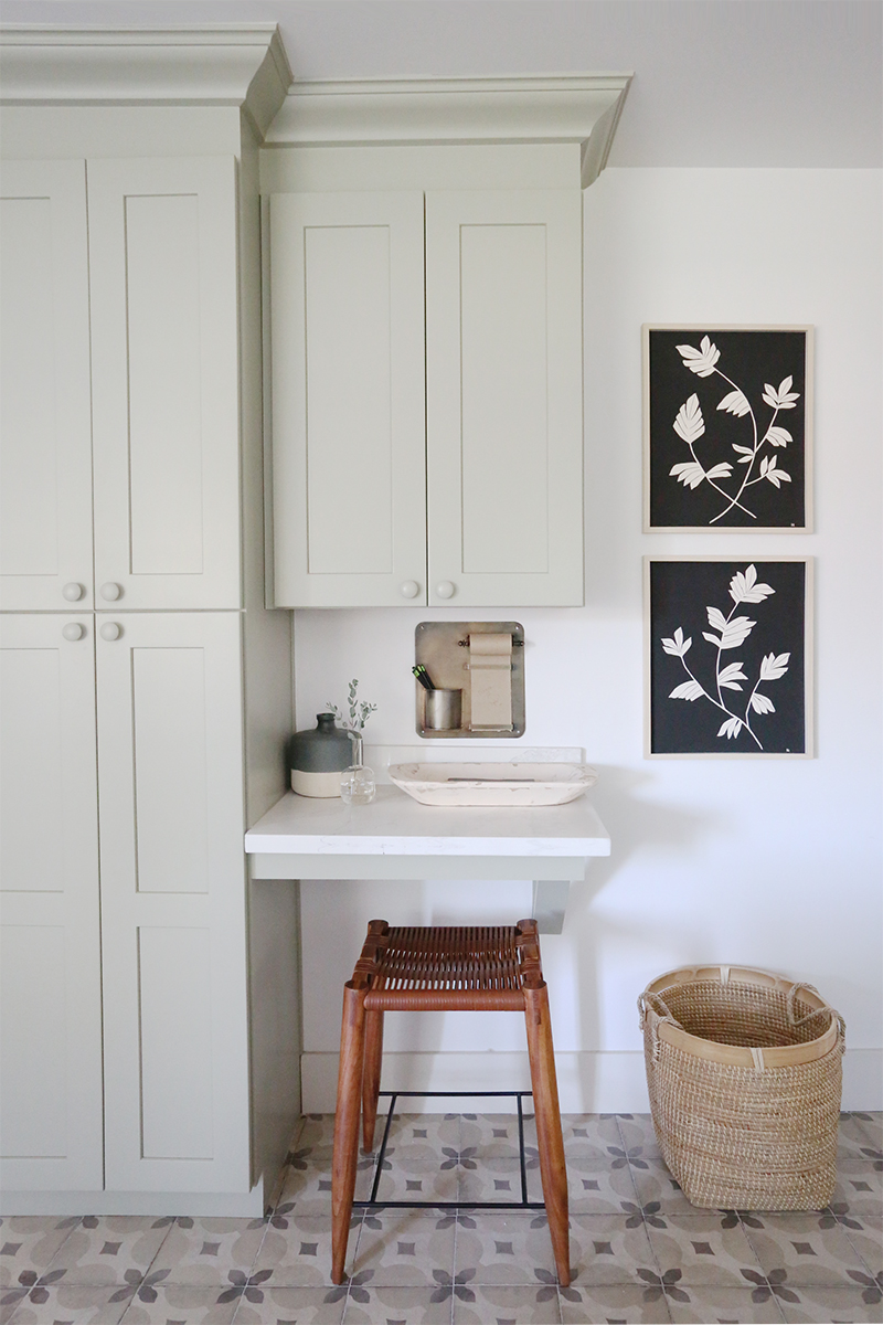
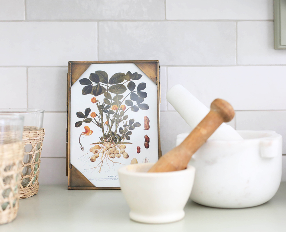
BOTANICAL III print // BOTANICAL IV print
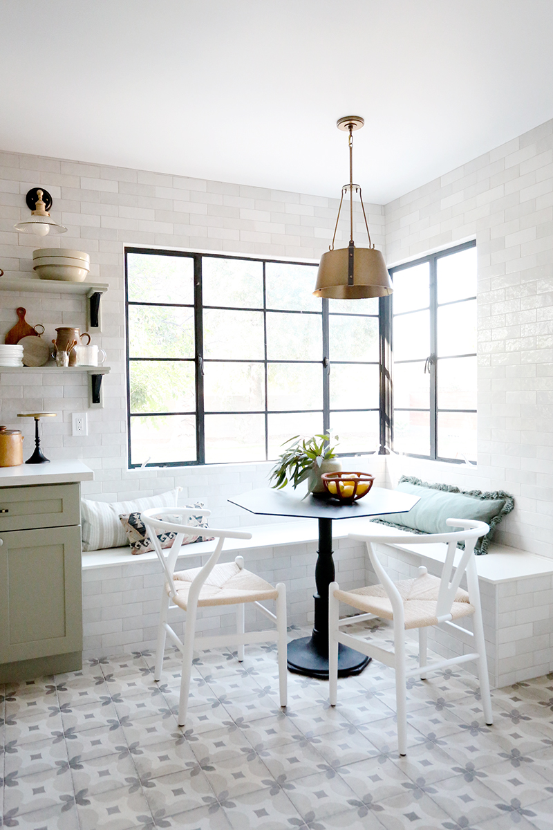
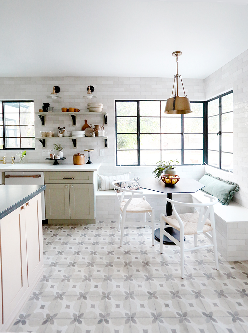
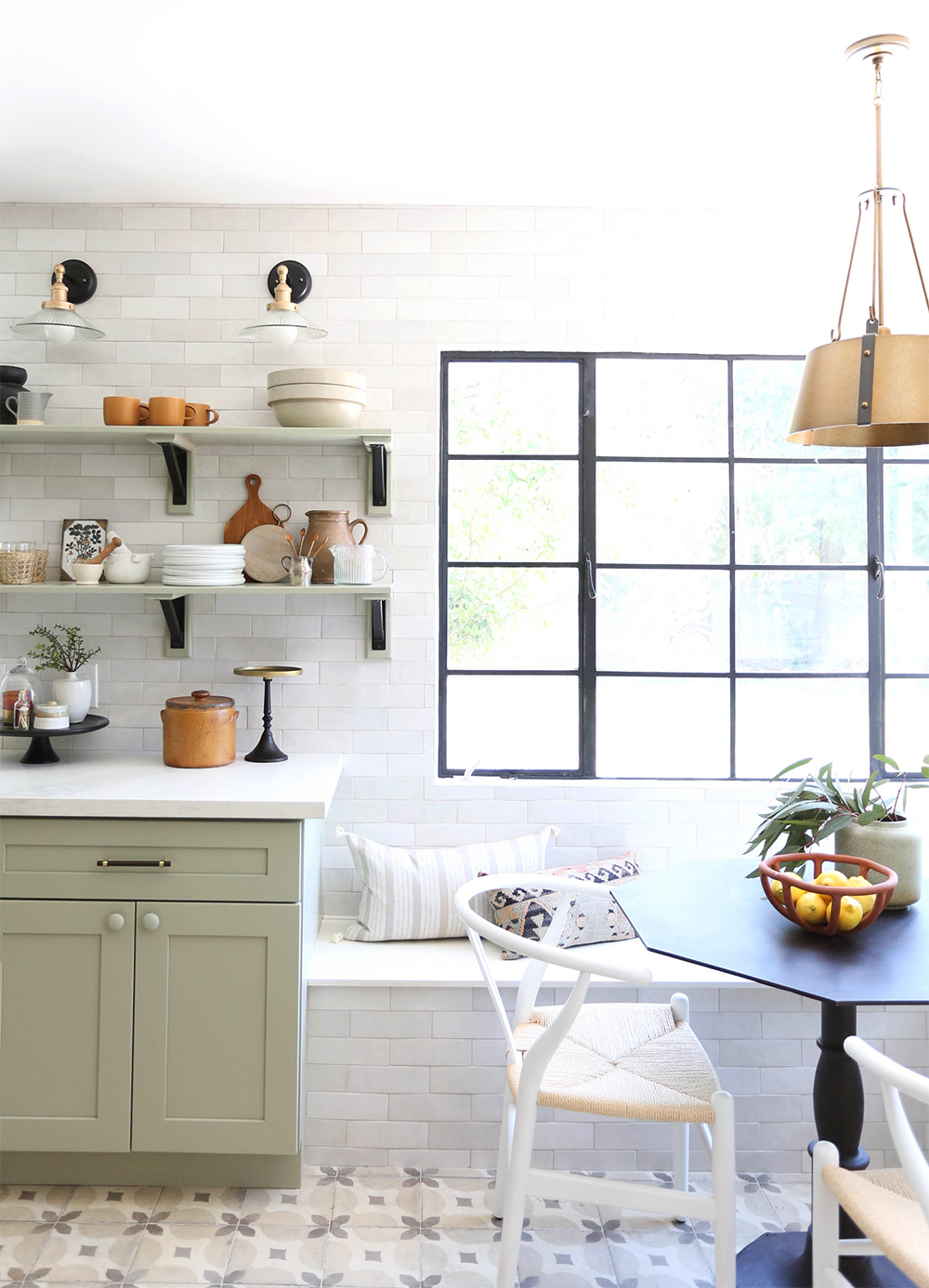
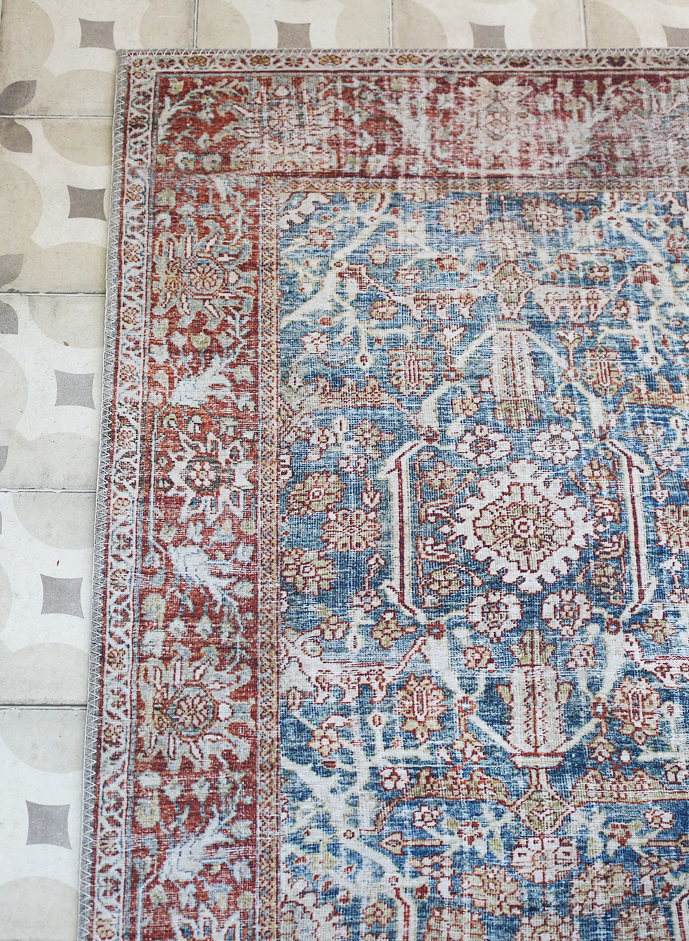
runner // pendant light (similar)
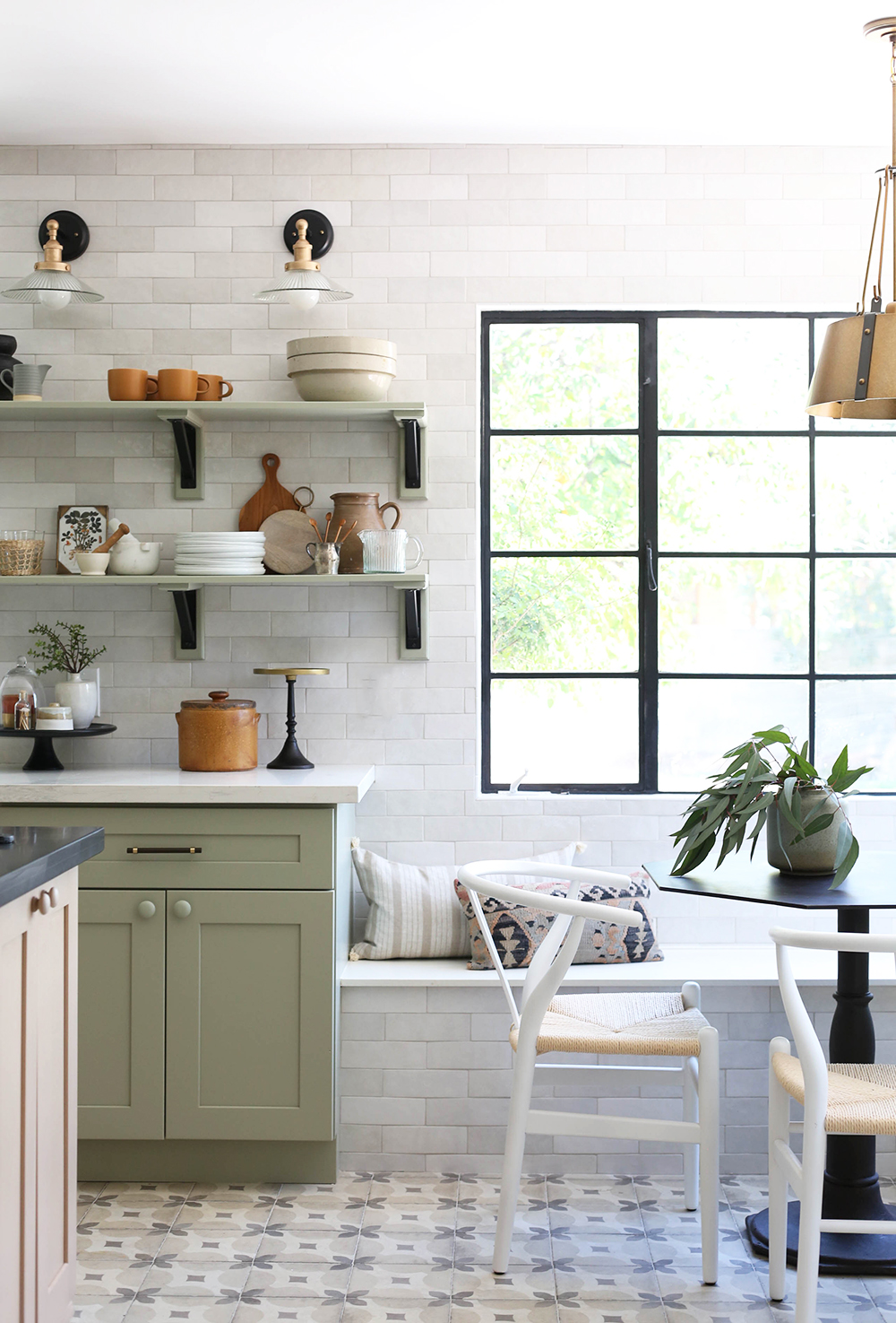
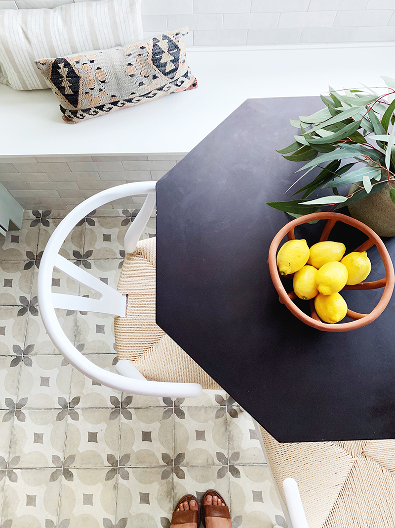
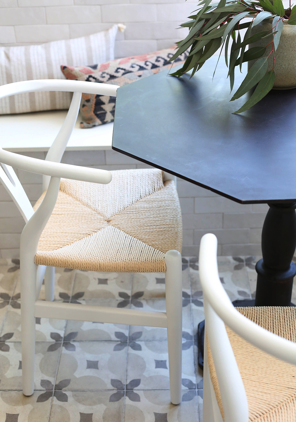
floor tile (similar) // chairs // bistro table (similar)
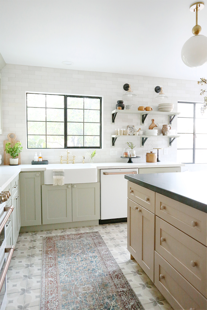
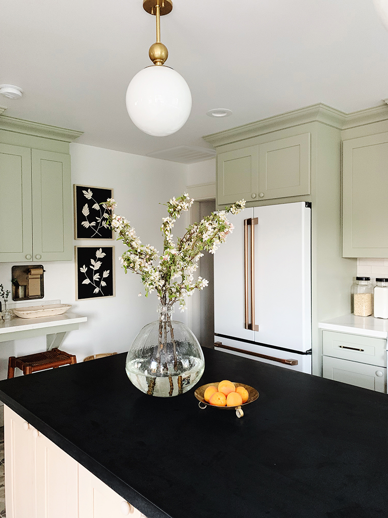
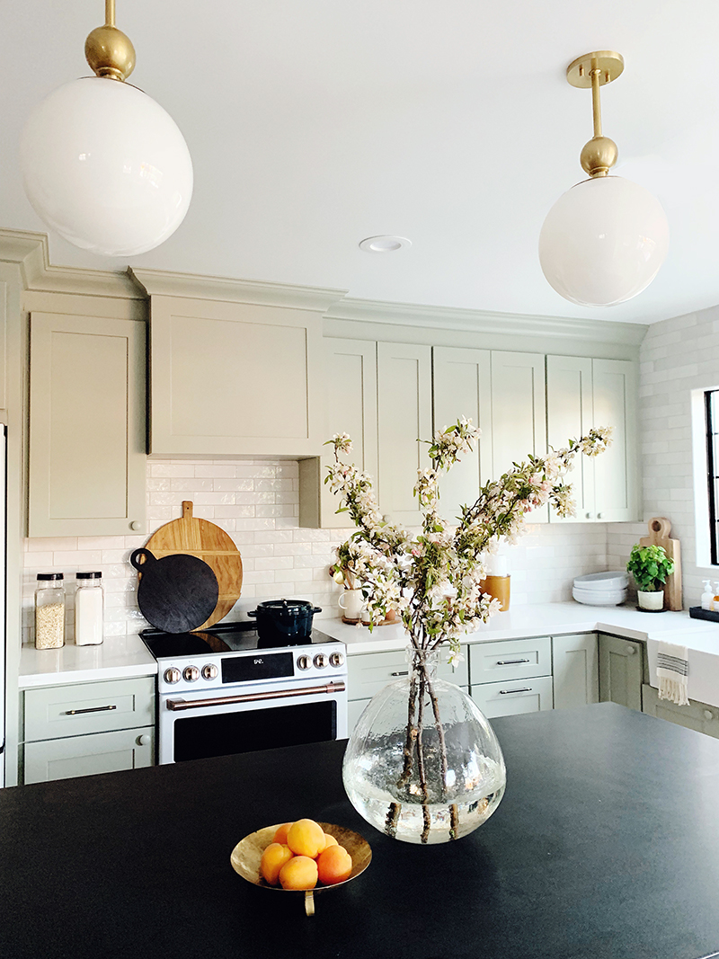
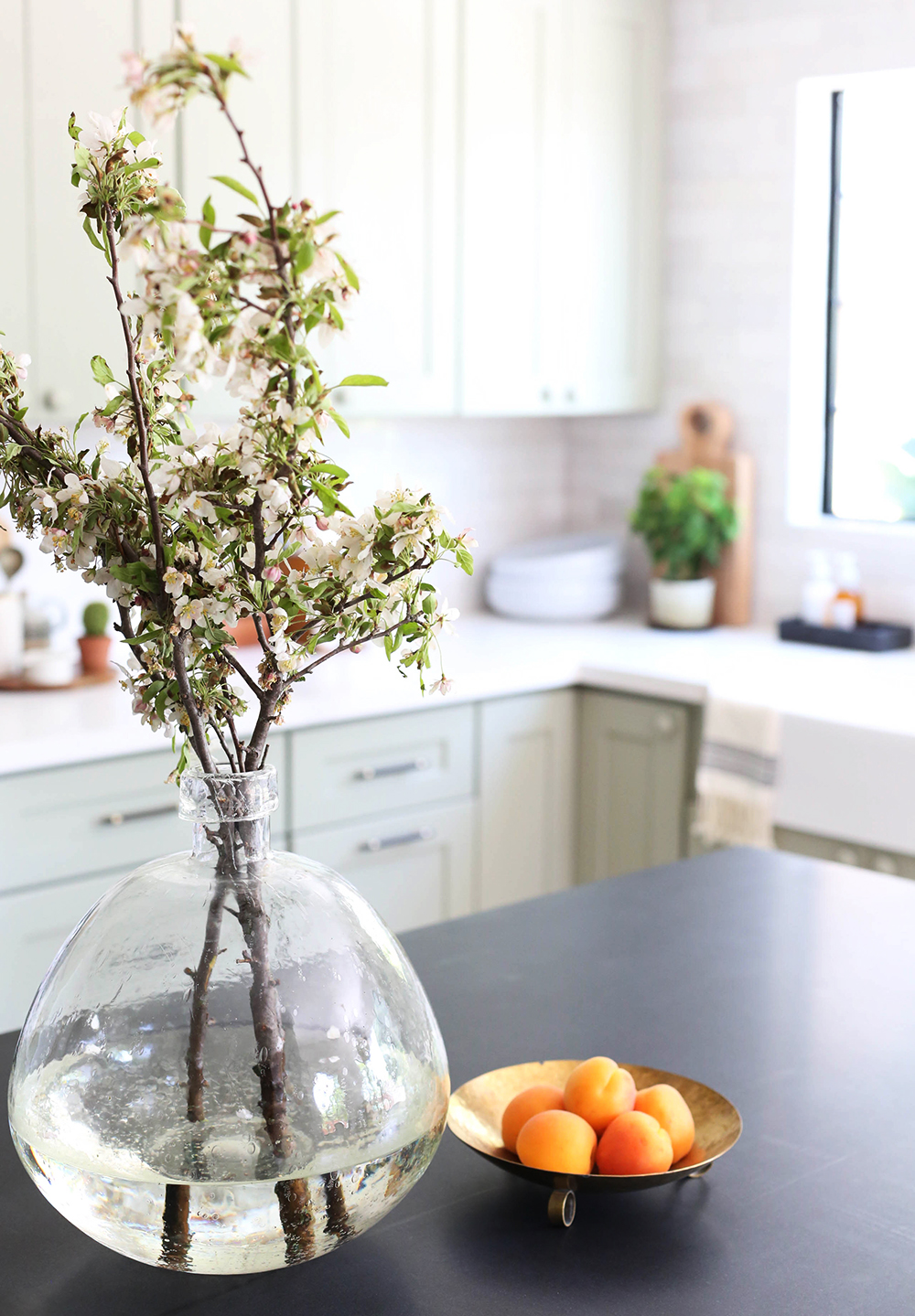
vase (similar) // refrigerator // brass bowl (similar)
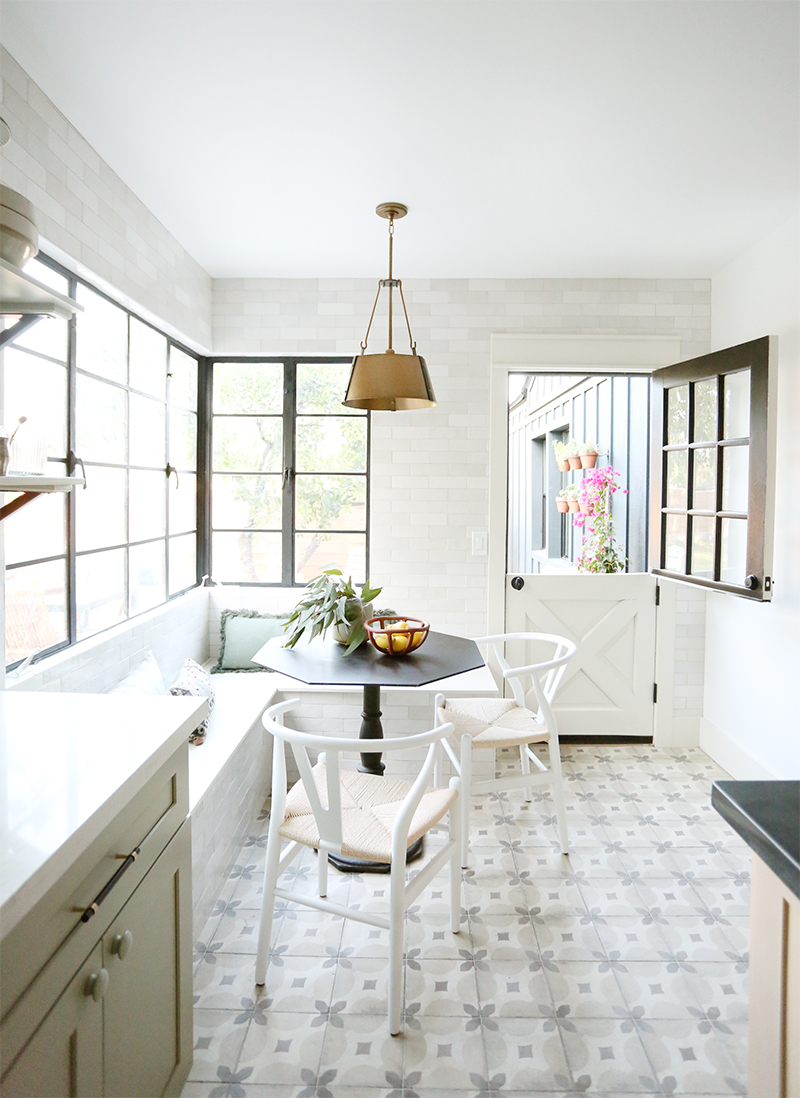
table (similar) // chairs // brass pendant light // vase (similar) // bowl
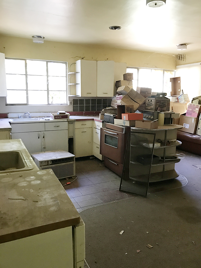
Ready for some crazy before photos? There were two sinks in here, some serious water damage and how about that carpet?!
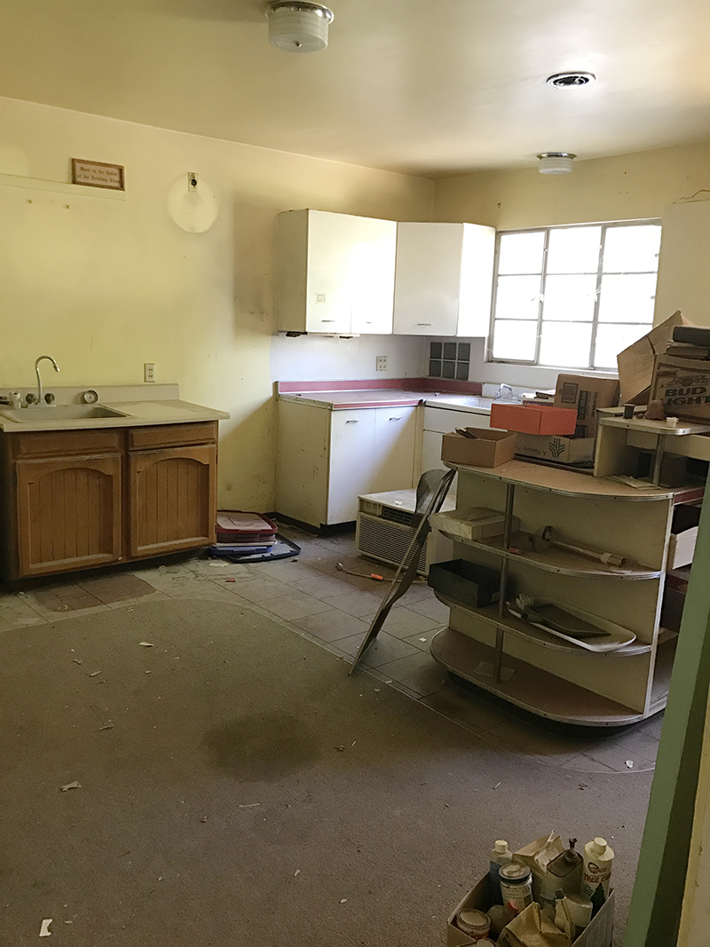
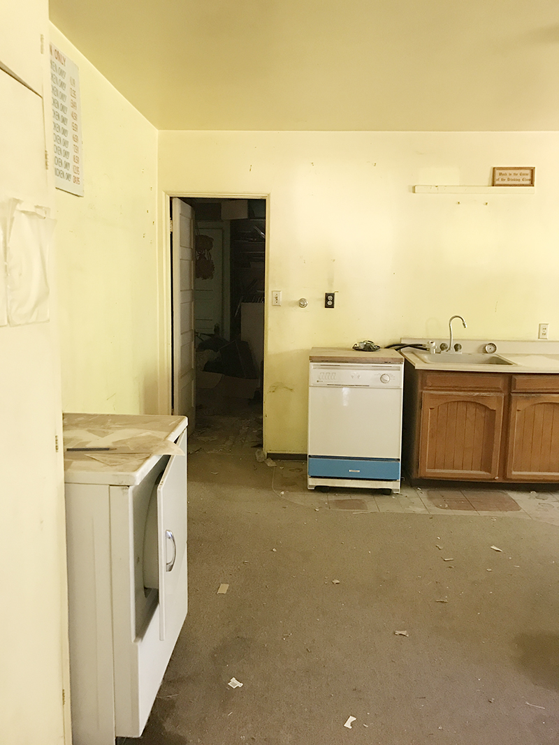
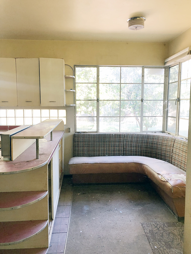
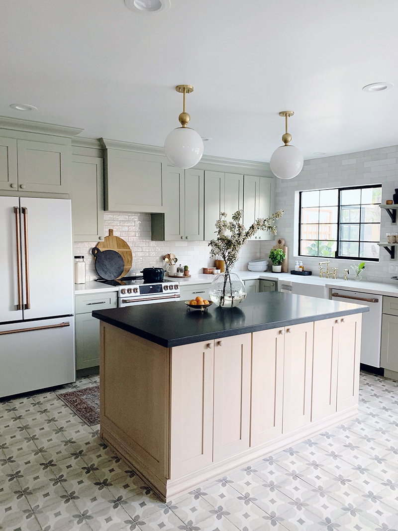
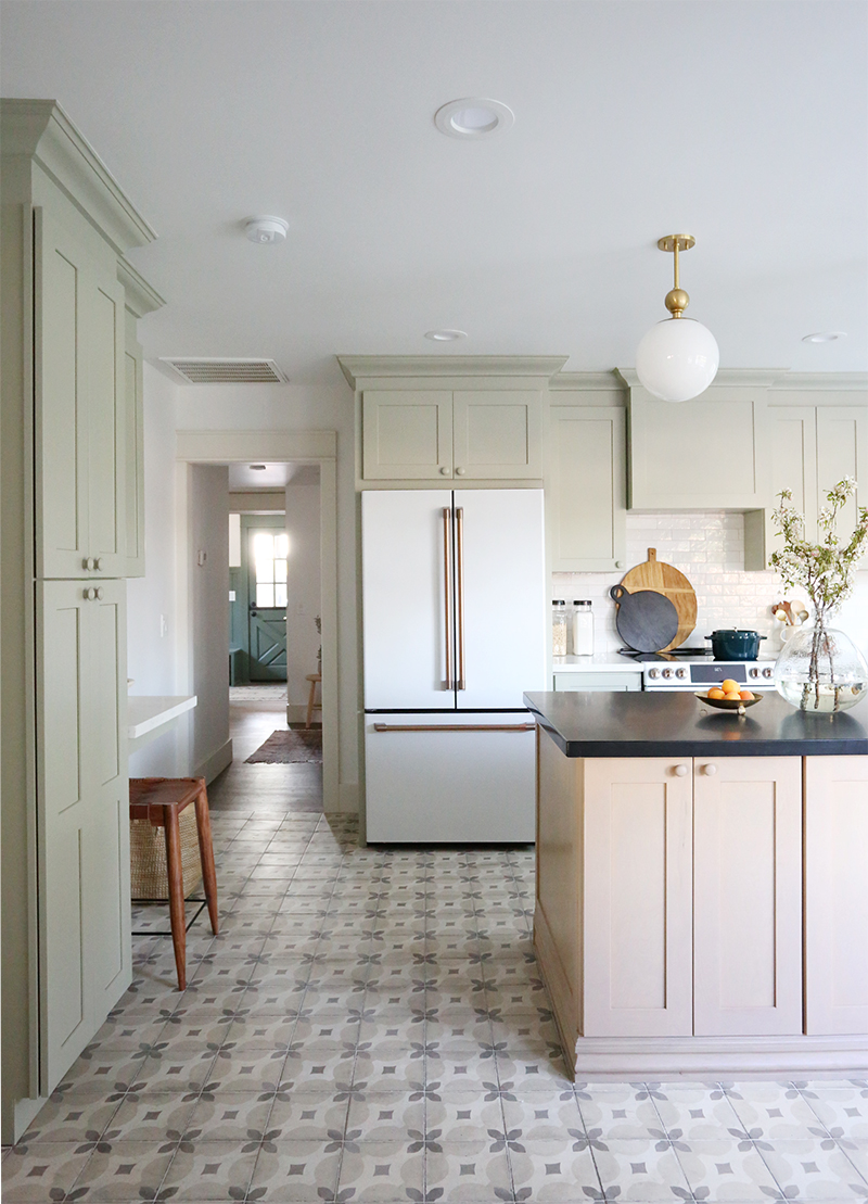
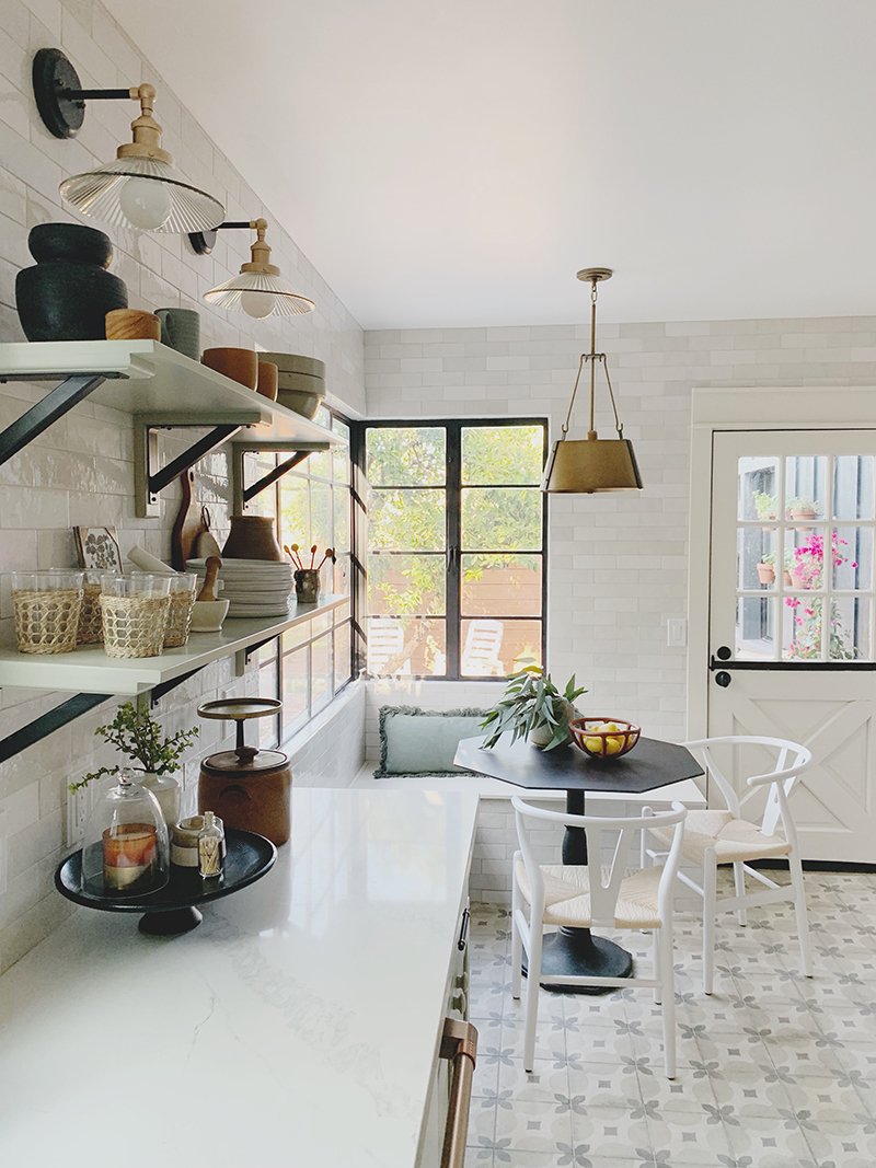
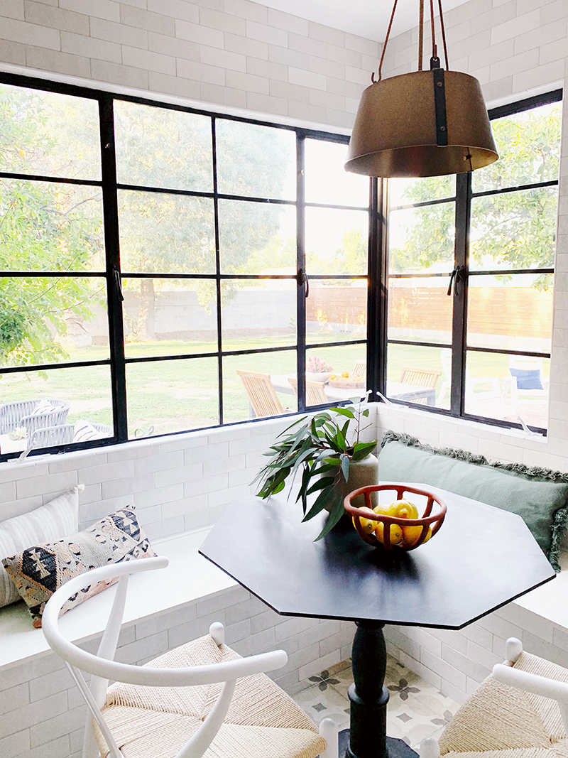
We were really lucky though that we didn’t have to change the footprint in here. I was actually pretty shocked when we first walked through that a 100 year-old house had such a large kitchen! We just needed to move a window a few inches and we opened up a few of the doorways, but that’s it for structural changes! I loved the original corner banquette concept and opted to recreate that space, which also allowed us to skip barstools at the island in favor of more storage (and a prettier view of the kitchen from the front rooms – it’s not fun to be a slave to straightening up barstools!).
Here are some wide shots to give you a sense of how the space flows:
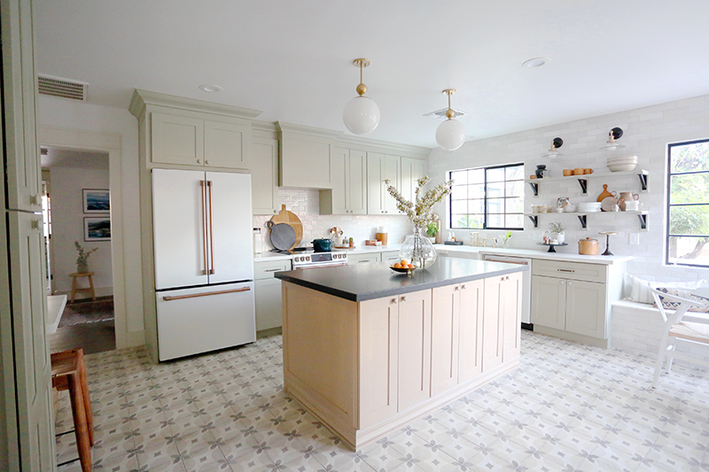
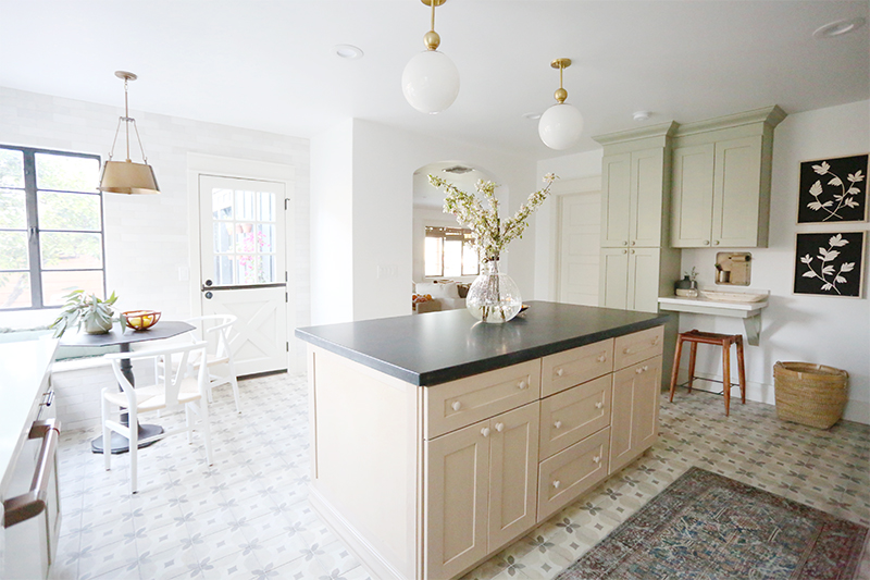
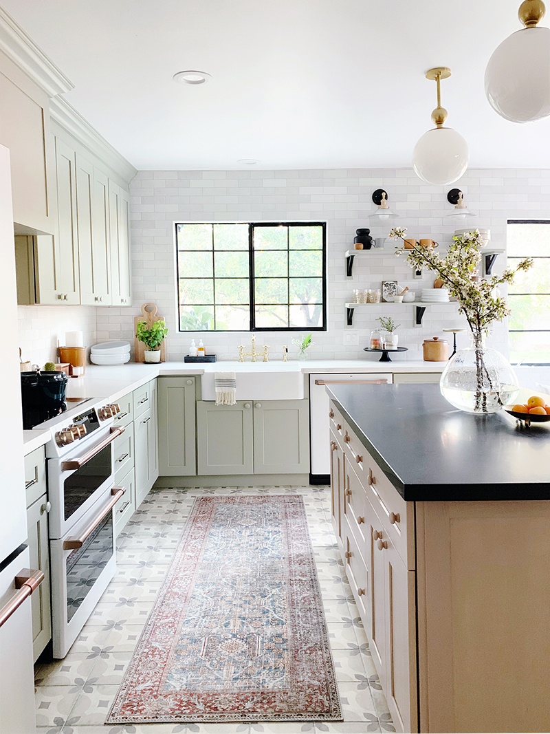
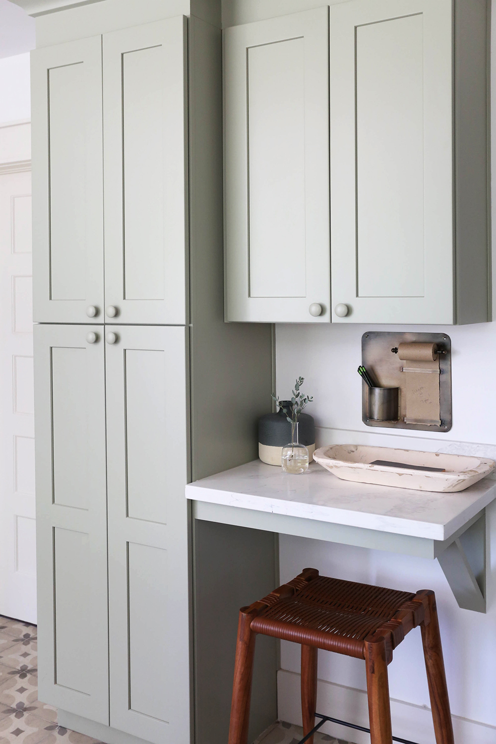
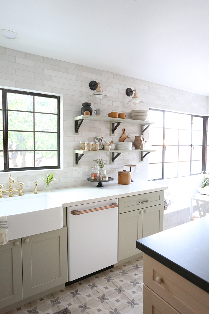
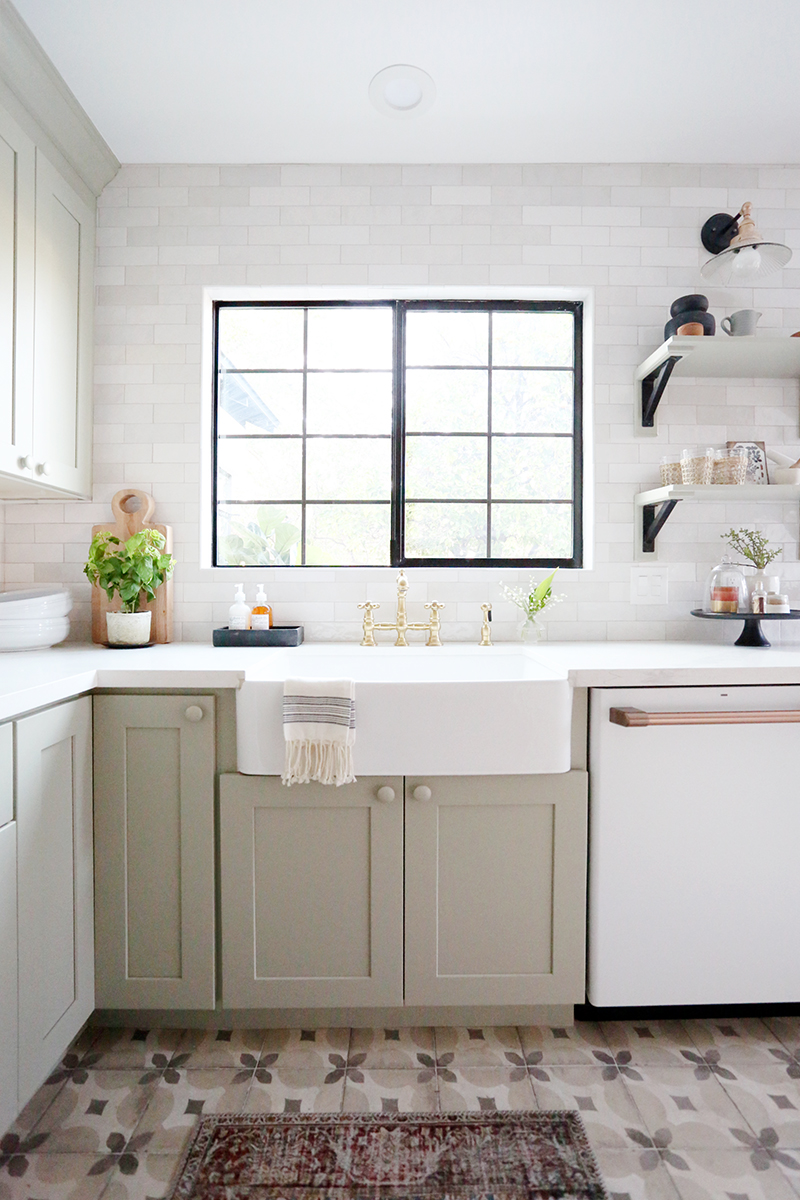
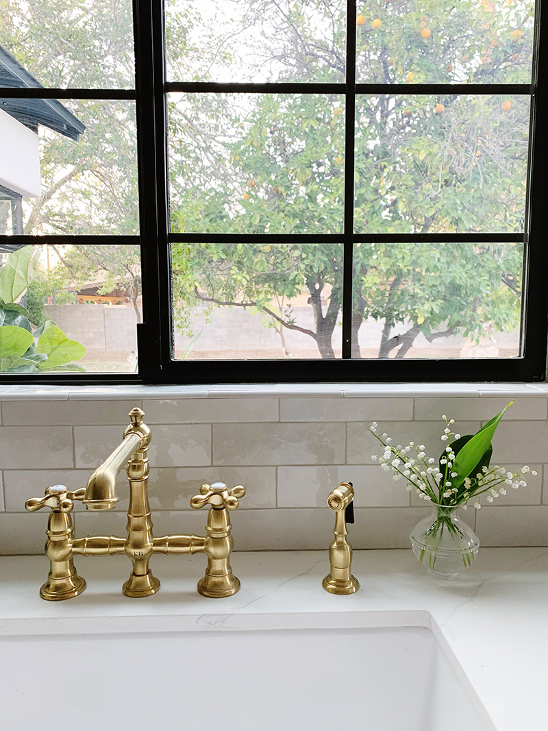
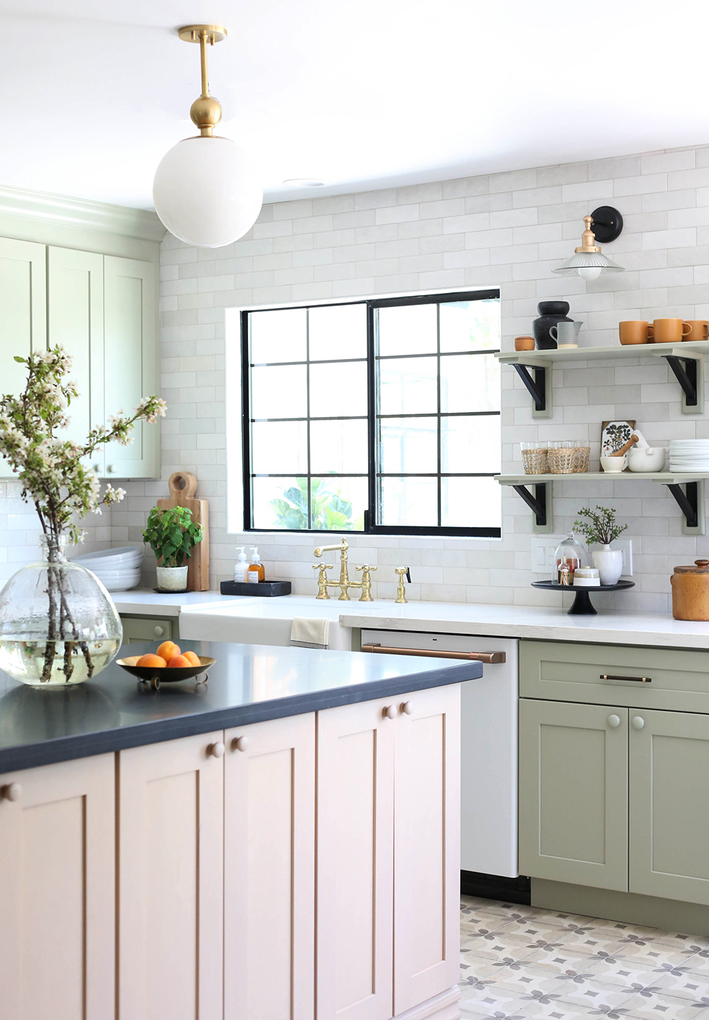
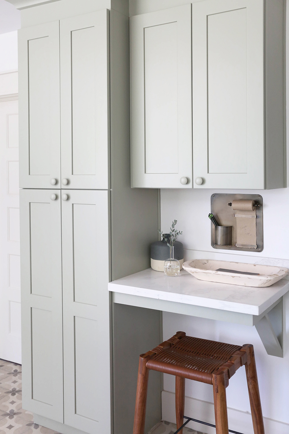
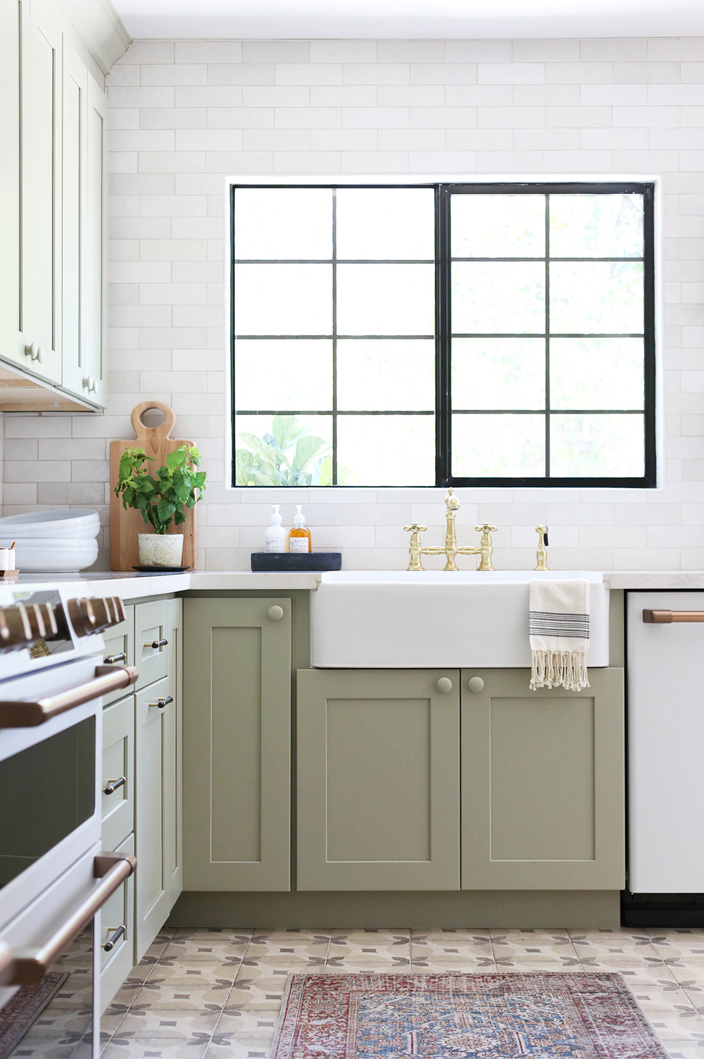
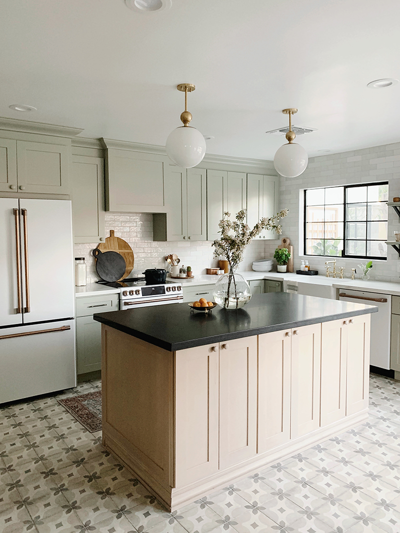
When designing a kitchen layout, I always like to have the sink in front of the window if at all possible and the range as the center focal point. I fill in the fridge wherever makes the most sense after that. In this space we also had room for a pantry hutch and little desk area to keep mail and cook books.
My biggest tip for selecting kitchen colors and finishes is to let your starting point be whatever is the hardest thing to source (or the hardest thing to change in the space if you’re not starting from scratch). For us, the trickiest selection was the floor tile, for sure. I wanted a patterned tile, but I wanted something more affordable and durable than cement tile. We totally scored with this neutral patterned porcelain tile (similar) that was only $5/ft! Once we figured out the tile, it was easy to pick cabinet colors, wall tile and and counter material from there. When you start with the tricky part, the rest of the design will fit together like puzzle pieces. Because we all see so many amazing kitchen designs on Pinterest all the time, it can be hard to narrow down a favorite color or material when it feels like there are infinite wonderful options! But this approach makes it easier to eliminate good options in favor of the right-for-the-house option.
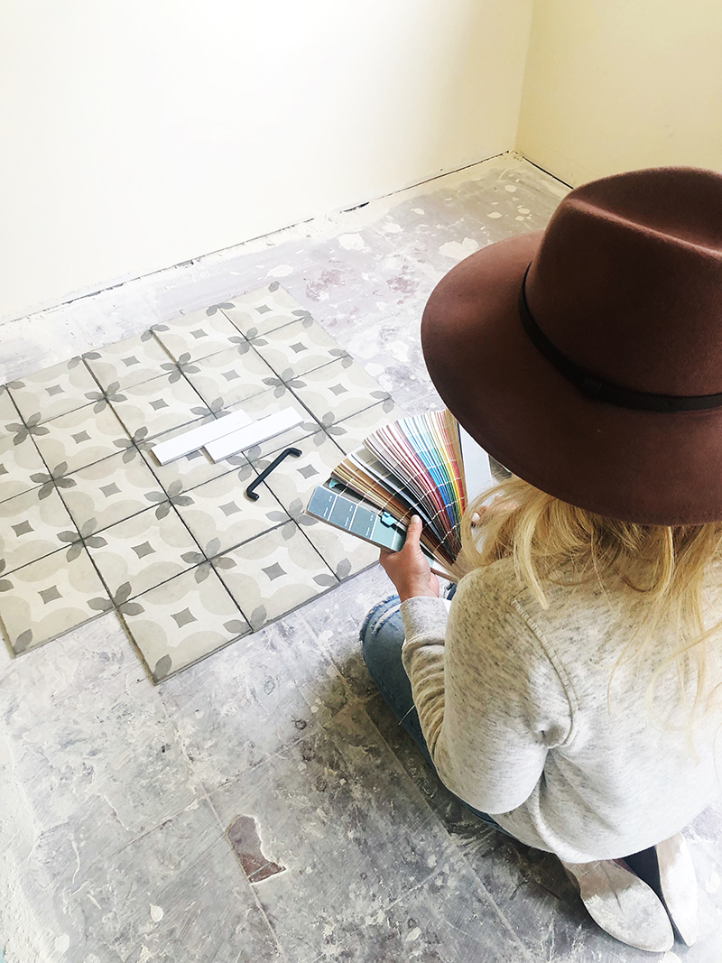
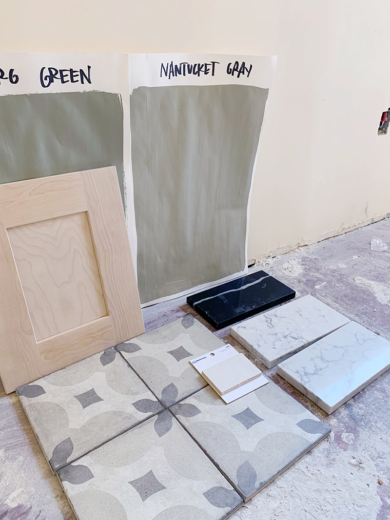
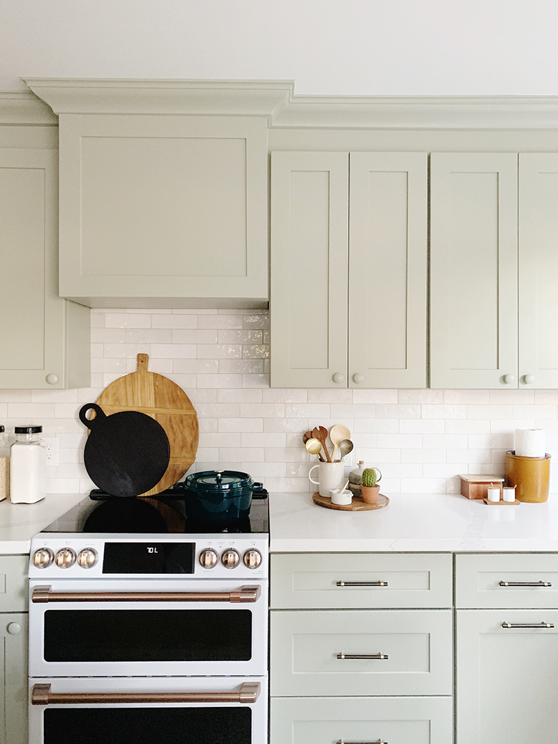
Once we got the floor tile samples in, we saw there were some green undertones in the tile and that gave me the idea of doing a sage green perimeter cabinet color. (See what I mean about how once you make the hardest decision first, it’s easier to narrow down options?!) Our cabinet company, CabCo Cabinets, offers unfinished maple cabinet options, so we went with a gray-blonde island to mix things up a little. We actually had our painter brush on a gray-beige acrylic paint wash on the raw wood cabinets and I really like how it turned out! It adds a lot of warmth to the room without darkening the space. And to add to the cottage/traditional look, I chose painted and stained wood knobs for the cupboard doors and all of the drawers on the island. I love, love, love this look!
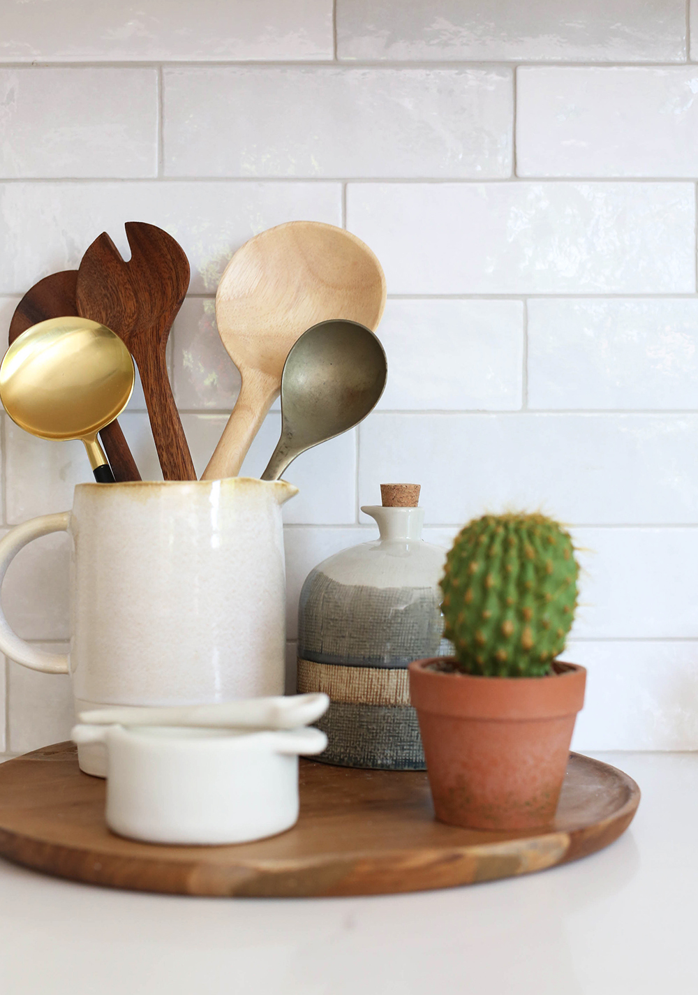
wood bowl // brass hanging note roll
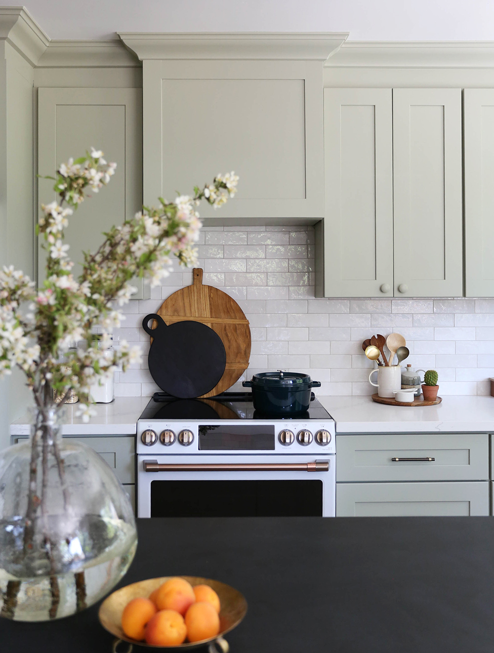
Another way we worked to keep the space light was with the matte white Cafe Appliances. They are GORGEOUS and every single person who comes through the house has asked about these appliances! They come in a few different smudge-resistant matte finishes and the handles are customizable as well – I selected the Brushed Bronze option. I only wish this house had a gas line because I LOVE their gas burner range, but the double convection/induction ovens on our electric range are pretty amazing. The fridge is my absolute favorite – the proportions are perfect – and I love that it has a water dispenser on the inside for a solid front door! I couldn’t recommend the Cafe line more if you want a high end look at a more affordable price point.
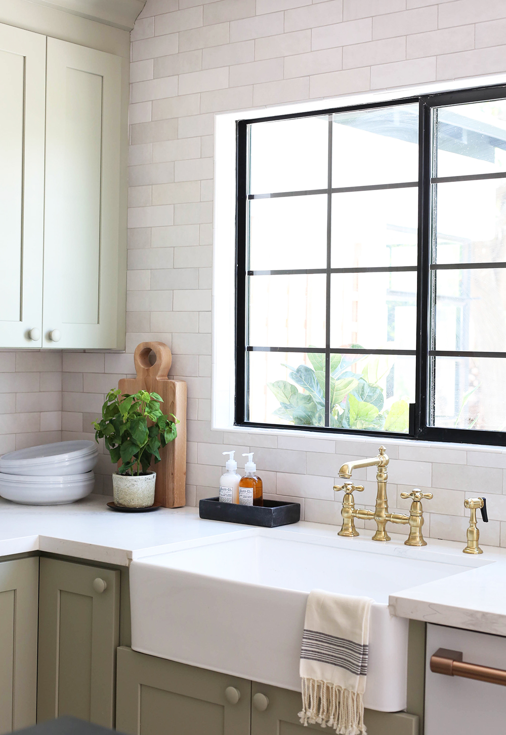
sink // brass faucet // sconces

large bread board (similar) // black bread board (similar) // dutch oven
I love to mix metals and finishes in a kitchen – I think when it’s done right, it makes a kitchen look more custom and less cookie cutter. I used a lot of brass finishes in the lighting and on the appliances, and a little black/bronze in there too with the drawer pulls and shelf brackets. I think little hits of black keep the eye moving around a space and provides some good balance.
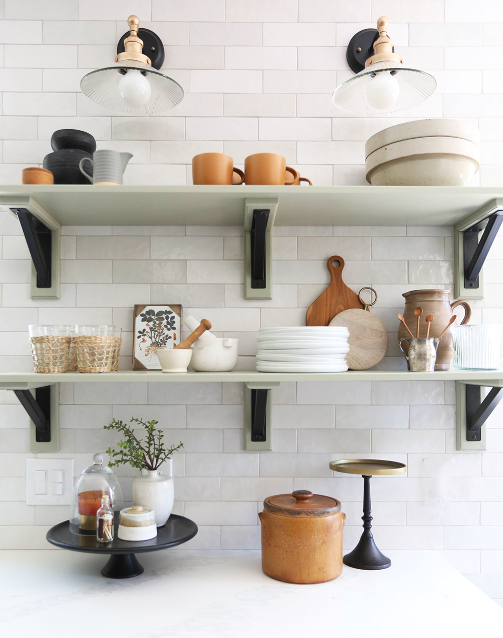
seagrass cups // mortar & pestle (similar) // white plates // mini wood spoons
candle // cloche // black & brass cake stand // sugar bowl (similar)
BOTANICAL III print // BOTANICAL IV print
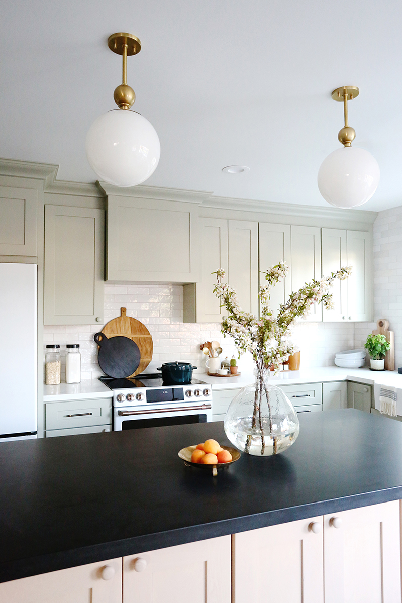
Speaking of black and high contrast, we went with white quartz from MSI called Calacatta Venice for the perimeter countertops. It’s affordable and much easier to maintain than marble but gives a similar look. I like the subtle veining in this one! For the island we found a black honed granite remnant and I love the mix of materials! Granite is a total workhorse in a kitchen, and I love honed jet black granite the most because it doesn’t have any speckles and can pass for soapstone or honed black marble, which are much more expensive materials.
seagrass cups // mortar & pestle // white plates // mini wood spoons
candle // cloche // black & brass cake stand // sugar bowl (similar)
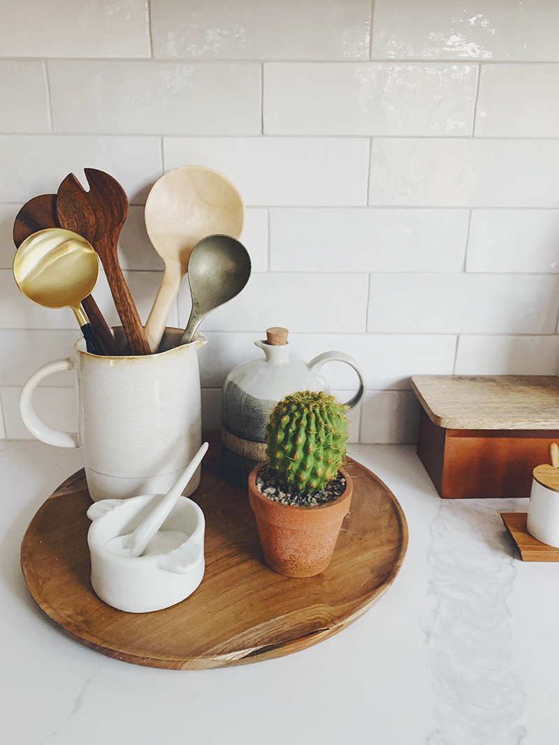
salt holder (similar) // copper box (similar)
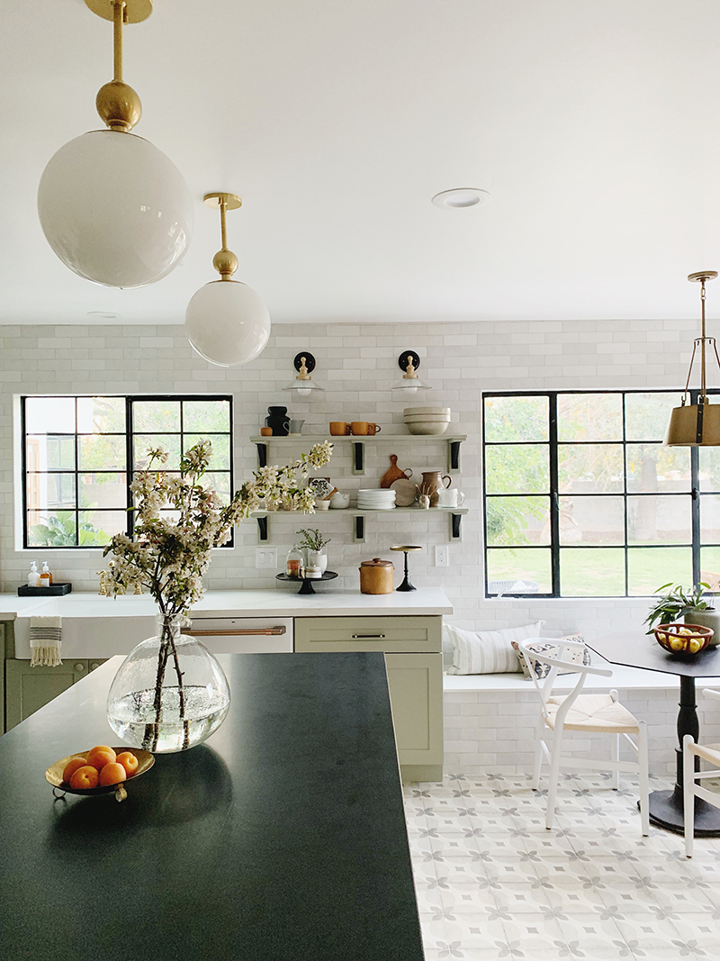
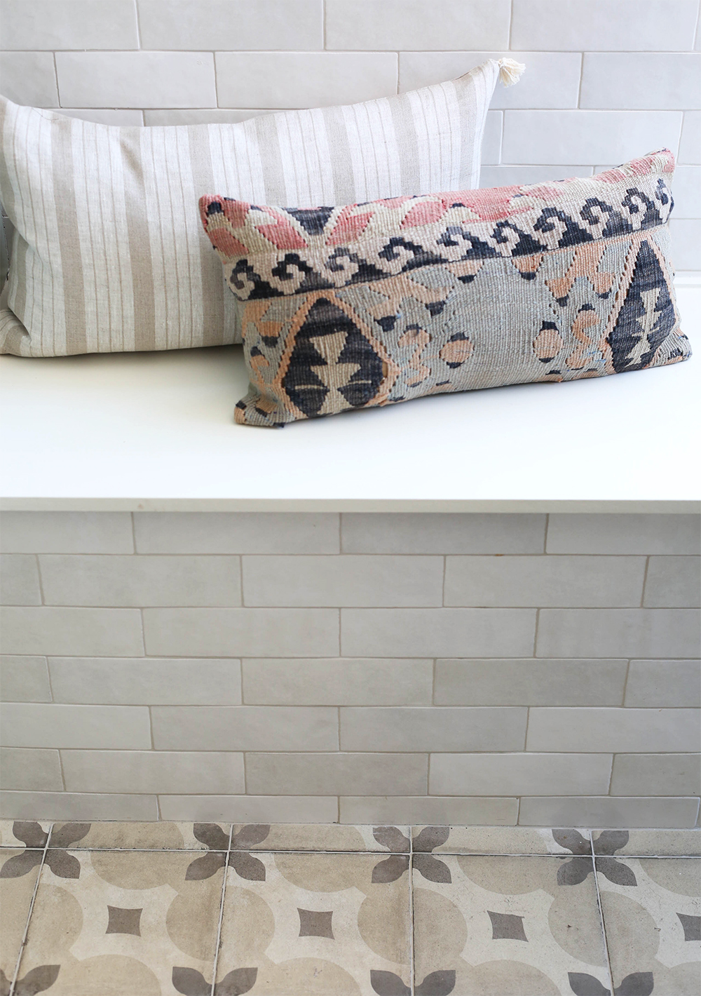
The backsplash is another favorite moment in the design for me. We opted for floor to ceiling handmade subway tiles from Bedrosians Tile. We even installed the tile on the front of the banquette bench! The tile is from Bedrosian’s Cloe line in White and we used Mapei Alabaster grout. The subtle color variation in the tiles is my absolute favorite. It adds such a beautiful, textural layer to this space. And the price is so, so reasonable at under $7/ft. I’m obsessed and can’t wait to use these tiles again in another project. Maybe the square size? And maybe the pink or the blue next time?!
chairs // brass pendant light // vase (similar) // bowl // green lumbar (similar)
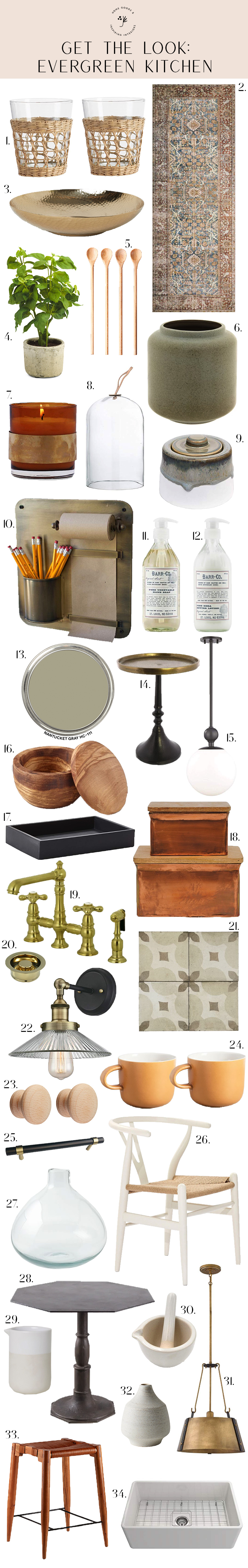
My final tip is to save some room in your kitchen reno budget for pretty organizational items and accessories for styling, which absolutely put the finishing touch on any kitchen! Even just a little bit of styling for your surfaces will help to cozy up your kitchen. We’ll be sharing more how-to’s for kitchen styling soon and on the @juniper.home instagram account, because heaven knows this post is loooooong enough already! :) We’ve tried to round up all of the sources for you here, but for sure let us know if we missed anything in the comments!
seagrass cups // mortar & pestle // white plates // mini wood spoons
candle // cloche // black & brass cake stand // sugar bowl (similar)
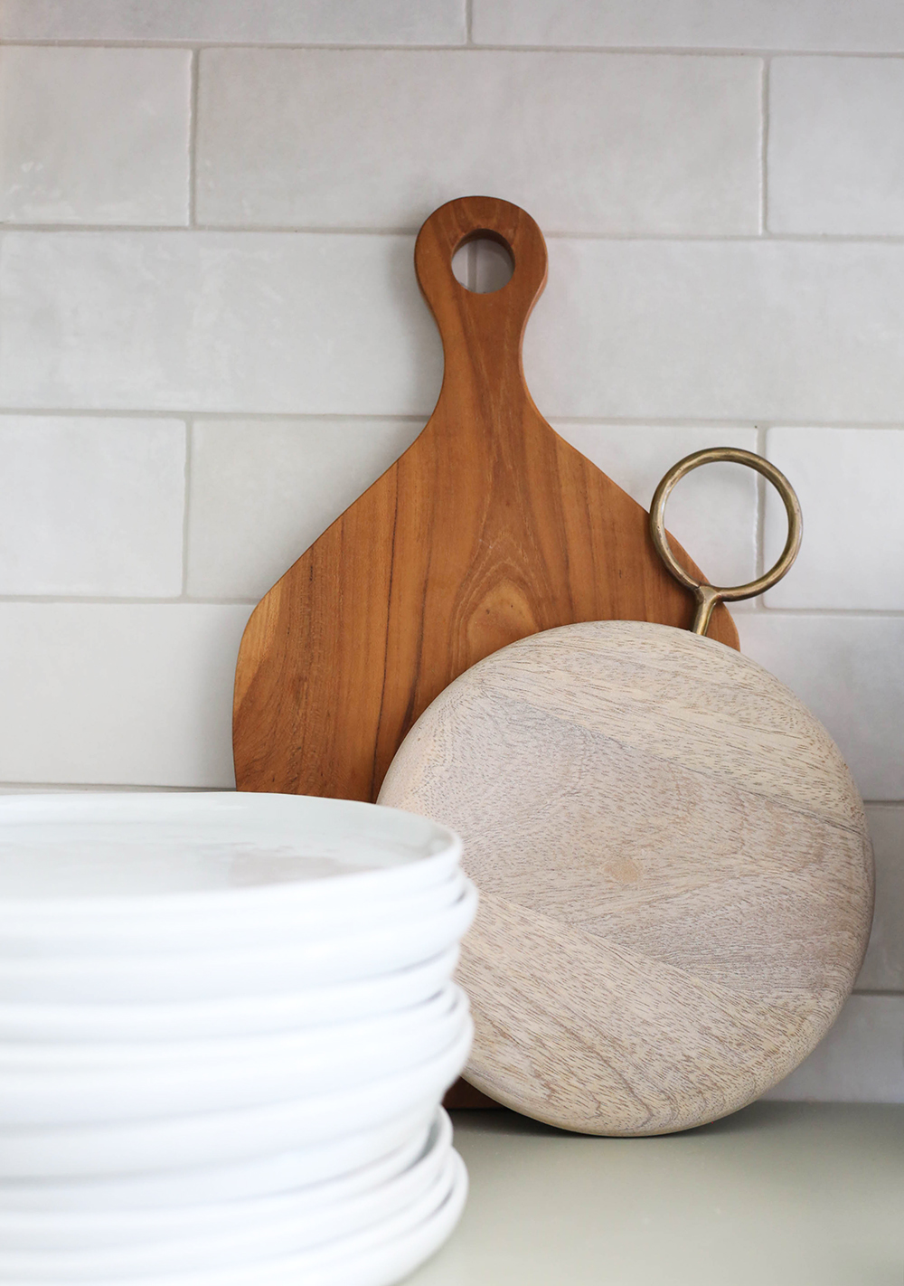
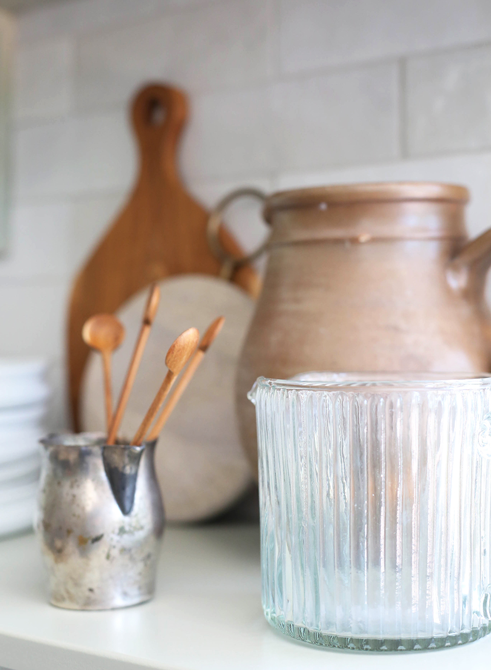
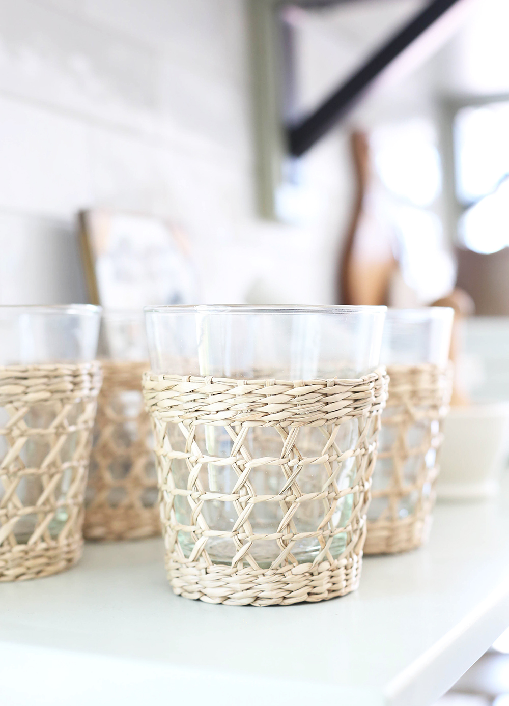
seagrass cups // mortar & pestle // white plates // mini wood spoons
candle // cloche // black & brass cake stand // sugar bowl (similar)
1 // 2 // 3 // 4 // 5 // 6 // 7 // 8 // 9 // 10 // 11
12 // 13 // 14 // 15 // 16 // 17 // 18 // 19 // 20 // 21
22 // 23 // 24 // 25 // 26 // 27 // 28 // 29


Hello! Beautiful kitchen! I keep coming back here to this post for more inspiration! Do you happen to know the name of the floor tile? The Wayfair link doesn’t appear to be working. Thanks!
Hi Jenny, what a beautiful kitchen! Can you share the source for the floral print/picture frame on the open shelves? It’s gorgeous!!
Hi Jenny! They should be all linked here. That print is a peanut plant botanical print we sell in Juniper print shop! :)
I’m wondering how that black granite in the island holds up on a daily basis with food spills and crumbs, etc. Does it show every little imperfection and water stain, and just constantly look dirty, or is it pretty forgiving?
Your kitchen is gorgeous! Can I ask a question? When it comes to home design, I am really “play it safe,” especially when it comes to hard-to-change things like tile. I am planning to use the Cloe white tile for my kitchen backsplash but am worried the gradations in tile color might be to “wild” for me (haha, I am SO vanilla). Do you think the differences in the shades of white are more pronounced, or less pronounced, in person as compared to photos? In everything I’ve seen online, it seems like people love how it turns out in their kitchens, but for some reason I am having trouble pulling the trigger! I guess maybe I’m just looking for some reassurance that it’s a beautiful in person as in the photos? :) Thanks a million!
Hi Colleen, These photos are a pretty accurate portrayal of the color. There is color variation for sure, but it’s subtle!
first off, thank you! i’m doing a remodel including 3 bathrooms and our kitchen and have been using your site and all the remodel resources a ton. can i ask about the hood? did you have your cabinet maker custom make it? also what is the grout color? i’m using the same tile as a backsplash. thank you!!!
We just had our trim carpenter make the hood. We used Mapei Alabaster for the grout!
Hi!
Quick question on the floor tiles. Did you get the color in “warm fiore” or “cool fiore”??
The links takes you to cool fiore but in the picture, they look more like the warm?
Thank you in advance!
Beautiful design! We bought the white cloe tiles for our kitchen as well. Would you mind telling me what sized grout spacer you used here? Thanks!
I think we used 1/16″ spacers! Very slim.
Hi Jenny, this space looks so wonderful! I started following you after I found your print shop, and this kitchen is so inspiring! Do you mind sharing what paint colors you used on the walls/ceilings in this space? I love the cloe tile and white ceiling, but whites are so hard to pick.
Hi Wendy! Thanks for reaching out and for your kind words! We used Chantilly Lace on the walls and ceiling in here. It’s my favorite white! :)