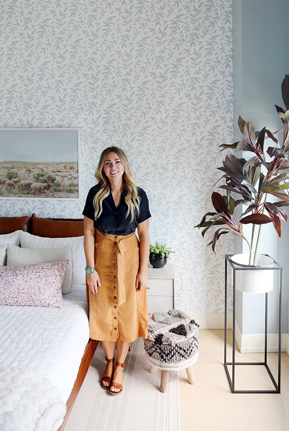
A few months ago, Real Simple magazine reached out to see if I’d be interested in designing the kid’s room in their first #RSHome show house. Of course I was THRILLED to participate, especially when hearing about the other designers working on the other spaces including Nate Berkus and Jeremiah Brent, Studio McGee, Sabrina Soto, Home Polish, The Decorist, Robyn Henry, Donna Garlough and The Neat Method. Such an inspiring group! And it didn’t hurt that the show home was going to be held in the most stunning penthouse apartment at 550 Vanderbilt Avenue in Brooklyn’s Prospect Heights! :) The HUGE spread on the entire show house is in the new October issue of Real Simple, so go grab a copy to see all of the other spaces! Here are a few more photos of my finished room. If you’re looking for the behind the scenes when we installed this space, check out my insta stories highlights called REAL SIMPLE HOME.
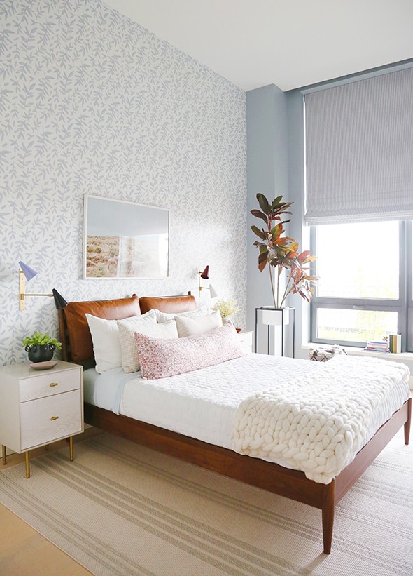
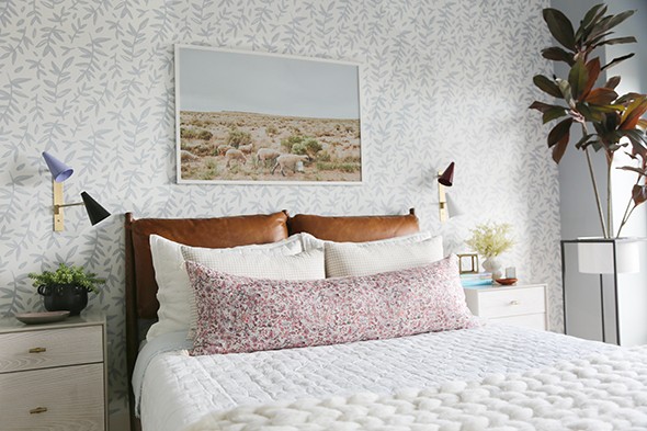
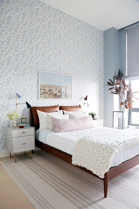
COUNTING SHEEP print // WILDFLOWER lumbar
rug // bed frame // white tufted quilt // blue sheet set
wall sconces // faux rubber tree
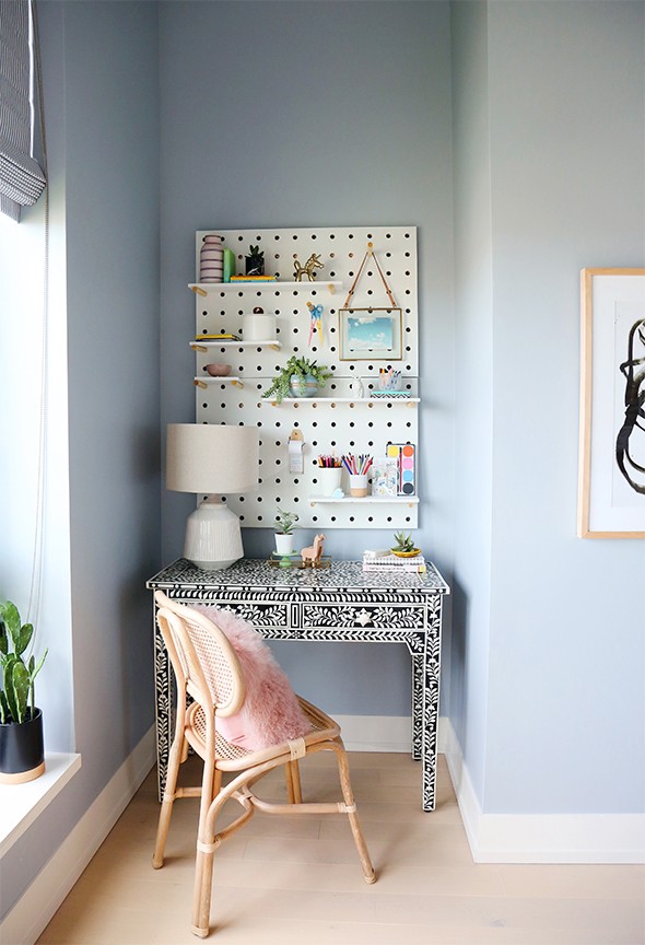
peg board // bone inlay desk // caned chair // pink fur pillow
faux potted cactus // lamp // hanging picture frame
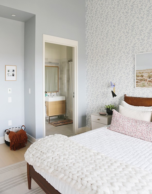
Since we didn’t have a real client to work with on this project, I had to imagine up a young girl we were designing this space for. Real Simple suggested a space for a pre-teen girl, which was easy for me, since I have two of those! I imagined this little girl to be an art-lover and a reader. I love using blue in girls spaces and I thought wallpaper would be so fun! I also wanted the space to feel slightly grown up. I talked about this in the article interview, but my biggest tip for designing kids spaces, is to invest in furniture that grows with your littles. It’s easy and inexpensive to switch out accessories and linens as the child grows. If you find furniture that is more grown up but still playful, you’ll be able to keep these pieces forever, like this beautiful inlay desk from Arhaus and the bed and nightstands from West Elm. I love these pieces in this space, but I’d love them equally in an adult’s room (like my own bedroom maybe?!)
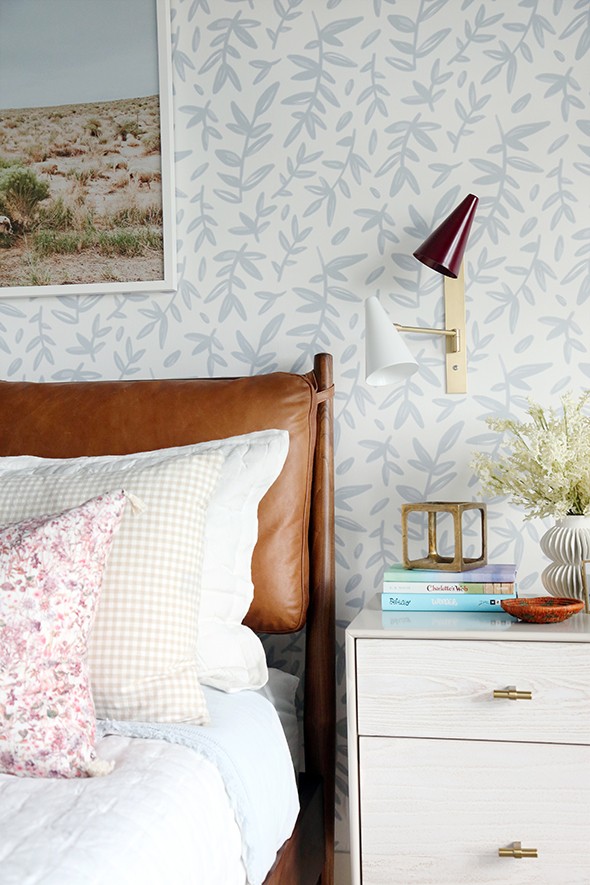
nightstand // wall sconces // checked pillowcases
white vase // faux white flowers
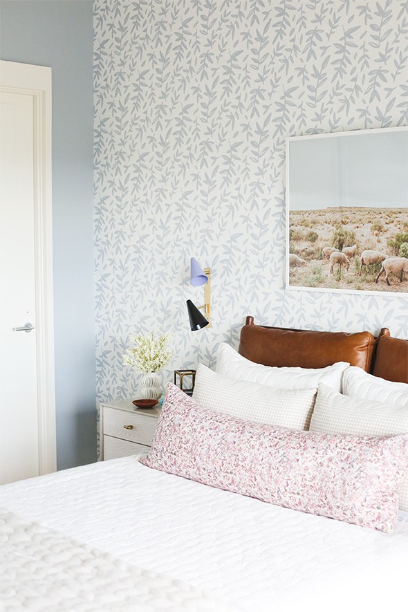
The sconces were another fun collaboration with Lucent Lightshop and they now offer them (both in neutral colors and these playful color shades!). I love that they are a throwback to Italian midcentury design.
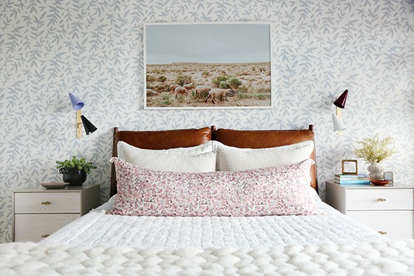
COUNTING SHEEP print // WILDFLOWER lumbar
chunky knit throw blanket // white tufted quilt // wall sconces
The floral lumbar pillow is brand new in our shop today! We are calling it the WILDFLOWER lumbar and I LOVE this fabric and pattern!
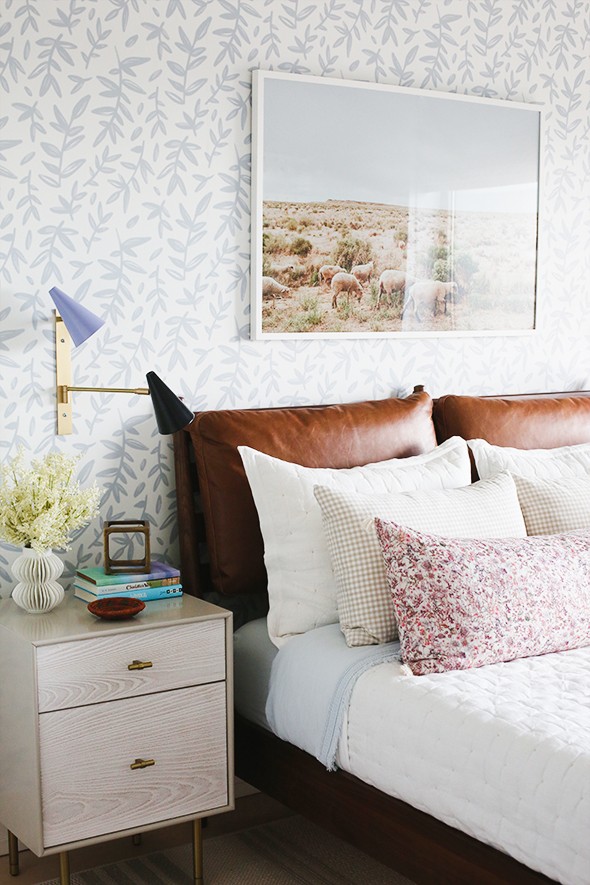
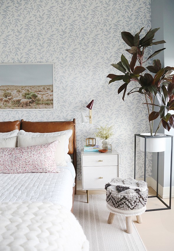
The wall color was tricky to get right in this space (it is SO important to put up samples!), but I think we got it right the second go-round. The color is called Jubilee by Sherwin Williams. We wanted a warm chambray blue and I think this is just that! How amazing does it look with the blue and white ticking stripe roman shade from The Shade Store? The windows in this apartment were a major challenge, but the sweet designers at The Shade Store really came through for all of us working on the RS Home and everything turned out beautifully!
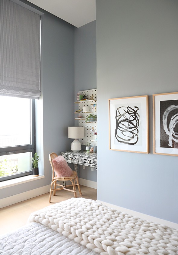
KNOTS I print // KNOTS II print
chunky knit throw blanket // bone inlay desk // chair
pink fur pillow // lamp // pegboard
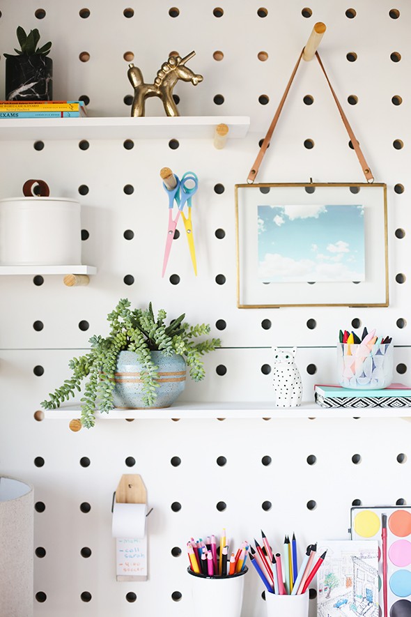
The pegboard was an Etsy find. We bought it in a natural finish and painted the board and shelves white. I wish we could have just bought it this way, but I wasn’t finding any good quick-ship options!
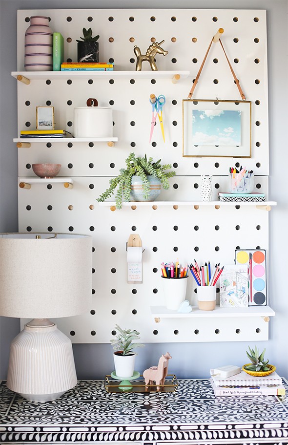
pegboard // lamp // tape dispenser // hanging frame
white canister // pink marble bowl
It wasn’t hard to paint with a mini roller, but spray painting would have been even easier. We left the pegs natural and I love the warmth they bring! (PS as a side note – I brought one of my sister’s ceramic pots with us to use in the styling here and she straight up cried seeing one of her pieces in a magazine. Such a sweet moment for me!)
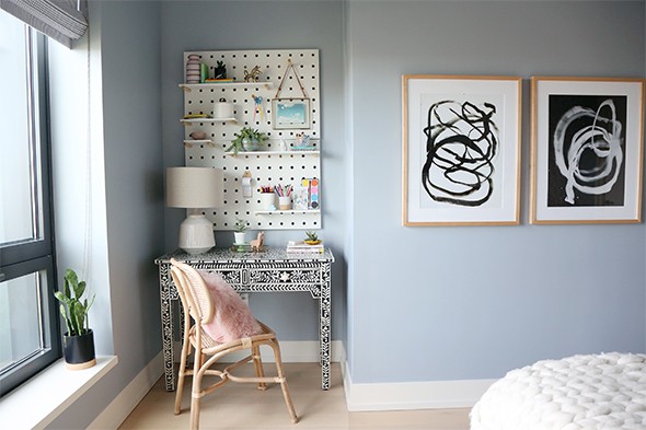
KNOTS I print // KNOTS II print
chunky knit throw blanket // bone inlay desk // chair
pink fur pillow // lamp // pegboard
Framebridge was kind enough to do all the framing for this space and they always do such impeccable work! I especially love the proportions of their gallery frames series! We used the natural with KNOTS I and KNOTS II and the white gallery frame over the bed with COUNTING SHEEP (a beautiful photo taken by Cami Parker for Jenny’s Print Shop).
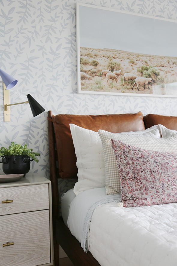
COUNTING SHEEP print // WILDFLOWER lumbar
white tufted quilt // wall sconces
Isn’t the wallpaper amazing!? It’s from Muse Wall Studio and the pattern is called Leaf Branches. It is a removable wallpaper and it is surprisingly easy to hang (it’s like a giant sticker!). I love the movement and texture this pattern brings to our room.
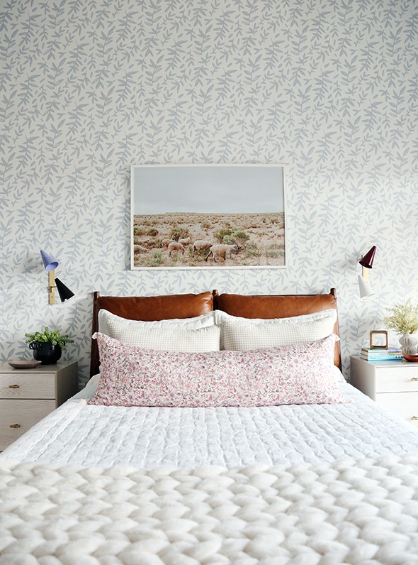
COUNTING SHEEP print // WILDFLOWER lumbar
chunky knit throw blanket // white tufted quilt // nightstands
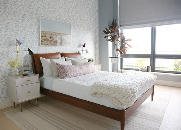
rug // chunky knit throw blanket // white tufted quilt // wall sconces
It was a little tricky to match the wallpaper to a paint color thousands of miles away without a wallpaper sample or without being able to put up sample paint colors, but I think it really turned out great in the end! The wallpaper, paint and roman shade fabric are all subtly different colors of blue, but I think they play together beautifully!
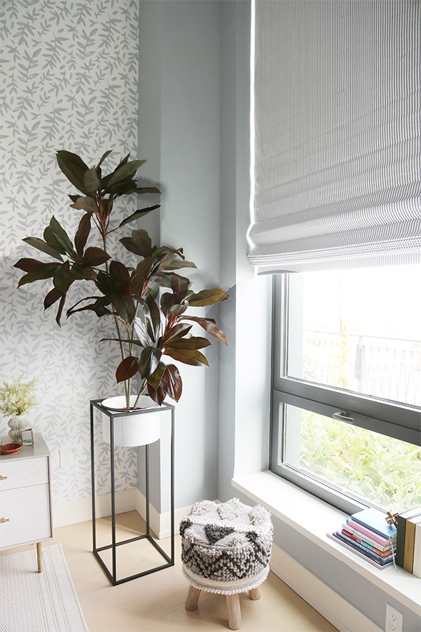
plant stand – similar here and here
The cute little en suite bathroom was tricky to photograph, but I think it turned out sweet! We found that beautiful little Persian throw rug at the ABC Carpet & Home in their basement outlet area (similar here)! I love that coral pink pop!
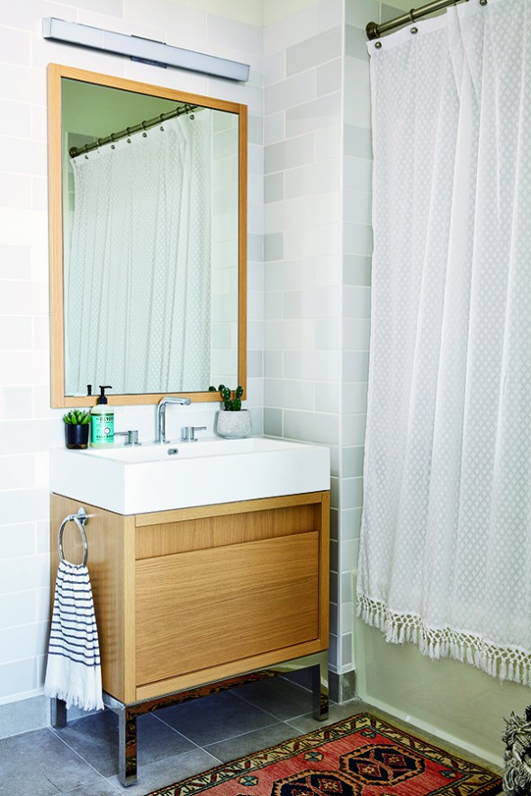
rug (similar) // shower curtain
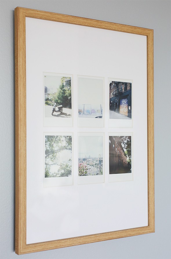
We used my favorite Instax camera to take photos of the city while we were doing the install and put them in this frame made specially for Instax photos. I love how this turned out! Such a sweet way to remember a specific trip or day!
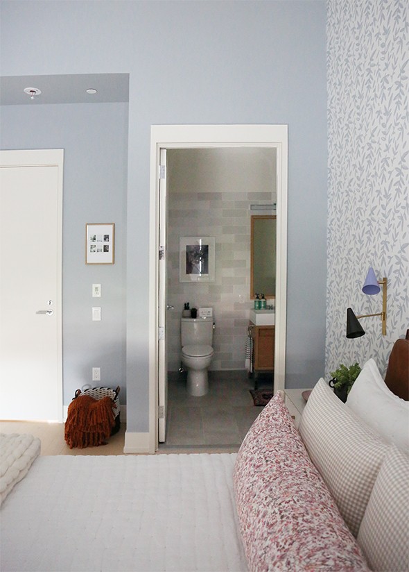
Another favorite purchase for this room, was this AMAZING faux rubber tree! Isn’t the color so good? I love that it has large leaves like a fiddle leaf fig, but the coloring is so different and dramatic! I also love the enamel plant stand we found at Homegoods (similar here and here). We needed some serious height in this room with its 15 foot ceilings and this plant stand really helped!
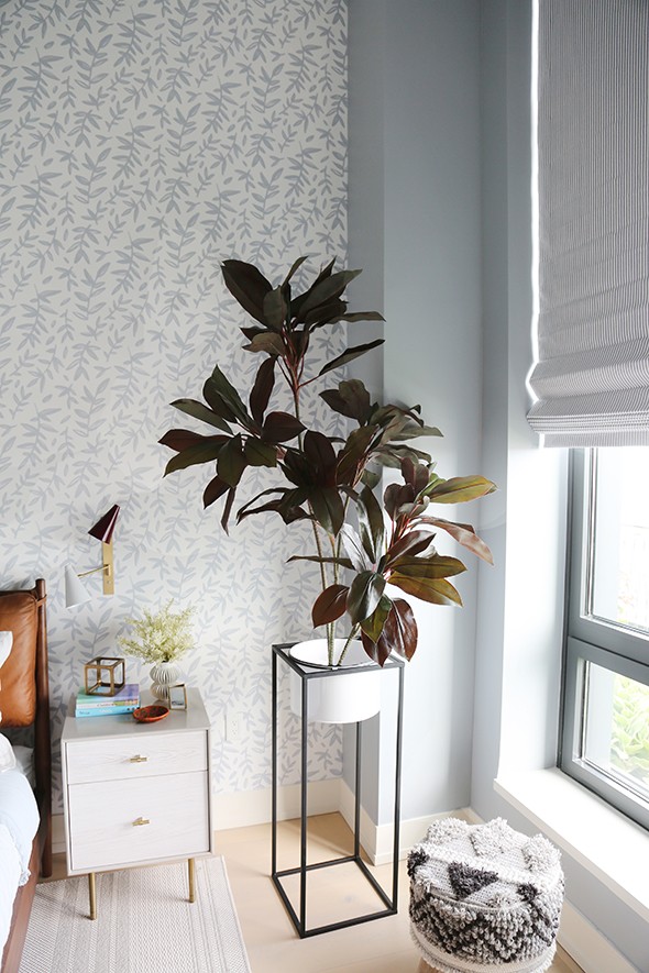
nightstand // faux rubber tree // wall sconces // plant stand – similar here and here
I am SO honored that Real Simple invited us to help with this beautiful show home! What a dream! I love designing kids rooms and we had a lot of fun in here. :) Don’t forget to pick up the October issue to see the rest of the designers’ spaces! I know you’ll love them as much as I do!
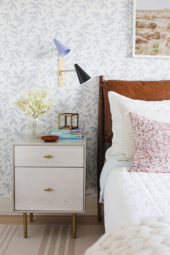
nightstand // white vase // brass cube // wall sconce

paint color – Sherwin Williams Jubilee // wallpaper // bed frame // wall sconces
nightstands // WILDFLOWER lumbar pillow // COUNTING SHEEP print
tufted quilt // blue sheet set // faux potted succulent // roman shade fabric
checked pillow cases // knitted throw // black loop planter // rug

KNOTS I print // KNOTS II print // bone inlay desk // caned chair
striped vase // pink fur pillow // white ceramic lamp // pegboard
faux rubber tree // hanging frame // tape dispenser // watercolor notebook
solid notebook // faux potted cactus // pencil cup // white canister
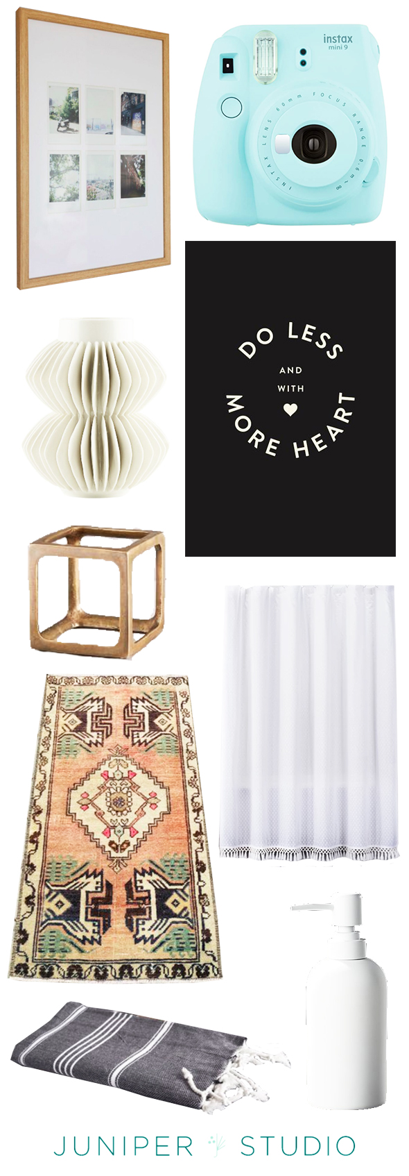
instax picture frame // instax camera // white vase
DO LESS print // brass cube // shower curtain // vintage rug



Wonderful job! That room is really beautiful. Thank you so much for sharing!
I got my magazine last week and flipped through with such pride, cause “my friend” was in it. I’ve been reading your blog for like 10 years:) Haha the internet is so weird, how we get to know people, but really, I was excited to see your amazing work being shown off in the mix with other incredible designers!! Congrats! You’re the real deal. I love how true your are to yourself, and how youve kept your humility, even amidst all the success. Lots of love!
The room turned out so lovely. Curious where the black and white plant stand is from? I’d love something like that and I don’t see it sourced in the post.
Hi Marcey,
It’s from Homegoods but we added a few similar links in the post! Thank you!
so cute! the link to the pegboard is not working for me?
Hi Kathy,
We just updated the link!
Love it all. The peg board link on Etsy is not working.
Uh oh! Thanks for the heads up! We’ll update now. :)
Where’s the black and white basket by the front door from? Thanks!!!
So, so pretty! Those sconces against that wallpaper…genius! Beautiful work.
Really like it, although would think it was more of a college girl dorm room/ first apartment kind of vibe. (My pre-teens would be a bit bummed how serious the room looks, the abstract art across from the bed seems particularly grown-up). But, my biggest impression is that this is the best version of your signature style that you have shown us- eclectic but, especially the color story, restrained. Bravo!
Love the info and I really amazed to have this wonderful post
That has to be one of the coolest desk setups I’ve ever seen in my life.
So lovely!
http://www.motownsavvy.com
Gorgeous wallpaper!
http://www.thislifeisbelle.com
Loving that wallpaper and the body pillow.
Hi, I’m in love with the black and white knotted stool I see in several of the pictures. Any idea on where I can buy something similar? I fear I’m googling incorrectly because I’m coming up short. Let me know if you can!!!!
Wondering where the wonderful vanity in the bathroom is from? Thanks