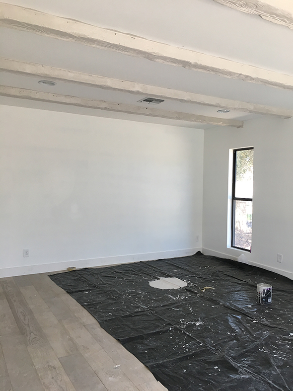
It’s time for a One Room Challenge update!! :) Last week we mentioned that we were thinking about painting the beams in the #GentryProject master bedroom. Some of you voiced your concerns, but don’t worry! These beams aren’t real wood and they looked really awful in person. We had our painters paint them in a warm gray tone and I think it was the right choice for the space. If feels so much more fresh in the room! (This is right after the first coat and before the painters did any clean up)
When I started thinking about what kind of space we wanted to create, the idea kept popping up of wallpapering the room in a soft, peaceful and textural pattern.
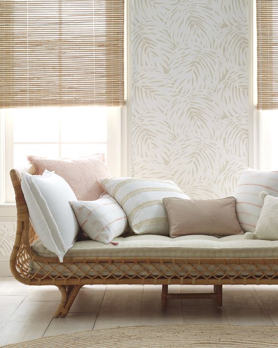
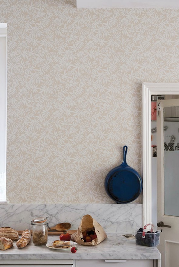
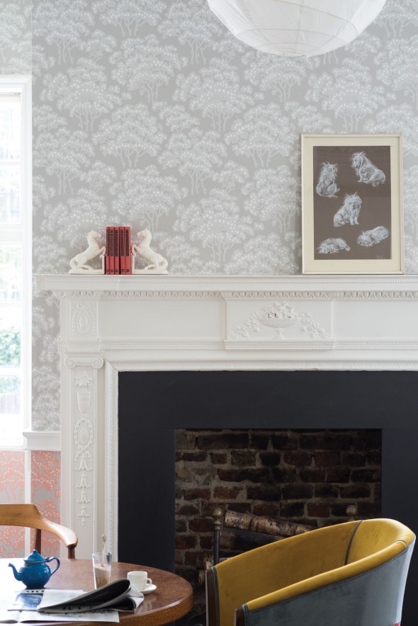
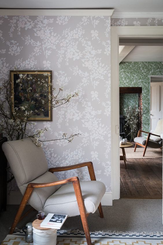
We knew we wanted to go with a warm, neutral wallpaper and Farrow & Ball (who is a participating sponsor of the ORC) has a lot to offer in that area! (Remember this wallpaper I picked for my entry? I still love it almost four years later!) We laid out our top six picks to help us decide which scale and pattern would be best for the room.
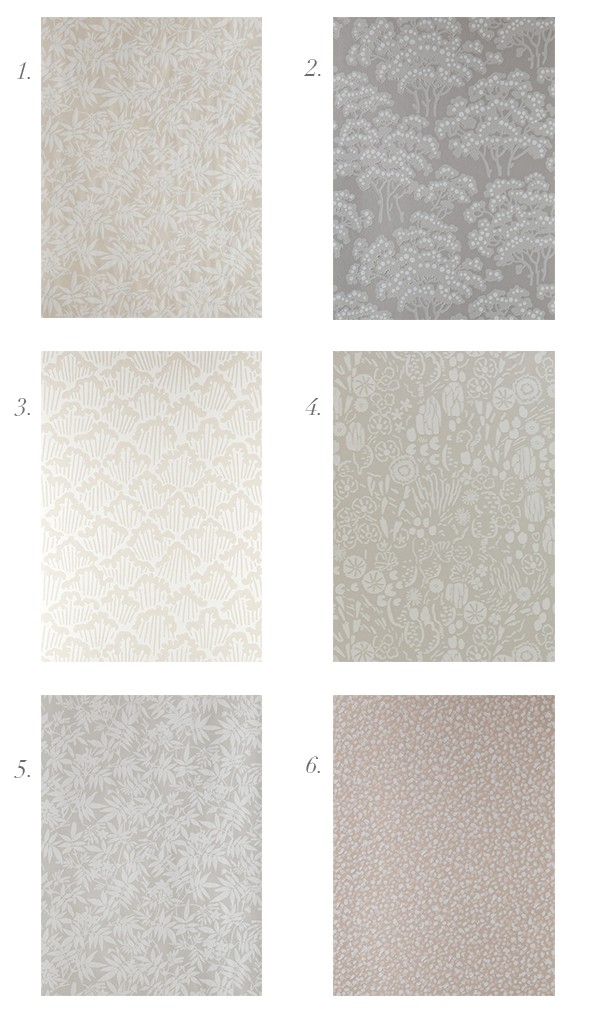
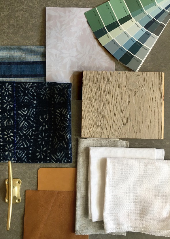
Okay, spill the beans. What would you pick here?? I have to admit, I’m most drawn to #1. I keep finding myself loving warmer tones lately – don’t you? I am loving taupes and beiges mixed with bright whites and black! SO GOOD. Here’s a little board we put together with the Jasmine paper and some other colors we’re loving for the room. What do you think of this start? I’m hoping it’s a soothing, peaceful space that is NOT AT ALL BORING!! :)
——————————————–
Don’t forget to check in on the progress of the other ORC participants! So many exciting rooms this season!! xo
Boxwood Avenue // Coco & Jack // Shay Geyer // Design Manifest
Dwell with Dignity // The Makerista // Making it Lovely // Dabito
Old Home Love // The Painted House // Megan Pflug // The Pink Pagoda
Erica Reitman // Sacramento Street // Simply Grove // Jill Sorensen
Sugar & Cloth // BrittanyMakes // Waiting on Martha // The House that Lars Built


I favor #6 because I like it and I like it with the textiles you’ve chosen, but #1 would be my second choice. I think #1 a tiny bit looks like marijuana leaves; that’s my only hesitation about it.
#3 is my vote. I love the organic pattern without it reading too floral/leafy. Same warmth as #1, just a little more contemporary. Less Golden Girls.
#2, definitely.
I think I missed this…will this be a bedroom? I saw the rattan bed so I guess that’s what I was thinking.
Of the wallpapers shown in your post, I like Hegemone & Hornbeam–both Farrow & Ball. The Hornbeam seems to be only in gray, though. The wallpaper you show on your mood board is too tight for me; it looks like Laura Ashley. Hegemone comes in the same colorway, but it’s a looser more organic pattern. That’s my preference. Loving the painted beams, flooring, and all the other things going on. Looking forward to seeing the final result. BTW, I’m not totally over gray yet. I’m warming up to the beiges though.
Oh, wow. 3 and 4 are really speaking to me! <3
Agreed. I would choose between these two based on the white balance I wanted in the room.
Love, love #2
I adore #2!
I like no3!
An amazing home decor idea. You may use handicrafts to decorate your home or workspace. Today handicrafts come in huge varieties like wooden, brass, copper, metal and much more. Try them too. Thanks
I love the Hornbeam (#2), but I definitely dig the scheme you’ve created. The painted beams look a thousand times better! Can’t wait to see where those pretty paint colors will end up. (I could not live in a neutral world :-)
#2 or #4
I don’t love #1, it reads very 80s peachy pink to me, especially against the cooler colors (might just be my monitor, but seems the same against the marble). I’d probably vote for #4 for that reason, although I still like your entry wallpaper the best!
#4 is the magic for me, as it doesn’t seem so busy. I personally don’t feel that that style of home lends itself to busy and overworked–a bit more minimal I think. But, thats why you’re the pro! I’m excited to see what you went with.
2, 3 or 4 for me! I feel very strongly against 1, 5 and 6. They seem super boring although I know in person they are probably amazing because Farrow and Ball only does amazing. But maybe dated? In a bad way? I’m currently picking out wallpaper for my hallway and it’s between 3 and 4 for that project.
Also, when is your furniture line coming out? I dream about your coffee table designs!
This is so so great!! Will you do a post on Margot’s room? My poor baby is 16 months and her nursery is rubbish!
yes yes yes for #1.. I also love #3 but go with your gut!
C’s Collection | http://www.chelseascollection.com
I love 3 & 4! 1 is not my favorite. I don’t mind it, but I feel like it doesn’t fit with the feel of the what you’re doing in the rest of the house. I can’t see the kitchen ideas you’ve talked about in the same house as this.
I like #4
All is looking great, but No 1 is supper.