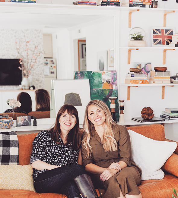
Though I had been a reader and fan for years before, Joanna Goddard and I became real-life friends in 2008. She had emailed me when we were still living in Delaware about coming up to the city to do a refresh on their West Village apartment. I remember the first time we met at her place for a design meeting. I was instantly in awe of her – she was as cool, smart, funny and interesting as she was in her writing.
I had the exact same reaction when I met Joanna’s twin sister, Lucy, this month. They are obviously two different people, of course, but their kindness, quick humor, voices (!) and realness felt so similar to me. It was an absolute pleasure to get to know Lucy a little during the process of redecorating her Bay Area apartment.
You may have heard about Lucy’s story on Cup of Jo (or on Good Morning America or in the New York Times). Lucy’s husband, Paul Kalanithi, was diagnosed with late-stage cancer while finishing his neurology residency at Stanford Medical. Before he passed away last spring, he wrote an amazing, poignant book called When Breath Becomes Air. It is one of those books that forever changes your perspective on life and on dying. Lucy’s prologue was equally beautiful and thought-provoking (and will tear your heart into pieces).
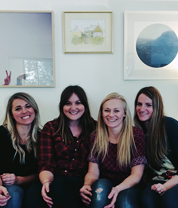
A few weeks ago, while Lucy was on the UK leg of the book tour, I loaded up a U-haul full of vintage furniture finds and DIY projects and drove to Northern California from Phoenix with a few women from my Juniper team, Kate and Kayla (my sister, Ali, flew in to join us later that week). We took this photo right before we left to go back home – exhausted and puffy-faced from all the tears! Gosh, I love these women so, so much. They are always very hard workers, but I was humbled by their selflessness and abounding energy on this project especially.
Lucy had sent us a house key, so we let ourselves in and got to work moving furniture and tools. Thankfully, Lucy and her sweet mother, Jean, had worked tirelessly to organize and clean out Lucy’s apartment before we got there so we would have a mostly blank slate when walking in. I know what a hard job that is without having the added emotion to the thing. Lucy was incredibly brave making decisions about her and Paul’s things. I loved that she was very clear about keeping things that mattered the most to her, and she showed immense strength while parting with others. I can’t imagine how hard that process must have been for her.
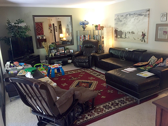
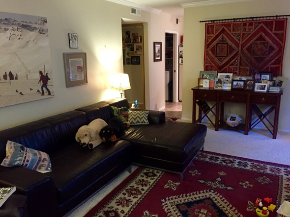
Here are some of the before images of Lucy’s living room. It was comfortable before, but Lucy was ready for a big change! During our calls, she said that she wanted her apartment to feel light, bright and nature-filled. So we had all the walls, ceiling and trim painted Benjamin Moore’s Chantilly Lace (OC-65). That alone brightened up her space SO MUCH!! She lives on the second floor, which is so pretty for all the tree foliage you get in the windows, but can sometimes make a space a little shadowy. Chantilly Lace has just a touch of warmth to it, so it is still a bright and clear white, but it has a beautiful soft glow that feels like sunshine. It’s my favorite white, hands down.
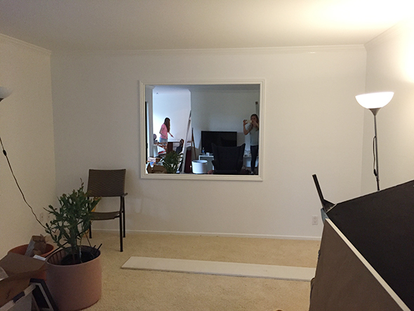
We also picked the wall color with the carpet in mind. Lucy would love to replace this eventually, but decided to keep the carpet for now. People always talk about wanting to coordinate wall colors with their furniture, which is all well and good, but it’s much more important to find a color that works best with the flooring! A gray paint color in here would have made her cream carpet look pink. A soft blue-green would have brought out the yellow tones. White is easy and happy and brings out the best of the colors in furniture and flooring alike!
So in addition to the challenge of keeping Lucy’s carpeting, we had a couple more design obstacles to overcome in the room. Whenever we start a project we like to ask two big questions: what works in here and what doesn’t? If you can figure out what parts of a room both bring your joy and really function well, and then you simply build on those things in your redesign, you will be in a great spot. Similarly, if you can really nail down the challenges/bummers in the room, you’ve essentially created a to-do list for yourself!
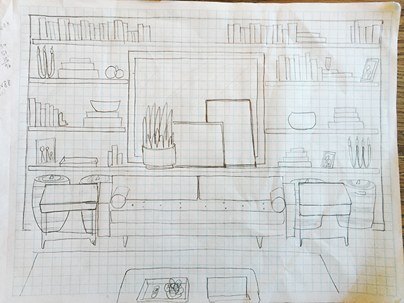
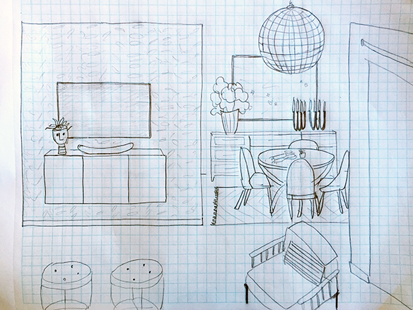
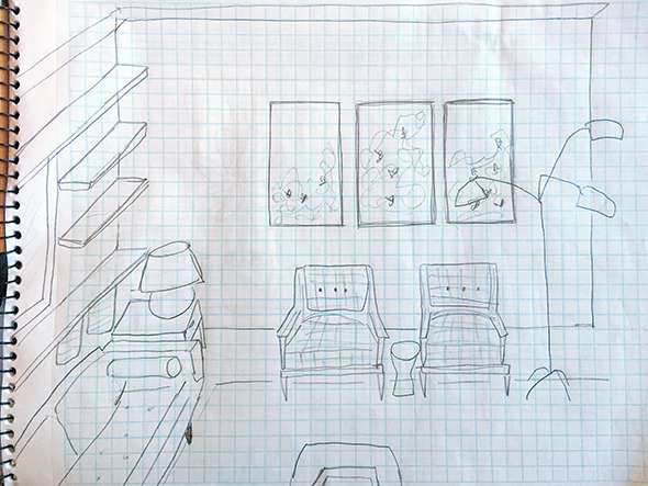
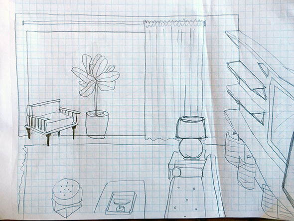
(these are some very early sketches before we had measurements for floor plans – it’s fun for me to remember what we initially planned on and what ended up needing to change!)
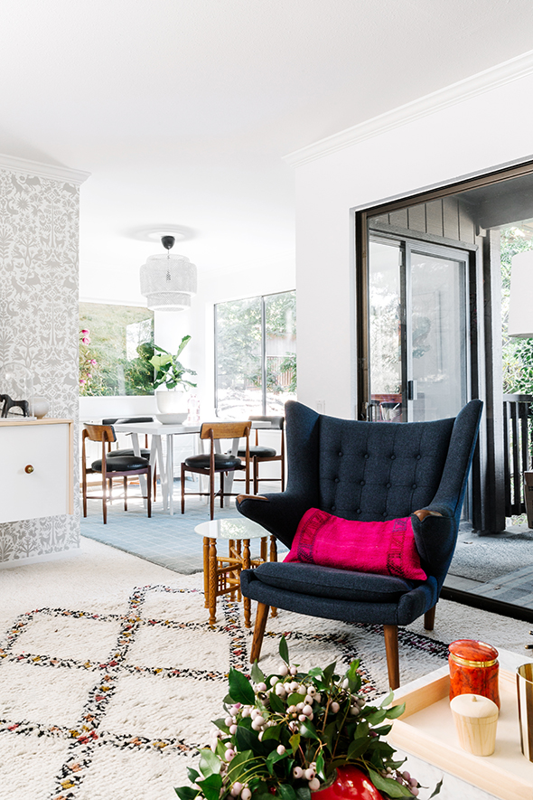
The big mirror on the back wall was on my Challenge list at first, but it was always on Lucy’s Joy list. She loved the light it brought into her living room. I loved the light too, but it was making the furniture layout tricky. Lucy originally had her TV in the back left corner of the room. When we decided to make the mirror a focal point of the room, and build it out with the shelving, it worked best to put the TV on the opposite side of the room, on the floating wall between the kitchen and the main living area.
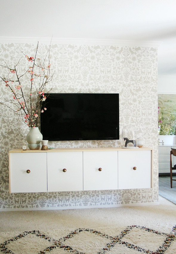
(removable wallpaper tiles available at Hygge & West! More info and installation tips to come for the wallpaper and the floating credenza!)
As soon as we had that figured out, it was easy to tackle some of the other items on the Challenge list:
There is no overhead lighting anywhere in the apartment other than the dining room, so we needed to add as many lighting sources as possible. We also wanted the carpet to blend in and to even coordinate with the design choices. We needed storage for books and toys and TV components. And we needed as much seating as Lucy had with her old sectional, but in a layout that worked better for the room.
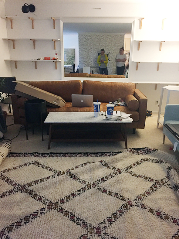
coffee table // rug
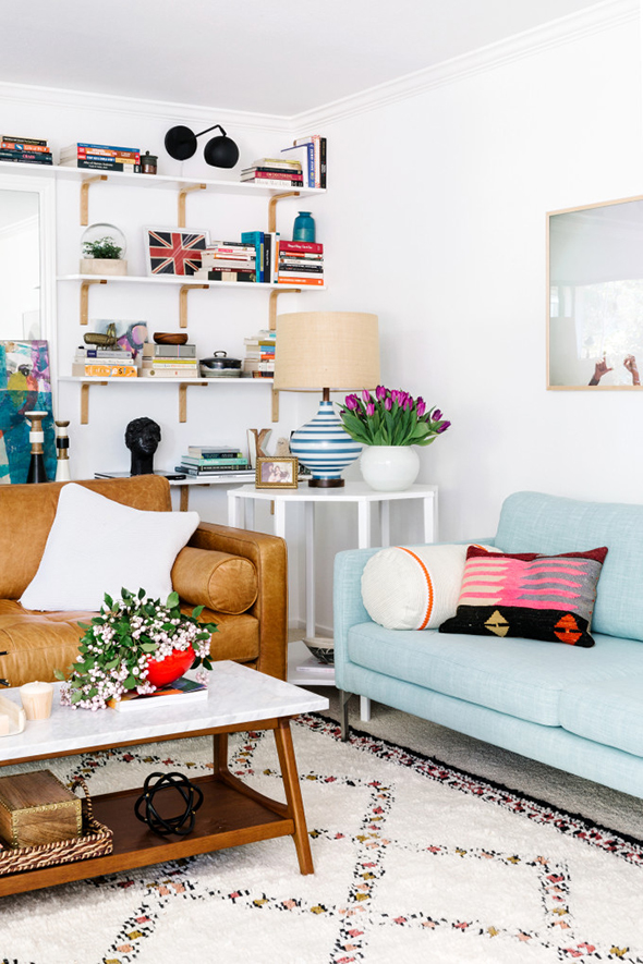
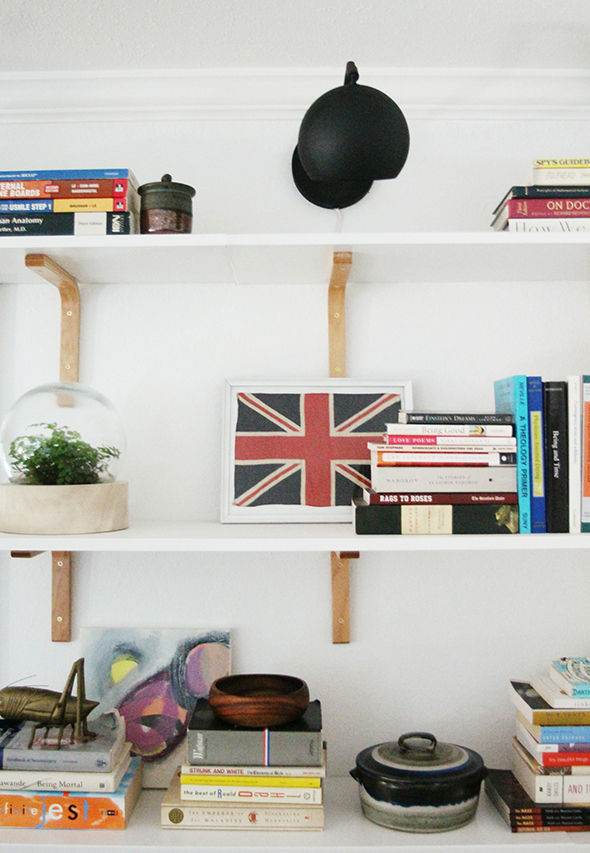
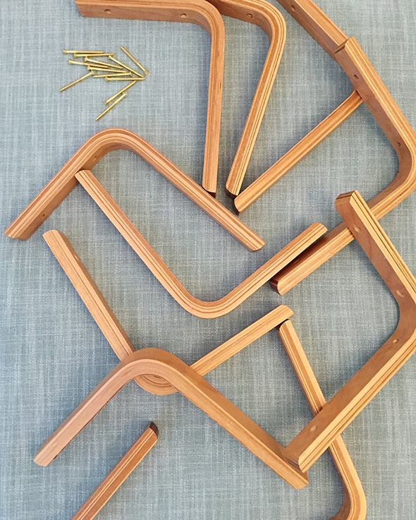
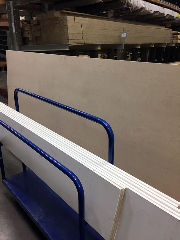
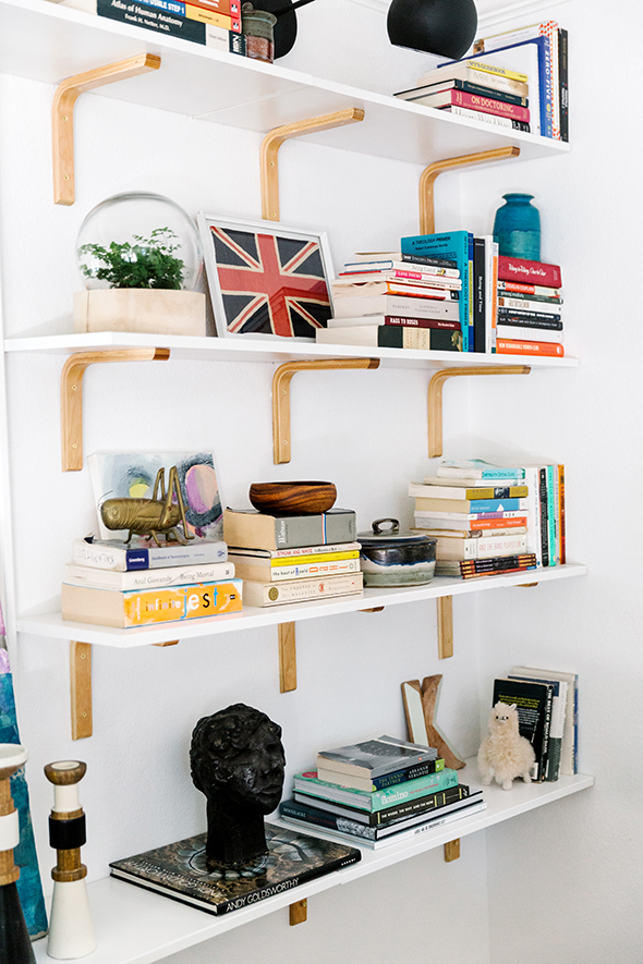
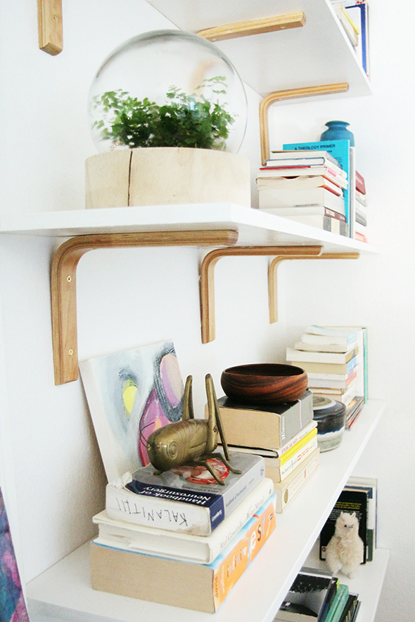
I found these amazing bent plywood shelf brackets on Amazon of all places (they’re sold out everywhere now, but keep an eye out for them – they were only $3 each and are super beautiful in person!!). It took almost a full day to very carefully mark out all the shelving and to install the heavy-duty wall anchors before hanging the shelves, but they’re my favorite! :)
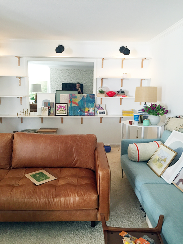
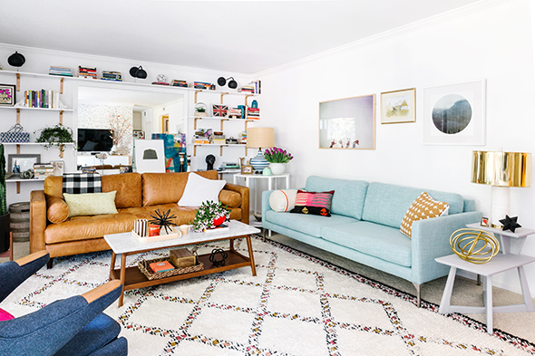
The bookshelf idea maximized a lot of our Joy list and crossed off a few Challenges as well! We were able to add three long arm sconces above the shelving (the lights look SO pretty when they’re on at night!), we made the mirror look purposeful, and added a TON of storage with these Land of Nod woven baskets. Lucy’s living room is really long, so it also helped to have the usable floor space pushed down toward the TV another foot. Even still, we had plenty of room to use two full size sofas in the space!
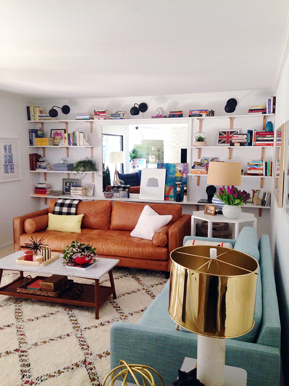
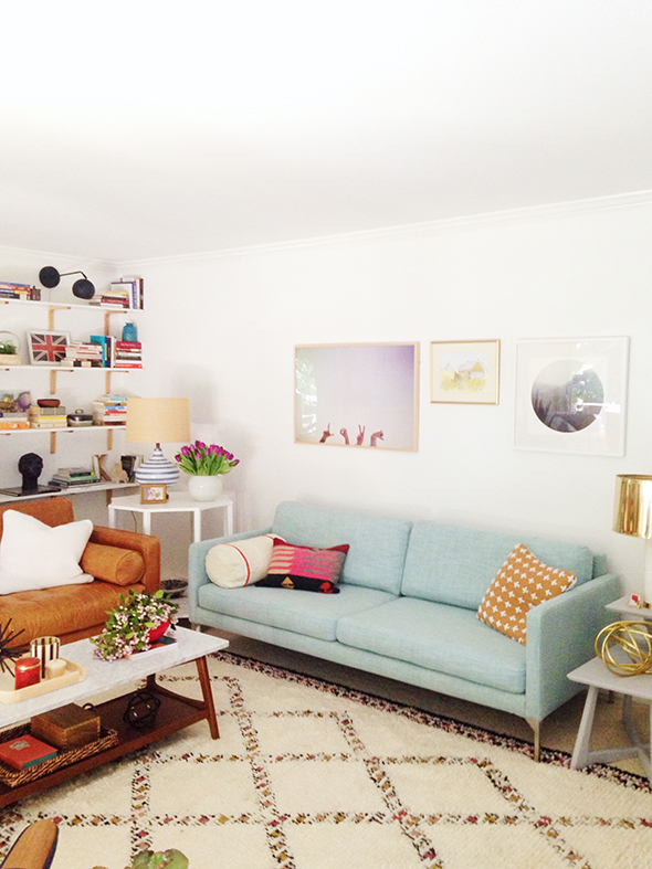
We chose two sofas from a company I’ve been dying to use for a while now – Bryght. And let me tell you, the quality blew me away. We used the Sven leather sofa (can you believe the price point for leather?!) and the Echo mint linen sofa and I LOVE how they look together!!
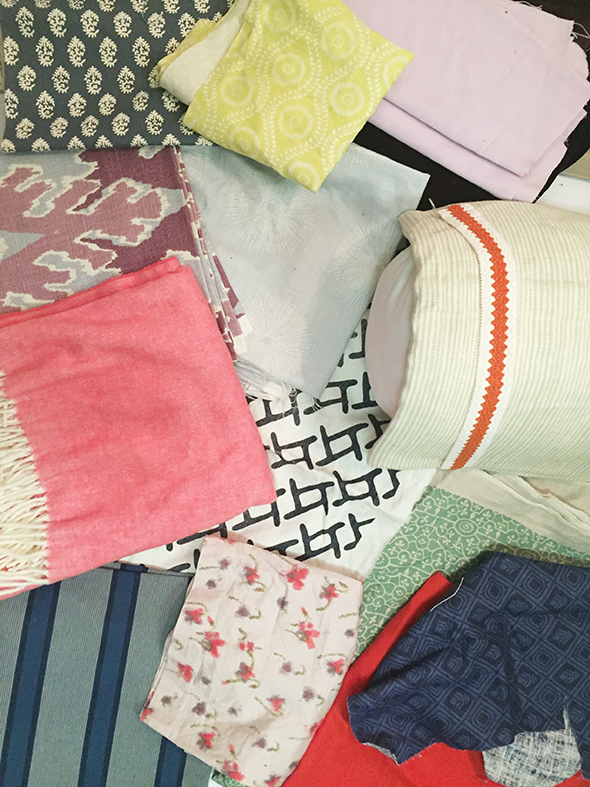
We had pulled some fabrics from my stash, before getting too far along in the design process, to figure out what color direction we were hoping to go with, and I think we got pretty close to our vision with the final results!
I love the navy and pink combo and the Papa Bear chair from Modernica turned out to be one of my favorite pieces in the room. It is SO INCREDIBLY COMFORTABLE. I love that it has such a sculptural shape! The Moroccan style rug from West Elm also goes on the favorites list. I have one of my own now, I loved it that much (and now it’s on super sale!!!).
The styling part of the show is always my favorite. We had been collecting pieces for weeks to add in to the mix on Lucy’s shelves and tabletops! I feel like a house really starts to come alive when all the pretty things are unwrapped and put out. :) The blue and white stripe lamp is from Schoolhouse Electric and it’s also on my wish list now. Every millimeter of that lamp is gorgeous from the cord to the finial to the finish on the glass and of course the gorgeous shade! I wanted something special to sit on the white scalloped edge table I designed and had made here locally. We’re going to start selling furniture this year if all goes well and it would be fun to have a similar piece in the line up! :)
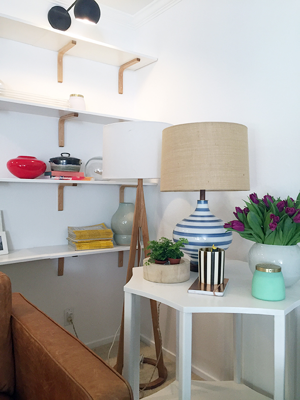
It’s been fun to go back and hunt for the before photos for this project, down to even the little vases and accessories we bought. I feel like a lot of happy blessings and coincidences happened and I love how it all came together in the end.
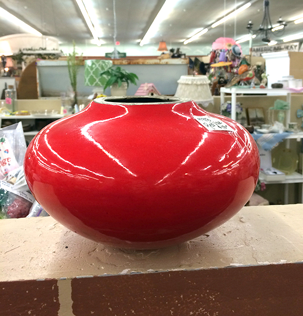
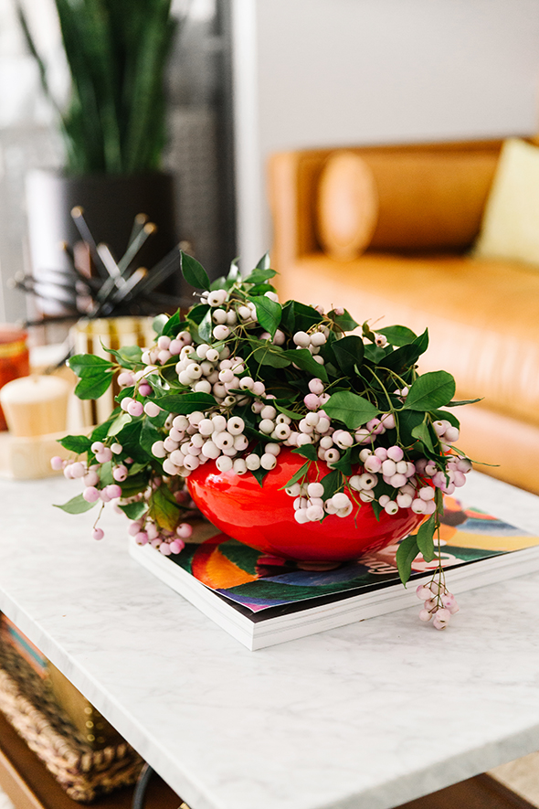
Like that vintage Union Jack was a $5 junk store find. The shop owner had a bunch of flags from all different countries hanging up high. I asked about them and he said they had been hanging at a Boy Scout jamboree camp since the 50s! Cool right? Lucy’s family is from England and I thought if we framed the flag, it would be a fun and graphic addition to her shelves. (I also bought the Swedish flag for my house! :)
The gem stand is going to be for sale in our online shop soon! :)
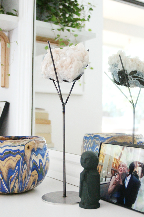
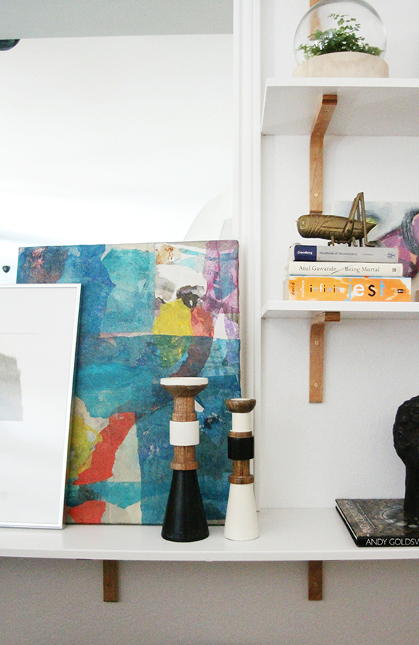
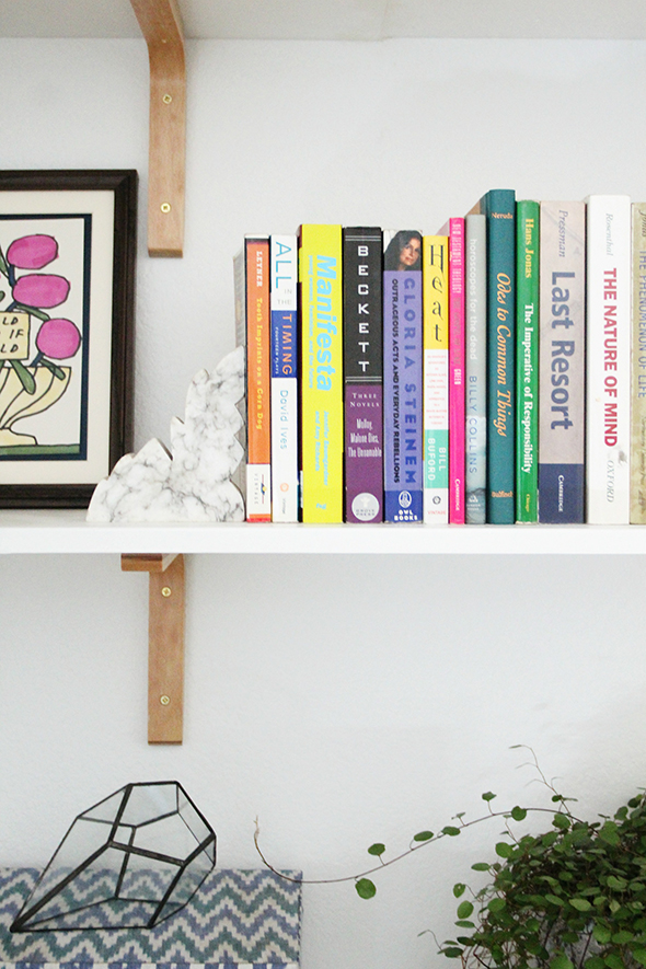
We got that beautiful little terrarium from Anthropologie and the fern inside it was bought at the coolest nursery ever in San Francisco called Flora Grubb Gardens. My friend, Jordan Ferney, took us around shopping on one of the days we were there and we found some really special pieces!
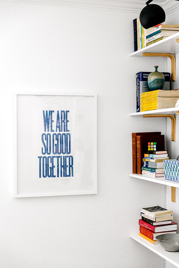
We collaborated with Lucy a lot on the art – something that I think is important in every project so that the homeowner feels very connected with what she will see on the walls every day. We hung many of her favorite pieces that she had before and we got some new prints as well. Lucy really loved this one from 20×200 because it reminded her of something Paul would say to her, and brought back good memories, but mostly it made Lucy think of her young daughter, Cady. She liked being reminded that they could do anything together as a great little team!
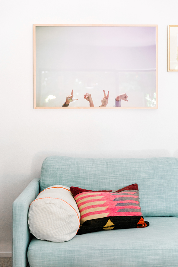
This LOVE print was from Max Wanger’s new Printshop and it is gorgeous! The colors!! So soft and dreamy!
I am so happy with how Lucy’s living room transformed before our eyes! We were so excited to show Lucy when she got back from her trip. She texted me when she pulled up to her building and we all went outside to meet her and Cady. There were already tears just upon finally getting to meet and hug this sweet woman! Then we brought her in to show her all the changes and the water works really started! I feel like interior design is a fun job, but it’s not always in the noble or even necessary category. But sometimes the idea of home as a healing place can be critical and even life-changing. It was an honor of a lifetime for me and my team to get to know Lucy and to be a small part of this chapter of her life.
The full house tour and lots of my tips and behind-the-scenes thoughts from Lucy are on Cup of Jo and on my Instagram feed. I will be posting the process photos for each room, one by one. As always, thanks for your support and kindness!! xo
Professional photos above by Julia Robbs. Styling and floral assistance by Kendra Smoot. A HUGE thanks to my team and to Joanna and of course, to Lucy.


Oh wow! That looks absolutely beautiful. I wish we had the money for a complete living room makeover. We recently had our entire house professionally cleaned in Houston and it looks great, however I really think a makeover would make me fall in love with our house. Got any tips for those of us that might try DIY?
Hi Jenny,
I have admired this transformation ever since seeing it on Cup of Jo and I FINALLY own my first house and want to do something similar with shelving and brackets. Could you please tell me how you spaced the shelves? Eyeballing your photos it looks like maybe 18-24in between each shelf (height-wise), but I’m a terrible judge of distance. Thanks so much!
Cheers,
Nicole