When we first bought the Evergreen house, there were two smaller bedrooms on the first floor, sort of across from the kitchen and toward the back of the house. We considered combining them into one large bedroom, but ultimately decided that two smaller, cozy spaces would be perfect for kids room and what we would want for our own families. When one of my team members walked the house and declared this room needed to be a nursery, I thought YES! It’s further back in the house, where it’s a little quieter and it’s right next to the master bedroom. Plus I’ve been wanting an excuse to use this cute and affordable crib!
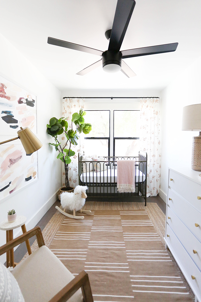
crib // crib mattress // jute rug // striped rug(similar) // white dresser // ceiling fan
rocking chair // faux tree (similar) // lamp // rocking sheep (similar)
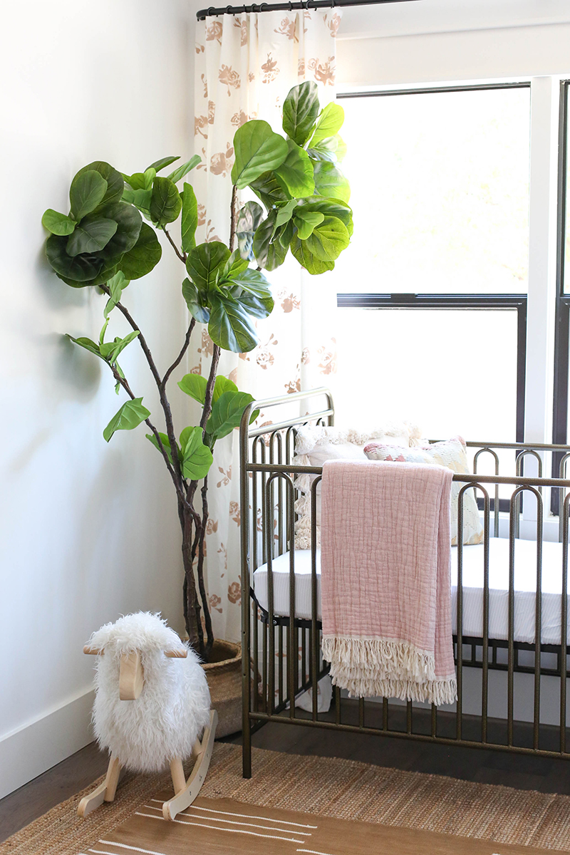
crib // crib mattress // jute rug // striped rug(similar)
rocking sheep (similar) // faux tree (similar)
crib // jute rug // striped rug(similar) // white dresser // ceiling fan
rocking chair // faux tree (similar) // lamp // rocking sheep (similar)
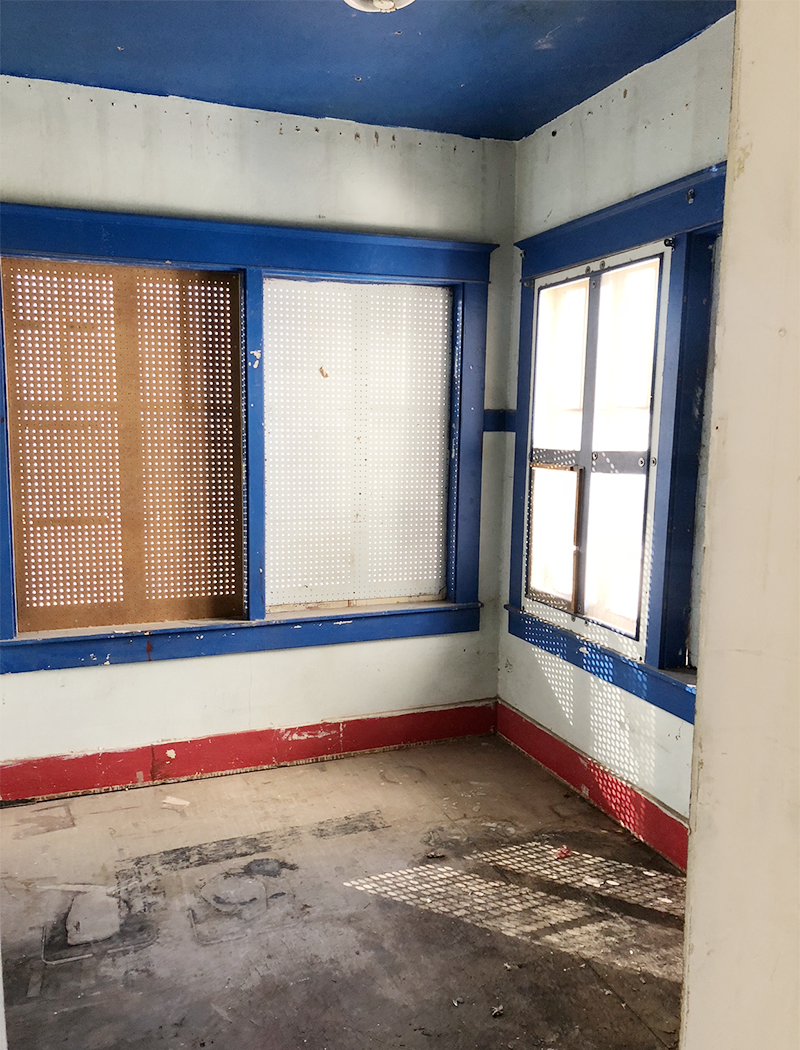
Here’s what the space looked like when we bought the house. Rough, right? We had to close up the window to the right for the guest bathroom we added, but there is still plenty of great light in here!
The walls throughout the house are painted Benjamin Moore Chantilly Lace and the trim and doors are Seapearl. The flooring is engineered wood from Grand Pacific in the color Sea Lion.
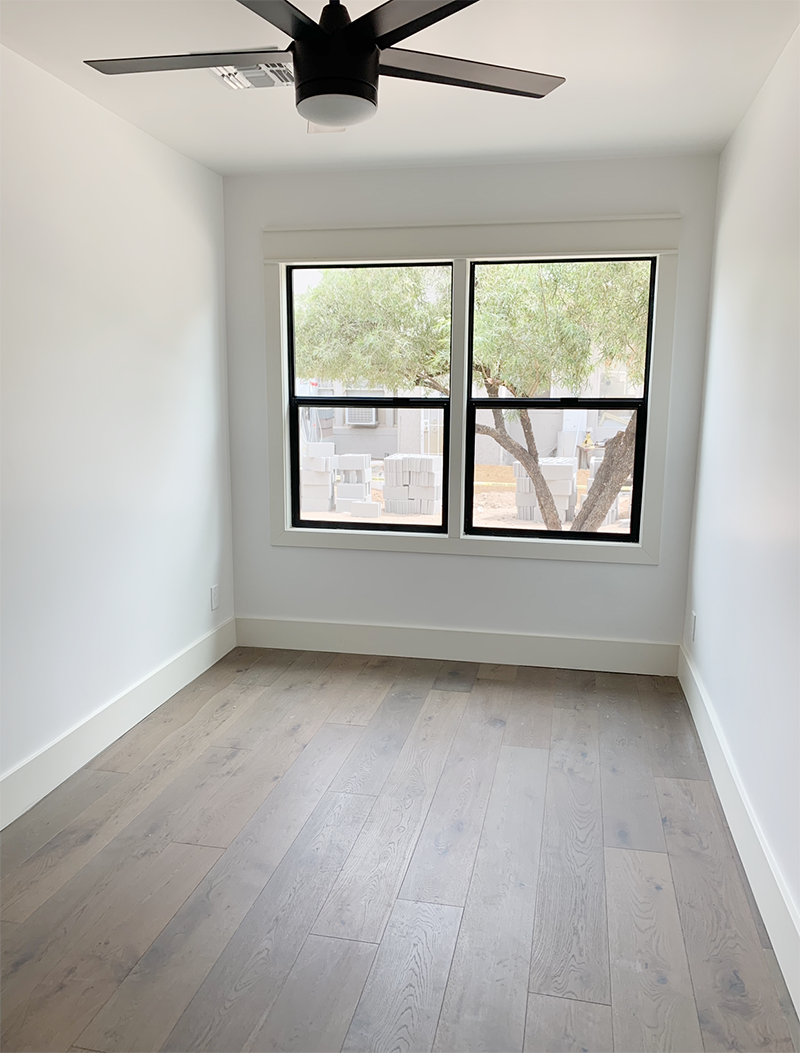
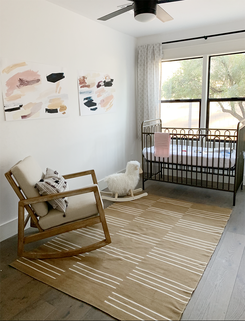
In the bedrooms, we used this really great ceiling fan. I like that it is clean and modern, but also just sort of goes away. Here’s a picture of where we started with the decor. It’s always a process guys! Start with what you really like, get it in there and then adjust! I knew pretty quickly we were going to need a bigger rug and different curtains and textiles. Decorating should take time so all the layers can be thoughtfully built. It was hard to do that with the tight timeline on this project to be honest, but I love this sweet little room!
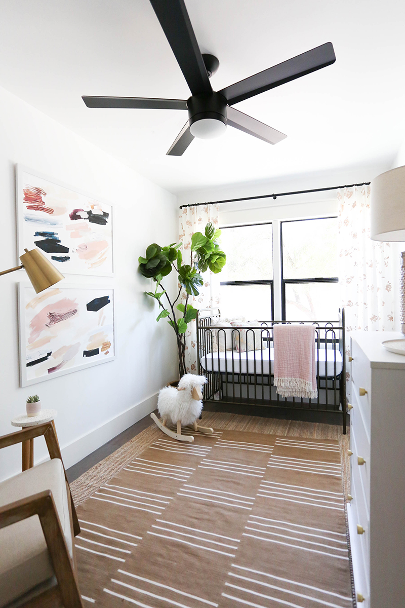
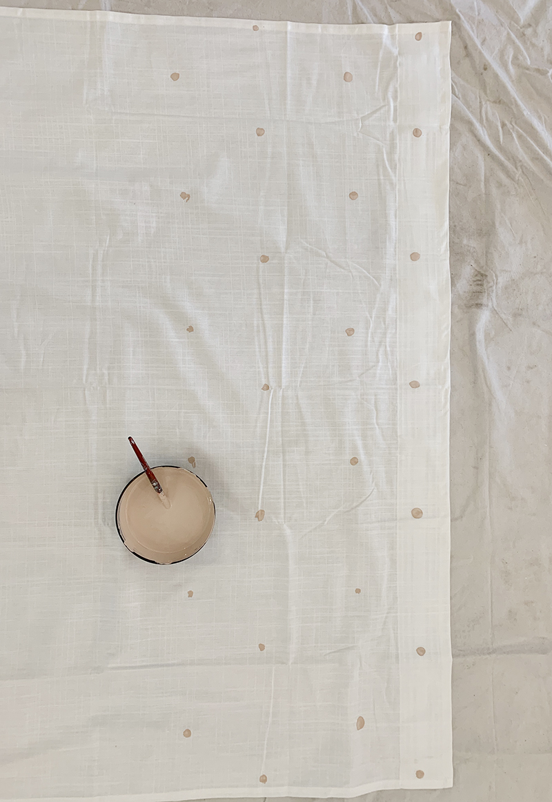
One way we added some interest and layering was to paint a loose floral pattern on my favorite white linen Ritva curtains! I used this craft paint and watered it down by about half in a bowl. Then just eyeballing it, I made a row of little marks about 8″ apart. I continued making the marks all the way down the curtain, offsetting the rows. (Also, make sure your heights and spaces roughly match on both curtain panels, so that the pattern rows continue in the same line!)
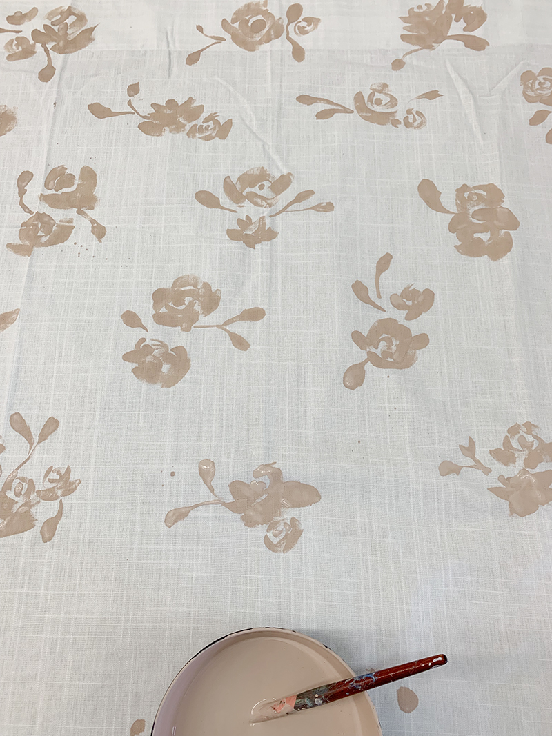
I’ll share a video of how I painted the loose roses in my stories and save them as a highlight. I basically started with the mark as the center of the rose and did 4-6 slightly curved, loose lines, building out from the center. I tried to make every one a little different, but all similar in scale and feel. You can see here too that there are little bits of splatter in some places. I tried to avoid that but in the end, they weren’t too noticeable and in a way added to the painterly quality of the pattern! (Wishful thinking??) :)
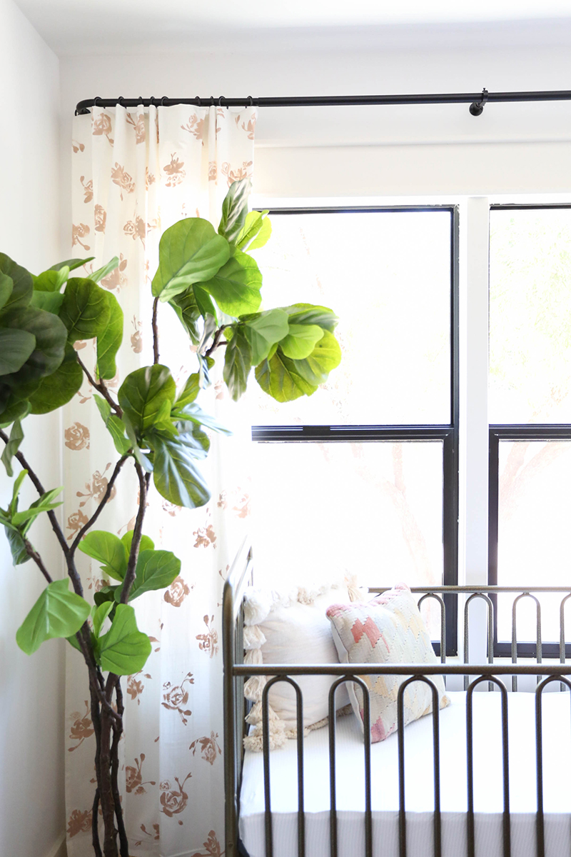
I used my favorite affordable matte black French rod and rings to hang the curtains. I also used these pronged curtain hooks to get a subtle pleat in the Ritva curtain header.

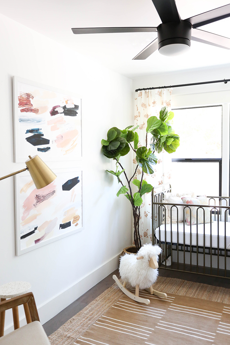
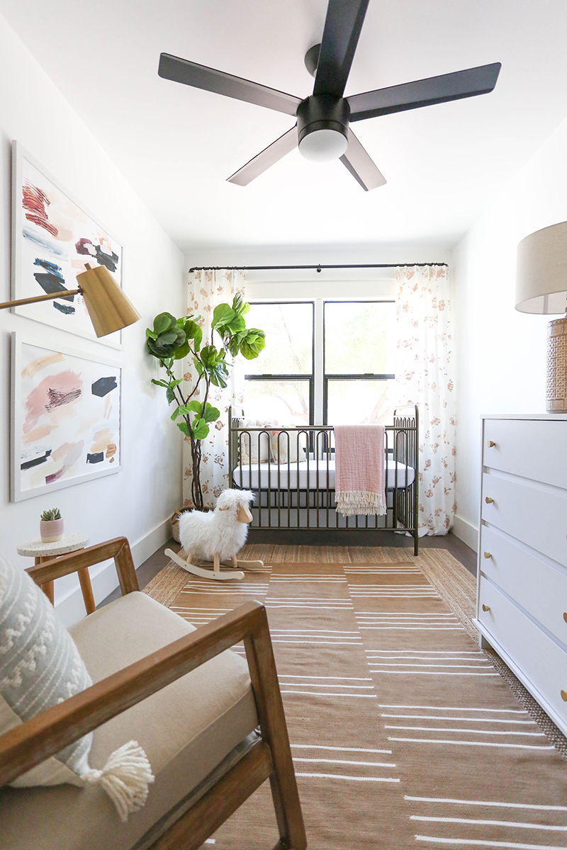
I love how the organic pattern of the curtains balances the graphic pattern of the rug. I have always loved this rug(similar) and was able to snag it on super sale a few months ago. They only had the 5×7′ size left, but I knew I could find a good place for it – and this nursery space was just right! The room is about 8×14′ – so super narrow. I layered this long and narrow jute rug from IKEA(similar) under the striped dhurrie rug to give it a little more presence in the room. With smaller rooms, I always think a bigger rug is better than a smaller one! Just give a couple inches of clearance around the perimeter of the room.
crib // crib mattress // jute rug (similar) // striped rug
rocking sheep (similar) // faux tree (similar)
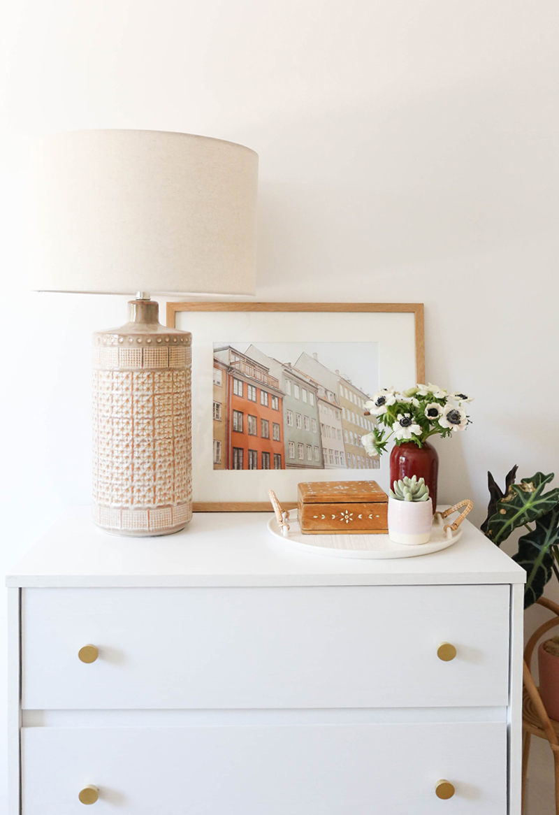
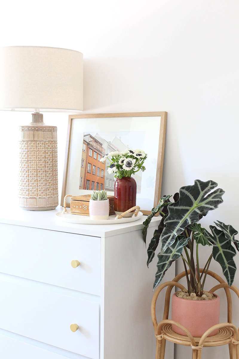
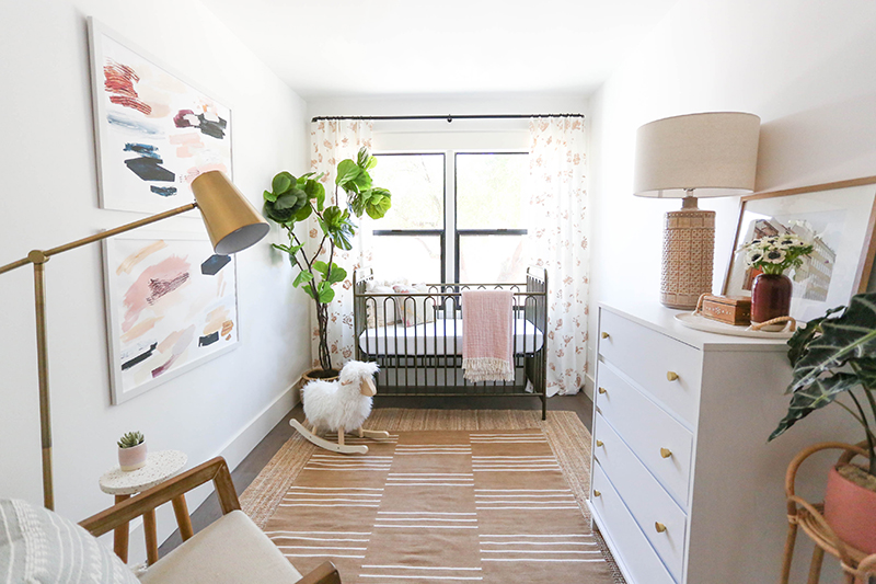
We found a simple white dresser at Target for the room and added these cute and affordable brass knobs to dress it up a bit!
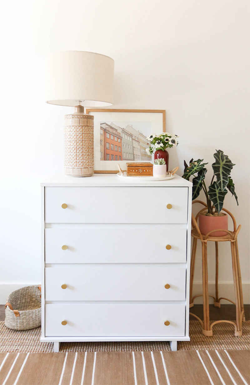
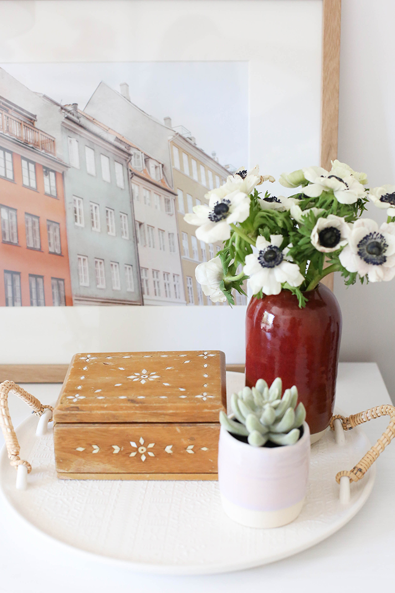
white dresser // brass knobs(similar) // lamp // rattan plant stand(similar)
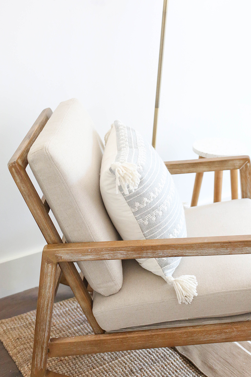
With the room being pretty long, we were able to squeeze out a nice sized closet and still have plenty of room for a rocking chair in here. This one was an Amazon find and it was beautiful!!
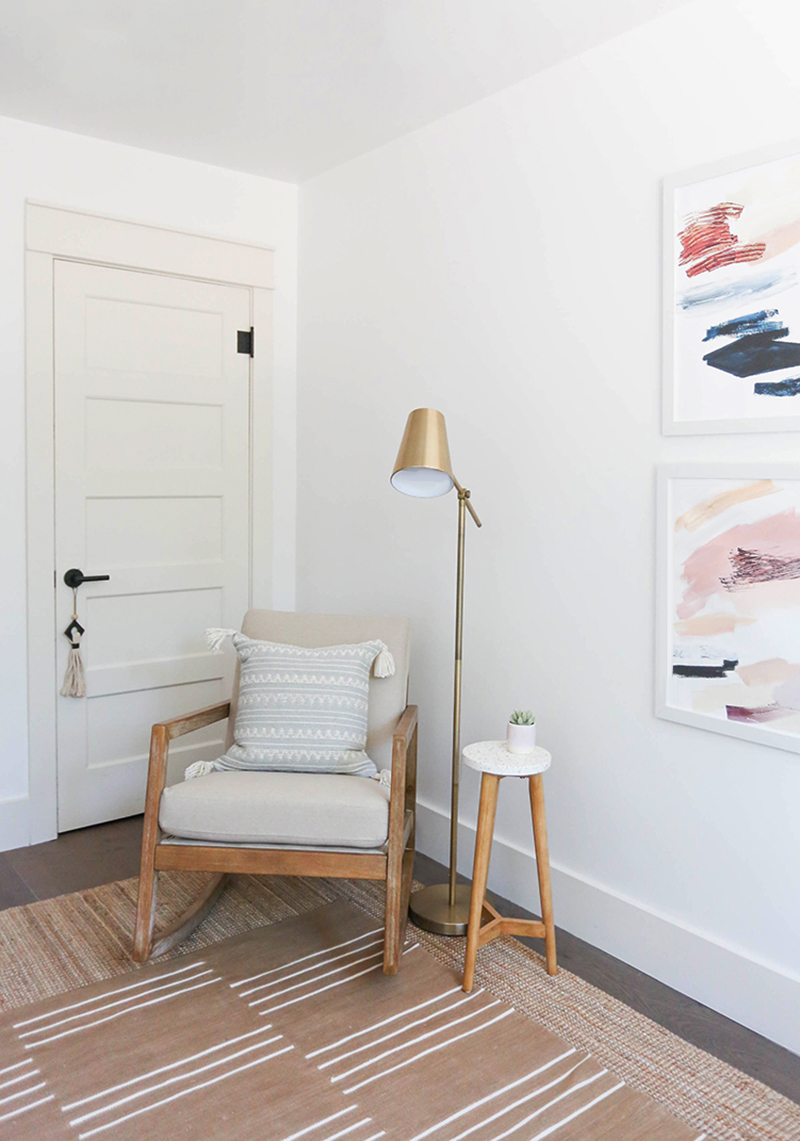
rocking chair // brass floor lamp // side table(similar)
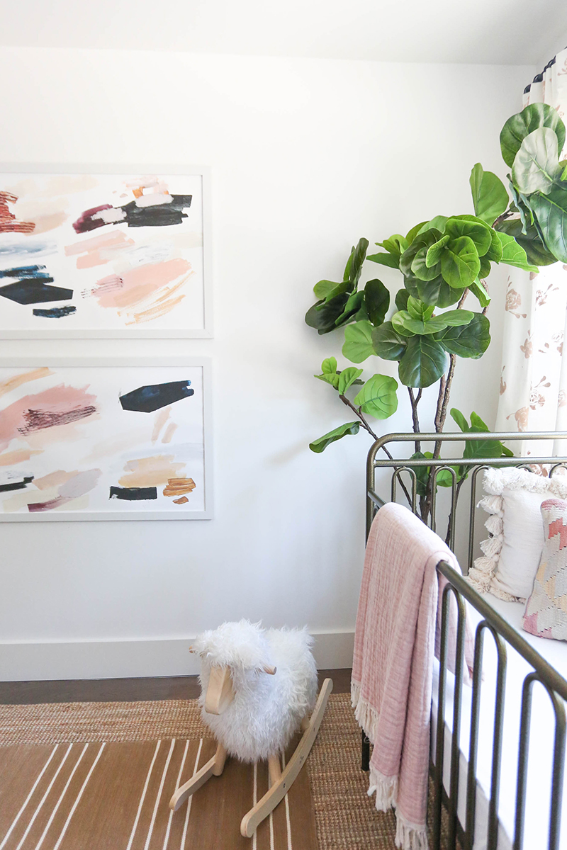
The prints in this room are all from our printshop! To add to the layers of pattern in the space, I went with these two DASH prints from NYC artist Lauren Packard. I love the color and texture in these!
crib // jute rug // striped rug(similar) // white dresser // ceiling fan
rocking chair // faux tree (similar) // lamp // rocking sheep (similar)
And that’s it for this small but sweet space! As always, please let us know if you have any questions about this room in the comments!
Source List:


This nursery turns out so sweet, everything is just perfect, love your art on the curtains. Great job!
I love this!! Savings lots of these pieces for future projects!
This turned out so sweet. Great work! And the curtains… so a nice touch.
I might never have thought of using browns in a nursery but it is wonderful! I love what you do and you! All the touches are so sweet and thoughtful. Your spirit comes through in the things that you design!
The curtains are so sweet! It came together beautifully!
Man! No wonder you were MIA on instagram while this was all going down.You must have been soooo busy! Each space is as carefully and thoughtfully designed as the last. You are the master at making a house a home. This room is so sweet and even though it’s small, it’s absolutely perfect. Well done!
Love it! And the flowers on the curtains are genious absolutely gorgeous!
Thank you! They’re really easy to do! :)
I love this peaceful room so much! Where did you get that little tray on the dresser from?
Thank you! The tray is from Target’s Hearth and Hand!
This small room is so relatable to me in my 930 sq ft Seattle home. I love seeing small spaces that are beautiful and functional and that I could actually fit in my little house! You are so talented and inspiring. Thank you for teaching us all so much about design!!
Thank you Lisa! Glad you stopped by!
Hand painting curtains is one of my favorite ways to personalize a space. I love how you marked it first to get the spacing right!
This is the loveliest room, as with all your rooms. I know you get lots of questions but hoping you could help answer a question about ceiling fan. When to go with white or black? Thank you!!
We went with black here to match the door hardware! I think you can go either way and it will look great!
Beautiful!! Kind of unrelated, but Jenny, do you have any tips on how to find a good interior designer? We’re moving to a new state where we don’t know anyone and I’m not sure if should just google “interior designer + city”, or if there is another route you’d suggest? I wish we were moving to Arizona, just so we could work with you haha!!
I would start on Houzz! They have a great directory and then you can see all their work! xo
Thank you Jenny!!
This is such a beautiful, sweet nursery. I love what you did with the curtains! Such a great idea!
Laura
http://www.laurelandfern.com
What size did you go with on the dash prints in here? Is the white frame from Michaels? Beautiful!!
Thank you! These are 24×36 in Michaels frames! :)
Using this as my nursery inspiration, love it! What size are the Dash prints?
These are 20×30!