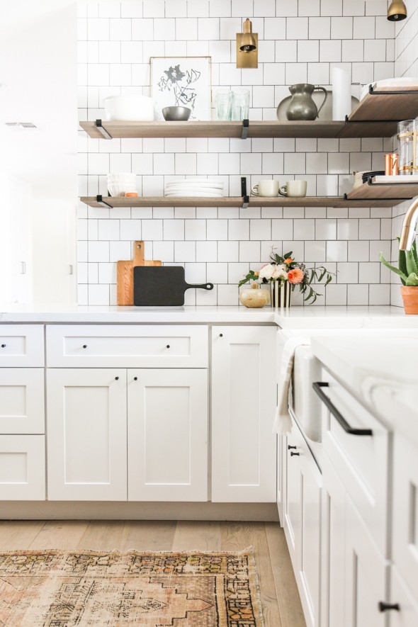
cheese board (similar) // white plates // white bowls // gold wall sconces
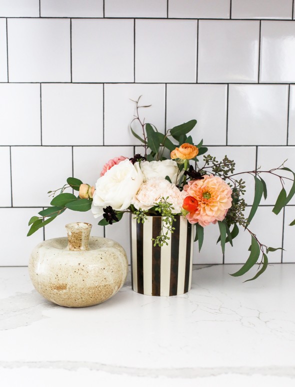
Today is SUCH an exciting day! The Gentry project is finished and I am so thrilled with how all of these spaces turned out, but I especially love the kitchen. When the time came to choose the appliances for this space, I knew we wanted to go with something modern, beautiful and most importantly, high quality. I was thrilled to get to partner with Bosch and Domino Magazine on this kitchen and I hope you caught the video series we posted on Instagram the past couple of weeks. We had a lot of fun with this collaboration!
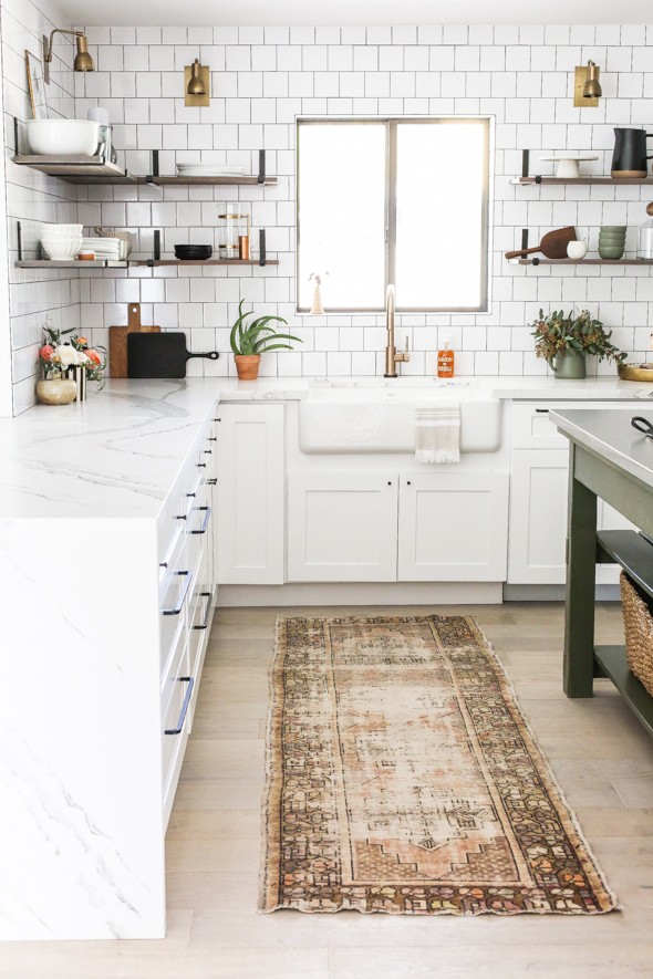
rug (similar)
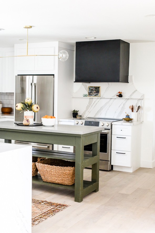
large baskets (similar) // pendant light (similar)
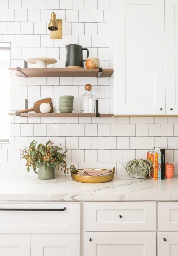
green pitcher // mini pink bowls // gold tray with handles (similar) // black pitcher (similar)
decanter with wood stopper // cake stand // gold wall sconces
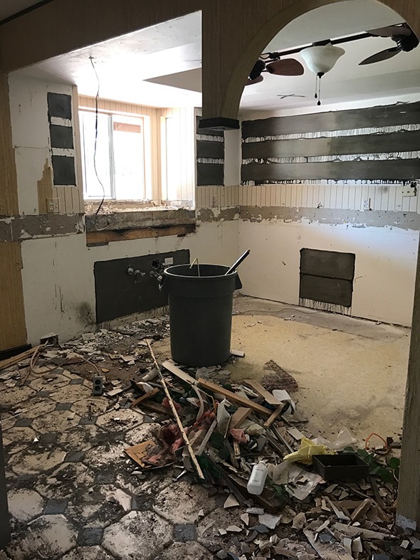
Okay, should we dig right in with some crazy before photos?? Check out that funky tile! :)
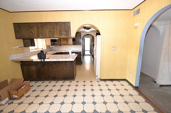
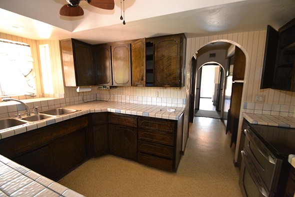
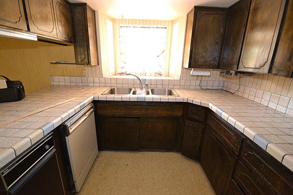
The footprint of the original kitchen from the 60s was small and cramped. We gutted everything in here and bumped up the insanely low ceiling and took out a few walls to make the space work better.
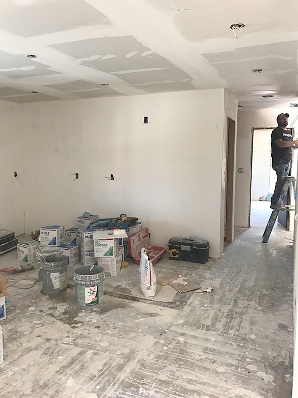
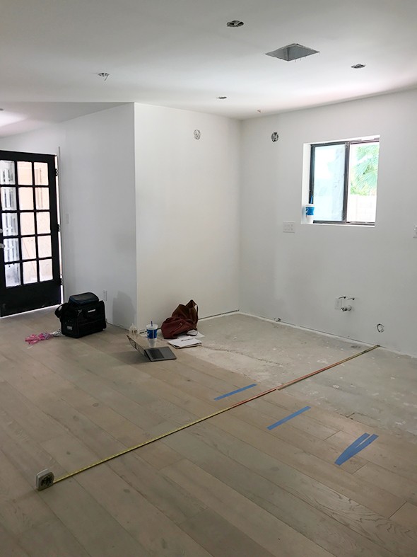
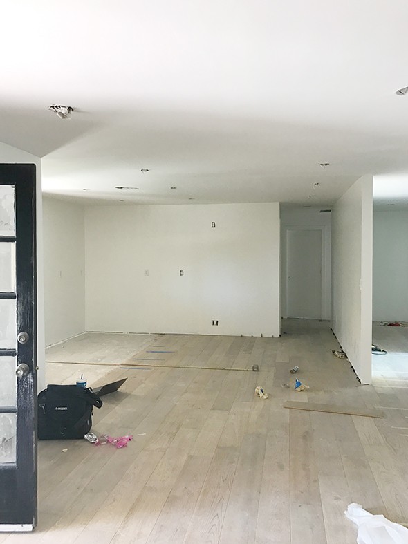
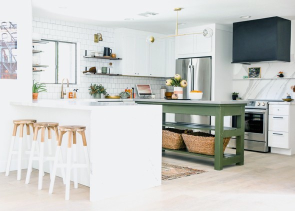
Once the new walls were up and the white oak floors were installed, it was easier to get excited about the kitchen’s potential! :) To help keep things bright and airy in here, we decided on white cabinets. We landed on an olive color for the island and pops of black in the hood surround, the backsplash grout and the cabinet hardware to contrast against all the white.
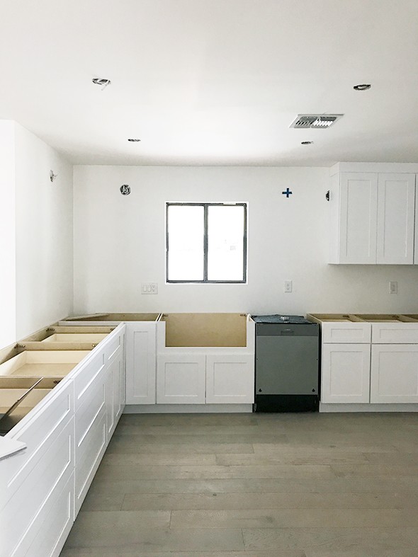
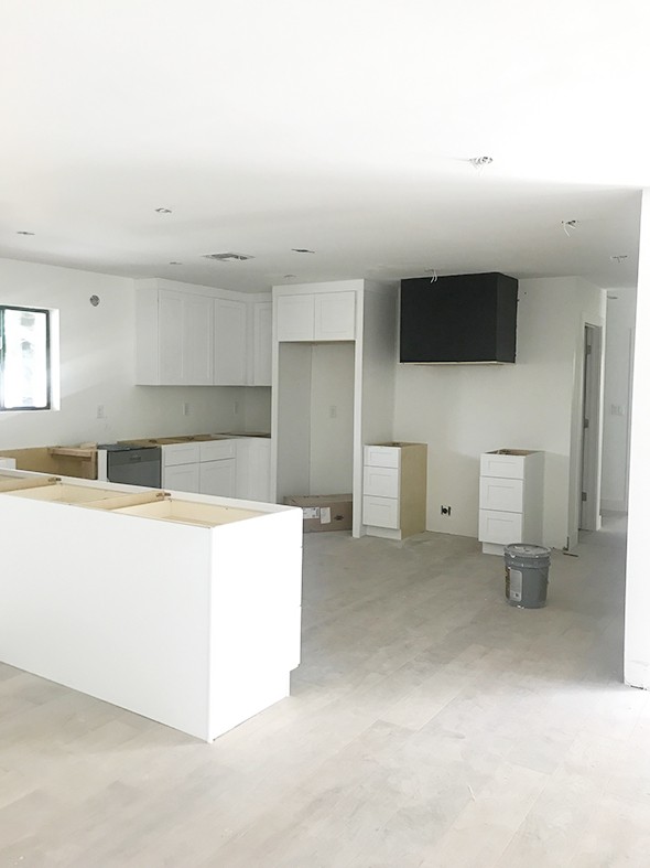
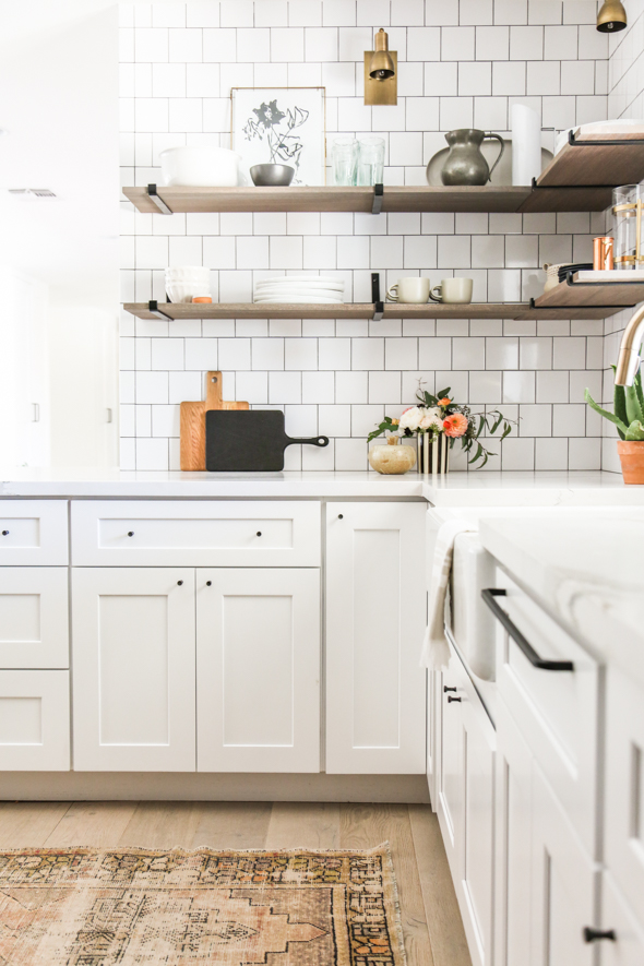
Brass accents in the lighting and the faucet as well as the wood open shelving helps to warm up the space. The warm gray veining in the Cambria quartz countertops also really helps to add interest and character!
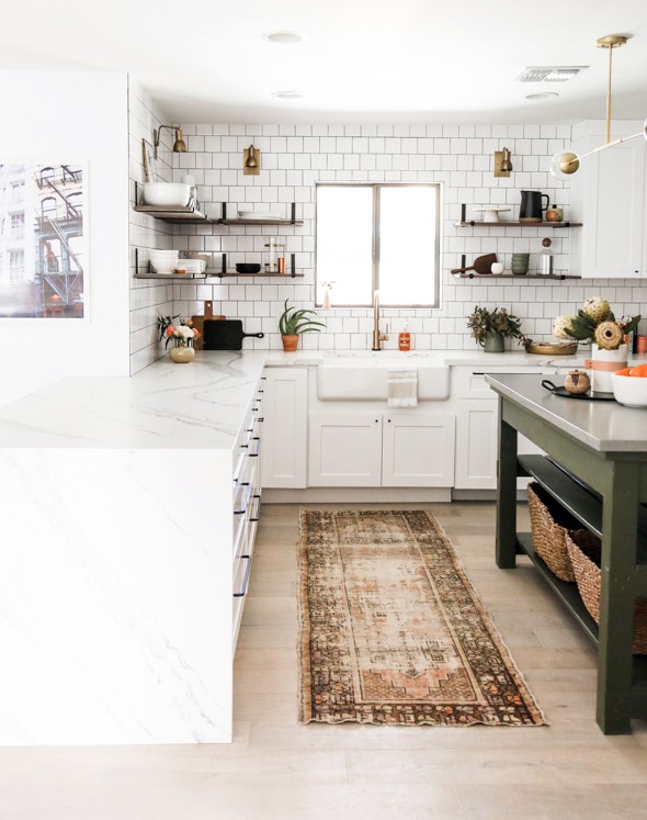
rug (similar)
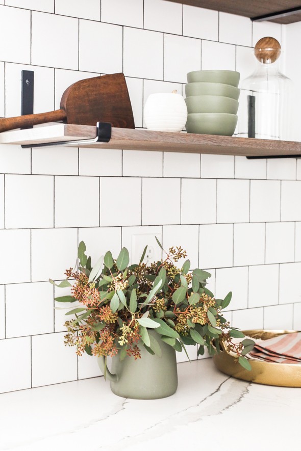
green pitcher // gold tray with handles (similar) // green bowls // decanter with wood stopper
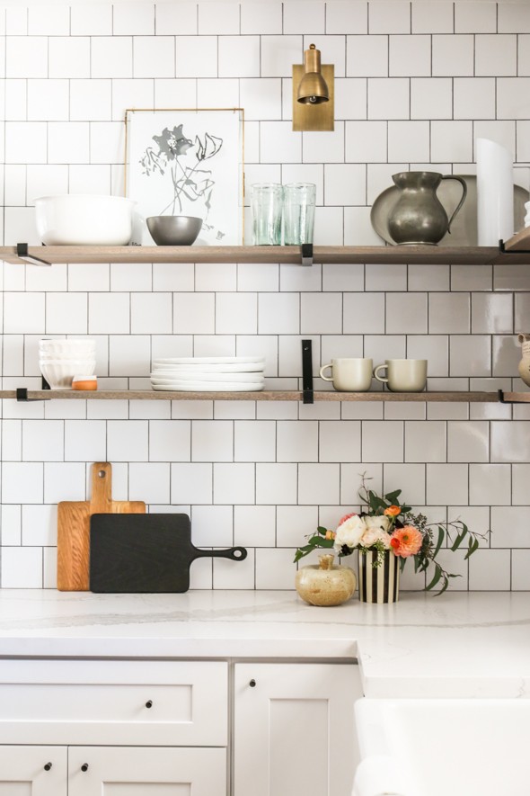
white bowls // white plates // cheese board (similar) // gold frame
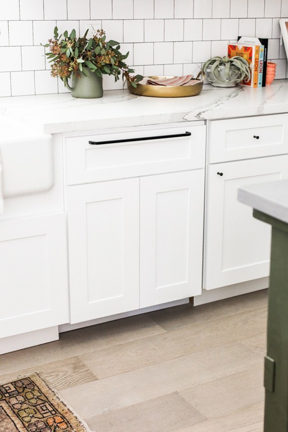
When we started working with Bosch on this kitchen build out, I was so thrilled to learn that their Benchmark series dishwasher accepts ready-made cabinet fronts (our cabinets were not custom) for a seamless look in the cabinetry. This really helps to make this kitchen look even bigger I think! And check out this video to see how cool the dishwasher is inside! The tines that hold up the dishes are adjustable, the bottom rack holds all sorts of big, bulky items (like HUGE popcorn bowls and stock pots!) and there’s the MyWay Rack that allows you to accommodate deeper items that you usually never have a place for! I’m OBSESSED with this dishwasher!
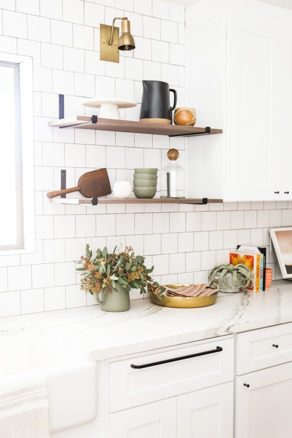
green pitcher // cake stand // black pitcher (similar) // gold tray (similar)
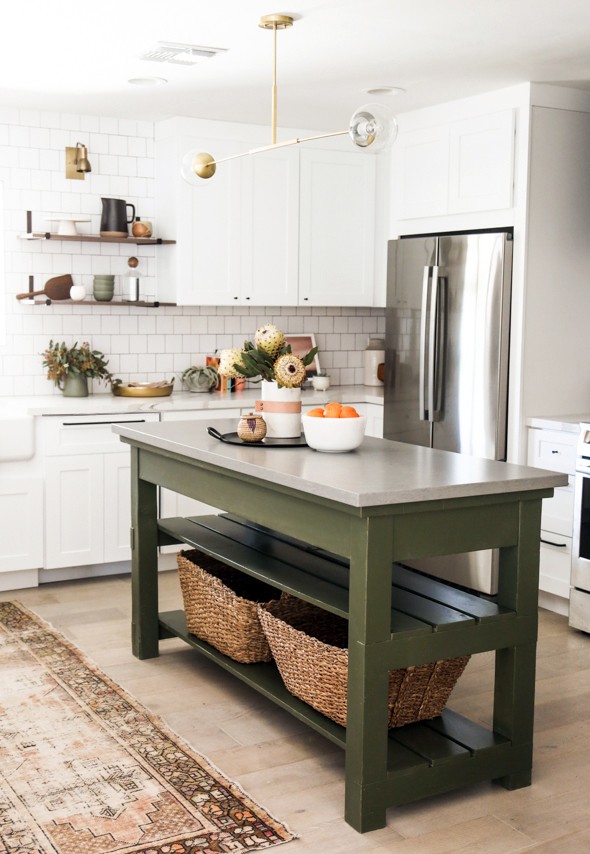
rug (similar) // baskets (similar) // pendant light (similar)
When I posted about this dishwasher on Instagram a lot of you that have this same model mentioned you LOVE the whisper-quiet aspect. I love it too, especially for the Gentry house kitchen because it is so open to the living and dining rooms. It’s so quiet you can run a load during a dinner party and none of your guests would realize it! :) You can literally be standing right next to the dishwasher while it’s running and not hear a thing.
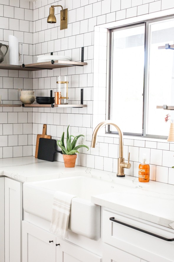
white plates // black plates // glass and gold pitcher
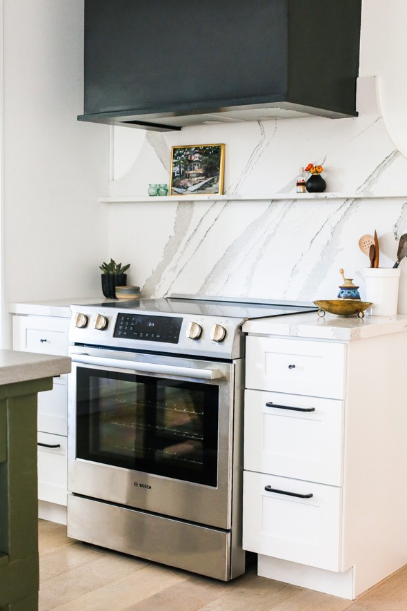
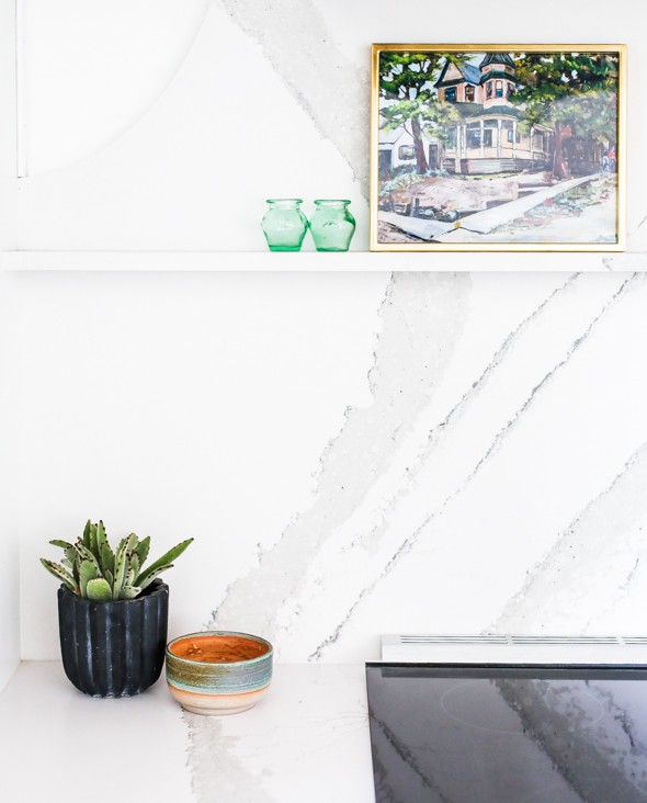
We couldn’t choose a gas range in this house, so we used Bosch’s beautifully designed app to easily and quickly find the perfect 30″ slide-in electric range. Isn’t it gorgeous? We really needed the range to not have a back panel to work with the quartz backsplash design, and Bosch came through for us! We also chose a Bosch hood insert above the range in the custom surround our contractor made. I’m SO happy with how this whole range area turned out! It’s functional AND beautiful.
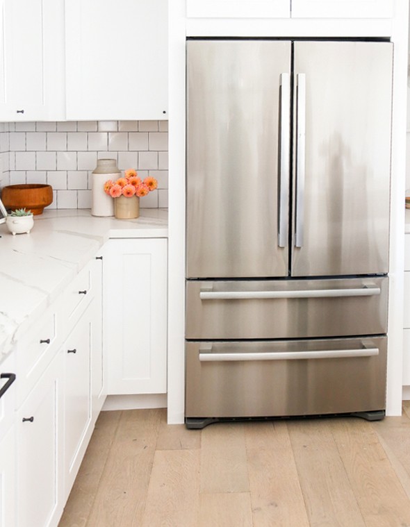
We also used the Bosch app to source the 36″ wide French Door counter-depth fridge. I love the sleek design and the organization of the interior components. The French Door design is a huge space saver and makes it easy to have a lot of people in the kitchen at the same time.
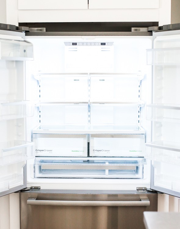
Our goal with this whole house renovation was to choose unique, beautifully designed elements that, most importantly, help this home function well, but that also look great. Bosch is known for making appliances that have quality that is both lasting and noticeable, and I know that the future homeowners will see and feel that from Day 1 here in the Gentry Project kitchen!
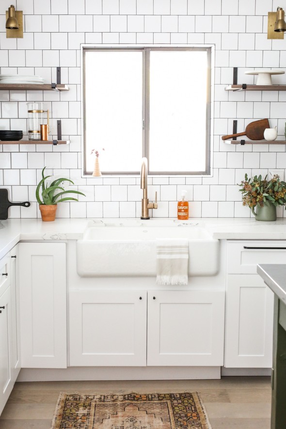
glass and gold pitcher // cake stand // soap
This post was brought to you in partnership with Bosch and Domino Magazine. Thank you for supporting the brands we use and love!
SOURCES
Bosch Benchmark Series Dishwasher
Bosch Counter-Depth Refrigerator
Bosch 30″ Electric Slide-In Range
Stone Fabrication by G3 Glass and Granite
Cambria Brittannica Matte Quartz on perimeter
Cambria Carrick Matte Quartz on island
Island custom, paint color is Ben Moore Dragon’s Breath
Cabinet Hardware – Pulls and Knobs
Brass Pull-Down Faucet by Delta
Brass Sconces by Lucent Lightshop
Brass Pendant light over island (similar)
Grout color: Dark Truffle
Shelf Brackets, wood is 11″ Mahogany from Home Depot in Minwax Driftwood stain
Runner (similar)
Wood floors Delaware Driftwood by Lumber Liquidators (similar)
Stools – DIY painted IKEA
Island Baskets (similar)
Print hanging on wall – FIRE ESCAPES
Print on range spice shelf – DOVER HOUSE



I came for the “gender reveal” party. I must’ve read that wrong.
I might be in the minority here, but I’m not a huge fan of the black vent hood over the range, which seems out of place in the [almost] all-white kitchen. When I first saw it, I wasn’t sure what the giant black box was, especially without something else to balance it out or being centered as the obvious focal point. (It seems like the shelf and accompanying items below the vent hood is going to get awfully greasy, too.) I have a lot to learn and am not a designer, so please teach me how this works!
I agree. That vent hood could be more attractive. The cut outs on the marble backsplash are a little odd too. Love the rest of it though! I would like to do something similar to that island in my traditional kitchen, but I don’t know if I could deal with the open shelves on an island in my everyday life. The closed cabinets hold more and keep things cleaner I think, but I love the look.
100 %agree.
I agree – it looks very heavy and draws focus. Frankly it looks like a mistake.
Hi Sarah,
Not a mistake! Black hood surrounds are not a new thing at all, but maybe this is the first time you’ve seen one? I like the contrast in the space but understand you might have chosen something different if you were the designer on this project. To each her own!
Jenny
Hi Liz,
The black works well in the space to me and helps add some much needed contrast in all the white and light. I like it!
The spice shelf is only a few inches deep so it won’t be getting overly greasy. I have one in my own kitchen and I haven’t had any problems with it at all. I love having a place to perch pretty spice bottles and salt and pepper cellars.
jenny
I Love the marble cut out and small shelf above the stove! The unique design is so refreshing! I also really love the black hood, it’s simple and beautiful and I’m sure in such an open space it will tie right in to the other rooms (I remember seeing black framed windows, right?). You always balance colors textures so perfectly!
Thank you, I love the range area too! The windows and doors are black and in person I think it all looks intentional and pretty! :)
Wow! Gorgeous! The square tiles look so fresh. It’s making me wish I’d done a few things differently in my own kitchen remodel. C’est la vie…. It’s a stunning, functional kitchen.
Thank you Aidel! So sweet of you to say, and I’m sure your kitchen is gorgeous!! xo
I really enjoyed your reveal! However I thought in one of your original posts this was going to have a Spanish modern theme, so I have been patiently waiting for your reveal posts! I hope to see a little Spanish modern in some of the other rooms as I really enjoy the pairing of warm woods with clean crisp walls.
Once the arches were gone (which we took out primarily to help with the painfully low ceilings), the house didn’t feel Spanish any more! We did patterned tiles in the master bathroom and on the fireplace that I think have a hint of Spanish style though! :)
ok i cant want to see that! Everyone in Texas is now doing farmhouse-y stuff, thanks to a fun couple on TV and I am just ready for a little bit of a change :)
What a great kitchen! I love the balance of white and black neutrals with the green! That island is amazing! I saw that it was custom and at first glance I thought the counter top might be stainless but in other photos it looks like a stone of some kind. May I ask what kind it is? I am looking to build something similar in my kitchen and would love to know more about your decision process!
Hi Melody!
The countertop on the island is a matte quartz from Cambria called Carrick. I love it! Indestructible! :)
This kitchen is really stunning. I especially love the black range hood, what’s it made of? It looks like painted plaster? Also, the island layout, and those quartz counters, especially around the stove *heart eyes*. Everything you guys do is flawless. Also, could I ask if you have an idea of how big the kitchen is? I’m planning a kitchen renovation myself adn it would be helpful.
Thanks Kate! I appreciate the kind words! :)
The hood is painted plaster. The kitchen as a whole is about 15×15′ but there is a seperate pantry that’s about 3×6′. I hope that helps! :)
Great renovation! Curious- where did you put the microwave? Currently struggling with that in my own remodel. Thanks!
It’s going in the pantry! :)
Awesome! I am going to try and do that as well. Thank you!!
Hi, Jenny! Gorgeous and covetable and inspiring! I always love your work and this is no exception! :)
One question – are you sure the island isn’t painted in Dragon’s Breath? I helped my mom select that color for her kitchen cabinets and it is very gray (green tinted for sure) but it truly looks nothing like your island (which I adore! And I love the color!) I know colors change with lighting, screen resolution, etc but that is a big jump! Again, wonderful job!
Hi Lauren!
I was surprised when the island turned out so green too! We definitely told the contractor Dragon’s Breath, but maybe there was a mistake? If so, it was a happy mistake! I love the green in here! :)
I hate to admit…I’m disappointed! The Gentry house had so much potential when you first gave us the tour and now it feels very generic. It’s nice, but it doesn’t feel unique. And the layout feels weird with two tiny little counters on each side of the stove. I dunno, I usually love everything you do but between this and the bedroom you shared already, I’m feeling pretty meh about this project now. Goodbye Spanish charm, hello blogger special of 2014. But maybe when it’s a flip it has to be that way.
Hi Katy, that’s really sad for me to hear. I don’t feel like this space is generic at all! I LOVE all the details – the spice shelf, the spanish-moroccan inspired ogee cut-outs on the range backsplash, the olive and rust colors with accents of wrought iron and black finishes feels very Spanish to me. We custom designed all the lighting special for this spaces and really put our heart and soul in it.
You’re right that we had budget constraints because this is a flip, but we didn’t skimp here! I’d be more than happy to call this place home.
Do people really have such mean, negative comments to leave on your wonderful blog? Jenny I’ve been following you since you started. Some time had passed and I’m finally doing a full kitchen Reno of my own!!! I’ve been torn on some of the final, but important details and selections, and ‘Little Green Notebook’ whispered in my head! Makes me realize the incredible effort, talent and know-how it takes! And I’m glad and grateful you’re helping me walk through this phase of the job! Specifically what to do with the wood oak floors, I’m happy to see Cambria Brittanicca here because it’s what I’m using (also for the backsplash which I’m excited and very nervous to do), finishes AND I’ll be sure to have a couple of breadboards!! Thank you Jenny for your generosity and sharing your talent with us all!
Hi Jenny, Fabulous reno!!! I want to move right in:-) Love,Love every detail. It just dawned on me. This looks like a friend of ours kitchen? Is this property on Kalil Drive in Scottsdale?? Great job
Thank you Susan! I’m so glad you like it! :) This is on Gentry Drive in Mesa – not too far away!
Hi Jenny, so beautiful! What did you do to secure the corners of the open shelves where they meet? I don’t see a bracket, but wouldn’t want to not utilize that space.
Keep up the good work!
Hi Taylor!
The wood gets screwed into the brackets and is strong enough to support the corners, so no need for a corner bracket here!
Thanks for stopping by! xo
Love, love, love this Jenny! That little salt shelf is so adorable and the sweetest touch. Well done!
Thank you Kate!! I love the shelf too! :) It’s the little things in life, right?!
xo
My question is when can I move in?
Jenny, I LOVE it!!! Black hood, tiny shelf, scalloped corners on the backsplash – but I think my favorite is the square tiles laid in running bond – I just did the same thing in my kitchen and seeing that you made the same choice is confirmation for me! Thanks for always inspiring!!!
I love it too, Lydia! Feels like a modern way to do subway tile! xo
I love this Jenny! So beautiful and a great mix of elements as usual. You’re a champ to roll with the mixed comments. It’s a beautiful space and I love your choices… For what it’s worth, I think you nailed it!
Thanks Jamie! After a decade of blogging I’ve developed some thick skin, but I’ll never fully understand why people feel the need to comment if something isn’t their style! But I SO appreciate you and others taking the time to comment and pass along a compliment! There’s nothing better after all the hard work that went into the design and install and then the production of the photos and post. I’m so grateful for your kind words! xo
Beautiful work, Jenny!
Thanks for sharing!
Thank you Mariana! Means the world! xo
Ugh, okay this is really, really great! I love the choice of hardware0 that dainty knob! Well done *claps*
Thank you, Ally! I love the dainty knobs too! xo
Where did you get the knobs and pulls? Thanks!
Nicely done! I especially love the island, the lighting and the countertops…and the hardware, the rug and the appliances. It looks like a kitchen I could use! Will we get to see the pantry???? Can’t wait to see the rest of the house!
Definitely want to see the pantry too like the above commenter. I was hoping you’d retain some of the Spanish charm of this house, but it looks like you took every single bit of it away. Were the Spanish elements not original to the house or just felt too niche for a flip? Just curious on why you did away with, what seems like, every single Spanish element (the fountain out front, the fireplace, the arched doorways, etc). The kitchen is beautiful though!
Hi James,
The Gentry house is not historic, or even all that old – the Spanish elements before were bad and awkward, especially in person. The fireplace was a monstrosity and needed to be removed for safety reasons as well as aesthetic ones.
We kept or reinstalled the beams, the iron and wood accents, and patterned tile to give it the vibe we were after that fits the flat roof/Spanish style of the house, but still works for today’s market. I think it’s fresh and was a smart way to handle the less exciting aspects of this house. If a home buyer is interested in getting the low ceilings, 70s arched windows and dangerous fireplaces, there are plenty of houses here in AZ for them, promise!
Jenny
I LOVE everything you do!! I want to copy the island color but it def isn’t the dragons breath, do you happen to know what it is?
I love this kitchen! I’ve kind of been over white, but you made me love it again! Maybe I missed it, do you happen to have a source for the tray on the island? Thank you!
This kitchen design is beautiful! I love the open shelves and the white cabinets. But, my favorite part is the rug. It’s gorgeous!
I’d love to see a budget for this project. Also time frame from demo to functioning. It’s getting that time in our 100 year old house.
BEAUTIFUL kitchen and timely as I am ready to install open shelves in my own kitchen. I am trying to purchase the same brackets. Which size did you use here? I can’t decide what is the best size to line up with upper cabinets.
Thanks!
Absolutely love your work! Well done
I am sure I just missed this somewhere, but can you tell me the flooring source? Thank you so much!
Did you paint the IKEA knobs to match the pulls? They look to be different colors online? Thanks! I love the overall look and feel of the house.
Hi Jenny- I LOVE this kitchen (and project as a whole) and only wish I could add so much careful detail to my own renovation! I have searched the internet, and your knob/pull layout feels so fresh, and yet classic. Would you be willing to share how you spaced the”double knobs” out on the drawers? I know proportion is everything, and I’m worried I’ll ruin it if I just try to eyeball. I have upper drawers that are 21″- would you do the “double knob” on those? Thanks!
Hi Jenny and Fellow LGN Readers…Can someone tell me if it was ever mentioned if the open shelves were sealed with anything after the Minwax stain in Driftwood? Thank you!
Hi Katrina! We used satin finish polycrylic sealer! Hope that helps!
It does! Thank you so much for taking the time to reply!
Hi Jenny! Any chance you know the dimensions of the peninsula with the 3 stools? We’re starting a kitchen remodel and are very limited on space, but are putting in a peninsula and really want to fit 3 stools in. I know those IKEA stools have about the smallest footprint out there so I’m wondering if we could make it work. Any help would be so greatly appreciated!
Hi Jenny- I love the plaster range hood so much and was wondering if you could let me know how it is done? My finish carpenter is willing to build the hood around the hood insert for me, but as far as the plaster I have no idea how to go about that. Also, could you share the dimensions of the vent hood? Thank you so much.
I absolutely love the remodel!!! Could you give me some more info on the floating shelves? Did you just buy wood and stain it?
On the bar stools in this project, did you stain the wood as well as paint the white? Of were they already finished?
I just sprayed the white on the legs. The stools come in the that wood finish at IKEA!