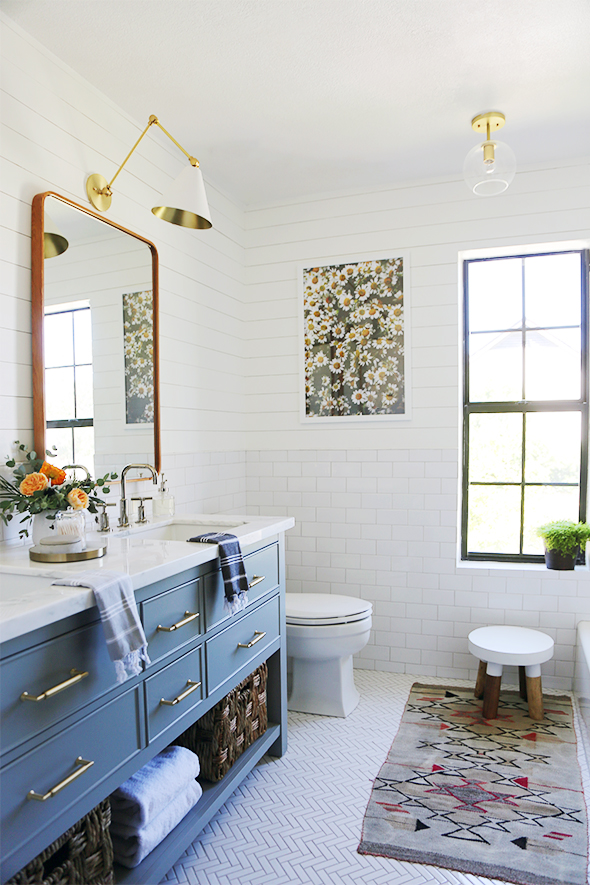
The girls upstairs bathroom is finished! I starting writing a MONSTER reveal post with the shiplap tutorial included, but I just couldn’t edit it down to less than, like, 70 photos, so I decided to make this reveal a two-parter! This post is still enormous, but I’m hoping it’s a little more bite-sized! :)
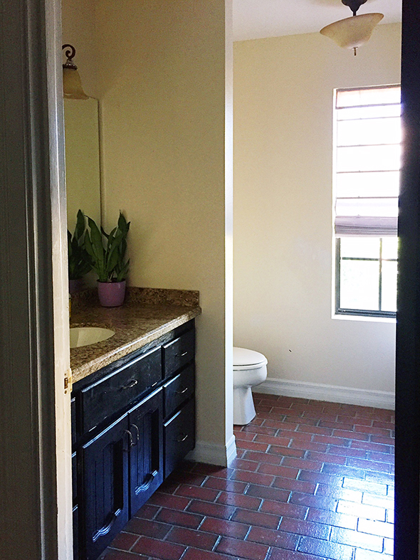
As a reminder, here’s what the bathroom looked like when we moved in (and here’s the post where I talked all about the tile we considered for this space).
And here was my rough plan for the project:
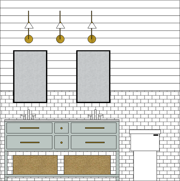
There was only one sink before and all the plumbing fixtures were almond color (not exactly contributing the the bright and fresh look I was after here!). We tore everything out, including the framing and drywall next to the sink so we could put in a 60″ double vanity. Just removing the little wall already made the space look and feel so much bigger!
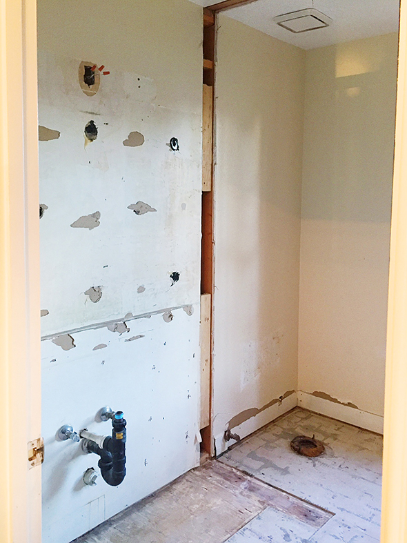
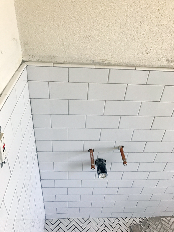
After we moved the plumbing, repaired the drywall and framed in two shampoo niches, we installed the tile I picked up from Floor & Decor. There are SO many affordable tile and flooring options at Floor & Decor! I used them a TON in my client work when we need to save some money but don’t want to sacrifice on look. The herringbone tile we put on the floors here is only $2.99/ft!
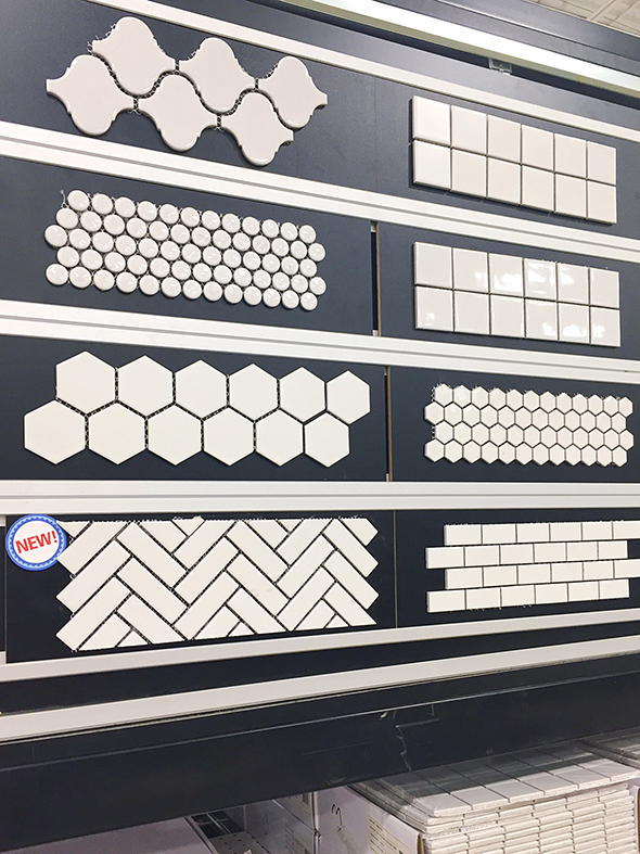
I thought a lot about the white penny tile or the 2″ hex shown here, but I think I always knew in my heart that the herringbone would win in the end. :) It’s just too pretty (and too affordable!) to pass up! It cost less than $120 for all the floor tile in this bathroom!
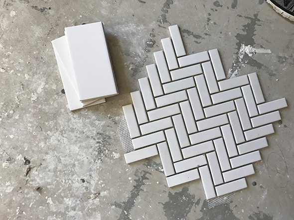
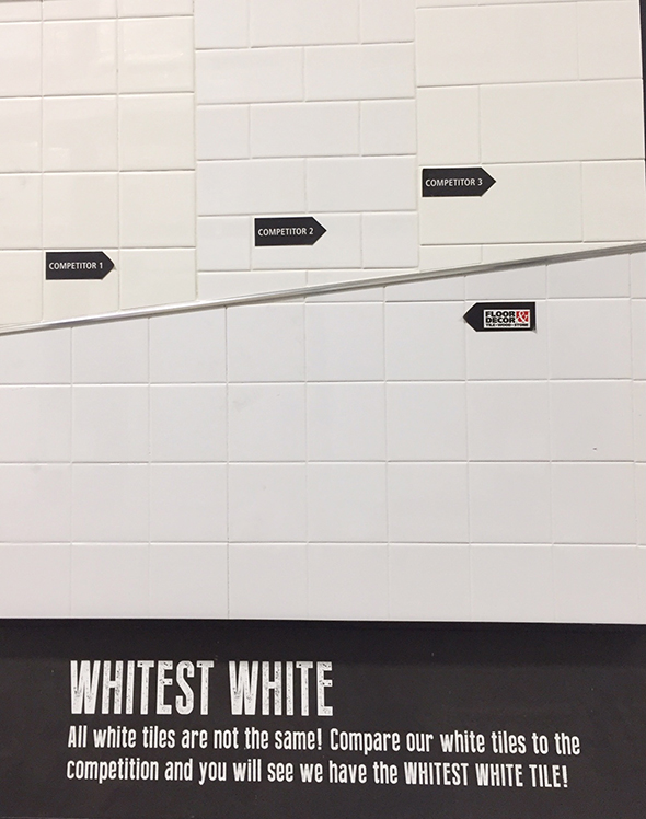
Their bright white ice subway tile really is a VERY bright shade of white and only costs 21 cents a piece! I wanted to run the tile up to chair rail height around the main perimeter of the bathroom and all the way up to the ceiling in the shower/tub surround.
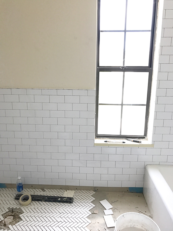
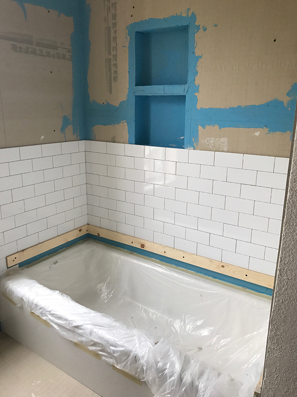
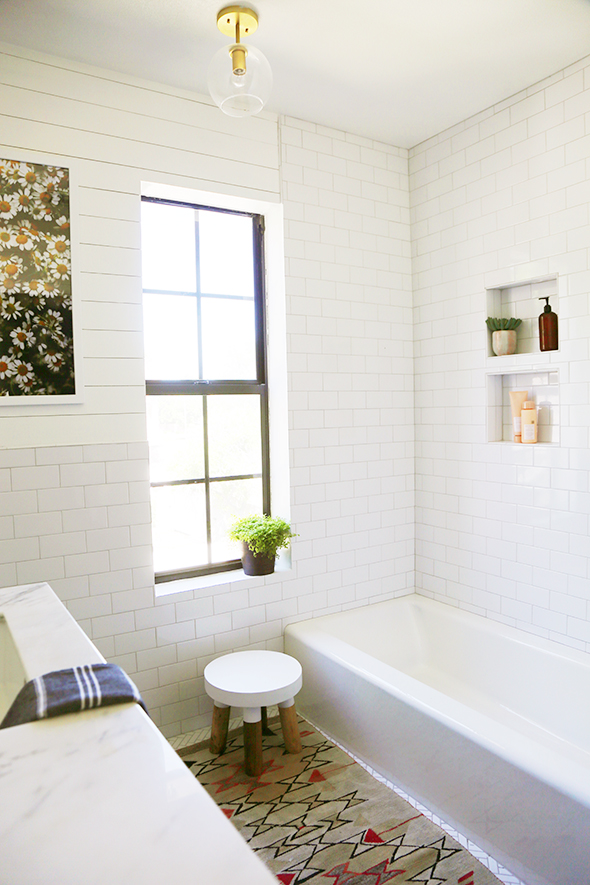
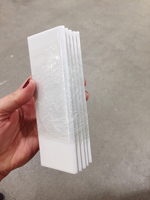
We used their bullnose trim pieces cut down to 1/2″ wide to act as a cap piece on top of 1/4″ backer board. I like how it has a more squared off, stepped out look than the standard cap pieces that have a much more pronounced, dramatic roll. It feels a little more modern and fresh to me!
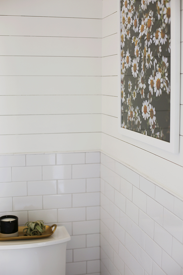
You can see here that the mirrors just sit right on top of the face of the tile. Since the step out is only about a 1/4″ after the shiplap was installed, there was no real issue with the mirrors sitting on top of both surfaces.
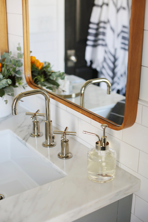
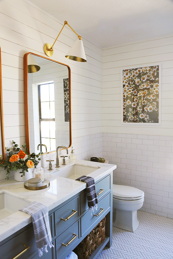
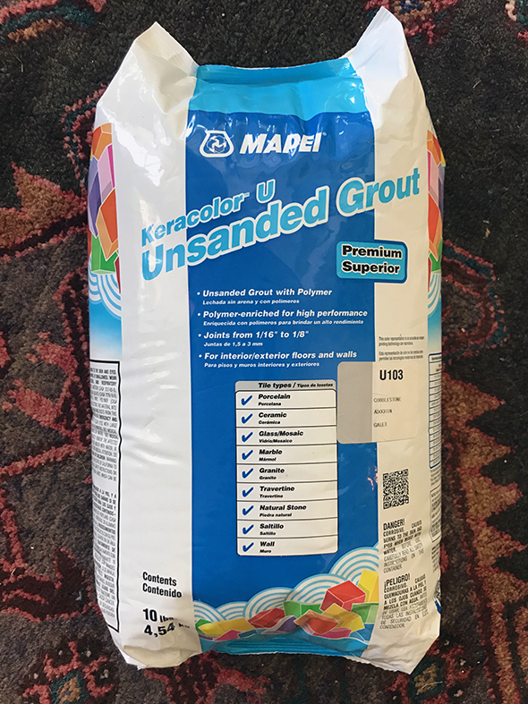
I went back and forth on grout color quite a bit and was all over the map. Did I want black grout in here? Maybe white is a more classic choice? I ultimately decided to go the lazy route – right down the middle with a warm gray called Cobblestone that I knew would be durable and practical. I also love that the Cobblestone color didn’t feel too trendy but also gave a nice contrast to all the white tile.
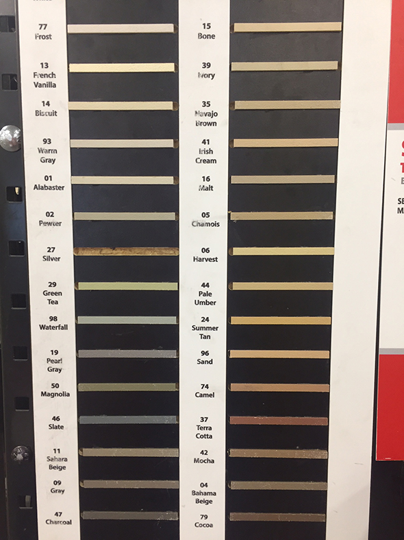
They have a MILLION shades of grout to choose from at Floor & Decor and you should always use unsanded grout for wall tile and sanded grout for floor tiles.
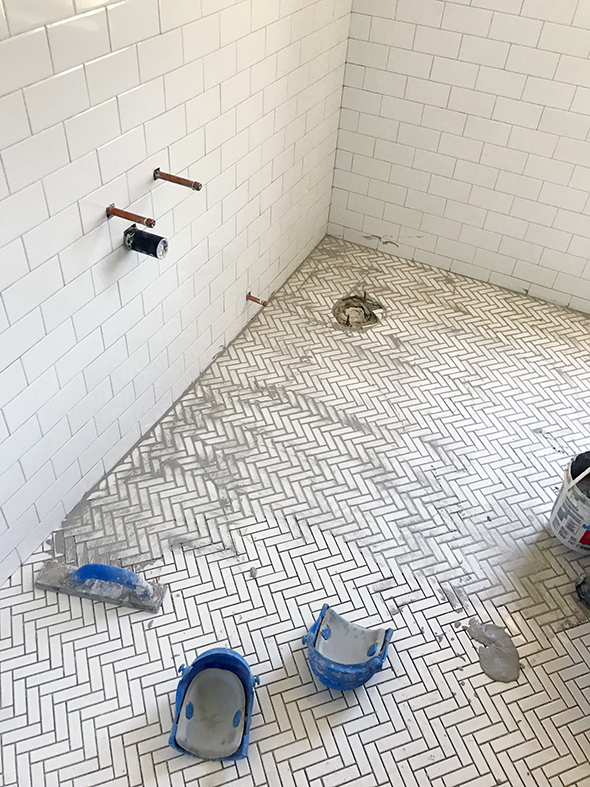
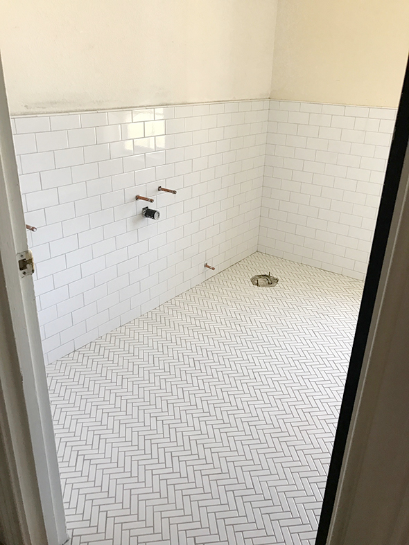
I think the grout color I landed on is just right for this space! The warmth in the gray plays nicely with the bluey gray vanity color.
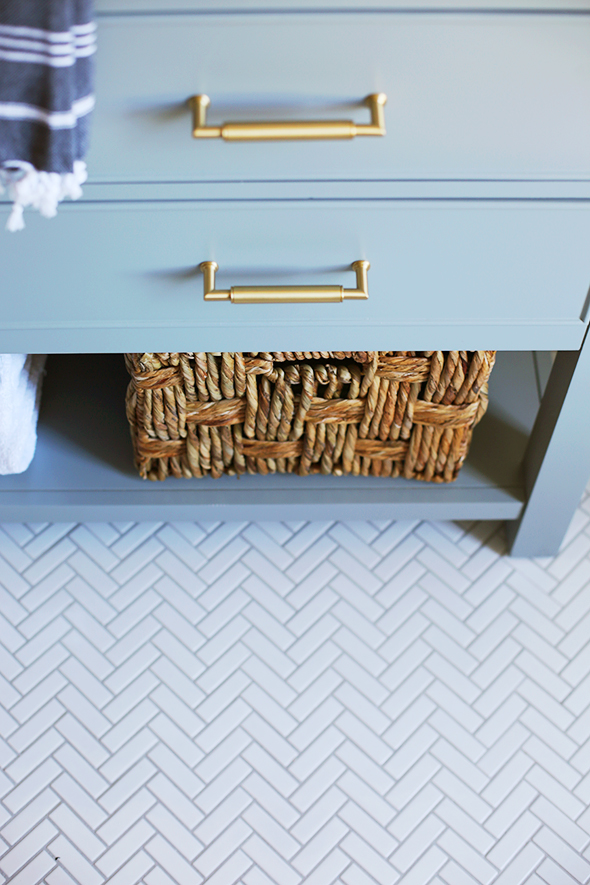
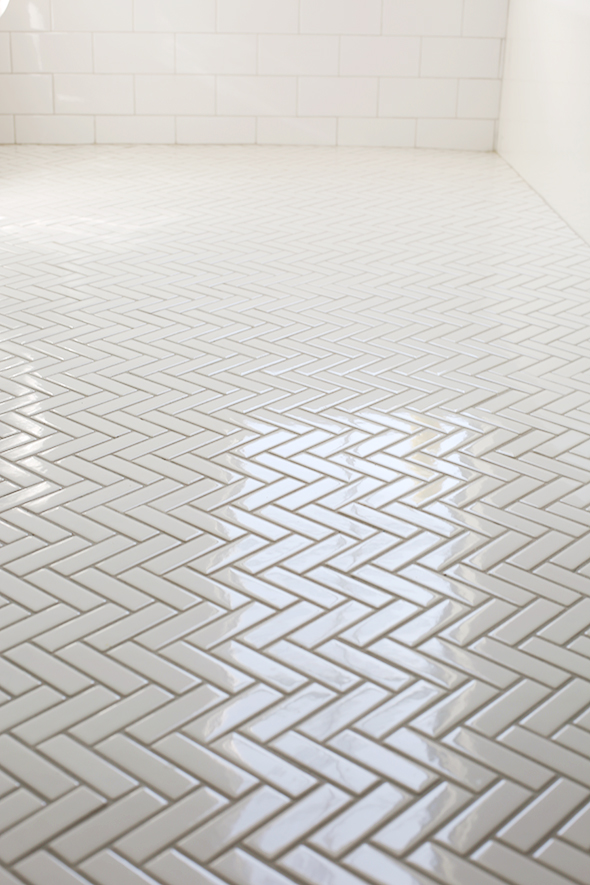
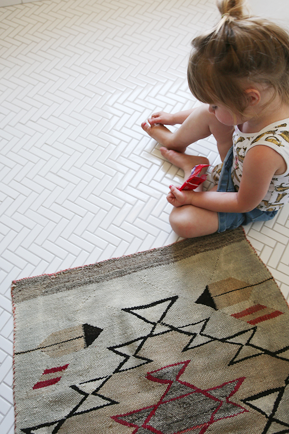
I also love the bright white tile + grout color with the vintage kilim rug we have in front of the tub.
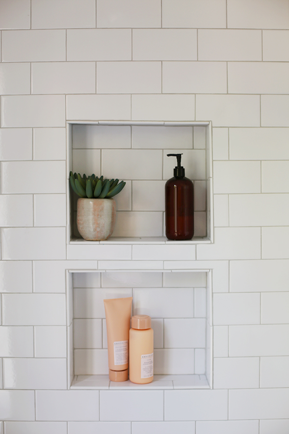
I thought about having just one long shampoo niche that would run the whole length of the tub, but ultimately landed on two smaller niches, which cost a lot less money for framing out. And we used the same bullnose edge pieces to create the edging for the shampoo niches.
I LOVE the tile and how absolutely FRESH the formerly dark and dingy bathroom feels now!
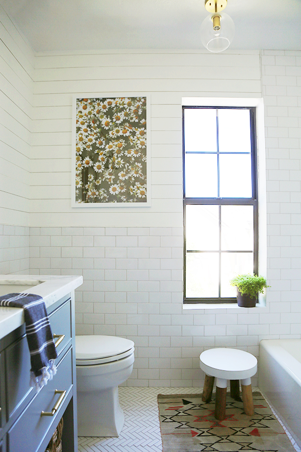
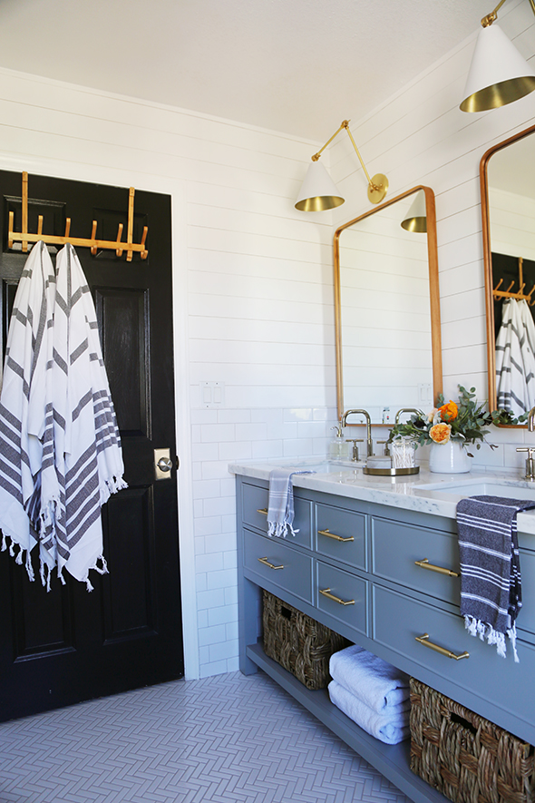
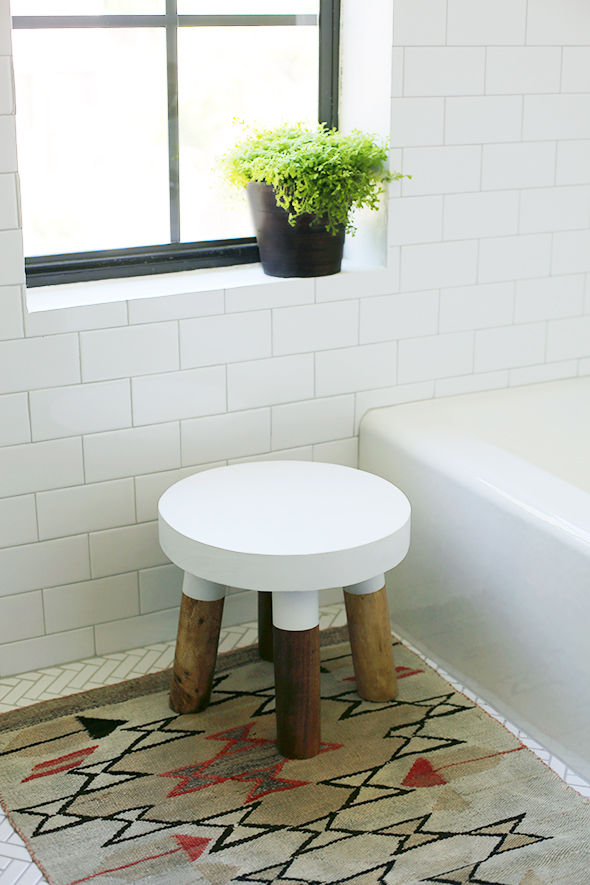
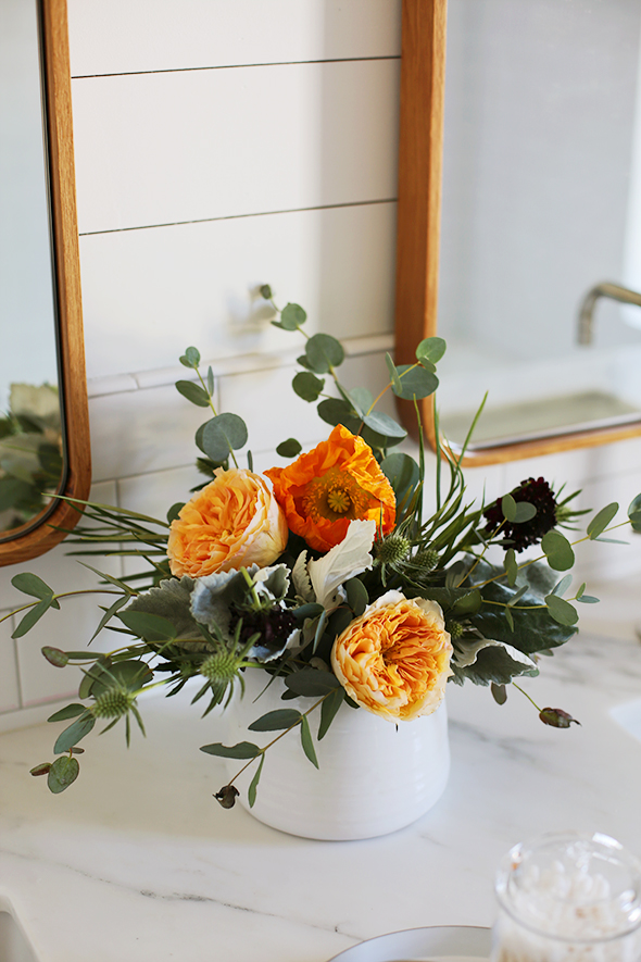
(PS I’m writing another post now about the shiplap we installed here that will include more info on the plumbing and vanity, so stay tuned for that! Should be up tomorrow or the next day! In the meantime, if you’re looking for the sources for some of the items pictured here, check out the round up below!)
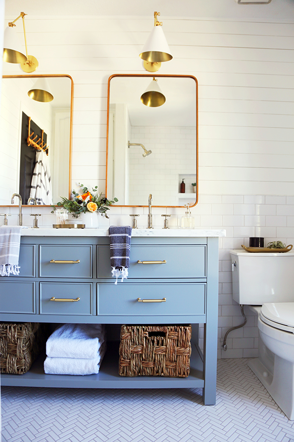

(comes with or without stone – I bought mine without, though it may have been more cost effective in the end to buy it WITH!)
Kohler Purist Polished Nickel faucet
Rejuvenation Bentwood White Oak Mirror
Flatweave rug ( I use and recommend this one ALL the time, but the one in our bathroom is vintage)
Black Forest Candle (smells SO GOOD)
Bergamot Black Candle (the container makes a pretty planter once the candle is done burning!)
Wooden Over-the-door Towel Rack (great for small bathrooms!)
Brass tray (perfect for coralling toiletries)
Kohler Bellwether alcove bathtub
Paint Color – Benjamin Moore Chantilly Lace
**Also, this post was not sponsored, but I wanted to mention that Floor & Decor provided me with the tile for this project as a part of this post collaboration. As always, all opinions are genuine and my own! So, so happy with this tile! :)


I followed the link to the bathroom vanity you purchased and the color listed appears to be more of a light gray than the blueish color on your post. Did you paint it?
Hi there! I was curious if you could tell me what the dimensions of the shower niche are?
Thank you!
What color did you use to paint your vanity? I love the shade of blue and am using your bathroom as inspo!
What color of paint did you use for the vanity? I love the shade of blue and am using your bathroom as inspo!
Hi Leah! I didn’t paint the vanity. It came in that blue gray color! It’s was a great find!
Hello! This bathroom is beautiful! How has the tile floor held up? It doesn’t have a PEI listed, so I was just curious. Considering using this for a bathroom for future hopeful kids :) Thank you!
Hi! Did you paint the sconces white or did they come like that? Would love to know! Thanks for sharing this redo and the sources!
Yes would also love to know if you painted the sconces or if you used a different brand? Love the design!!
I just asked Luvent to make them with white shades! Super simple swap out for them! :)
Thanks for the super helpful folding tips. Beautiful!
Beautiful bathroom metamorphosis! Now it looks great, I liked the floor tiles, I would like it at my own, but it’s too late: D
It looks really great, I have to tell you that I particularly liked the tiles, the ones on the wall as well as the ones on the floor, have their own climate, the bathroom will fit perfectly, I plan similar things at home, although I do not know what to do end up deciding, I hope it will go all out my way, best regards!
The end result is dazzling. A great idea turned into a beautiful final effect! Bravo.
I love this bathroom and am using it as inspiration for our bathroom design. My only concern is choosing a floor tile with that many grout lines with regard to wear and tear. Ours is a kids bathroom too. Did you have any trepidation about how it would hold up long term? Thanks so much in advance for your thoughts!
It’s holding up well for us! We used an epoxy grout and it seems to be very hard wearing. I’d suggest going with a mid-tone warm gray for good stain hiding factor!
Hello,
Would you be able to give me the dimensions of the shower niche?
Thank you.
Absolutely love this bathroom, you are so talented! Thank you for sharing the sources – SO helpful. Did you put up a shower curtain? If so, any particular design? Thank you!
i was thinking in this bathroom that you had painted the vanity but just saw in another comment that you didn’t! are there any bathrooms where you purchased a vanity only to immediately repaint? trying to find some tips thanks
How did you paint the vanity?
Hi Denise! The vanity was not painted – it comes in this color. I would describe it as a true blue=gray. Hope that helps!
Looks great. By any chance the herringbone in the shower floor to be slippery? I was thinking of doing the same thing.
Love the bathroom! Was curious about the size of the shower niches. Are the connected or two separate ones? Thanks in advance.
All these years later, I still have this bathroom as an inspiration photo for my girls bath. I have two daughters…do you feel like this has been enough storage for your family? We try to be minimalistic but I also want to be realistic. Love your eye + style + super love your gift guides refer to them every holiday! XO