Our guest room has been an eyesore from day one of moving in. Despite a few efforts to spruce it up over the last few years, it’s always been sort of an afterthought. Here’s what it looked like when we first walked the house before buying it. Pink carpet. Golden Tan walls. Heavy furniture. Astroturf on the balcony. (Yes, astroturf.) Not totally my style I would say.
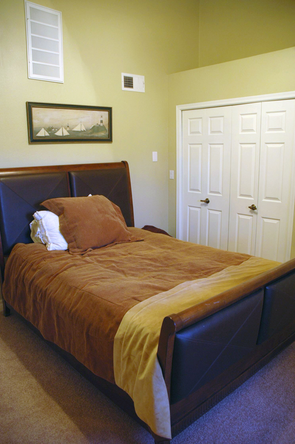
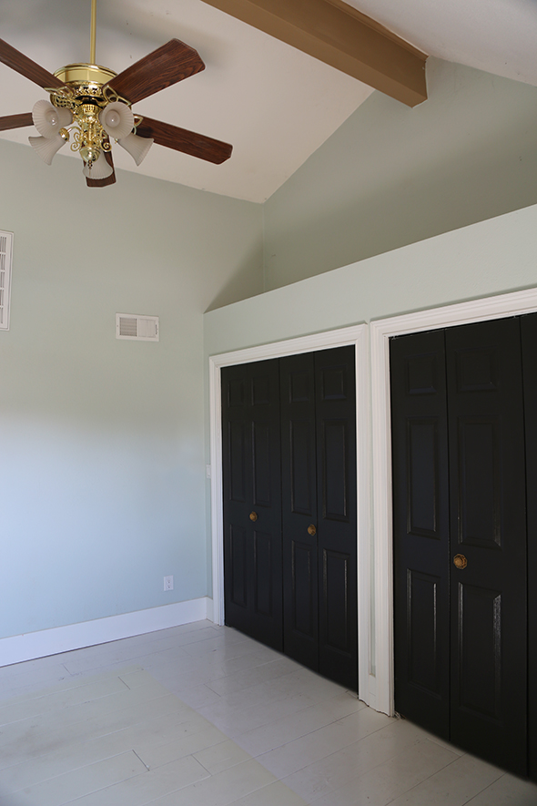
Right after we moved in, when my sister Heather still lived with us and stayed in this room, we painted the doors black, the molding white and used some leftover random light blue paint for the walls. It was an improvement on the tan walls for sure, but still not ideal, right? And those black doors were a pretty idea, but that’s a LOT of door there on that wall. It was essentially a black wall in a tiny, already dark room. Not a great choice.
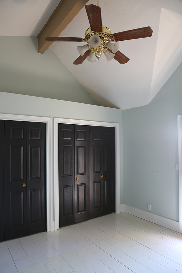
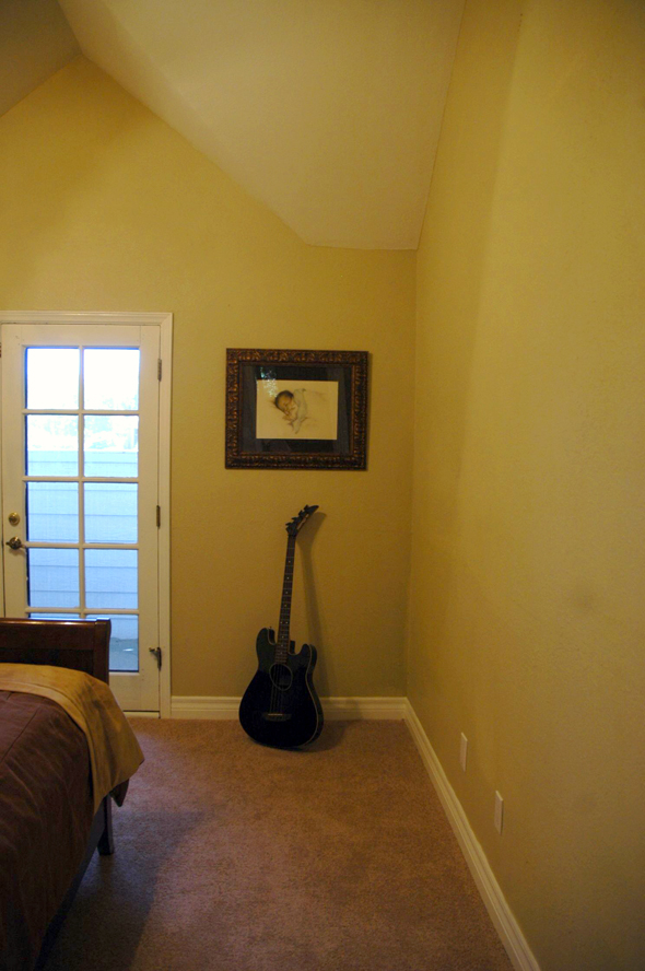
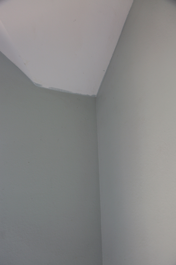
We didn’t realize it until it was too late, but we didn’t end up having enough blue paint to do the pitched ceilings, just enough to cover the tan paint. It has always bugged me, but apparently not enough to do anything about it for a really long time! Poor Heather had to live with janky paint lines like this for years.
Enter, my friends from Ace Hardware! They invited me to check out their Optimus line from Valspar (which is one of Ace’s best paint brands and is the most stain resistant). I immediately thought of the guest bedroom. Followed by a lighting bolt of inspiration: PAINT THE WALLS WHITE AND THE TRIM A DARKER COLOR! YESSSSSSSsssssss….
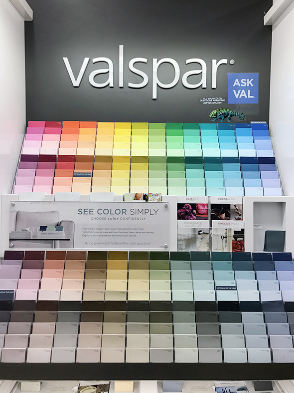
I went to Ace to pick up a few paint chips in their Paint Studio (you can find your local Ace here!). Their Valspar line is so well curated. I think they offer just the right number of color options. Too many choices can be so overwhelming, right? But too few can feel frustrating, since not every color looks the same, or good, for that matter, in every house. Guys, PINTEREST LIES TO YOU. What looks great in one blogger’s house just might not be the right fit for your home! It it SO important to get the right color for your space.

Take our funky guest bedroom for instance. There is only one window in the room (and actually it’s not a window – it’s a paned door) and it is south-east facing, but its also on a little porch so the door is pulled back from the face of the house. It’s full, bright sun, spotlight style, for the first few hours of the morning, but then it’s pretty dark the rest of the day.
The tan was a terrible color for maximizing the natural light, but the blue I chose after we moved in was pretty sad, too.
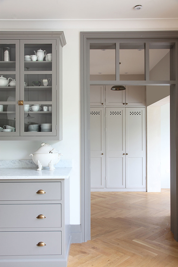
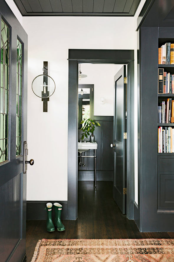
For our little makeover, I knew I wanted to do a creamy white on the walls and a contrasting color on the millwork. I think its such a fun way to get the best of all worlds – where you get the beautiful light that comes with white walls and the depth and character that comes with a color on the trim and doors. I had these two inspiration images in mind as I was selecting colors.
After lighting and orientation of exposures, your floors are the most important factor of your paint color choices. Next comes your decor, of course, but that part is definitely last. SO many times I see friends choosing a color (usually gray, which is really hard to get right) based on their bedding or the color of their side tables… or solely because they saw it being used on a ton of blogs or in magazines. :/ And once they get their walls painted they realize the color of their carpet and the shadows in the room makes the gray paint look very purple! GASP!
Don’t make the same mistake! Just grab a couple samples and try them out in your actual space. And the amazing news about Valspar at Ace Hardware is they guarantee you will love the color. And if you don’t love it, you can get a replacement gallon! How’s that for taking the pressure off?!
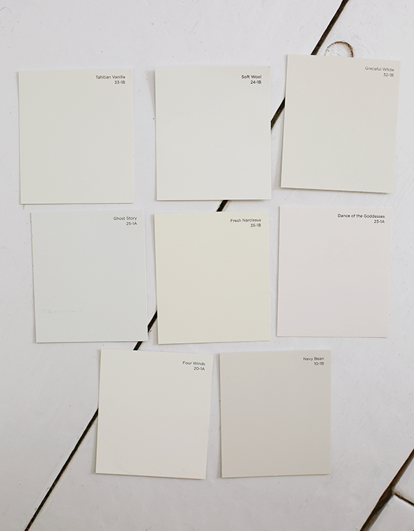
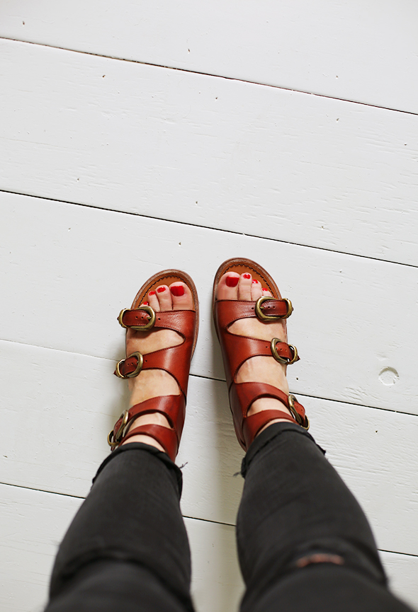
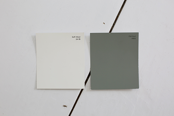
I brought all my samples in the guest room, laid them out on my white painted plywood floors, and I instantly knew the colors I liked and didn’t like for the space – and I’ll tell you, they weren’t the colors I thought I was going to choose in the store! For the walls, I thought I would want Graceful White (top right), but I ended up really loving Soft Wool (top middle) with our floors! And for the trim color, I originally thought I would want something deeper and more moody. Like this beautiful color, called Old Soul.
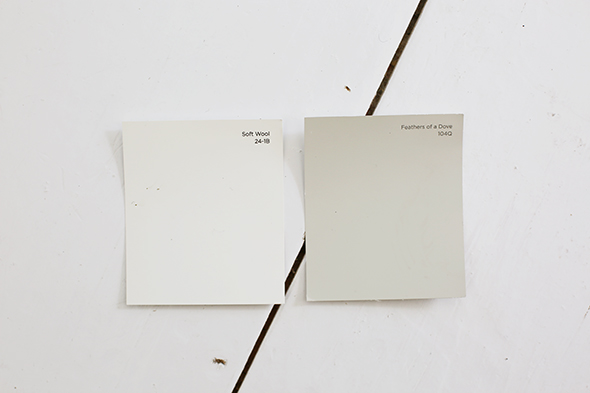
But as soon as I got all the colors in there, I knew I wanted a lighter gray on the millwork. The bottom center chip called to me!
It’s called Feathers of a Dove and I think it works beautifully with Soft Wool and the floors! Doesn’t the color combo feel so classic?
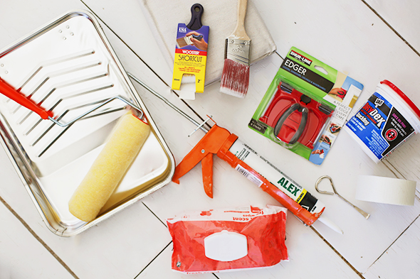
Before I started painting, I took the time to patch a few holes in the wall and to caulk some areas in the trim that had settled and cracked over the past few years. Here are the products that I use the most when painting. All of these items are available at Ace Hardware, except for the baby wipes (which I use to clean up drips!). And if you have any trouble finding anything, the Ace Hardware employees are always incredibly nice and helpful.
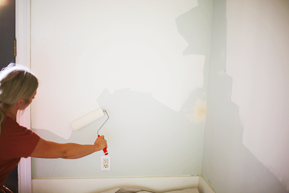
When painting with a roller, my best tip is to avoid only rolling up and down. If you roll the paint on in a W or X pattern, you’ll get in all the nooks and crannies (if you have textured walls like I do).
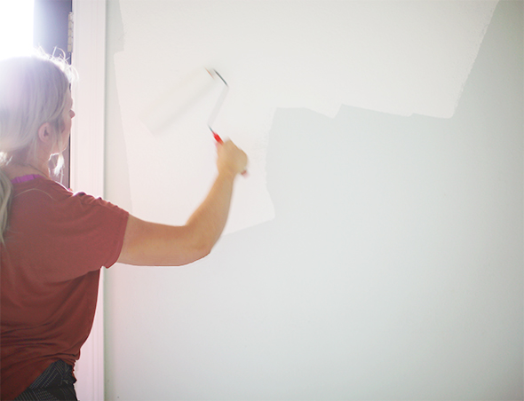
Also be sure to load the roller with paint for every 3 square feet you paint! If you try to roll on more than that, you’ll end up having uneven coverage. If you reload the roller often, you’ll probably only have to do one coat like I did! That Optimus line is REALLY good and covered my blue walls with no problem!
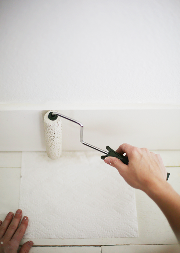
I like to use a mini roller to paint all my base boards. If you keep a paper towel or a scrap piece of paper under your roller at all times, you’ll only have to cut in on the top of your base boards, SO EASY!
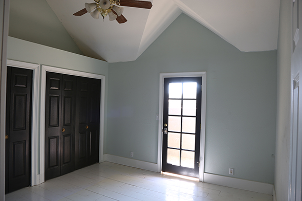
Here’s how the beautiful new paint job turned out! I’m SO happy with it!!
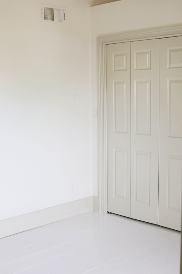
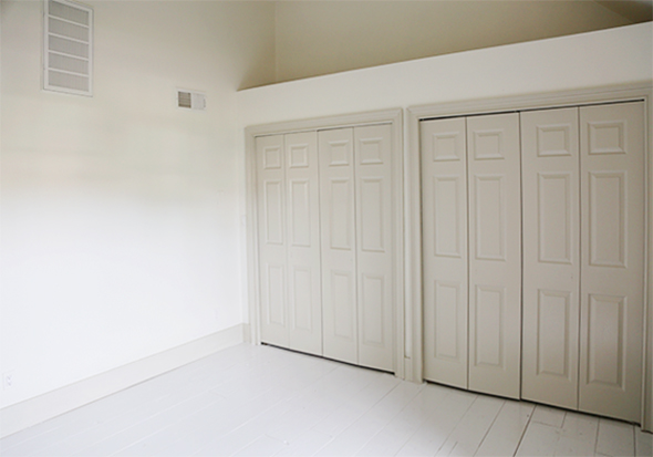
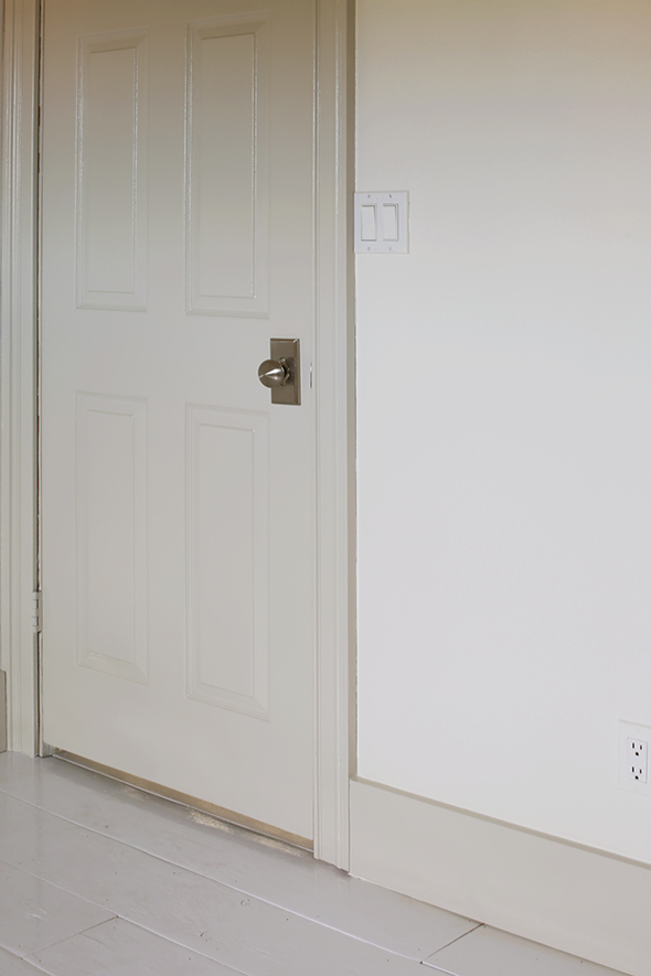
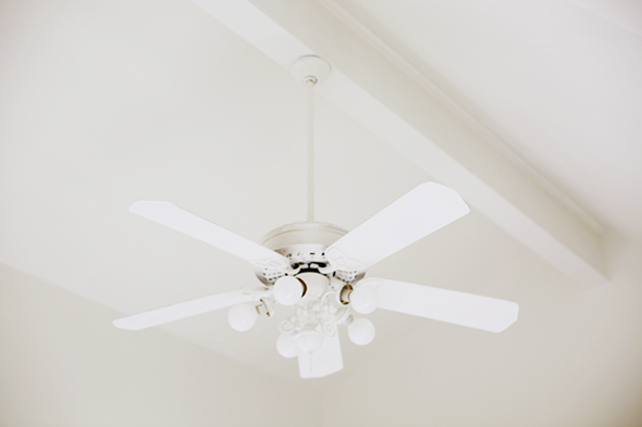
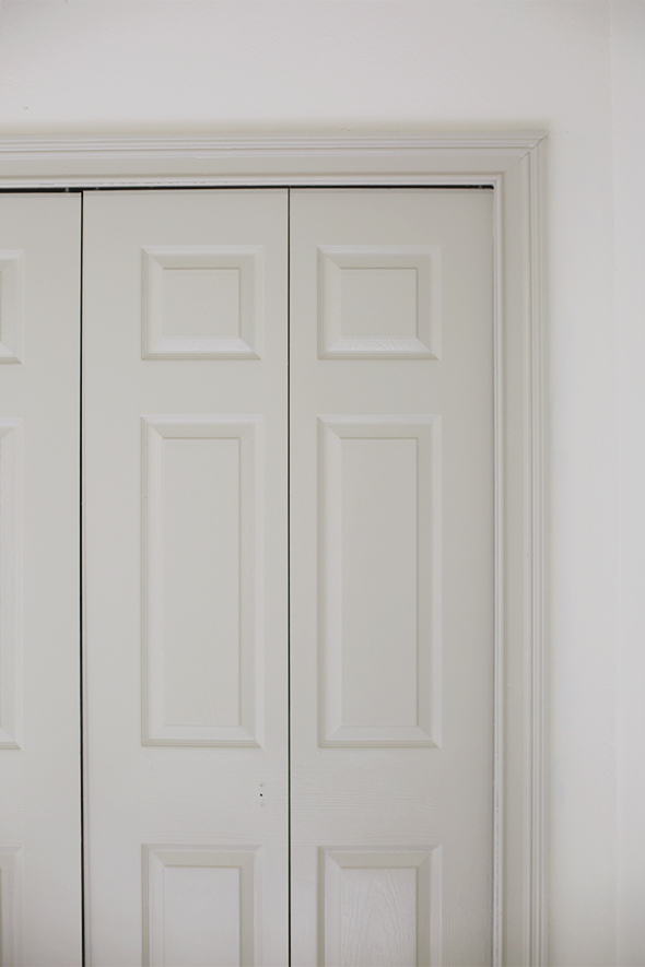
I painted the ceiling, the center beam and even the ceiling fan in the Soft Wool white color. The Feather of a Dove warm gray color is heaven to me on all the doors and trim in the room! It all feels light and so fresh, but still interesting/not boring!
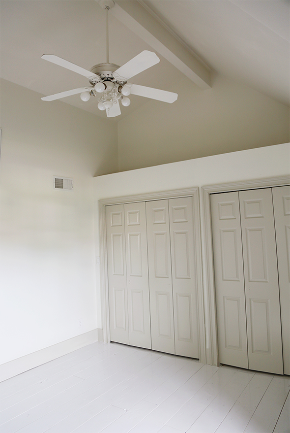
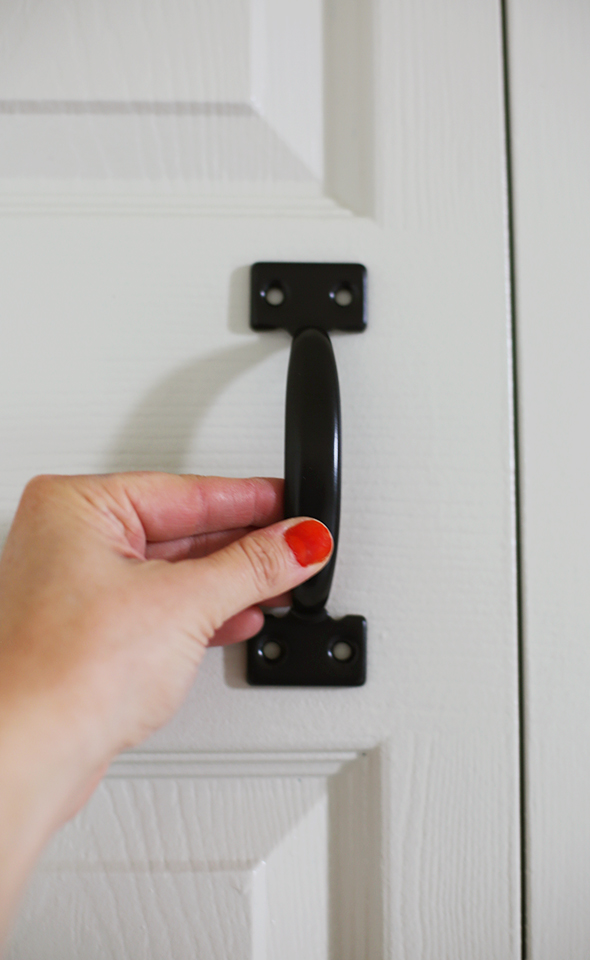
I’m excited to add these black pulls to the closet doors that I bought at Ace.
I think they’ll look so cool with these accordion sconces I bought for either side of the bed.
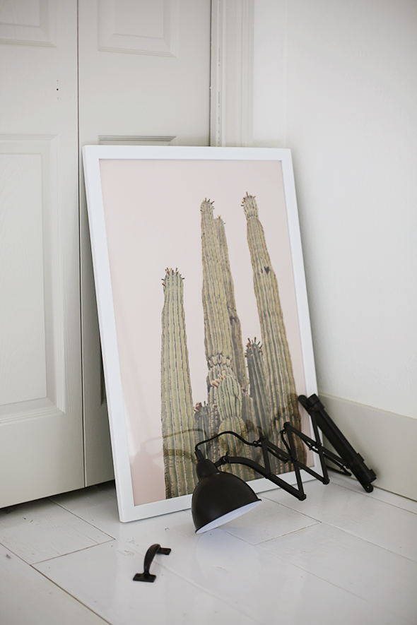
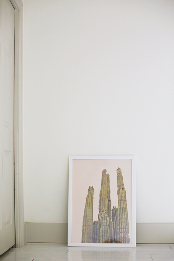
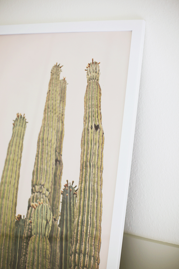
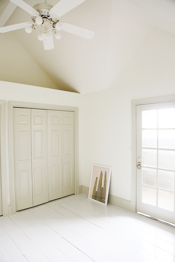
I’m also thinking of using one of my new prints called Hidden Heart from Jenny’s Print Shop in the room. I love how the pink and gray look together! (PS can you see the little heart in the cactus arm?) :)
All the furniture for the room arrives in the next week or so. I can’t wait to share the finished room photos with you soon! I’m SO happy with the progress so far though and can’t believe how different this room feels just by changing the wall and trim colors! The power of paint is REAL! :)
A HUGE thanks to Valspar and Ace Hardware for sponsoring this post. All opinions are my own and don’t necessarily reflect the opinions of Ace or Valspar. :)


I love how this turned out! Thanks so much for sharing. I always wonder about the rules of the floor effecting the paint color. We are in a small rental and I painted the walls hale navy to hide lots of blemishes and give depth but the floors are a icky terrazzo and even though I’d love to paint walls white I often wonder if it’d make the floors look dirtier because of contrast.
White might actually work for you, Sarah! I would stick with high contrast colors like you are – either really dark or really light – when you’re not loving your midtone floors. If you did a gray, your floors would look extra blah. Thanks for stopping by today! xo
Lovely! Did you have to Kilz the black on the closet doors? How many coats covered the darker hue? Also, great idea to paint the fan; they are so ugly but so necessary in a warm climate. Best wishes!
Great question about the doors, DD! I love this post – we had the gray-turns-lavender problem with a paint color my son picked out for his room. Luckily, we tried a swatch and I nixed it. We had enough paint left over from the kitchen/dining area to do his room too. Weirdly, it looked very beige in the can but quite gray on our walls!
I absolutely love the new color combination – I never would have thought to go that way and it’s just lovely in the space (and it really brightens it up).
Thank you, Yasmara!
Grays can be SO hard! I’m glad you didn’t paint the whole room before switching colors! :)
We didn’t use primer here and it easily covered in two coats! It’s really good paint.
Love that you’re getting back into blogging more! I know you’re probably sick of people asking you where your clothes and shoes (those sandals!) are from so maybe you could start doing a fashion post here and there? Like a roundup of a few things you’ve bought lately. Just a thought!
That is SO nice of you to say! Thank you! I post about outfits here and there on Instagram, but maybe a Friday post for fashion picks every week would be fun?
Yes we would love the style posts! Also, I have similar ceiling fans with the same blade shape. I’ve been thinking about painting and would love tips — I’ve been considering using a table saw to cut off the curvy tip of the blades to modernize them a bit more. But then the bulb covers would still be outdated. What are you planning to use for bulb covers?
Yes, that would be great!
Yes! I am always googling everything you wear!
I loved seeing this color on the trim. I am having a problem with white for the trim – it is all yellowed five years after painting. My walls are all in different colors – blue, yellow, green and a light purple, so it is hard to find a color for the trim that would unify and go with the insane rainbow in my apartment.
I do love the insane rainbow and would not have it any other way. I am more secure now of painting the trim a light gray, since it doesn’t look heavy in your space. Thanks so much for sharing.
Leticia, I also really love the look of the moulding being the same color as the millwork. We did this in our music room and it is my favorite! It makes the ceilings look taller!
Hi Jenny. I love that you’re blogging more too, and this post is very timely for me. It’d be great to hear more about the crucial moments between thinking you liked Graceful White and Old Soul and deciding instead to go with Soft White and Feathers of a Dove. (I can see maybe Graceful White was too yellow/brown, but I think I would have jumped to Four Winds.) I think all of these look great, but clearly that’s why your home looks professional and mine looks amateurish. I’d love to hear more about the “why” you selected the colors you did.
Great question, Molly!
I really wanted a warm white in here so that it complimented the color of the floors, but was obviously not the same color as the floors. I definitely could have gone with Four Winds though. It is a beautiful, bright white!
Thank you & glad to hear my inclination (Four Winds) wouldn’t have been a terrible choice. Anytime you feel like talking more about color, undertones, light vs dark rooms, working with existing colors in floors, cabinets, or carpets, we are here to listen, you design goddess.
This post was so timely for me! I have small guest room that has even less natural light than what you have here. In fact the window faces our neighbor’s house. On the plus side it has really high ceilings. I’ve been trying to decide if white is the right route for the walls but because it has so little light I’m afraid it will feel flat and maybe even dingy. Thoughts? I’ve read differing opinions all over the internet.
I think white is a GREAT option for you, Katy! Try Four Winds here or Soft Wool (the color I used). Both would be great for reflecting and maximizing the light in your space. xo
Love this! I’d love to know what paint finishes you used for the walls and trim? Thanks for the inspiration and insights!
Jenny! That ceiling fan has got to go, right?! There must be a better way…..
But I love the paint combo in the room though. Very soothing and relaxing for a guestroom.
Agreed!
I’m interested in how you transition molding colors from one room to the next… is it weird to not have everything be the same color, house-wise? It seems like it would be hard to unify, although I’m sure it’s easier in a standalone room like this (i.e. Not open to any other rooms). Any tips?
Love you sandals! Could you share the source? Also, the source for the accordion scones.
Thanks!
Love the room Jenny! Wondering where that sconce is from? Love the accordion arm!
This is so lovely! Can’t wait to see what you do with the space above the closets! My grandparents used to live in AZ and had decorative spaces like that in every room which I always remember thinking was so cool but now I wonder what people put up there lol.
I think your new paint is beautiful~I love your style!
Jenny, I 100% thought the cactus print was a photo of the sagrada familia! They look so similar!
Nice choice with the white, very pretty :)
Jenny, this is so good and very helpful. Thank you!
these are so cute! I love how they look in that space.
This looks great! I love white rooms with contrasting paint. We did something similar with my daughters room, but we chose a bright blue/turquoise color and it’s my favorite room in the house.
Where’s that amazing cardigan from? Love it!
Thanks Elisa! It’s from Nordstrom/Free People!
Jenny, I love how your guest room turned out. I also love the fact that it looks somewhat similar to my master bedroom–one large southeast facing window and a wall of closets. I have to paint the ceiling the same color as the walls as it’s an attic room and the walls flow right into the curved ceiling. I can’t go with white trim, which I love, because i have offwhite carpeting (which I hate but for now it has to stay) I had planned to paint the walls, and trim including the baseboards the same color, just changing to a semi gloss for the trim. I’d hoped to go with a darker color for the closets, but I can see where that might just look like a black hole. Do you think I could go with a color like Benny Moore’s oilcloth? And I’m at a loss for the closets? Any suggestions?
Loving this project.
Have you ever thought about injecting some personality into your walls using custom word art? You can design your own beautiful typographic wall art in seconds at http://www.chatterboxwalls.com.
I think we have that exact ceiling fan. Did you take it down to paint it or spray it while up? Love the room!! Thanks!!
I’m glad you’re blogging more—especially helpful things like this post. I’m trying to decide if I should paint a couple rooms in my house but I haven’t wanted to do anything because it’s just so intimidating. Thank you for this advice!
I’ve seen you paint ceiling fans so often, but I’ve never found a post on how you do it. I painted mine and I love how it makes the fan disappear into the ceiling, but if you really look at my fan, it starts whispering “diy” as it spins. Please help!
Yeah, I think it’s not the most seamless look, no matter how you do it! I just carefully rolled and brushed the whole thing. One other time I did this, I pulled off the fan blades and sprayed those and that helped the overall look a lot I think!
I LOVE your sandals. Can you share where they are from?
Hi Emily! They are by Free People! :)
Love this! The room turned out so light and airy. You might check out http://www.haikuhome.com for more modern ceiling fan options. We were tired of seeing the same old fans from grandma’s house, so we flipped the ceiling fan on its head. We have several models that can blend in or even function as artwork for the room!
Absolutely love the color combos in this room!! What paint color and paint type did you use on the floor. I’ve always wanted to paint my hardwoods white :)
Hi Jenny I love the color combo of room. I’m sorry I couldn’t find what color floor is painted!? Is it same as wall? Do you think I could paint an existing dark laminate?
Hi, I’m confused! I have white shiplap walls (BM alabaster) so what color should I paint the crown molding? Darker?
I am thinking of doing a contrast trim interior. I am guessing that I should include the front door, but looking for opinions on this.
Also, do you keep the door color same on both sides???
I like including the front door, but I don’t think doors need to be the same color on both sides!