 This post is brought to you by Behr Marquee, Behr’s most advanced paint. Change can be this beautiful, and this easy.
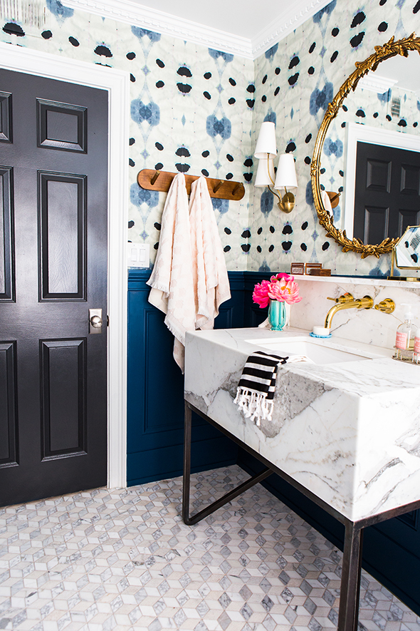
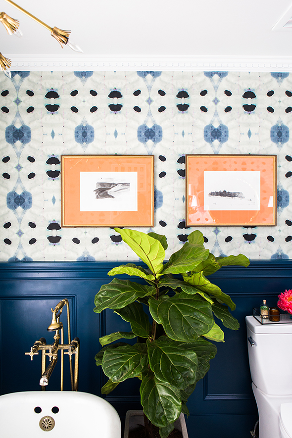
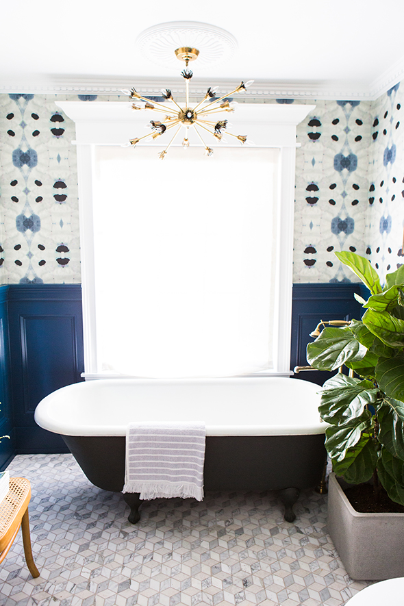
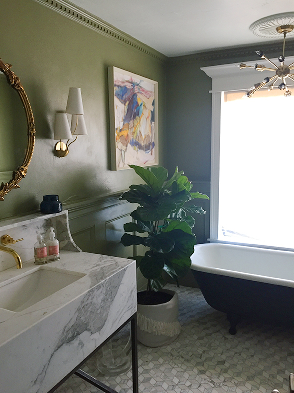
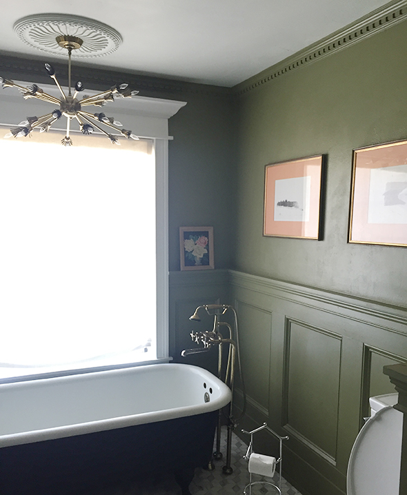
Can you believe it’s already been two years since I painted the guest bathroom olive green? I still love that color, but you guys know me by now. I start to get antsy for changes before too long, and when my sister’s wedding reception was just around the corner, I decided to not fight the impulse to paint again (resistance is futile anyway). This time I went in a completely different direction with crazy abstract wallpaper and the most gorgeous shade of navy on the millwork!
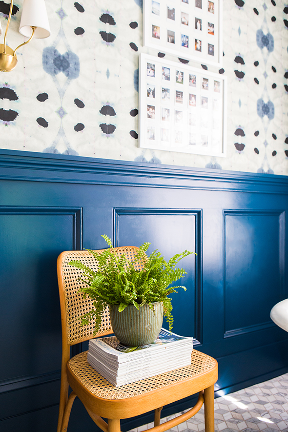
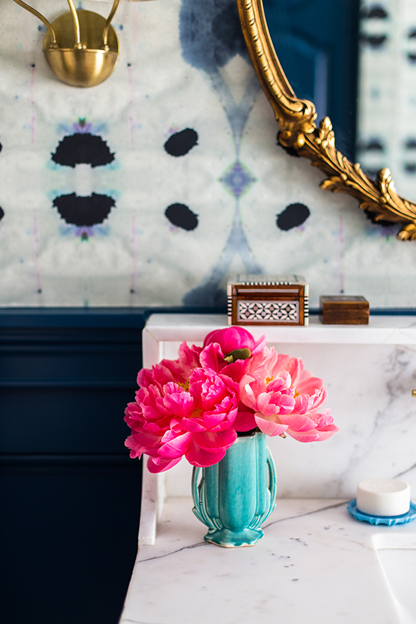
We’re all loving the changes! It feels like a completely different room. One of my girls even asked if she could turn the tub into a bed and make this her bedroom. :)
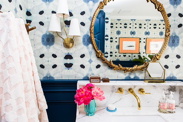
When it came to choosing a specific color for our bathroom walls, my starting point was this gorgeous wallpaper from Eskayel.
I wanted a paint color for the wainscotting that really worked well with the wallpaper, but that could also stand on it’s own. As I’m sure many of you know, navy is a REALLY tricky paint color to get right. It seems like most shades are either way too purple, or too bright, or not saturated enough.
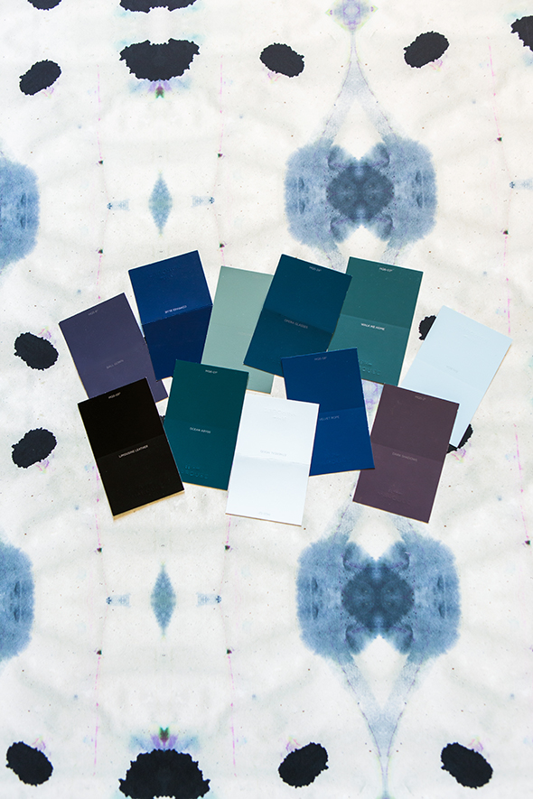
I grabbed a handful of samples from the BEHR Marquee line at Home Depot. I have used the Marquee colors and paint a million times and the colors are SO well-curated. There are still plenty of shades to choose from, but the process of standing there and choosing your paint swatches is actually enjoyable and not at all overwhelming like with other paint lines! You can rest assured that each of the colors are tried and true and are going to be beautiful on your walls.
I landed on these three navy swatches and picked up three sample pots, which is such an important part of the process! (Also – I LOVE that Marquee sample pots come in different sheens! I got my samples in a semi-gloss finish, which can really look different from a flat paint.)
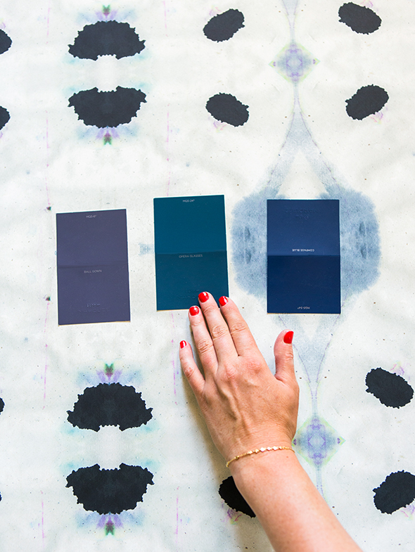
Ball Gown // Opera Glasses // Compass Blue
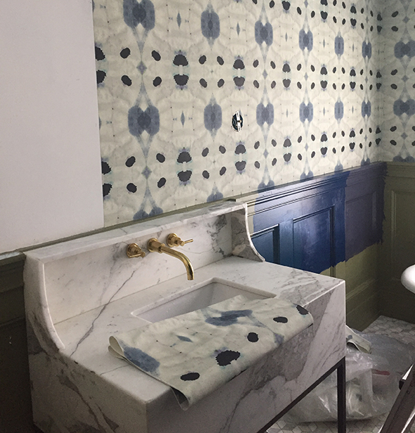
At first I was leaning toward Ball Gown, a really muddy, warm navy that felt unique and interesting to me. But after we hung the wallpaper and painted the samples on the wainscotting, Opera Glasses immediately jumped out as the winner! I just can’t get enough of that dramatic, moody greeny-blue!
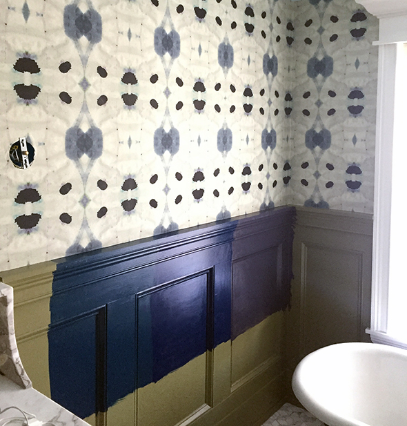
Opera Glasses // Compass Blue // Ball Gown
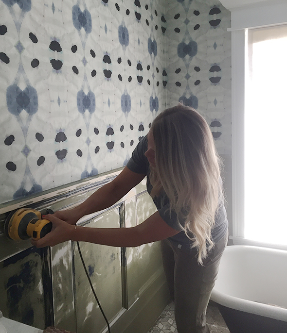
There are three things about the Marquee collection that keep me coming back for more – the great colors, the convenience (they can be mixing me a gallon while I tackle the other items on my Home Depot list and hit up the house plants section), and the one-coat coverage. It’s a super high-quality paint that sprays, rolls and brushes on like a dream. Before we hung the wallpaper and started painting, I did some prep by skim coating the walls with drywall mud and giving the wainscotting a really good sanding, which we neglected to do before painting the olive color. We finished this room literally hours before the Domino shoot and the rush job really showed! But it was nothing a little elbow grease couldn’t fix. I smoothed out the inconsistencies in the drywall and sanded down most of the bumpiness in the millwork and now it looks so much better!
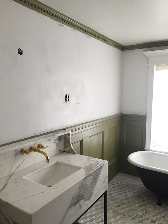
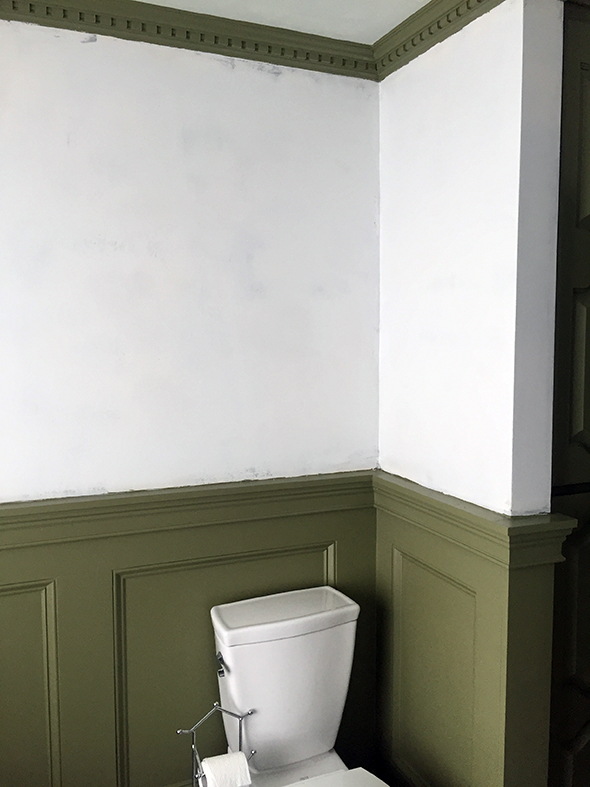
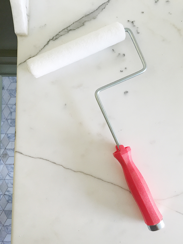
I’ve been using a new roller lately that I’m LOVING. It’s 6″ wide, so right in between a 4″ foam roller (which sometimes leaves air bubbles and roller lines :/) and a full-sized 9″ wall roller. I always pay the extra buck or two for the highest quality rollers and I think it really makes a big difference in the ultimate paint finish and helps reduce shedding.
I used my favorite paint brush to cut in and do all the detail work. I love that the Marquee paint self-levels so nicely! The semi-gloss finish is really lovely.
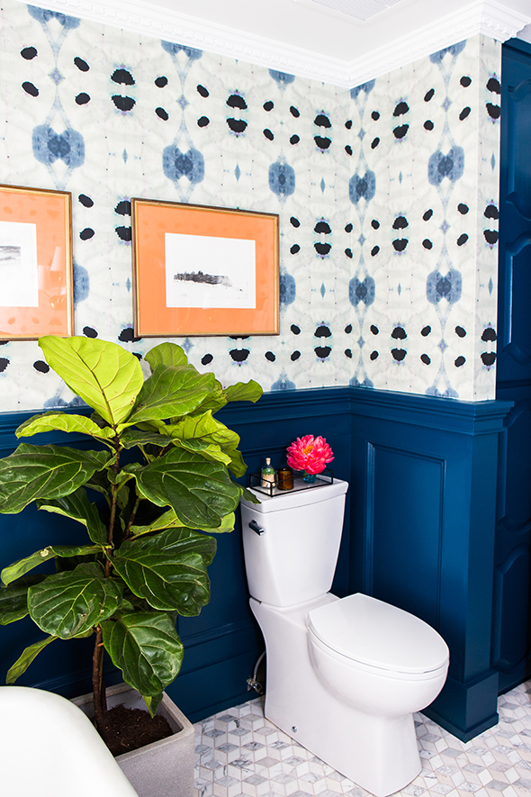
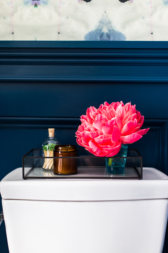
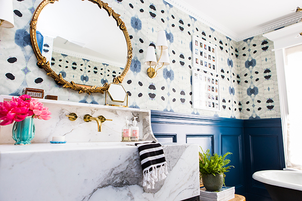
I think the Opera Glasses color pairs so, so well with the brass, marble and wood accents in our bathroom. And I also really love how it looks next to the black tub and door. Black and navy will always be one of my favorite combos.

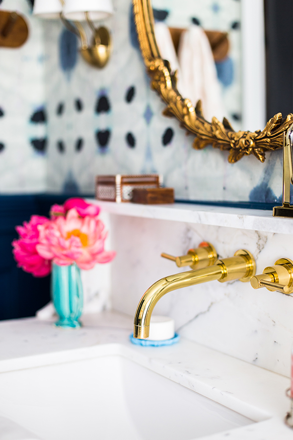
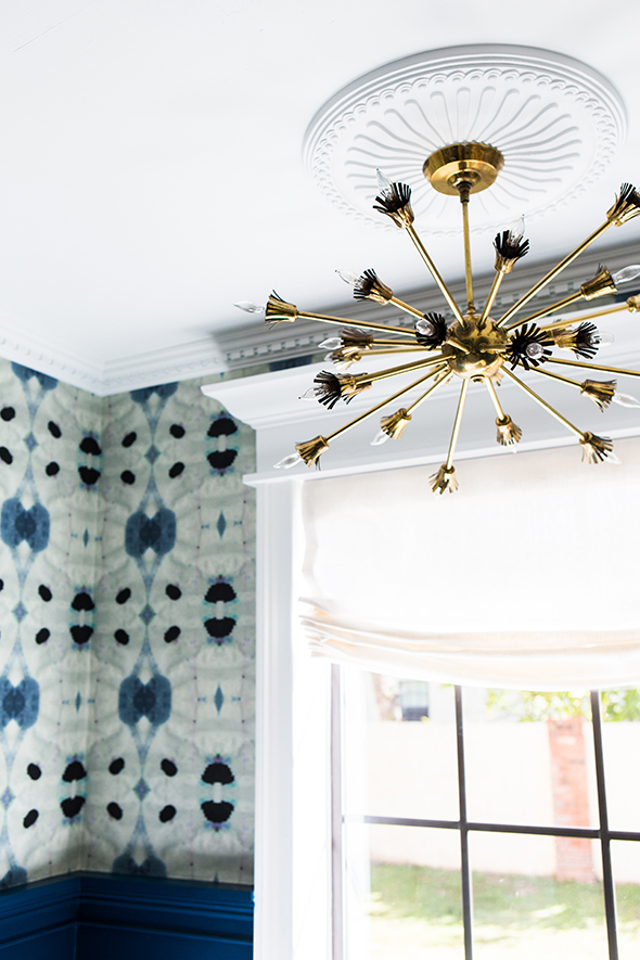
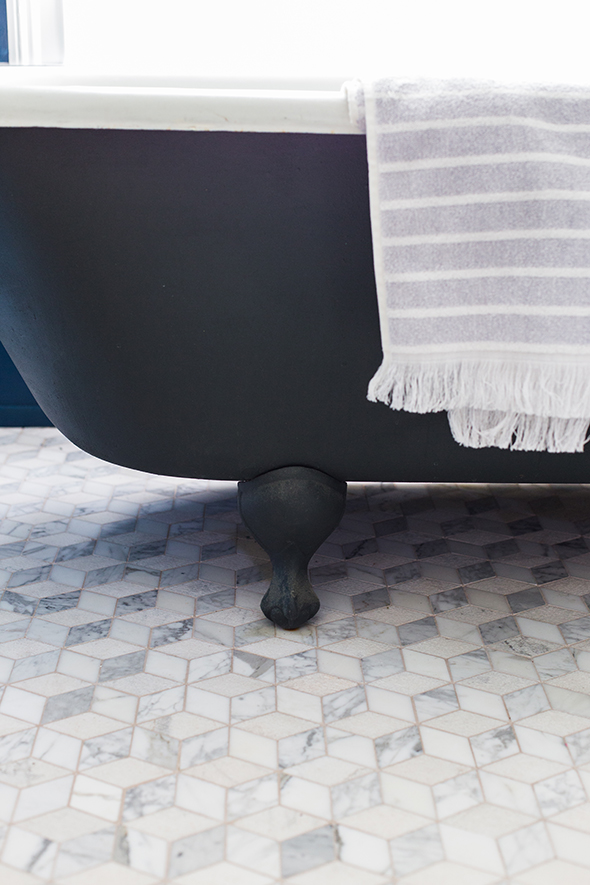
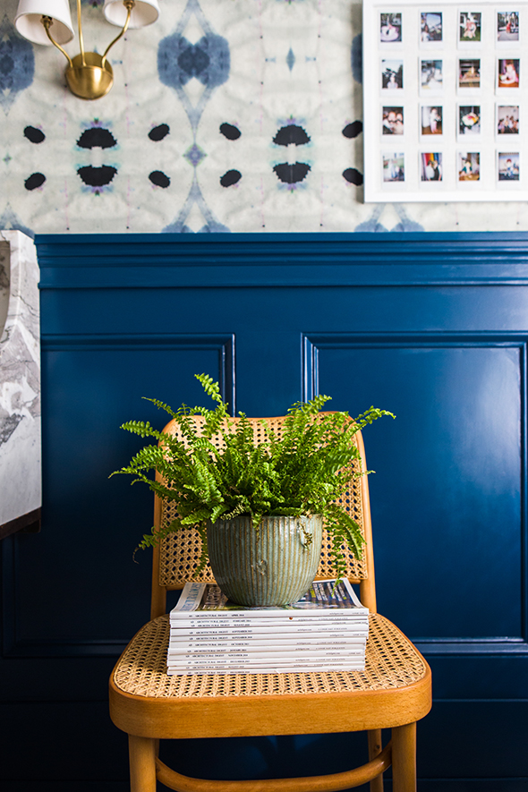
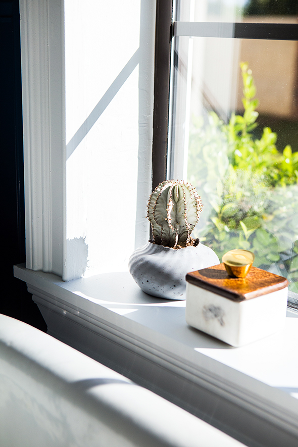
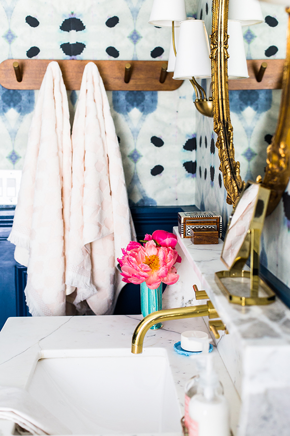
I really love these changes! The whole room feels so fresh and pretty to me now. I still loved the before, but I’m so excited about the after!
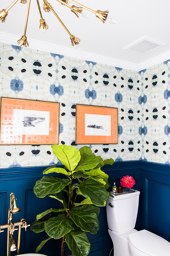
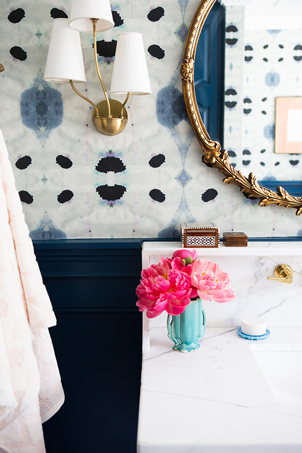
What do you think of the new walls? Would you have gone with Opera Glasses too? My friend came over to weigh in and she was really drawn to the Compass Blue color. It was a tough choice – they’re all so pretty! :)
Photos by Tiffany Haynes.


So beautiful!!
Jenny! This is gorgeous. It feels so much more true to your style that we have all come to know and love. I agree on the Behr paint, it is the only brand I will use. Bravo on these gorgeous changes.
Thanks Kimber! It definitely feels like welcome change to the house!! :) xoxoxoxo
Gorgeous as always! Love how the blue makes your fixtures pop.
I love it! Can you please post the sources for the other bathroom accessories. I am especially curious about the photo frame.
Hi Sam! Do you mean the polaroid frames? I made the arrangements myself, but I think the frames are from IKEA or Target or Michaels (where I buy a lot of my frames!). Hope that helps!
Love it! The olive was really nice, but the new design really brightens up the whole room. Gorgeous!
Gorgeous! That sink tho! That is the most beautiful sink I have ever seen. Where did you find it?
Jenny brilliantly designed it herself! https://jennykomenda.com/2014/06/guest-bathroom-sink.html/
Thanks, Carmen! I designed it and had a local stone fabricator make the marble basin and my metal guy make the steel stand. I love it too! :)
Oh Jenny, I love it, and it’s brilliant, (OBVIOUSLY), but I’m also a little heart-broken. That green was so amazing, it ranks as one of my favorite rooms ever. But… I get it. And if you were going to change, you did it well. As always. You’re amazing and I love you.
i have ‘opera glasses’ in my office and i love it! it’s so intense and awesome in a small space. my coverage is NOT as good as yours, though — but it went on over banana yellow (the previous owners used the room as a nursery). i think you made a good choice with the half wall/chair rail setup; i have it all the way up and love it because i wanted the room to be cozy and cave-like, but it looms a bit sometimes, which would be less pleasant in a bathroom!
dying over your towel rack/hooks! I’ve been shopping everywhere looking for something similar. Please tell me it isn’t vintage one of a kind–and that I can get it somewhere online!
(fingers crossed!)
Hi Jody! I bought it at West Elm a couple weeks ago in the sale/as-is section for $10! They might have a similar one in your local store still? :)
soon to be bath twins in the smallest way possible! thanks for sharing!
Jenny Komenda you are a design goddess!!!!!!!
You’re just amazing at what you do! I was missing your posts so much over the last couple of weeks . . . this was SO SO SO worth the wait! Jaw-dropping! I wish I had a fraction of your energy and talent!
I didn’t think I could love this room any more than I already did, but it is beyond perfect! Did you make the roman shade yourself? If not, can you share your shade source? Thanks!
This is so beautiful!! It’s so refreshing to see beautiful COLORFUL design. I really love the all white trend, but am growing a little tired of seeing it everywhere and I have such respect for people who go bold and pull it off. Great job!
Thanks Marci! I love color too! :)
great wallpaper and beautiful paint color! so vibrant! those towels caught my eye. where are they from?
The bath towels are from Target! So many cute ones there right now!
Love it, so refreshing! I would have picked Opera Glasses all the way, too. That wallpaper is absolutely amazing … I wish it was more affordable though :(
Also, where did you get that black and white turkish hand towel … I need one!
Thanks Nicole! I got it at West Elm a year or two ago. The Eskayel paper is for sure an investment, but you can buy it in short panels like I did if you are hanging it just above a chair rail or wainscotting and that REALLY helps reduce the waste and the total amount needed for a room! :)
Holy shiz! That looks awesome. I don’t think I’ve ever wanted to pick up a room and transport it to my house more. I really love this version of the bathroom. You’re so talented!
Stunning!! I love the color, and it pulls some blue tones out of the floor too, which is beautiful!
Love it. Was there ever a post on this millwork? I can’t find it in the search feature… :/
LOVE the color but I have to say, I’m not the biggest fan of the Marquee paint. We used it in two different colors in our house and it was really difficult to work with when it came to cutting in and wasn’t truly 1 coat coverage. We didn’t have to do a full second coat but it definitely needed touch ups in a lot of spots. Kind of a bummer considering the price tag for a gallon.
Aw, I’m sorry to hear that, Jessica! I’ve had lots of great luck with the Marquee paint. I found it really easy to work with for our bathroom here! :)
Wow! I love it so much. The olive green was always sort of “meh” to me–just not my style. I LOVE the wallpaper and the navy together. So beautiful! Great job.
Just when I thought this room couldn’t be topped, you topped it! Still crazy pretty, but in a whole new light. That wallpaper is the pièce de résistance. Cette vue est magnifique.
STAAAAAHP with this awesomeness!!! If this is why you haven’t posted in a while, it was well worth the wait! I know you’re busy, but please don’t forget us Little Green Notebook addicts!!!
When I first saw that you changed the bathroom, I thought “NOOOO!! That room was beyond perfect!” but then I saw the after and WOW – beautiful job! I love this version even more! So bright and fresh.
This is stunning!!
I. am. speechless. What a breathtaking room. I’ve read your blog for years and I don’t think I’ve ever commented on a post, but this bathroom remodel is so exquisite, I couldn’t help myself. Great work!!!!
Uhhhhhmazing!!
This room is just lovely!
That wallpaper, that mirror, that light fixture, and that paint color – I can’t handle how much I love this bathroom. It’s making me rethink my whole house design plan. Absolutely STUNNING wallpaper.
Vintage mirror? Or would you share where you found that one?
Yes! Vintage mirror. I found the empty frame at the Chelsea flea in NYC for really cheap and later I had a local glass company fit it with new mirror. Easy!
Oh my . I love the change. I loved the before as well. You have such a talent.
Stunning!!!
Really like the Opera Glasses, but I would have gone with Compass Blue. I am usually a green person, but this was a wonderful change. It looks so fresh and new. The navy and black is fab. I wore navy and black to a brunch a couple of weeks ago and got tons of compliments. People don’t realize what a sophisticated combo it makes.
Opera Glasses is the perfect color! I’ve been searching for a navy that has a bit of green in it, that is bold but not too teal, and wow……perfect. Love the bathroom design. So well done!
Jenny, I love everything about this room…such a fantastic mix of old and new fixtures and styles. I actually borrowed the olive color you had in here before for my entry :) Could you share more detail about the tile? Would love to know where it is sourced and what grout color you used. Thank you!!
Hey Jenny,
I too LOVE the Marquee line, and recommend it a lot. Good stuff. The bathroom looks awesome, and if that’s the same fiddle leaf (alive and healthy) you’ve had from the original shoot, I’m totes impressed!! ;)
xo,
ag
This is a very beautiful room and does look like it really brightened up the space. I have to agree with another commenter though, the olive green room was one of my all time favorites ever. Too bad you can’t have both at the same time. Well done!
I also want to make the bathtub my bed and have it be my room! Drop dead gorgeous.
Lovely. Got my LGN fix for a bit now, thanks for sharing the gorgeous changes!
The opera glasses color and wallpaper are amazing. What color and sheen on paint did you use for your black door?
All the doors in my house are Benjamin Moore’s Onyx in semigloss. Hope that helps!
Stunning!!! I’m so inspired- once again!!
Jenny – The bathroom is amazing! That wall paper is truly special. Great work! Love following you from all the way across the country here in CT. Have a great weekend!
Jenny, Are the flowers you use often in your photos fresh or fake? If fake, where do you get them? I hate when fake flowers LOOK fake, but also love not always having to swap it fresh flowers. Don’t get me wrong… I love myself some fresh blooms! :)
Thanks
I like using fresh flowers and almost always just go to the grocery store to get mine. I have a couple of posts about how to make them last as long as possible. These peonies are from Traders Joes – I love peony season!
I love everything about this bathroom! beautiful wallpaper!
This looks so gorgeous! and the peach art… what a touch! You are so gifted, woman! Congrats
Beautiful as always! I really loved the olive too but this is stunning.
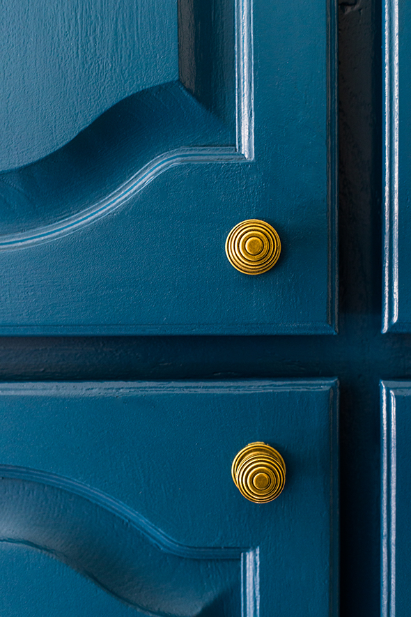
One question, do you have a link for the hardware? Those knobs are exactly what I’m looking for
Hi Kathleen!
The knobs are from Home Depot’s Martha Stewart line. I think they are called beehive knobs or something like that. They are great and cost only a couple of dollars each. :)
I ADORED the previous green but this is super stunning as well. Another commenter said something about how they tire of white and love that you embrace color and I feel the same way! Im also a HUGE Behr Marquee fan. I love all the Behr paint but recently converted when I painted my nursery with the marquee line (I knew I’d only want to do one coat). Not only did it only take one coat, but the paint goes alot farther than other paints. I used 2/3 of a gallon for a whole (albeit small) room (which previously took 1+ gallon). So…even though it’s $10 more than their other lines, you get way more for what you paid for as the paint goes further and the coverage is impeccable. Well done Jenny – love the room, and love the paint :)
Thank you for sharing, Melanie!! I feel the exact same way about the Marquee paint line. So worth the extra couple of dollars! :)
Love the wallpaper. Wonderful how the pattern is perfectly spaced either side of the window.
Never commented before but that color is too beautiful not to mention!! Awesome room!
Well done, as usual. Did you hang the wallpaper yourself? How tricky is it? I’m thinking of using it in the back of bokshelves.
It’s pretty easy to hang wallpaper in shorter lengths like above a wainscotting or in a bookshelf. You’ll do great!
I loved the olive, but then I saw this. That color/wallpaper combo is the stuff dreams are made of.
Absolutely beautiful!!!