 This post is brought to you by Behr Marquee, Behr’s most advanced paint. Change can be this beautiful, and this easy.
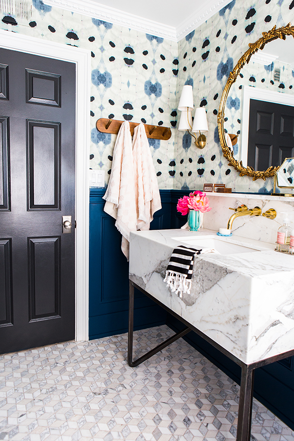
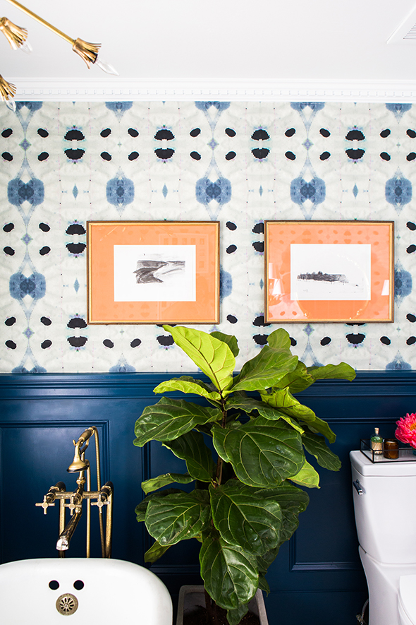
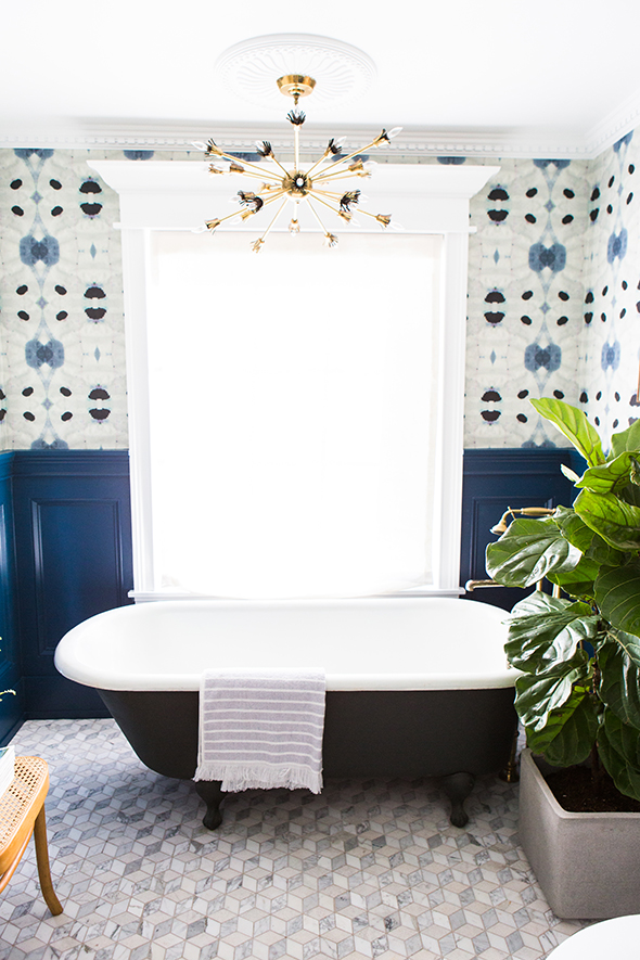
Can you believe it’s already been two years since I painted the guest bathroom olive green? I still love that color, but you guys know me by now. I start to get antsy for changes before too long, and when my sister’s wedding reception was just around the corner, I decided to not fight the impulse to paint again (resistance is futile anyway). This time I went in a completely different direction with crazy abstract wallpaper and the most gorgeous shade of navy on the millwork!
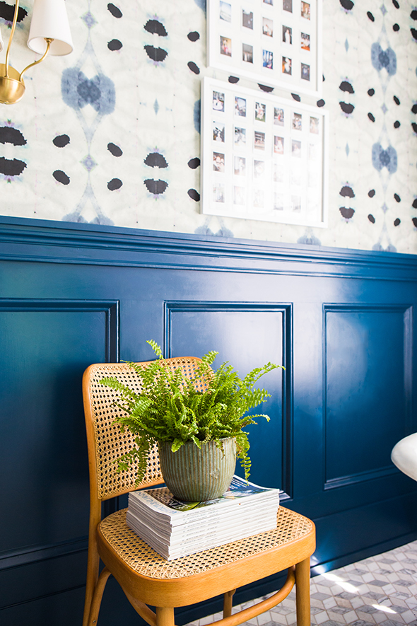
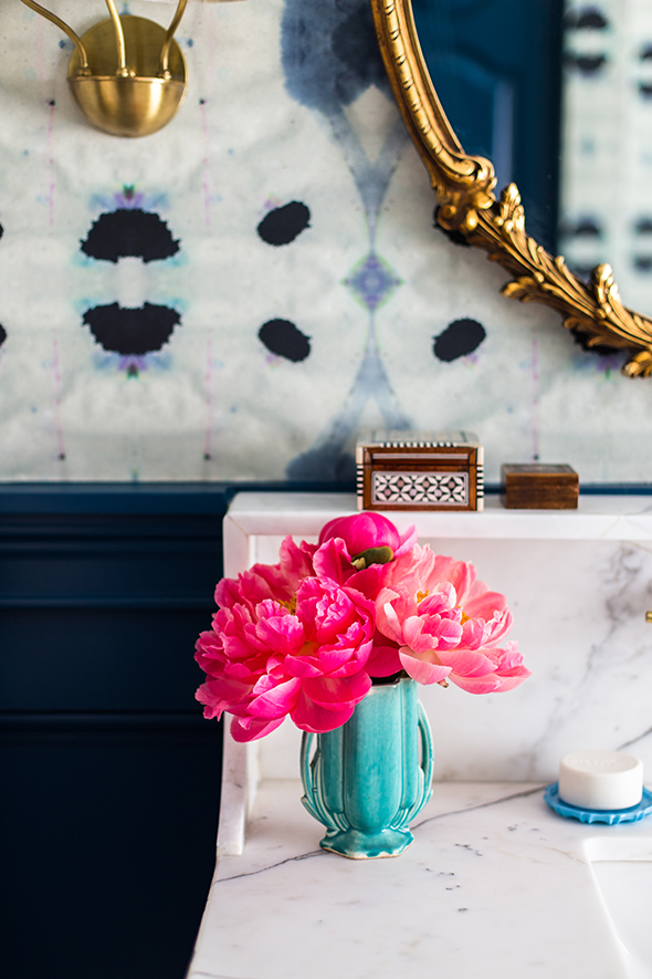
We’re all loving the changes! It feels like a completely different room. One of my girls even asked if she could turn the tub into a bed and make this her bedroom. :)
When it came to choosing a specific color for our bathroom walls, my starting point was this gorgeous wallpaper from Eskayel.
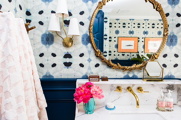
I wanted a paint color for the wainscotting that really worked well with the wallpaper, but that could also stand on it’s own. As I’m sure many of you know, navy is a REALLY tricky paint color to get right. It seems like most shades are either way too purple, or too bright, or not saturated enough.
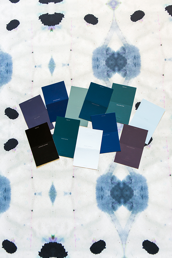
I grabbed a handful of samples from the BEHR Marquee line at Home Depot. I have used the Marquee colors and paint a million times and the colors are SO well-curated. There are still plenty of shades to choose from, but the process of standing there and choosing your paint swatches is actually enjoyable and not at all overwhelming like with other paint lines! You can rest assured that each of the colors are tried and true and are going to be beautiful on your walls.
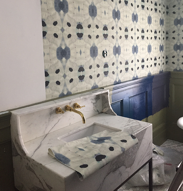
I landed on these three navy swatches and picked up three sample pots, which is such an important part of the process! (Also – I LOVE that Marquee sample pots come in different sheens! I got my samples in a semi-gloss finish, which can really look different from a flat paint.)
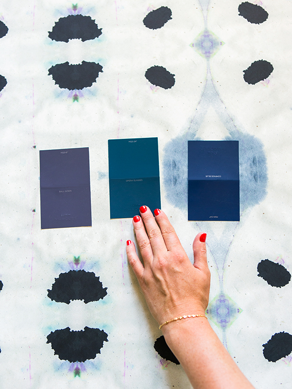
Ball Gown // Opera Glasses // Compass Blue
At first I was leaning toward Ball Gown, a really muddy, warm navy that felt unique and interesting to me. But after we hung the wallpaper and painted the samples on the wainscotting, Opera Glasses immediately jumped out as the winner! I just can’t get enough of that dramatic, moody greeny-blue!
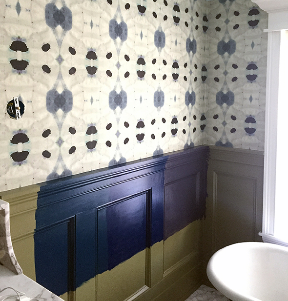
Opera Glasses // Compass Blue // Ball Gown
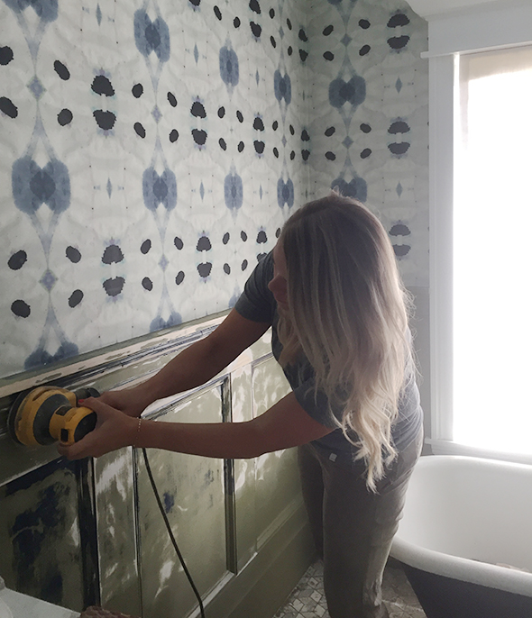
There are three things about the Marquee collection that keep me coming back for more – the great colors, the convenience (they can be mixing me a gallon while I tackle the other items on my Home Depot list and hit up the house plants section), and the one-coat coverage. It’s a super high-quality paint that sprays, rolls and brushes on like a dream. Before we hung the wallpaper and started painting, I did some prep by skim coating the walls with drywall mud and giving the wainscotting a really good sanding, which we neglected to do before painting the olive color. We finished this room literally hours before the Domino shoot and the rush job really showed! But it was nothing a little elbow grease couldn’t fix. I smoothed out the inconsistencies in the drywall and sanded down most of the bumpiness in the millwork and now it looks so much better!
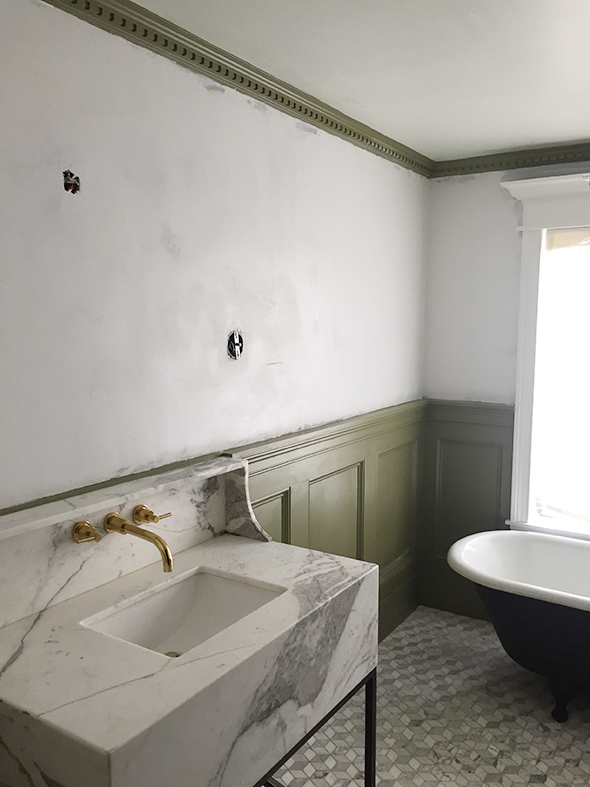
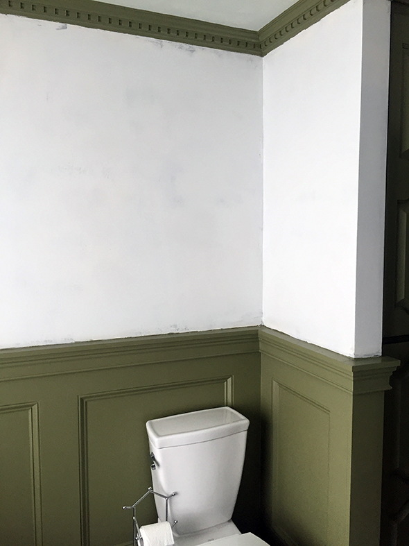
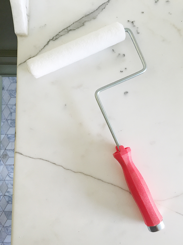
I’ve been using a new roller lately that I’m LOVING. It’s 6″ wide, so right in between a 4″ foam roller (which sometimes leaves air bubbles and roller lines :/) and a full-sized 9″ wall roller. I always pay the extra buck or two for the highest quality rollers and I think it really makes a big difference in the ultimate paint finish and helps reduce shedding.
I used my favorite paint brush to cut in and do all the detail work. I love that the Marquee paint self-levels so nicely! The semi-gloss finish is really lovely.
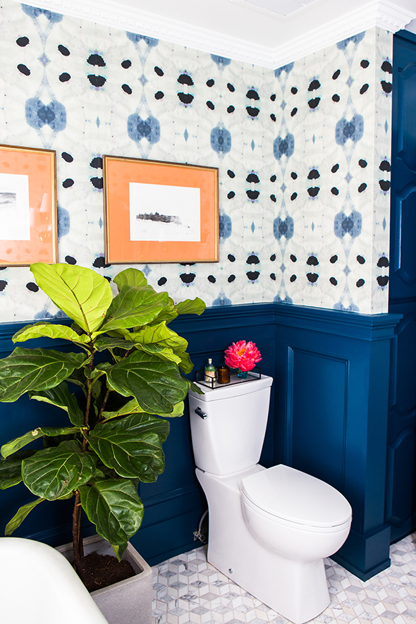
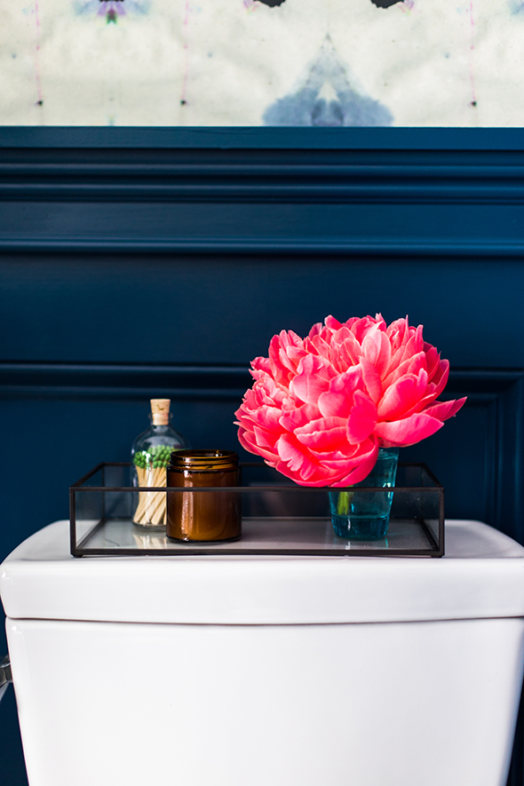
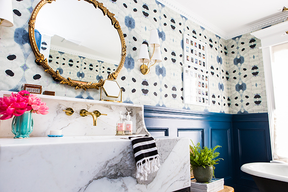
I think the Opera Glasses color pairs so, so well with the brass, marble and wood accents in our bathroom. And I also really love how it looks next to the black tub and door. Black and navy will always be one of my favorite combos.

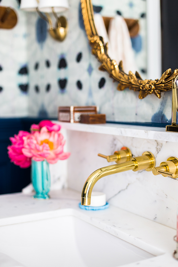
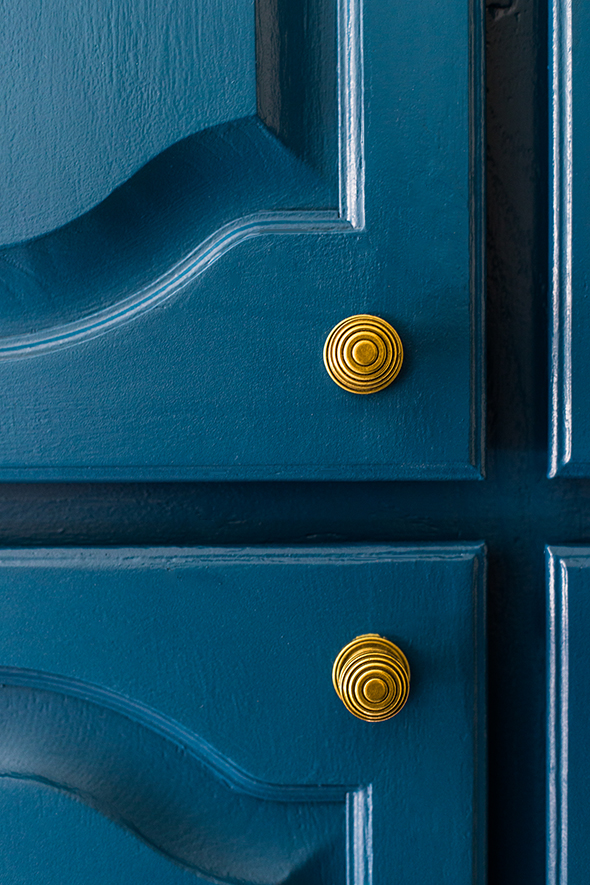
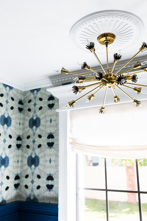
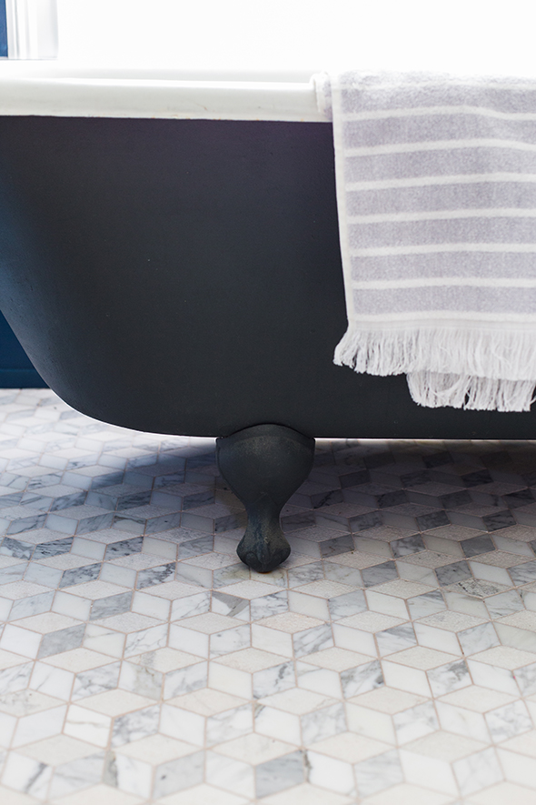
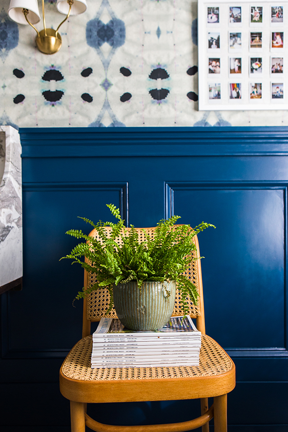
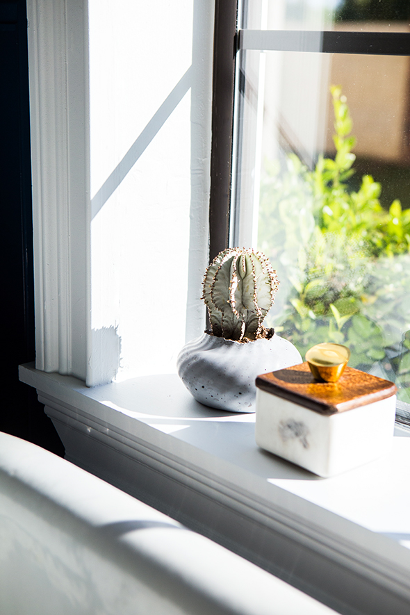
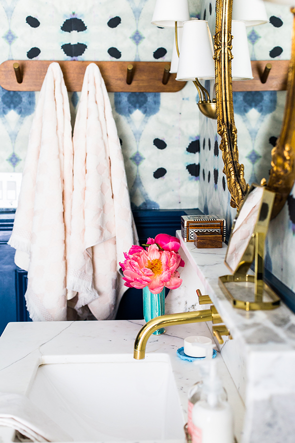
I really love these changes! The whole room feels so fresh and pretty to me now. I still loved the before, but I’m so excited about the after!
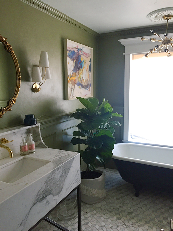
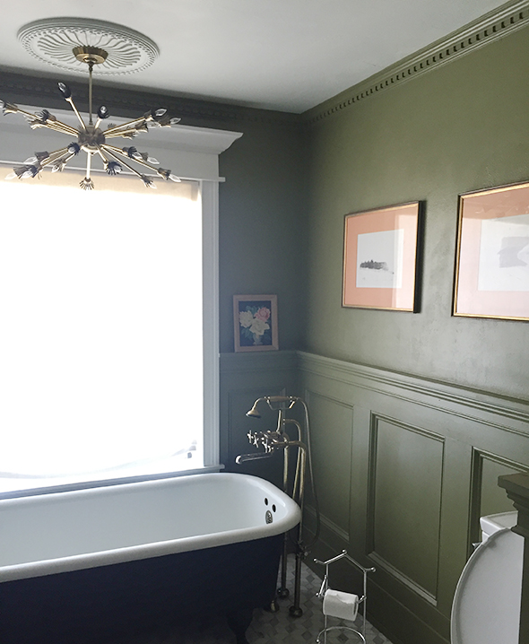
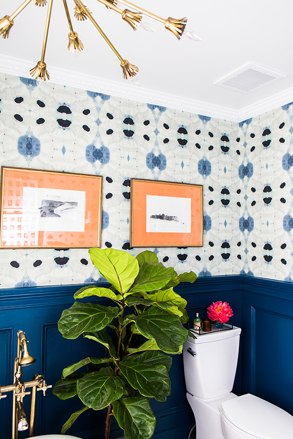
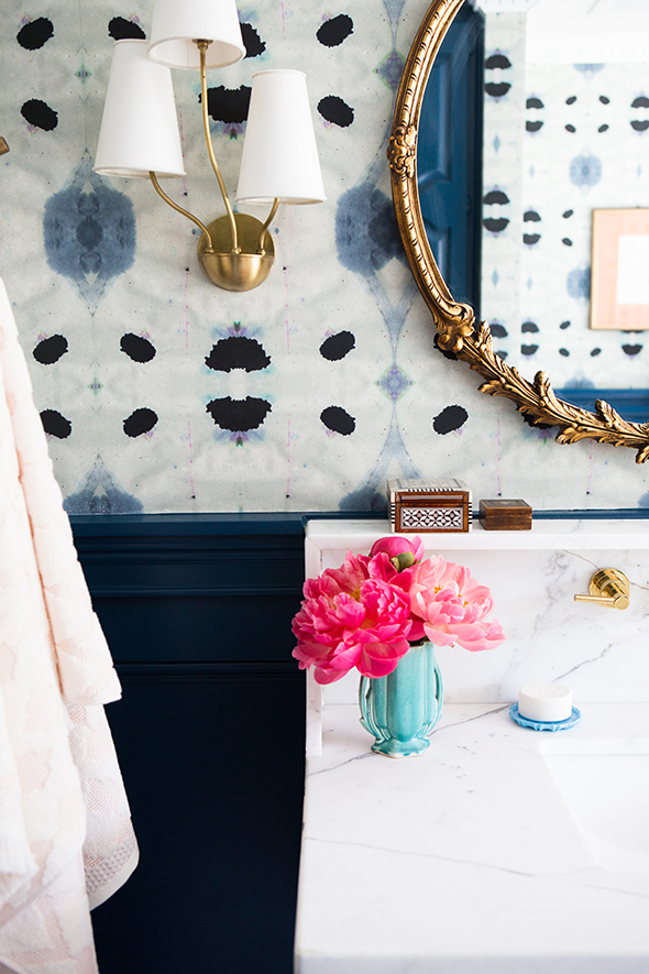
What do you think of the new walls? Would you have gone with Opera Glasses too? My friend came over to weigh in and she was really drawn to the Compass Blue color. It was a tough choice – they’re all so pretty! :)
Photos by Tiffany Haynes.


Jenny do you have a good source for solid affordable faucets? I’ve seen you use Kingston. If you have any info to share I’d appreciate it
What was the color of the other dark blue paint you did not choose??
Where did you get the vanity? I’m obsessed!
Absolutely beautiful! I want that bathroom. Great job! What can u tell me about the sink?
The sink came with the vanity! It’s gorgeous!