One of the big projects I tackled this month was painting the kitchen. No small feat with those 16 ft. vaulted ceilings!!
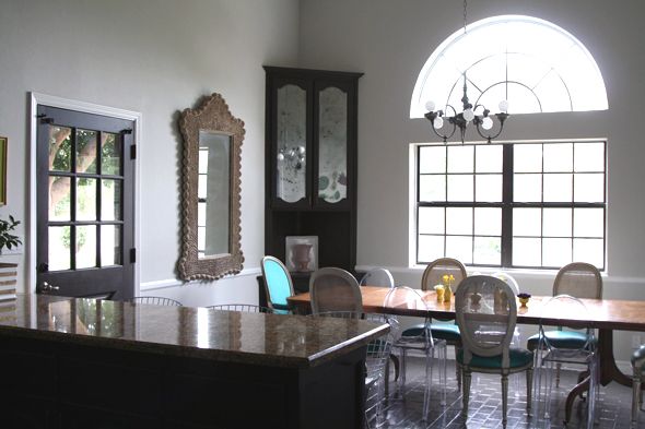
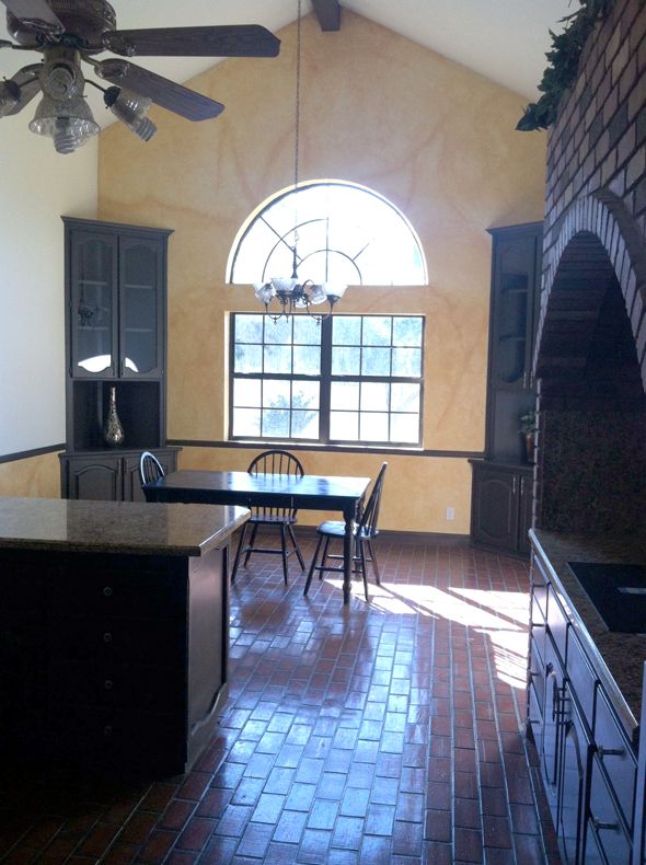
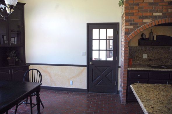
Remember how it looked before we moved in? Lots of yellow and lots of faux brick:
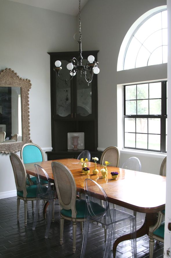
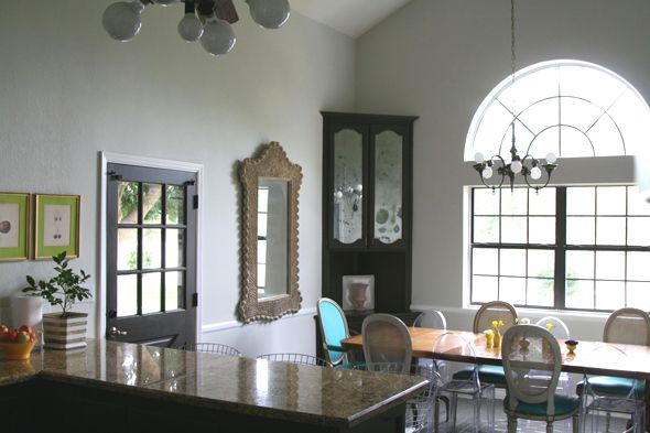
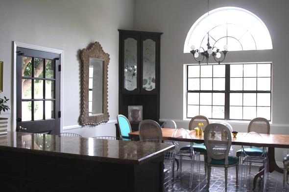
The walls are now Benjamin Moore’s Titanium, which was a runner up for the common areas in the rest of the house. I had two gallons on hand already, and I love the color, so it was an easy choice.
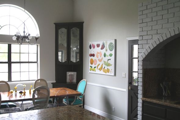
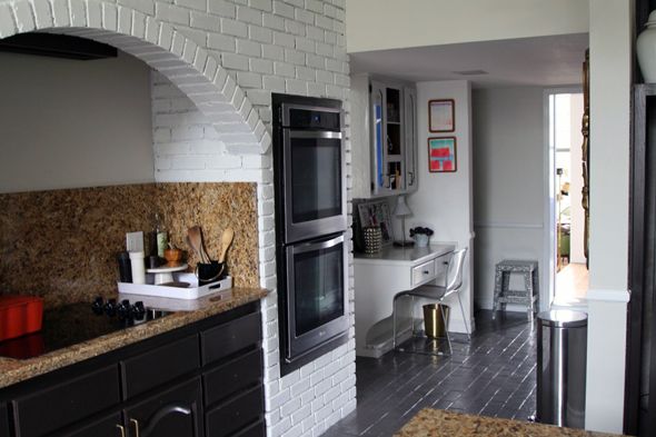
The brick range surround also got a paint job. I need to do a second coat, but I’m still recovering from the hours and hours of work the first coat took! I’ll do a post about it later, but the gist is that the mortar was a beast.
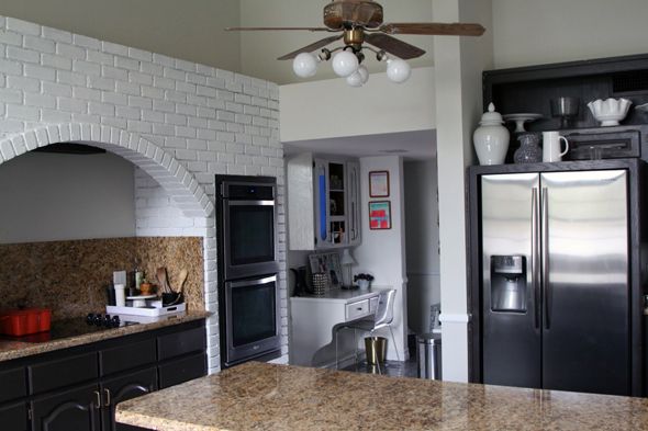
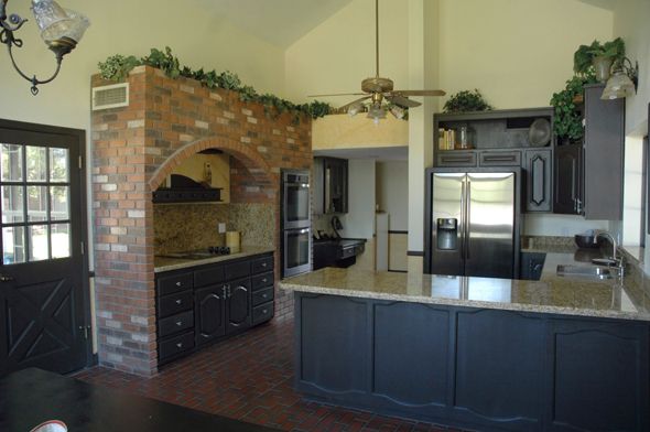
I’ll admit I was a little nervous to paint out the brick for about five seconds, but now I have exactly zero regrets. It’s so much brighter in here! I know I’ll love it even more when the second coat is done.
The dining table could use a refinishing, but my love affair with this vintage beauty is still going strong. We recently put in all the leaves after I picked up four ghost chairs at a junk shop for $60 for the set, so now we can seat ten people around the table comfortably. I love it.

And I really like how the ghost chairs mix with the Widdicomb chairs, which I got back from the upholsterers just in time for Christmas dinners and parties. They’ve held up so well the past two months! The leather is really easy to keep clean (spills wipe right off) and the color is so pretty against the soft gray walls.
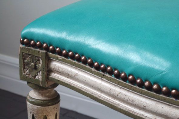
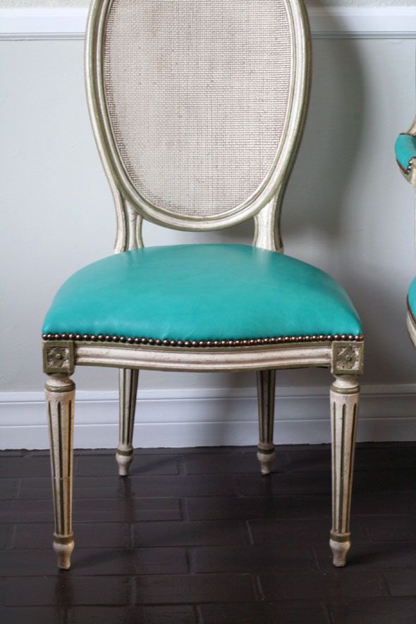
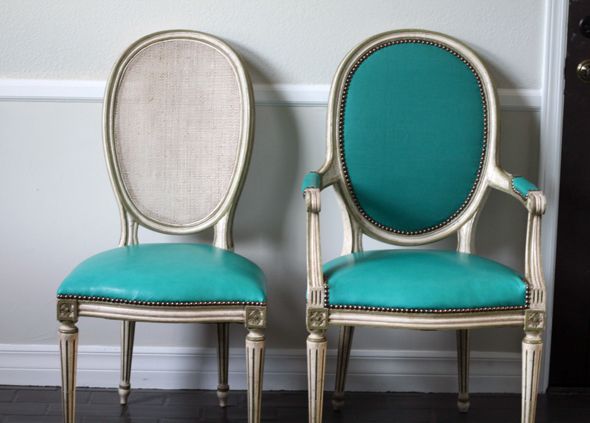
I hung my old Italian mirror on one side of the table and a new piece of art on the other side that I made last night on the fly.
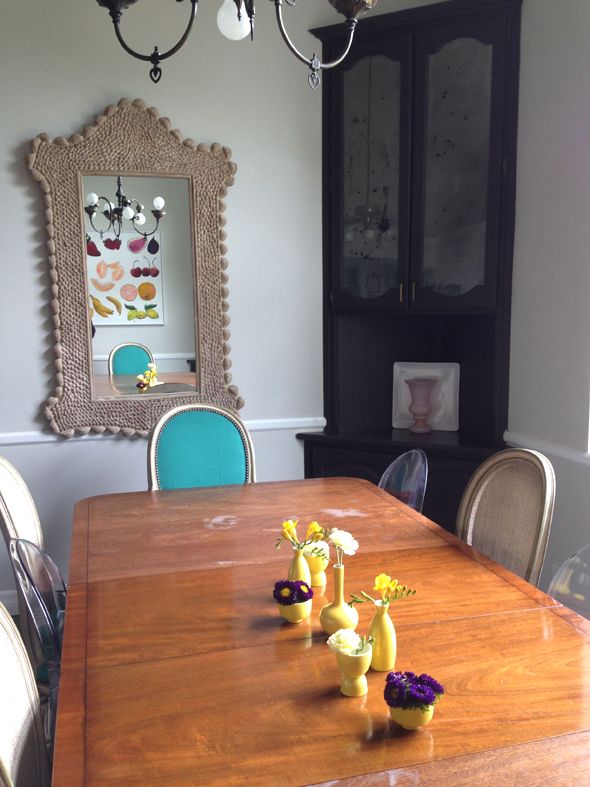
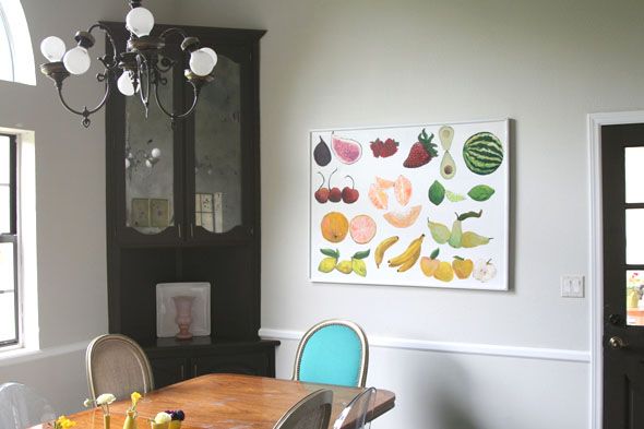
There are about a million things left to do in this room. New lighting. Cabinets facelift. Backsplashes. New sink and faucet. Open shelving. Etc., etc., etc. But I think now we’re at least in a pretty comfortable place. I don’t mind the blacky-brown color of the cabinets any more now that the yellow is gone. The lights are still horrible, but I took off the old globes and put in big white vanity bulbs and that somehow helps. We’ve only done temporary fixes, but they really add up and help make this room more inviting.



That was a beast of a job. Good work, it looks phenomenal!
I definitely like your kitchen this way. It is brighter and looks modern. The chairs you choose are the bast. And I like that they are not the same. This makes the kitchen interesting because you have to pay attention on every single detail. Congratulations for the work you've done.
The wall color made such an improvement, and the leather chair color is fabulous. What a great spot to sit down with your girls at the end of the day.
Jenny, it looks so amazing! What a huge undertaking to paint those walls, you're my hero.
I just love the leather on the fantastic chairs, you'll have those forever!
What a great mix of styles and color you have in your house. I love it all!
How are the floors holding up with the paint job?
Betsy
What?! No more fake ivy? ;)
Love the vanity bulbs! Great character. Also love the turquoise chairs.
-Trish
what a steal on those ghost chairs! Loving the way this room is coming together!
I love your fruit art!
Love seeing the before and after shots. The chairs are amazing!
Wonderful transformation! I love the painted brick and the pops of color.
Those chairs!! SWOON!!!
Love it all, but I must say my favorite is your "last minute art". It is awesome!
I would buy a print of you artwork! Wow, lady!
$60 ghost chairs?! And I thought I found a deal for one for that price. This space looks 100x's better. I can't believe you climbed up a ladder to paint this yourself though!
You have done an amazing job! Looks fabulous!
Looks fantastic, and so much more "you"! Please don't paint anymore walls that high, too dangerous! Really. But you are amazing. :-)
Like you, we recently moved from the East Coast to a western state and our house is about 4 times the size of our previous one. I'm having a tough time filling the space! Can you give some tips on how to decorate a larger space? Things like how occupy a big wall, using the vertical when you have higher ceilings, creating multiple seating areas in a single room, how to make smaller scale furniture work in a larger scale house? I always love your insights. Thanks!
Those chairs are just freaking amazing Jenny! Love the pop of color they give, and your artwork came out great! I have been totally enjoying watching all your updates on this house.
Wouldn't the oversize chandelier from the Brooklyn brownstone look incredible in this space???
you, Nervous about painting the brick?… it will look great with the second coat and looks so much better now! amazing improvement.
Let me know if you ever figure out anything for that eighties window behind your kitchen table. I hae one too! How did you ever incorporatea broken bone into all of this productive design work?you amaze me!
It looks beautiful! I'd love a tutorial on the antique effect mirrored corner cabinets…
this kitchen has amazing heart! and love all your inspiration poured into this space. it so shows!!
Oh how I love your blog and home(s)! Thank you for sharing your talent and inspiring so many!
May I ask what color your white trim is? Also the desk? I am going through old posts but haven't run across it yet… Whenever you have a moment, I do appreciate it. Thank you!
You have such a wonderfully unique style, but what I love most about your blog is your resourcefulness – nothing is wasted and so much secondhand goodness.
Makes me tired just thinking about all that painting. Looks so good!
And I have to say, I am totally impressed with the temporary lighting fix! I'm sure the lantern lights will be 1000 times better, but for now it's clever and interesting (and not offensive).
Oh, the chairs, the lovely chairs! The turquoise is divine and with the ghost chairs – so nice. (Wishing I could find a set for that price too!)
Jenny, I love what you've done with this space! The wall color, new chairs, beautiful mirror! My favorite part though is that painting you did!! Such talent you have!
Gorgeous!!!! And the turquoise on those chairs! I love it all so much. You have such vision. I'm always so excited to click over here and see what genius thing you are up to.
The mirroring you did on the glass in the corner cabinets looks awesome! I am staring down my dining room cabinets right now. Can you give us an update on how you changed (or didn't change) your technique from your last post in August?
good job! so much better than before already!
What a HUGE improvement!! Just the feel of the kitchen is so much more sophisticated and modern. I love the punch of lime green in your matted art on the sink wall! It is amazing to me how you can hit those sorts of details right on!! Lovely, congrats!
georg! I love the wall color and the painted brick! I was considering that gray color for my home and it just didn't go well…but I totally love it in your space! So beautiful!
What a difference a little–no, alot of paint can make. Painting the floor and brick made a total transformation. You are right, you can live with the things you want to change because the overall effect is pleasing. You are one AMAZING woman!
Jenny, it looks great. You continually amaze me at all that you are able to accomplish and your vision. Bravo!
The chairs look amazing! And I love the color on the walls, the cabinets look really modern with all of the grey. Ghost chairs for $60…girl, you are quite the hunter. :)
The Vanity bulbs in the fixtures make them look so much better. Looks fabulous per the norm.
Looks great! The floors seem to be holding up well. Did you use a semi-gloss finish with the porch and floor paint? I painted mine and they have so many scratches, but I think it really just needs another coat and a top coat. Only 2 months in and isn't holding up well. Any advice? Much appreciated!!!! Love seeing all your posts.
I like the idea that you share here and I hope there is a fresh idea that can be shared in the future
If later there was a chance I would like to exchange thoughts with you
Thank you very much for sharing interesting things here
jual vimax herbal jual vimax original vimax termurah bergaransi jual vimax bergaransi jual vimax canada
Would you please share the paint color you used on the floors? I'm trying to paint my tile kitchen floors, and I've tried three different colors so far. All were fails. Help please!
I love the chairs! They turned out great! I need to come to AZ and go thrifting/junking with you. Ghost chairs for $60, dang girl! I hope you are feeling better, and happy with the direction of your blog and ambitions. Take care!
Love the mix of chairs!! Stunning!
I cant even believe you got a set of ghost chairs for $60!!! So good girl!
Small changes, big results. It looks great- cool and moody.
What I took away from this post: vanity bulbs; for the hideous brass chandelier in my dining room & a bright leather; for our dining room chairs. I've done outdoor canvas but leather would hold up better. Also this- $60! For a SET of ghost chairs? That is truly a SCORE!! Thanks for the inspiration.
You are BRAVE!! I don't know of I could've scaled those walls without completely freaking out. And the room looks great! I'm a fool for painted brick! :)
Jenny,
I have the same question that Nkla had, could you share the white (?) trim color and paint thanks!
Love the cool tones, will be helpful in those AZ summers!
Al in all FANTASTIC!!! i love how the chairs turned out and they look wonderful with the original finish. I'd love to see how the ghost chairs look flanking the leather ones… those were a fabulous and add so might seating without the visual weight. Again…just fantastic.
Wow! It's a true transformation. Very interesting mix of everything. Painting the brick was a no brainer: great choice. I do think you should paint the chair rail out in the wall color. I have super high ceilings in my house with a similar chair rail and the proportions looked soooo much better when I painted it out in the wall color.
I actually really like that crazy chandy with the vanity bulbs! Another commenter called it "interesting". Totally! But in the best way.