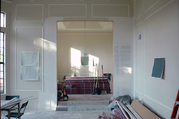
I keep kicking myself for not painting the house before the floors were put in (we’re on the home stretch there, by the way! So happy!). But the fact is, it just didn’t make sense to paint before now. The walls just weren’t ready. We still have some drywall work that has to get done and one of the rooms needs to be skim-coated, so I haven’t been thinking all that seriously about paint colors. But it’s time to figure it out now. I had so much fun sitting on the beach in San Diego over the long weekend, looking at paint decks and finally thinking about how I want to decorate our home. Let the games begin!!
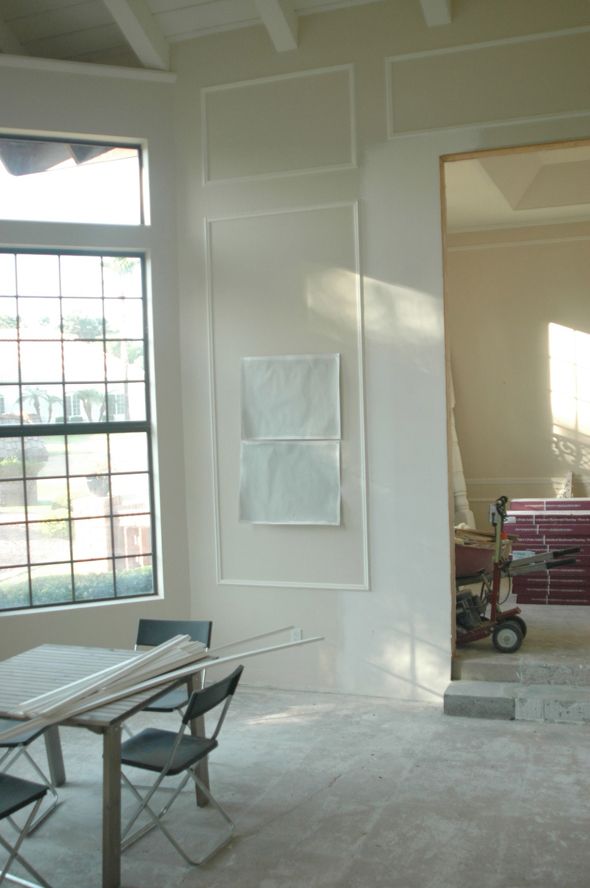
For the most of the main areas and the hallways, I want to do a neutral light gray. I do this in most every home I decorate, just because I think it always looks so fresh and bright and clean.
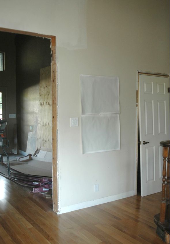
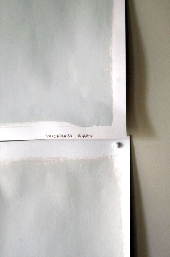
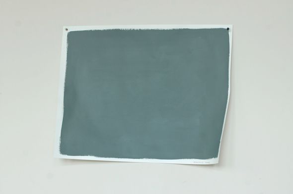
The two colors that I thought were going to be my main contenders are on the left, above. On top is Benjamin Moore’s Titanium and Wickham Gray is on the bottom.
I thought I needed something with a bit more blue in the undertones, but I think Wickham Gray (bottom) is too blue. I’m leaning toward the Titanium (top). Those green undertones are just singing to me in here!
The order is switched in the photo below. Titanium is on the bottom.
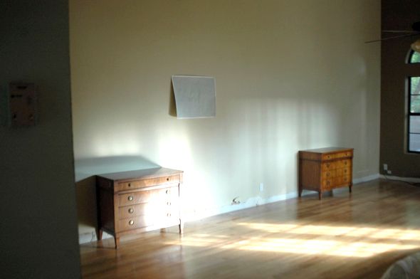
I might throw up a few different colors up on poster boards today to see if there’s a color I like more. Maybe something a hair darker. I don’t want to go too dark though.
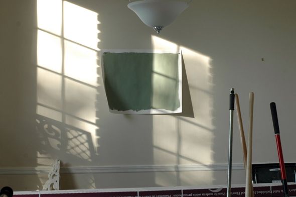
In the music room, I was thinking about doing a green lacquer. The color here is Kennebunkport Green. I’m going to let this one sort of simmer for a bit.
I’m pretty positive I want to do Knoxville Gray on the big wall of built-ins in the library. This is one of my very favorite colors. It is like a chameleon – it just sort of works with whatever you pair it with.
If I don’t use Knoxville Gray on the shelving, I might be tempted to use it in our bedroom. I put up a sample of Palladian Blue, but it might be too sweet for what I’m imagining in here. It’s a great color though.
Also on the to do list today is to finalize a layered trim design for the big doors and pass-throughs. Jason (who is very good at carpentry) is tackling those for me. I’m going to start the base boards and the regular door and window casings myself, so I really need to figure out these paint colors soon.


I look forward to seeing how it all turns out. These are all gorgeous paint colors. We have a pale gray in most of our house too.
Ha, my husband said everyone from Arizona would be coming to our San Diego beaches over Labor Day and I guess he was right :) How fun that you're on to paint colors now. It is going to change the look of things so much!
Hi Jenny, I used Titanium in the Dining Room I designed in this link: http://designsavvyofnj.blogspot.com/2013/03/federal-colonial-dining-room-reveal.html
I love the color, perhaps this is helpful to you and can't wait to see the final results!! You always do an amazing job!
I admit, I'm a little prejudice against the Wickham Gray because I'm a Jane Austen fan. But also the Titanium is really pretty. There is a wall here at work that is very much that color and I look at it each time thinking, "that looks really good…"
Who knew you could actually get paint color inspiration at work?
I'm picking out paint colors today too. In fact, I am just sucking it up this afternoon and going to get the paint at lunch time. I'm probably stuck with a linen for the room I'm doing right now because it has a lot of darkish cabinets and wood floors so I want to lighten it up as much as possible.
Oh the agony of decision! And it's just paint so I don't know why I'm sweating it so much.
I have palladian blue in my living room and love it. Everyone compliments it! I also absolutely love gray cashmere, which I have in the bedroom. That Knoxville Gray is so pretty!
love the pale gray… definitely titanium over wickham gray… gray cashmere another good one w/ green/blue tones (BM) I have palladian blue in my master and love it but hubby would kill for something darker like you are considering. Can't wait to see it and so glad you are almost done /w the floors.. you are fast!
We have Wickham Gray in our bedroom and I would say it is even more blue than gray in certain light. LIke the other commenter who is a Jane Austen fan, I was very biased against that color name! But in the end it was the right color for the space and I love it. (In my mind it's "Darcy Gray" instead.)
Titanium looks lovely in that photo. If you don't want too much blue then that will be a better direction to go.
The funny thing is, I never would have thought of light grey as bright and fresh and clean, but looking at Denise's dining room project and a few other sites (I'm obsessing over light greys for kitchen cabinets), it IS. You're completely right (as usual). It'll be gorgeous – can't wait to see.
Love the moldings you've incorporated in the first space you show. They look fab! Can't wait to see it all done. And I agree with you about Palladian Blue. So pretty but very sweet :)
Oh I hope you do the lacquer in the music room! I am dying for lacquered walls and would love to see someone actually do it!
My husband's parents painted his childhood bedroom Kennebunkport Green. It was a nice medium-dark, woodsy green in their house (lots of light because they lived in a lake and had tons of windows).
Good luck picking paint colors!
Love the Titanium and the Knoxville. I think I read you are planning Gray Owl for your kitchen cabinets? Have you used it before? I did my FR and K walls in it — based on Emily Henderson's proclamation that it is the truest gray gray… Immediately repainted entire space because of heavy blue undertones. Seriously — bad baby boy nursery blue. But I have yellow undertone floors, so that may have had significant impact. Anyway, I ended up going with Dolphin Fin by Behr. True light/medium gray.
Oh my goodness, I'm so excited to see the finished result and it's not even my house! It's so easy to get bogged down by the minutest colour differences but in the long run I'm sure whatever you pick will look great. If not re-painting walls is way easier than re-building walls taken down.
This looks like such a lovely, restful palette. I can't wait to see the (mostly) finished product!
http://www.fullbellywornsoles.com
I love the Austenian reference of Wickham Gray and used it recently in my relatively dark family room. You are right: it reads more blue than gray at various points throughout the day. Still a very cool, pretty color, but I sometimes wish it was a truer gray (too lazy to repaint, though!).
I can't believe how much better the oak floors make the whole house look!
The first photos you shared reminded me of all the homes in my neighborhood when I lived in St. George, UT, just a few hours north. Everyone used that dark brown treated wood flooring and painted their walls beige. It looked so generic! I never thought I would be able to find a home that was "me" somewhere like that but you've shown me otherwise! It just takes a little bit of elbow grease, good taste, and some help from the Internet.
I'm painting my guest bathroom gray. I agree with Nicol that Gray Owl looks blue. Why do people keep recommending that color? We are going with Benjamin Moore's Rodeo (which is probably pronounced like Rodeo Drive, but I keep say "RO-dee-o" like a cowboy show). Rodeo is a really nice warm gray.
Anyone have any advice about white trims? Should I go with a warm white because Rodeo is warm? Or a cool white to offset the warmth? We have swatched Simply White (cool bright white) and White Dove (warm white). Right now, I'm leaning toward the Simply White.
My favorite gray of all time is BM Pashmina. It's medium and bright and happy and just beautiful!
Those are some of my favorite wall colors. Can't wait to see the outcome!
I don't know what it is but choosing a paint color gives me a panic attack! We finally choose one for a hugeee accent wall in our living room/dining room (kinda like a loft setup) but I'm still not sure after looking at probably ever paint color in three stores. Gotta just try it, right?!
Have you ever thought of checking out Farrow & Ball paints? You've probably got more intel and experience with those than I have as a consumer, but I recently selected a couple amazing grays from their line that I plan to use in my open, west-facing Seattle living/dining room. You can see the selection I picked in this blog post.
Since you like the green undertones, I'll list the F&B colors that were grays with comparatively green undertones in case that's helpful: Pigeon, French Gray, and Blue Gray, amusingly enough. :) I'd love to hear your thoughts!
*gasp* The floor in the master bedroom looks AMAZING! I'm trying to find the perfect light gray for our master bedroom that has crappy lighting, I'm leaning towards doing Gray Owl by BM in half tint. The test sample I did doesn't look blue at all thankfully, just a lovely floaty gray. But seriously, those floors are killer.
Have you looked at Sherwin Williams modern gray. It's a lovely clean light gray.
Please tell me you're going to do a post on lacquering walls?! I literally just had it bid for my dining room and the contractor wouldn't even give me a number since it'd take over a week's worth of labor.
Grays have been my go-to color with our first place.
So calming & you can use any accent color throughout time.
Love following along with you! Thanks for sharing :)
Manda from Eat Cake
We are finalizing paint, as well. I tried several of these same colors last weekend. It stinks there are soooooo many whites & grays, as I spent $130 on samples from BM Saturday. The clerks were wondering what I was up to when I picked them all up. In the end, we are going with BM White Wisp for much of the house. I also had them tint Gray Owl at 50% lighter for the baths with Carrara marble. They are both glorious (if painted walls can be glorious, I don't know)! I am doing Hale Navy in my son's room – it is the most beautiful blue ever! I also had Revere Pewter customized at 50% lighter for his bathroom. I don't think you can go wrong with the myriad of colors BM offers. Good luck, as picking paint colors has had me in near panic-attack mode all week. I woke up at 5 this a.m. with paint on the brain & could not get back to sleep.
Can I ask what you all do with the samples when you are finished? I have at least 30 pint samples that I no longer need but don't want to take them to the toxic waste facility if someone can use them. Craigslist them for free?
Mix them all together and paint the inside of your closets or small bathroom. I once mixed all my paints to paint all the walls of a friends ranch house. Shockingly great color.
I know this post is about the paint but gotta say that I'm loving the new wood floors. What a difference!
Such beautiful colors. I love the kind of muted finishes they have. I could see Palladian Blue being a bit too sweet for you, that knoxville gray, however is lovely! I know they will be the perfect backdrop for your gorgeous decor.
I LOVE Knoxville Gray. I keep trying to convince clients who like that type of palette to use it, and I can't wait to see the photos of it in your house! I never end up using Titanium because it always seems like too little pigment/too washed out here in the midwest, but I bet in your house with so much AZ sunshine, you will actually be able to see the color and it will look great. I also like Oyster Shell for a light gray that is more blue, and I'm surprised by all of the negative Gray Owl comments because I love that one, too (which I usually think of as blue/green undertones). Palladian blue is also one of my favorites…the others I tend to think of in that category are blue Wedegewood gray and woodlawn blue.
I really like that you are thinking of incorporating some other colors, like a green, etc., especially since you have so many rooms. The gray/blue palette is of course beautiful and elegant, but I have to admit I am also excited to see what new-trend-establishing colors you might consider ;). I just love all of your thoughts and can't wait to see how it all turns out!
You might try BM Silver Fox (hee!) for a darker grey. It can go taupe or lavender depending on light but it was STUNNING in our old condo, which had lots of white molding. I'd started out w Puritan Gray and that was way too light/taupe.
I used Wickham Gray, and it is BLUE. Want to re-paint – but hubby isn't as willing :)
I painted my living room Knoxville Gray a few years ago, I still love it. Here's a pic: http://4.bp.blogspot.com/-maklZzMpZck/UioVvKxLckI/AAAAAAAACD4/XJxcDlj-P2s/s1600/IMG_3624.jpg
My hands down favorite neutral gray is Montpelier Madison White by Valspar. It is just gorgeous and I have it on every wall in my house!
To Natalie A. who asked about what to do with her leftover samples – try donating to a community theater or to the theater program at your local high school.