
I went to the High Gloss Mag launch party last night and it was so fun to see some of my favorite blog friends. The premiere issue launched yesterday and I loved it. Of course Jamie’s house is unbelievably gorgeous and I loved the bachelorette pad Erin designed!
It was also so fun to see Tia Zoldan’s house featured in this issue. Her home was a favorite among bloggers when it was featured in Cottage Living years ago. It was a treat to check out what Tia has kept over the years and what has changed. Shall we do a little comparison?
Tia’s old living room:

New living room:
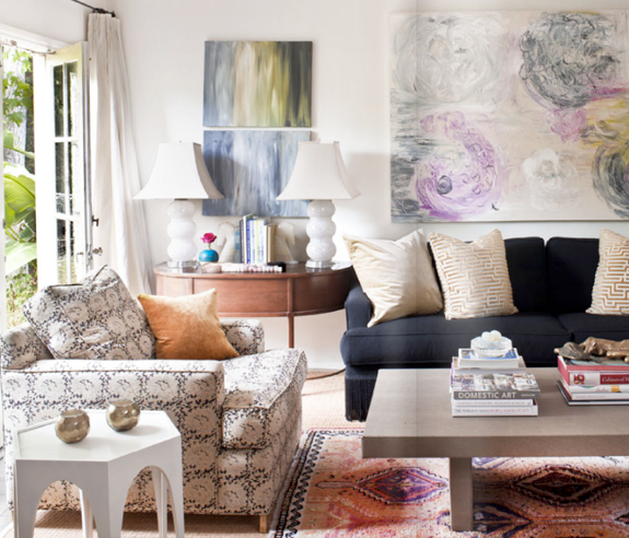
Looks like pretty much everything is new in the living room. She might have reupholstered the chair in that amazing print. The arm looks the same. I like the furniture lay out in the newer version, with everything laid out on a 90 degree angle. Love the new art and the rug.
Old dining room:
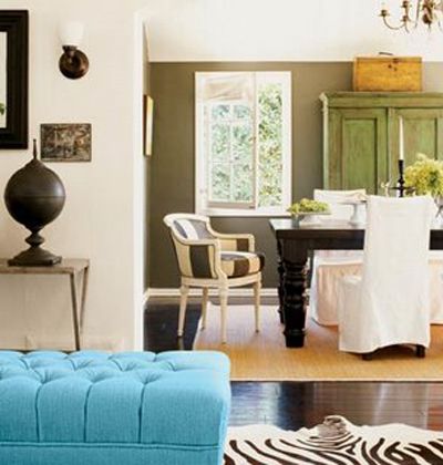
New dining room:
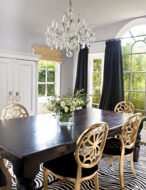
Tia kept her farmhouse table and painted the armoire white. I miss those stripey end chairs!
Daughter’s old room:
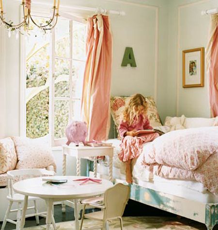
Daughter’s new room:
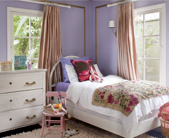
I like both of these rooms for different reasons. It’s fun to see how this room has grown up with Tia’s daughter. The bed was painted white. The moulding was gilded. The curtains are more tailored, but the hardware is the same. I LOVE the suzani on the bed and the wall sconce.
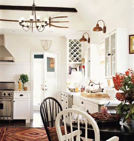
Old kitchen:
New kitchen:
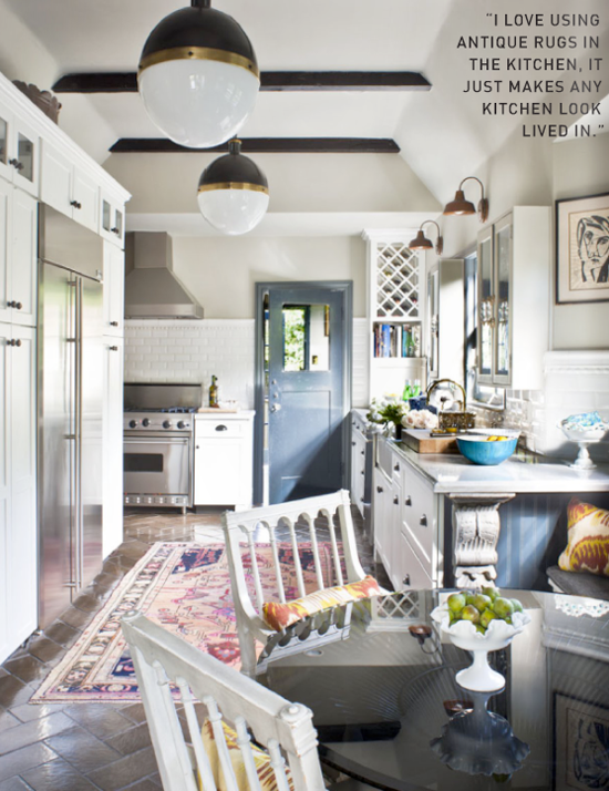
I love the new lighting and the new rug (though the old rug was really great too). I am head over heels for the chairs in the new version of the kitchen. And the herringbone patterned tile floors? So great. My very favorite change in here was probably the least expensive. That design genius, Tia, painted her back door a show-stopping blueish charcoal color.
It’s fun to see how a decorator’s tastes evolve, right? I think Tia’s home is lovely in all it’s phases.
**Also, did you know that Tia has a GREAT blog? She updates it often with images and products that inspire her. A must-read!**


great to see these photos side by side. everytime i look through my old cottage livings (yes, i still have them all), i see something new. i never would have noticed that wall sconce in her little's room if you hadn't pointed it out!
Ohhh thanks Jenny. That was fun! I love love love the new kitchen, especially the door but I think I like the old living and dining rooms better.
Love the door too. I want to do that at my house but I'm scared…It's only paint, right?
Tia has such amazing style! Both the befores and afters are amazing. I love how even though her before living room would fit right into today's Lonny, she changed it over completely and it still is magazine worthy. Thanks for sharing these.
Love the current spaces, but the "befores" were fabulous as well. I would have gladly taken Tia's cast offs as her tastes evolved :)
thanks for a great comparison…
Both are great, but I like the new better. It looks like she painted her old coffee table in the living room. I love paint.
She has such a great place. I really loved the previous rooms, but the new ones are great too. It's so fun seeing how a designer's home evolves!!
Oh my goodness! I would take either version of her home… absolutely gorgeous! LOVE the new rug in the kitchen. Any clue where it's from?!
Then it is even fun to see how her "new" living room was even a little different from 7 months ago. She switched out pillows for the photo shoot.
http://vivafullhouse.blogspot.com/2010/07/tia-zoldans-favorite-spot-in-her-home.html
xx – CB
this posts help's me feel normal, changing a good thing is okay. i feel like i am always wanting to re-design my spaces even when they look good!
This space was my favorite. I think it was all of the rugs and prints!!
It does seem a little bit less "country" to me now, but still lived in and beautiful.
just what i was wanting to see, the room by room comparisons. thanks for posting! i love her rugs. and i think i need to paint my kitchen door dark. pam
I'm painting my kitchen cupboards a similar bluish gray right now and I couldn't be happier!
Beautiful rooms, I always like a before and after! The only room I prefer in the old version is the dining room!
Loved the colors!
We always re-do something in the house too!
Love seeing how ppl update their homes. I am so bad about that. You would think being a designer that I would change often- but I put something somewhere and it often stays. Good thing we are moving in June!
I really love seeing this comparison. It's really is fun to see things evolve in a person's home. I wish there was more!
What a fab post! LOVE seeing her taste evolve.
lovely post Jennifer. V interesting!
Oh Tia's home was one of my favorite parts of High Gloss magazine and to see your comparison on your blog is GREAT!!! I love! Thanks for doing this…inspired by both then and now images :-)
I remember these rooms. How fascinating to see how they have changed.
I LOVE both the before and afters!! Also follow her blog. Love it! ;)
I too loved seeing the old and new! Does everyone buy that much new furniture in that short a time?
What a luxury to redecorate that often. So dreamy!
I have always loved Tia's style; I remember poring over her home in Cottage Living.
I love the farmhouse table. I remember the table from a post you ran.
Teresa
xoxo
Using that same charcoaly blue on the end of her cabinets and then framing the picture with that in the foreground and distance makes it look even better- unbelievable eye.
I'm jumping up and down because she has the same dinning table as me! Also i love both the 'before' and the 'after' looks.
Great commentary…loved your comparison…never saw the original version. First time on your blog and will definitely come back!!
Great post, love to see how homes evolve! I believe when looking at the living room, the sofa looks the same but now charcoal, as well the coffee table is stripped to raw wood … both great ideas.
Great photos!! Love the Navy curtains against a light grey wall, with the gold single shade!
Also – the little girl's room is GORGEOUS! I am partial to the "before," but both are fabulous!
Love your blog- it inspired me to start mine this January.
Happy Weekend! :)
diana
i love that print on that left chair in the living room as well. any idea what it is?