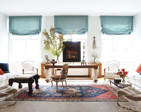
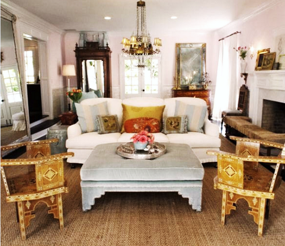
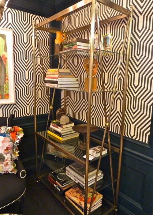
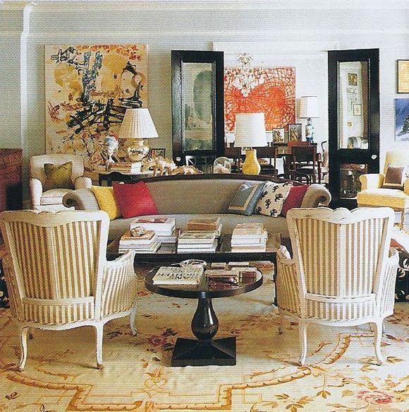
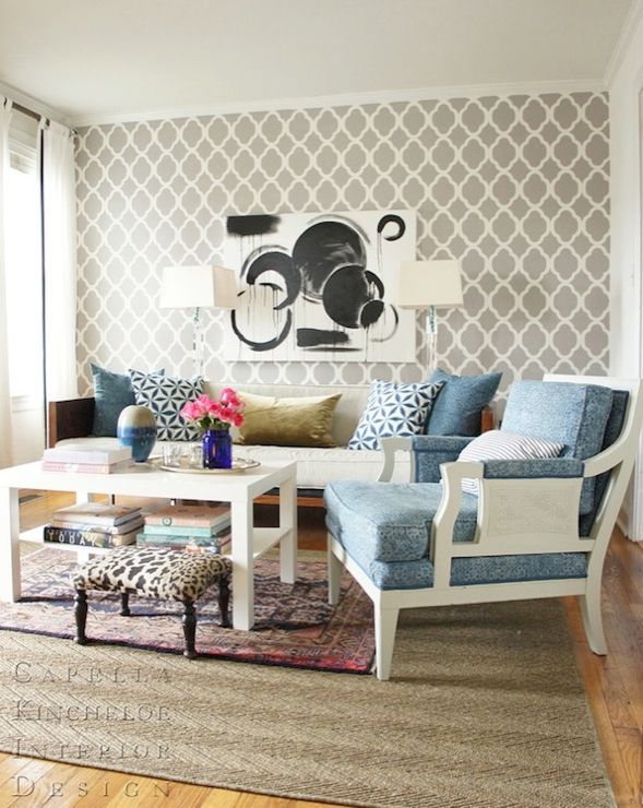
I’ve been rug shopping for about a year now, trying to find a pretty persian for our loft living room. The striped rug suffered from a red juice incident and has never quite been the same. It is a lovely rug, but I’ve pretty much decided across the board that I prefer that graphic patterned rugs with any white in the pattern go in a bedroom or an office. Any time I choose a jute or a persian rug for a living room project, it just works better and looks better for longer. Function trumps form for me, but only by a little bit. :)
I am SO picky about rugs now. They are the hardest design decision for a room I think. Just like clothes, fit is everything, so often you should be buying a rug for a specific room’s needs. And since rugs should be so big, the color can really change the feel of a room. And because of lighting, you almost always have to try a rug out before buying, which is a nightmare. And rugs are so gosh darn expensive. And if they’re not expensive, you can tell. Tricky! (going rugless seems better and better by the day!)
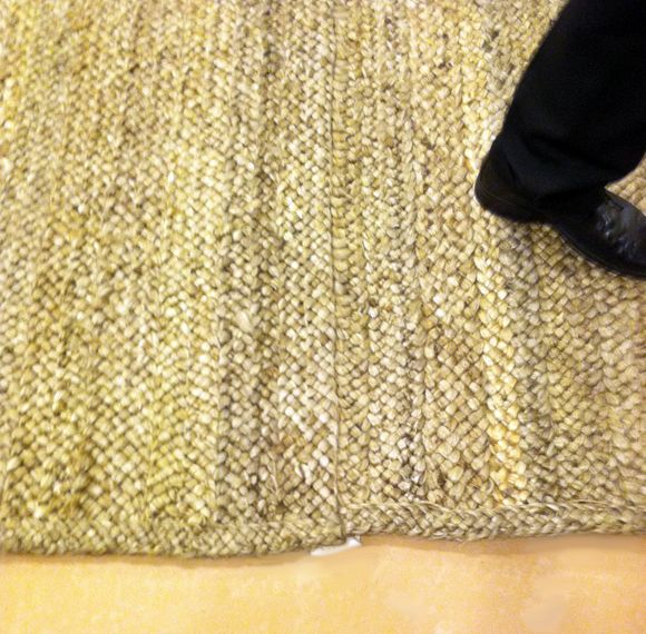
I’ve decided to go with a jute rug in our brownstone’s extra long living room. I love the texture of natural fiber rugs and I think the jute will hold up well against the residual dirt I’m sure will get tracked in from the garden (although I do know there are cleaning challenges that come with natural fiber rugs).
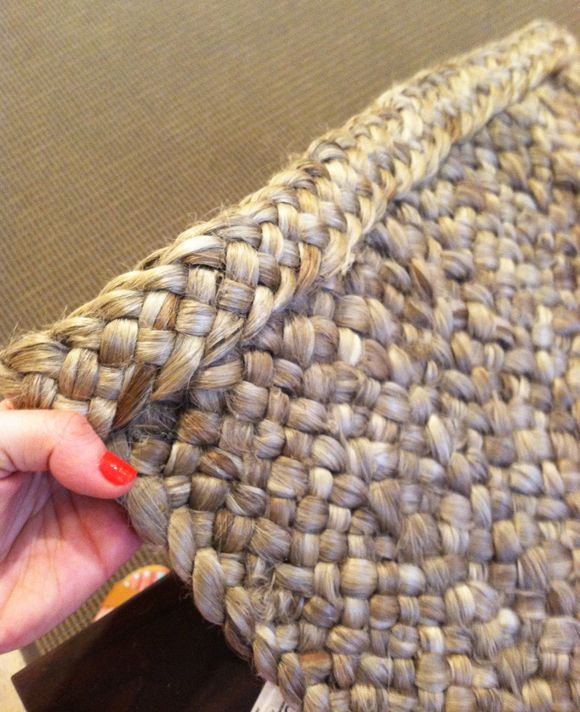
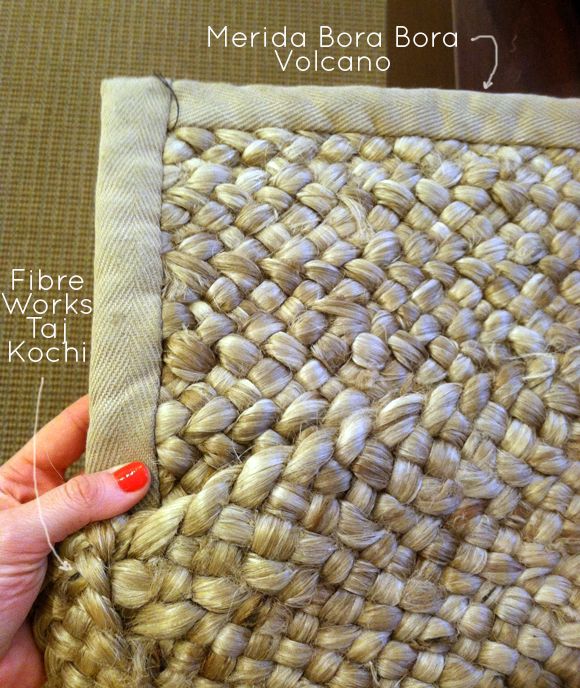
I used Merida’s Bora Bora jute rug in Volcano for a client project recently and it is just natural fiber rug perfection. It’s as cushy and soft as wool. The color is a lovely driftwood gray, not yellow like most jutes (so over yellow rugs for a while!), and it comes with a braided edging option.
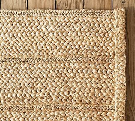
The IKEA Tarnby and West Elm jutes are great rugs, but they are not nearly as soft as the Merida and I don’t like that they are borderless. It feels a little unfinished and the edges have rolled up for me even with rug tape. The closest second place to the Merida rug I’ve seen is this Pottery Barn rug. But again, it’s not as soft and the color is very light and yellow.
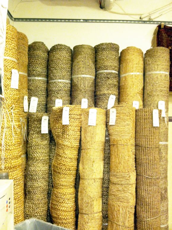
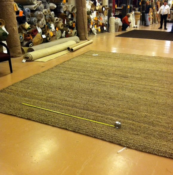
We need a long, narrow rug for the brownstone, and the quote back from Merida was out of our budget (almost $4000 for the custom size. Ouch!). Then over Memorial Day I did a little shopping in the ABC clearance basement, and what did I spy over in the jute corner? A handful of driftwood gray braided jute rugs.
Turns out these are not Merida, but a company called
Fibre Works. Look how similar the color and weave is though!
Full price, their rugs are not all that much cheaper than the Merida jutes. But they just happened to have some in the clearance basement. So while they weren’t IKEA-cheap, they ended up being more like PotteryBarn-cheap with the sale and my designer discount.
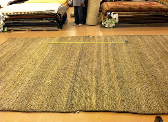
I ended up buying two 8x11s that I’ll use to make a big 11×16 rug. I’m thinking about blind-stich binding them myself with some jute twine and then the seam will be invisible. But even when they’re separate and just sitting next to each other, the seam is not all that noticeable. It would be super easy to do this with the IKEATarnby if you need a big rug for super cheap. The weave of jute provides a lot of give, so you can sort of morph the edges into each other.
The tape measure marks out the LEE sofa here.
And here’s where the chesterfield will sit.
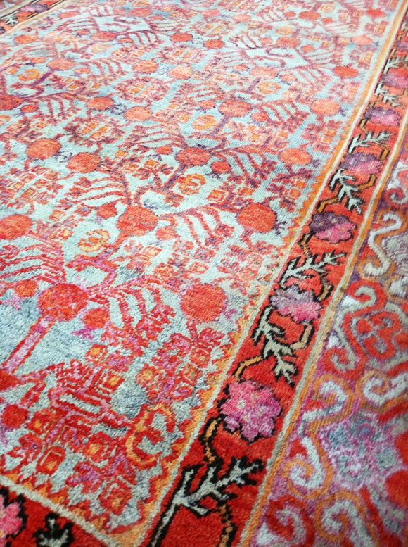
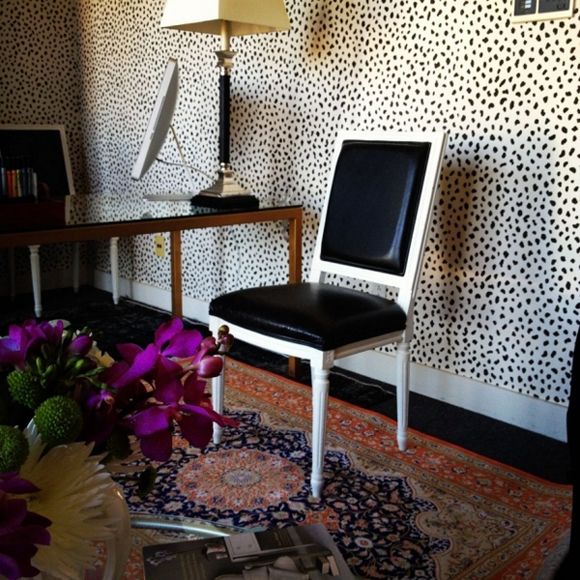
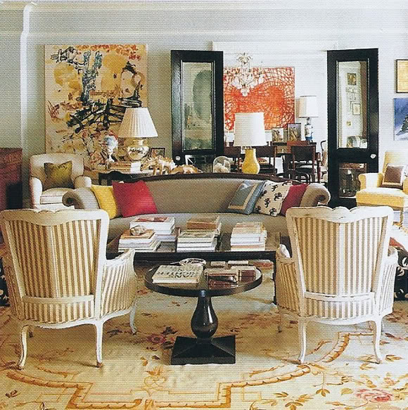
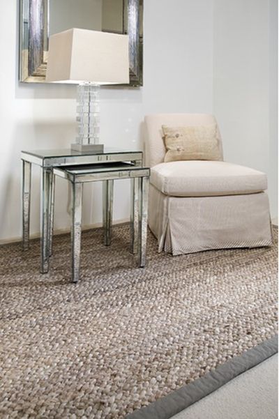
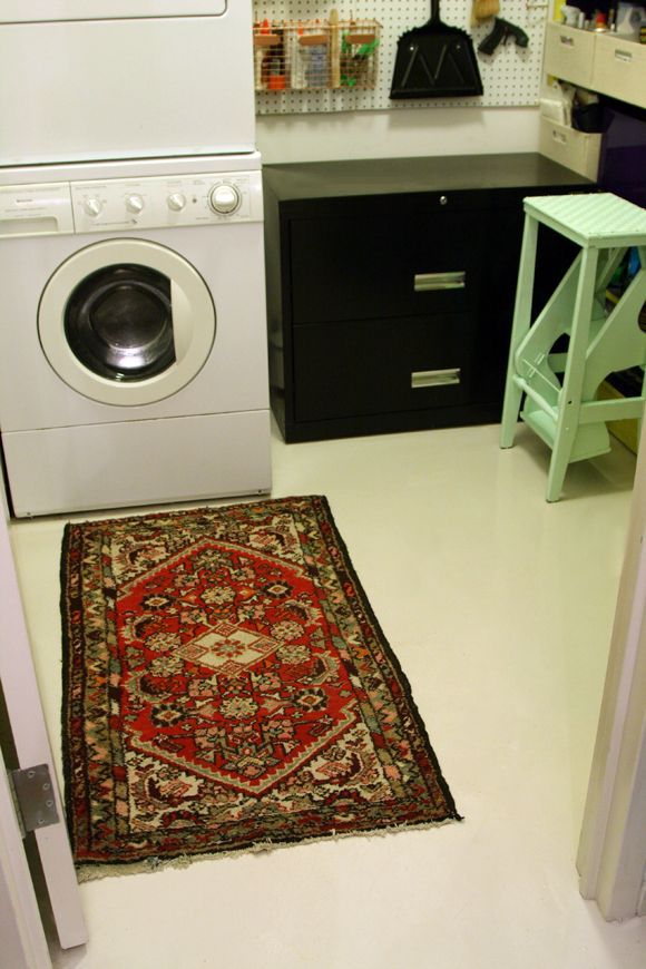
I want to layer a smaller (like 6×9) persian on the jute under the seating area for a little bit of color and pattern on the floor, like the inspiration photos at the top of the post. I saw this pretty turkish rug at the flea market the same day I bought the jutes. Aren’t the colors fantastic? It was not super cheap, so I was a good girl and passed. I’m sure eBay will come through for me like it always does.
So what are your thoughts about my new rug philosophy (no graphic white in the living room rug)? Feeling a little like I should get off
my high horse here! :)


