***UPDATE: Thank you guys for all the notes and emails about the font being too small, issues with leaving a comment and requests for bringing back the blog roll. I didn’t realize SO many of you used the blog roll like a makeshift RSS feed! We are taking your feedback to heart and will do our best to make the new site more functional!! xo
Well, it’s been a long time coming, but littlegreennotebook.com is finally mi-i-ine!! Welcome to the new site! My talented friend, Angela Hardison, who also photographed this amazing print, was my designer extraordinaire/professional hand-holder. She did an amazing job, giving me exactly what I asked for – a simple, easy-to-navigate, searchable site.
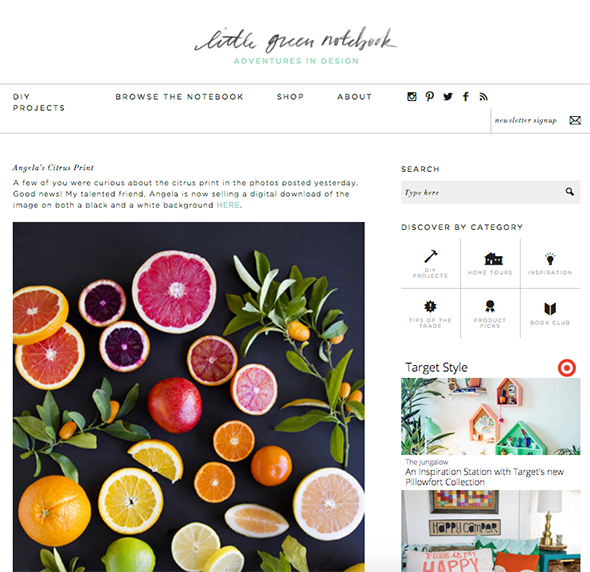
RIP old Chiang Mai Dragon header and Blogspot! You were good to me.

Also, a HUGE thank you to my right-hand lady, Kate, who painstakingly went through all my old posts (1200+ of them!!) and retagged and edited every single one. We are still working on fleshing out some of the new site’s pages, but I hope you stick around and kick the tires a bit!
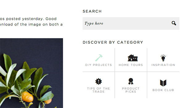
Most all of the content fit into these six categories (the icons change color when you hover over them!)
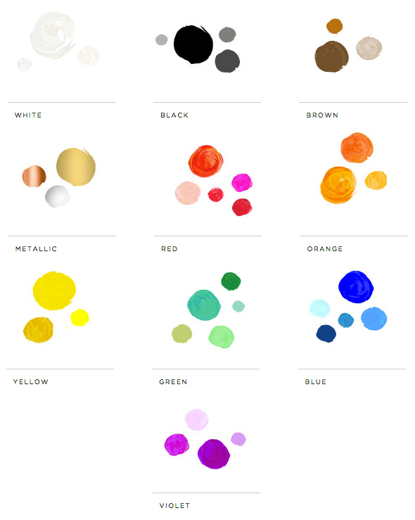
Under the Browse the Notebook drop down menu at the top, we included a page called Inspiration by Color that lets you search for images and products of a certain color you might be looking for. Cool, right? If you’re looking for a round up of black bedrooms, or brass kitchen hardware, or favorite white paint colors, look no further than the color page!
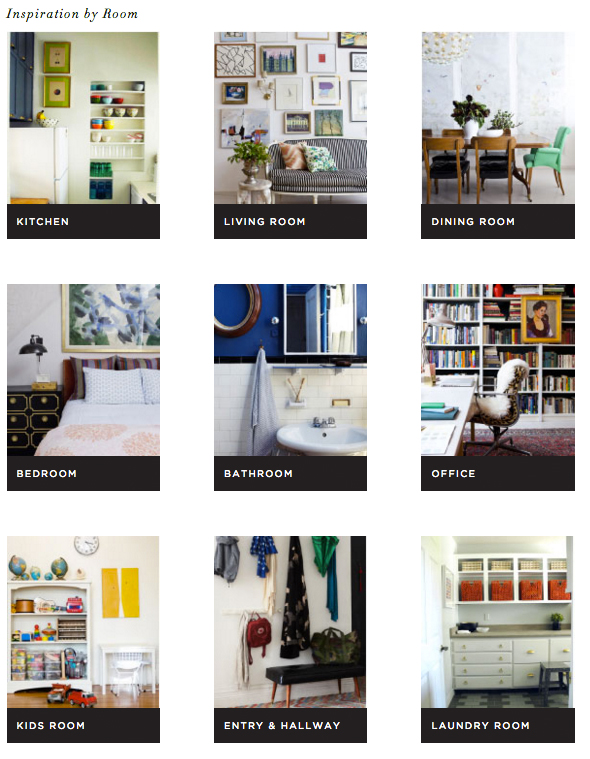
The Inspiration by Room page is pretty self-explanatory, but has already turned out to be so helpful for me! I am getting ready to start my own kitchen reno and Pinterest feels like an ocean of inspiration lately. Like drinking from a fire hose! But scrolling through my Kitchen inspiration page has been incredibly helpful! Not surprisingly, every image is exactly my taste! :) Hopefully you like some of them too!
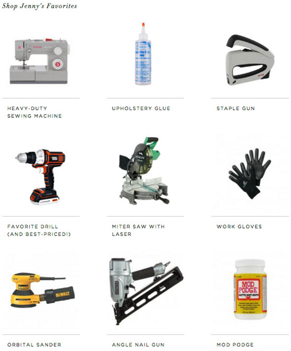
And the DIY Supplies shopping page was SO fun to put together! We gathered up links to all of my favorite, tried-and-true products for DIYing in one place! Please let me know if you feel like I’m missing anything. I love trying new products!
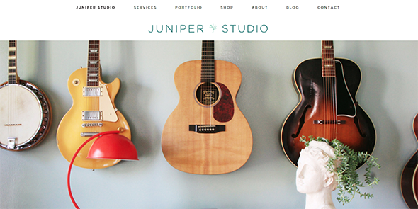
Also, don’t forget to check out the new site for my design company. Last year I renamed my business Juniper Studio and we have lots of big things coming to fruition in 2016. We are starting a local home rehabbing business (something VERY near and dear to my Mesa-loving heart!) as well as wrapping up several client projects that I can’t wait to share with you! We are also gearing up for a retail shop that will sell custom furniture, pillows and home accessories including beautiful art prints! Coming sooooooon! :)
And finally – a quick note to say THANK YOU. I get overwhelmed with gratitude when I think of all the love and support and patience my readers have shown me over the years! Here’s to at least nine more years of design adventures!! xo


Hooray!
Not trying to leave as a reply, but can’t get comments function to work another way. I have always enjoyed your blog. I’m not that old a reader, but, you might want to consider upping the font size because I feel elderly suddenly. This text is nearly illegible.
I also really enjoyed the brand your old header reflected. The new one is scrubbed of personality. It’s a bit of a shame. This is a lovely, clean layout that, except for the tiny font, is great. But it doesn’t tell me a thing about your brand or style. The old header did and seemed to have great staying power throughout the trends of the last 9 years.
I am also leaving a comment as a reply, for some reason the normal way isn’t working…ANYWAY< I love, love, love everything!! I have been a fan for years and your blog is at the top of the list that I check every day. I actually just installed plywood flooring throughout my whole upstairs of my home because of you. Keep up the great work, Love your site and all that you do!!
Hi! The new design looks great. Kudos. My only critique is that one of the key reasons that I come to LGN almost daily is the blogroll on the sidebar – it is a great index of sites and I use it like an RSS feed to see which have been updated. This was a wonderful function. Will it be replaced? Many thanks!
Hi–I could only reply to leave a comment also, btw. Waaay to go! High five! I was glumly visiting your site wondering where you were–it’s been over a month since that last post! I missed you. So happy Little Green Notebook is all yours and stylin! Here’s to 9 more.
I love it! The font is a tad too small for me to read comfortably, fyi!
Having the same issue as others with the comments. Not sure what tool you’re using for comments, but it also is freezing me out if I open a different tab then try to come back.
I agree that the typeface would be much easier to read if it were larger. I’m straining my eyes trying to read this blog I love.
Redesigns take a ton of work–I’ve endured one myself. Congrats!
Hello,
Just thought you might want to know that I can’t access your older home tours. The link works just fine for your current home, but not the others which were featured on the page.
Glad you have a new site that you love! It looks beautiful.
Love love love your new site, Jenny! Your new upcoming projects sound so exciting! I just wanted to check if you will be hiring additional help for your team with the new projects you’re launching? I am moving to the Mesa area in May and would love to apply to work for you if you’re ever hiring. I’m a longtime fan of yours! :)
Awesome, Hannah!! Welcome! I know you will love it here! :)
Send me an email – I’d love to talk and learn more about you! xo
Thanks for the feedback, guys! Still working out some kinks I guess! :)
Saw you’re update but wanted to say I second bringing back the blog roll! I check that thing every day :) Very excited for all that is to come for you, especially the shop!!
Xx a long time lgn lover
Beautiful new site. :) Congrats.
I’ve missed you! I’m excited to see all the new projects you’ve been working on! I agree that the font size could be bigger, and the blog roll was a favorite feature of mine….please bring it back. Thanks for sharing your talents with Us!
Xoxoxo
I agree on the blog roll. It’s the reason for visiting the site daily.
I MISS the blog roll as well…a reason I visited every day. Bring it back!!!
So very excited! I was sad, thinking you’d abandoned your blog. Thank you so much for this new site and all the amazing content you post. It’s a true inspiration and I’ve learned a lot!
LOVE the new site – it was worth the wait. I especially love the new navigation features (by color? genius.) but wanted to let you know that when searching BROWSE THE NOTEBOOK > MY HOMES each leads to a 404 error.
I love your blog and would read it for content no matter what it looked like, but I have to echo the first commenter that the font is too small and the new header just doesn’t capture your brand like the old one.
Congrats Jenny! Looks fantastic.
The “my homes” section is not working yet FYI. Excited for it!
Woot! Congrats! Very excited to explore your new site. I especially like the search by colour feature!
LOVE how much thought you’ve put into this new site. I’m so excited about all the categorizations because I am always searching your site for tips, products, etc. that you’ve mentioned and I’ve just filed away in my brain. This will be so much easier!
Just one thing… the body text is so small! I’m only in my 20’s and having a hard time reading it.
Beautiful otherwise!
Yay! This works today. I just had to come back and GUSH over that amazing job you did on Lucy’s place!!! Wow! I see why you were so busy now. Here it is fellow commenters: http://cupofjo.com/2016/03/lucy-kalanithi-home-tour-makeover/
Yay Jenny! It’s lovely and I really love how you’ve organized everything. I use your blog as my main reference for any design-y kind of things I wonder about and this makes it even easier to find stuff. Thanks! And – the home tour over on Cup of Jo made me cry. So sweet and just really beautiful, so full of heart.
Sweet Lynne!! Thank you friend!! All my love to you! I can’t wait to share your home tour here soon! xo
I just wanted to say that the new format is lovely, just like everything you do!
I’ve been a reader for years and want to reach through the screen to give you a big “congrats!” hug. Also, I’m still crying over the beautiful work you did for Lucy K. The site looks phenomenal.
Thanks Laura!! Hugs right back to you! xo
I just wanted to share that I finished reading about Lucy’s home makeover, and your work was absolutely phenomenal. It was super sweet to read about you both! I love that you hand stamped the curtains, and how Lucy wholly appreciates it! Beautiful!
Thanks Jeannie! We have a lot of fun tutorials coming this week from Lucy’s project. I hope you come back and check them out! xo
As far as the font size comments, it might also help to eliminate the letterspacing for better legibility? That said, I landed here from the home makeover on Cup of Jo and blown away. Gorgeous and heart warming.
So very happy for you & your new site. Just wanted to say you were one ( or maybe the first ever!) blog I started following years ago. I will miss the Chiang Mai Dragon header but realize change is inevitable. Your home makeover for Lucy was fabulous & a tear jerker. I agree with the others, the font is way too small & I miss the blog roll as well.
Thanks for the feedback! We’re working on both of these issues! :)
I noticed the comment above saying they liked the old header/logo better and I just wanted to throw my 2 cents out there because I LOVE your new header!!! It looks like the same beautiful script as the old one but it’s fresh and simple and modern. In my opinion it captures the essence of your brand without needing to literally be written on a “little green notebook,” so don’t change a thing! :)
Thanks, Hannah! The update was a looooong time coming and I totally agree with you. I wanted it clean and simple so that the photos could be fun and colorful and stand on their own. Thanks for reading! xo
Congratulations on your new blog site – I know that is a huge undertaking to move everything! It sound like you are super busy – wow, so many new projects going on! I wish you continued success!
Love the new site, the new search options, the DIY stuff – all of it! I can’t wait to see what you do next! Please keep sharing with us. I have learned a ton from you about design and gained a lot of courage to DIY from you. Thank you for years of inspiration – please please keep it coming!
Thanks SO much, Jessica!! Your comment means so much about getting the courage to try projects yourself. :)
It looks great but the font is even smaller than before.
I loved the Blogroll too! It was the reason I visited your site daily. Congrats on the new site! :)
I was starting to get the shakes and twitches in my eyes from LGN Withdrawal! LOL! So glad to see you are back in fabulously stylin’ action. You are still my #1 favorite blog of all time. So happy for your victory over the url and congratulations on this beautiful new baby.
Thank you Caroline!! Lots of fun changes this year! xo
Congratulations on the new site!!! I too loved the Blogroll! Hope to see it come back (fingers crossed).
Longtime daily reader here also inspired to weigh in on the tough-to-read font and the blog roll- I never did figure out what an RSS feed was but didn’t have to thanks to your site! I visit it first and then see what else is updated, so I would love to see that feature come back. Otherwise all the new organizational features are great. I’m sure many of us will associate your blog with Chang Mai and a little green notebook no matter what is on your header! Congratulations on the rebrand and I wish you much success with the new business ventures.
LOVE, LOVE!! So happy to see you… I thought you were gone! The new site is perfect.
Love the site, I just wanted to let you know that its not updating when I pull it up on my phone (an Android). It shows the most recent post as the Artsy Family Photos.
Yay! You’re back. I was scrolling through the inter web and came across a redo you did on Cup o Joe and thought “Ah! That’s where’s she’s been. But why didn’t I get an email alert from her blog of the new post.” A quick Google search later I discovered the new website. Congrats! I came to rely on the alerts for new posting and would have missed so much on your new site had I not stalked you. Maybe you can post on the old blog your new site. Also, I can’t seem to subscribe to the newsletter feature from my iPhone.
I am unable to subscribe to the newsletter. After entering my email address, nothing happens…
Love your new website!
http://www.topswedding.net/embroidery-ruffle-beautiful-square-neck-tealength-flower-girls-dress-p-5997.html
Hey Jenny, just a quick comment on the header. For me at least, there’s not much that visually distinguishes the header from the content even though technically the long, horizontal header box with the main link does provide separation. It all just sort of blends together as black text on a white background. Does that make sense? I totally understand wanting a change, and to keep things more minimal so content can shine. Something as simple as a subtle wash of color behind the header would make it distinct and highlight who you are without visually cluttering things up like a pattern or picture would. Anyways, just my two cents.
I found your blog a little over a year ago and binge read the whole thing in just a few months!! I love it! It’s definitely my favorite combo of design and DIY. I read through Feedly most of the time and I had been so bummed that it seemed like you weren’t blogging much anymore. Then for some reason I went straight there a few days ago and this! Yay!! So, so happy to keep reading your awesome posts and see what you are doing.
You might want to do one last post on your old site redirecting here, bc I thought were just on an extended hiatus. The only reason I found this is that sarahmdorseydesigns.com recommended one of your posts this week
It should just be automatically redirecting? Like if you type in the blogspot address, it should take you to the new .com url. Is it not for you?