We’re working on several kitchen projects for clients right now and I’m starting to figure out what I want to do for my own kitchen’s mini reno. I’ve been pinning up a storm, but sometimes Pinterest can make me feel a little uninspired and over stimulated at the same time. Do you ever feel that way? So a few days ago I decided to pull out some of my old magazines just to switch things up a little.
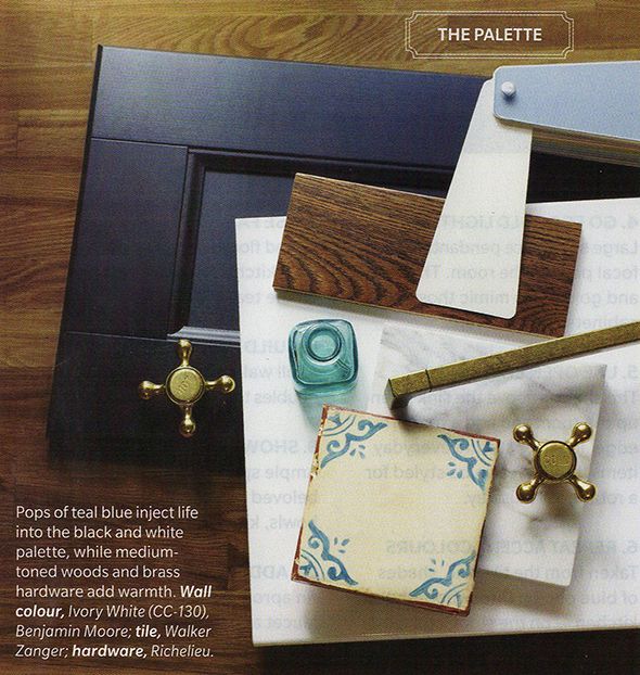
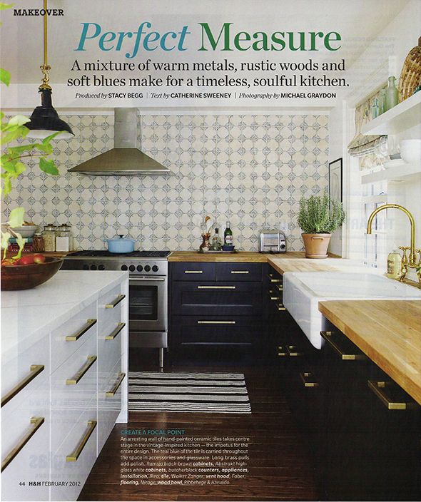
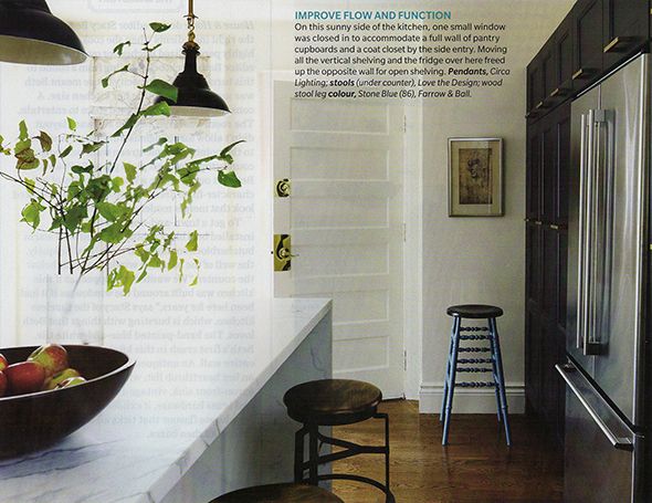
A few dozen magazines later, I got to my February 2012 House and Home issue and rediscovered this kitchen, an old favorite for sure. Remember this spread? It’s everything I’m hoping to achieve with my kitchen update. It’s a little bit modern, a little farmhouse, and there’s lots of personality thrown in. And for the first time, I realized those cabinets are IKEA! They look SO great here, don’t they? That brass hardware from Richelieu is pulling some serious weight!
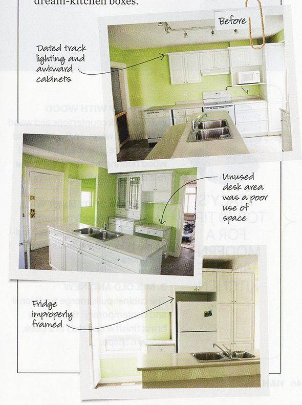
The space looked pretty sad before the renovations. It was outdated and the layout was terrible.
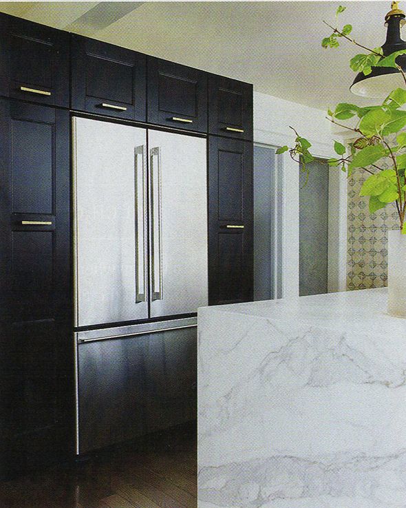
The new layout makes the space look twice as big! It’s crazy how expensive this whole space looks. They built out the pantry cabinets a little bit so the (IKEA!) fridge would be flush with the fronts. I also like where they mounted the hardware on the tall side cabinets. And check out that waterfall edge on the island!
You know how much I love that look…
I love how they mixed
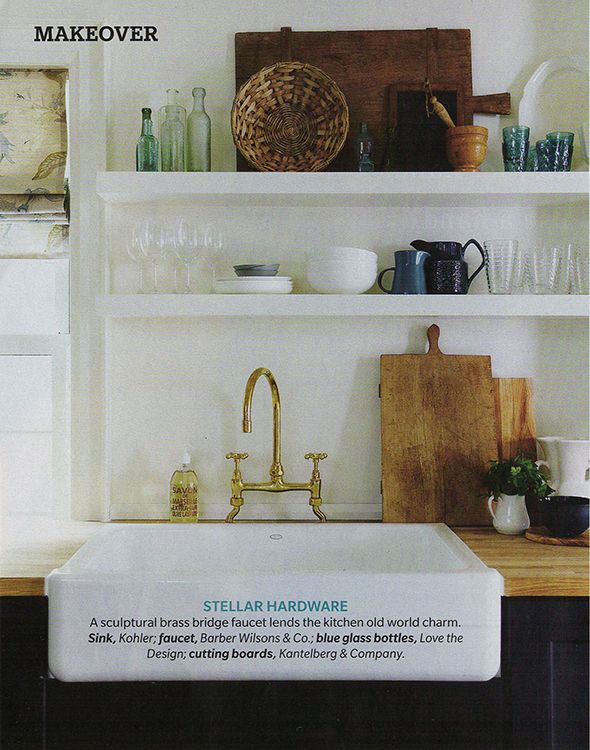
inexpensive butcher block with the marble. It seems like this mix of low and super high-end was the secret here for the entire space. You might not normally expect to see a
Barber Wilsons brass faucet in an IKEA kitchen, but I guess you can afford to spend thousands on faucets and hardware if you are spending only a third the cost of custom cabinetry. It’s a great trick – distract the eye with the shiny pretties and no one will notice the IKEA at first glance. And then they won’t care when they do figure it out! IKEA cabinets work and look great!
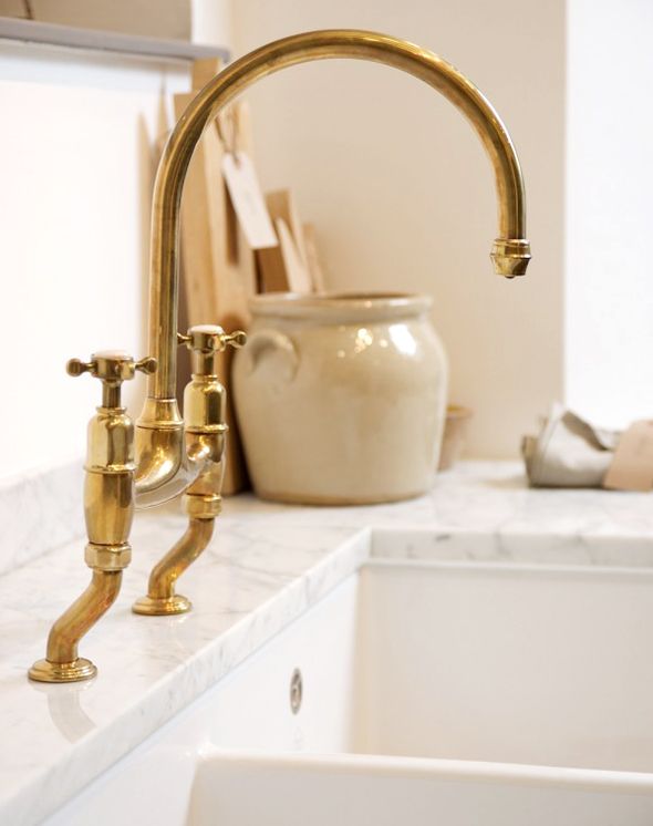
Oh, and speaking of brass faucets, did you see this beauty from
DeVol for Perrin and Rowe? Such a great price point and so similar to the much pricier one above.
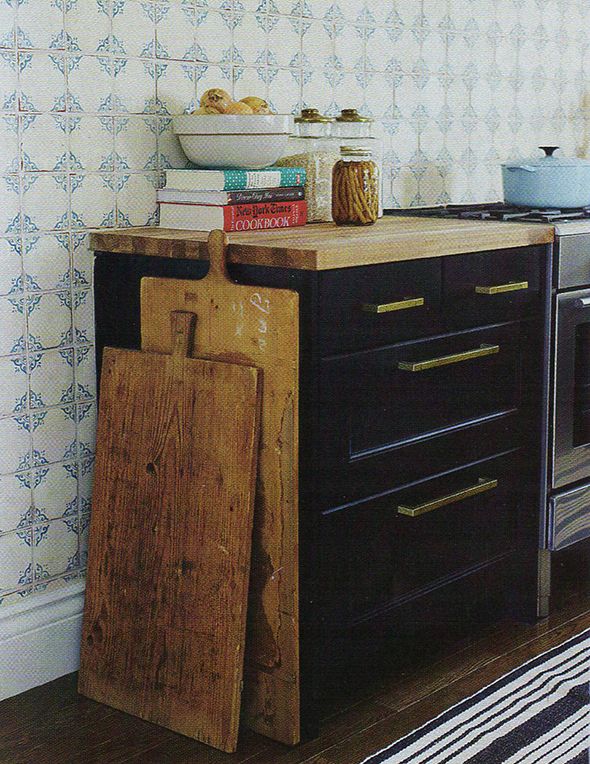
I feel like the obvious showstopper in this kitchen though is the handpainted backsplash tile. I lurve it.
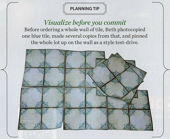
The homeowner scanned in a sample tile and printed out multiple pages of the scan to tape up on her kitchen wall to make sure she could live with and commit to the pattern. Isn’t that a GENIUS idea? Just like with wallpaper, it’s easy to fall in love with a small sample, but it’s really the overall pulled back pattern that you’ll actually need to love!
This tile is from
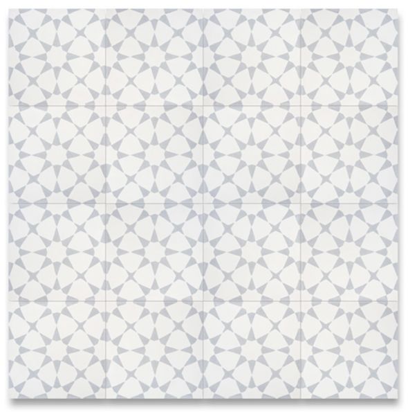
Walker Zanger (another high-end purchase). I love it. I think it’s a smart move to go with a more restrained pattern. I’m thinking of something like
this similar cement tile for my kitchen backsplash maybe and printing out scanned in tiles to tape up on my kitchen wall was just added to my to-do list!
Do you have an all-time favorite kitchen? I have about twenty, but this one is proving to still be an inspiration! Long live print publishing!! :)
images are my scans of House and Home February 2012



I'm in love with all of the old cutting boards! So beautiful!
We have used IKEA cabinets and they are really great – but stay away from their great looking – but poorly made – ceramic farm house sinks – my plumber says they don't hold up, are hard to install because of the inconsistent quality and can break really easily – drop a heavy pot in and the whole thing might break!
That kitchen reminds me somewhat of this other one I've had bookmarked for my future dream house: http://stylebyemilyhenderson.com/blog/spanish-california-home-the-kitchen
I enjoy hearing your kitchen insights and seeing this article. I've not read House & Home, but recently saw it referenced in another blog. I would appreciate seeing a list of recommended "home design" magazines. I regularly read House Beautiful, Dwell, and MSL–what else is out there that I'm missing?
Domino is nice, but it's only 4 times per year.
Okay, just days ago I watched the episode of this kitchen. Crazy!
I want to know how hard it would be to paint my own tile? I know it's probably different than "paint the town", but wouldn't it be cool if you could paint over white tile then realize and get fired? Would that work anybody?
*reglaze
I definitely remember that kitchen. That's what I love about magazines – you can go back years later and notice things you didn't notice the first time around. And yay for House & Home. I might be biased but I think the Canadian design magazines are the top of the industry ;)
I definitely agree about Canadian design magazines! Also some British magazines. I find House Beautiful, Elle Decor and other American magazines a little stuffy and full of themselves!
Watching the walk through video of this kitchen is amazing, what looks huge in the photographs is actually quiet a moderate size kitchen well planned and with lots of open space. I have been having a major aaahhh moment of hood position. Middle of the wall or middle of the cabinets. I have pinned hundreds of images going back and forth between the two – They have balanced this perfectly in the kitchen its middle of the wall and middle of the cabinets!
PS Chris loves Julia blog went with Ikea cabinets.
My neighbor has an Ikea kitchen with marble counters and it looks great! I love the pulls – Richlieu is my favorite source for knobs and pulls. Looking forward to seeing your kitchen!
What a lovely kitchen, super fresh and calm lines. I don´t know if it is mentioned above, but the new IKEA cabinets are slightly deeper (maybe an adjustment to the US market with bigger appliances?) so no need to adjust them but might sometimes get in the way of doorframes. A very smart tip for the tile. This kitchen must have been one of the very first with the brass and light marble.
Thanks for the kitchen inspiration! The previous owner of our apartment put up a lot of patterned tile in the kitchen. It's not quite what I would have chosen, but I'm learning to live with it. I love that your posts have budgets in mind, but never sacrificing design.
OMG I can completely relate to the"uninspired and over stimulated" with Pinterest lately. I think because it has now been around for a while, the archives go back so far that in all likelihood, something you like is LONG gone, in fact, often the websites are even gone! What was once so organized is so completely DIS organized and so many sites have links to things that are so NOT cheap…or worse..spam…but I always say…necessity is the mother of invention…and I am the most creative when I have to just rely on my gut…even though sometimes I get a Tummy ache! xo
Hi Jenny! I love your ideas for the kitchen, just wanted to share that I used that same tile on a fireplace makeover, and it's SO great! I ordered 3 boxes and not a single piece was chipped or broken, it's packaged really well and I love the pattern and neutral colors. I'd love to see it as a backsplash so I hope you go for it!!!!
Here's the link: https://centsationalgirl.com/2016/01/diy-fireplace-makeover/
xo
Kate
I love Pinterest but I laugh at myself because I pin but rarely "do". Ha! I LOVE PRINT MAGAZINES. There is something to the tactile experience of flipping through the pages.
This kitchen is amazing and how great is it that 4 years later it's completely up to date because it is TRULY classic.
I had these Ikea cabinets in my old house and I highly recommend. They were great!
What a great testimony to the importance of timeless, classic style choices. I love this kitchen also… and that tile.
This is still one of my favorite kitchens of all time!
We have those dark IKEA cabinets! Love them. The savings allowed us to splurge on tons of Ceasarstone counters. :)
We also built out around our fridge using deeper base cabinets that we stacked. Looks completely custom and provides more storage, which we like.
Can't wait to see your kitchen when you are done!!
What a great idea to tape up the images of the tile. One day I hope to switch our's as well. Love House & Home magazine!
Thanks for sharing Jenny.
It's a beautiful kitchen! I love it.
Brenda
You know, I don't know why some people knock IKEA kitchen cabinets. From what I've seen, the nicer ones are MUCH better than most of the tacky, builder-grade cabinets I've seen installed in NEW homes. You're right, the trick is to be a little more clever and pretty them up!
So beautiful! Do you have a source suggestion for butcher block countertops? I'm hesitant to use Ikea for that element of a kitchen. All about their cabinets though! Also, someone mentioned it earlier but do you know of a good tutorial for making hand painted concrete tiles? If anyone could do it, it's YOU!
That is a beautiful kitchen!
Yes I know exactly what you mean about the over stimulated/uninspired. I had a magazine subscription for many years in a row to a home design magazine and after awhile every room looked the same I felt very "blah" about them. I canceled it for quite awhile and am now out of the slump! :)
http://www.lifewithleroy.blogspot.com
The colors remind me of your Brooklyn kitchen
That is a beautiful kitchen!
http://www.decorify.info
Have you talked to anyone about how well the IKEA cabinets hold up over time? We are looking at doing a kitchen reno and I really would like new cabinets. We lived overseas for a few years and had mostly ikea furniture and I thought that the quality was fair so I am a little hesitant to take the plunge on their cabinets for the kitchen.
Kitchen makeovers are THE BEST :)
Have a great weekend dear!
LOVE Maria
WOW the handles are expensive. I wonder if it's possible to find something similar for a lot less, and would it be worth it? Any ideas?
This is the EXACT same palette as my kitchen rework is going to be (but with a MUCH smaller budget!) this was very inspirational!
That is a beautiful kitchen!
( https://www.thetaylorsauce.com/french-riviera-part-one/ )