
What kind of blogger would I be if I didn’t regularly sing my praises of Jenna Lyons and her chic office? There’s a reason everyone loves this space. She is the coolest.
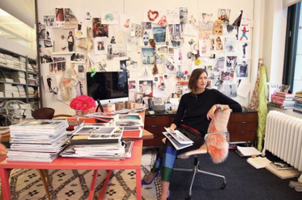
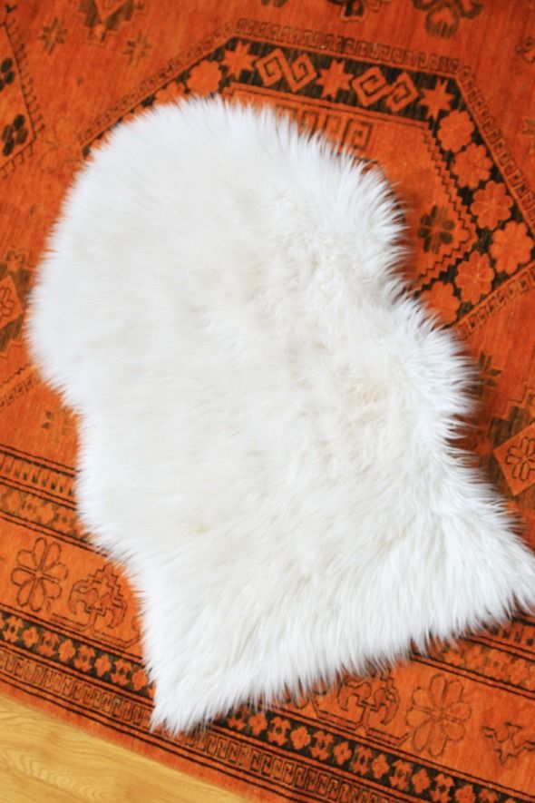
I realized I was subconsciously channeling her office style while doing some updates to our studio space this month when I had the thought to dye this little faux flokati throw pink.

I picked up my throw at HomeGoods (it was made by Safavieh) for about $15. IKEA sells a very similar version in both acrylic (which is what this one is made out of) and the real deal wool sheepskin (which I used in this and this upholstery project).
Before dying the throw, I rinsed it really well and made sure every fiber was all the way wet.

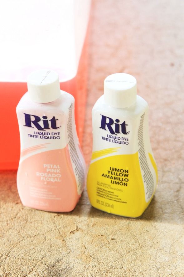
Then I mixed a small dye bath in a tupperware tub in the hottest water my tap would give me. I use about 3 parts Petal Pink colored liquid RIT and 1 part Lemon Yellow.
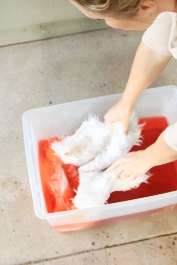
I let the throw sit in the hot dye bath for about an hour before rinsing it in cold water.
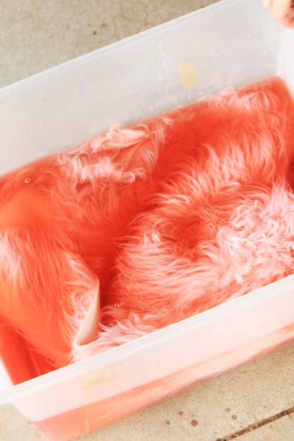
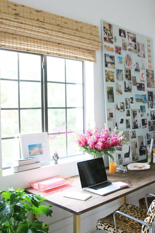
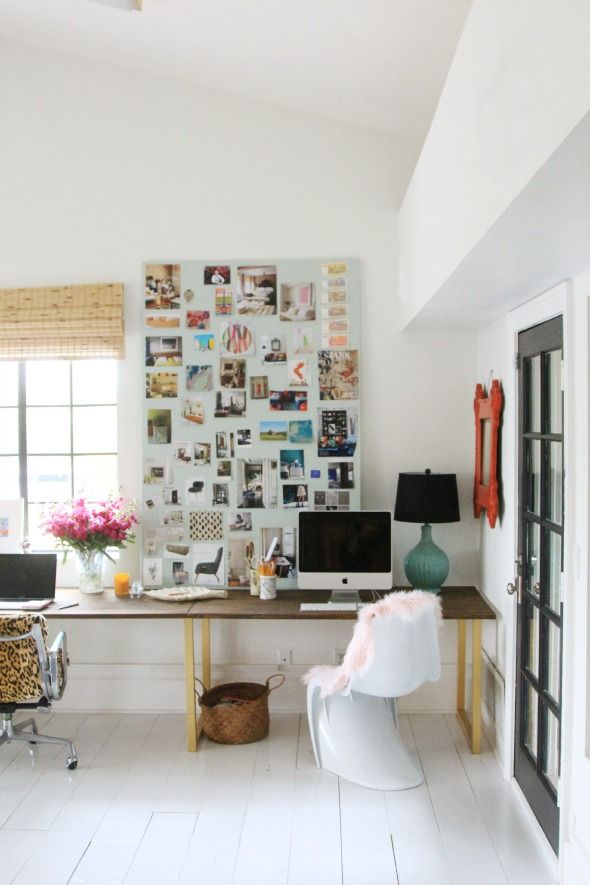
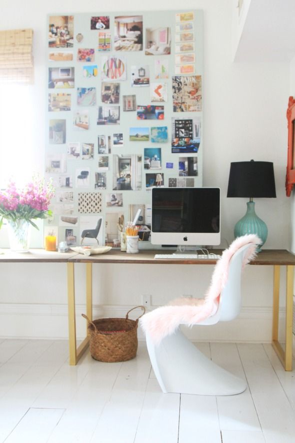
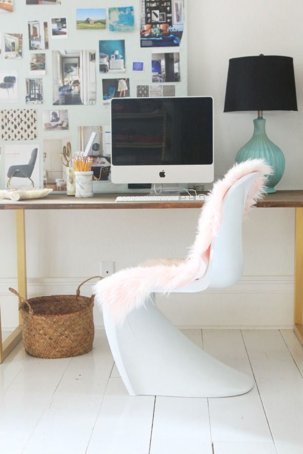
I let the throw drip dry over night and then I gave it a brush and blow dry to make it nice and soft and fluffy before throwing it over one of our white S chairs.
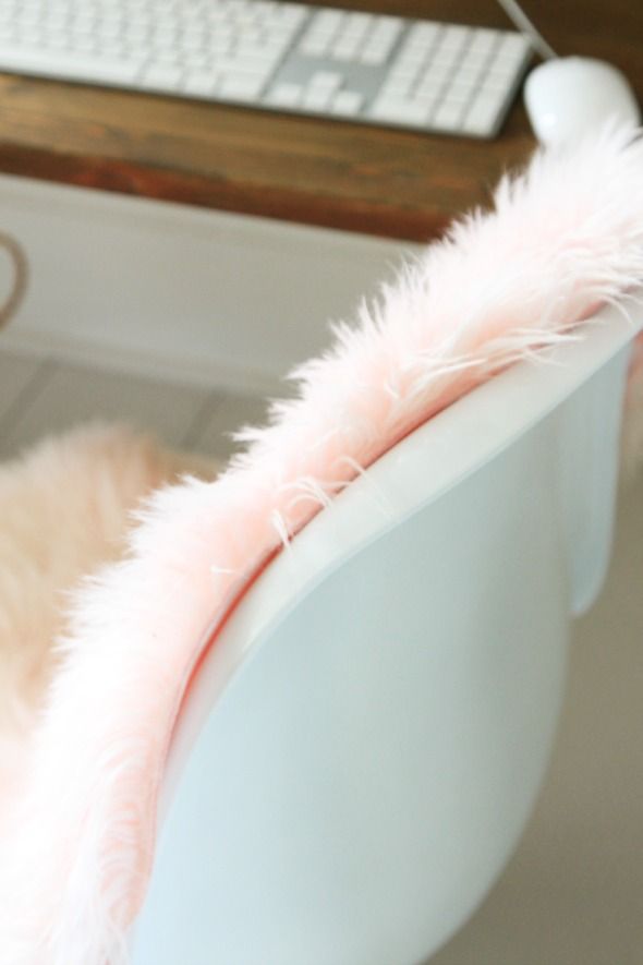
Because my throw was acrylic, the dye only barely tinted the fibers. The natural wool version would have been much darker, but I don’t really mind the subtlety here. A little pink can go a long way. :)


I was a bit nervous when I saw what you were going to do to the white rug!! But it turned out really well..;)
http://vodkaandarose.blogspot.co.uk
Oh, I have to pin this one for later! The color turned out perfect Jenny :)
Ah! I've been wanting to inject a little pink into my bedroom. This is such a killer idea.
Hi there. I have been following your evolution as a designer and I was curious to hear about the shifts in your tastes over time. You have gone from high contrast and bright to more muted colors recently and from warmer earlier choices to a keen interest in cooler tones (grey, blues greens). Also, a shift in overall mostly glam traditional toward modern mostly. Any insights about this?
Hi aeb!
Thanks for the comment!
I think I will always love and use lots of saturated colors in my spaces, but you're right, I've been toning it down a little bit the past couple of years. Maybe I'm just getting older? Who knows. But I think colors can feel more thoughtful and look more interesting when you can really see them. And I think that often works best against a neutral background.
Plus, and this isn't new, I like to change things up every few months. A more neutral palette for the big parts and pieces of room can make it easier and more affordable for me to make small changes that have impact.
I have long loved and touted the idea of finding color temperature balance in a space (equal doses of warm and cool tones), so I think I'm about the same there. And actually, I would say I'm shifting toward more warm tones in this new house (olives, rusts, lots of warm grays and whites). I even talked about it in this recent House Beautiful article:
http://www.housebeautiful.com/shopping/decorating-trends/2015-color-trends-8#slide-9
I don't know that I've ever felt like my style was glam (maybe just bc that's not my favorite word?), but I've always loved a mixed of traditional and modern and I don't feel like much has changed there either. I probably do feel more drawn to cleaner lines in upholstered pieces as of late, but I still love an ornate mirror and a Persian rug, you know? :)
Thanks for the great question! Deep thoughts on a Wednesday…
xo
I just wanted to share that you've been an incredible inspiration for me as a SAH home of 3 youngins with a passion for design. I'm in the beginning stages of starting our design company and your blog gives me hope that's it's totally doable with young children. I don't usually comment on things (meaning never) but I just wanted to say you have incredible taste and thanks for all the inspiration, Merry Christmas!
Thanks, Ashley! What a lovely comment! I so appreciate you taking the time to share that. :) Best of luck with your new business. I've loved being able to work from home around my kids these last seven years. It's still crazy chaos, but I love it and thank my lucky stars every day. xoxoxoxo
Your desk in this post caught my eye because it's a combination of finishes I have in mind for a coffee table. When I searched on your blog for more pictures, I realized it's had two other finishes on the top: a pickled finish in 2011, and a faux malachite a couple of years ago.
I'd still like to know more about what stain/finish is on the current desk top. Will you be sharing that soon?
I enjoy your blog- every day!
I am totally obsessed with blush pink — this project turned out so well!
x Lily
http://whilemyboyfriendsaway.blogspot.com/
I LOVE your desk. Where is it from?
This is a really cool idea. I completely agree that a little pink can go a long way. I've been making over my desk area lately and I think this would be a PERFECT addition. Thanks for sharing!!
Best,
Meredith from http://www.everydayenthusiastic.com
I've never even considered dying one of these rugs, but now that I've seen it I want to do it in several projects! Thanks for sharing!
Hi! I absolutely love the color and want to dye an off-white blanket the same color. You mentioned a 1:3 ratio, but exactly how much of each did you use (e.g., teaspoons, tablespoons, etc.)? Sorry, I’m new to dyeing. I also wanted to know what the yellow dye does? How does it impact the color? I’m just asking because on the Rit website they say you should use tan to achieve this color. They don’t seem to mix yellow and pink in any of their samples, but many DIYers do. Just wondering how the yellow impacts the color. Thanks so much for sharing your wisdom! :)
our service https://playcasinoca.com/all-slots-casino/ will help you find a casino for you, by choosing something you like from our reviews