We just passed the one year mark here in Arizona. What a year it’s been! There, for sure, have been some hard moments, and we miss parts of living in the city like crazy, but overall, we’re so happy and grateful for this past year. Mostly, it has been wonderful to live so close to family and of course I’ve loved getting to turn this house upside down! I can’t believe how much has changed since last July. The exterior was the most recent big change and I’m so happy with how it turned out!
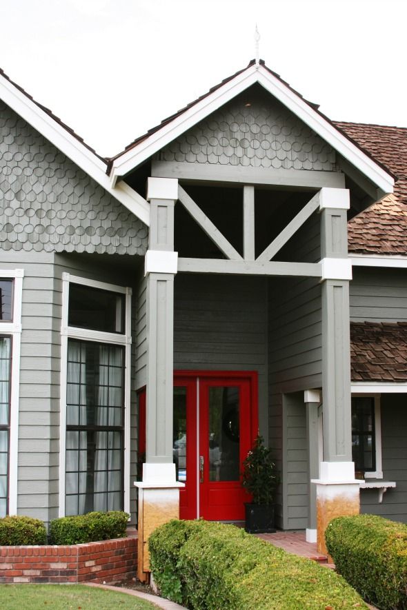
Benjamin Moore, a company I love and support whole-heartedly, saw that we were planning to paint our house and reached out about donating the paint. What an AMAZING help that was! The house needed a ton of prep work before the paint, and we made some big changes to the exterior structures with a contractor, so the labor alone ended up taking most of our exterior budget. Getting to work with Benjamin Moore on the paint was a dream come true! :) But I’ll get to that in a minute. Here’s the story of how the exterior of our house has changed this year, and a few plans for finishing up.
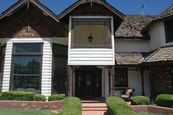
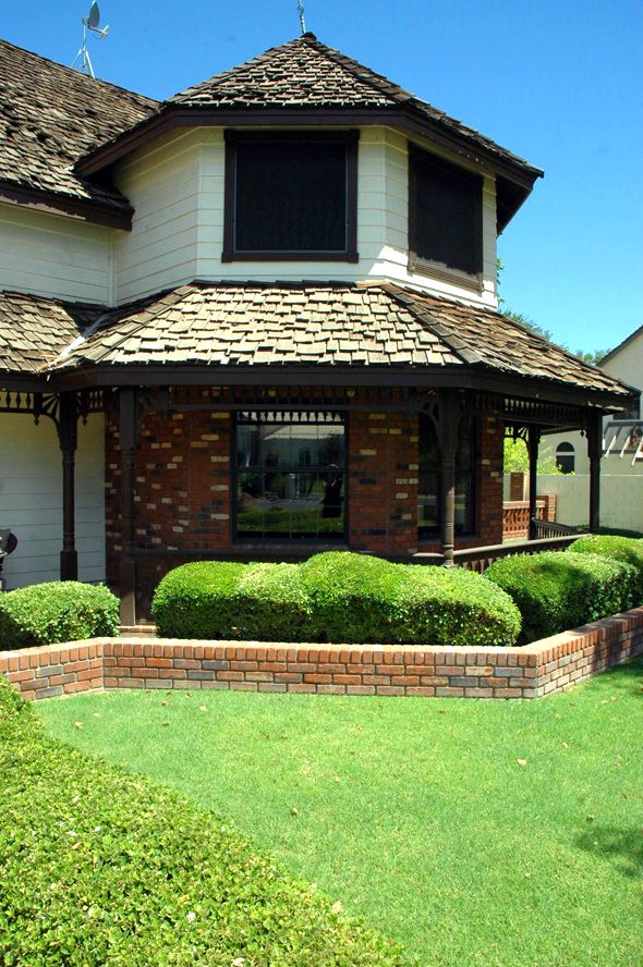
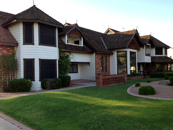
Remember when the house looked like this? Gingerbread everywhere. Cream body and brown trim. Black, scary sun shades on all the windows (which are helpful for keeping out the sun, but man, are they UGLY!).
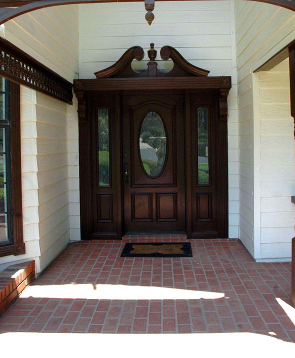
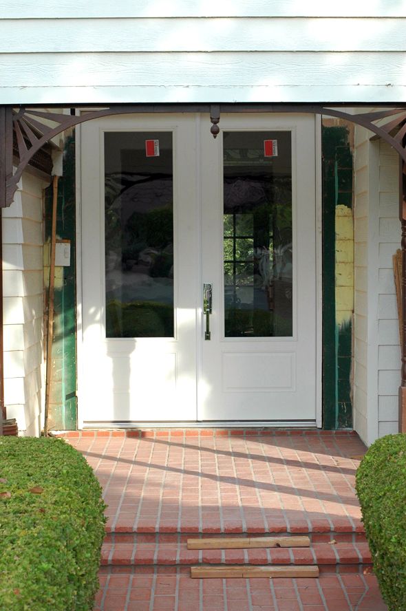
The first big project was changing out the front door. It’s hard to show in pictures just how much of a transformation this was! The old door was only 80″ tall, which felt so squatty with the tall vaulted entrance.
Here’s the post on changing out the door.
We chose a 9.5′ tall double door. It fit the vertical space much better, but the door was blocked in the front by the weird front facade area.
My original thoughts were to just remove the front panel and open everything up all the way to the roof basically.
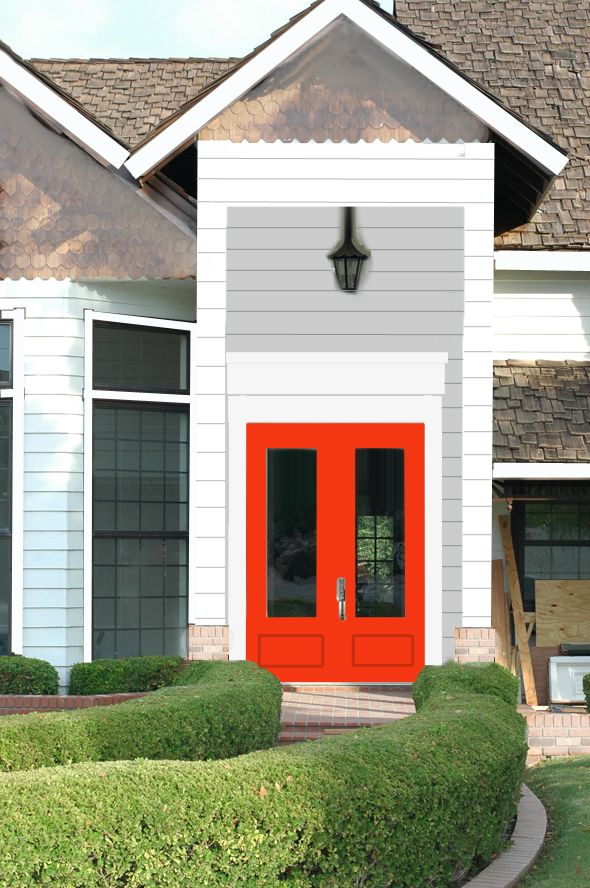
But after we opened it up, the proportions felt so weird again! Too much was exposed, although, I was loving how much light was streaming in to the entry after getting rid of that partition piece!
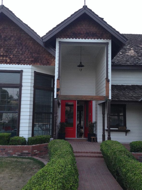
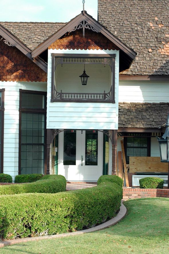
Our contractor was nervous about losing the cross beam altogether as well, even though it wasn’t technically the load-bearing beam. So we came up with an idea to bump up the beam and add angled beams in too, which we would mimic all around the exterior of the house, where all the gingerbread used to be.
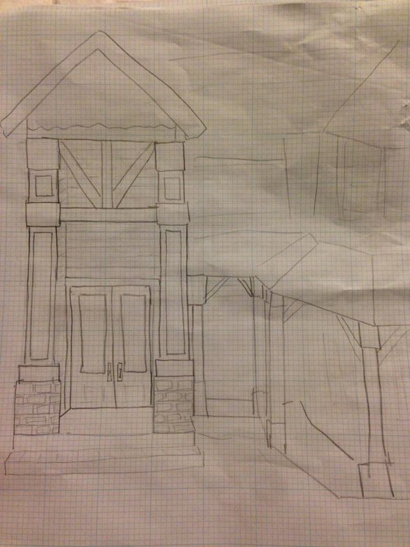
All the turned columns were replaced with chunky square beams and instantly everything felt more modern and more balanced.
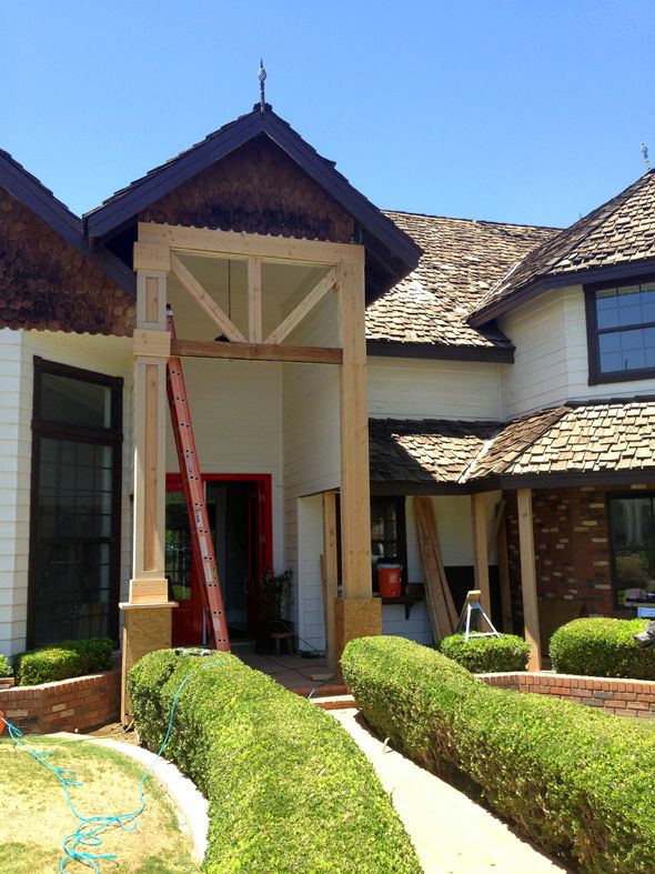
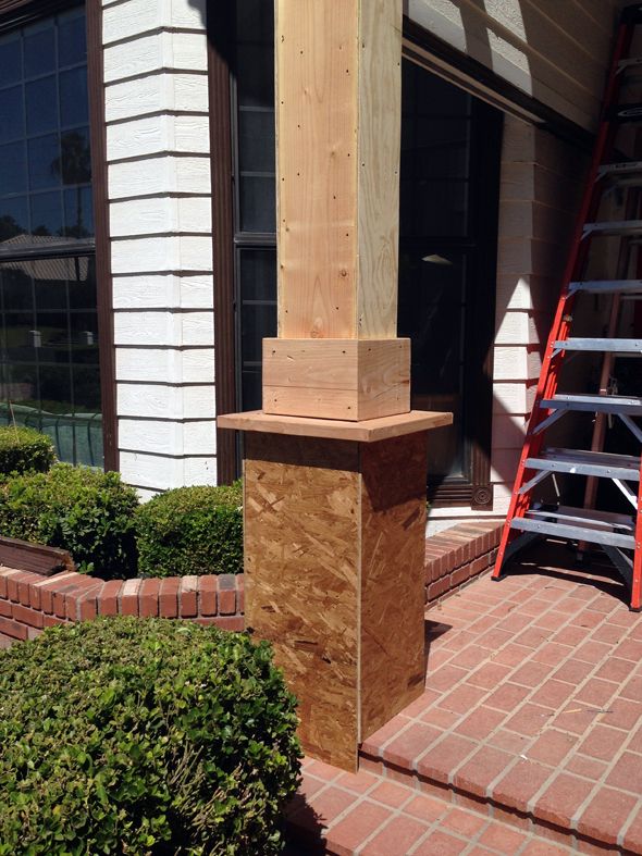
Once the exterior structural changes were almost done I went to my local Benjamin Moore store (Color Wheel on Stapley and Main) and looked at swatches for a good long while. I talked to them about different paint lines too and got their advice on that and finishes.
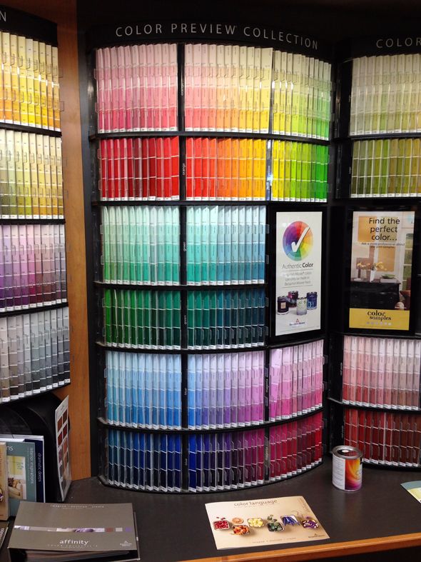
Benjamin Moore has so many wonderful colors it was tricky to pick a favorite for the house. I was drawn to the greeny grays the most and picked up a couple of chips and even a few sample pots to put up.
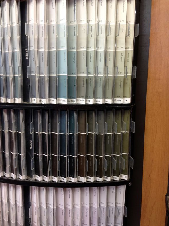
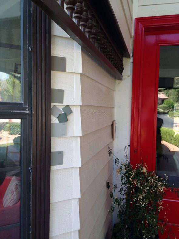
I put
this photo up on Instagram for a reader vote. It seemed pretty split, which I expected. They’re all great colors! (Top to bottom: Fieldstone, Desert Twilight, Rockport Gray)
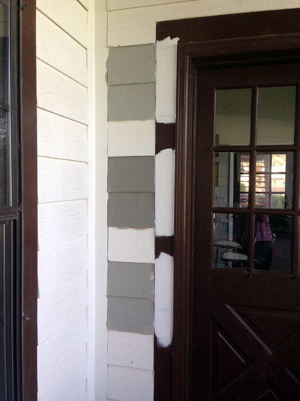
I really tried hard to make it not be the name the put me over the edge, but
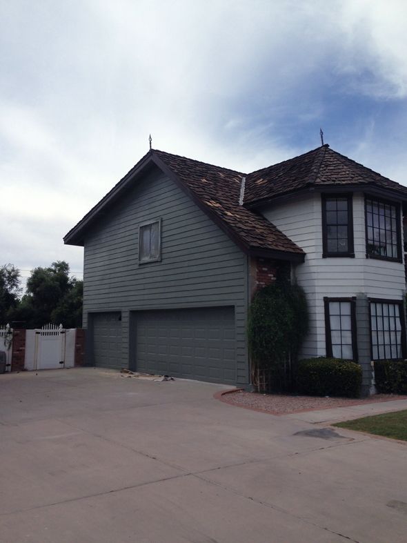
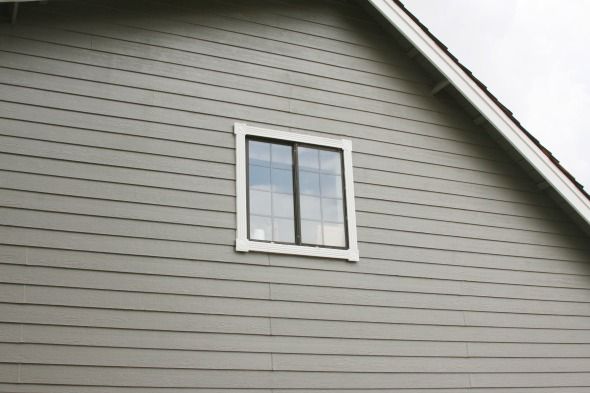
Desert Twilight (2137-40) was my favorite from the get-go. It was a little more green than I originally thought I’d want, but more and more I was in love with the shade and the idea of a greeny gray house. (Or at least I didn’t want a color with very blue undertones and I felt like my other top choices swung more blue). I put up a big sample on the front and the back of the house, so we could see what Desert Twilight did at different times of day.
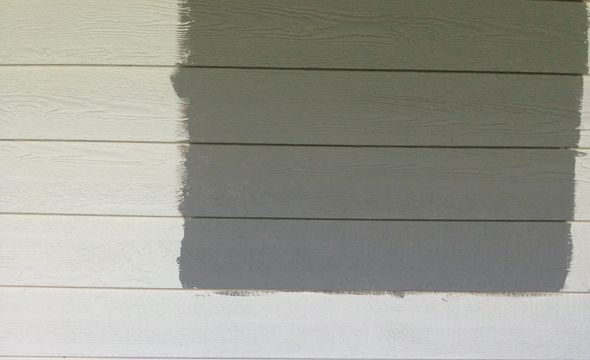
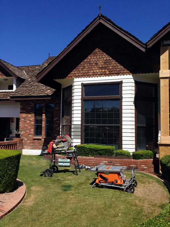
I was a little apprehensive to make the final call, but I knew I’d love the color, especially once all that icky brown color was gone.
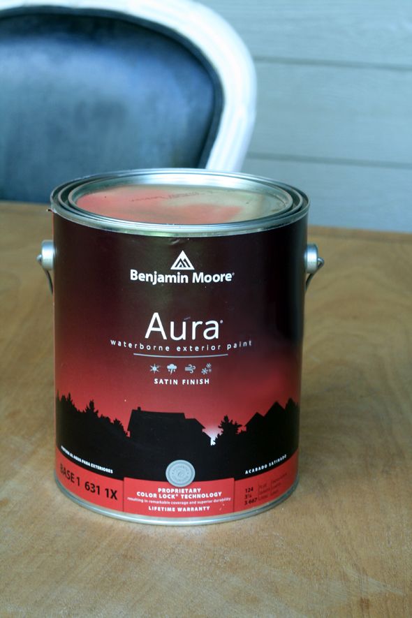
We chose to use the Aura exterior line in a Satin finish for both the body and the trim. My Benjamin Moore store said there’s nothing like it on the market that resists color fading and paint deterioration as well, which were both problems we could see the house has had in the past. My wonderful team of painters (Eagle Painting) loved the product and commented multiple times about the quality of the paint. They were super impressed with the coverage.
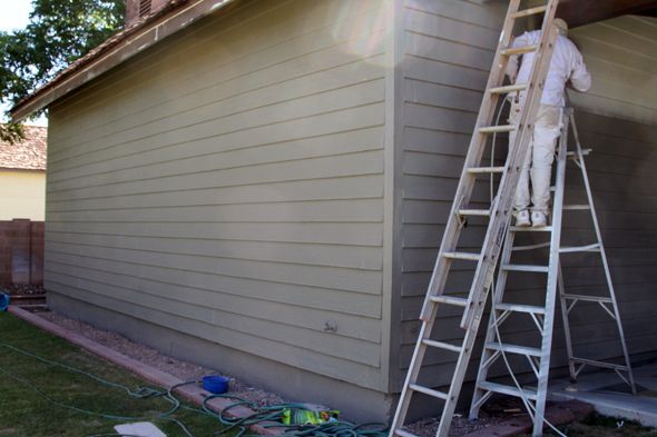
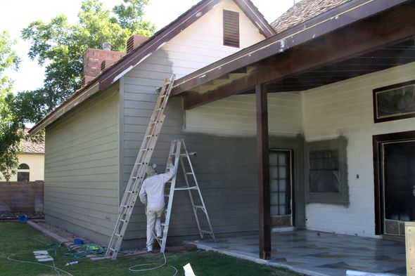
It was an exciting day when the painters sprayed the first coat of Aura on the back of the house! So pretty! So dramatic!
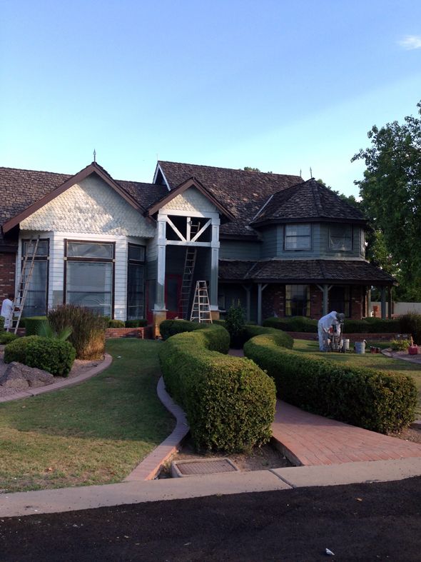
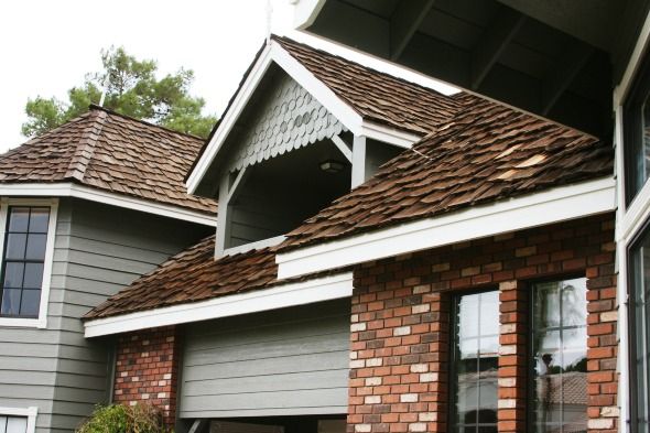
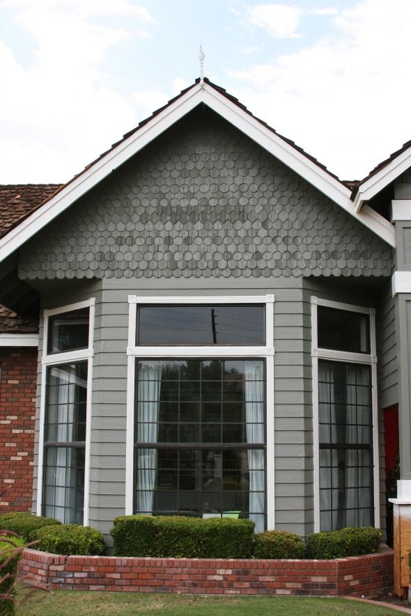
The Aura paint is actually self-priming, so we didn’t need to use a primer on the back at all, but the front of the house gets a lot of full sun and there had been some damage from the elements. And since I wanted to paint out the weird shake shingles on the front of the house, the painters decided it would be a good idea to spray a coat of primer on the front. I knew the shake would never be a consistent, solid color the way that the siding looks, but I think the layer of primer helped even out the shake shingles.
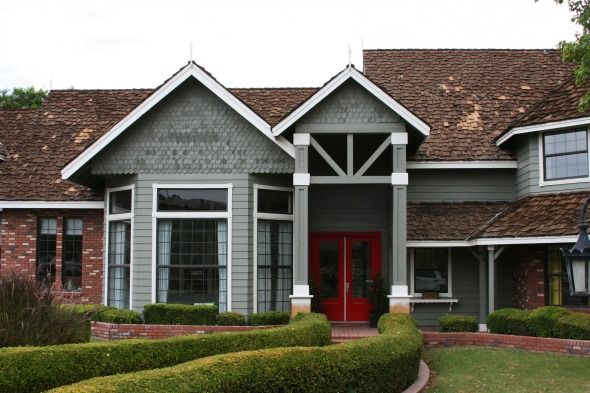
I think painting the shake out helped unify the choppy look of the house so much! I almost painted out the brick for the same reason, but I think I’m glad we kept the brick as-is for now. It was tricky to find a stopping point with the brick and I didn’t want to paint the floors or the fencing.
We might figure out something to do with the brick down the road, but for now I think the new house color is in harmony with the tones of the brick. Such an improvement!
As soon as the white trim went on, I finally felt like I could catch my breath and let go of my worries about this project! It looked SO much more fresh with the dark trim gone!
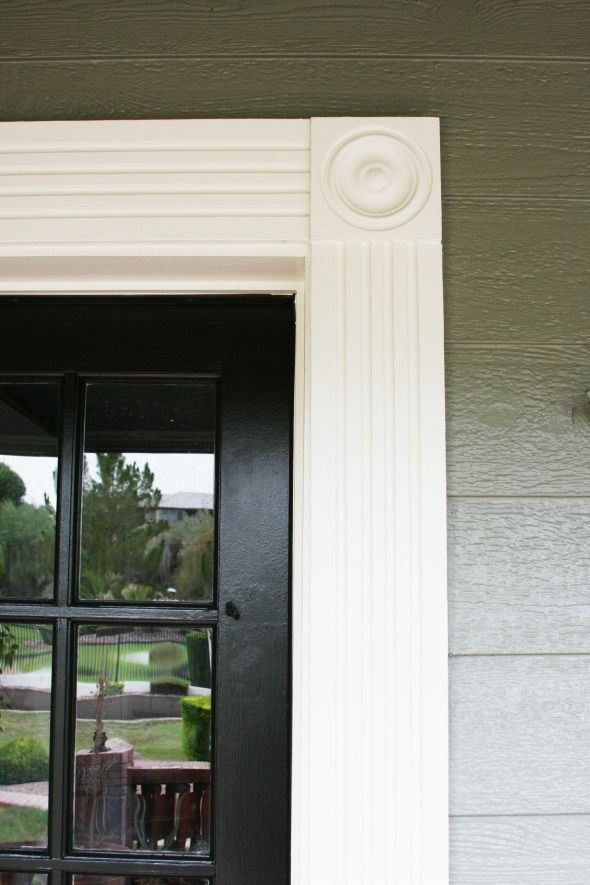
We chose White Dove (OC-17) for the trim and Onyx (2133-10) for the doors. All Aura, all satin.
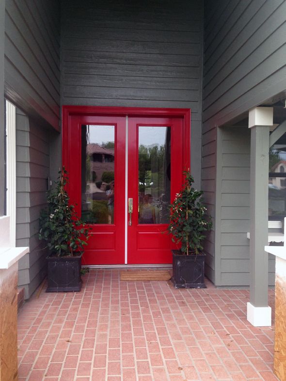
We decided to keep the front door red in the end. I love how it looks against the Desert Twilight color! I was worried it would look Christmas-y, but it really doesn’t. I actually think the red tones down the green a bit too.
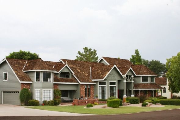
So, I’m sure you noticed, but we still have a way to go with the exterior of the house before we can call it good. We’re saving our pennies right now so we can replace the roof next spring. It’s expensive and not fun to spend that kind of money, but we’ve known about it and it is what it is. In the shorter term, we’re going to have a mason come out and fix some of our broken bricks and then add matching brick to the bases of the two new columns flanking the front door.
Looking down the road maybe a year or two, I’d like to change up the landscaping. Not sure with what, but something less twisty and curvy and fussy would be my preference. But truly, I am SO happy with all the changes we’ve accomplished in only a year’s time! Every single one of our neighbors has stopped by to say how much they love it too and the validation feels great! :)
And OF COURSE, thank you, thank you, thank you to the wonderful people at
Benjamin Moore, both local and corporate, for helping us to transform our home! We could not be more happy with the product or the outcome. :)






Bella – Yes! I forgot to mention we need a new lantern above the front door!! We added these super cool barn lights all around the back (missing one on the front still), that are now a really pretty chalky black. I love them and hope we can find something in the same vein for the lantern.
Also, the house is definitely big, but it probably looks bigger than it actually is, with the addition over the garage,etc. It's long and narrow, but we love the layout! :)
xo
Hi Margaret!
I think there was a period in the late 70s and early 80s where all the custom homes in the area were built with shake roofs. I've noticed a few other hold-outs in our community. Our neighbors have a really pretty house that used to have a shake roof and they replaced it with a material that I think is a dark gray ceramic tile that was moulded to have a similar shape and texture as shake shingles. Sounds weird, looks great. We're also looking at metal roofs, but those are amazingly expensive!
I'm glad we have at least a couple more months to figure it out! :)
It looks GREAT!
Spectacular. The color looks so fresh and just like you said it really does "harmonize" with the brick too. Really beautiful. Its a "wow" house now!
Oh my goodness! What a huge, beautiful house! You've done such a nice job with all of your choices. If you ever find yourself in Boston…
So stunning! I'm like you, it doesn't take me too long to decide on a design decision. It's really a blessing, because some people take ages to make up their mind. Congratulations on pairing with Benjamin Moore, too!
Such a big house and a big job, but I love the color you chose! We have a lot of green-gray in our house – it works so well with practically any other color.
wow. I've never seen your house in a wide view. It's huge. I love the new exterior. Do you have a light to hang above the front door? I see you left a nice space above the door for something special?
I love how it turned out! Great transformation! Well done!
Carpet cleaners Battersea
Bella – Yes! I forgot to mention we need a new lantern above the front door!! We added these super cool barn lights all around the back (missing one on the front still), that are now a really pretty chalky black. I love them and hope we can find something in the same vein for the lantern.
Also, the house is definitely big, but it probably looks bigger than it actually is, with the addition over the garage,etc. It's long and narrow, but we love the layout! :)
xo
So much better. And when you have the new roof, it will be amazing. Also, we lived in southern AZ for almost 3 years and I never saw a roof like yours on any AZ house. So strange. Are you thinking tile for the next roof?
Jenny, it looks so great! And what a dream come true to get to work with Benjamin Moore and have the paint donated.
Hi Margaret!
I think there was a period in the late 70s and early 80s where all the custom homes in the area were built with shake roofs. I've noticed a few other hold-outs in our community. Our neighbors have a really pretty house that used to have a shake roof and they replaced it with a material that I think is a dark gray ceramic tile that was moulded to have a similar shape and texture as shake shingles. Sounds weird, looks great. We're also looking at metal roofs, but those are amazingly expensive!
I'm glad we have at least a couple more months to figure it out! :)
Congratulations! Awesome job!
I am visiting Portland this month and went to school house electric and rejuvenation and drooled over everything there. I'm not sure I saw anything lantern like but the Redlands cage lights are pretty cool! Maybe not big enough….and maybe not exterior enough. Haha!
It looks amazing – such a transformation! I do think you should paint the brick eventually, though.
Love your blog and am always impressed with your vision, ability and willingness to try anything!
Have you considered painting the brick as well? That might seem whacky to some, and I don't know the trends in the Southwest, but here in the South, we do it all the time. I think it would pull your exterior elevation together nicely, especially since your trim is such a high contrast. Food for thought.
Keep doing your thing! :)
So much prettier! You had such vision and it's turning out great.
Looks great!!!
What is the little spire at the peak of each rooftop?
I thought those would be removed when the house was painted, but it seems they all have been painted white.
They look a little off for the new style of the house.
Jenny, the house looks unbelievable. It's really amazing what a few coats of paint can do. I think you were right to not paint out the brick immediately. Live with it as-is for a while until you're sure what you want to do since you can't unpaint it! On another note, I saw you mentioned a metal roof in a previous comment response. I can't recommend metal roofs enough! I put a standing seam galvalume roof on my home last year (definitely do standing seam…it's more expensive, but it's better for the long haul) and while it was not cheap (it ended up being more than 3x the cost of a composition roof), it was the best call I could have made. It's crazy energy efficient (I live in Austin and my electricity bills in the hot months are about 30-40% less since my roof switch), you get a federal (and sometimes local) tax credit and certain brands qualify for insurance discounts (check with your insurance provider during the bid process so you're sure to use a material that gives you a discount). Plus, it looks FABULOUS and raises your home's value significantly. You can also get them in different colors if you're not sold on the metal look. Good luck!
I love the gray! The previous color made the house look a little outdated–the gray is just perfect! And I love the new columns and pop of red on the door. Fabulous job!! :)
Looks GREAT Jenny…there's that Onyx again! My new fav black paint color. Can't stop (won't stop) using it everywhere!
Such a dramatic transformation!! I love the crossbeams and the color and of course that white trim looks stunning. Such a huge difference!
Dramatic and classy. I've long loved gray-greens and used local gray-green slate in our kitchen and master bath with no regrets. It's a very soothing neutral hue with a lot of depth.
I think that's my favorite exterior color combo…gray, white, and black! It's bee-you-ti-ful!
i agree with josie. i really like the color and the new entry elevation. but i think the brick needs the same green-gray paint as the rest of the house. i imagine it would give it a good flow.
Love the new color! Did you consider painting the brick out too? I think it looks great, just curious!
Wow, I don't think I realized how big your home is, it's beautiful! Amazing color choice, I can't wait to see what happens next. I definitely agree that a change to the brick in the future but in the meantime, it looks great!
It looks great! I would paint the brick as well if it were me :) I love everything looking uniform! The updated crossbeams and columns are fantastic!
Wow, this house gave you some design challenges! I like the way you explain your thought process about each design choice. It helps me understand how I can make better choices for my own home. I recently went from a condo to a house, and I'm just beginning to learn the ins and outs of exterior design.
I never would've thought to paint shake shingles, but they look wonderful. I like that the color isn't 100% uniform. It gives you more texture and dimension.
And it's great to see full disclosure about sponsorship! Benjamin Moore makes wonderful paint and my favorite colors. It's good to know that they're nice, too.
Oh my gosh, your house is enormous! Extended family living with you? Sreiously, it looks like enough house for 3-4 families!
Love the paint color though, it looks just perfect! I'd vote for painting the brick too!
I *LOVE* the color, love the door, love the color on the shake shingles.
I also think that the brick should be painted the same gray color as the rest of the house – it looks kind of faux brick right now, even though it's not, and painted brick is so pretty! I'd go for it!
The house looks beautiful!
And Benjamin Moore is the only paint we've used for the past five years (and four houses!). Now the colors we've used in our homes are in all our extended families' homes too because when they've visited, they've just loved the colors. The quality is really exceptional so I'm glad you were able to partner with them.
Looks fantastic! I love how you added the beams at the top, above the door. It looks really great. It definitely took some good insight to turn your house from gingerbread to something more transitional with just a few changes. What a difference some color makes! Beautiful work and great vision!
I'm floored by the transformation! Love it .. it looks amazing!!
TOTALLY an improvement! looks great!
x Lily
http://whilemyboyfriendsaway.blogspot.com/
What a transformation! It's amazing what a difference new paint can make!
Looks great! In the wide shot of the 'old' house it is hard to tell where the front door is, but now…there is no guessing. Way to welcome your guests with such style.
Omg! This looks seriously amazing. It's crazy what a fresh coat of paint will do. Love the color you went with!
Wow! What a transformation!
I think the paint on the shake shingles/tiles makes it look like marble, which is kind of neat!
Looks amazing!! You have done such a beautiful job transforming it!!! So inspired by you & your designs!!
It looks beautiful! Did you or your painter have any concern about the paint peeling off the shakes? The upper story of my house is brown stained cedar shakes that I would love to lighten up but I've heard there is a high probability of the paint peeling. Thanks!
Thanks to you, we painted our front door the same beautiful red, and ironically, the house paint I chose was a slightly darker green-grey with crisp white trim and black lanterns. We LOVE it! So thank you, because the door was entirely your inspiration, and we got no pushback from the HOA when I included your blog post. ;)
I *love* how the little fish scales things took the paint differently. It kinda looks like hand dyed yarn does once it's knit up. Movement, and texture. Very, very nice. Your landscaping is super formal looking. I would love to see your take on an English cottage garden/landscape. Swoon!
It looks gorgeous! Boy, I never realized how huge the house really was.
I keep forgetting how giant the house is. None of the exterior pictures have shown it in its entirety for a long time. Massive!
It looks fantastic! I wonder if down the line you want to limewash the brick? I would imagine it would tone down the red and tie into the trim. But really, kudos to you! You've done amazing work in that one year, and I love reading about it :)
500% improvement! Loving the direction it's headed. Keep on keepin on!!
I see you left the red trim around the door…. I remember when you posted about it you had said it was a mistake but were going to change it. Do you plan to paint it white or keep the moulding red? Just curious on your thought process and decisions. Gearing up for a remodel of our own one day. :).
Thanks for putting it all out there!! Great work as usual.
WOW! That is a massive house! Holy moly! Looks like an apartment complex!
I do like the color. I like the textures all mixing together (siding, brick, and shingles). I'm amazed at all the transformations you have done while being able to save for your roof! Our tile roof has about ten years left and I bet it will take at least that for us to save even half of the cost to replace it.
You guys are doing so so well. I'm amazed!! Great job as always!
Looks great. Beautiful color. Would love to see the brick painted or stained though.