
Michael has a great eye and he has definitely become fluent in decorator-speak after years of hearing me yammer on about this stuff. He always has an opinion (and I love hearing his spot-on ideas), but he’s also really flexible, for which I’m so grateful. He trusts me and is willing to sign off on most anything I am planning to do.
Because he trusts me so much and because I decorate our house as part of my job, he usually just lets me do my thing and chimes in when asked (except for the big decisions/purchases, of course). So I was a little surprised when out of nowhere he told me he would love to see blue lacquered walls in that little space next to the library we are planning to use as a music room… Uh, okay!!
We pulled out my paint decks and I was showing him darker blues with a healthy dose of green (like F&B Hague Blue and Ben Moore’s Gentleman’s Gray), but he was drawn to more clear and bright blues.
I told him I wasn’t sure about doing an Yves Klein blue with our bright red door only a few feet away, but a bright blue with just a hint of green in it seemed really lovely. So I threw up five samples (all colors are Ben Moore — the pale gray is from the other samples we were doing for the main rooms).
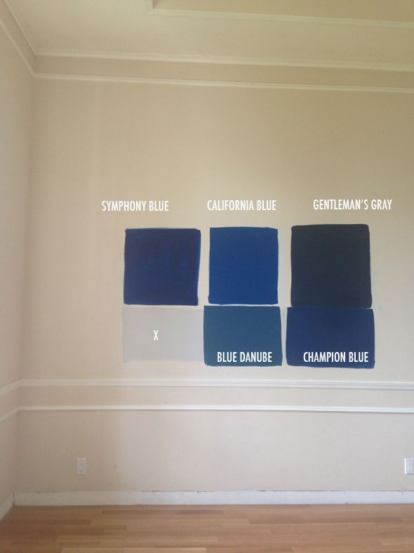
Pretty quickly I pulled out Symphony Blue because it was too purple in real life. Michael nixed Blue Danube (too green) and Gentleman’s Gray because it was too dark (a fair point with all our dark paint projects in the house lately – mudroom walls, stairs, fireplace, bedroom walls…). We both were really drawn to California Blue and Champion Blue, so I painted out the other colors.
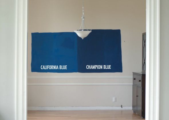
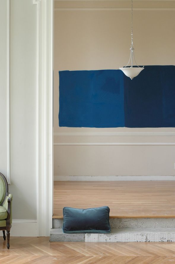
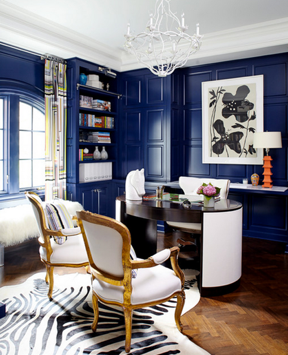
While I love the inky depth of color in Champion Blue, I think I’m leaning a bit toward California Blue, just because it would be fun to make a big statement in this really small space. There will be a big mirror in here probably and guitars on one of the walls, the camel leather Chesterfield, a piano and a rug to break it up, so the bright contrast might actually be really perfect. What do you think? I’m mostly just thrilled that Michael chose the direction and that he gets a room that’s all his idea (for once!).
PS After I nail down the color choice, I’m going to do some experimenting on plywood with DIY lacquering vs just high gloss latex and I’ll be sure to share what I learn. Lacquering walls is notoriously tricky, so this one might be a job for the pros.


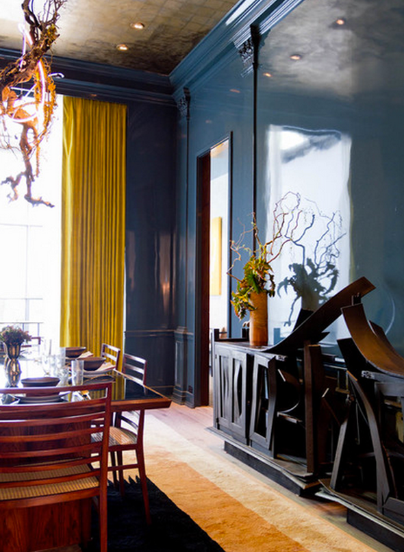
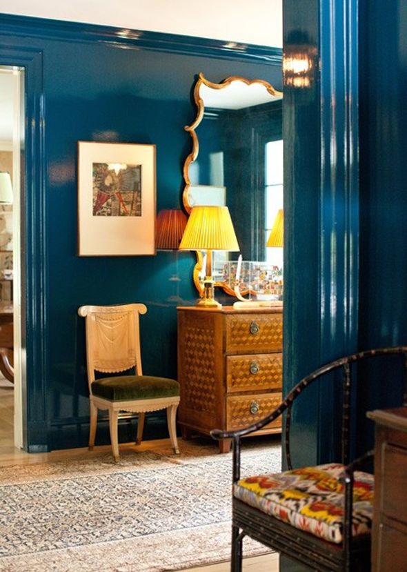
The Kips Bay dining room was designed by design superstar Kristen McGinnis! ;) Love the glossy walls look!
I am really glad you're the guinea pig for this :) I've been wanting to try this for some time, in a powder room or other small room, but glossy all over the walls seems vary daunting and different than slapping on a coat of satin. Good luck! I am sure it will look wonderful and i am anxious to see how it turns out.
I definitely would recommend going with the darker, more muter blue, especially if you are going to do a lacquer finish. Every time I choose the more saturated color for a wall paint color, I am disappointed and redo it with a more muter version. It still gives a bold statement but without as much of a "yowza" reaction.
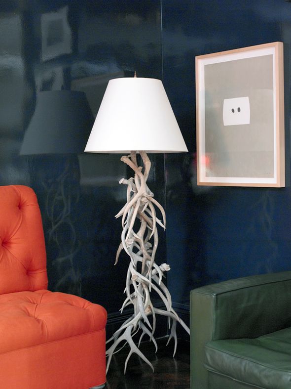
Dear God of All Things Decorating, I LOVE the direction you are taking with this!! How much fun is this room going to be?!?! Either of those colors with the leather Chesterfield and the beautiful wood of the guitars…so good, I could cry big fat tears of Miles Redd happiness. They are both so fantastic. Is there a way you could use both given you have the tray ceiling to play with?
Wow! So dramatic! I love the darker one.
LOVE this! I'm a fan of the darker color.
I am really drawn to the California Blue. I'm sure either would be lovely.
I really love blue so all blues are great, but I think with going for the lacquer look, the Champion Blue will really look better. Just look at all your inspiration pics! They are all more of the Champion Blue.
Ha! Michael is attracted to TARDIS blue! That is going to be a fun space for sure. Can't wait to see how this is done. I've never seen it in real life.
My eyes were on the Champion Blue from the beginning. I think it looks more elegant and less tween boy's room. Though, I'm sure you of all people could swing either one. :)
Oh my god, lacquered walls!!! I'll be waiting on pins and needles to see more! Yum!
Fascinating! Most of our walls are either 40s lathe and plaster with a weird texture, or new drywall that's been sprayed with that awful texture in a can stuff. I know it made it easier for the builders, but ugh!
I felt like I can't do any kind of lacquering or high gloss in most spaces because of all that texture, but we do have a small bathroom I've been doing in an increasingly nautical vibe (but not over the top, I swear.) So I might steal your idea for that smaller space; I'll be excited to see how the experimentation goes!
Get outta my head, Komendas! Just kidding, of course. I've been making similar choices. A cobalt entry (which doesn't have bright lighting so the yowza effect is definitely there but muted without having to pick a grey version. This is a preview, like you said, of the blue and white ginger jars on the mantle and the blue-grey velvet parsons chair. I'm so, so happy with it. Good choice, Michael!
California! Definitely.
Yea I was immediately drawn to the California Blue. Soooo pretty
This room is going to be SICK! Love the Champion Blue.
We've really enjoyed BM New York State of Mind in our dining room, as a rich, deep color with verve. (Just in case you need another contender.) I type this seated on my mystere peacock velvet sofa :)
My vote is for Champion… I like that it has a hiiiint of green it!
I was drawn to both of these and my favorite is the Champion Blue. Although – go with your gut since you are seeing it in real life and know the house best! Good luck1
Champion blue all the way!
Wow…you are a nice wife! I am drawn to the darker myself but can't wait to see. I have painted 2 different bedrooms the clearer blue over the years and everyone loved them but I found them difficult over time. A music room is the perfect place for something like this.
I am feeling the California Blue. Either choice I am sure will be fabulous. I can't wait to see your tutorial on the lacquer technique!
I really don't think you could go wrong with either, but I lean towards Champion Blue. We went back and forth on colors for our masculine office, and finally decided on a navy…we haven't painted yet, but I can't wait to see how it turns out! I just love rich colors!
I would also choose the California Blue. The other color seems a bit too moody, and I have charcoal gray dining room walls. :)
I love it! I would try mixing the two together and try a sample on the walls. Something in between might be perfect. But otherwise, I'd also say California.
I like both of the blues. I painted a dresser in glossy California Blue though and it was awesome. I really loved how it turned out, so maybe I am partial to seeing the color on the walls. The room needed a little kick in the pants not to be too serious and traditional and California Blue delivered. I think you are right, since your room is a small space and you will have big neutral pieces – a piano, leather sofa, & a mirror – breaking things up, it could work.
Here is the dresser if you want to see the color. There is also gray and wood in the room and it looks great with the antique rug . . .
THIS was a late afternoon shot, so it looks a little moody, probably darker and more purple than it really is.
THIS is probably more true to color.
Can't wait to see your room!
My vote is also for champion blue, I feel that it ties in with the lighter blue/grey in the other rooms. Best of luck-Can't wait to see the results!
I love the Champion Blue, but I bet the California Blue is going to look awesome too! Can't wait to see how it turns out!
http://www.ahealthymrs.com
Benjamin Moore Blue Note. You won't be sorry – it's the nice middle ground. Will pop once lacquered but is not crazy.
Champion Blue for sure! It speaks to the sofa better and will still be a vibrant pop (without competing with the beautiful door).
My dining room is waiting on pins and needles for the results of your experiment! ;)
Champion Blue for sure! It speaks to the sofa better and will still be a vibrant pop (without competing with the beautiful door).
I painted all the interior doors in my house BM Polo Blue in high gloss. Its a great color. Your choices are more bright and I think the color might read too black on such a big wall, but its a wonderful color – lots of depth and very "neutral". The high gloss paint worked great with my doors which have a pretty smooth finish. I just bought Behr Interior/Exterior High Gloss Enamel (cheaper than a waterborne alkyd)and couldn't be happier.
I am so excited to see what you do with a large wall (short of having the walls professionally skim coated level 5) to get that beautiful glossy look!
Both nice, but I think that the Champion Blue would go better with the rest of your house. Can't wait to see it finished!
I love Champion Blue. I feel it looks better with the paint color in the other room. Also a bit more subdued so perhaps I will have more longevity. Either choice is a bold move. Can't wait to see the results.
I love the blues, Jenny! I actually just finished painting my front door with Hollandlac from Fine Paints of Europe. The look is amazing, but it is definitely a labour of love. It took me nearly 2 months to finish a double door, and every last ounce of DIY determination! Good luck! If you're interested, I can share my work & what I learned.
California blue was my first choice from the get-go…so clearly you're on the right track. I can't wait to see more of this house come together!
I painted our piano California Blue – I love that color.
California Blue! I love bright and bold colors though. I'm sure either will look great! Can't wait to see how it turns out!
The two blues you choose are the same I like too :-).
Which ever color you choose it will be a BEAUTIFUL
room. So excited to see the transformation :-)
Love the blues! We have Blue Danube on a big wall in our house, which has sight lines from the front door, kitchen, and dining room. I still get a thrill when I come through the front door and get a peek of the blue wall. On our big wall it certainly reads blue, not green. But it is not as true of a blue as the two that you are considering. Good luck!
I liked California Blue straight away, but have loved bright red with bright blue, ever since I saw an advert as a teenager. I believe it was Reem Acra, an elegant blue evening gown with surprising red pumps.
I liked California Blue straight away, but have loved bright red with bright blue, ever since I saw an advert as a teenager. I believe it was Reem Acra, an elegant blue evening gown with surprising red pumps.
California Blue would be the choice in our house…I saw the first picture and assumed this would be another case of a designer going for a more muted color (and I tend to like the more pure colors) so I was THRILLED to read that you are leaning towards bright.
I'm loving the Champion. Either way it will look gorgeous!
I'm loving the Champion. Either way it will look gorgeous!
I think either of your choices will be lovely and I applaud Michael for his suggestion. Yay for bold color! I used BM Cobalt in our den and I love it. I just wish I had smooth enough walls to lacquer. Looking forward to seeing the finished project. I'm sure it will be beautiful as always.
I used Gentleman's Gray in my tiny foyer. It's a gorgeous color, but definitely dark, and a little "velvety" in a satin finish. I've been pondering a layer of gloss on top to reflect what little light we get in Seattle. I'll look forward to seeing how you achieve that lacquered finish!
My eye goes more toward the champion blue….what a flexible husband u have,my husband wanted to paint the exterior of our newly remodeled house dark navy blue…i vetoed the idea with the builders support….happy exploring.
I like Michael's thinking! A small, creative space seems like the perfect space to try a daring paint treatment. I'm leaning towards Champion Blue though… the moodiness of it seems, I dunno, more musically inspiring somehow. Curious as to what you'll do with the ceiling?