
Michael has a great eye and he has definitely become fluent in decorator-speak after years of hearing me yammer on about this stuff. He always has an opinion (and I love hearing his spot-on ideas), but he’s also really flexible, for which I’m so grateful. He trusts me and is willing to sign off on most anything I am planning to do.
Because he trusts me so much and because I decorate our house as part of my job, he usually just lets me do my thing and chimes in when asked (except for the big decisions/purchases, of course). So I was a little surprised when out of nowhere he told me he would love to see blue lacquered walls in that little space next to the library we are planning to use as a music room… Uh, okay!!
We pulled out my paint decks and I was showing him darker blues with a healthy dose of green (like F&B Hague Blue and Ben Moore’s Gentleman’s Gray), but he was drawn to more clear and bright blues.
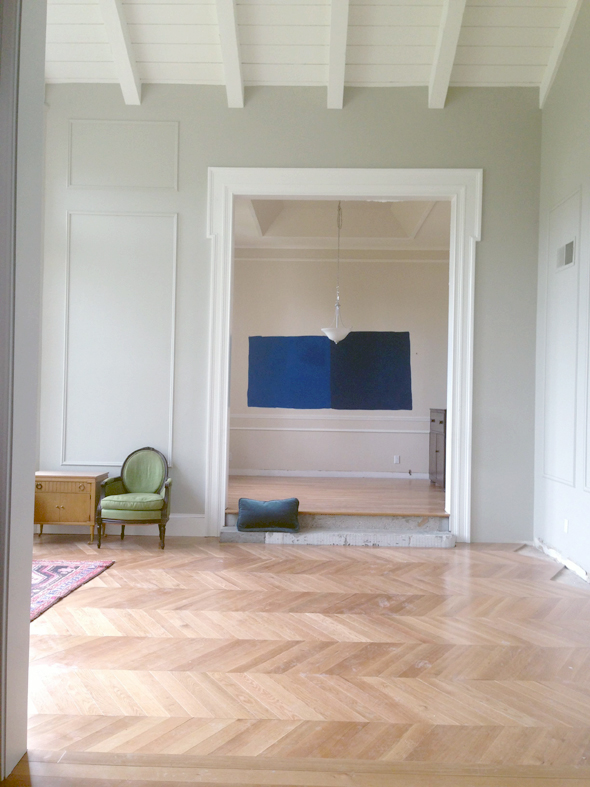
I told him I wasn’t sure about doing an Yves Klein blue with our bright red door only a few feet away, but a bright blue with just a hint of green in it seemed really lovely. So I threw up five samples (all colors are Ben Moore — the pale gray is from the other samples we were doing for the main rooms).
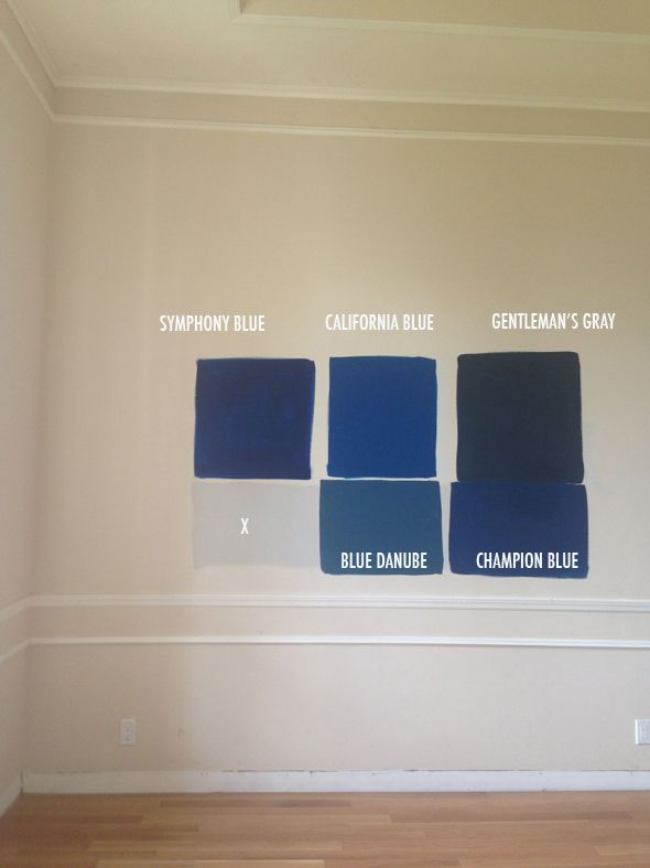
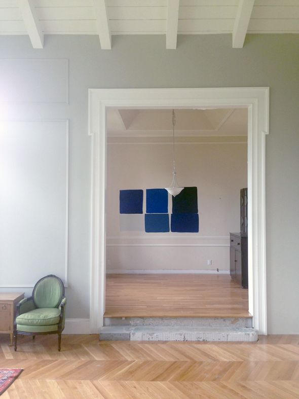
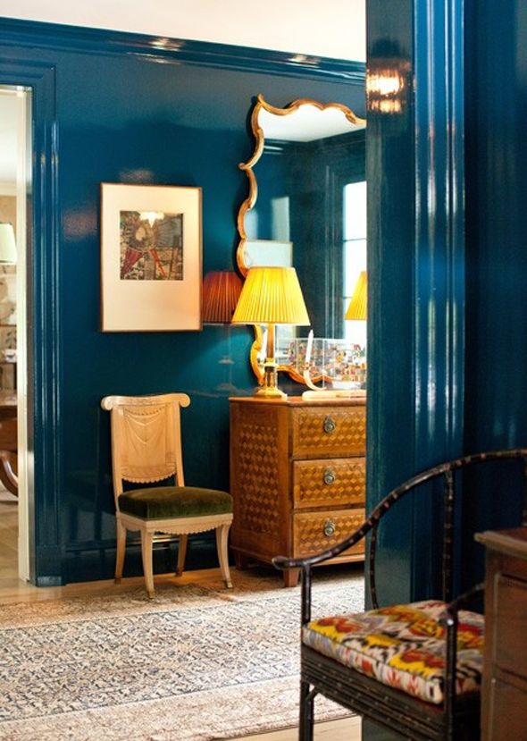
Pretty quickly I pulled out Symphony Blue because it was too purple in real life. Michael nixed Blue Danube (too green) and Gentleman’s Gray because it was too dark (a fair point with all our dark paint projects in the house lately – mudroom walls, stairs, fireplace, bedroom walls…). We both were really drawn to California Blue and Champion Blue, so I painted out the other colors.
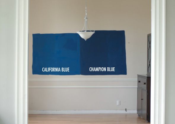
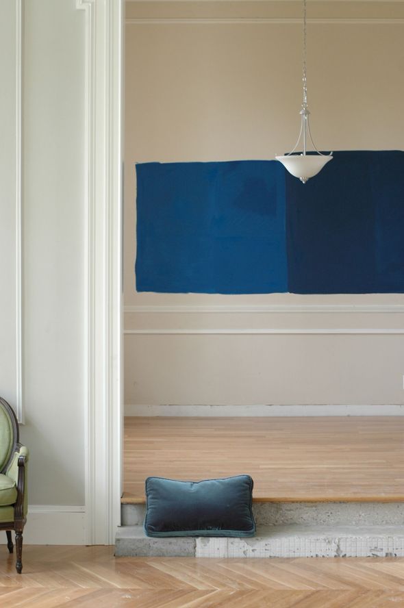
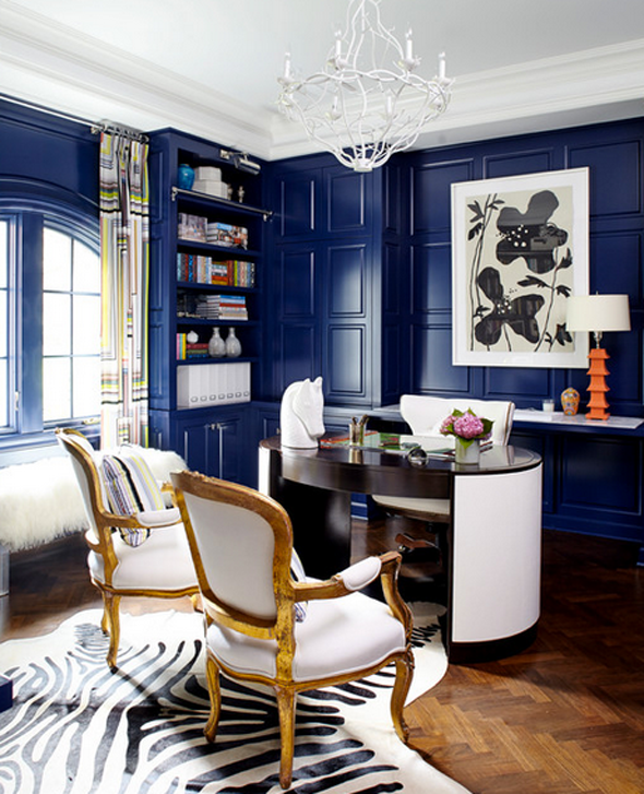
While I love the inky depth of color in Champion Blue, I think I’m leaning a bit toward California Blue, just because it would be fun to make a big statement in this really small space. There will be a big mirror in here probably and guitars on one of the walls, the camel leather Chesterfield, a piano and a rug to break it up, so the bright contrast might actually be really perfect. What do you think? I’m mostly just thrilled that Michael chose the direction and that he gets a room that’s all his idea (for once!).
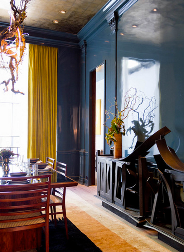
PS After I nail down the color choice, I’m going to do some experimenting on plywood with DIY lacquering vs just high gloss latex and I’ll be sure to share what I learn. Lacquering walls is notoriously tricky, so this one might be a job for the pros.


At first I though California, but after "living" with it for few, I'm definitely voting for Champion. While preferring the former for itself, the latter goes doesn't fight the green in your gray walls…and would look fabulous with the chesterfield. I, too, am curious how you'll handle the ceiling. Hoorah for your husband's choice. CTD
My initial thought from the get go was Champion. I like how clear it is, but the other blue I don't think I would ever tire of. I find that to be the hardest thing: something more neutral never gets old, but bright color is just so much more fun!
The California Blue makes more of a statement. Stunning!!!
Be still my beating heart! I love EVERYTHING about this. My vote is the champion blue but I always tend to vote darker :) can't wait for updates on this project
I initially liked blue Danube, but as soon as I saw the view from the other room, I fell in love with California Blue….and it looks incredible with the pillow from the sofa. My husband is a musician. Your description of the vision for this room makes me want one for our house. It's going to be beautiful!
Your house looks like it has great bones. I'm off to see if I can find a house tour on your blog.
Can't wait to see the finished room!
Wow, what a fun decorating idea. LOVE the lacquered look, but your walls really need to be smooth perfection to pull this off. Can't wait to see how it turns out!
http://www.fullbellywornsoles.com
That man is a keeper!
I LOVE that you're doing this!! I absolutely love the California blue best. It looks fantastic with the sofa color. No matter what though, you can't make a mistake here. Go with your instincts as usual :)
The floor is looking amazing! I prefer the darker blue. Looking forward to seeing what you select!
Dee@delolovesdesign
Champion Blue all the way!! I thin that with the light the glossiness will reflect it will be slightly brighter, and California would be too exaggerated lacquered.
http://www.anna-bird.com
Love the champion blue but both are really beautiful. I can't wait to see the high gloss finish.
We've just completed our home (http://lemongrassprojects-gallowaybarn.blogspot.com) and I painted my laundry room/pantry Benjamin Moore's Hale Navy, with a fair amount of doubt from everyone. But I assured them that all of the white shelving, cabinets and appliances would moderate the very dark tone. Now that we're done, it's one of everyone's favorite rooms in the house!
Hands down the Champion Blue. It's a much more sophisticated color and I don't think you'll tire of it over time. Such gorgeous, rich undertones. A winner. Good luck. LOVE, LOVE, LOVE your Blog. It rocks my world and gets my creative energies flowing.
I love the Champion Blue but no matter what it will look amazing. I can't wait to see if you decide to DIY it! I have been wanting lacquered walls for so long!
My living room (and dining room) is BM's Bold Blue. I really like the intense blue–I couldn't go as dark as Hague Blue. But I went matte with matching glossy crown. I'd love to go glossy, but I my old plaster walls need too much work :)
(I vote Champion Blue, but you can't go wrong with either).
california! it really pops out and I think it will make it such a happy room! danube is pretty but high gloss it will feel really dark
LOVE a high gloss dark blue lacquer. Without a doubt whatever you choose will look gorgeous! My husband lacquers furniture and has done walls as well. If you decide to go with a "pro" check out his work! europaintfinishes.blogspot.com Excited to see the finished music room… along with the whole house! :)
Love this. I'm so excited for you and glad you are doing what you love and sharing it with us. Design should feel like it's just for you and you show us just that with your fabulous ideas and designs. Enjoy the process.
I love a dark wall — I have BM Soot walls in my bedroom but you HAVE to go with California blue! It will be stunning with the lacquer AND the red door. Can't wait to see it!
Glad to see someone else's house covered in construction dust! Thanks for all the inspiration!
I painted my family room BM Champion Cobalt a couple of years ago and we love it. It's a perfect blue: not too navy and not too grey. It's rich and warm. The room is accented with orange and my shelving is a creamy white, which keeps everything from appearing too dark. I can certainly send you a photo if you want to see a finished room in Champion.
I'm a huge fan of dark rooms – you are gonna love yours!
Both colors are great & were my 2 favorites to begin with! My vote is for California Blue though.
My eye went directly to California blue! But either one will look lovely. Can't wait to see the final result.
My eye went directly to California blue! But either one will look lovely. Can't wait to see the final result.
California Blue! Love!
Meanwhile the more I look at your painted beams on the ceiling, the more I think my mother is right – I def need to paint my exposed beams in my living room white…
Can't wait to see how amazing you make this! I was immediately drawn to the California Blue.
Can't wait to see how amazing you make this! I was immediately drawn to the California Blue.
I want to see the finish design and hope you will do it fantastic. Will come soon, Thanks. Interior design ideas
This is the first shot where I have noticed the finished look of your enhanced trim work on the doorways. Just perfect. It really looks so simple and unique. Well done! :)
I love the Cali blue! And with big gold (antique French style) mirrors would be amazing and I LOVE the idea of that with a camel couch
This room is going to be ridiculously fabulous. I would go with the darker blue. I think the lighter blue may be a little bright once it's on all four walls especially in a lacquer. That's my two cents! I love seeing what you come up with in your new house.
Oooh so rich! I too like both blues and was on the bench…BUT, looking at the existing walls and the tone of the floor, I think my vote is for Champion Blue~ the bright color splashes in room will really pop rather than compete with a background color like this one. (I can see emeralds and golds and fuschias-endless options here). Can wait to see it…good luck!
A blue music room like Zooey's in 2009 Domino!
http://vainandvapid.blogspot.com/2009/01/zooey-deschanels-music-room.html
I have been crushing on blue walls for a while now, and am considering SW Indigo Batik for my living room. My husband is not so design-oriented, and doesn't like to take risks to boot, so I've been working for several months to try to convince him it's a good idea. So great that Michael has good taste!
It'll be gorgeous either way. I'm loving all things glossy and color-saturated these days so can't wait to see your final product!
Champion Blue all the way!
Champion blue please. Beyond that, I just love watching your projects and your though processes when it comes to making design decisions, and how you share your techniques and what works best. Thank you!
Wow don't you love it when men throw in a curve ball. Such a great idea though! So glad you narrowed it down to those two colours. I'm torn between the two, probably until you test them in their gloss form. It would be interesting to see if the California Blue becomes too much against the door (though the more saturated colour is my first pick) or if the Champion Blue will take on a bit more brightness, rather than absorbing all the light. Hmmm. Can't wait to see!!!
Wow don't you love it when men throw in a curve ball. Such a great idea though! So glad you narrowed it down to those two colours. I'm torn between the two, probably until you test them in their gloss form. It would be interesting to see if the California Blue becomes too much against the door (though the more saturated colour is my first pick) or if the Champion Blue will take on a bit more brightness, rather than absorbing all the light. Hmmm. Can't wait to see!!!
Elizabeth and James shoes would be my pick!
we just had glossy blue flooring installed in our ENTIRE HOUSE and let me tell you… it RULES! obviously a big dose of color, but i am keeping most of the major furniture & rug choices pretty neutral, so the blue isn't so crazy. you will have fun with the blue walls–i swear every color you put next to it looks good! xo