
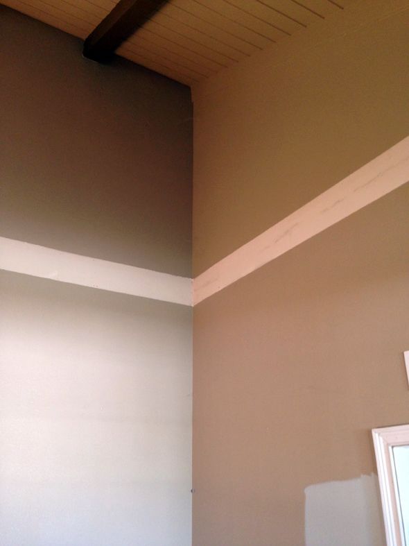
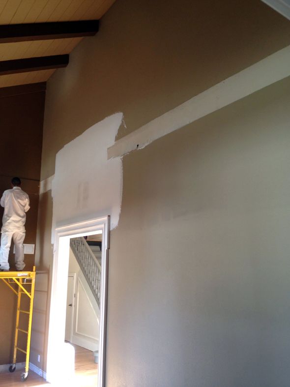
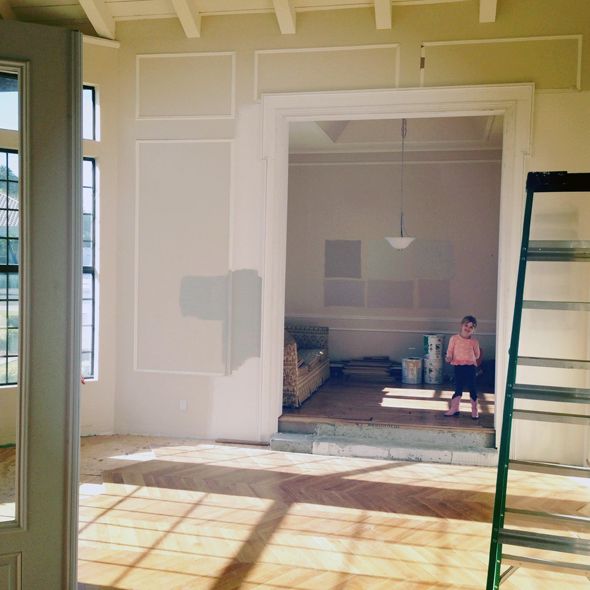
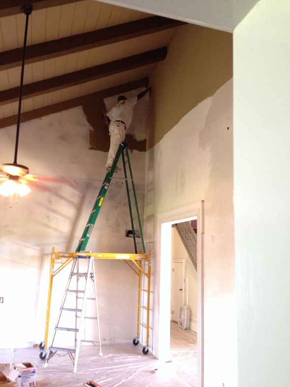
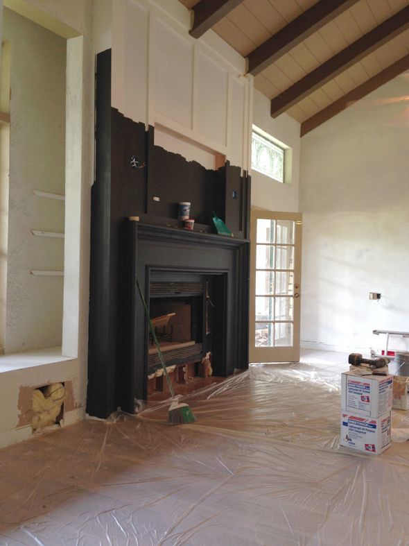
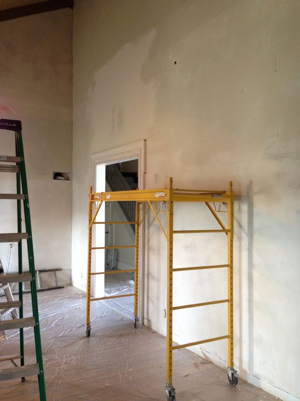
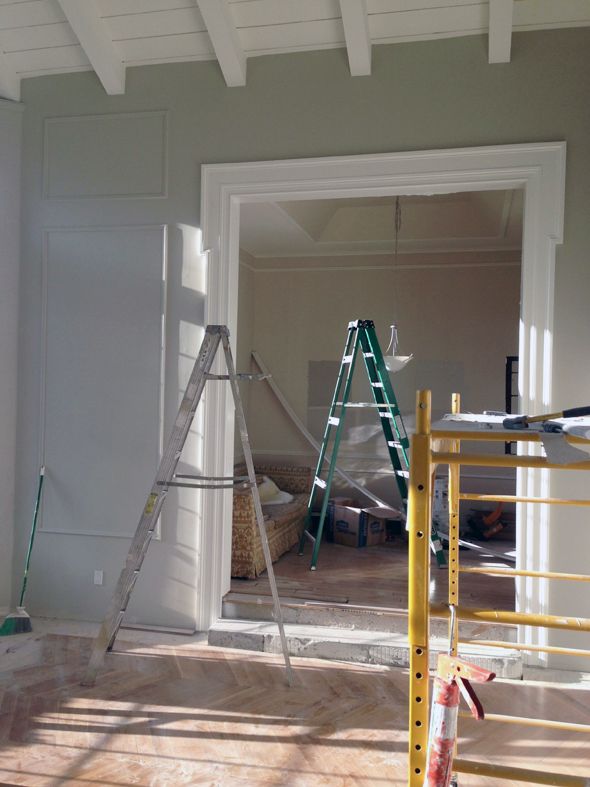
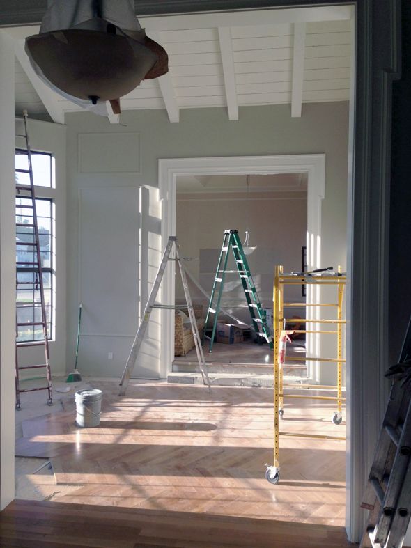
The foyer, library and living room all have really crazy-high vaulted ceilings. Like 20 feet high. The idea of even climbing a ladder that reached that high is pretty dizzying, let alone painting the walls. Let alone skim coating and sanding away the texture on all the walls! (shudder!)
I hardly ever hire out painters for my own spaces because I don’t mind just doing it myself, but the job for these three rooms was definitely in the DDIY category, and I called in the big guns.
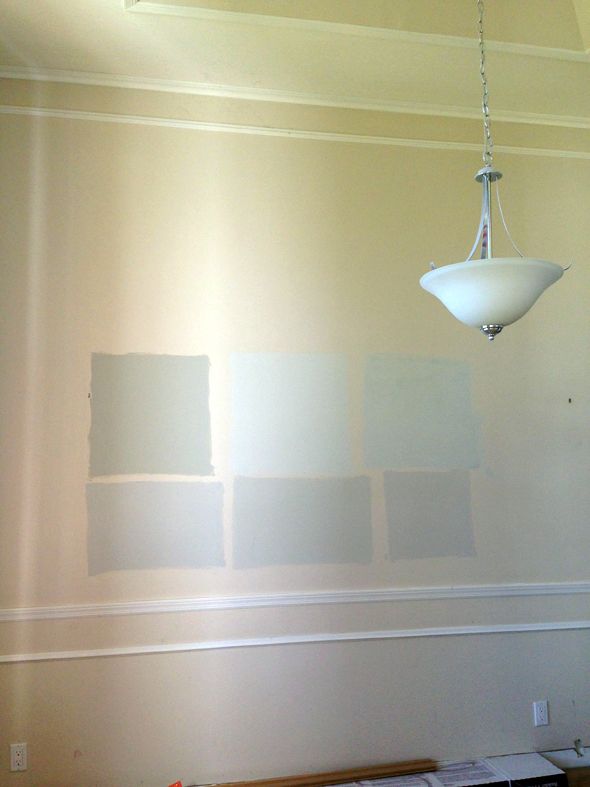
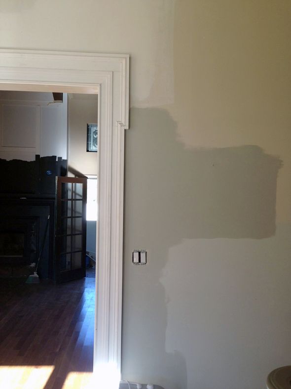
You might remember from this post how I was leaning toward Benjamin Moore’s Titanium. I’m glad I had a few weeks to sit on the decision though. I ended up feeling like the blue undertones in Titanium weren’t actually doing me any favors for making the floors look less pink.
So I went to the paint store in search of a new gray. I picked up a few samples and threw them up on the wall. I put Titanium up there too for comparison.
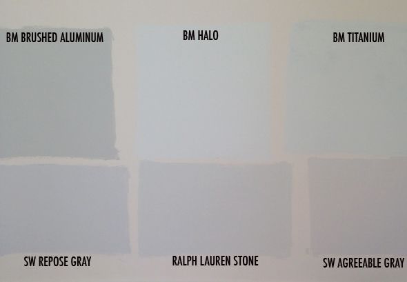
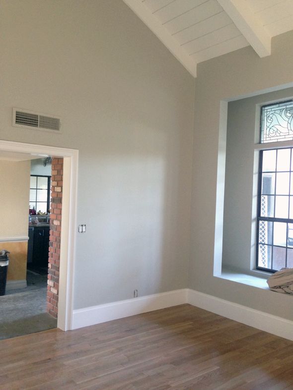
I thought Ralph Lauren’s Stone was really, really pretty, and I almost went with that. But then I started looking at Brushed Aluminum a little more. I liked that it was a neutral, but with a depth of color in the undertones. Equal parts blue and green. I threw up a bigger sample in the library and loved it more. So I put up samples on most of the big walls, just to see how the color changed with the light. It was so interesting to me how it was more of a color in the front of the house and was way more true gray in the back of the house.
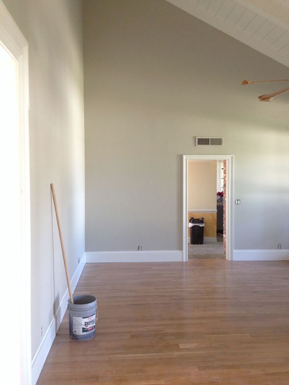
Here it is next to the Titanium sample I had up for forever. The soft blue gray color is so pretty, but it sort of fell flat for me after a while. The rich, warm greeny grays of the Brushed Aluminum felt like exactly what I wanted, but didn’t really know it. I think it’s just right with the floors. And it pairs SO well with bright colors (which we all know are inevitable in my rooms). You can throw pretty much any color next to it and the combo will be brilliant every time.
So I took a leap of faith and handed the painters the Brushed Aluminum paint chip. They were actually here for more than a week. I had them float the walls in the living room to cover the high texture on the drywall and that alone took nearly three days. (!!!)
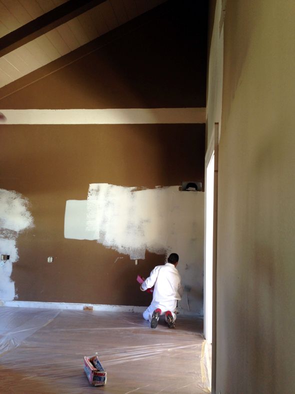
After day two, I was so happy with how much brighter the living room felt with the majority of the brown paint covered up. What a huge difference the light drywall mud was making in the color already! And the smooth texture? SO worth the time and expense. The room has such a glow about it now. The light bounces around in such a lovely way. The other common spaces in the house had already been smooth-coated so it seemed worth it to match the texture in here too, especially since this is a room we’ll likely spend the most time in.
I had all the ceilings in the three rooms painted the same white as all the trimwork – Benjamin Moore’s Chantilly Lace. It’s one of my favorite whites to use because it reads as a true white. There are no gray undertones like White Dove has and no blue undertones like a pure white usually gives off. Simply White is another favorite, but it’s a little more yellow than Chantilly Lace. I wanted a bright, clean white in here.
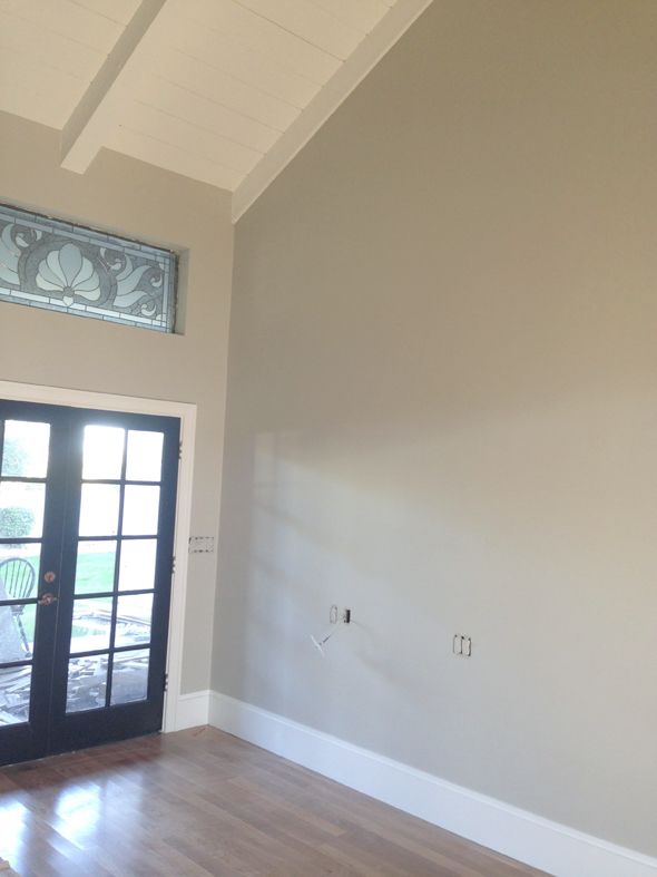
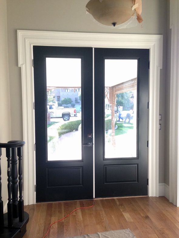
All the doors were painted Onyx, another favorite shade of mine. It’s a black with depth – a lot like Farrow and Ball’s Off Black (but without the insane price tag!) :) I’m so happy with how the front door turned out! (ps the white astragal down the middle will be black)
We’re going to do something special in the music room like lacquer or grasscloth, but I want to go more colorful in there. Michael’s vote is a bright, inky blue, which I love.
I’m so happy with how the new paint has completely transformed the look and feel of these three spaces! When I look at all those ladders and the scaffolding, I know it was worth every single penny!!


Fabulous! The palette is really lovely and you're right, so neutral you can go a bunch of different ways with this.
I'm so impressed you got the skim coating done. I really want to do that in my house. The texture is so awful and such a dust catcher. Why do they do that?
I'm liking the black stair case I spy with the wall color and white trim. Pretty, pretty!
It looks amazing! And it's hard to believe that's the same house you moved into a few months ago…
Thanks for being such an inspiration.
I know this sounds SO STUPID but I have been struggling on what to paint my ceilings for months. I finally decided oh to heck with it I'll do white but then I was still dumbfounded on what white to use. I now know thanks to you. Ahhhh relief!
The color looks gorgeous!! Also, I can't help eyeing up those floors, I can't wait to see the finish!
It looks awesome :) especially that fireplace, good stuff!
Oh Jenny, it's spectacular. The new paint, the new floor and all of your trim detail. Just wow. I'm blown away. I can't tell you how much I love it!
It looks so great!!! So nice that you are taking your time and not rushing to decisions. Finding the perfect color is always a challenge….designer or not!
I'm not usually a "gray" person, but I love what you selected. It looks so modern and fresh.
The paint looks fabulous – but how stressful it must have been to choose! Your walls are huge! I love the grey paired with the black door, staircase, and herringbone floor. It all feels quite grand.
Your home looks very French. I love everything…the floors, walls stairs and the ceiling.
Ahh, your house is starting to look so "you"! I can see it! That must feel great. :)
This is SO HELPFUL! We're deciding on what gray to paint the entire interior of our house! agreeable gray and repose gray were both on my list, and it's helpful to see them in a bigger swatch. (We don't live in the house, and right now I can't paint in the space.)
Lovely as always!
I spy a black stair rail. Looking forward to the post on the updated stairs:). When I want to repaint something for the 5th time- I will use your stair rails as an example that I am not the only crazy one out there! Love the walls.
Love the black staircase!! Can't wait to see the finished project!
love it!
It even makes the room look so much bigger! I love the black doors and fireplace with it all.
I love this! The house looks so different already! Can't wait to see what you do next :)
http://www.ahealthymrs.com
Absolutely gorgeous!!!!!q
I love it! So glad you hired a pro. Isn't your staircase gray?
It looks like such a pretty room, I know you're happy! I'm painting our new house too and picking grays has been a very difficult task so I know how you feel about working through your choices. Looks like you made the right one though!
The gray you picked is perfect with your gorgeous herringbone floor ( which reminds me, I need to go back and read your blog on those angles.) I love the black doors and clean white paring with the wall color! When I first saw this house and all the doodads, I was skeptical, but knew if anyone could make a "silk purse out of a sows ear", it was you! And I am beginning to see the silk! :)
Your place is looking so much more bright and airy and modern now! I love it!
http://www.fullbellywornsoles.com
The thought of those ladders makes me dizzy…excellent choice! Love the colors and can't wait to see what you do with the music room. BTW, those floors….amazing!!!
In the picture with the front door, the staircase is now black? Didn't you do a post in September and paint the staircase from wood to gray with your critter?
It looks amazing! The color combo is beautiful and the white molding around the door and trims pop out so nicely! THe black stair case and black door are lovely!
So beautiful! Did I miss it? What is the color of the music room?
CONGRATS! It must feel so nice to have it all done and looking great. Thanks for the onyx tip…I'm repainting my staircase and will definitely try that one.
Love your choice of paint colour!
We just painted our living room a bright navy. It is just the right blue. Despite BM's Hale Navy being the blogger favourite, I found it too gray for what we were going for and almost looks like a muted purple in some light.
I'm fairly certain we went with BM's North Sea (although I will check on that) and its perfect. Not too teal, not too purple. You can see it here – http://harrycanary.co/?p=89
Beware if you google the colour! The promo shots make it look green! Which looking at the swatch or actual room it is not AT ALL.
Almost as deceiving as the coloured sticker on the bottom of a thing of lip gloss ;)
Wow! It's really coming along. You're house is amazing. It's going to be absolutely gorgeous when you are done.
Love it!!!
Everything is coming together so beautifully! I can't wait to see the rooms once you start decorating!
Wow! That big room looks beautiful in gray instead of brown. It's so calming! Thanks for sharing- it's so fun to see the big transformations!
It looks crazy good! and your floors! so excited to get a peek at those :)
Just have to echo all the compliments, it does look crazy good! What a joy to see it all starting to come together :)
It's looking so great! When you compare it to your first moved-in photos it's hard to believe it's the same house
Also, good call on the DDIY, that picture of the man on the ladder ON TOP of scaffolding is terrifying!
THE CHEVRON FLOORS LOOK AHHHMAZING!!! I agree with you on the expense of hiring-out the overwhelming large jobs. I feel as though it's better to support the economy than to go insane!!
Looks amazing.
You make my pinterest Dream House board look much better with everything I pin on your blog.
Your house is looking amazing!!
Very cool! I'm still stuck on wanting to use a gray paint from Farrow & Ball, and I went through similar sampling to narrow it down to Lamp Room Gray.
Our house has slightly textured plaster walls, and I dislike the texture but I've never even considered getting the walls and ceiling skim-coated before. Would you be comfortable sharing about how much that cost you? That'd help us decide if it's worth doing! It'd also be nice if you think it's DIY-able for someone who has more time. :) Thanks!
Your stairs are black?? I need to go back and look for a reveal photo, I don't remember seeing that but I love the idea!
Yes – all those ladders! Yikes. Amazing how much it brightened up the living room – I know you are thrilled!
Sigh- oh so pretty. I love the white beamed ceiling. Droooooool :)
http://www.davenportdiy.com
What finish did you use on the doors? That is exactly what I want to do to mine. I have gray walls and white trim too. Lovely!
This is so inspiring! I live in Utah, which is full of similar homes. It's great to see that with just a few changes (most of which are sourced from a national chain) you've customized your home to be much, much more than it was.
On that note, I would be curious what about this home drew you in. I would love if you did some kind of post about what in a home determines whether or not it has good bones.
Just beautiful! What a lovely choice you've made. What sort of finish did you end up going with for the walls–flat vs. eggshell vs. satin, etc.?
Hi, I'm a Canadian reader. I think your house is beautiful! The bones are fantastic and you're decorating it beautifully! I wish I could walk through it when it's all done – it looks like a space that would look even better in person! Thanks for sharing all your progress. I look forward to more updates!
Love the colors. Painting the samples on your wall is such a good idea. I know everything will be beautiful.
Linda
gameday dresses
Great choices! Yes, that color will go with anything! I really like the direction you're going, classic and neutral backdrops that let your furnishings and accessories really stand out.
And a blue in the music room will be such a great pop! So exciting to see it all coming together!
Nailed it. Perfect color choice!