Hi guys! I hope you had a nice weekend! My parents were in town and we all took a little trip to the Salt River, which I hadn’t done in like a decade. It was seriously just what the doctor ordered. Other than being sunburned in the few random spots I missed with my sunscreen, I’m feeling rested and happy. :)
We’re not quite ready to move over to the other side of the house yet, so we set up some temporary furniture in the master bedroom and my mom and dad slept in there. I have to admit I was a little jealous while I was setting up the bathroom for them. It’s okay though. We’re getting close with the floors, and we’ll be moved in to our bedrooms soon enough. I was feeling the pressure bad a few weeks ago, but I sort of got over the self-imposed need to move in as soon as possible. We’re fine sleeping in the playroom area for now. I’m mostly just sick of living out of suitcases still. But there’s no need to do things hastily or to burn myself out. These things can and should take time to get done right.
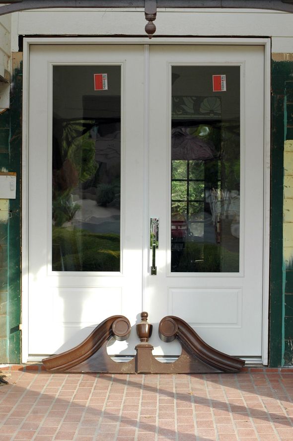
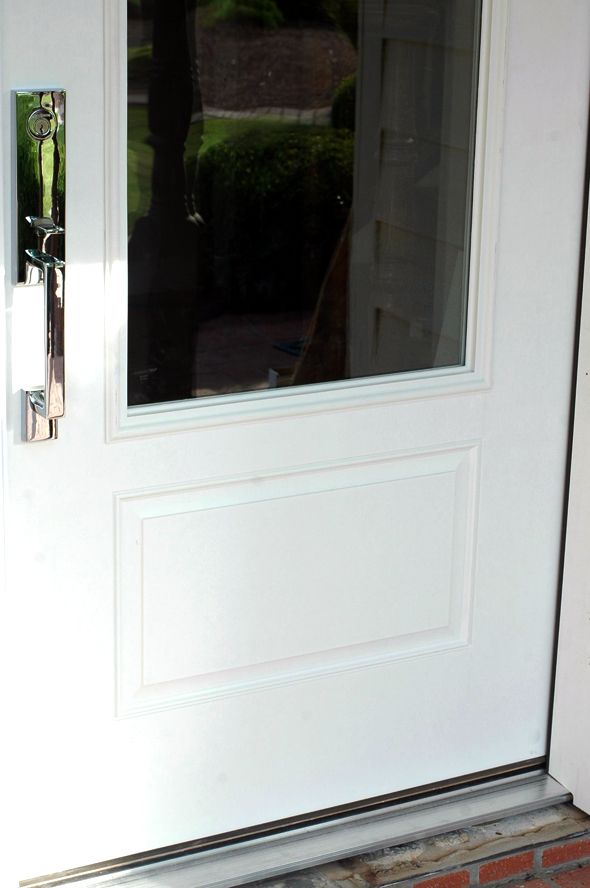
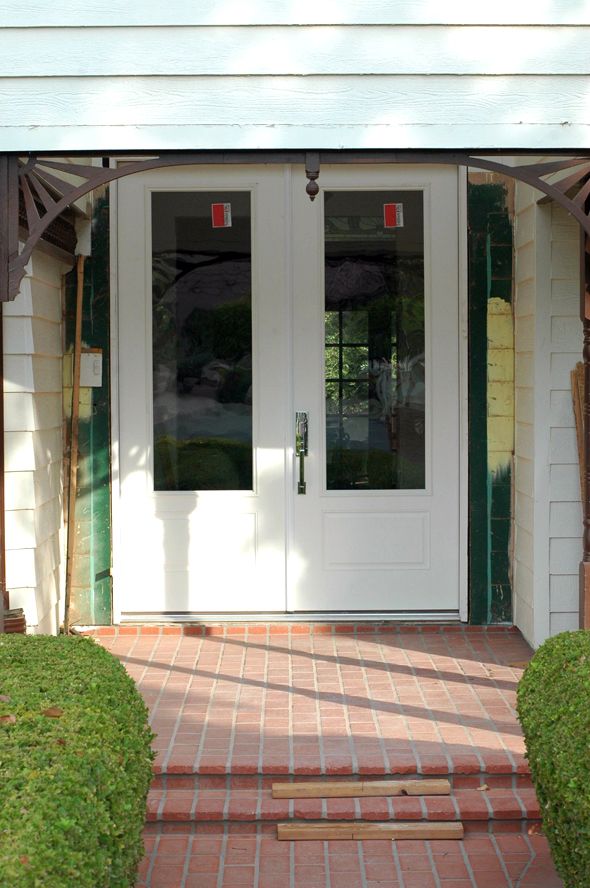
And when I stop and look around, it’s amazing to see all the things we are getting done! The new front door was installed last week and I’m loving it. I wanted to do something maybe a little more special, but doors are really expensive, especially 8.5′ double doors. Since our front yard gets a lot of harsh Arizona sunlight, the sales rep suggested we go with a paint-grade fiberglass door instead of wood.
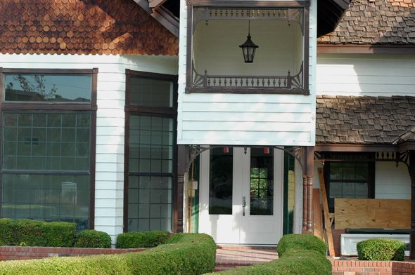
Here’s the one we went with. (don’t mind the pile of plywood to the right of the door – we had to temporarily board off the entrance while we waited for the doors to get delivered that were about a week late. It was a really classy look and I’m sure our neighbors were sad to see the plywood wall go. :))
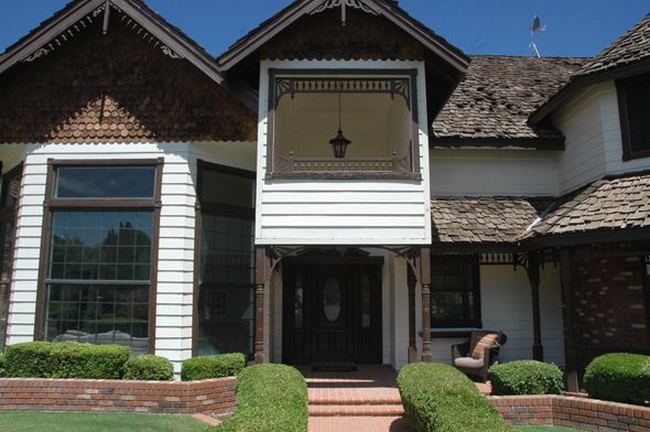
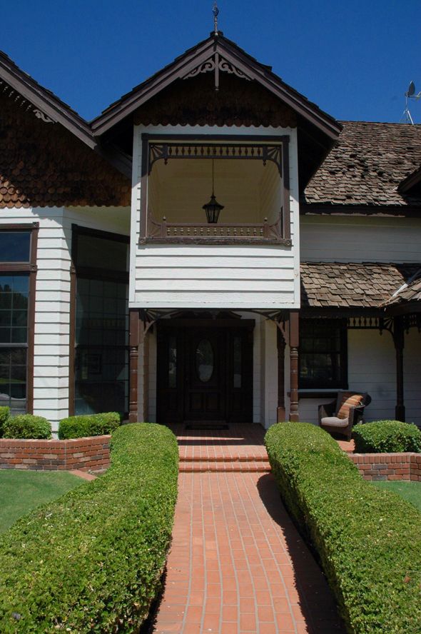
The old door was only about 80″ tall, which felt way too squatty for the tall entry hall and front porch.
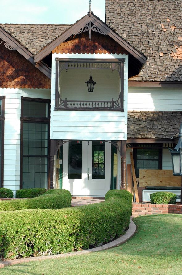
Here are our plans for the front, which I’m hoping we can tackle next, after we finish the floors:
The sort of picture window situation isn’t really working with the new doors – you can’t even see the top of them. The simplest and least expensive way to fix it is to remove the whole front face and extend the two front columns all the way to the roof. We’ll make them chunkier and maybe add a brick base to match some of the fencing we have in the yard.
A big change from the before, right? I think it will be a lot cleaner looking and will work better with the bones of the house, which really aren’t all that Victorian other than the old trimwork. I’m hoping we can help steer this house more into the Cape Cod style direction.
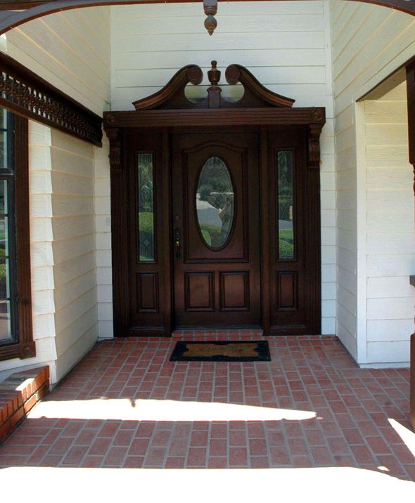
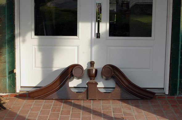
Speaking of stripping things back and trying to figure out the style of this house, I’ve been confused about whether or not to keep the Federal style overhang that was above the old front door. Since we want to modernize the exterior a lot and take down all the gingerbread trim, I thought it might be nice to keep the scrolled overhang as sort of a nod to the original owner’s vision.
I think it’s kind of a cool shape and once all the new trim is up around the door and everything’s painted white, including the scroll, I think it could be kind of Miles Redd looking and less Alice in Wonderland?
There’s an awful lot of vertical space above the door that the scroll would help to fill, but I’m sort of loving the clean, more modern look without the scroll.
Especially if we add a few rows of thick trim to the header, like I did in the mock up. I did this really fast in photoshop, so it might not make sense, but the bright white part is the new front of the entry (the new columns with the brick base) and the shadowed gray part is the door wall, which is set back about eight feet from the columns. I need to do some more research, but I remember seeing an all white house once somewhere online or in a magazine that had a style similar to our house, with the shake roof. The body of the house was a creamy white and the trim was a brighter white and it looked really great. If we did something similar, it would save us thousands of dollars by keeping the creamy white body color as is and then we’d just pay to have the trim painted white (or maybe tackle the project ourselves – although my hands get a little shaky imagining being up on an 18 foot extension ladder). I’m thinking of also whitewashing the brick and the cedar shingles that are just on the front of the house in a few places (we’d leave the shake roof, of course). The house looks pretty choppy with the dark trim and brick and shingle sections against the white body. I think unifying the color palette would be really pretty here. Also, I’m thinking bright, glossy red for the front door. Maybe my favorite Safety Red?
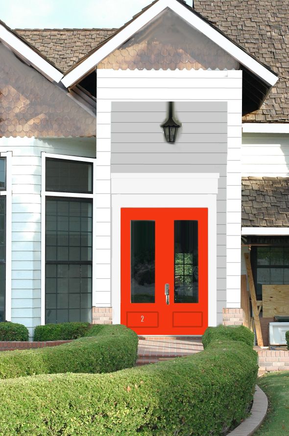
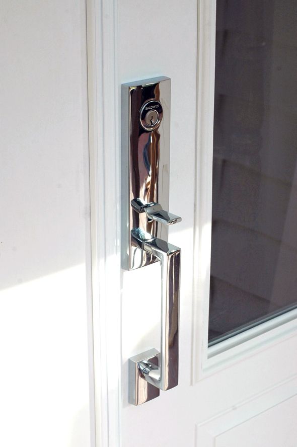
I think the red would look so pretty with the new hardware and the simple shape of the doors.
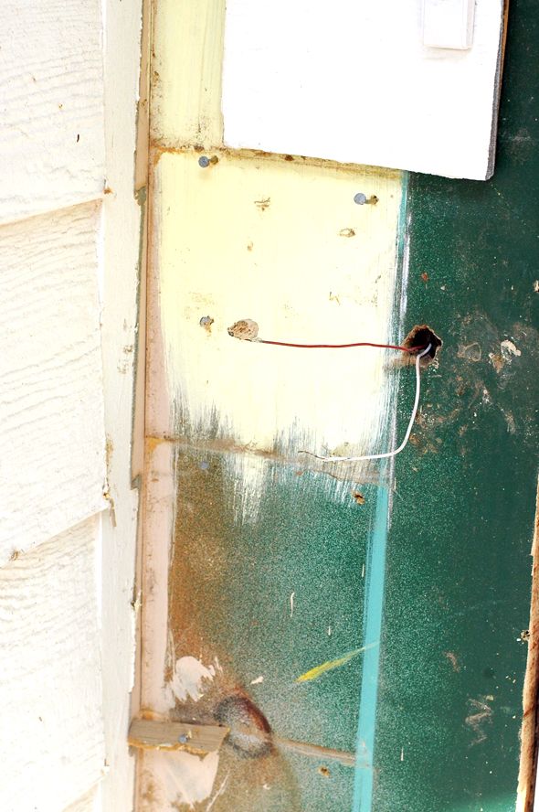
While we were pulling down the old siding to install the doors we found the wires for the doorbell which had been buried under siding (the one currently installed is battery-operated). I was so excited about this, because now I can order
the doorbell I’ve been eyeing, which needs to be hardwired. I think it will be so pretty with the polished nickel house number and hardware.
Alright, back to floors. whew!





Great door choice! I like the idea of the white paint choices with the red door. I vote save the Federal pediment-thing for another project. It could be cool incorporated elsewhere. It just fights with the shingles.
Awesome. I think you should keep the old header, but maybe use it inside? No clue how to incorporate it though. Perhaps support in a kitchen island? I have to go back and see what you kitchen looks like, can't remember right now. I like the clean front with the red door, beautiful!
Sounds like you had a much needed and well-deserved break from the floors. The new doors look GREAT — what a difference already! The red will be stunning. I can also see a really rich, deep Weimaraner gray or for a totally different twist even a Notting Hill bright blue door. I agree with the other posters re: the federal scrolly thing. You're working so hard for a clean profile by removing that heavy surround and all of the bric-a-brac that I think it would take away from other elements. On the other hand, I wouldn't be logging-on every day to see the creative things you've done if I knew best(!) Congratulations on all of the progress so far!
Isn't it going to be creepy that people can see straight through into your house? No privacy. Are you going to do something to cover the glass?
Looks amazing so far; can't wait to see that gingerbread trim come down!
i look forward to seeing your progress every day. you are making serious dents on updating this house. love them all. especially the thought of the hot red front door!!!
This is going to look awesome once you get rid of the hideous overhang! I vote you keep the scroll. Maybe paint it out white for a subtle look or red, like the doors? Red would look awesome.
http://www.fullbellywornsoles.com
Love the door and I love your mock up! My only vision would be to extend the light fixture. Would you consider painting the front entry a differnt color? I would get rid of the scrolls; but that's just me; I like the cleaner lines:)
What a great idea to whitewash the cedar shingles. I like that you could keep the shape and texture variety but unify things a bit more with color. I think that could look awesome! You have great vision for the exterior of this house–way to go!
The new door is beautiful. Have you considered lowering the porch roof instead of opening it all up? I think that's more in line with a Cape Cod. Those super-high, two storey porches seem very 90s and McMansiony to me.
Red/orange fades really quickly in the sun. If you commit to that color, be prepared to repaint frequently.
That is such an interesting doorway. I lived in Phoenix for 20 years and I never saw architecture like that.
Was that doorway supposed to help with air flow or shade or was it just appearance? I really prefer the vision you have. With all that space in the entryway you could really have fun with a light fixture or climbing plants or something.
The fun thing about a white house like that is you can change out the door color every few years for fun. Red now, blue down the line, etc. Fun!
Great improvement already!
Although I love a red front door, I don't think it's the ideal color against the orangey brick and brown shakes–and overall hot climate. To me, the stylized roof and tall white house could go with deep Normandy blue you might see on a stuccoed white house in Brittany. Picture it with silvery gray blue catmint, santolina, and other herbs growing over the brick wall.
Your house reminds me the Fachwerkhäuser houses in Germany. They have a lot of the same timber-frame elements you see in England and across Europe but there are also some stylistic elements that are distinctly Germanic, which I also see in your home. It would explain the faux water well in the front yard…
I vote you save the pediment for another project. It's neat, but I like cleaner lines of your mock up. Also, maybe a cleaner lined (and larger) lantern in the same chrome as the door handle? Have you thought about taking the fishcale shingles down a bit further? Painted tone on tone they would add subtle texture.
I absolutely love your front doors! Have you thought about a larger more contemporary porch light? That would fill up the space nicely. I'm thinking the pediment, while nice, just doesn't go with the doors. Either save it for a client, or sell it.
I love the hardware! Who is the manufacturer?
I love the hardware! Who is the manufacturer?
I love the door and the contemporary look. Have you thought of extending the white panels all the way under the roof… the brown shingles add too many elements to the whole thing….
I am amazed at all the things you have done! Bravo!!!
Jenny – I love the new doors and the hardware. And I totally get it about the door bell. None of the wireless options are at all attractive. Regarding the pediment above the door (that's the technical architectural term) you could do some research. It almost seems a little small. I think the pediment should sort of overhang the sides of the door. You could sort of box it out with the scrolly federal part inside a triangular pediment that would echo the triangular gables on the house. Just a thought.
i see,you have a nice door here by the way..loved the view here.nice house too.
I love love love the improvements you have made so far! I think a red door would be fabulous and I am keeping my fingers crossed that you keep the scroll header above the door! I can't wait to see what it will look like once you remove the picture window. Keep up the amazing work! You're blog is definitely one of my favorites!
Love the direction your mock up is going! What about using the header on the inside above the door? You always make great decisions… Just go with your gut. Thanks for sharing all your hard work!!
I say keep the scroll.
Loving the doors and the hardware is fantastic!! I understand your pediment dilemma. It's a fun chunk of wood to throw out. Maybe you can use it inside somewhere…
Maybe do away with the gable over the door altogether and just extend the rooflines of the second floor and first floor porch straight across? You eliminate the picture window and simplify some of the lines of the house. Great door choices!
I put those doors in 3 yrs ago, still love them. Mine are painted a tomato red/orange. I got the dummy handle for the left door, worth the $ for the look.
Girl, I'm lovin' them doors!
Love those doors! I think the scroll pediment needs a different home…it'd be like putting a cheap wig on a super model…why ruin a good thing?!? ;)
Since the new doors have a lot of glass, are you worried about privacy? Will you be putting up curtains?
No scroll! That's my vote anyway! I love the clean look of the thick header in the mock up. I love the red door too! But I think I always love red doors. And that doorbell is adorable!
Abby J.
Love the doors and hardware but think a matching dummy handle would bring a nice balance.
I love the scroll and would keep it if it were me…Love your mock-up idea and the red on the door. Great job Jenny!
This is going to look AWESOME! I think opening up that entry will make the house feel so grand and make it more clear where your eyes should go. Red is a definite yes and whitewashing will again help with the grandeur as well! I know you can make the header work, if anyone can, and I can see why you want to…it's just beautiful!
Jenny, don't usually comment but when you said white on white I immediately thought of that HGTV dream home from a few years back- it was a victorian in a few shades of white, so sort of in line with your thinking. I remembering thinking it was a great clean, contemporary look for a historically fussy style.
I am surprised at this, but I really like it white!
I like the idea of a red door, but not a bright one with an old house. I like the idea of a darker red, though–such a great pop of color!
http://greenmountainglobetrotter.blogspot.com/
We have a red front door and only repainted it after 8 years. It didn't even really need it, though it did fade a little. I do love vermillion on a front door!
I think the facade would look much more unified if you painted the shakes the same colour as the siding.
Here here to getting rid of the picture window/ opening! However I would not move the new opening as high up as you have it but rather line it up with the roof soffit. Maybe put a flat rectangular panel with moulding above the opening to eat up some of the space?
http://WWW.lexandliv.com
http://WWW.lexandliv.blogspot.com
Your mockup of the new front door and columns makes such a big difference in modernizing the facade. Great choices!
The old one looks good but this is ten times better. It gives the entire house a touch of modernity. I think every old house needs a little bit of that. The shapes and details are simple and don't catch too much attention, which is good, so every looker would see the beauty of your house base on its totality. Good luck on the renovations!
Leah Clay @Vanderlaan Home Improvement