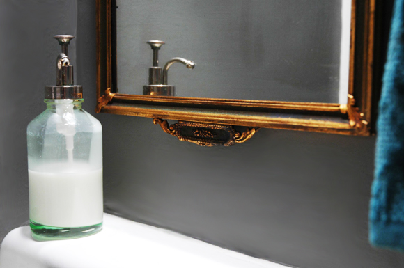
I have been looking for a new mirror for our powder bath for a while (you can see the super boring, plastic(!) old mirror here). The corner sink is so teeny that the dimensions of the new mirror needed to be pretty specific, and the frame had to be thin. It’s hard to find a thin and interesting frame!

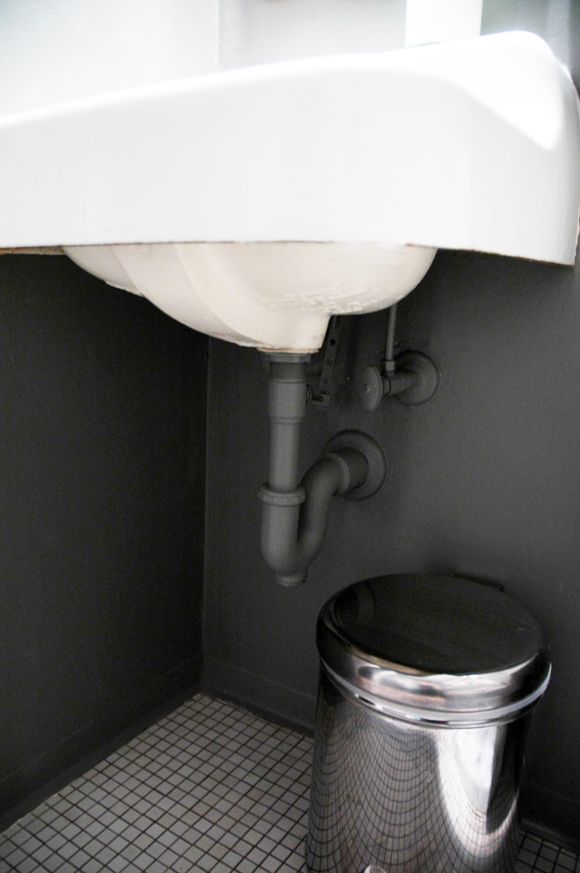
And rather than going for a skirt on the sink like I thought I would, I just put a new coat of paint on the pipes so they sort of blend into the wall more. I love how industrial (and clean!) it looks compared to before.
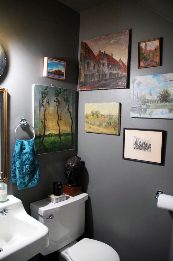
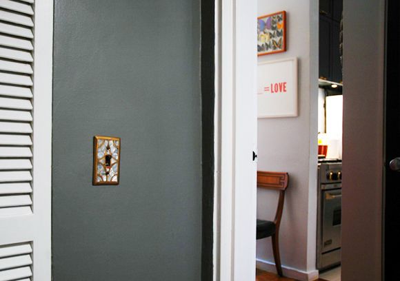
I kept the bi-fold doors white for now for some lightness in the space. That old mother of pearl and brass light switch cover from Anthropologie came alive on the dark gray walls! It’s been one of my favorites over the years. I think we’ve had this cover in five homes now?
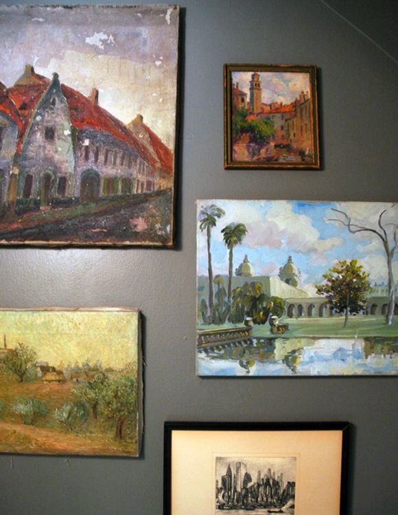
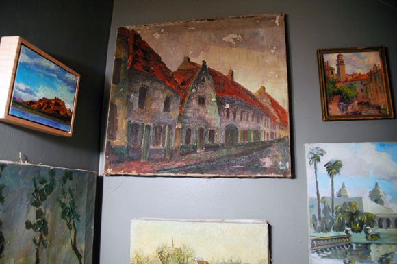
I kept the old art hanging in the same places. These are all paintings (most of them really old) of my favorite places. I bought most of them in flea markets of the places they depict (Venice, Rome, Brussels, Bruges, and of course the Seaport etching.)


Heather – I actually think Chelsea Gray is a good choice if you're looking for something more gray, with a tiny bit of purple in it. It's a great color.
xx
I love this color. Do you have any recommendations for a gray with a purple undertone?
A good grey with about the same depth as Chelsea Grey is Sea Life Benjamin and Moore #2118-40, has purple undertones. For more purple try Hazy Lilac #2116-40. Going with a pale grey is tricky because it will look like mauve or dusty lavender- check out Violet Mist
CC 880 (that's on the Canadian deck, sorry not sure what it is on the US deck) Hope this helps.
Heather, Behr's road runner is a nice gray with a plummy undertone – it's a bit lighter than the shade Jenny used, but still a really pretty color!
http://dailydoseofkevin.blogspot.com/
Oh I loved the minty abstract walls… But this is just as nice. I like how you painted the pipe. Why can't plumbing be attractive??
The grey is so beautiful! I liked the minty walls, but this is a space I would love to get dressed in.
I love tiny little bathrooms that turn into art galleries. Great way to make the small space pretty. I think the idea of painting the pipes was very smart!
Heather – I actually think Chelsea Gray is a good choice if you're looking for something more gray, with a tiny bit of purple in it. It's a great color.
xx
love, love, love the transformation jenny! the minty walls were fun, but this has such a personality now. deep, sexy, elegant. i also love your little gallery you've got going on!
this may sound like a dumb question, but would you put up art in a bathroom with a shower? wouldn't it ruin it given the moisture level? would love to know!
That little space is now a gem; the moody gray suits it, I think. Love that switchplate! (too bad it's on the long-discontinued list)
LOVE the moody gray with the beautiful art! I think I would stay in there way longer than I should!
Looks gorgeous!
i love the powder room as art gallery! it looks great! when i was growing up, my mom had old b/w pics of our ancestors in our powder room! definitely got more attention there than they would have elswhere.
Oooh, this is so great! I liked the minty abstract walls, but this is just so much better. I love the way the artwork and gold/brass tones pop against the dark gray!
Nice job Jenny I love that fabulous grey with your art collections!! Oh and of course the mirror!
xoxo
Karena
2013 Artists Series
wait – we didn't get to see the mirror….
but the wall color is a winner. good move.
Wonderful. Reminds me of Geoffrey Beene. He always had something wonderfully chic in a gunmetal or gray flannel…..
I love that color.
pve
So lovely! The brass/dark gray is fantastic. The paintings stand out, too.
Can we see the whole mirror?? I have to admit, I'm kind of sad you painted over you lovely mint abstract design. I loved that!
hi there, i like your paintings. we have old unframed paintings as well…any advice for hanging them? they don't have wire on the back.
Very nice! I especially love the art works! The paint color is fabulous too! Bravo!
I love the changes! I also have a teeny tiny sink like yours (maybe even smaller actually) and I want to embrace so I'm really liking the idea to paint the plumbing…although our walls are tiled (white with black trim from the 50s).
I did pick up this cool vintage sofa to reupholster this weekend but we couldn't get it in the house! It is standing up on its end on our back porch for now until we try our last option…through the garage which is too messy to get through at this moment.
I love this version much better! And i also like that you painted the ceiling the same color.Great twist!
I love the idea of painting the pipes!
Can I ask where the soap dispenser is from? I was in a wedding last weekend and the powder rooms had the same one and I love it!
love the mirror and the change of color!
Is the soap pump from Target? Looks just like the one I got, but it quickly deteriorated and won't work. The spout sort of disintegrated and squirts out an icky green mix of soap and corroded metal. Just wondering if it was a fluke or a common problem with this item. I loved the look and was debating buying a replacement!
I remember the previous paint technique and while I loved that idea, I REALLY love this paint color with all of your wonderful art! Such a great combination of elements. Now I want to go paint something this same color….just need to figure out what!
LOVE the grey. Question: did you paint the ceiling grey as well? I have a small room with vaulted ceilings and it is hard to demarcate the ceiling from the wall but not sure whether I should paint the ceiling grey too?
LOVE it! Did you paint the ceiling grey too? I have a small room with vaulted ceilings I want to paint but it is hard to define the wall from the ceiling so I was thinking of doing the whole thing grey
This looks fantastic. I love the dark gray with white trim. Love the art grouping.
xo Nancy
Powellbrowerhome.com
This is exactly what I'm going to do to my bathroom. It is a tiny room and I figured it needs a punch of saturated color.
Do you have any recommendations on how to paint behind the toilet?
As fun as the abstracts were (i really liked them), I must say this powder room is rocking now! I love the contrast the gray plays on the gold! And the artwork stands out on it's own as opposed to competing with the walls. You'll have to post a pic of the mirror you selected, we only got a glimpse ;) Great job!!
I love your painting of Balboa Park in San Diego. (It is of the koi pond and the Museum of Man.)One of the most beautiful parks I know.
Don't think I've ever seen a collection of paintings in the bathroom but I love it! The grey you chose it very pretty.
Love the grey!
http://www.etsy.com/shop/theenchantedfigtree
Stephanie Fig
Adore it!!