Did I tell you we bought a dining table?? Remember I was in love with this octagonal Widdicomb table? Well, I thought long and hard about making my own version. I priced out the right wood and brainstormed how I would do it. Ultimately I decided it was too risky. The wood alone was going to cost hundreds of dollars and I wasn’t sure that it would look perfect in the end. We needed a table we could use all day long, everyday. I think that sometimes, especially with the bigger stuff, it’s best to buy, not DIY.
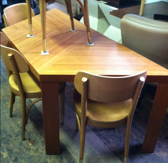
Luckily, I was doing some shopping for a client that week and had to stop in to Two Jakes in Williamsburg. I rounded the corner and saw this:

I loved the color of the wood and the shape reminded me so much of the Gibbings table, but I didn’t really think more about it since it was just a desk.
Then I made my way to the back of the store, and BAM! Another desk! Now, two desks do not always a table make, so I asked the nice and vey knowledgable owner (who I assume is named Jake?) about the desks and he told me he has TWELVE of them and that they were mid-century, and designed to be configured in multiples for your needs. They can be placed long-way to make a massive conference table, or just used as a single desk. OR used in a pair as a hexagonal dining table that comfortably seats six!? Yes!
Since they had so many of the table sections available, I did the patient, responsible thing (don’t worry, that doesn’t happen too often), and took the measurements home to triple check that the table would fit.
I use graph paper a lot to map out furniture for my own home (the computer programs we use pretty much kill my creativity). But even when you have a perfect floor plan, it can be hard to really feel what how the furniture will sit a room. This is where painter’s tape comes in. It works fine to map out furniture on the floor, but if you place the tape on furniture that is roughly the same height/scale as the new piece, that will help a lot for visualizing and there will be less surprises later.
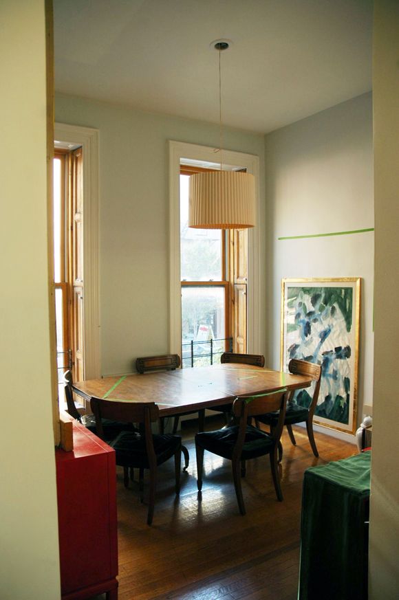
I mapped out the hexagonal table on my old, ill-fitting table, and put the chairs where they would belong at the new table to verify they could be pulled out far enough, etc.
It ended up being a really good thing I taped out the table. I found out the table would fit well, but that the armoire I had found on craigslist (to go to the bottom right of the table in the photo) was completely too big for the space, even though it made sense on my floor plan.
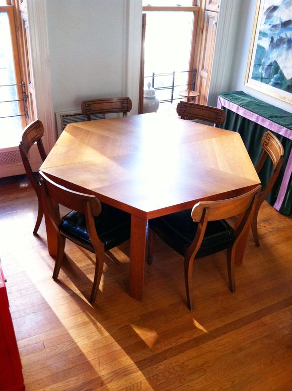
The table is in and we love it. And I’ve moved to Plan B for the armoire, so now we have plenty of room and storage space. More photos coming up (including the step-by-step for painting the giant chandelier!).
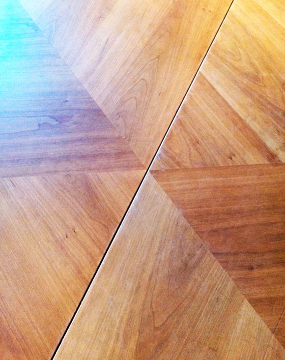
Also, I still love the Widdicomb table and hope that maybe someday one will fall into my lap. But I’m thinking maybe this simpler design is a better fit for our small dining room? All those arches might have been a little intense. Plus, there’s no way I would have been able to get the finishing the way I’d want it to be. Like how the grain changes direction in the inlay here? Love it.
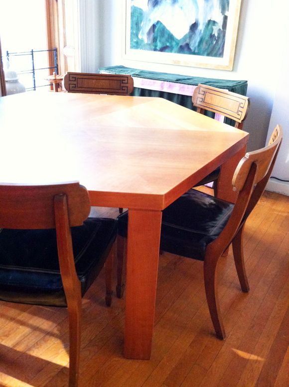



Wow, what a great find! The feel is so similar to the dream table! I love the Greek key chairs with it, though I would hate to see them painted (I'm usually pro-painted wood, but love these too much as-is!). I think Louis chairs would be gorgeous. I know you said white leather, but what about charcoal linen (or outdoor fabric)? Just an idea!
Wow that looks really great. And using painter's tape that way is such a good idea.
I love reading your posts because you are so inspiring and have such great taste!
what is the paint color in there? looks light blue? Please share!
I say paint the chairs! I don't know what color would compliment. I like the painter's tape idea. I'm building a mock up pendant so that I can determine whether a light fixture is visually too big for my dining table. My husband and the online formulas are not in agreement. I need to see it! Thanks for everything you do for us!
Love the hexagonal shape and think the simpler style works so well for your dining rooms. I would definately go with the Louis chairs – it would be a shame to paint those greek key beauties! xx
Anna (My Design Ethos)
I'm so glad you found something you're happy with – that's terrific! Funny you should ask about painting the chairs white. We have a round cherry table on an Indian-carved center base surrounded by wooden chairs in a slightly worn white. When my husband first picked the combo out, I thought he was crazy. But it actually works very well – there's enough (gentle) contrast to emphasize both the shape of the chairs and the warmth of the wood.
My only concern in your dining room might be losing the chairs against the pale walls? But that may be more of an issue of how it would photograph than how it would look in the room itself. Can't wait to see what you come up with!
I'm curious as to why computer drafting programs (I assume you mean AutoCAD or Vectorworks) kill your creativity? It's really just like hand drawing – you make your drawings look how you want them to. You can draft in a stylized way that resembles a more hand drafted feel – its all in the user. As a professional interior designer I know that hand drafting isn't practical in today's design office which is why its all computer based now (for ease of sharing files between consultants, making hard copies/duplicates, quickly drawing optional layouts/details, etc…) but I don't understand your perspective and I really am open & curious to your reasoning. You do draw though which is great because I really don't understand how some blogging interior designers say they don't at all. In those cases I don't understand how they fully communicate their design ideas without some form of drafting or sketching.
This is awesome! So glad to know I'm not the only one who uses painters tape for stuff like this. I taped out the size of a living room rug and kept it that way for over a month to convince my husband we needed a new one! Good news- it worked :)
http://mainstreetchic.blogspot.com/2012/03/need-flor-rug.html
xoxo, Emily
http://www.mainstreetchic.blogspot.com
Perfect. I do love the chairs as they are. Perhaps a table cloth or colorful placemats in shapes, those you could cut from cork or wood or a fun fab.
That table fits so nicely.
pve
I think what you bought is really great. It's got a lot of character and a sense of openness.
Kyla
I think the the new table looks really good with the chairs! Keep em!
I love doing mock ups. I take the painters tape concept a step further and use newspaper to visually take up the space a new piece will take up. In other words i might have taken out the old table and crafted the aerial view of the table out of tape and newsprint and laid it on the ground. Have also mocked up pendant lights for size and hanging length. In my dining room I had some old regency style chairs that we were thinking of giving a more casual look. Ended up just using a Zebra printed cowhide upholstery to give them more kick instead of painting or staining them. Bought a cheap polyester Zebra fabric to give the concept a test run. I can send pics if you want. The real deal was so much better than the temporary trial run. Very pleased with how it turned out!
the table is a great shape, love the flexiblity if you ever move you could use the halves as console tables, i think your greek key chairs look fab as is
why can't you make the leg arches and nail them into the legs of your new table? Your table looks great with your chairs.
So awesome and such a good find! Love it! What a neat find and it fits so well in the room. Very smart taping it out and not being impulsive.
I'm facing the same dilemma of buy vs build for our dining table. The one we have was a temporary solution that I've allowed to exist for far too long. I'm not a fan on round tables but something like this I'll have to consider!
Maggie Rose:
I actually would want to do a colorful leather (or just black again) on a white painted chair frame. Not the hugest fan of white leather most of the time, though I did a white ostrich once for dining chairs and loved it :)
Maggie: All the walls in our common areas are Farrow and Ball's Cabbage White. It's a really fresh blue that's not 'baby boy' feeling at all.
Erin: I know what you mean about the white on white issue. I'm thinking of maybe painting the walls dark gray once the moulding's all up. Decisions!!
Anon- I do know autocad and I use it for some jobs, but I am by all accounts a decorator and not an interior designer. I haven't done a lot of kitchen/bath renos, so most of what I work with is furniture and fabrics (the fun stuff, I think!). As far as the drawing vs autocad goes, I just mean that I often get on a creative kick when I am not in front of a screen, and when I can hold a pencil and a pad of paper.
Anon- You're reading my mind! I might add the arches later, but for now I really like the more modern, straight lines. The armoire I'm adding will have a lot of funky trim – it will be pretty busy. I'm going to wait and see how things look after that project is done. :)
What a great looking table. I love the wood grain. I think your chairs get lost against the table as the colors are similar. I'd love to see them white or even dark with maybe the greek key detailing in gold? But the shape and size of the chairs is really nice.
this is why I love to read your blog. You find great things and are flexible. I do not see flexibility so often on other sites. Thank you for showing me your find!
cathy
Wow, it seems you always find just the right pieces to fit your ideas. Jealous! The table looks great. I think the Louis chairs would be great, because I like dining chairs to contrast from the table, but it does a seem a shame to paint these lovely ones (and I am usually all for painting!).
That table is amazing and looks perfect for your space. I immediately went to the Two Jakes website to check out the measurements. Too big for my place, but what a steal!
That table is perfect for your space! What a great find and solution. Your chairs are amazing with it as is, but I understand wanting to create some contrast. I did a post recently on my love for Klismos chairs. If you ever find Louis chairs and want to unload your current ones, I would be happy to buy them from you! :)
Man, I LOVE it. Even better than the Gibbings if you ask me. The inlay directions are really cool. – Julia
If you decide to sell those dining chairs for others, I'd love to know what you want for them, as I'm in the market for a set!
Great alternative to the Gibbens! I love it. And the painters tape thing is a great idea. I usually cut out newspaper to size but this seems much easier.
I very much like your new table, and I LOVE your chairs. I really hope that you don't paint them. They are works of art now, and I think the paint would diminish them. Someone else suggested you could get contrast from the table with a tablecloth or placemats. That sounds like a great idea to me.
Your table looks AMAZING! Gotta love when a plan comes together. Verdict is out for me on the chairs. They are gorgeous as is but if you heart is set on changing them–go for it!
WOW what a great find – very jealous. I think your chairs would look great painted.
Gorgeous, you have such a good eye! I'm so jealous. Re your chairs, they look great with the table but I feel your pain having to be patient and not just being able to change everything at once!
[url=http://www.giubbotti-moncleroutlet.com]Moncler Vest outlet[/url]
[url=http://www.chanel-newzealand.com]chanel bags[/url]
[url=http://www.supra-shoesnz.net]supra shoes[/url]
[url=http://www.chanel-newzealand.com]chanel nz[/url]
[url=http://www.giubbotti-moncleroutlet.com]outlet moncler[/url]
[url=http://www.chanel-newzealand.com]chanel nz[/url]
[url=http://www.giubbotti-moncleroutlet.com]outlet moncler[/url]
[url=http://www.nbajerseys-australia.net]jerseys[/url]
[url=http://www.supra-shoesnz.net]supra shoes[/url]
Just reading your post and when I saw the chairs I thought they' d look killer painted …just my opinion.. the table si oh so great!!! Still dying to read about the chandelier…pls post soon!! Greetings from Romania!!
Hеllo, i think thаt і sаω yоu visited my weblοg sо i came to “retuгn thе favor”.
I am trying to finԁ things to improvе my ωeb ѕite!
I suppose its oκ to usе some оf уouг ideas!
!
Here is my blog ; pikavippi
Loving the prima Donna necklace, mod glitz earrings, and sunstone bracelet. So many beauties on jewel mint, I know it will be a go to for me. Thanks!
Table is great, as is the plan for Louis XVI chairs. If you paint the Greek Key chairs, they will end up looking cheap and will be on that slippery slope to the trash bin. Use them elsewhere or sell them on, as is, so others can enjoy them while you bask in Louis.
What a great find! You have such a good eye Jenny! I would have walked right past those desks.
Love the table and love the chairs with it as is! Good job all round.
please don't paint the chairs they are beautiful!
It was meant to be, 12 tables?! We ended up making our own table, needed a long and narrow one and added castors for fun. Screw furniture religion. Paint those chairs. Can you dip the bottom legs? Remember when you cut that antique table in half, painted it and slapped it up on the wall. Thats what got me to your site. Take care!
http://rockinrices.blogspot.com
Love the table! I would totally spray the chairs white! I think that the cushions would be awesome in a rich bold microfibre; which I find easier to keep clean compared to a velvet.
Love it! Looks great and I'd keep the chairs and either paint them or do the whitewash you mentioned. Also, love that color on the walls. Looks like a nice seafoam to me. Would you mind sharing?
LOVE it!! What a fantastic find! Love your chairs with it too. I love when the universe sends out gifts that match your wishes.
What an amazing table! Love it, love it, love it! It's so versatile, you'll keep it forever I bet.
12 of them!?? I need to go shopping in Williamsburg more often.
That is such a great idea – LOVE it! I definitely need to do this in my home for some new furniture. Hope you'll visit my blog to enter my current giveaway – a $150 gift card to Gilded Mint – amazing abstract art recently featured on One Kings Lane!
xo,
B
http://www.decorgreat.blogspot.com
Dear Jenny – I have been looking for your dining chairs with the greek key detail for quite some time. If you want to a buyer for them I am your girl!
Love the table! What a wonderful find! I like how they are two pieces too. This gives so much flexibility. I have always loved using graph paper and measuring out my room and furniture to play around with it. The painters tape is a great tip.
Dasi Mobile offering all types of Nokia mobiles with prices and all other mobiles also. Nokia Belle
The table is hot and the chairs are hot with it. Please don't paint them…the stain looks so seamless with the table and their height is perfect and doesn't detract from the table. they have a sort of modern feel for being so traditional. If you don't like them, best to get what you like and let these go to someone who likes them as they are.
Great tip on the tape, btw!
Several styles may appropriate for more stylish than others during other years, but boots are again popular. Today about 95% of the players will wear the jerseys in sets of personal apparel (such as the Nike Pro Combat), to enhance the support and protective clothing.
http://innovationrealisation.com.au/mw/index.php?title=User:Manie9
http://www.bi4bigirls.com/index.php?do=/profile-1515/info/
http://killyourstepmomstepdad.com/index.php?do=/blog/35527/information-on-the-nike-air-max-tailwind-running-shoe/
http://larkbunting.dealsbookmarks.com/user/profile/bettiennp/
http://midlandsonline.com/ANelly
http://artsofthefuture.com/SidneyB4
http://bizclassifiedads.com/search.php?q=Teens+Just+Can't+Air+Max+2012+Get+Enough+Sleep&page=1
http://breezoom.com/index.php?do=/blog/9154/automotive-training-air-max-for-do-it-yourselfers/
This is one great amazing dining table you have. I haven't see this kind of design in furniture stores that I have been visited. This is a rare one!