
I started the draft for this post a while ago and never got around to posting it. Before I got sick we pumped out a lot of yard projects (photos to come!), and I had this post in the back of my mind when I made some of the plant choices. Here’s the old post…
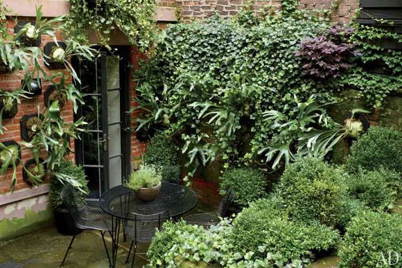
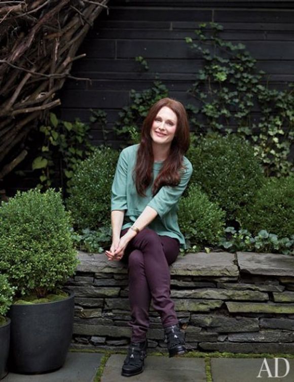
Someone commented here to remind me about Julianne Moore’s lovely new landscaping of her West Village brownstone. And then I was chatting with the lovely Joslyn (who was on the SF trip last weekend) about how awesome her yard is. Simple. Artsy. Pretty easy-care. This might be the right approach for us busy ladies.
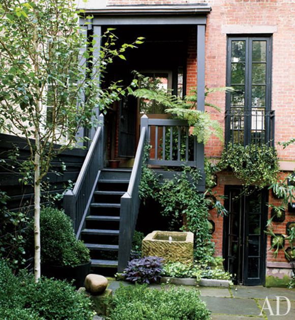
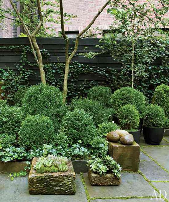
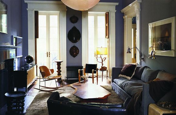
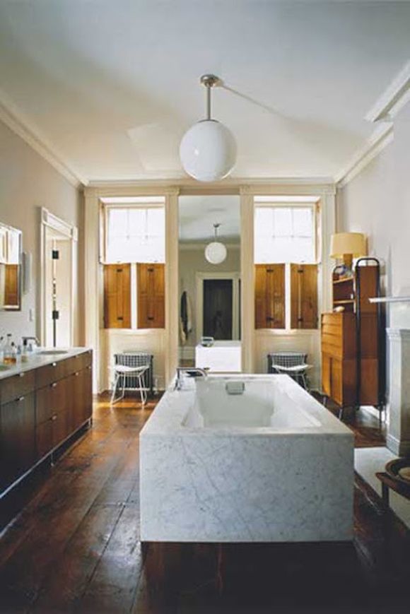
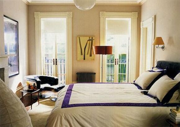
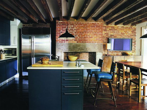
So I pulled up the article from Arch Digest on my flight home Saturday night. The photos really are cool (Her whole house has a great vibe – I’ve included photos from other shoots here, too).
I was super fascinated with this part of the article where Julianne mentions that she only wears and decorates with a handful of colors. She won’t buy it or bring it into her home unless it’s white, black, gray, green or purple. At first I was like…huh. But the idea has stayed with me all weekend.
Wasn’t it was Matisse who talked about how the beauty of art comes from the struggle of an artist and his limited medium? I think the idea works in designing a home.
As a decorator who usually uses a lot of color, I think I’m making my life harder by not limited my color palette a little. When there are infinite choices, it’s easier to make a misstep.
Although, let the record show, I am not usually in favor of matchy-matchy rooms and I think what we’re talking about is a very different approach. The key here is to vary the shades and tones of similar colors. Use peach and tangerine colors rather than the same bright orange on every accessory. Try mixing sky blue with cobalt. I doubt Julianne’s house is filled with the exact same shade of plum over and over again. It looks like she mixes plum with dusky gray lavender and deep burgundy, which feels lovely and warm.
What are your thoughts about limiting the color palette in your home? Do you love for things to match in your home?


I know there is a certain intensity/saturation of color that I tend to work in. I like the idea of limiting the palette for a project, that way a client really focuses in on the way their house is going to feel and the decisions are somewhat limited.
What a good question!
I for one definitely subscribe to a limited color palette… It really has worked for me as I have gotten older and refined my tastes. It makes for a cohesive look that is easy to live with. Don't get me wrong, our home has a lot going on but it flows nicely from space to space.
Best,
Terri
I lived in a studio for the past two years, so limiting was a necessity! We went with a warm brown and sage green color scheme (nice and neutral to satisfy both of us. I wanted all purple haha but that's just because I love it so much), and it's everywhere. It made it easy to buy things. I've had fun mixing patterns! on our pillows and rugs, etc.
I really, really like this idea! (and I love the outfit Julianne has on!!)
My wardrobe and my home were pretty limited in color (black, grey, brown, red, purple) until I moved into a new apartment with my honey–and boy does he love color. His favorite painting is a complicated, rainbow-hued modern piece, while mine is a fairy-tale illustration in the muted colors above. So the bedroom is decorated according to my color palette, and since orange is his favorite color I've used it to anchor the rest of the multi-colored house. It helps that it is so popular this year–I've even added a bunch of orange items to my wardrobe. And reading this blog has helped me come out of my color shell too! It's been a joy learning to embrace more color.
Hope you have a speedy recovery!!
I love this… I'm not a fan of matchy, but I think that limiting a color palette in a room can be a total success. Makes me want to add more plum/lavender/etc. to my home.
I love color as an artist yes, yes. I have found though at times I need softer calming shades for serenity at home, even if my art is colorful.
xoxo
Karena
2012 Artists Series
First of all, I can hardly see you making a misstep when it comes to design-everything you touch turns out awesome! I feel like this approach would help me as our house is in ongoing renovation mode. It makes it easier to make long term choices when there seems to be so many to make! Love this article-helpful reminder to someone who loves a lot of colors!
I'm not a fan of matchy-matchy, but I do tend to limit color palettes somewhat. I can't imagine limiting my wardrobe so severely, though.
I'm working hard on adding more color in my closet. I have to force myself to put back the grey and black every time i go shopping. It might be chic, but boy does it get depressing!
I have a palette that I tend to use for my clothes, and it rolls over to the soft furnishing that I use in my home.
The interesting thing about Julianne Moore's choice of colours is that they all contrast really well with her spectacular hair. Those colours would be the perfect backdrop, making her the star in any room she should choose to visit!
i am so GLAD you are back and feeling better. I have been so worried and scared for you. Thank God you are ok!!!!!! I couldn't quit thinking about you and what you must have been going through.
I hope you are feeling better and are healing up!!!!!!
Joni
cote de texas
i agree on having a limited palette simply because there are colors I don't like to look at (anything hot or contrasty). but I don't like matching anything, either. green, blue, purple, grey, wood, metal and i am good to go!
Glad you posted – hope this means you are on the mend!
What a beautiful garden and photos of it.
Autumn coloured warm greetings from Finland!
This is so much more than i needed!!! but will all come in use thanks!!
Bathroom Remodeling Arlington VA
I love this post. Having moved into a new and larger home, I am finding that my old design won't work well for this house. I wish I would've stuck to a more neutral and limited palette. It would save us a lot of money. The hard part is deciding what that palette should be and sticking to it.
I don't know about dressing in limited colours but as for decorating its been something I've been trying to do in my home for awhile now…brown, green, blue, white and black – I find that things can be moved around more from room to room – for me its beachy colours that calm and soothe me…so while it seems a limited palette there are shades of each and different textures that keep things from becoming stagnant
I guess by default, we all tend to limit the palette, especially in cities, where the limited space does not allow for a cacophony of colors to run riot, at least not with ease or comfort. I have always thought of my personal selections in terms of 18th century French architecture and the effects of "light". Old white walls as a base and then the reflective qualities of metals, mirror, porcelain, crystal, polished wood and fabrics in tones of gold (generally antiqued), silver (generally "Butler's finish") and bronze (ranging from gilt to dark), darks (woods and a deep taupe damask sofa as well as a wing chair in "Charleston Green" mohair velvet)) and lights (yellow and ivory damask pillows and a pale cream club chair, with hints of green here and there (which also references some of the bronzes). Note that the fabrics are chosen for the way light will play across them as much as for the color, thus keeping with the overarching theme. The varied colors in paintings seem to settle down visually within their silvered or gilded frames. The net effect is visually not unlike pictures of certain old French rooms; though there is a great variety and range of interest and color, if asked to categorize the room, a casual observer might say it is "white and gold". Additional big splashes of color never jar the effect, as it is always done through naturals, i.e. flowers- often in one color and type of flower, always contained within crystal or bronze vases. As others have noted about their own spaces, a lot is going on, but there is a clear sense of a guiding hand to it all, which settles everything and puts the room, and its occupants, at ease.
Oh, I definitely think that "limiting the color palette in your home" is quite different from having "things match in your home," just like you were saying. A huge difference between harmony and flow based on limited palettes and having matching colors. I totally love the idea of limiting your palatte, but then getting creative with analogous shades, and then throwing in a fun surprise of color. It is super wise to limit your palatte, in my opinion!
Great post!
I would have a hard time limiting my house pallets …and clothing? Forget it. I don't like too matchy, but I like things to flow. my walls are neutral (gray) but from there i have mixed in a lot of color. Luckily there are so many colors that look good together that I don't have to limit too much.
I would have a hard time limiting my house pallets …and clothing? Forget it. I don't like too matchy, but I like things to flow. my walls are neutral (gray) but from there i have mixed in a lot of color. Luckily there are so many colors that look good together that I don't have to limit too much.
What a great post. I've never thought about it but I guess I do that to a point – unintentionally. I find I repeatedly pick the same colors for rooms because those are the colors I love. So I guess I do have a few core colors that I stick with.
hmmm….interesting concept for sure! i have a color conceot for sure- white, brown, black, gray blue and yellow and for the most part I love it- but sometimes I do find myself craving a hot pink pillow or wall that I see:)
I think her house is very blah. The bedroom looks undecorated and not warm at all…same with her bathroom. It's definitely not charming and I prefer charming and cozy. Good thing there are different strokes for different folks– but hers doesn't work for me and sticking to a color palette for both home and wear is boring. I love your use of colors. They generate brightness and life!
Undecorated is the new decorated. And I love it. Her place feels comfortable and collected over time. It appears effortless but I don't think it's easy to do.
Jenny, have you read Celerie Kemble's latest book, "Black, White and a bit in between?" it's the same idea — expanding your creativity by working with a limited palette. And she's known for bold color, too, but it was a great exercise for her. –Courtney
So grateful you're home and feeling better! I don't know that I could limit my colors, but the idea of it sure makes life simpler! Now i'm going to be watching Julianne and noticing her colors!
Jenny, this is a cool idea. It's defintely a big change for you, but when you are decorating a whole house (not that you haven't before) it makes it really easy- like color by numbers ;)
I remember deciding when we moved into our lovely home about a year ago- that I would use neutrals (wood, brown, black, silver, bronze, white/cream) and my color pallete would be blue or red. It really worked out- navy walls, pops of turquoise, rust upholstery, light blue pillows, and bright red lamps. It provides a lot of texture without confusion.
Thanks for expalining this concept so eloquently!
I'd be curious to know where she over-winters all those staghorn ferns and the Australian fern. They'd be gone with the first drop below 35.
I have a small bungalow and the rooms all kind of open in to each other. I picked a pale warm color for the walls and used it throughout the house but in various shades. I also did the same with my trim color, using the same creamy white but in different strengthens and finishes. All of my rooms have a similar color palate but each room picks up one of the base colors as a feature color. It makes the house have put together look without being to matchy-matchy.
OHay! Glad you are back.
And I was JUST thinking about this.
My business partner, Isabel, and I were just in SC supervising the first printing of the fabrics for Biscuit and we came to the same-ish conclusion. When we were initially designing the prints we would pick whatever pink, green, yellow etc. we wanted. At the factory it was overwhelming when a color came back not quite right having to go to the pantone infinite playbook and start over, so we decided to create a sort of color guideline for the brand.
It's slightly different for us because we are creating products for the marketplace as a whole so we can't limit ourselves to just green and purple, but deciding on a few greens that work, a few purples, etc. and trying to stick with those throughout the applications was AMAZING! So many prints where we had planned to use a more obvious green, we went with the chartreuse that will be one of our signatures, and it made everything so much more interesting.
That was really long. But I do agree that imposing some limitations on yourself can, at times, cure a little decorators block.
I noticed recently that I have unintentionally done this with my wardrobe – pretty much everything I own is in shades of blue, green, black, white, or khaki/beige, though I do have a couple hits (one skirt, one top, and one dress) in a tomato red. I'm drawn to those colors continually, and it's super easy to mix and match. Maybe I should come up with a more limited palette for my house …
PS glad you are feeling better!
I definitely limit at home. Too much pattern and color tires me out. For clothes – all over the color wheel right now.
I think the principle creates a beautiful space, yet I know that I feed off the vibe that a colorful, and unexpected, living space gives me. So, red, orange, yellow, green, blue…and not purple. Although, I usually limit a room to two or three particular tones or shades and the other colors are interesting accents. But now that I think about it, I rely on gold and glass pieces to give the room a unified feeling amongst all the color. It works.
This is such an interesting idea. It never really occured to me to limit my color palette in decorating and fashion. I adore the color green and sort of have to fight myself not to paint every room in my house green, but maybe I shouldn't push against this idea so much. Something to think about. Thanks for this great post, Jenny!
Absolutely I do! I am not an expert color-mixer anyway, so when I try to add too much color, it usually comes out looking not-so-great.
I let art bring color into my house, since it doesn't have to match, and then use texture to keep it interesting.
Works for me, and then I don't have to keep up with the "it" colors for the year, which I love. I'll buy every color of the year in lipsticks, which are much less expensive and permanent than upholstering a chair in a color that will look dated next year.
This is such a neat concept, and one I think I should employ in my own apartment. I've been so busy trying to figure out how all of our art & furniture goes together- and it would be so much simpler if I drew from a limited color palette! Thanks for this idea!
I have a similar rule to Julianne Moore, I only bring white, black, grey, green and blue in usually. And use different shades of those colors. I use orange for subtle pops here and there. It makes things flow nicer. I always say less is more. But pops of color are great, I use fresh flowers in my apartment to bring pops of color in the most.
I am open to all colors for wardrobe, that should never be limited, otherwise your wardrobe is boring. You can be more adventurous with clothes cause you only wear your outfit for the day, your home you live in day in and day out so it needs to be something you won't get sick of.
love your blog!
-Taylor
Taylor Morgan Design Blog
I wonder how Julianne Moore would explain her dress from the Emmys the other night. I bet someone talked her into it. It was definitely NOT in her palette.
Jenny, I love your use of color.
I love this post. I've never commented before, but this is something I've been thinking about a lot lately! Tim Ferris recently wrote about ego-depletion and how we start each day able to make only a limited amount of decisions. http://www.fourhourworkweek.com/blog/2012/08/12/understanding-the-dangers-of-ego-depletion/
It led me to think that if I only buy clothes, furnishings, etc – in a few colors… that frees up more decisions for the rest of my day – maybe like going to the gym or eating a healthy dinner. It's a very interesting concept!
Hi jenny,
I love thinking about these types of design questions. And I agree. I'm not a fan of matchy matchy. But and this is a big but I am a fan of what "works" with my aesthetic and what doesn't. To that extent I think using a limited pallette or medium makes the process of choosing items easier. Less mistakes are made. But I do feel there is a downside here. Risk is involved in exceptional decorating. Sometimes things "work" and sometimes they don't. Mistakes are necessary from time to time to really create an exceptional space. So while safe is well, safe I would vote for a little more "out of the box" strategy when it comes to decorating my home.
k
I think limiting the palette in your home gives a sense of cohesion. The colors I choose to wear for clothing all depend on my mood.
I work with a limited palette. For my wardrobe its black, pinks, purples, blues and greens. For my home its blues (turquoise, aqua and cobalt), pea/leaf green with black and white. The home felt kind of one dimensional. Yesterday I brought in some fuchsia pillows and accessories and it brought the space alive. I also live in about 750 sq. ft. so limiting my colors is almost a necessity.
I have found over the years that I need to limit my color palette, considering I change things so often. It's easier if I don't have to repaint/buy a bunch of new stuff. My colors are green, blue and orange mixed with lots of neutrals. It's pretty consistent through out my house, so I can move things around easily.
I think that it is very smart when decorating your home to limit your color pallet. It provides unity to the house, but that doesnt mean that you can add pops of other colors. I agree with you on using varying shades of the colors you choose AND using varying textures is important too.
I tend to limit my color choices, but because I have limited decorating talents. I had always thought this was a hallmark of genius decorators. That they could pick out the final elements that harmonize with the room in texture, style and color without competing with any of the elements within it. I like the idea of rooms transitioning well from room to room, but the above images, and the space I'm in seems a bit flat and cold.
Julianne Moore's such a classic beauty and what timeless beautiful and comfortable home.
It's funny, but the colors Ms. Moore likes are also flattering to her coloring. Thanks for the post and making me think because the more I get exposed to lovely things with the discovery of blogs (yours is truly the first I go too) the more I think my house is getting slightly off balance. But I wouldn't trade it for the days of just the pottery barn catalog for inspiration.