
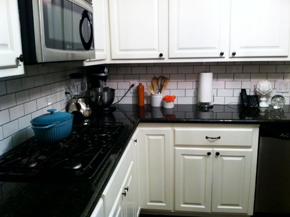
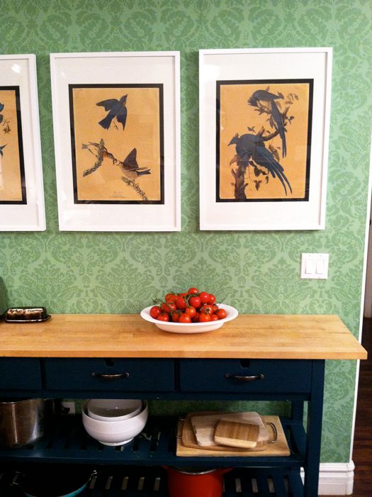
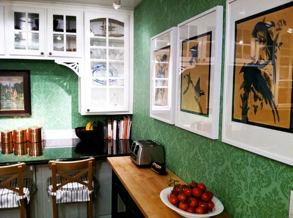
Like I mentioned earlier, the main part of my mom’s kitchen is very white. So when we added the green wallpaper and painted the island navy blue, it seemed like a good idea to add some white to that side of the room to get some more balance.
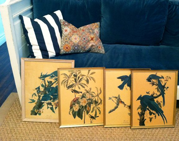
When I imagined what art we were going to put over the island, I really wanted two big botanical prints with fruits and vegetables. I did a little searching and nothing I found was the right size or price. So we went antique shopping and found these antique Audobon prints for $26 for all four.
We decided to use just the three blue bird prints in the kitchen and to put the yellow finches in another room. These definitely needed to be reframed though.
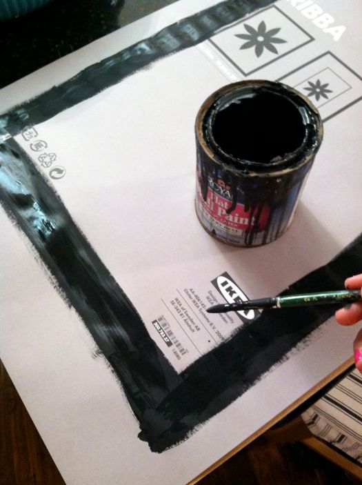
I love the modern look and the very reasonable price of IKEA’s Ribba frames. My only complaint is the long, european sizing of the mats. It makes framing standard US sized prints very tricky. And getting custom mats cut is more expensive than these frames so we needed a make-it-work solution.
I thought about getting some velvet ribbon to cover the gap between the matting and the print, but first I thought I’d try just painting out the gap. I used a little bit of flat black latex paint right on the paper that comes with the frame. I didn’t thinking it would work because it was a little ripple-y at first, but it dried pretty flat.
I LOVE the way the black accents the print. It looks really custom, right?
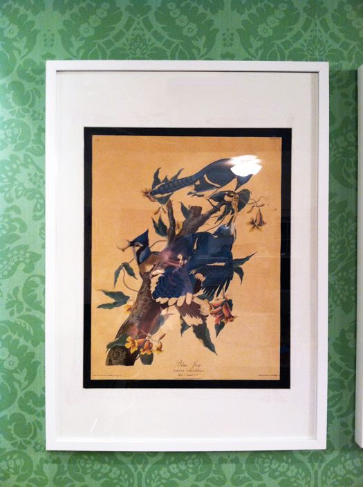
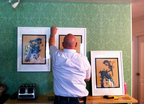
We hung the frames 3″ apart from each other, which is how far apart I usually hang frames in gallery walls.
So, I guess I have two complaints about the Ribba frames. Those lame wire hanging mechanisms on the back always slip and are such a pain to use. And if you hang the frame just by the lip of the moulding, it eventually stretches the wood and the frame begins to sag.
To fix the problem, we bought some of these keyhole fasteners:
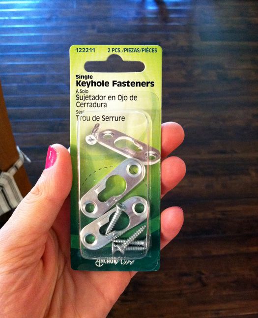
And attached them along the top corners of the frame, using a drill and the provided screws. It’s a good idea to make a little pilot hole first to avoid any splitting.
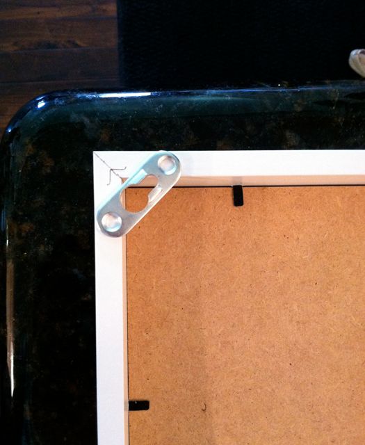
We did a little marking and then my Dad drilled in a couple Wall Dog screws to hang these.


nicely executed. also, using the wallpaper behind the birds inside the frame could be an option, so they literally look as if they landed.
pve
Kristen – your dream room sounds beautiful! I think if your entire house is done in a particular color scheme it can be had to break free of that in one room. The most important factor is how open the room is to rest of the house. If it is pretty closed off, I say go for it. If not, maybe you can make some subtle changes to the adjoining rooms to bring in the new colors?
Good luck!
Brilliant! I would have thought that the paper would remain rippled. So glad to know this. The vintage prints look as though they were made to go there. It all came together so nicely. Congrats.
Just perfect! It's great to find that one of a kind set and nice fixes on the frames. I do like the ribbon–and the green background with the blue is wonderful.
The blue of the birds is just the right touch with the blue table. Love this whole space redesign.
I love the idea of painting out the gap, it really makes the prints pop. I may have to give this a go this weekend, thanks for the inspiration!
Amy
I have the same complaint re the mat size of Ribba frames. I really love how you solved this problem by painting the gap. It look seamless.
Love it! What a creative solution, and it looks great. Thanks for sharing :)
What a fantastic idea. Definitely looks custom. I'll have to remember this idea. Great job!
I love how the prints really pop because of the black border! Nice job with this whole redesign. The green, navy, white combo is really pretty together!
Wow! The pictures look great! I love the black border.
Love seeing creative and attractive ways to use ikea–because it's so cheap and easy! Nice framing can cost a fortune, but your budget version looks fabulous! I bet your mom is thrilled!
I LOVE it!!!
Lilac and Grey
PS. I have antique hand sewn silk "prints" that I need to frame and hang..you just reminded me!
Love these! And thanks for the tip on the Ribba frames. I love the way they look but I hate trying to hang them.
How pretty that looks! And no one could ever tell it's paint on cheap ikea paper. It looks so sharp. Good job!
That paint trick is amazing!
And I'm feeling your pain on the ikea hanging hardware – I just hung 8 ribba frames yesterday. I finally figured out a little hack to get them up quickly and easily and I'm kicking myself for not having it up on my blog yet. I'm posting it soon though.
Anyway, loving the prints! Looks so expensive!
Looks great! You are so good!
Lovely. Old prints add so much character to almost anything.
How did you affix the prints to the paper backing? Spray adhesive? Other?
beautiful! i love the prints and the way the blue picks up the color of the island. i also love your solution for the Ikea frames (I continue to be vexed by the EU sizing too)– and have just noticed the top of the frames starting to sag. thanks to you for the brilliant solutions!
These look incredible. I'm constantly in awe of the things you do and how it turns out. Thank you for having the style and eye that you do, and for making it so easy to replicate!
Perfectly timed! Just bought a bunch of Ribba frames with mats that are incompatible with the dimensions of my art!
Jenny! One of my favorites of yours to date. As always, your color combinations are brilliant.
I'm dying to know the fabric on the sofa/ pillows from the photo of the four leaning pieces of art before they were hung. Thanks so much for sharing!
xoxo Heidi
You never cease to amaze me! I hung a gallery wall of 12 of those ribba frames…ended up using double sided tape. I thought they were so secure that they would never come down, but they are starting to fall one by one. So disappointing!!They are really impossible to hang, it was kind of a nightmare!! I love your hack but am worried I won't be able to get them straight enough…
These are gorgeous! Where did you find the prints? Adore them and the colors are amazing!
they really do look fab! the whole project does, really. can't believe you transformed that space so quickly!
They look great! I love the idea of painting the paper behind the prints. When I've used the Ribba frames in the past, I've had to cut the mats to fit with an exacto knife. But, the cut mats didn't look great, so I ended up covering them in linen.
Gurl you is good! Genius. Timmy hugs!
They look great !!
xxLily
goldandgray.com
I despise the Ikea wires, too, because I can never get a grouping of frames to be perfect. Thank you so much for the suggestion of using keyhole fasteners. You have no idea how happy this makes me!
Ikea to the rescue again. Love the frames and your idea to paint out a mat! Also, thx for the hanging tip. The little bit of extra hardware has a big reward in not having to straighten out your pictures forever after…
Such a great fix with the hangers. Those have driven me crazy as well. That wall has such great impact.
I don't see a ton of interactive reader discussions here (long time lurker here!) but was wondering what people thought of mixing colors from room to room. Right now my house has a great flow from room to room in a warm and somewhat bright color palette (forest greens, bright and warm yellows, reds and lots of metals). However, I've been *dying* to do a room in greys and this fab ceramic lamp that I bought (on sale, woot!) in this rich amazing blue-green. Then I';m dipping in towards these fab grey-black-white-yellow combos. They will *totally* clash with the rest of the house, but I am obsessing about doing this room – even DREAMING about it. It's bad. LOL. What do you all think of mixing up the rooms and destroying the flow? I want to hang grass paper, stain/paint furniture, stencil – so it's a big commitment. I'm torn every day between jumping in and wondering if I'll jsut regret it later (but then again it might be my favorite room in the house…)
Kristen – your dream room sounds beautiful! I think if your entire house is done in a particular color scheme it can be had to break free of that in one room. The most important factor is how open the room is to rest of the house. If it is pretty closed off, I say go for it. If not, maybe you can make some subtle changes to the adjoining rooms to bring in the new colors?
Good luck!
well done! and so simple. :)
Maybe I missed this Jenny but am wondering if the painted island is also from IKEA. What was it like before you (so beautifully) painted it?
I love the the entire look of your moms kitchen. Thanks for sharing it all – and especially thank you for your hacks and ideas and (especially upholstery) pictures!
You have a gift of teaching and encouraging as well as your lovely practical gift of design. Thank you.
Jenny, thanks for responding. It really won't flow. The room is a guest room/my craft room at the top of the stairs (forest green walls, cream carpet) next to my office (bright yellow walls, warm funiture, kind of palm beach meets old colony house) and master bedroom (pale yellow, copper metals, and dark wood and pale yellow bathroom with champagne gold highlights). I just bought a gorgeous murphy bed off craigslist and an amazing grey rug. In my mind this room is amazing. I'd have to really work to not make it jarring. But I really really really really want this room.
Anyway, not trying to source for free advice – just wondering if other people face this dilemma too? It really won't work in the house. But I'm also literally obsessing over it.
SIGH. :)
I did a similar thing to some ikea frames. i added ribbon to the top and bottom where there was a gap. it really didn't bother me in the end and actually looked more expensive.
Love the kelly green wallpaper!
lavitapetite.wordpress.com
Such a good idea! I am going to be doing this to an Ikea framed print that has been annoying me for months! :)
You are so crafty! How did you learn to do all this stuff?
I love how this turned out! Very surprising. If I were you I'd invest in a mat cutter though. I was scared of cutting my own mats for the longest time until I finally borrowed my mom's mat cutter and gave it a shot. Really easy and SO gratifying to get a custom job done for next to nothing! I got to addicted to it I bought one of my own and it's almost paid for itself.
i love this look. i bet your parents love you coming into town!
I love it! They do look really custom and expensive, nice job!
Great idea with the black paint, it really sets them off and makes them look more expensive!!
It all turned out so well! Truly fantastic job! I LOVE the prints you found, looks fantastic against the wallpaper!
The black paint is SUCH a great idea…it's looks fab!
I can't believe how well that worked out! I always struggle with those ikea frames too. Such a great solution and that black really accents the artwork!
So amazing! I work at IKEA and I always love seeing the hacks people come up with to make an IKEA item their own. I might have to steal this one to use on the new Ödby frames. Thanks for sharing!
For future projects, you can also look at the large (poster sized) archival quality craft paper from Jo-Ann. It's maybe a dollar per sheet. I have mounted things on it as a kind of background mat.
Love it Jenny! They came out wonderfully! Bravo!
Nice how the pictures worked out. I suggest, for those who might find drilling for the keyhole fasteners to be intimidating, that you can get the same effect by hanging the pictures by the wire AND using tabs of Velcro in each of the corners; it keeps the picture in place. Use black Velcro, since it fades into the shadow cast by the frame and put it about 1/4 inch in from edge so it is not easily noticeable. When you use Velcro, you can even hang pictures on a closet door, without fear of them shifting when the door is opened.