Kids Room

Dear Jenny: Can I Use a Rug on my Wall-to-Wall Carpet?

Here’s a question from a reader that I know many of you living in newer homes have asked yourself: Hi Jenny,I am helping with a friend on her house (just a few ideas for her girl’s nursery) & I suggested that she put a rug on top of her carpet. She declined & I persisted….

Here’s a question from a reader that I know many of you living in newer homes have asked yourself:

Hi Jenny,
I am helping with a friend on her house (just a few ideas for her girl’s nursery) & I suggested that she put a rug on top of her carpet. She declined & I persisted. :) She finally said she thinks it looks tacky & cheap. Oh no! I have never thought that and I’m wondering if I’m way off-base. Does it just depend on the type of rug (weight of it) or do rugs on top of carpet always look tacky?

I’m going to open this one up to the comments section, because I think the vote is going to be pretty split. Also my answer is a pretty lame one: it depends. I think overall, I prefer no area rugs on top of wall-to-wall carpeting, at least carpeting that has a pile greater than 1/2″. I feel like the area rug never sits right on top of shaggier carpet.

Here are some examples that I do like in kids rooms. Notice how low the pile is with all of these carpets:


Serena and Lily


House and Home Magazine


unknown


Marie Claire Maison


Coastal Living


Angie Hranowsky (thanks Vinyasa Mama for the source!)

And of course, I LOVE the look of an area rug layered on top of natural fiber rugs or flooring.


Lonny


O at Home


Country Living


Peter Dunham

When we rented a house in Delaware last year, our bedrooms upstairs had carpeting and I opted out of floor rugs. I actually felt like it was a bit of a bonus. Rugs are EXPENSIVE!! If you were counting on the rug to add some pattern or to define the space, use the hundreds of dollars you’re saving to invest in a pair of benches with a great pattern. Or amazing window treatments.

What do you think, readers? Do any of you have area rugs layered on top of your carpet? How is it working for you?

P.S. If you have a very general question about home decor that you would like to see answered here, please email your submission to jenny @jennykomenda.com. Please keep the emails brief and remember that the question should be relevant to most LGN readers.

**PPS As I was waiting for the photos to upload for this post, I was lost in thought, staring at my desk. Suddenly I realized that what I was staring at was an area rug on top of high pile carpet on the cover of this month’s Elle Decor! Looks great here:

Musings

Trash Bin

To the right of our kitchen island we keep a stainless trash can with a step mechanism. We use that garbage bin all of the time, so I’m okay with keeping it out in full view (we don’t really have a place to tuck away the trash anyway). Our current bin is pretty standard and…

To the right of our kitchen island we keep a stainless trash can with a step mechanism. We use that garbage bin all of the time, so I’m okay with keeping it out in full view (we don’t really have a place to tuck away the trash anyway). Our current bin is pretty standard and the look of it is not completely offensive, but the step mechanism is a little…labored, and also I feel like it doesn’t hold bin liners very well.

I’m loving the industrial look of Martha’s garbage bins, available here in white, stainless and red. I’m considering the standard 12 Gallon size in white. The best part is these are commercial-grade, so I’m the thinking they can really stand up to my cooking marathons and the clean up from my kids’ art projects.

Any other suggestions for a great-looking, super functional trash bin? My friend has this SimpleHuman butterfly style bin and loves it.

Furniture

Sneak Peek: Living Room Bookshelves

I thought you might enjoy some ‘during shots’ of the bookshelf project. As a reminder, here’s the before: Then I added stud-shaped moulding from Michaels. Subtle, but a cool discovery if you’re looking close. (And isn’t that what home decor is all about? I love little surprises.) So when it came to choosing a paint…

I thought you might enjoy some ‘during shots’ of the bookshelf project. As a reminder, here’s the before:

Then I added stud-shaped moulding from Michaels. Subtle, but a cool discovery if you’re looking close. (And isn’t that what home decor is all about? I love little surprises.)

So when it came to choosing a paint color for this piece, I went back and forth a lot. I almost did a soft blue gray color so it would be less of a presence in the space. But I decided to try the crazy color combo first and save the blue gray idea as a back up plan. I’m really glad I didn’t do the blue gray because I ended up painting the fretwork cabinets pale blue (they were white at the time) and I’m really happy with that color there.

So what crazy colors did I go with? My mom was in town visiting at the time and she suggested coral pink for the inside (genius that she is).

I picked up a quart of Benjamin Moore’s Mixed Fruit (2011-50) in semi-gloss and my sweet mom did all the painting for me. Here’s the first coat:

And then the second coat. We’re thinking, okay, looking pretty good, but we’ll see…

You can see in this real estate listing photo that our kitchen is all black, which I actually really like. When your kitchen is front and center, it’s best for the appliances and cabinets to sort of fade away. I wanted to carry some of that black over to the living room. We thought it would be nice to frame out the shelves in black and then do the coral on the inside.


In case you’re confused by this picture, we added temporary walls to split up the space into bedrooms. This is how the loft looked when we moved in. The door to the girls’ room and the bookshelf is directly to the left of the stove area, only set back a couple feet.

We put that first coat of hi gloss black paint on the shelves and we knew we had made a good choice.

I love the contrast.

The orangey coral feels so Dorothy Draper/Greenbrier to me. You’ll die when you see how great it looks with the black kitchen (and my new persian rug!!). I’m wrapping up the kitchen island project and then I’ll share photos.

P.S. If you look close here you can see I added some little white and black mini-floral trim to the shades. Such an easy fix that made me like the shades 1000x more. Still moving them to make way for my GG sconces though! :)
Living Room

Inspiration: Book Shelf Styling

When I’m styling a bookshelf, I try to keep the tchotckies under control. I like books a lot and think they should be the star of the shelves normally. We’re going to have a wall of books in the office (no accessories at all probably) so for the bookshelf under the new sconces in the…

When I’m styling a bookshelf, I try to keep the tchotckies under control. I like books a lot and think they should be the star of the shelves normally. We’re going to have a wall of books in the office (no accessories at all probably) so for the bookshelf under the new sconces in the living room, I’m going to mix things up a little. Probably like half books, half accessories.

Here are some inspiration shots. Let’s play a little game of I Spy.

I spy with my little eye books arranged by color, but not in an annoying perfect sort of way. Sort of just stacked and piled by tone. Also, I like all the family photos grouped on the shelf. It’s a good idea to keep things that are meant to be examined at eye level.


Kelly Klein via Habitually Chic

I love the square shape of these shelves. It makes it easier to display larger pieces like the coral and that big turquoise pottery. I would want to check out the contents of these shelves a little closer if I were a visitor here.

It’s a good idea to add some bigger pieces to break it up and add a little storage. Try hat boxes, shaker boxes, baskets, lacquered boxes, lidded candy dishes, etc. I also love the yellow on the back of the shelves here.


House Beautiful

This designer left out some of the shelves to make space for bigger artwork and taller accessories. What do you think of this look? I do like some of the bookends here a lot. Pieces like the brass rams are easy to find in thrift stores or on etsy.


M Designs via La Dolce Vita

These shelves are really pretty. Not many books, and the ones here are covered in kraft paper, which is pretty for a more styled look. I love that ostrich egg and that cage/terrarium thing on the bottom shelf. So cool. Also, pretty obsessed with this color of gray.

I looove the coziness of this photo. The slouchy couch. The laid back book arrangement. I also love the Staffordshire doggies, the ginger jar and the bullseye mirror. The little checkerboard is also awesome and a nice graphic touch. I’ve been wanting to incorporate some sort of game board in our house too. Checkerboard or maybe backgammon…

Look! A television!! I like this idea of incorporating a TV into your built-ins.


Lonny

Lots to love on these shelves. I think the designer did a good job of leaving just enough empty space on the shelves (though I would probably prefer more books in the mix here). I think it’s easy to overload the shelves and the layers, so be careful there. I think you’d want a maximum of five types of accessories on a single shelf (books count for one type of accessory here).


Martensen via Desire to Inspire

These shelves are more crowded, but I think the trick is the colors are all pretty muted. I love that these items all feel very purposeful and collected – like the owner probably has a cool adventure story behind each object.


Jaime’s (I Suwanee) Bookcase of the Day

Another one with some shelves removed for art. Love that ladder!


Martha Stewart Living

Fun and quirky for a teenager’s room…


Betsy Burnham via Decor Demon

I love the burl wood frame here. And this is just the right mix of books to accessories for me.


Summer Heckman in Lonny

More square shelves! Galvanized metal here maybe? I like how these are casually stacked. The color groupings flow nicely for a great overall composition.


Nuevo Estilo

Colorful and pretty. Love the turquoise vase and the modern artwork up top especially. I also spy a pair of candlesticks, two different types of coral, a beautiful tortoise shell glass vase, a zinc letter and little framed pieces of art on easels.


Ashley Mcaleer in Domino

Off to style my shelves which I’ll share soon. (P.S. You’re going to love the paint job!)
xx
Tips of the Trade

Layering: Floral Pillows

**Wow, this turned out to be a wordy post. Apologies in advance.** When I posted last week about how I like to work in layers on decorating projects, I got some comments and email feedback asking for elaboration. I’ve been wanting to share my new pillows anyway, so I thought maybe I’d share a little…

**Wow, this turned out to be a wordy post. Apologies in advance.**

When I posted last week about how I like to work in layers on decorating projects, I got some comments and email feedback asking for elaboration. I’ve been wanting to share my new pillows anyway, so I thought maybe I’d share a little bit more about my overall approach to decorating a space. It’s not fool-proof, but this has been pretty tried and true over the years for me.

Here’s how I get to the first foundation layer with a client. If I can have these three questions flushed out at our first meeting, we are in good shape.

1) How do you live in the space?

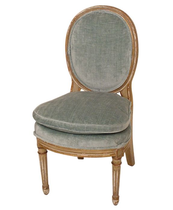
So, the first point is obvious, but so important. What is the primary function for the space? And be honest with yourself. It’s okay if you mostly watch tv in your living room. It’s easy to convince yourself that a pair of lovely little antique chairs would be perfect for your space because they are so amazing to look at. But if the chairs are uncomfortable – no one will ever sit there. Waste of space. Waste of money. Function comes first.

{BUT! If you have the room in your budget, get those chairs you love and put them where the function of the seats would be different, like in a bedroom or in an entry.}

2) What has to stay?

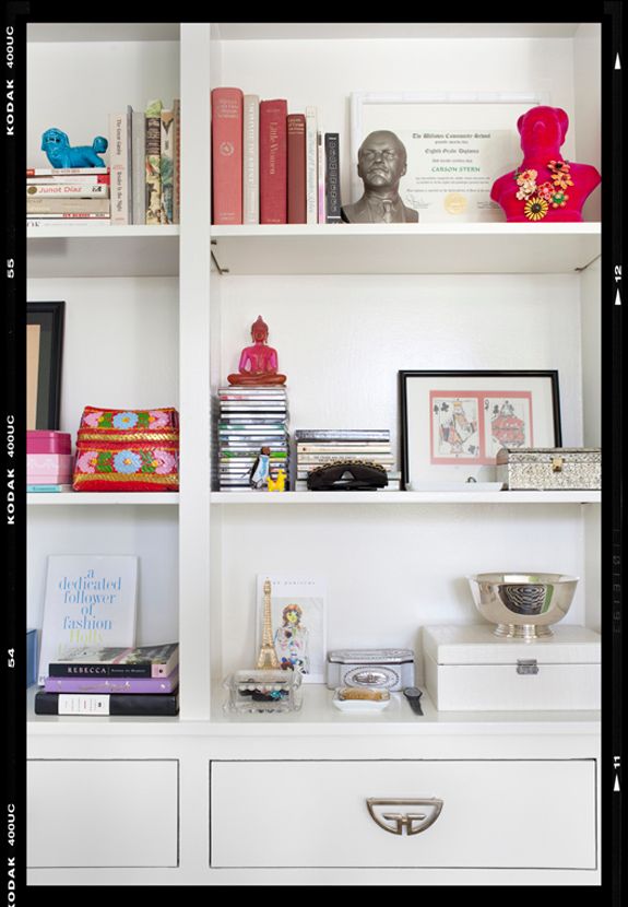
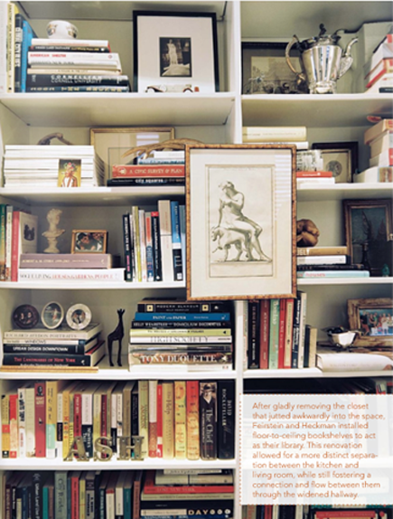
Deciding what has to stay and what can go is a really great way to overcome decorator’s block. People will sit and stare at their old furniture and accessories and work and rework configurations and feel like nothing fits right. Or, and this is a really tricky one, people will fall in love with a handful of fabrics and run themselves in circles trying to figure out how to use them all together. Don’t let that happen to you. It’s okay to love a piece of furniture or a fabric and decide to not incorporate it into your home.

Be a ruthless editor. Do you love it? Do you use it? Does it work well with what you DO love and use? If not, can it go elsewhere? Or can you sell it and then maybe buy something better for the room? Try to only keep things that have both form and function perfectly suited to your space and to your budget. (which is a whole other post for another time – decorating for your budget)

3) What’s your inspiration piece going to be?

Once you’ve put on your Editor’s hat and made an inventory of the items you’re keeping, the exciting part starts! When I decorate rooms in my own house, I like to pick one serious statement item for each space. A piece of furniture, a fabric pattern or a colorful work of art.

This is key: Don’t get caught up in matching everything in the room to that inspiration piece. Just use it as the first piece of the puzzle and build from there. A room where everything matches perfectly can feel lifeless and flat, so try to mix it up. Throw in a random color that’s nowhere to be found in your inspiration. Use an accent color that’s four shades darker than the color found in your inspiration fabric.

Rather than mastering the matching of fabrics and furniture, focus on nailing the mix.

Here’s some applied theory. I am probably on the second layer of decorating my living room and it’s starting to come together. But, this is how I figured out the first layer.

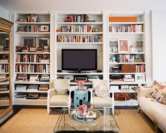
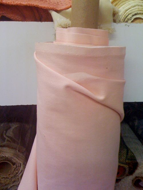
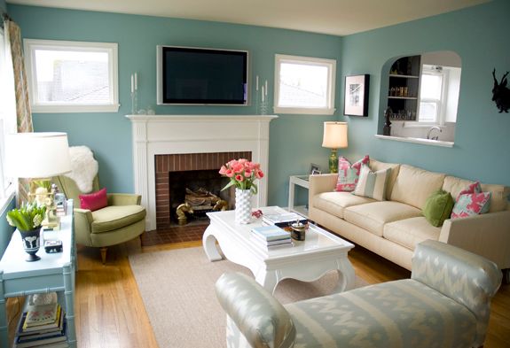
1) For us, our living room is used for one part tv-watching (just keeping it real here, folks), one part hosting (we like to have friends over), and one part kids play room (though toys are usually corralled in the girls room, just a few feet away). This all means we need kid-friendly and comfortable seating and lots of floor space. I bought a new slip-covered sofa and had our green linen LEE roll arm reupholstered in an outdoor velvet and I bought a pair of arm chairs (posts coming soon about the specifics). We opted out of a coffee table so we could have more room for the kids to run around. And we got rid of the old ottoman because I’m not planning on having another baby for a while (ba dum dum).

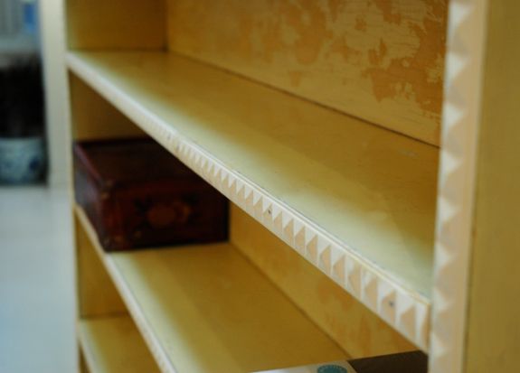
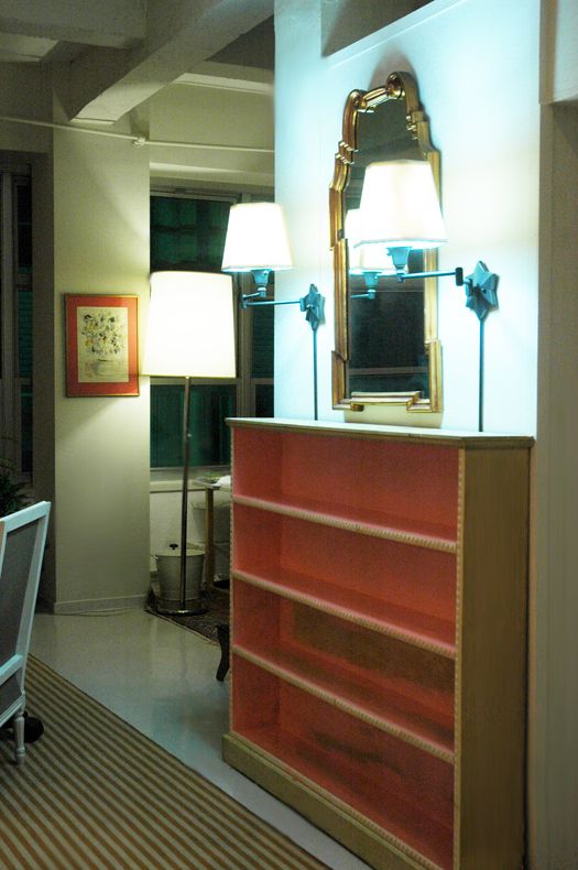
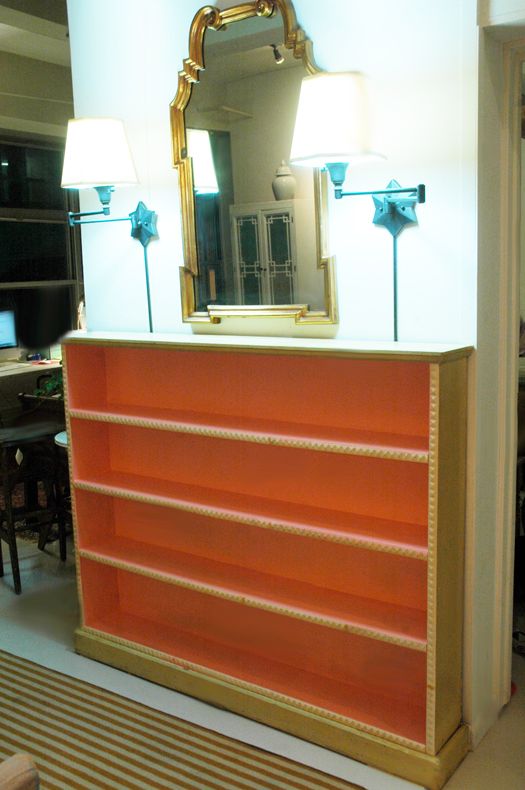
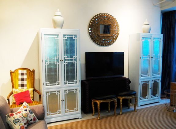
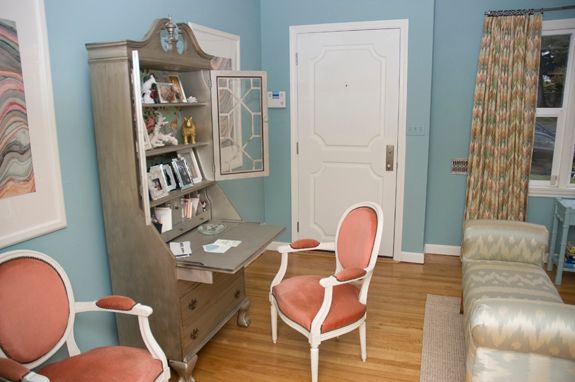
We do have lots of side tables and the big red credenza as flat surfaces for books and drinks, etc. And we have a pair of extra benches that sit in front of the tv for extra seating (and to keep Evie out of the DVDs). Also, despite my huge sale last summer, I still have ridiculous amounts of stuff, so the two armoires act as great storage for china collections, picture frames and other accessories not currently in rotation.

I tried to buy and place things in our living room with purpose. I sold stuff that I still liked, but knew wouldn’t work for us here in a loft apartment. And I kept things that fit the space and our needs and that were investment pieces, like the LEE sofa. I’m pretty sure we’ll have this thing for decades to come. It is as sturdy as can be and I love the pretty shape. But best of all, it is so dang comfortable. We call it the nappin’ couch.

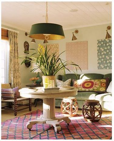
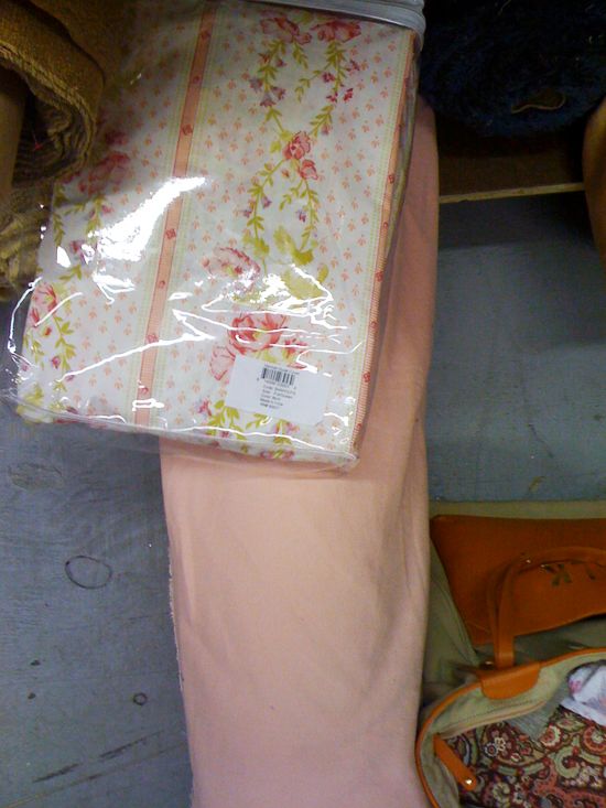
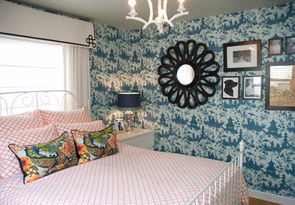
Since the LEE is the last thing your eye stops at when you walk into our apartment, I knew the inspiration item needed to be some killer pillows. I searched high and low for just the right pattern. I wanted something colorful, floral and modern. I thought a lot about this Designer’s Guild pattern, called Rugosa, but the scale is really better suited for drapery.

But right next to it was the heart-stopping Orangerie. For some reason, I had never seen this pattern before (though I’ve recently seen it used as wallpaper).

The colors are amazing. The pattern is big and bold, with a crisp white background and there’s lots of black, which I like in florals. And I love that the flowers have this really lovely hand-painted quality.

It’s a pricey fabric, but I only needed a little more than a yard to make two 12×36 lumbar pillows. To help justify the cost of the fabric, I sewed the pillows myself and I’m so proud of the black piping and the invisible zipper. Each side has a different scene (the repeat on this fabric is huge), so I can flip and switch these up to see different flowers and colors. Also, they’re fully lined and the inside edges are serged to help them stand up to washings.

We’ve had a chance to live with these pillows for a bit now, and I have to say that I’m a big fan of the long lumbar style, especially for a deep couch like ours. The pillows provide nice back support, but don’t get in the way at all like big square throw pillows sometimes do.

PHEW. 10 points for you if you’re still reading this.

I’m beat, so here’s the conclusion in a nutshell: Once we had figured out the function of the space, the main pieces we needed and then the inspiration fabric, I have been able to sort of build a master plan. After deciding on the floral pattern, I knew I wanted a striped rug. From that, I knew it made the most sense to do a solid color on the curtains. The next step is reupholstering the arm chairs in a small scale print and making a skirt for the tv console with a more organic/flowy pattern, like an ikat. The next layer will be the smaller stuff: reupholstering and painting the rope benches, pillows for the chairs and the gray sofa, lamp shade changes, throws, accessories, etc. I’m not really even thinking about what I’ll do for that layer until I get there and can see what colors and pattern scale I’m lacking in the room.

I’ve learned the rooms I like the best aren’t usually designed with moodboards in one day or even a week. I think you’ll be most happy with your space if you move a little slower and try to decorate in layers.

Aaannd, I just want to point out lastly that it’s 75 degrees here in NYC today! Awesome. I’m looking forward to lots more one on one time with Evie’s belly, which has been absolutely neglected all winter long and needs lots of tickling and squeezing.

Musings

Gossip Girl Sconces

I bookmarked this post from Things That Inspire (a really lovely blog) waaay back in 2007. Holly featured some screen shots of these sconces on the set of Gossip Girl (P.S. remember that first season of GG? When the plot was semi-interesting and the fashion oh-so-good?). Anyway, I remember noticing those sconces on the show…

I bookmarked this post from Things That Inspire (a really lovely blog) waaay back in 2007. Holly featured some screen shots of these sconces on the set of Gossip Girl (P.S. remember that first season of GG? When the plot was semi-interesting and the fashion oh-so-good?).

Anyway, I remember noticing those sconces on the show too, and seeing Holly’s post confirmed that I wanted/needed/could no longer live without these sconces in my life. To me, they are lighting perfection. A little traditional, a little modern, a little floral, a little quirky.

Somehow I survived for a couple years without them (when I first saw the post no one really knew who made the sconces), but I thought of them fondly from time to time.

A follow up post left some of us wondering if they were made by French lighting designer Jean Royere, who made these lovelies below, priced at about $30,000 each. So beautiful, but…yikes.

Fast forward a couple years. I have this situation in my house (at least this is how it looked mid-project a month or two ago):

I love the star wall sconces, but I’ve decided to move them around the corner to the daybed wall. They’ll be perfect there, but I was at square one again with sconces above my bookshelf.

On Bowery, sort of where China Town is melting into SOHO, there is a string of lighting stores that carry some nice lines like Circa and Visual Comfort. I bought these Thomas OBrien sconces for a client there and thought about just getting a pair for myself too.

But then I stumbled into a little store on Delancey called Lighting Craftsman. You know when a place looks not at all promising from the outside and then you walk in and your insides start screaming and freaking out and you’re all ohmygoshohmygoshohmygosh under your breath? That’s how I felt when I walked into this place that does all custom brass light fixtures.

And then, my brain completely exploded. BAM:

Turns out the GG set designer commissioned this shop to make the sconces and they still offer the design to retail and trade customers. They aren’t exactly cheap at $200-$300 depending on the size and the number of arms, but they are really, really lovely (will be even more so with new shades a la the Royere numbers above) and I’ll be so thrilled to see them in my home some time next week. It’s been a long time coming.

Why Don't You

Abbey’s Mirror

Over the past few months, I have been working with Abbey Nova (of Design Scouting fame) to decorate her amazing NYC apartment. Abbey and her little family are so, so lovely. It’s been a treat to get to know them and to collaborate on their space, which is about 95% done now. Hooray! I was…

Over the past few months, I have been working with Abbey Nova (of Design Scouting fame) to decorate her amazing NYC apartment. Abbey and her little family are so, so lovely. It’s been a treat to get to know them and to collaborate on their space, which is about 95% done now. Hooray! I was looking at my notes from our first meeting and there were about three pages of to-do items. We are down to FIVE items! Crossing off a to do list is just about my favorite thing in the world.

Here’s a photo from that first meeting. Abbey got this great mirror on sale from Pottery Barn a while back and it’s no longer available. At $300 or so full price, it wouldn’t break the bank, but it also wasn’t super cheap. I love the shape and the finish and I was so surprised when Abbey told me where she bought it.

Then last week I was at IKEA buying some Ribbas and I spied this new series called Odby. The largest frame is almost exactly the same as Abbey’s mirror.

For $40 you can buy the Odby at IKEA and then get some mirror cut for another $20 or so and then paint or gold leaf the frame. $50-70 buys you a really lovely, large mirror, perfect for a dining room, above a mantel or in a powder bath.

{Stay tuned for more photos and some great projects from Abbey’s apartment.}
Kids Room

Pink, but not too precious

Decorating a house takes a lot of time and a lot of money. If you live in a huge house, it takes even more time and more money. I’ve been working with a handful of my clients for a really long time on their large homes. We sort of take things piecemeal and I’m cool…

Decorating a house takes a lot of time and a lot of money. If you live in a huge house, it takes even more time and more money. I’ve been working with a handful of my clients for a really long time on their large homes. We sort of take things piecemeal and I’m cool with that. I like working in layers.

This client has a large and lovely home and though she likes the look of her home to fall on the less cluttered side, I’d say we’re about 75% there with her decorating projects. But I think it’s good to take a break, let the new furniture settle in a bit and begin to prepare for the next layer.

I got some of the progress photos from this home last week and I thought I’d share a few shots. You’ll probably remember the night stand project from this old post.

I think this home is the perfect mix of high and low furnishings. The couple spends on only things they really, really love and plan to keep for a long time.

These were two inspiration images for the oldest daughter’s room:

Suzanne Kasler

Sources:
Wall color: Benjamin Moore Pale Oak
Chair: LEE Industries in Raspberry Strie velvet
Pouf: Tazi Designs
Bed: Oly Studio Helena
Sheets: Serena and Lily
Duvet: Pine Cone Hill (Hannah in pink)
Quilt and shams: Matteo
Box spring cover: Restoration Hardware Matelasse in Blush
Rug: Wool broadloom that looks a lot like seagrass but is really quite soft.
Pink chevron pillow: Fabricadabra
Nightstand: Homegoods DIY knock-off of Bungalow 5 night stand
Side table: Restoration Hardware Baby
Lamps: Pottery Barn
Curtains: Made them from inexpensive but nice, heavy weight linen I found on Fabric Row in Philly


It was a perfect match with the duvet. We really wanted a coral, peachy pink for the room, so this fabric was a big find.

The placement of the windows and the queen-sized bed made curtains tricky. We opted for one wide panel at each window pulled to the side with a tie-back. It’s hard to see, but we added a thick band of creamy white linen to the leading edge. This was our inspiration photo.


Ruthie Sommers for Domino

We’re getting there! Layers! We’ve talked about putting up a big wall of fabric-covered cork board in a coral and white stripe for pinning up homework and artwork, etc. There’s also some cute pink movie posters that need to go up.

Inspiration

Slipper Chair Dreamin’

I love slipper chairs, so I was thrilled when Cristin asked me and three other bloggers to imagine up a room using this beautiful antique from 1st Dibs. Want to see what I chose to pair up with this chair? Head on over to Simplified Bee. (sneak peek: one of my picks was this amazing…

I love slipper chairs, so I was thrilled when Cristin asked me and three other bloggers to imagine up a room using this beautiful antique from 1st Dibs.

Want to see what I chose to pair up with this chair? Head on over to Simplified Bee. (sneak peek: one of my picks was this amazing Robert Abbey lamp ($137) in watermelon pink)

Musings

Whitewashed

I’ve been super into the pickled or whitewashed look lately so I about died when I saw this Dorothy Draper bench on eBay a couple weeks ago. It was like $700 for just the one, so I didn’t bite. But as they say, inspiration is free. How great is the red with the glaze?! This…

I’ve been super into the pickled or whitewashed look lately so I about died when I saw this Dorothy Draper bench on eBay a couple weeks ago. It was like $700 for just the one, so I didn’t bite. But as they say, inspiration is free.

How great is the red with the glaze?! This would be genius on anything with pretty moulding – a mirror, a side table, a little writing desk…

If you’re looking for some suggestions on how to get a similar look, I highly recommend Ralph Lauren’s technique glaze in Sunfade (which is still available at Home Depot). Or add a bit of white paint to clear Polycrylic.

Accessories

Frameless Mirrors

Remember this mirror on mirror project from my parents’ bedroom suite redo? The basic idea was we used an approaching ridiculous number of 3M Picture Hanging Strips to hang these frameless IKEA mirrors on top of their bathroom’s basic vanity mirror. If you’re looking to tackle this project in your house, check out the selection…

Remember this mirror on mirror project from my parents’ bedroom suite redo? The basic idea was we used an approaching ridiculous number of 3M Picture Hanging Strips to hang these frameless IKEA mirrors on top of their bathroom’s basic vanity mirror.

If you’re looking to tackle this project in your house, check out the selection of pretty inexpensive frameless mirrors from this eBay seller.

Scalloped

Octagon

Arched Louis Phillipe style

Frenchie

Also totally diggin this almost venetian style mirror ($69) from Lowes.


Inspiration

Hour Tour: Melanie of Plum Cushion

Melanie is the lovely lady behind Plum Cushion (where all your designer pillow dreams come true). She has an amazing eye and I am thrilled to share photos of her gorgeous home with you today. Sources are listed below, but feel free to leave questions in the comment section. Thanks, Melanie!! Living room: Wall color:…

Melanie is the lovely lady behind Plum Cushion (where all your designer pillow dreams come true). She has an amazing eye and I am thrilled to share photos of her gorgeous home with you today. Sources are listed below, but feel free to leave questions in the comment section.

Thanks, Melanie!!

Living room:
Wall color: Verdigris Mist, True Value
Sofa: ‘South Beach’, Schumacher
Green chair: vintage (hand me down, from mom – reupholstered)
Pink chairs: Gussy Chairs (Etsy)
Bench: hand me down from Hubby’s Aunt & Uncle (I just reupholstered it in Kravet’s “Passage” in aqua)
Cocktail Table and side tables: Craigslist, professionally lacquered
Console: Craigslist, I painted it Verdigris Mist (the wall color) but in high gloss
Secretary: Craigslist (massively-lucky find)
Framed art: marbled paper from Paper Mojo (I got the idea from LGN), “Blonde Girl in Gray” – original watercolor from Wm. Gangol, purchased on eBay
Draperies: custom, flamestitch fabric purchased on eBay

Bedroom sources:
Wallcovering: Waterhouse Wallhangings (purchased on eBay – and they still have it! )
Bedding: Pottery Barn ’tile print’ in orange
Pillows: Chiang Mai Dragon (from Plum Cushion) ;-)
Pelmets: Made by hubby and me, following the instructions on LGN
Flower Mirror: GR Hedges

Bathroom:
Striped wall treatment, hand applied (wow was it a job!): All Behr paint. I may be able to scrape up the colors used but I don’t have them all in my online file. (please comment if you need these)
Valance: Imperial Trellis

Kitchen:
Wall color: Midnight Dream, Behr
Table: Craigslist, professionally refinished
Chairs: Craigslist, painted
Rug: vintage, Turkish, purchased on eBay


Workroom:
Wall color: Valley Mist, Behr
Rug: West Elm
Painting: Original Oil (also a hand me down from my mom)

This error message is only visible to WordPress admins
There has been a problem with your Instagram Feed.
© Jenny Komenda. All Rights Reserved.
Site by