Happy Monday, everyone! Sorry we are a little late with this week’s Love Notes post. Last Friday was a little crazy and I was in Salt Lake City for a really cool designer challenge at Overstock’s headquarters (stay tuned for more on that soon! And I PROMISE all the details and links on finished room will be in the post. Especially that rug you all were dying over in my Insta stories!! :)
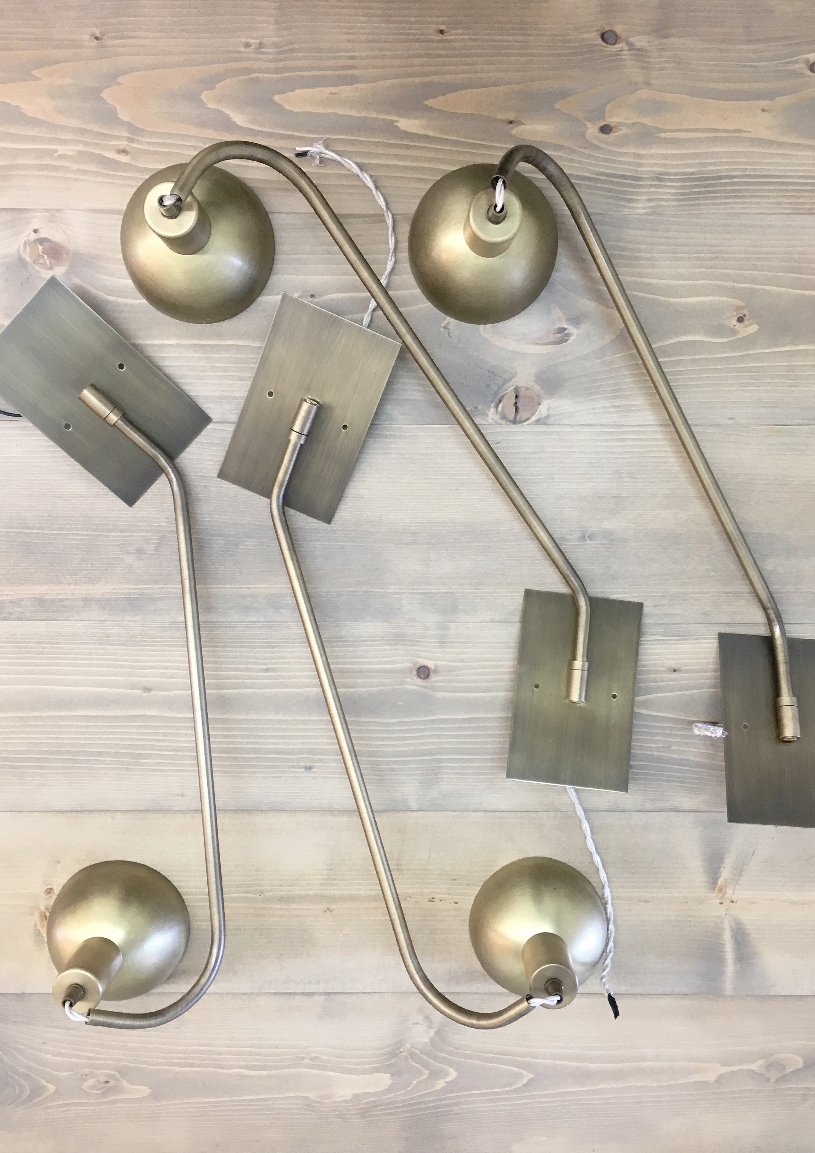
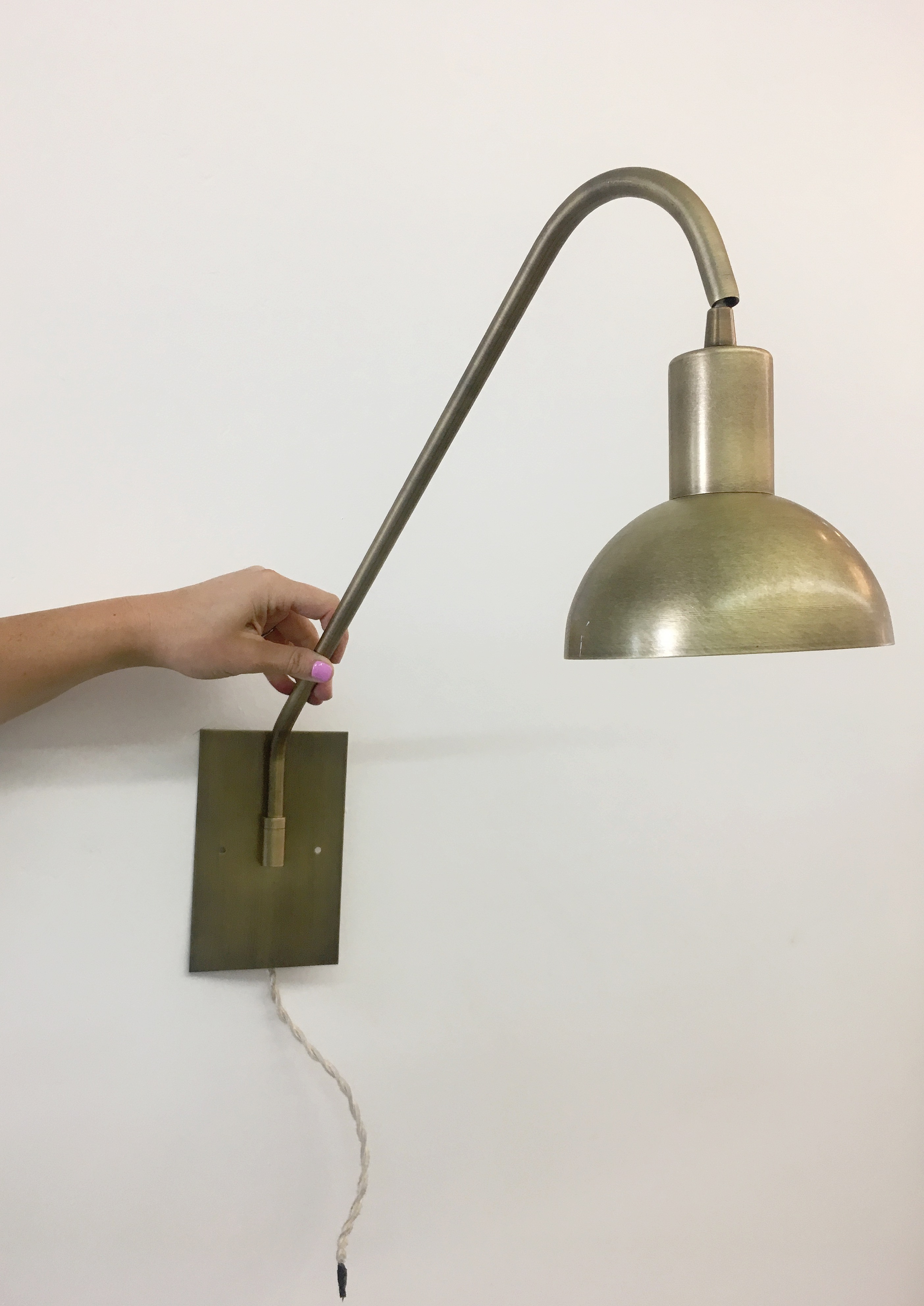
We are doing some shooting for Domino tomorrow so now we are hustling to wrap up some of our studio projects, including our kitchenette. Our new lighting from Lucent Light Shop arrived this week and we are SO excited to get these installed today!! They’re beautiful!
______________________
Things are really starting to come together at the Gentry Project. We had originally planned to do a cement tile backsplash in the kitchen, but it just kept feeling hard to pull the trigger. You know that feeling? When you’re trying to make a design choice and everything you’re looking at is falling a little flat? That usually means it’s time to go back to the drawing board. And I’m so glad we decided to rethink that range surround area – I can’t wait to show you the design! And the great news is now we are going to incorporate some pattern on the fireplace! The tile on the far right was our original pick for the kitchen, but maybe it’s not the right choice for the living room? I think we are leaning towards the tile on the far left (called Amalia Gris) so the color and pattern can stay on the more subtle side. Which would you pick?
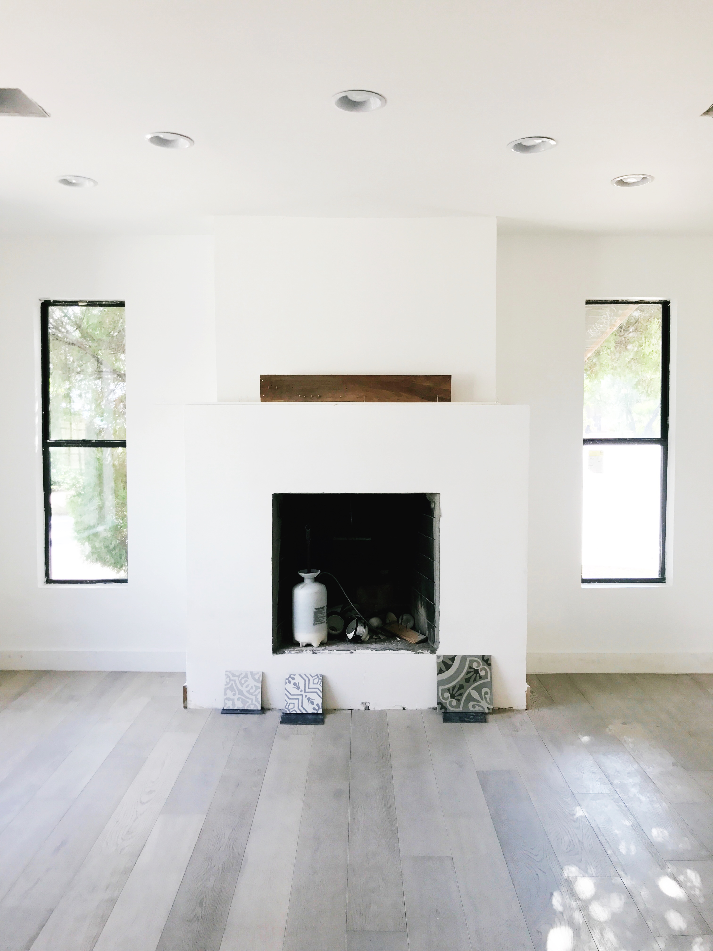
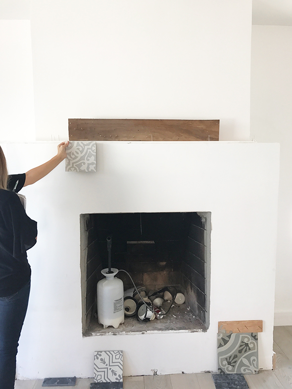
left tile // center tile // right tile
______________________
We made a trip to Anthropologie last week to pick up a few items for the studio. How cute is this little face planter that we are using to hold matches?!
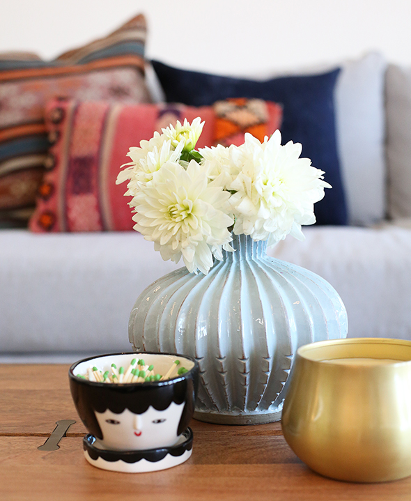
face planter // gold candle // blue vase
We have used these hooks in other projects in the past and we just love them. I think these two are going to be used in our kitchenette. Won’t they look so pretty with our new gold wall lamps??
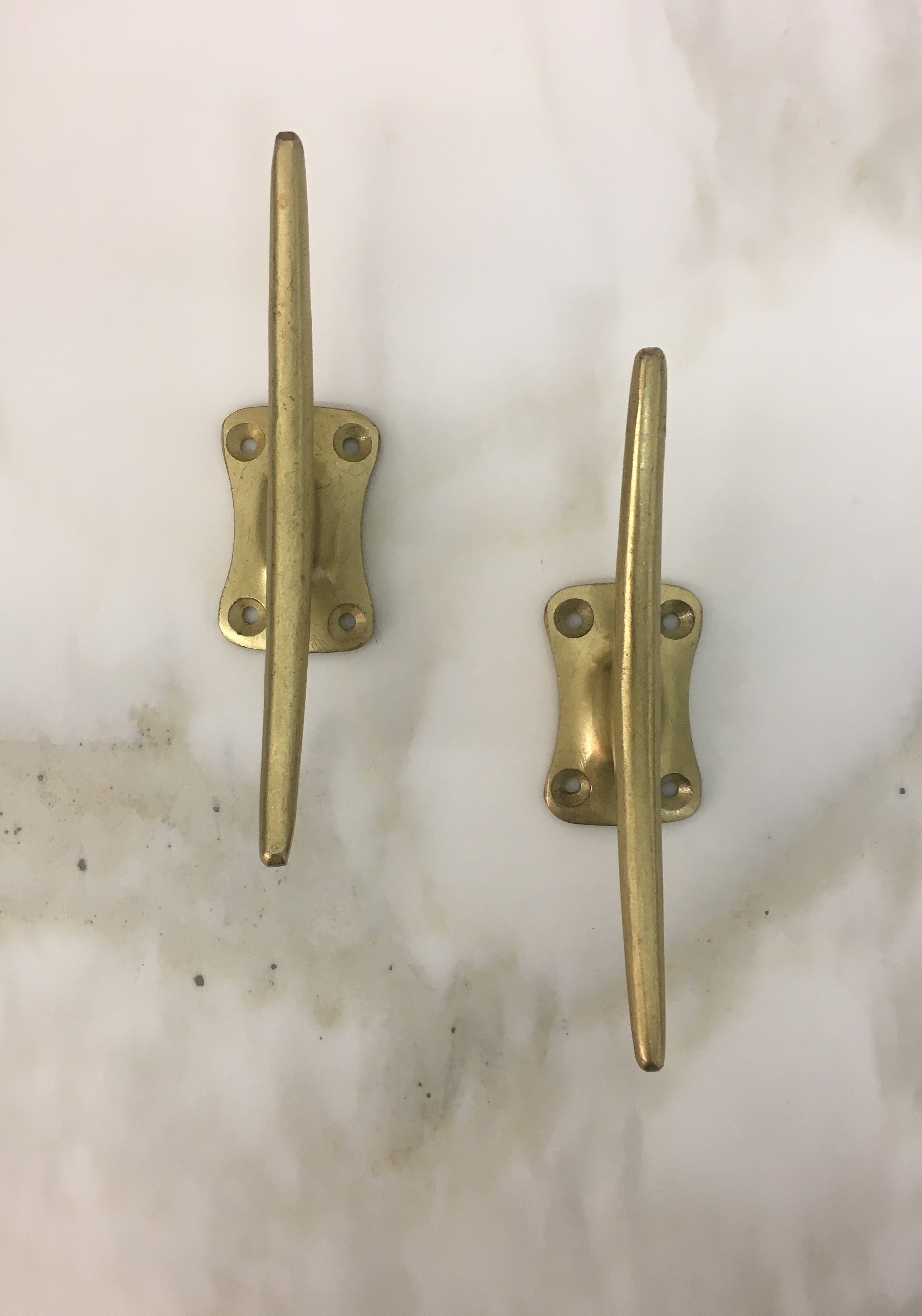
Here are some of our current favorite items!
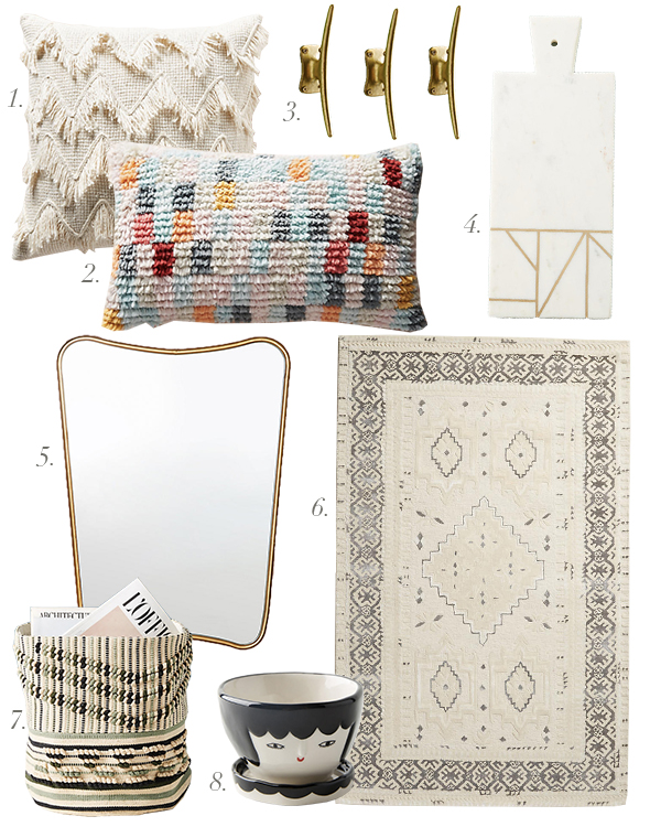
1 // 2 // 3 // 4 // 5 // 6 // 7 // 8
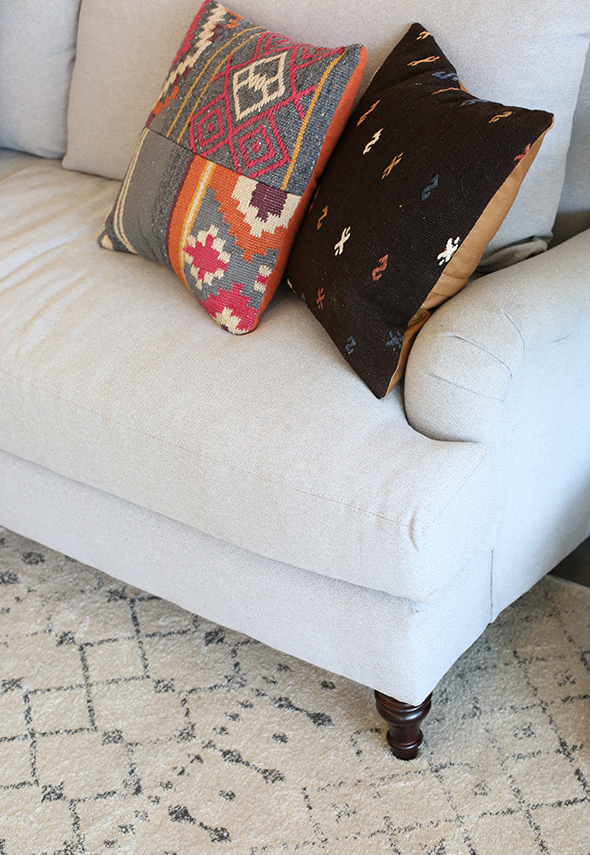
World Market is offering 20% online only through Friday!! We couldn’t resist these patterned kilim pillows or their new live edge coffee table that we put in the studio sitting area.
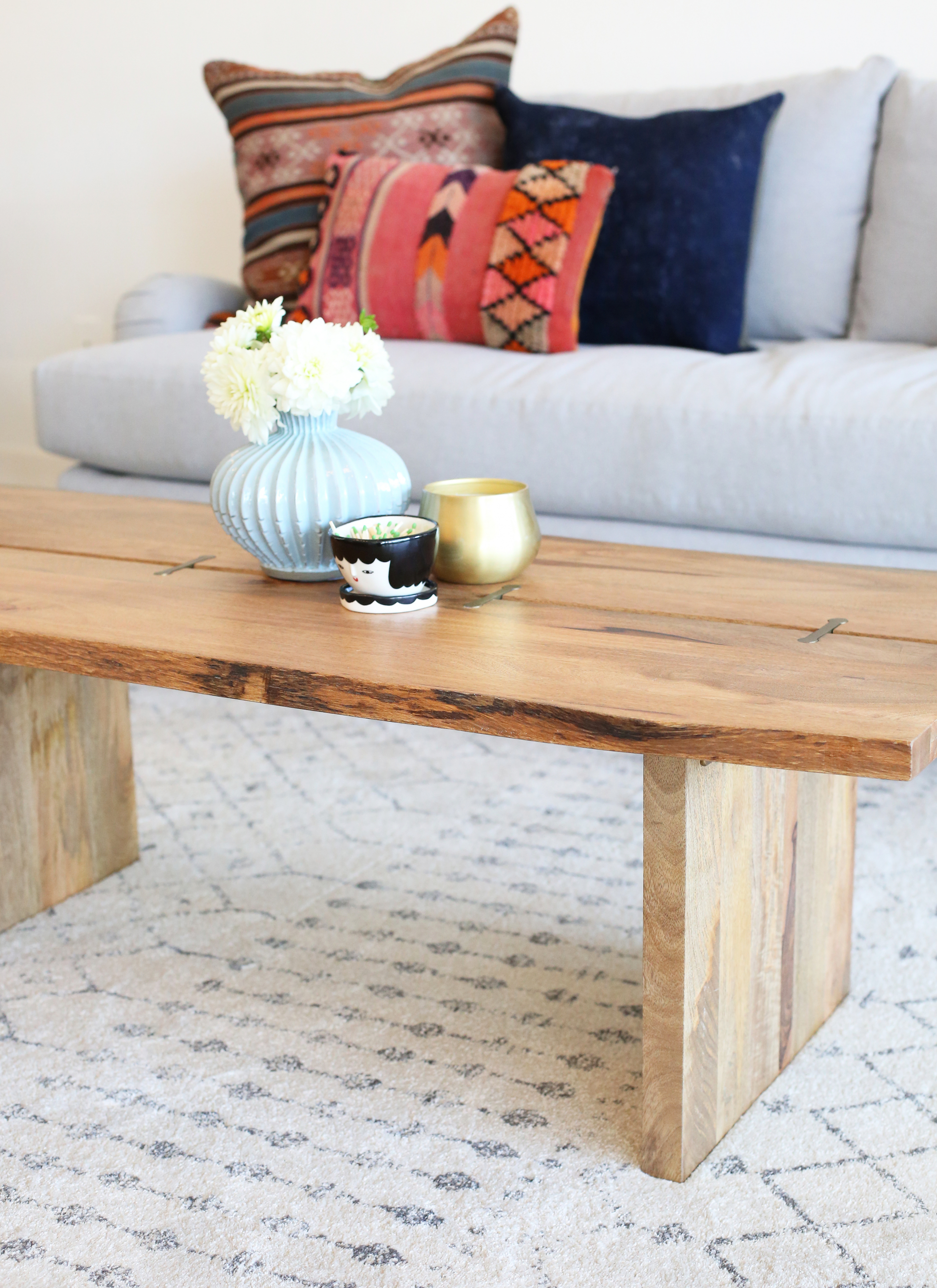
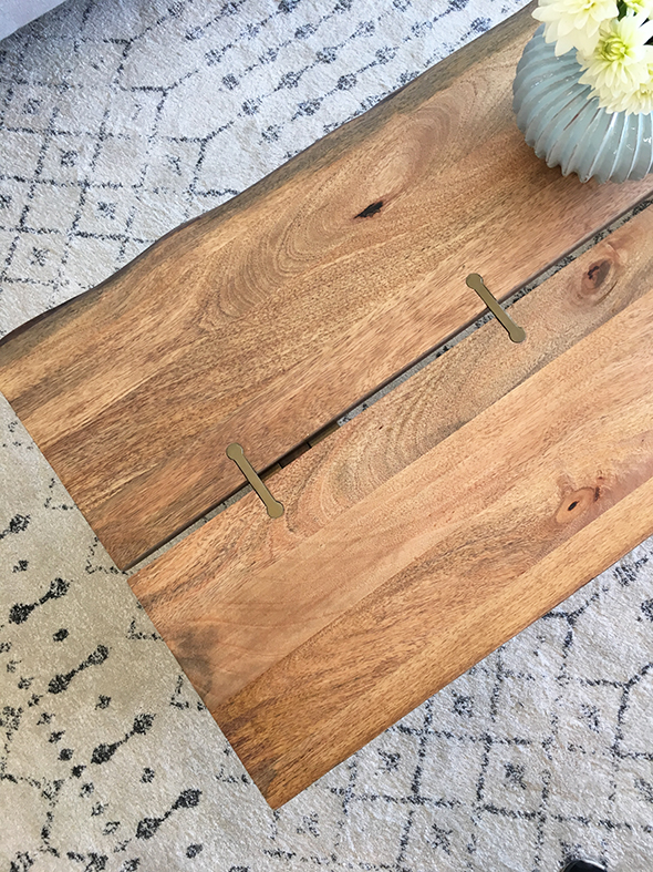
The coffee table is so pretty in real life. Check out that brass inlay on the top!!! So many heart eyes! And I can’t believe it’s only $230 with free shipping!
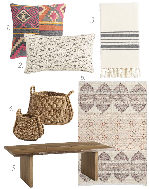
coffee table // rug
______________________
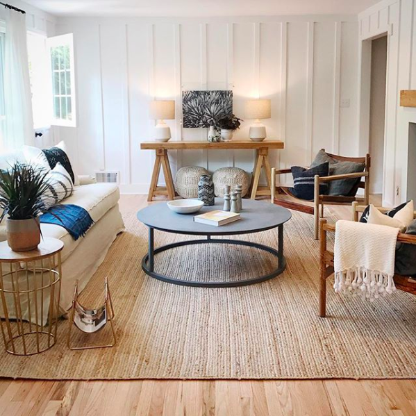
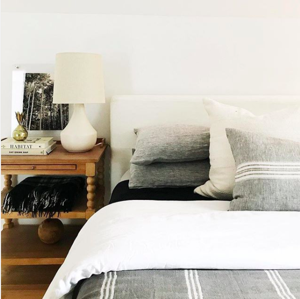
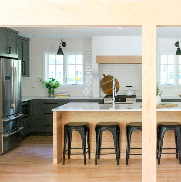
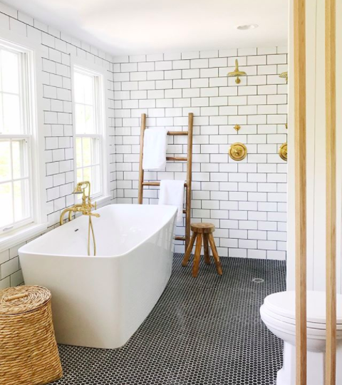
Have you been following along with House Seven Design as they take on their new remodel house? It is absolutely stunning and of course we’re loving how Anissa incorporated some Jenny’s Print Shop prints into the space!
Speaking of prints, we have been getting a ton of questions about framing. Framebridge is one of the best options out there if you are trying to get totally custom look with minimal hassle! All you have to do is upload your digital print to their site, pick a frame and mat option, and order! They are offering all first time customers 15% off their order when you use the code JENNYSPRINT15!!
PS – Don’t forget to enter the simplehuman giveaway in our last post!! We’re picking a winner in the next few days! xo


I need a cheap place to print that isn’t Costco since I don’t have any of those near me. Has any used Sam’s club before and do you have to be a member to get prints there?
I don’t like the phrase “pull the trigger” to describe a decorating decision. Not good.
love your style and your posts! I am drawn to the middle tile option, myself. I think that would add a good amount of interest to the room without being over the top. thanks for sharing your designs with us!
It’s so nice of you to ask our opinions! Wow! So, I like the tile in the middle best, especially if you consider the actual design pattern that it will form when laid out properly. It will make a beautiful statement that will be appreciated for many years to come! :)
Love all these inspirational pics. Still hoping to get the info on that pretty rug you used in the overstock competition. Pretty please.