I’m SO happy with the small changes we’ve made in the kitchen so far, which I’ll be sharing soon. The paint is making a huge difference. It’s crazy how a fresh coat of paint can make a house feel much more like it’s yours.
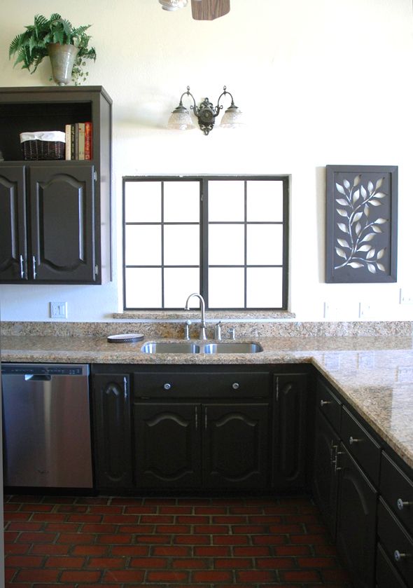
You probably remember from the kitchen tour that we’re planning a big kitchen reno in a year or so, and so I’m doing what I can to make the space pretty for now without doing anything major. Lots of cheap cosmetic fixes. I thought one big change I could do myself was take down my upper cabinets. At first I wanted to take all of them off and put shelves against the back wall next to the fridge as well as the walls flanking the windows. But the more I thought about it, I started to get worried that it would make the fridge look funny with the ceiling height. (For the first time in my life I caught myself saying “I wish these ceilings were lower” and then thought twice about it.) :)
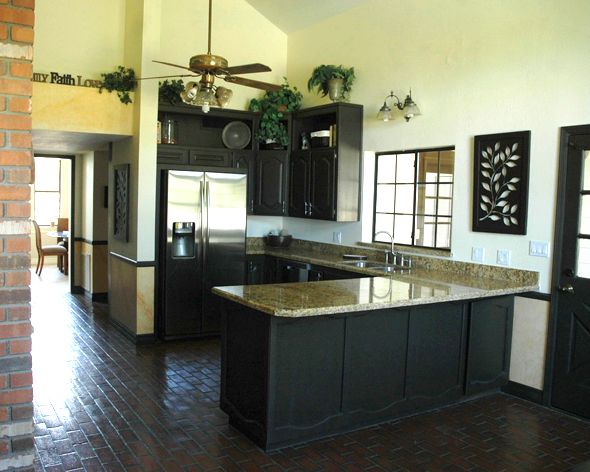
Also, I don’t think I want allllll that much open shelving. We had a small shelf area in the brownstone that was just big enough to store the dishes we’d use over the course of a couple of days. There was no time for things to get that layer of kitchen grease-dust on them. So I think less shelving is probably better than more in my case.

(More after the jump…)
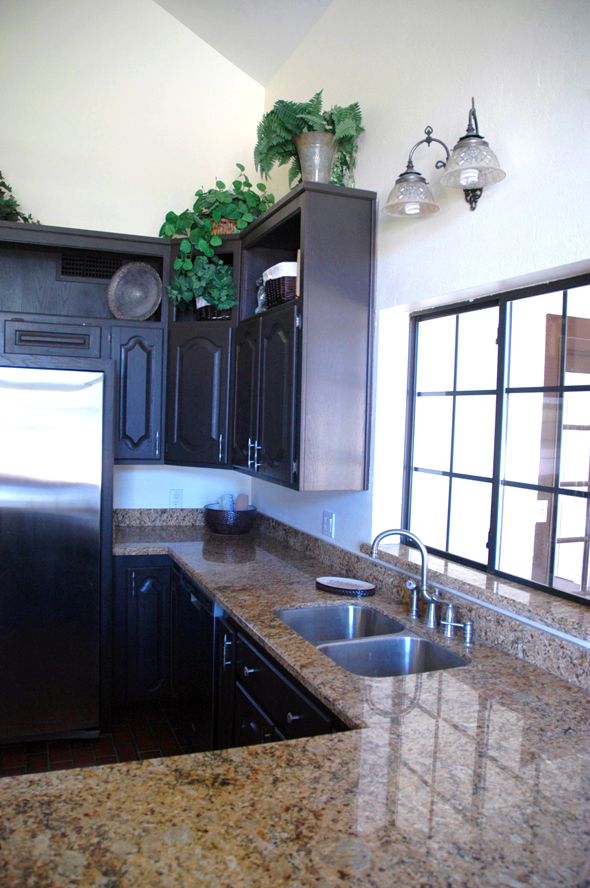
So now I’m thinking I’ll keep the uppers that surround the fridge and the ones that hang in the corner (and paint and change the doors like I’m doing with the lower cabinets). There’s a handy little lazy suzan in the corner cabinet that I’m strangely excited about having. But that first cabinet, just to the left of the sink will likely come down this week.
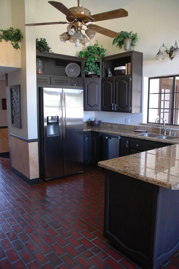
Then I’ll install shelves of equal size on either side of the window. I’m thinking of maybe doing a backsplash too that will end with the top shelf.
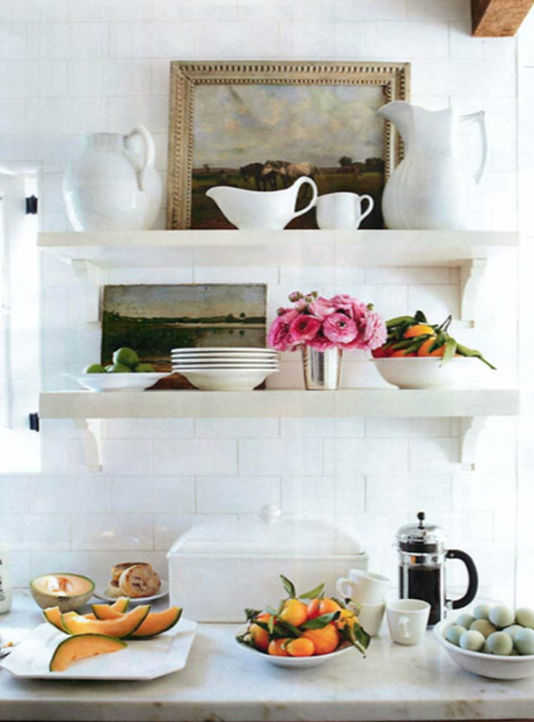
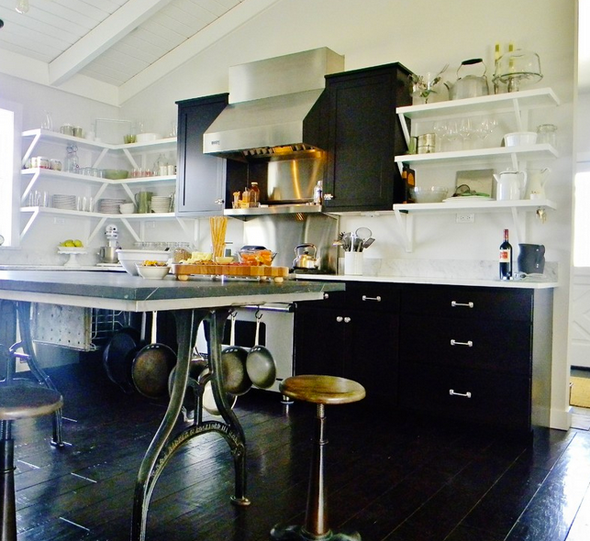
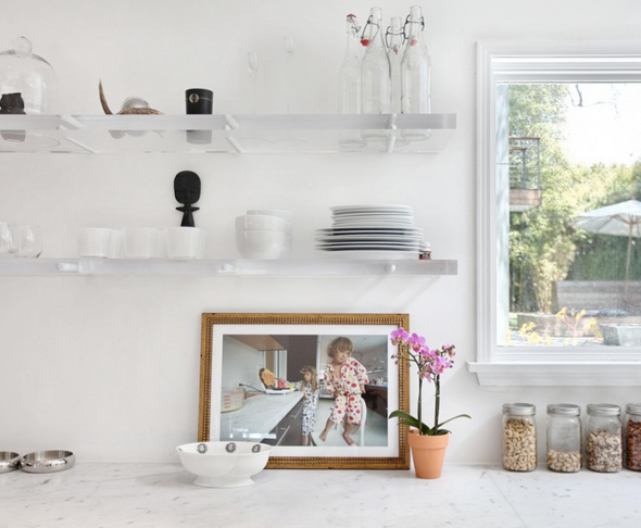
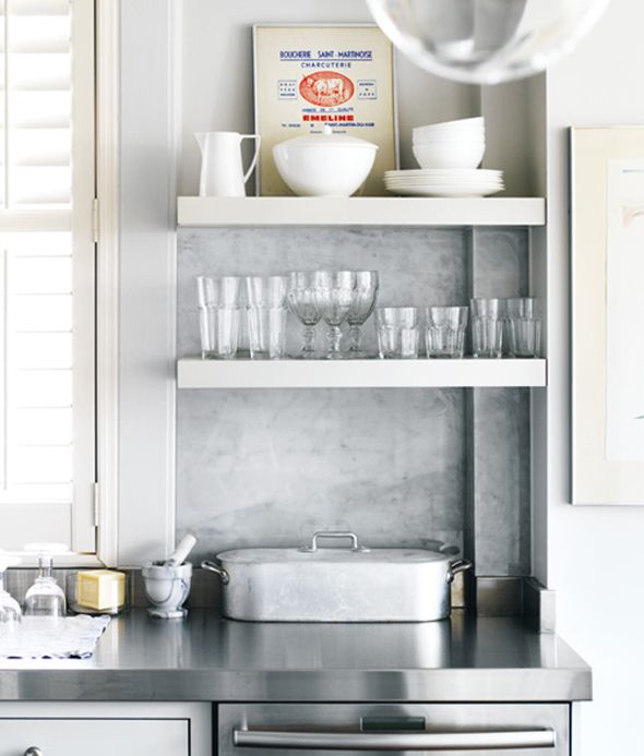
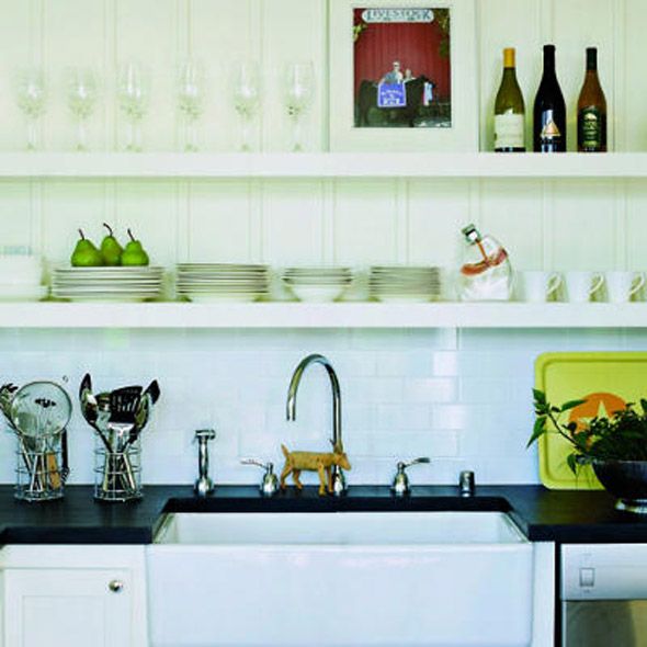
I’ve been thinking a lot about what I want the shelves to look like, but I’m a little undecided on the details. Here are some of the inspiration images that caught my eye. Right now I’m drawn to thicker shelves and brackets on the more modern (or at least less-ornate) side.


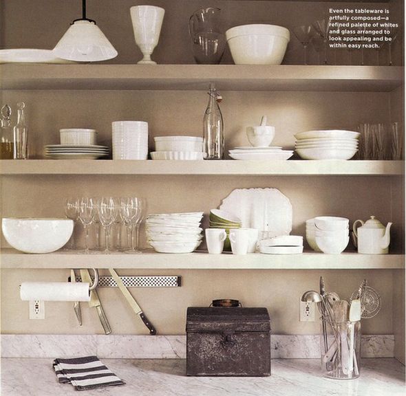
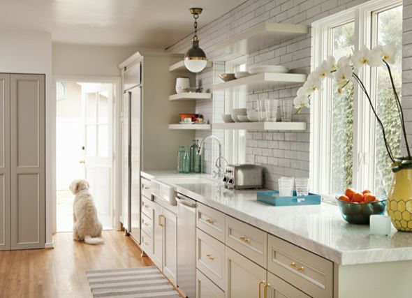
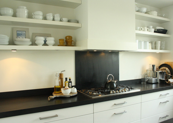
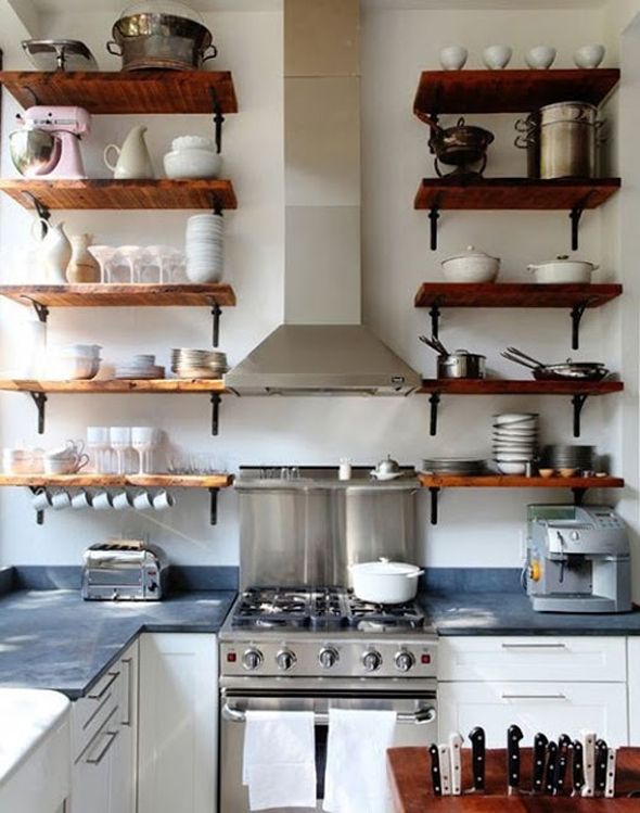
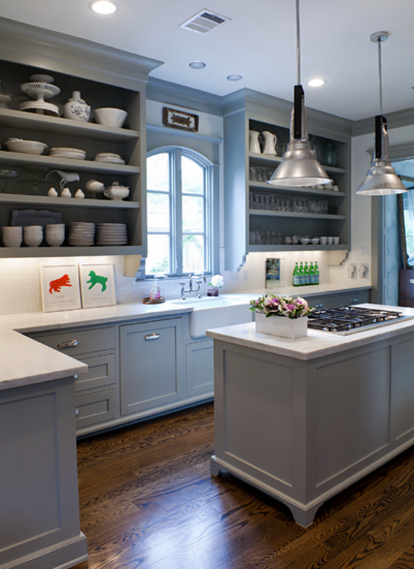
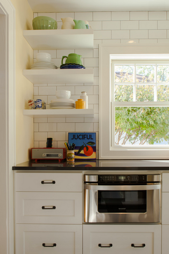
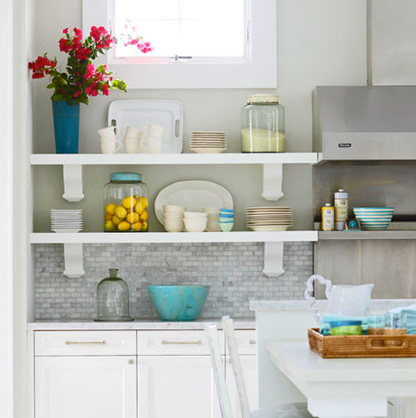
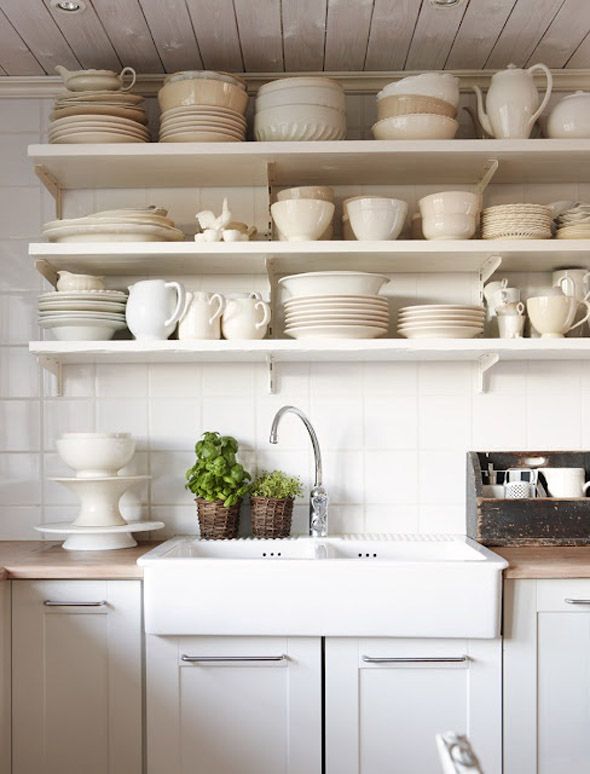
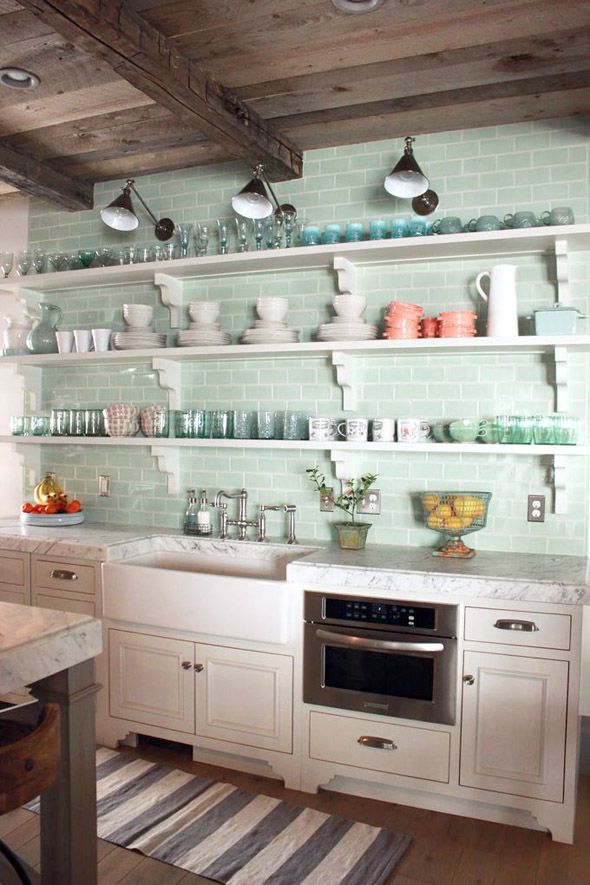
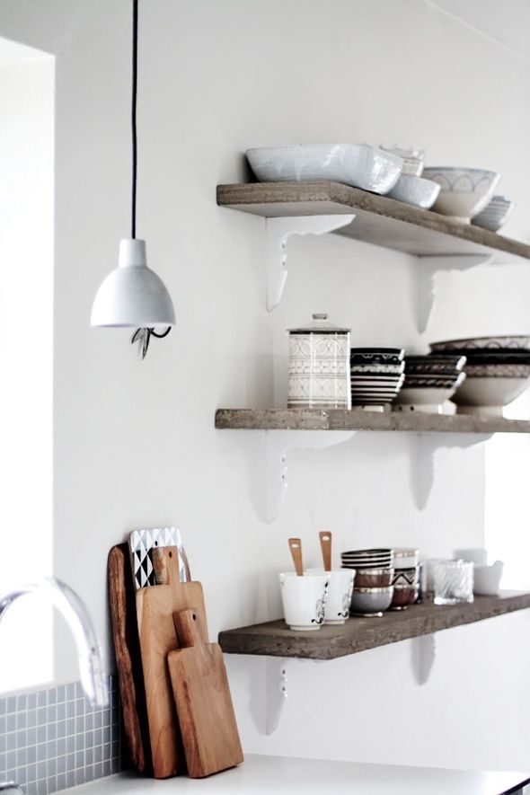
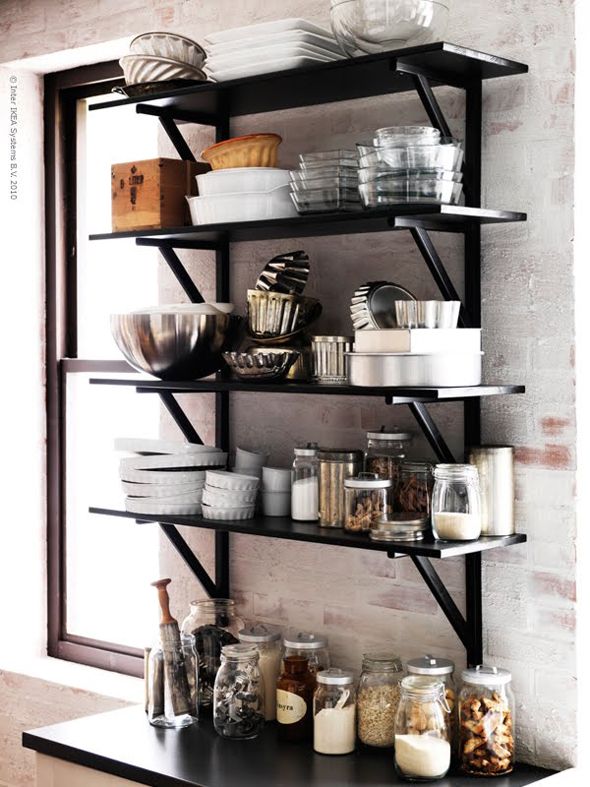
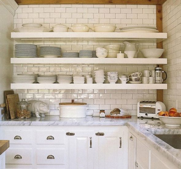


You bring up an interesting thought and i would love to hear what you think regarding ceiling height. Do you ever think it might make sense to lower a ceiling, particularly in a kitchen in order to visually separate spaces? Excited to see your space as it evolves!
I know what you mean about the high ceilings. I have lived with a similar situation–have you ever thought of tricking the eye by installing a strip of thick molding around the perimeter at the same height as the top of the kitchen cabinets-then painting below a different colour?
I agree, open shelves are fun but too many can be overwhelming to maintain. I can't wait to see what you come up with!
Our ceilings in Buenos Aires were about 14 feet high and I had cupboards up as far as I could go then put tall framed posters on the top of the cupboards. I wanted the high ceilings to look as high as they could be ! I love that , soaring ceilings .. we had them in the whole house but they were wonderful in a kitchen !
I did use warm colors, not white in the cabinets and black granite on the counters, to sort of "anchor" the place … if things had been light/white, it would have been too vast .
Think about the fun you can have with art works on the walls :)
I came across this website when looking for substantial brackets for open shelving. Thought you might like the CORV as it is similar to some of the images you posted. I'm really enjoying reading your blog and watching this house transform! http://www.allcabinetparts.com/openspacecorbels.html
I love your idea of taking down just the one cabinet and adding shelves on either side of the sink! There are several pics that I loved, favoring the white shelves, but mixing that with your existing dark cabinetry would be hard to do. I'm sure you will find a solution that's beautiful! Can't wait to see what you do!
Becky
Best of luck, Jenny! I love all of your inspiration. I can't wait to see what you do, and I do think leaving the cabinets around the fridge is a good idea. I have not exposed any shelving in our kitchen for the simple fact that I hate dusting and just imagine having to dust a lot more. :) It totally makes sense that your daily items wouldn't have time to get too bad. I've also heard that open shelving around the range is usually the worst…looks like you won't have that grease problem. :) Thanks for sharing!
Pam just did a great post with inspiration for the Ikea Ekby Bjarnum bracket. I think it totally looks like something you would use…especially if you paint it gold!
http://simpledetailsblog.blogspot.com/2013/07/ikea-ekby-bjarnum-bracket.html
Great round up of pix!
Some unsolicited advice: change out the ceiling fan light and wall light if you are doing open shelves. They look a but too fusy for the streamlined look of open shelves.
I love the two following kitchens, both with open shelves and the same granite you have (scroll down a bit):
http://www.tphblog.com/the-kitchen-after/ and
http://thedesignfiles.net/2012/02/melbourne-home-barbara-hyman-and-family/
I am loving open shelves right now, but I agree that too many can be overwhelming. As always, so looking forward to seeing what you come up with!
gorgeous of course! i want to add some open shelving to a small little nook with an open brick wall in our kitchen!
Oh my. Those lucite shelves are AMAZING! Also, I have 2 of those jars you had in your former kitchen's open shelf- the three blue ones with the bulbous lids. One of mine is green though, and I've considered parting with the blue one since I no longer have a use for it, but love it so much!
How fun are those lucite shelves?! Love them!!!
http://reuschinteriordesign.blogspot.com/?m=1
I am planning kitchen open shelving and came across these awesome Restoration Hardware brackets.
Really like!
http://www.restorationhardware.com/catalog/product/product.jsp?productId=prod1870749
These inspiration photos look really cool. I'm excited to see what you do with this area. I agree with some of the other commenters that open shelves might be a little harder to maintain (with the dust) but it sounds like such a small area wouldn't be too crazy to deal with.
Typically, I'm all over the white. But when I saw the first wooden photo with the black supports my heart jumped and I instantly thought of you. (The you the blogosphere knows anyways :) Plus, It looks more intentional to me. I feel like the other look I've seen so many times.
xoxo- A
Or what about stainless shelves???
I just recently came across your blog and instantly became a daily reader! so much inspiration in one place, love it! …and your a fellow desert rat… even better! :) Best of luck to the rest of the reno… not that you need it :)
I'd like to see a write-up about what you decide to do with the shelves. I see so many floating (zero bracket) shelves, and I wonder how other people do it. My mom has had two kitchens that she installed floating shelves in, and my dad is an engineer and insisted that they need much more support than the simple hardware that hardware/big box stores give you. With the second kitchen, he tore the wall down to the studs and mounted steel bars on the studs, then redid the wall, tiled the backsplash, and slid the shelves onto the steel bars. Sounds like overkill, maybe. But, my mom does keep all of her dishes on these shelves, so they're heavy.
Looking forward to seeing your take.
That will be a pretty window spot with the shelving! Nice for day dreaming while you do the dishes.
I hope you post a tutorial on your painted cabinets. I know they will be fantastic.
This was an interesting blog to learn about.
wedding dj services toronto
Love the open shelf idea! I made a couple of chunky wooden floating shelves for our narrow hallway (http://www.desertdomicile.com/2013/04/diy-chunky-wooden-floating-shelves.html) and they can be customized to any size and color you'd like! I think they'd look great in your kitchen ;)
I've always loved the idea of white subway tile with white floating shelves, but the inspiration photo with natural wood shelves is really cool too.
http://www.fullbellywornsoles.com
if you put up shelves to the right of the window, won't they be kind of hard to get to?
(since the "L" shaped counter is in fron instead of one that continues parallel to the window wall)
I really like most of those choices, especially the floating ones. The lucite and concrete ones look fab as well…perhaps you can use the new concrete overlay to achieve that effect. I guess it depends what color, finish you're going with on the cabinets.
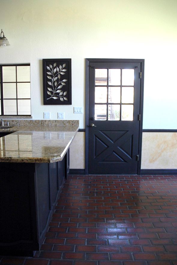
P.s. glad to hear you're chunking up the wood door surround. However, please try to avoid that picture frame look. I don't know when that became the norm, but it drives me crazy! Btw, love your doors. they remind me of Dutch doors.
Absolutely crazy about shelving and the dishes-as-decor idea. I could live with and love any one of the examples you showed…but know that we will all love yours best of all.
I'm so glad you are talking about this. I am searching high and low for perfect open shelves for my kitchen. I hope you talk about where you are getting yours (of course you will!!). IKEA is always the option I come back to, but I did find some cool worn wood ones at west elm. The brackets weren't the best though. I'll keep an eye out for your follow up post :)