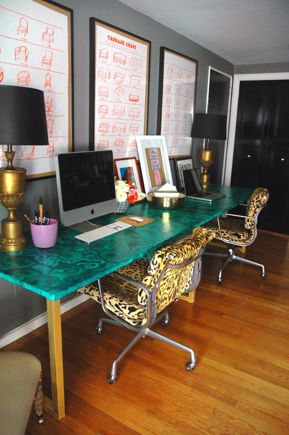
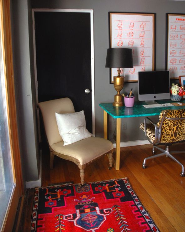
A lot of you asked where I got the upholstery yardage charts that I hung in my office. It was definitely one of those “make it work” ideas.

Originally I had grand plans of photoshopping out my favorite pieces from the various upholstery charts floating around the web (I posted a few of the ones I reference here) and making the lines a bright reddy orange and then taking the files to the printers.
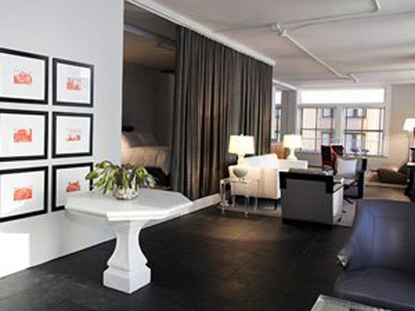
I was inspired by these orange prints from the first season of Top Design on Bravo (remember that show from back in the day?).

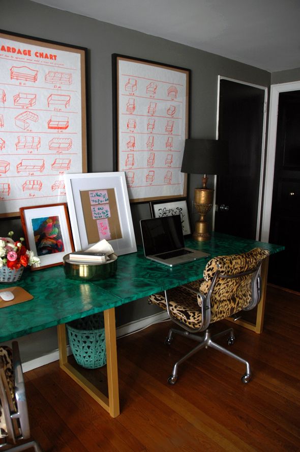
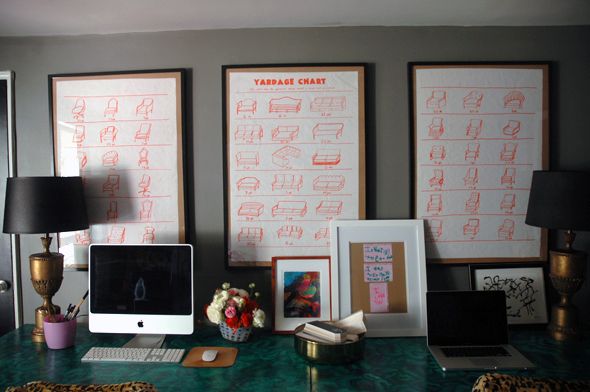
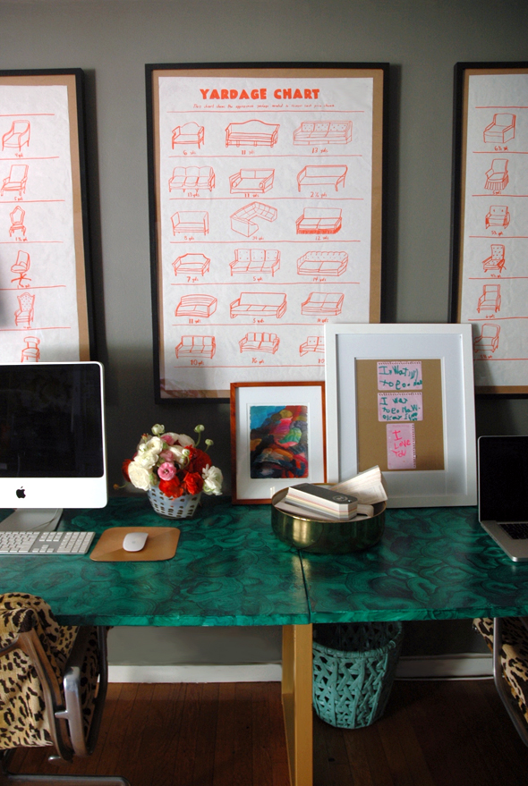
Well, the long and the short of it is I ran out of time to go with the original plan. So I grabbed an orange artist’s marker with a brush tip and a roll of white butcher paper and whipped these three “posters” up in about 30 minutes (I was really out of time and needed art up fast). I used these charts for reference and literally held up the paper to my laptop screen to roughly and quickly copy the “yardage chart” title.
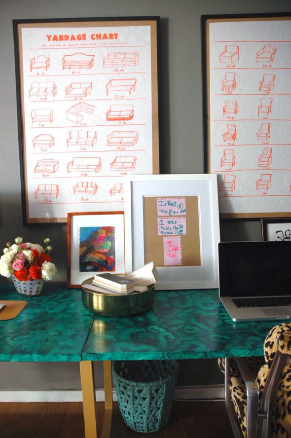
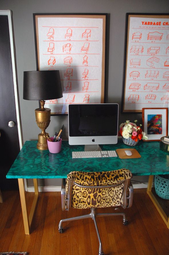
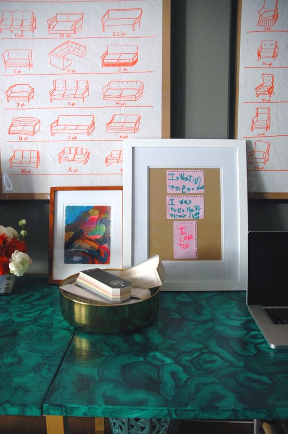
I have plans to go back and redraw them all because I like the concept a lot, but I started to get pretty sloppy with the execution by the third poster (the one with the sofas). Also, most of the pieces I drew were straight from the old upholstery charts which (I realized in the middle of my time crunch) were pretty generic (read: boring). But how cool would it be to do real iconic furniture pieces, or even some of the new pieces currently available online and in stores? I’d happily spend an afternoon sifting through 1st Dibs listings to get an inspiration file going!



I'm so impressed that you drew these yourself. I mean I'm defining not a good enough illustrator to even attempt these. They look like the real thing.
The color is great and your right they do look great in contrast to the dark tray walls.
xo Quinn
Quinn Cooper Style
Your office looks awesome. You're so talented!
Jenny, you did an awesome job on these! I think I may have to take on the job of sitting through and finding inspiration pieces from 1stDibs to make an upholstery chart. Tough job. ;) Fun, but time consuming! I really do love your drawn ones though, the sketch look is so chic! xoxo
You are amazing! You're the epitome of "Just Do It!" Nike should feature you in their ads. Love your blog and you work!
I love this idea of drawing them yourself! And I think the imperfect ones are what makes it so interesting. Way cooler than just printing them! Good job and thanks for the inspo., as always!
Your office looks great…amazing you did those posters yourself! Especially love that you framed your daughters notes on your desk, I'll have to use that idea
Jenny- I bet you could sell these! Put them up on etsy and people could pay for the pdf and then go print them at their neighborhood FedEx/kinkos!
Wow…very impressive sketching abilities! Especially since it took you only 30 minutes?!
I'm pretty sure I couldn't do those in 30 days….never mind 30 minutes! They look fabulous!
http://simplymodernhome.com/
I've always loved those charts! Can't believe you did them by hand!
I love that you made these! I would totally spend an afternoon with you drawing all the iconic chairs. I think it's a great idea.
holy crap! you should be selling these.
can I be your first customer and order a set of prints in hot pink????
call me!
;)
~ d.
Would have never known they were "thrown" together so quickly – very charming. You really do inspire to not think so hard and just DO!
When you first mentioned these a few weeks ago, I just assumed you changed the tone of the files you already had in photoshop and had them printed at kinkos or something. You hand drew these?!? And in 30 minutes?!?! I knew you were good, but… :)
what?! You drew these yourself, freehand? Dang!
Absolutely beautiful. You really have the knowledge to make these things better. I am proud of you.
Furniture Cleaning Brisbane
Love these charts. They just pop!!!
xoxo PARIS BEE kids blog