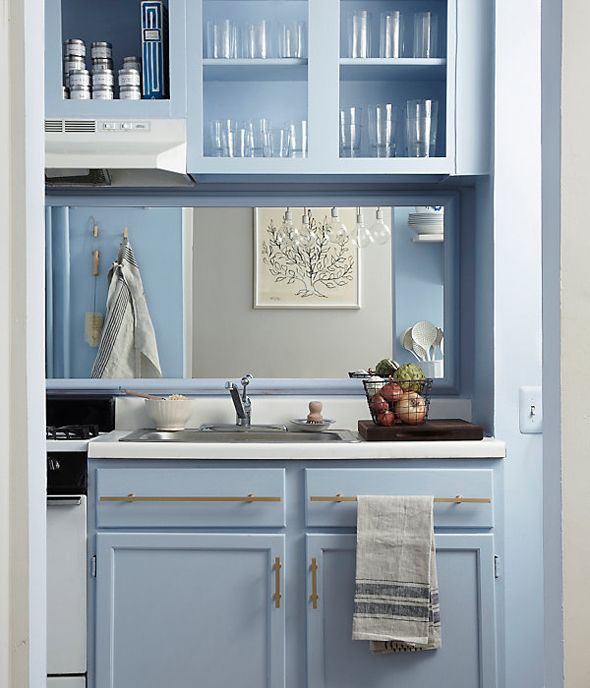
My friends over at One Kings Lane were so kind to share photos of this amazing kitchen redo they posted on the OKL blog this week (they even sent me over some outtakes). Isn’t this soft blue-gray color perfection? Such a contrast from the before images!
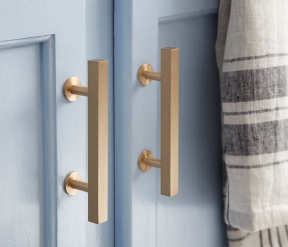
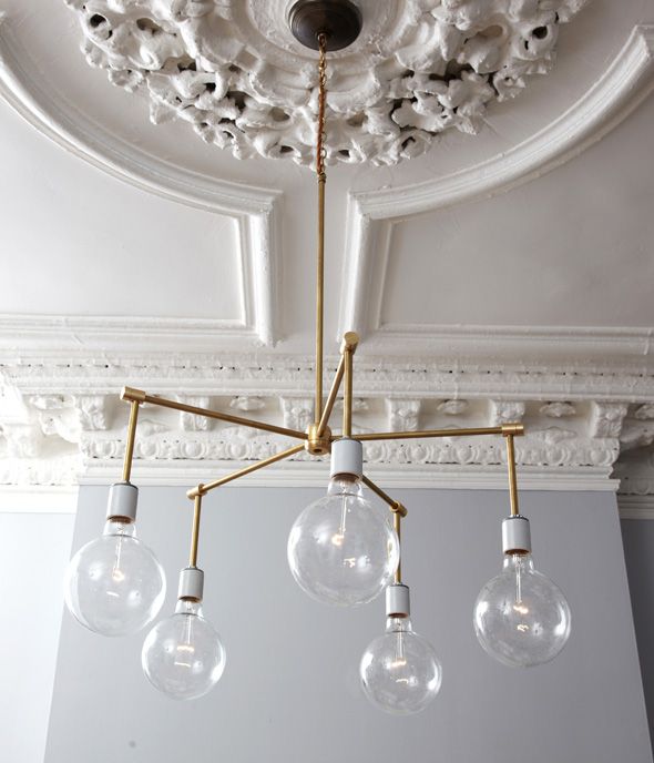
The kitchen belongs to OKL editor Kerstin Czarra. She and stylist Megan Phlug worked together to completely transform this small NYC kitchen with just a little paint, new brass hardware and a few really well-chosen accessories. Not to mention some new lighting, including this chandelier that they made themselves! Amazing, right? Also, that moulding is completely unreal.
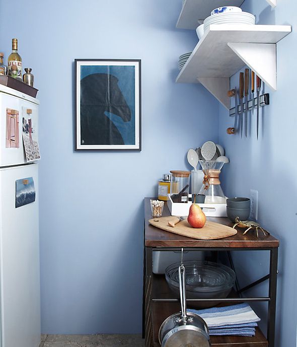
Adding a mirrored backsplash and taking off the upper cabinet doors really lightened up the space.
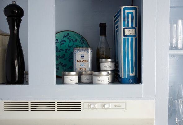
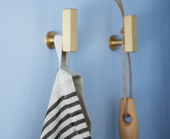
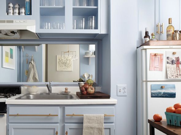


The brass is absolutely striking against the paint color. I'm seeing more use of mirrors in small kitchens and I'm liking it!
I'm ready to try it inside a glass front cabinet.
Thanks for the great photos. So inspirational!!!
Sharon
Ack!!!! That light!! She needs to do a tutorial on how to create that gorgeous thing!
LOve the hardware and the light. So pretty!
Absolutely gorgeous hardware! Take care, Caroline
I love it all! I'm in the process of streamlining my collection of glassware and this is just the boost I need to show it off. The blue + gold looks perfect together!
Any info on that tree print in the reflection? I know I've seen it floating around, but I can't quite remember where. Thanks!
Love this kitchen! I don't think I've ever seen a kitchen that color before. So beautiful. Love the brass hardware, its perfection.
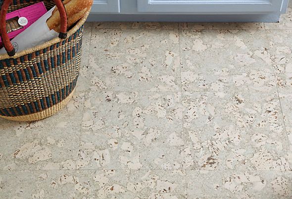
I grew up with cork tiles in my kitchen like the ones in this kitchen. They are awesome because they have some give to them. When you are standing in the kitchen for a long time baking or cooking they are great on your feet and back.
Thanks for sharing this awesome kitchen.
xo Quinn
Quinn Cooper Style
A dutch friend of mine said "blue" in the kitchen always soothes and cools the cook. I love that soft pale hint of blue. Yes, that light is wonderful too and the brass seems such the perfect touch.
pve
So inspiring! I need to talk to my next landlord about more paint :)
http://www.anna-bird.com
You amaze me with your sense of style Jenny! The blue with the gold! NICE!! Love it! Want it!Happy Thursday :)
The blue is so unusual for a kitchen. Very light and airy. And the brass hardware! A knock out!! Love it!
Susan
http://simplymodernhome.com/
I love it all but I'm DYING over the floors. I really need to get out and explore what is out there.
Wow…what don't i love about this kitchen! Brass, the blue, the floors….and that light! Can't believe they made that!
sooO pretty!!!
katie
I just read the entire before and after story. I myself love the Danish or Scandinavian grey-blue hue too and wish I could do the same for my tiny kitchen!
So lovely!
And that hardware is fantastic!!
This looks like something you'd pull off–max impact on minimal budget, with lots of elbow grease thrown in. Hey, isn't that how you pulled off the current kitchen makeover? The colors are different but the idea is similar, no?
YES! I am obsessed with whitewashed cork.
Please oh please figure out how to get a DIY tutorial for that light — and thanks for sharing. This kitchen is perfection (at least as far as a 3×6 kitchen can be)
This might be the push I need to put a mirror behind my counter in the kitchen – it's SO dark under the cabinets but no access to an outlet for light solutions. I bet a mirror would be the perfect thing. Off to measure!
You scared me half to death, I thought this was YOUR kitchen for a moment and I love what you already have going on in there!
Gorgeous. I default to light blue way too much but it's so easy to live with! That light fixture is amazing. Any thoughts on how DIY-able it is? Hope you are doing well!
(Love your comment warning!). Thank you for posting this. Husband and I are just about to move into a rental with a teeny kitchen with little storage and cabinet space. This was so inspiring!
I think this is gorgeous – I see so many things that LOOK amazing, but I'm trying to narrow down what might truly work, in my own, actual,living spaces. With that in mind, I'm trying to apply some "critical thinking," and I wonder if anyone can speak to 2 things I noticed that seem like they could be problematic? First – the drawer pulls seems like they'd catch hands, pockets, little kids' heads, etc. I can picture the corner of my favorite sweater getting ripped clean off! Also – back splashes get filthy – would a mirror in that position just be constantly in need of a Windex?
I want to stress that I'm not trying to be overly critical and I do think this is a gorgeous upgrade – just trying to hone my arm-chair decorator's eye. Thank you for indulging me. ;)
This is one of the prettiest kitchens I have ever seen…big, small, whatever. Amazing makeover.
It's amazing what a coat of gorgeous color does for a kitchen. And I LOVE that brass hardware!
http://www.minnickinteriors.com/1/category/kitchens/1.html
I love the look but had the same thought as unknown about the hardware– I'm clumsy enough that I'm sure I'd be black and blue from running into those square edges, and the mirror is very cool but in such a splashy area, it would get pretty messy. The color combo reminds me of one of those La Cornue ranges that I love the look of.
What an amazing piece of work!love the hardware.
Modular Kitchen Collection
I cannot believe how improved this kitchen is. It's gorgeous. Once again I'm hugely jealous of people with 'vision'.
Thanks for sharing
Emily
love it do you have a source for the hardware ?
I have to admit, I am not normally a fan of brass and think it can easily look outdated, but with the light blue it is really pretty. The only thing I am not a fan of is those extra long pulls. They look a bit overwhelming on the drawers.
Also interested in finding out where I can purchase the hardware (in silver, if poss).