I’m sure some of you already saw these photos on Joanna’s blog (and I just saw on twitter that Apartment Therapy did a feature too), so sorry for the repeat. This was such a fun (and very quick!) project Joanna, Kendra Smoot and I worked on together.

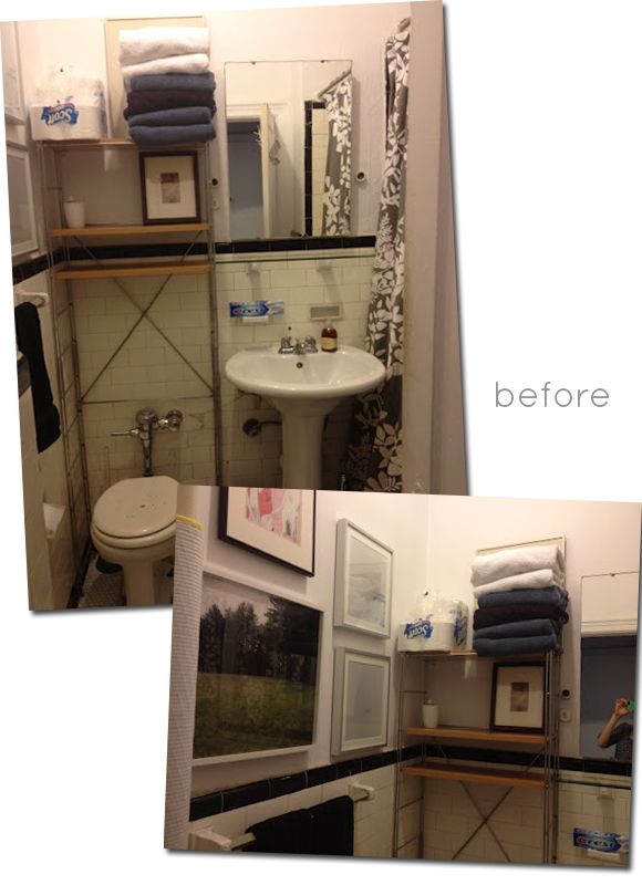
Joanna wanted an easy bathroom update. She and Kendra worked together to come up with a direction and I got to help with the execution. Here are the before shots. Such a dramatic difference, right?!
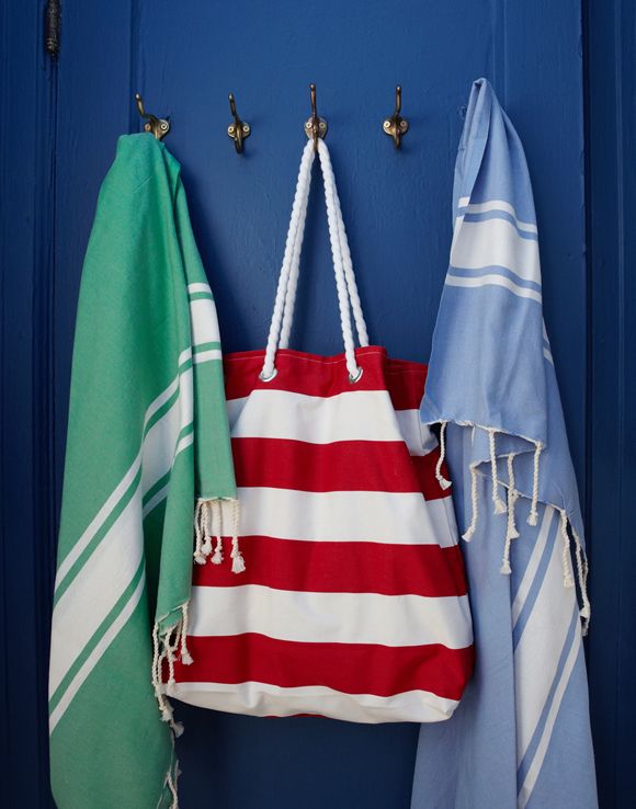
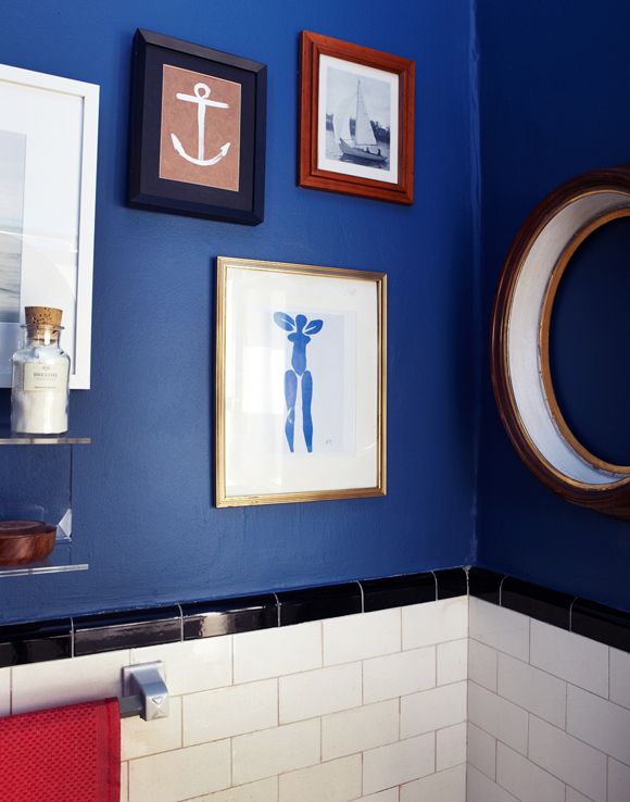
The walls AND ceiling were painted navy blue (the exact color was Ballard Blue by Valspar), which really helped the room both feel bigger and more cozy. We used a lot of brass accents, like these slightly mismatched antique brass hooks from the flea market.
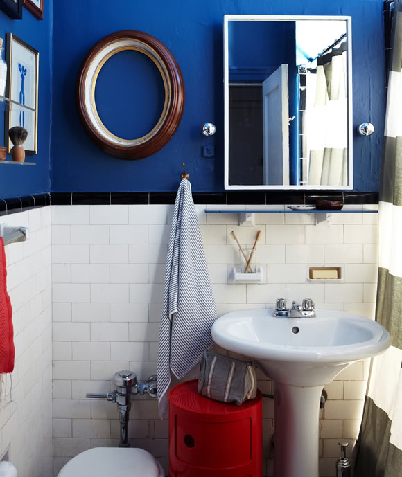
I added white painted cube moulding to the fronts of the medicine cabinet using mirror glue and a little caulk. It was a super easy, 20 minute project. The framing makes the old medicine cabinet look so much more finished, don’t you think?
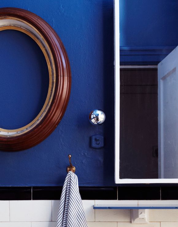
Last I checked there were a couple nay-sayers on the round captains mirror frame we hung to the left of the medicine cabinet. Some people thought we should have used the space for storage shelves, but I love the frame and there’s enough storage elsewhere. Plus, do you really want to see storage shelves first thing when you walk into a room? Me neither! :) And I really liked the idea of mixing of square and round corners on the frames. As soon as we hung it up I was like “Anna Spiro!” Remember her bathroom in Lonny?
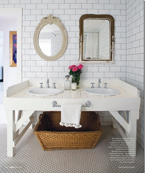
I was originally wanting to to add mirror to the frame, but we all ended up liking the empty frame enough to keep it open. Gosh I love that frame. I found another similar one at the flea market recently and it will be making an appearance at our house I think.
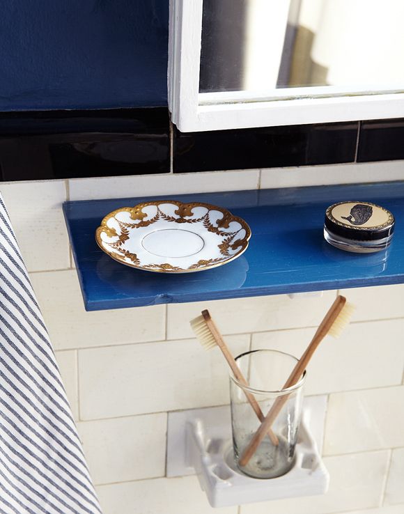
Another little easy project was painting the underside of Joanna’s glass shelf. Remember this post? It’s such a cool way to change things up without getting too crazy.
We wrapped the hot pipe (it literally gets boiling hot in the winter) with jute rope, which added a great textural element, but still allows the pipe to heat up the room, the way it was meant to – this way without burning little Toby’s hands. This was another easy project and there was absolutely zero glue required – just really tight wrapping.
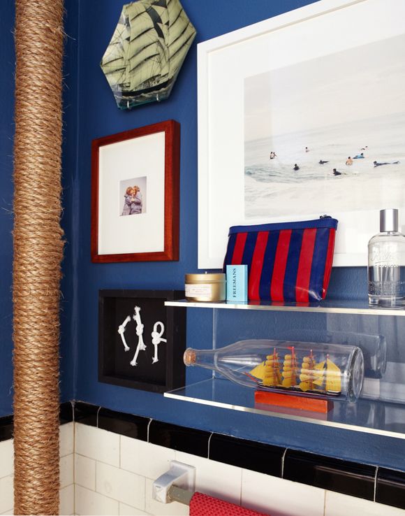
I think these $25 double acrylic shelves are so perfect for small spaces. I picked up two for our house too. Also, the artwork here (the photo with the surfers) is available at 20×200. I’ve got a fun giveaway from that site on the blog tomorrow, so don’t forget to stop by and say hi!
Thanks again to Joanna for letting me pitch in here. And a huge thanks to Kendra and Seth Smooth for the beautiful styling and photos.



Would you mind giving a little information about how you framed the medicine cabinet mirror? I've been looking to do the same thing but found scant information online.
I love the acrylic shelves. I have struggled with our teeny bathrooms, and these shelves would be a perfect addition! Thanks for sharing this awesome project! http://www.elizzym.blogspot.com
Oh boy — I have similar tile in my bath and I just might have to paint the walls Ballard Blue….
What a great update! It never ceases to amaze me how the smallest changes can make the biggest impact!
agreed. the round frame adds so much spunk. good job. donna
i saw this on AT today – GREAT JOB GALS!!!!!! looks wonderful!
it came out so great- i had my eye on those shelves for my bathroom, def going for it!
It looks amazing! I would love some tips on how you covered the hot pipe with the jute rope (roughly how much you need, how you fastened it without glue). I would love to do this in my bathroom. Thanks for sharing!
Looks so cute! How can you be sure that jute rope around the pipe isn't a fire hazard?
What a difference! Love the blue and the round frame makes the space unique. Great job as always!
Amazing!!! I can't get over how much bigger it looks. LOVE!
I have the same question as Melissa T — I have an old mirror with a few chips along the edges (nothing sharp, just looks sad) that I'd like to cover up, and this moulding technique looks perfect. Would you be willing to share more about how you framed the mirror and the materials you used? Thanks a ton! xoxo
I have the same question as Melissa T — I have an old mirror with a few chips along the edges (nothing sharp, just looks sad) that I'd like to cover up, and this moulding technique looks perfect. Would you be willing to share more about how you framed the mirror and the materials you used? Thanks a ton! xoxo
That blue on the wall looks nothing like the paint chip Valspar shows for Ballard Blue. Amazing how diff it looks.
help my sister get a new bathroom too! vote for Rory: houselogic.com/boostyourroost
help my sister get a new bathroom too! vote for Rory: houselogic.com/boostyourroost
its awesome and wonderful..hope that you would post more a lot of bright ideas so it would give us a lot of help and a lot of ideas..i love the bathroom its simple and it look good..
sydney mirrors
What an amazing transformation! I love it!
I love the blue! Looks great!
Love the blue! Also love that you wrapped the pipe in jute. We have one in our tiny powder room. Could you give a details on how you wrapped it?
Love the blue, love the frame, but not so much all the nautical touches. Did a nautical theme bathroom about ten years ago…. tired off it in about three months and had to change out a lot of stuff. Still have a box in a closet with a couple of expensive shells, some ship paintings, several ocean photos and boat cleats… unfortunately no one else has been foolish enough to do a theme room and take the stuff off my hands.
Nay sayers on AT site!? Get outta of here! (: I love this makeover, what a difference some paint and accessorizing can do to a space. I don't personally no Joanna but read her blog religiously and this space so seems to suit her and her family! Great job!!!
Wondering where you got the big towels–I want these!
We framed a mirror similar to this and it was a great inexpensive and low-commitment solution. A few basic things that make it go well: paint the back of the molding as well, as it reflects in the mirror and use caulk to touch up cracks in the joints and then touch up those with paint for a seamless look.
I really like the transformation, where is the red and white striped bag from?
Whoa! The paint alone made all the difference in the world! I saw the brass hooks photo on pinterest, but didn't know it was for Joanna's bathroom. Great look with the acrylic bath shelving. They are 'barely there', but uber functional! Nice work!
Love the extra details in your post! Looks so good!
I LOVE this post. My mom has a nautical theme going throughout her house. She has an impressive shell collection that she's been wanting to display for years. The acrylic shelves would be perfect for putting the shells in the bathroom.
I also love the molding around the medicine cabinet! Wow, does that provide impact without a lot of time or money.
Two thumbs up! The wrapped pipe was GENIOUS and plays so well into the nautical theme.
The colour you used worked really well considering it is a small space. Two thumbs up for this awesome post. Keep them coming.
I have had this pinned forever and am finally following through!
I need some advice though. if you have a moment—I have moulding in my small, old (1916) bathroom, should I also paint it blue like you did the door and doorframe? It is tile up to chair rail height, then moulding all around, including around the built in, open shelf medicine cabinet.
Any assistance is appreciated! Thank you so much!
You can even add a tankless water heater in your bathroom. Tankless water heaters have many advantages. Here you can get a descriptive information about different tankless water heater and can also review the best one that fits your budget: http://www.newtanklesswaterheaters.com/
wow I Love it…the most important point is space utilization its amazing each and every thing is placed without wasting space and that what in like about it & even the frame with white border looks much attractive
I just loved your creativity! the way you use jute threads to wrap pipe looks damm good, hoping for your more creative posts :)
wow I Love it…the most important point is space utilization its amazing each and every thing is placed without wasting space and that what in like about it & even the frame with white border looks much attractive.. For more information about homedecor ideas visit here: Homedecor ideas