I’m not usually someone whose feathers get easily ruffled, but I’ll admit that I’ve been a little flustered this week. Unpacking has been slow since the painters are still here. I feel like I live in a cave made of cardboard and superfluous sofas. Also work has been crazy, so when I do have a minute to start a project, I mostly sit here and stare wide-eyed at the chaos that is this new home. Where to even begin?
We’re getting there though. I made a project timeline, and that is helping me feel like I have a little bit more control over the situation. The first focus will be on the backyard and the kitchen. These are probably the two spaces that need the most time and money, so I guess those are good places to start.
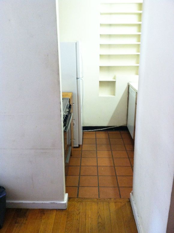
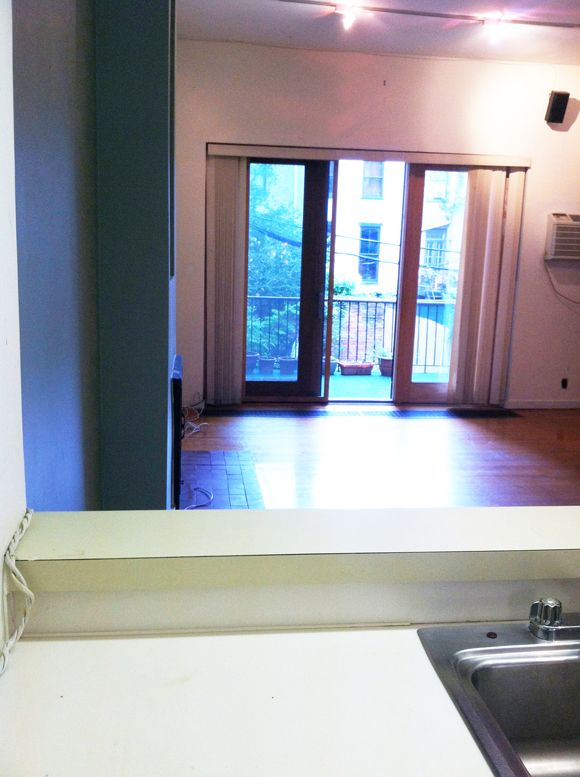
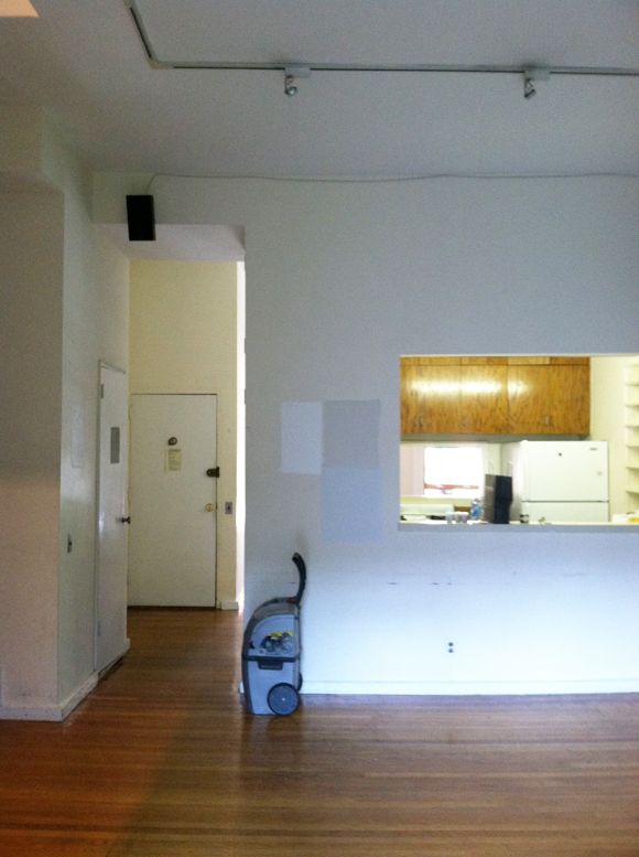
The kitchen is minuscule. We had a tiny kitchen in Cambridge, but this kitchen makes that one feel palatial. To make the space more usable, we’re adding a huge wall of cabinets in the dining room (which is just around the corner) to store dishes, pots and pans, and even some pantry items. So the kitchen itself will be mostly just a cooking and washing dishes space. I can work with it.
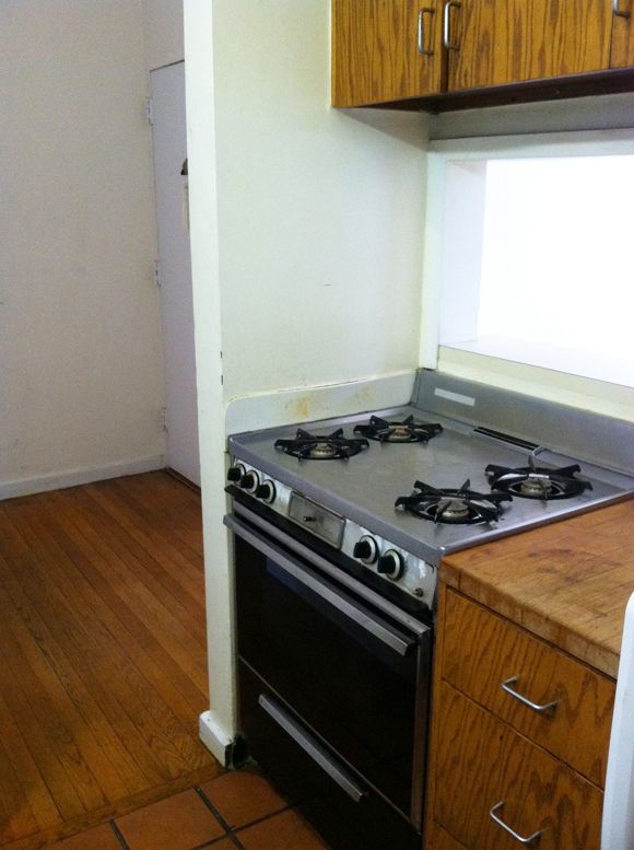
The original plan was to replace the oak cabinet doors with new shaker style mdf doors. I found some online for about $30 a door, unpainted. Not bad, but it was still going to be around $600, so now the plan is to just trim out and paint the old doors myself. I saw a video tutorial online for how to fill heavy graining and I ordered the products to do that. And yesterday I pulled off all the cabinet doors, so we’re on our way.
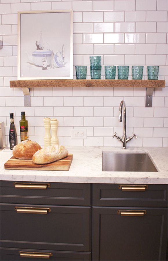
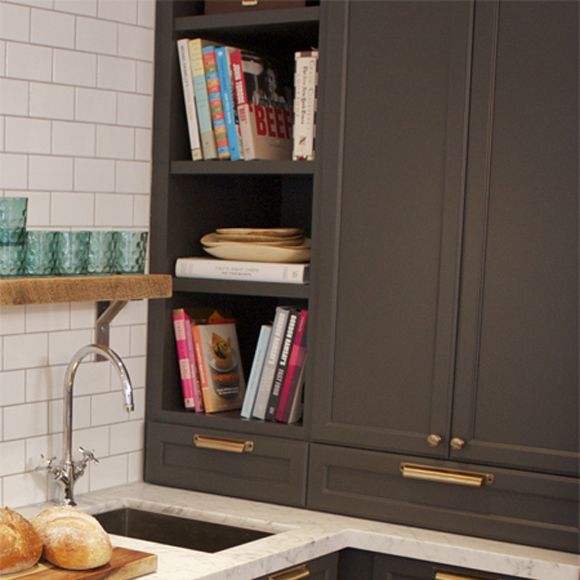
As far as colors go, my love affair with Farrow and Ball paint and colors continues. Inspired by this gorgeous kitchen, I’m going with a dark charcoal (Down Pipe) with brass pulls.

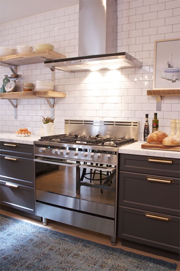
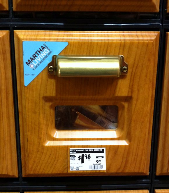
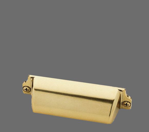
I really liked the look of the longer, more square bin pulls in this kitchen and thought something similar could work in mine. Thanks to twitter friends who alerted me to the price drop on these Martha Stewart pulls. They are less than $2 a pop, which is completely unbeatable, especially for unlacquered brass pulls.
Today I’m starting to paint the cabinet interiors and frames. Hopefully the grain filler comes tomorrow so that I can get these cabinets up and running this week! Then on to other kitchen projects: a new floor treatment, backsplash, shelving, appliances, lighting, sink/faucet, countertops… yikes!


It's always the detailing that makes things look more interesting. I can't wait to see how the cabinets turn out. I'm also interested to see what you do with that built-in shelving in the kitchen.
Jenny, I absolutely love that you decorate on the average man's budget and still make it fab. It gives me hope that I can do the same!
OMG! I LOVE that inspiration kitchen. I can't wait to see what you do to yours – those pulls are making me wish I had a project I could use them on!
Just a suggestion – forget those tiny shelves and make it a wall you can hang things on. Tiny shelves are an illusion of space but are hard to use – useless.
Admittedly I am a frequent lurker, but I had to comment because I have been obsessing with that Canadian House & Home Kitchen (and the video ) for some time. I love it and can't wait for your reveal.
I can not even believe the price on those handles- insane!!! I can't wait to see what you do- it's going to be amazing!
I just used those bin pulls on a dresser re-do! They are really nice looking for $2/pop!
jenny…you are amazing! and you make my head spin with ideas! I love what you are doing with the cabinets…cannot wait to see each step of the journey!
Great inspiration pix and I'm sure it'll turn out fabulous as all your projects seem to do. One suggestion for a blog post (or two), is how you set a budget for a project (or projects like your house) and this whole "project timeline," which sounds very organized and scary at the same time. I think your readers would love to know how to approach these daunting tasks you take on with such ease. Thanks!
Kitchen redesign is so exciting and it sounds like you've got your to-do list started. I love your inspiration images. The pulls and handles we ended up using are very similar and I love them. They are easy to use and a nice clean line. Ours are a polished chrome though. Sounds like you're on your way to a new look to your kitchen which is very exciting. We renovated ours in July 2009 and it was the best thing we ever did – and now we just got new paint in there 3 years later which was also a welcome update. Looking forward to seeing more.
I just found your site and am literally decorating every room by your pictures. Left ideas for your fireplace prior and have them to tie in the kithen since they're so close in proximity. Am a designer too, so it's a sickness. I see, therefore I design. =)
Leave the lovely wood of the upper and lower cabinets, but conditioning them, then either paint the countertops the glossy black or replace with slate (expensive, but has long life). Would probably go with the plain black polished stone or whatever mix of metals you end up choosing for your faucet for knobs/pulls. And stainless steel appliances – Ohhhlala! Paint the shelf nook the glossy black. Then with your dry goods in clear glass cannisters this area will simply pop and add texture and color for interest. Then to add other colors infuse your textiles like under the sink area, cafe curtains, area rug, etc. OK, I'm done. Can't wait to see the end result!
I think you are starting to change my feelings about brass…I've been "over it" for a while, but paired with the dark grey in a non-traditional setting, it really looks good!
We used those exact pulls for our "Accidental Kitchen Remodel" a while back and I couldn't be happier with them (they were on sale for $3 though, not $2). God bless Martha Stewart and her infinite empire.
I am just a few weeks behind you on the kitchen remodel. I just bought my first home, and the one down side is the small kitchen. I am looking for a temporary fix for this room while I save up for a larger remodel.
I love your ideas for the cupboards and want to figure out how do that to my old cupboards and add glass panes. My other obstacle in my kitchen is lack of dining space. Do you have any ideas for creating a hideaway/collapsable dining area for entertaining? I would love some ideas.