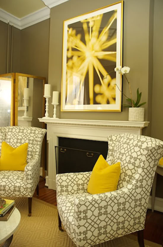
I love the warm gray and vibrant yellow combo in this sitting room decorated by Sally Steponkus and Heather Safferstone. Isn’t that Windsor Smith for Kravet fabric to die for? Coincidentally, CocoCozy is hosting a giveaway right now for two pillows in this exact print – check it out here.

Designer Sarah Wessel wanted the shelves in the showhouse library to be filled with leather-bound books. When she couldn’t find enough to her liking, she used Farrow & Ball wallpaper to cover inexpensive books. I love this look! Using scrapbook or wrapping paper would be a less pricey alternative to the wallpaper. Just don’t forget to label the spines of the books!

David Mitchell made a serious statement in the living room by simply cutting and arranging pieces of art paper for this beautiful framed series.

Elle Decor published a room by Shelton, Mindel & Associates that featured some very similar artwork done by Gunther Forg. Mrs. Blandings posted about this artwork and shared a method for creating her own version.


Love all the artistic details- especially those can be recreated! Great look– thank you!
Hooray! So few pictures made it out of the design house last year. It's great to see some nice, big images online (I won't be pitching the issue of DC Spaces that has print pictures for quite some time). The house was small and I loved it. So many design houses are in lofty, new construction homes.
By the way, an upstairs bedroom at the house led me to a first big art purchase. I've been blogging about the entire process…the artist (John Matthew Moore) has been a dream to work with. He gave me the impression that the DC design scene is very accessible and friendly. :)
Great ideas!
Thanks for the inspiration, great ideas :)
I'm still having dreams about my visit to that house! I loved the entry way, and the tiny powder room tucked underneath the stairs. The entire house was great, but Davis Mitchell's living room was my absolute FAVORITE!! :) Thanks for the reminder!
I love the yellow and gray together! It seems like as soon as I switch to a new color combination I find another I love too!
The grey and yellow combination is one of my favorites! I also love the natural touches you can find around the room.
Hi Jenny,
Thank you for another great post and inspiration. And thank you so much for mentioning the Cococozy pillow giveaway!
Hope you have a good day!
xo
Coco
Thanks for the link – and the idea! Paper would have been even easier.
Oh, thanks for the tip on the giveaway, those pillows are fabulous!! Love your blog, looking forward to reading about all your projects and inspirations in 2010!
Janell
i am so loving gray + yellow this year.
i think its all about 2010 new colors.
those are great inspiration pictures for me (your blog is always giving me new ideas)
thanks for your posts.
thank God for your creative talents.
THANKS A MILLION!
:)
Beautiful! I love the framed art paper.
Oh, this is awesome. I love how there are so many touches that look "lived in"– so many showhouses are just museums. I am sure there is some reason that I'm not sophisticated enough to get, but WHY is there a missing print in the Elle decor arrangment bottom right? It's driving my inner Type A personality crazy…
That DIY paper art is kind of a big deal.
Love your blog! I just found out about your blog and spent most of my holidays reading your blog. You are a genius and keep up the good work :)
It's very cute, but…fake books? Really?
I don't think I can go there.
Gorgeous, gorgeous, and gorgeous! That Windsor Smith fabric is to die for.
Congrats on all that you have accomplished this year! Your blog is so fun to read & full of little gems of inspiration. You deserve all your success.
DC Design House 2009 images by Carrie Russell
http://carrierussell.blogspot.com
http://www.photographercarrie.com/