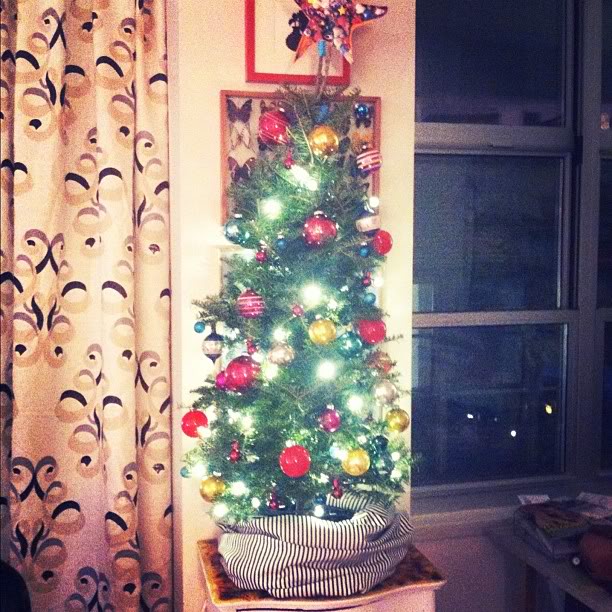
I love being a city girl, but there is just something so grounding about being outside all day, no buildings in sight.

We’re in heaven.


I love being a city girl, but there is just something so grounding about being outside all day, no buildings in sight. We’re in heaven.
I love being a city girl, but there is just something so grounding about being outside all day, no buildings in sight.
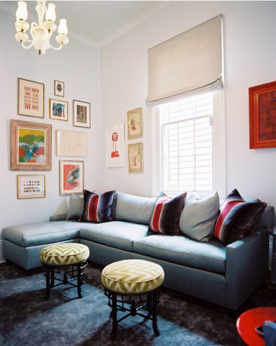
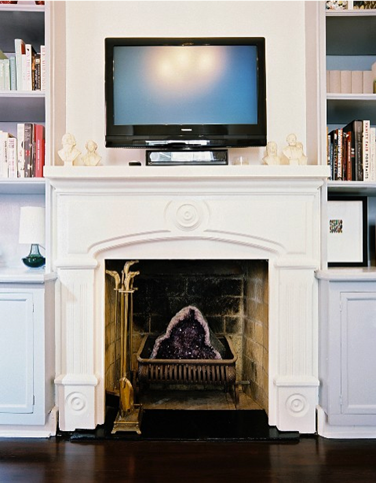
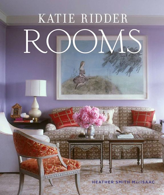
I recently stumbled across the work of John Loecke, a Brooklyn-based design firm – and I’m in LOVE! We all know I like to use color in decorating, but I also think there should be balance of neutral tones and also plenty of vintage/antique pieces. When everything is new and matchy-matchy, the color becomes garish…
I recently stumbled across the work of John Loecke, a Brooklyn-based design firm – and I’m in LOVE!


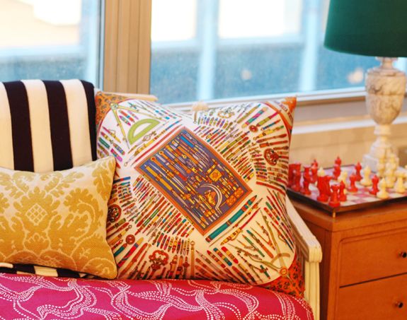
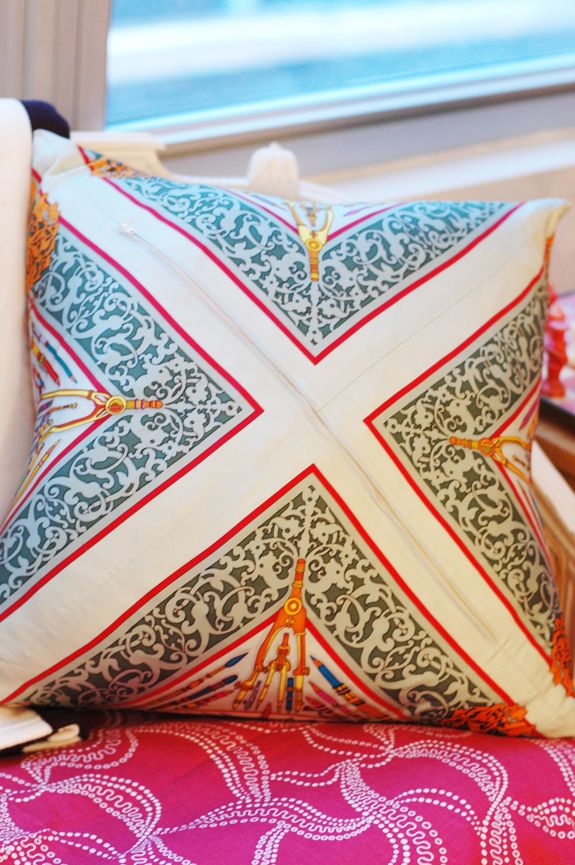
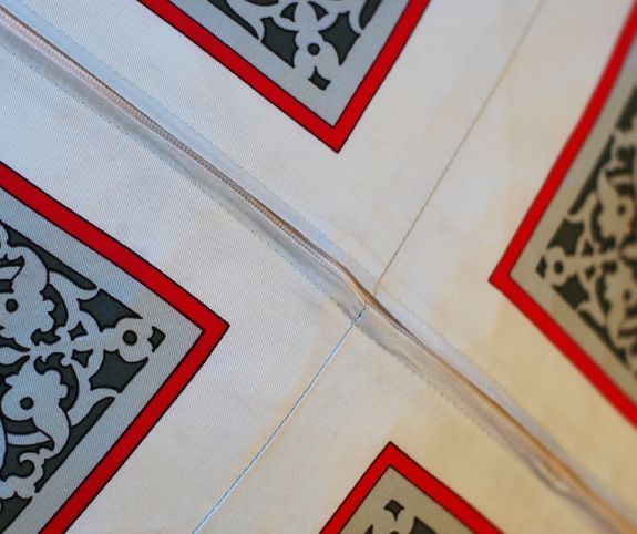
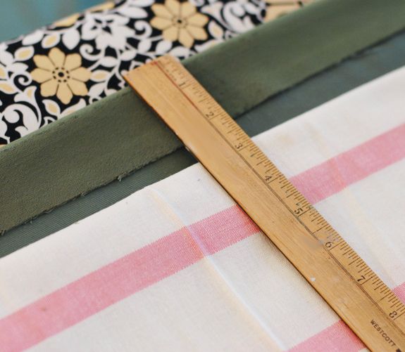
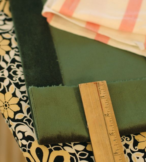
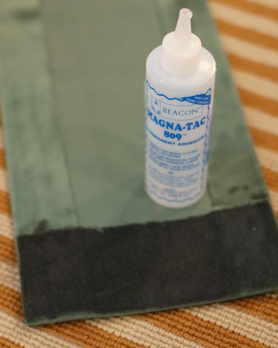
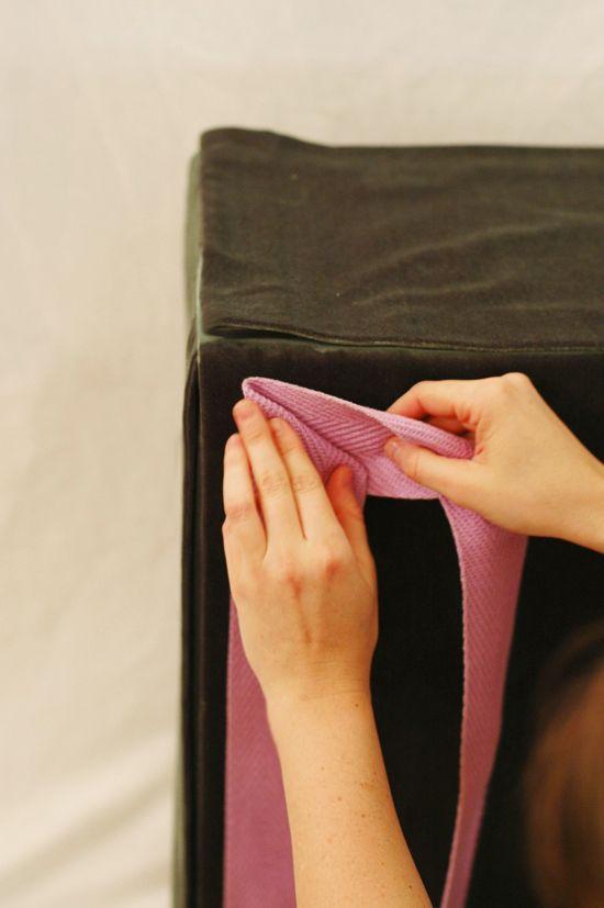
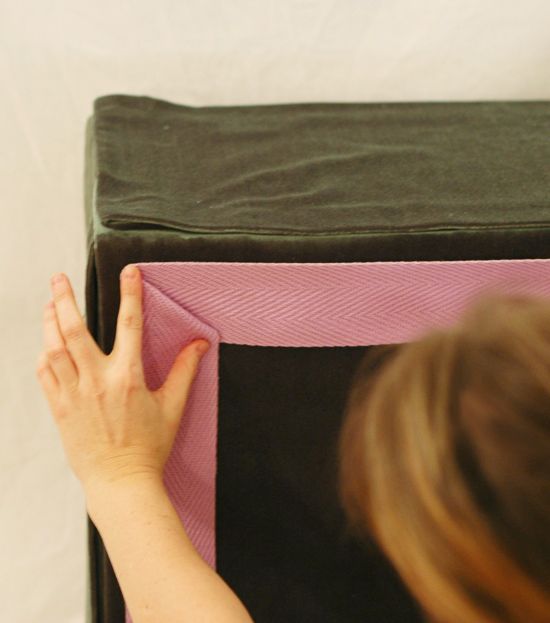
Last weekend I found this amazing vintage Gucci silk scarf at the flea market. It had been ingeniously sewn into a pillow. I am so inspired by the way they folded up the corners and sewed in a zipper diagonally. SO great, right? The colors in the pattern are so incredible in person, and of…
Last weekend I found this amazing vintage Gucci silk scarf at the flea market. It had been ingeniously sewn into a pillow.

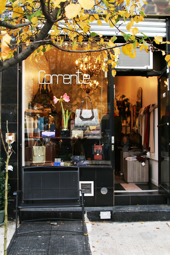
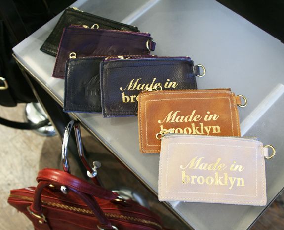
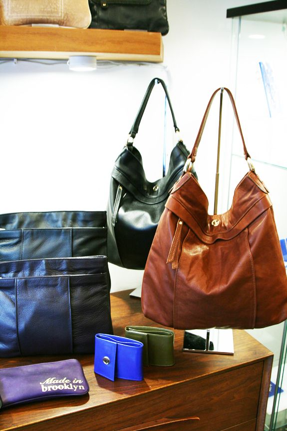
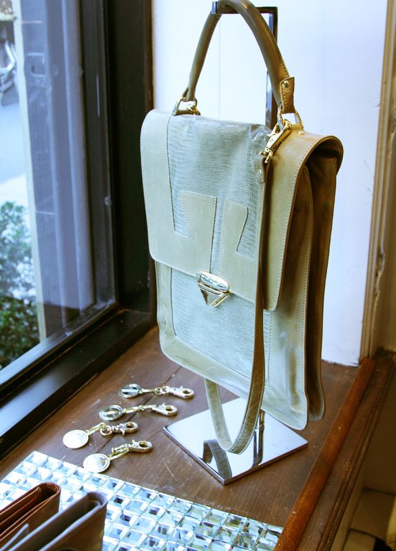
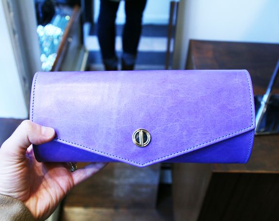
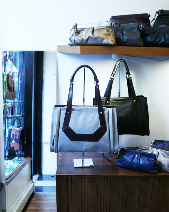
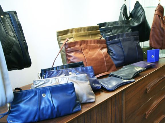
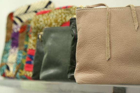
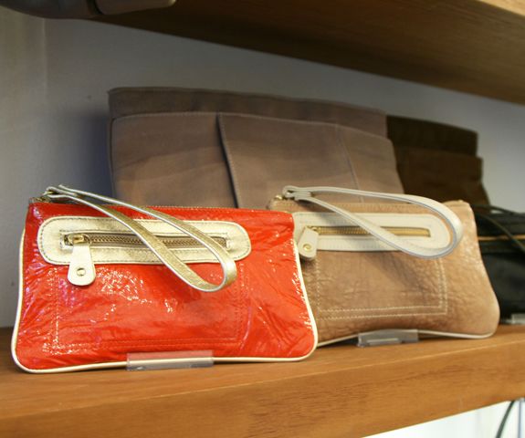
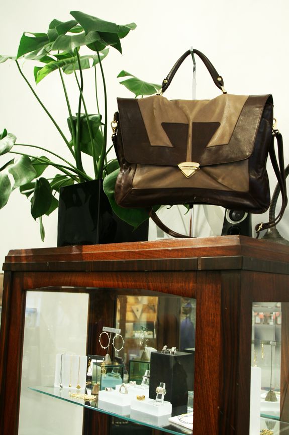
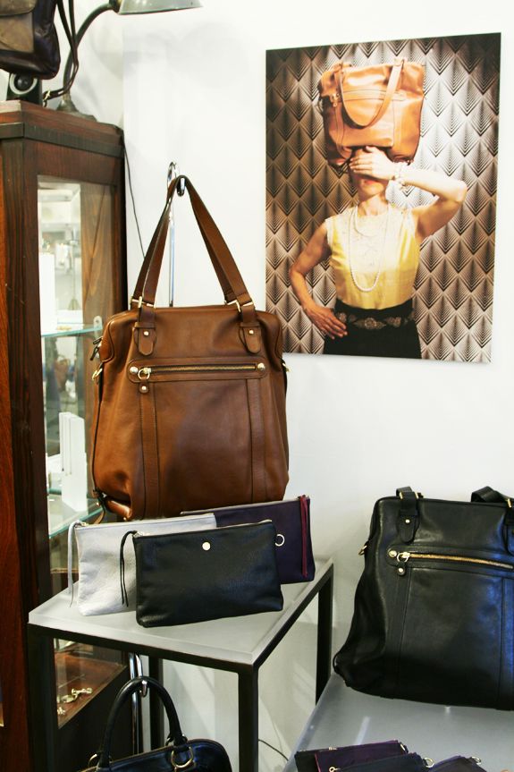
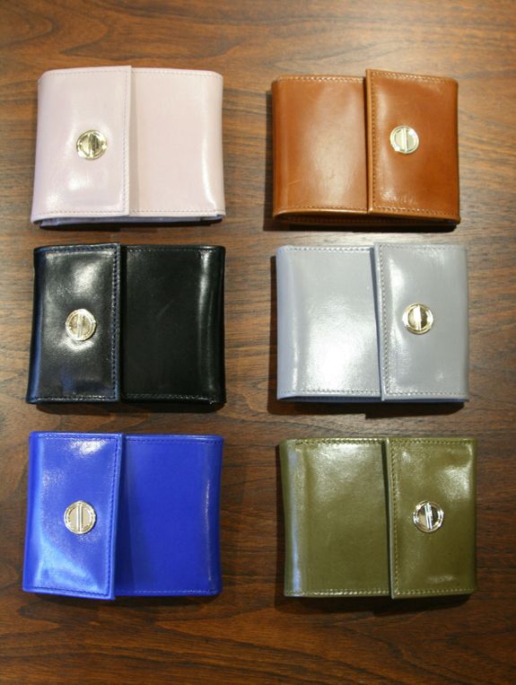
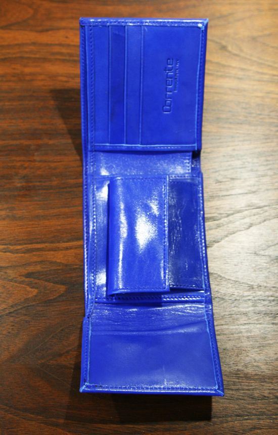
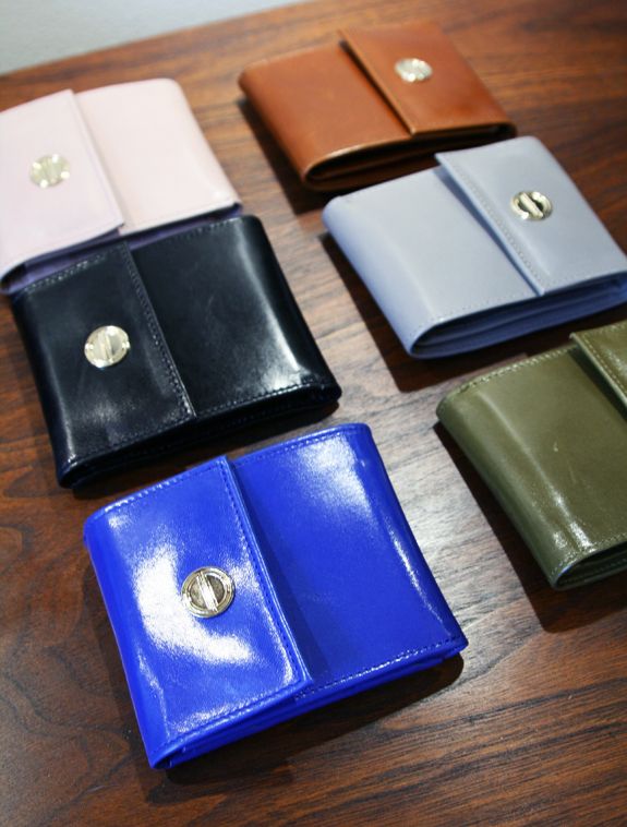
On the Lower East Side is an adorable little shop on Orchard, just south of Houston, called Corrente, that sells all sorts of lovely handbags, clutches and wallets. All of the Corrente products are made locally in Brooklyn from the highest quality materials. I got to stop in to the shop last week and see…

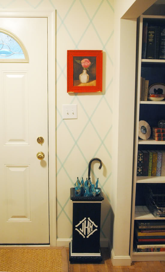
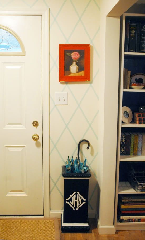
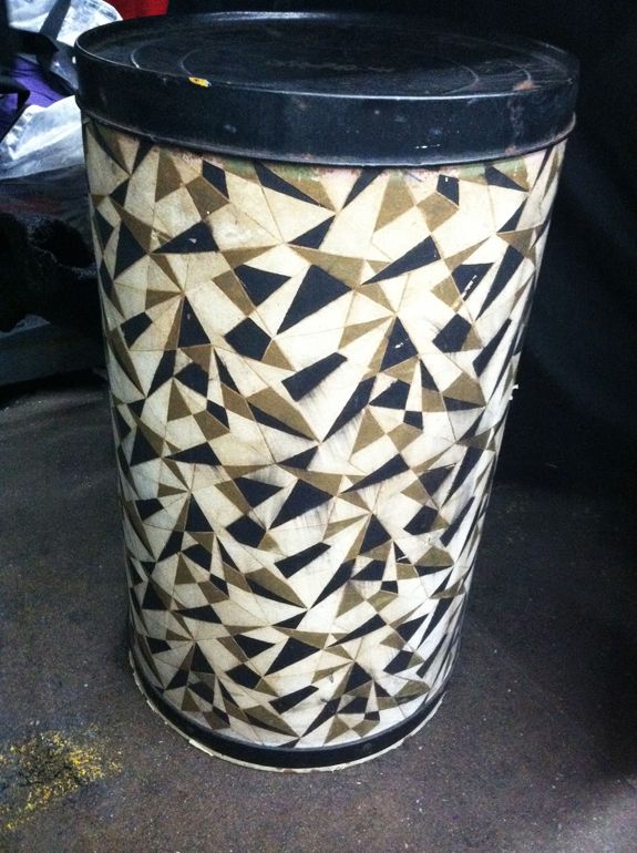
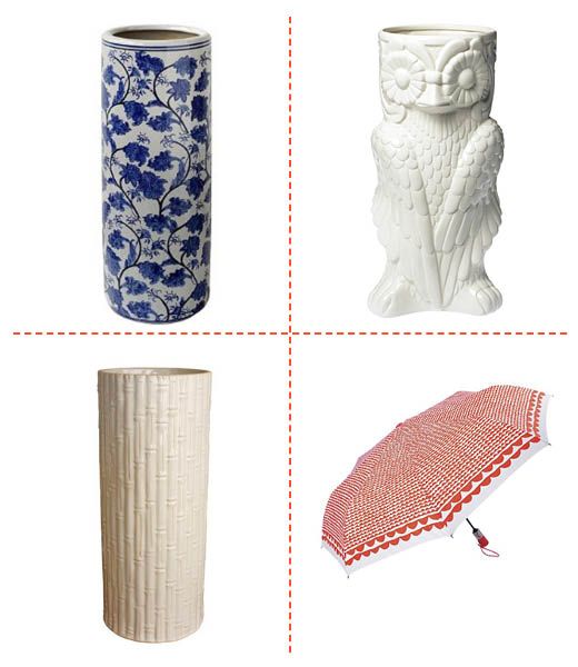
I can’t complain too much about the weather. It’s been a lovely and so mild fall/early winter. We still have had a lot of rain lately and have been getting a lot of use out of our umbrella stand. I monogrammed this one a year or two ago, but I feel ready for a change….
I can’t complain too much about the weather. It’s been a lovely and so mild fall/early winter. We still have had a lot of rain lately and have been getting a lot of use out of our umbrella stand.
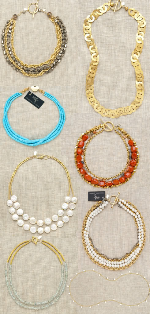
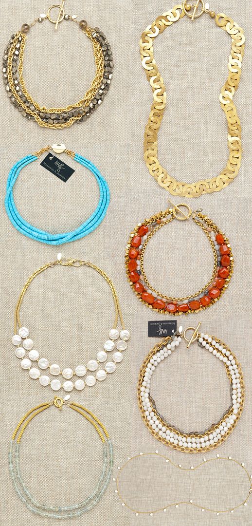
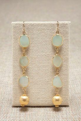
Wouldn’t this be just the best time of year to win a piece of fabulous jewelry from the uber-talented jewelry designer, Meredith Jackson? How surprised and excited would you make your mom or your best friend by gifting her one of these pretties! Or what about treating yourself !? I would be thrilled to wear…
Wouldn’t this be just the best time of year to win a piece of fabulous jewelry from the uber-talented jewelry designer, Meredith Jackson? How surprised and excited would you make your mom or your best friend by gifting her one of these pretties! Or what about treating yourself !? I would be thrilled to wear any of the pieces from Meredith’s site, but here are a few of the necklaces I have my eye on (take note, Santa!)

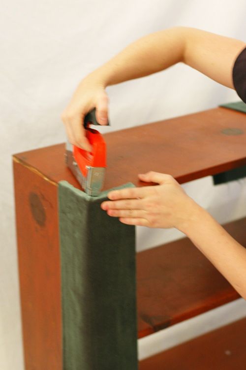
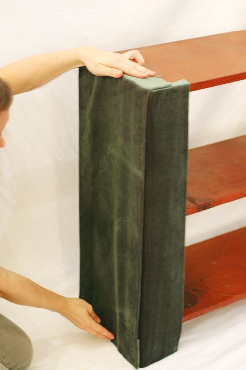
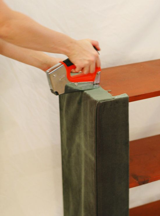
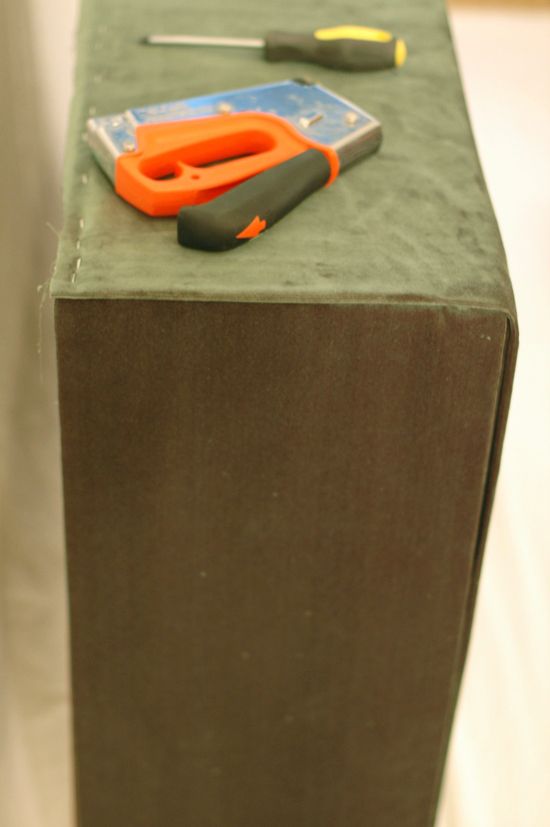
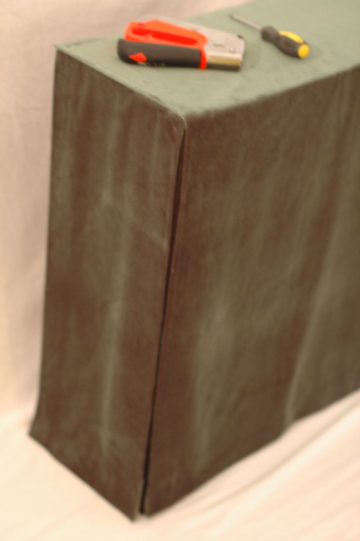
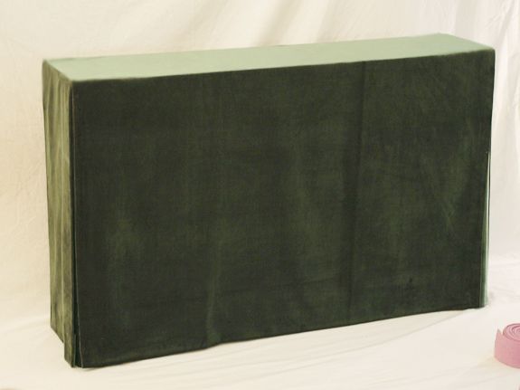
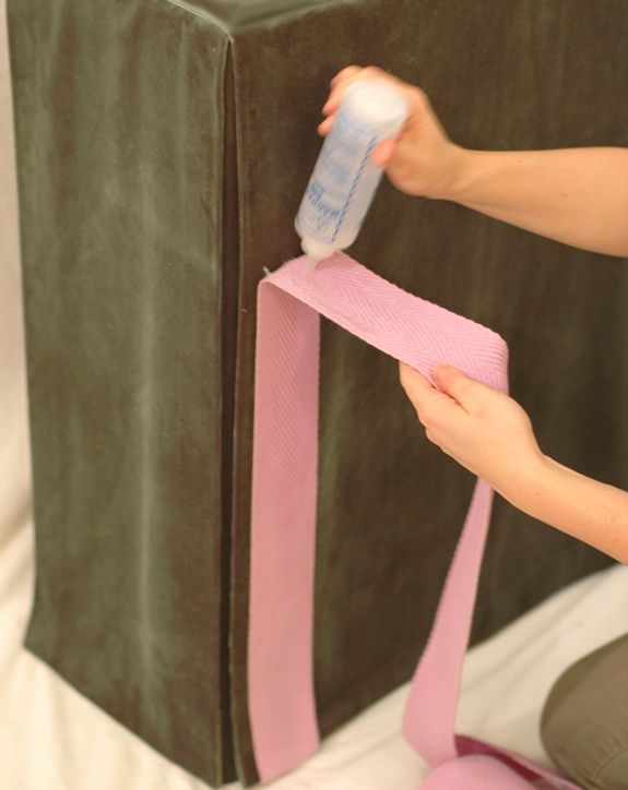
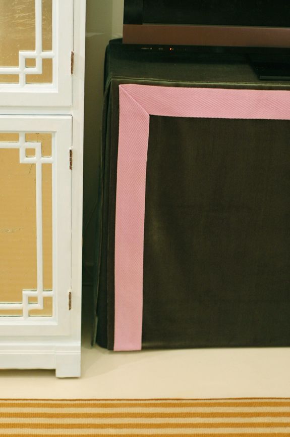
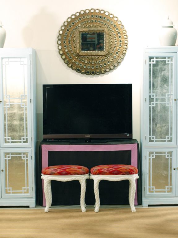
This post is sponsored by Glad. We’re taking small steps to do our part and want to help you waste less too. Visit GLAD.com for more information. I’m so excited to finally share this tutorial with you! This skirted table is my fourth or fifth of these DIYs, between my house and my client projects…
This post is sponsored by Glad. We’re taking small steps to do our part and want to help you waste less too. Visit GLAD.com for more information.

Hi! Happy Monday!! This is my last full week of client work before we leave for Hawaii (I’ll still be posting though) and I couldn’t be more excited for some R&R! We’ve been trying to do lots of Christmas-y things before we leave since NYC is so fun during the holidays and we’ll be missing…
Hi! Happy Monday!! This is my last full week of client work before we leave for Hawaii (I’ll still be posting though) and I couldn’t be more excited for some R&R! We’ve been trying to do lots of Christmas-y things before we leave since NYC is so fun during the holidays and we’ll be missing a lot of it this month. I think we’re going to go check out the Rockerfeller Center tree tonight, though I’m sure it will have nothing on our own little city-sized tree. :)

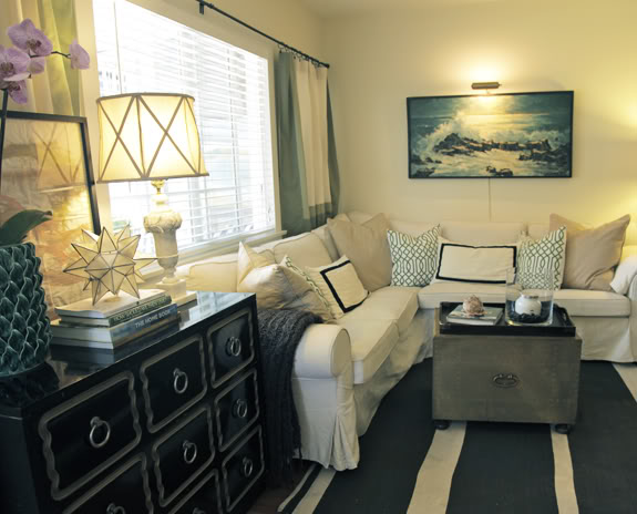
Hi friends! I hope you’re having a GREAT weekend!! I wanted to share this lovely living room tour with you sooner than later because Jay and Katherine are very kindly offering LGN readers 25% off their vintage shop Once Lost Home Goods, with the promo code “LGN25”. You mind find some pretties for gift-giving! Here’s…
My name is Jay Wolf, and I am what some may call a renaissance man, though maybe it’s more like a jack of all trades, master of none. Wearing lots of different hats has become the norm after my wife, Katherine, suffered a massive brain-stem stroke on April 21, 2008, as our 6-month old son slept in the other room. Miraculously Katherine survived, and we have been on the excruciating but beautiful road of recovery ever since (she shares her journey on her blog Hope Heals, www.hope-heals.com).
I have always been an artist and a creative, very right brain oriented (I somehow parlay that creativity into my “real job” as an attorney), so the decision to take on some of Katherine’s more wifely roles following her stroke was not too daunting for me, and I knew that finding ways to celebrate life in the midst of our suffering, as well as creating a really special home for my family would be keys to our overall healing.
We live in Los Angeles in a specific area called Culver City where I happened upon several thrift shops very close to our home. Finding little treasures amidst a lot of junk became extremely cathartic for me. I suppose in many ways it was a metaphor for what our life had become, finding the best things in the middle of lots of terrible things. I brought many of these finds into our home, and formed a little Etsy shop, Once Lost Home Goods, with the rest.
Our home seems to be a constant work in progress, and even the pictures posted here would look a bit different if actually taken again today (and these were only taken about a month ago!) I’ve found that carving out a unique, personal, safe, inviting place to call home and to “do life together” in is one of the great and unexpected joys that I’ve experienced recently in my life. Welcome to our home!
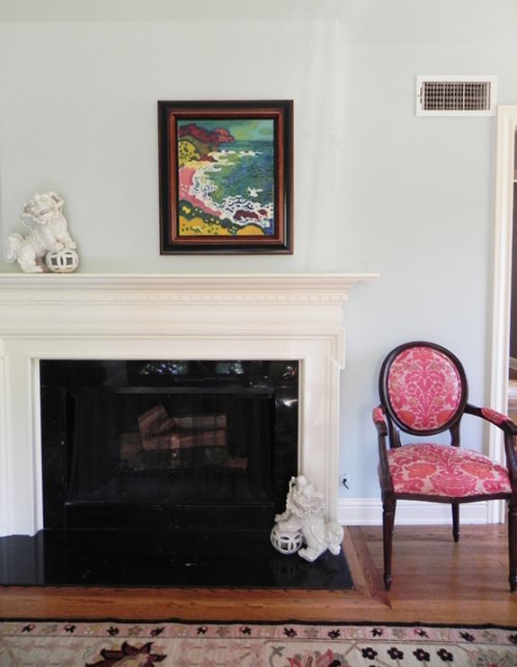
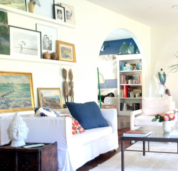
This is the view as you first walk into our living room, which for us, is truly the room that we do most of our living in. I love seeing the large, vintage seascape painting as I walk into the room, now dramatically lit with its own vintage art light from Katherine’s grandmother’s home. It definitely sets the tone. We lived in Malibu,CA, which is on the beach, for 3 years while I was in law school. We have such great memories from that time, so we incorporated lots of nautical and sea-inspired influences in our current home as a nod to that special time in our lives. Also, it’s hard not to feel relaxed when you have reminders of the ocean around you, so we tried to create our own little not-on-the-beach, beach cottage, while still not being too themey about it.
We’re from the South originally, which is much more traditional and formal than California, in every sense, I think. As a result of living in those two very different environments, our style has morphed over the years, and currently seems to be a cozy, eclectic, vintage, pared-down traditional. I think the juxtaposition and contrasts in a room are the most important elements for me, and of course, the mix of the new and the old seems to give a room lots of soul. Also, since two guys and a girl live in this space, I always try to mix the masculine and feminine. Not only does it end up pleasing everybody, but the combination of those differing elements adds infinitely more interest than something that has more of a one-note perspective.
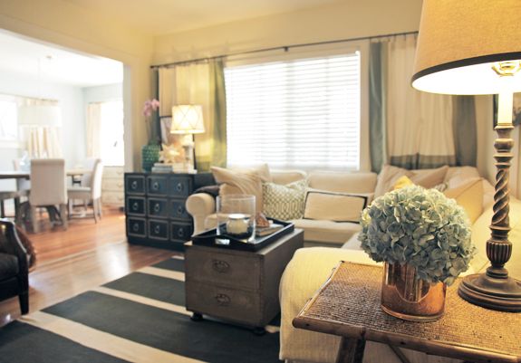
We live in a charming (aka “pretty old”) 1920’s bungalow. And while all 1,200 square feet of it have lots of character that can’t easily be found in new construction, it comes at a bit of a price. Honestly, did people in the 1920’s not have any stuff? Lack of storage is an issue, for sure, so when planning out the living room, we had to incorporate a good bit of non-built-in storage, this includes our “linen closet” boxed up in various sizes of Rubbermaids under our IKEA sectional. Also, the coffee table, while not so kid-friendly, is literally a trunk with drawers. This vintage piece was picked up for cheap at one of my local thrift stores because I thought it looked cool with the brass and the nailheads. I only later found out (thanks to some design blog) that this chest, handmade by the Spanish company Sarreid, was actually a really nice piece. Honestly, I could care less about the name, I just liked the design of it. To that end, I think you can never go wrong buying something you love, whether or not anyone else thinks it has value or not.
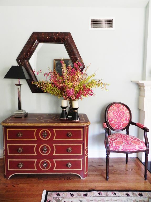
We received a lot of home items for our wedding (not off a registry, just given with the assumption that they would all come together somehow, I guess), many of which have left us for good at this point as we honed in on our own style; however, this spindle-base lamp (with an updated shade) and antique English bamboo table from the late 1800’s have stuck with us since the wedding day. It’s great to be able to incorporate personal things from your past into new spaces, even if you have to tweak them a little, and correspondingly, it’s even better to be able to let certain things go completely and start anew.
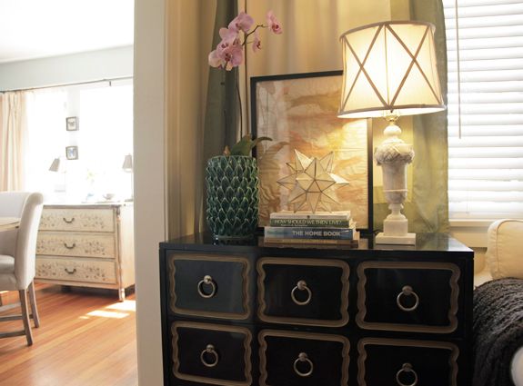
My introduction to the design world has mostly been through design blogs (thank you Jenny!) Literally, I knew very little of the lingo a year ago, but learning it proved to be valuable. For example, I would read about Hollywood Regency and the Dorothy Draper chest in blog after blog. One day, I went to a junk shop and this chest was sitting on the sidewalk, having been bought from the estate of a long-time LA resident, a woman who had gotten her start as an actress in Hollywood’s Golden Age. I knew this piece was a Dorothy Draper chest, and though it was not in perfect condition I figured it would still be way too expensive, but I thought I would inquire anyway. The price was $40, and after I asked the store owner to repeat it, I threw him two twenties and ran with my loot before he could change his mind! Full-on Hollywood Regency is not my style, for sure, but adding it to the room creates an unexpected visual edge. I love that this iconic piece holds all the odds and ends and 4-year old’s toys that must be shoved somewhere when company comes over. Beautiful and versatile, if only the walls on this chest could talk.
The grouping on top of the chest always makes me happy too, the textures and colors are just right, in my mind. And once and for all, I can’t be considered a bad parent for throwing away most of my son’s preschool art projects (where am I supposed to store them?!), since one of his first abstract finger paintings holds a place of great prominence in our living room. The capiz moravian star is from Target and the green leaf pottery is from TJ Maxx Home Goods, just going to show that in the right setting, anything can look more expensive than it actually was. The beautiful, vintage alabaster lamp (with an updated shade) was from Katherine’s grandmother’s home (she recently moved to a retirement home and gifted us quite a few great, vintage things) and is such a wonderful daily reminder of her beloved grandmother.
Also, I’m not much of a DIY’er, but I was quite proud that the bordered curtains in the living room were actually two Target fabric shower curtains that we had cut off and hemmed to the right length by our local alterations lady. So much cheaper than having custom curtains made in that bordered style and so much easier than trying to somehow, very badly make them myself.
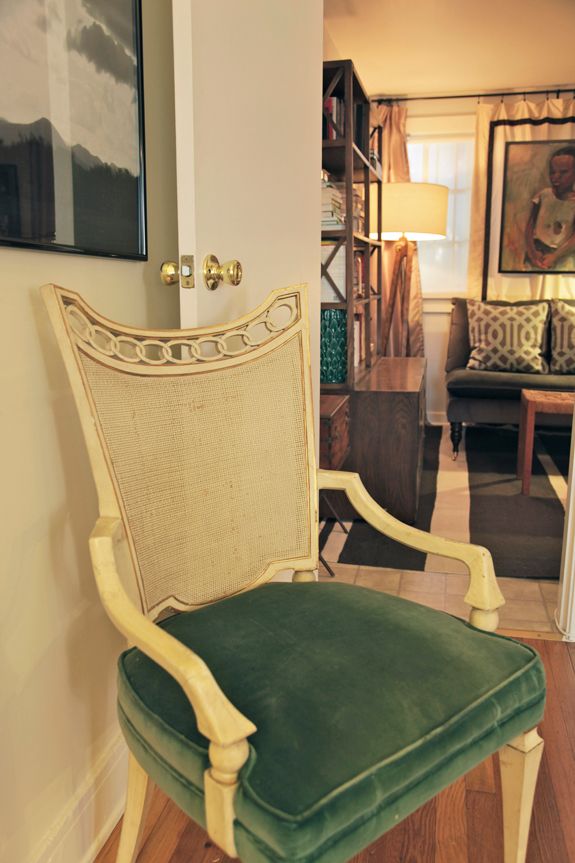
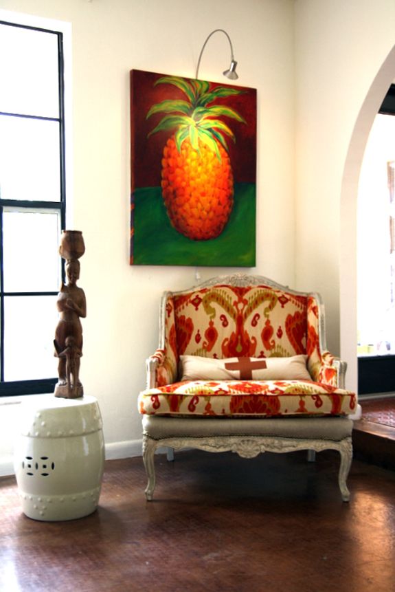
Again, the 1920’s architects didn’t do us a lot of favors in the storage or in the space planning department either. This room is an awkward, long rectangle, with lots of doors opening out to other rooms and heaters coming up from the floor, so we had to get creative. This very tight and long spacing is why we opted for the sectional sofa, which is not necessarily my favorite type of couch but sometimes practicality wins out, though practical can still look good. Likewise, some practical seating and visual space was needed in this tiny corner, over-crowded by the door to my office. I decided to fit this great occasional chair there, which looks like it was picked up from a Parisian flea market (it was actually from a rather seedy Goodwill on Santa Monica Blvd, but who would know?) The scale was much better than a previous chair we had there and the green velvet and patinaed gold edges fit the room perfectly. I love how it looks in contrast with the large black and white photograph of the California landscape that I took as we drove into California in our U-haul, for the first time, 7 years ago.
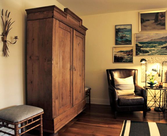
This armoire is one of my favorite things in the room, and I think it was the first one I bought. Of course, inside lies our TV and naturally, more storage space for exercise mats and DVD’s, etc. It was a Craigslist find, and I was initially drawn to the old oak and the shape of the top. I loved it even more when I found out it was used in the late 1800’s as an armory (ie. to store weapons and guns) and was made for quick disassembly and travel (I guess to run away from rebel forces) so it literally comes completely apart. Cool, right? Though it was not so cool when I was trying to put it together by myself late at night and the heavy wooden doors kept falling on my head, but still, totally worth it!
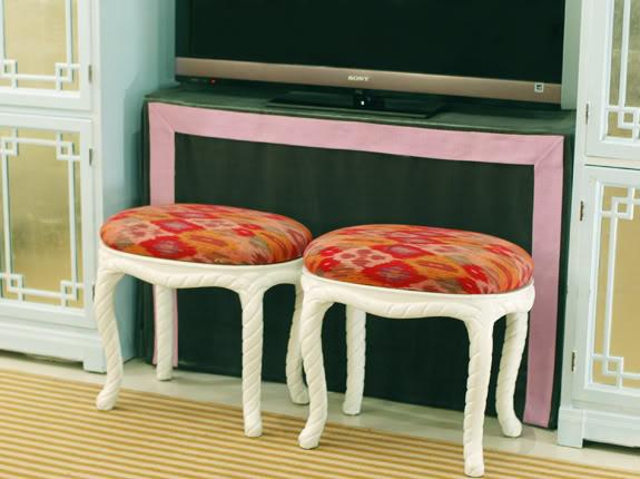
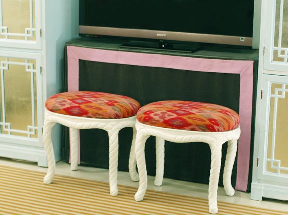
The faux bamboo stools were re-covered in a gray lattice patterned fabric shower curtain (what’s the deal?) and were originally from the Sunset Tower Hotel (a rather famous hotel among celebrities, on the Sunset Strip near Hollywood). There are several warehouse-sized businesses in LA that specialize in re-selling hotel surplus furniture. I’ve even picked up some furniture for a friend’s room that I designed (www.oncelosthomegoods.com/portfolio/before-after-classic-nautical-guestroom/) from a Kelly Wearstler-designed hotel, though like anything, you usually have to dig through a lot of junk to get there, but then you get a pretty inexpensive piece with great design. And you never know who might have been perched on that stool.
Another of my favorite elements in the room are the pair of vintage Italian tole wheat sconces. Despite my mentions of Kelly Wearstler, Dorothy Draper, and tole sconces, I truly do not have a secret obsession with Hollywood Regency–not that there’s anything wrong with that. What I most love about these is that they were not sold as a pair. I bought one on Ebay because it was inexpensive, and I loved its design compared to lots of other wheat, tole sconces that I had seen. I later concluded that two is better than one, so I set out looking for its mate, which I finally found on Etsy, from a totally different seller. I had to pay up a bit for this one, but I love how they flank the armoire, and the symbolism of harvest will always be extremely meaningful to me.
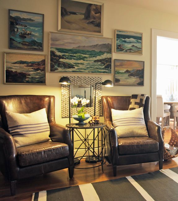
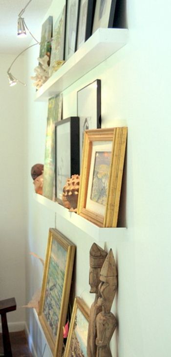
On this wall, the main visual element is obviously the collection of vintage seascape oils. I love art, in general, so I can’t help but love a good gallery wall, and I’ve got quite a few of them, even in our tiny house. I got all of these from either Ebay, Etsy, or my thrift stores. They are all by different artists but all in a rather specific range of color palettes and an impressionistic style which makes them work really well together as a grouping. I did change out most of the frames, and at first, I probably would have wanted all the frames to match, but the same frame wasn’t always available, but now, I really like that the frames are complimentary and all thin but not matching.
The pair of leather chairs was something that I have always wanted, and I finally got them on major sale at HD Buttercup, a great furniture store in Culver City. They are one of those items that I will keep no matter where we live or what my style may be. They were the biggest purchase in the room, and I love how they only get better with age. Our four year old does a fine job of adding to the weathered look, which is sort of softened by the large, French grain sack pillows.
The round occasional table between the two chairs is hands down my best and probably only find from Ross. It’s got a black marble top and though hard to see in the pictures has a fantastic, sort of mid-century starburst design base, made out of iron, with an antiqued brass finish. The apothecary floor lamps are from Target and again pull in some black, which is a color that is very grounding to a space (though I’m not even sure what that means, but I get it). I used to be kind of worried about matching black and brown and clashing metallic finishes but I think not knowing too many rules has probably helped me the most in being able to confidently pull designs together. Whatever works, just play around with it until it looks right to you.
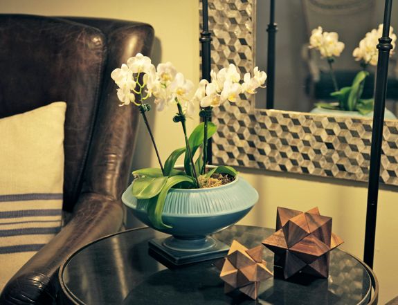
Katherine was in ICU for 40 days after her stroke, during which we could not fill that sterile, sad room with any flowers or potential contaminants, understandable, but it definitely made it hard to bring any sense of life into that place. So, ever since, I have felt the need to have fresh flowers around our home as much as possible. It’s a slight indulgence, but we always just get them at the grocery store and arrange them ourselves. We also use a lot of orchids and other long-lasting varieties. No offense to fake flowers, but it kind of defeats the purpose of bringing some life into a room, right?
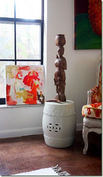
Though geometric shapes and patterns are pretty trendy, I feel they bring in a different kind of organic element which is really timeless. These wooden stars echo the larger white one on the chest (they were puzzles that I finally had to super glue together after one too many guests awkwardly brought me the pile of pieces unable to put it back together themselves). The wooden, mid-century geometric basket, DNA-model-esque, used for magazines on the floor next to the leather chair, was such a unique piece, spotted in a small Southern “antique” booth (looked a little more like a cross between Cracker Barrel and Hoarders) on a holiday trip back South, that I had to lug it back in a separate suitcase. The mirror is from Home Goods and is another example of something that looks much more expensive and unique than it was by being put in the right context. The orchid pot is mid-century vintage, with a unique ombre effect coming up from the base. This utilitarian piece also adds another layer of style and color, mixing eras, and not letting things fit too neatly into one box. There’s an inherent sense of nature and science and just enough uncommonness to these things which will never get old to me.
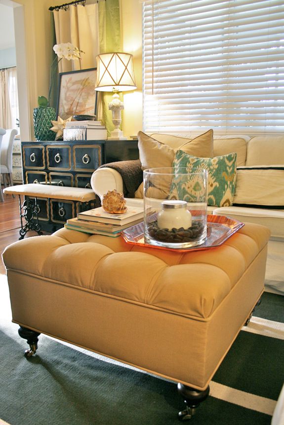
“After many a sore foot and many a passive aggressive remark about the hazards of child-rearing around a sharp metal trunk coffee table, I conceded and got this new tufted, storage ottoman. It’s brilliant because it is infinitely more comfortable to prop up our feet on when we watch TV, and it stores all our “blow-up guest bedroom” pillows and sheets. It’s also so much easier to move since it rolls around on casters, so we can push it out of the way when we need to do our Denise Austin workout videos! And of course, it was christened with a juice box on it’s first day in our home, but not to worry, it’s covered in Sunbrella, indoor/outdoor, washable fabric–victory (at least until a large cup of coffee is sloshed on it)! I added an extra yard of the fabric and recovered a vintage bench for more seating in front of the chest of drawers. Also, the pillows got a bit of an update, from one trendy pattern to another–what can I say, lots of people like them for a reason. This ikat in green, blue, cream and brown really pulls in all the colors of the room much better than the previous green trellis.”
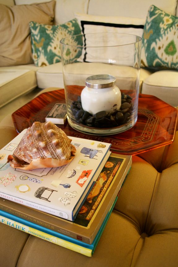
“Since we no longer have a hard-surfaced coffee table, a stable tray was needed to take on drinks and the like. I found this vintage lucite tortoise and greek key tray (I think Jenny might likey) at my local thrift store, originally intended for my Etsy shop, but as often happens, once I tried it on this new spot, there was no going back.”
*
Thanks for reading this to the end! I hope you enjoyed the tour and my rambling thoughts. Thank you Jenny for letting me share.
SOURCES:
FURNITURE:
– Couch = IKEA Ektorp Sectional, slipcovered in Svanby Beige
– Chest of Drawers = Vintage Dorothy Draper Espana Chest — Man on Motor, Culver City, CA
– Coffee Table = Vintage Brass Sarreid Chest — House of Return, Culver City, CA
– Side Table = Antique Bamboo Table — Appointments At Five, Athens, GA
– Occasional Chair = Vintage Green Velvet Chair — Goodwill, Santa Monica, CA
– Armoire = Antique Oak Armory — Craigslist, Los Angeles, CA
– Stools = Vintage Faux Bamboo Stools from Sunset Tower Hotel — Hotel Surplus Store, Van Nuys, CA; Fabric Shower Curtain — Ross
– Pair of Leather Chairs = HD Buttercup, Culver City, CA
– Occasional Table = Iron Starburst and Black Marble Top Table — Ross, Culver City, CA
– Rug = Nate Berkus Kilim Stripe Rug — HSN + 40oz Rug Pad — Amazon
LIGHTING:
– On Chest = Vintage Carved Alabaster Lamp; New Shade –Home Goods
– Art Light = Vintage
– On Side Table = Spindle Base Lamp — Appointments at Five, Athens, GA; New Shade — Target
– Between Leather Chairs = Pair of Pharmacy Lamps — Target
ACCESSORIES:
– On Chest = Green Leaf Pottery — TJ Maxx Home Goods, Westchester, CA; Child’s Art Frame and Capiz Moravian Star — Target; Books = Lapham’s Quarterly, Winter 2011 — Amazon, “How Should We Then Live?” by Francs Schaeffer — vintage, “The Home Book” by House Beautiful — Amazon, and “All the Saints of the City of Angels” by J. Michael Walker — The Hammer Museum, Westwood, CA
– On Coffee Table = Mahogany and Brass Tray — Crate & Barrel; Shell — African souvenir; “The Way We Live By the Sea” by Stafford Cliff — Amazon; Glass Hurricane — TJ Maxx Home Goods; Black River Rock Vase Filler — Target; Capri Blue Candle in Black Currant and Cassis — Lundeens, Culver City, CA
– On Couch = Tan Euro Shams — Target; Green Imperial Trellis — Nena Von Pillows on Etsy; Black and Cream Border Lumbar and all down inserts — Pottery Barn; Brown Cable knit and Cream Chain link Blankets — Nate Berkus for Linens ‘N Things
– Curtains = Bordered Fabric Shower Curtains by Fieldcrest and Curtain Clip Rings — Target; Curtain Rod — Ross
– On Side Tables = Hydrangea Vase — TJ Maxx Home Goods; Mini-orchid Ombre Pot, vintage — House of Return, Culver City, CA; Wooden Moravian Star Puzzles — Ross
– On Walls = Vintage Seascape Oil Paintings — Ebay, Etsy, House of Return, Culver City, CA, NCJW/LA Thrift Store, West LA, CA; Frames = Aaron Brothers, Culver City, CA; Large Black and White Photo — Jay Wolf, blown up on Shutterfly; Frame — Aaron Brothers; Vintage Italian Tole Wheat Sconces — Etsy and Ebay; Geometric Capiz Mirror — TJ Maxx Homegoods
– On Leather Chairs = French Grain Sack Pillows — Colcha, Venice, CA; Brown Geometric Blanket — TJ Maxx Home Goods
– Magazine Rack = Mid-century Wooden Basket — Eastbrook Flea Market, Montgomery, AL
– Tufted Ottoman = Ballard Designs, in Brass Sunbrella
– Tray = Vintage Lucite — House of Return, Culver City, CA
– Ironwork Bench = Vintage — House of Return, Culver City, CA
– Pillows = Ikat — Jenny Farley Designs on Etsy
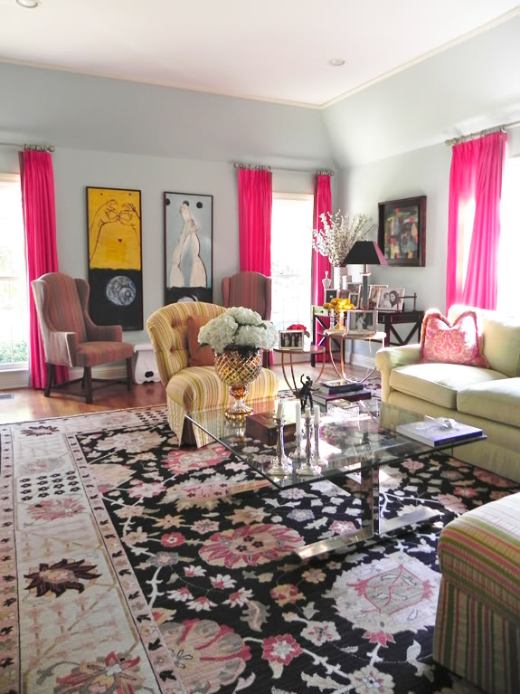
Next up in for our room tours is Albertina (who doesn’t have a blog or website yet, but has plans to start one this month or soon! Exciting!!). I am loving her fearless living room with the ‘just right’ pops of color. Thanks for sharing, Albertina! “The color of the walls is Benjamin Moore-Palladian Blue…
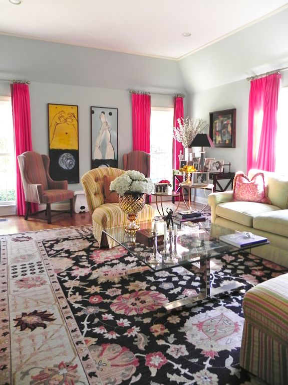
“The color of the walls is Benjamin Moore-Palladian Blue (HC-144)- flat. A lot of people have asked me the name and I love it too. I think the first thing we did in the living room after picking out the wall color was decide on color of the drapes. They had to be something that would go well with a beautiful trim my mom had given me that is about 40 years old and hand-made in Spain. I love how the walls color and curtains + trim look together.
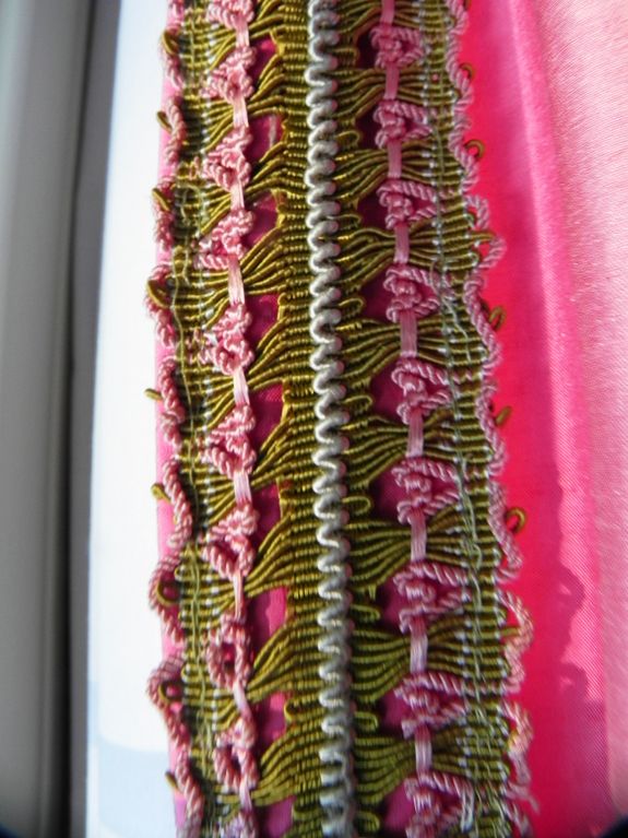
This is the hand made trim. It is a from store in Madrid called Galon. The paradise of trim. If I ever move from this house that trim is coming with me!
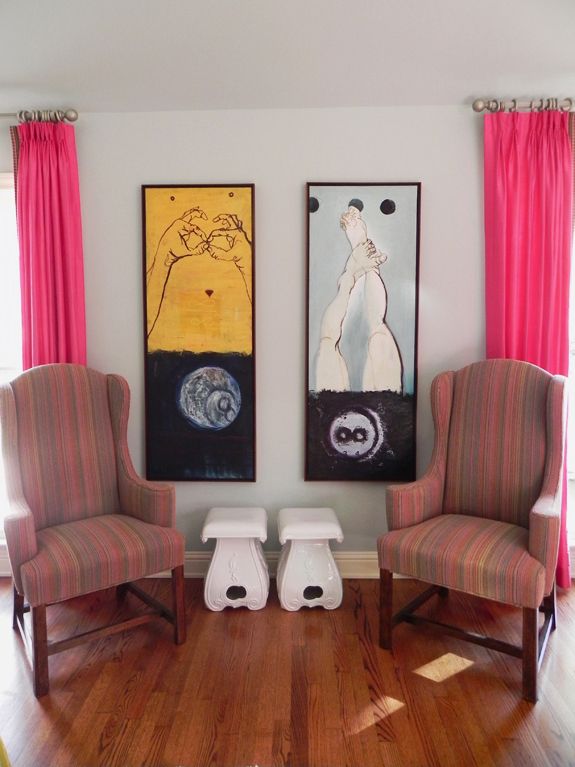
“I love having this separate seating area in the living room. At parties I have noticed that it is the men that really use and enjoy these chairs. They are actually part of my dining room set but decided they look better in the living room. The paintings are from a Colombian artist, Gonzalo Fuenmayor. I love his work and this diptych especially. Everyone inquires about it. The fabric on the chairs is from Clarence House and is very cozy. I love sitting here for a one-to-one conversation. Wing Chairs are from Lewis Mittman from about 35 years ago. White Stools are from Cyan Design but they have been discontinued.
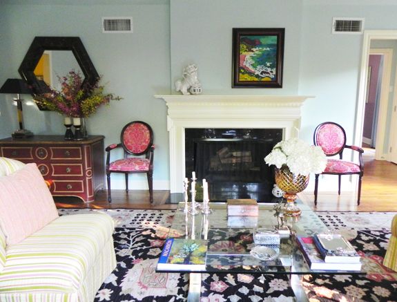
“This is my favorite painting. It is by a french artist, Charon. It is a view of the Ligurean coast in Italy. I did not want to center on top of the mantel so I used the Foo Dogs (from Neiman Marcus) to balance it out. The pair of damask chairs are from Calico Corners.
“This dresser is an antique from Yale Burge a present from my mom. I love the color and the knobs. The mirror is coconut shell also from Yale Burge. The lamp is also vintage from Chapman (I don’t think this company exists anymore).
“I put together this corner around the painting. I love this painting for two reasons. One is the painting itself. I love the composition and the fact that the artist, my good friend Alfredo Paris, gave it to me as a present. He went to RISD and is an amazing artist. We went to grade school together and have saved some of his amazing drawings from he was 10 years old in case he would become famous one day! He now lives in China and is studying print making. I can’t wait to see his latest (sorry he doesn’t have a website). The other thing that I love is the frame. It works so well together with the painting. The desk is from Mecox. I love the black. When I bought it I realized how much I loved the black in the room and decided that I needed more black in the room to balance out all the color. So I looked for a rug with black. I could not believe it when I found the perfect rug with pink, black, and light blue accents. I felt like it was made for my living room!
“These side tables are from Crate and Barrel. The lemons are plastic. I tried having real lemons for a while but it became too much of a hassle to change them so often! The stand they are in is antique from Michael C. Fina. And the little ashtray is from Hermes, it has a cute scottish terrier in the middle.
“This pouf is flanked by two of my dining room chairs. I love the pairing here of Nicole Cohen’s painting (from Sketch 42) with the colors of the Clarence House fabric of my dining chairs and the blue candle holders. I have three painting from Nicole Cohen all through the house. I like her bright, abstract style. Here’s a link to her etsy store.
“Painted Portraits! Interesting topic. I think so many of them are cheesy, but I love this one. Is it because its of me? or because an amazing Spanish artist, Macarron, painted it? or maybe because I’m used to seeing it all these years? Not sure, but think its pretty cool. I feel like it is a treasure in my home. I love the seriousness of it and how it looks against that blue wall. The side table is from Baker Furniture (Similar here)

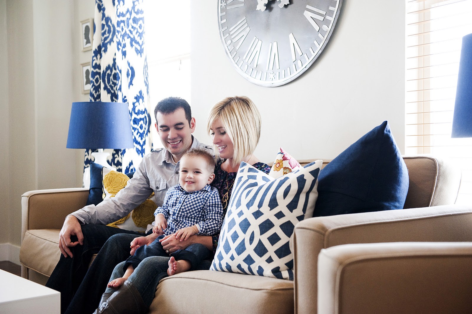
The next living room tour is from one of my favorite blogger ladies, the lovely Kirsten Krason of 6th Street Design School! I loved reading all about her beautiful living room. Thanks so much for sharing, Kirsten! xx Welcome to my Living Room! This room has come so far since it’s humble beginnings. I love…
The next living room tour is from one of my favorite blogger ladies, the lovely Kirsten Krason of 6th Street Design School! I loved reading all about her beautiful living room. Thanks so much for sharing, Kirsten! xx
Welcome to my Living Room! This room has come so far since it’s humble beginnings. I love spending time in here with my family.
Enjoy!
Our sofa and chair are wool and were originally purchased at Pottery Barn.
We bought them on Craigslist. I think it was like $1,300 for the set. The fabric is wool which has been interesting. It’s not the softest fabric but it does hold up pretty well with messes and spills. I love the color of these. Not too dark and not too light. The rug is by Nate Berkus from HSN. It is no longer available. I sure wish it was. It’s been a great rug. I love how graphic it is. It’s a flat weave which means it’s not super soft. But the nice thing is that when one side gets dirty we can just flip it over and the same pattern is on the other side.
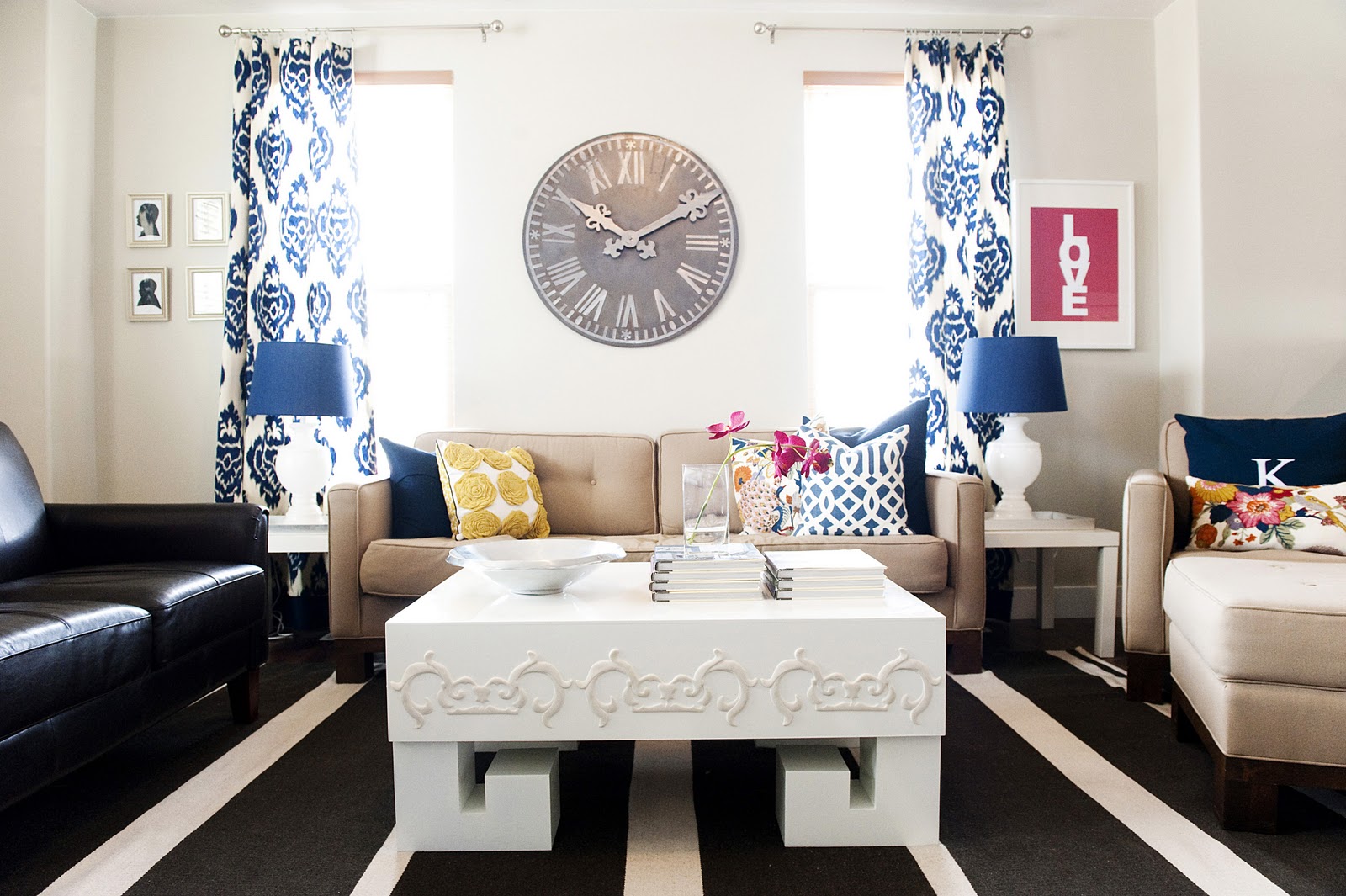
The clock above the sofa is from Pottery Barn. I bought it about 5 years ago for $50 on sale. It’s no loner available. It’s been a great clock. It’s not functional though. My husband thought I was crazy to buy a clock that doesn’t actually work. The decorator in me only cared that it looked good. Plus for $50 you can’t go wrong!
The yellow flower pillow was purchased at Target. It’s become a little trendy but I still love it. The shade of yellow is just perfect.
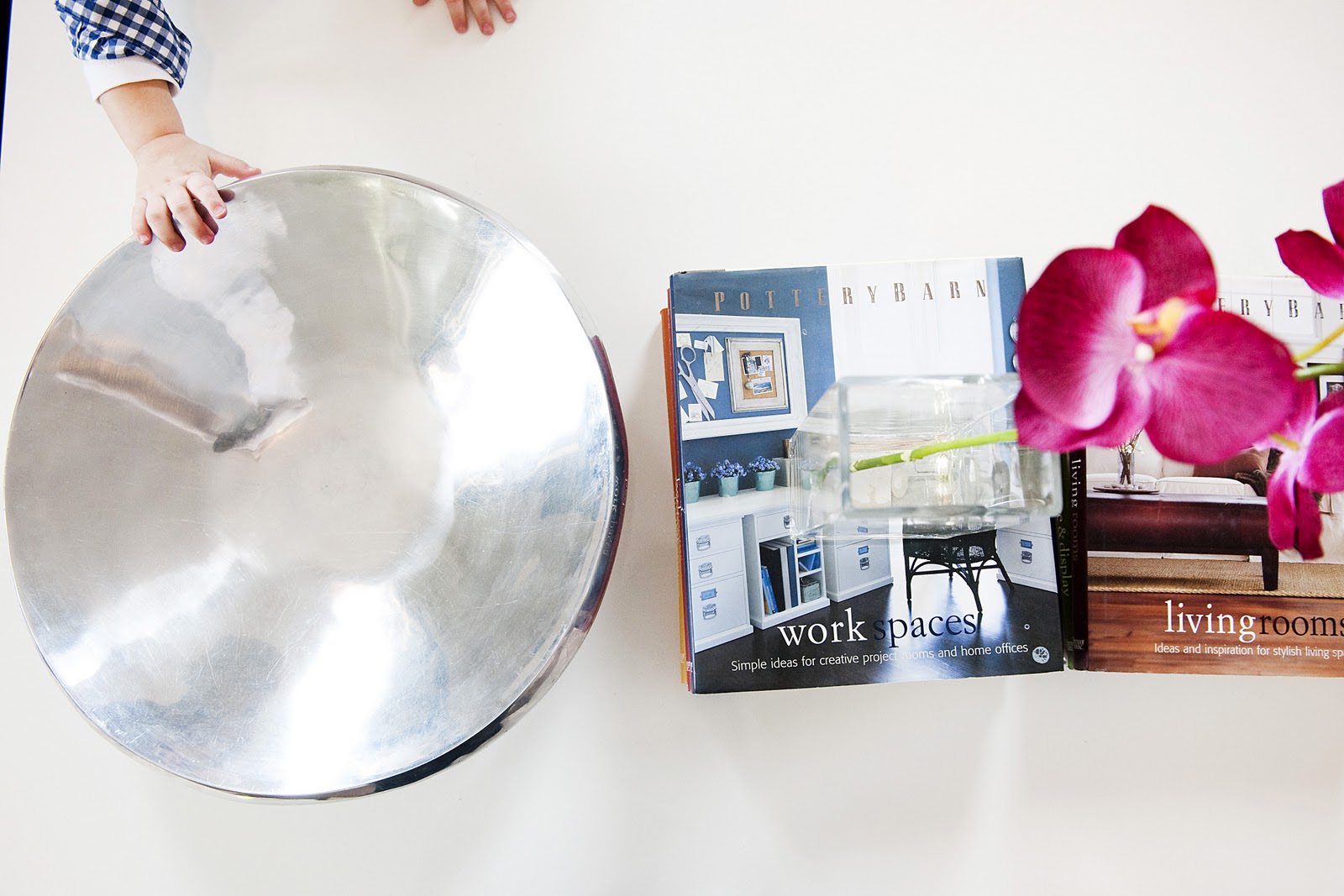
The silver bowl on the coffee table was bought in Mexico and is a gift from my Mother-in-Law.
I bought the Pottery Barn books at T.J. Maxx a few years ago. When I was first married I used to study these books religiously. There weren’t really blogs back then and there definitely wasn’t pintrest. We were too poor to afford design magazines so these books were my only source of information on design. The fuschia orchid on top of the books is fake. Ahhhh!! I know it’s horrible to have fake plants but guess what? I kill everything. Plus I just love the color. I purchased it about 6 years ago at Target.
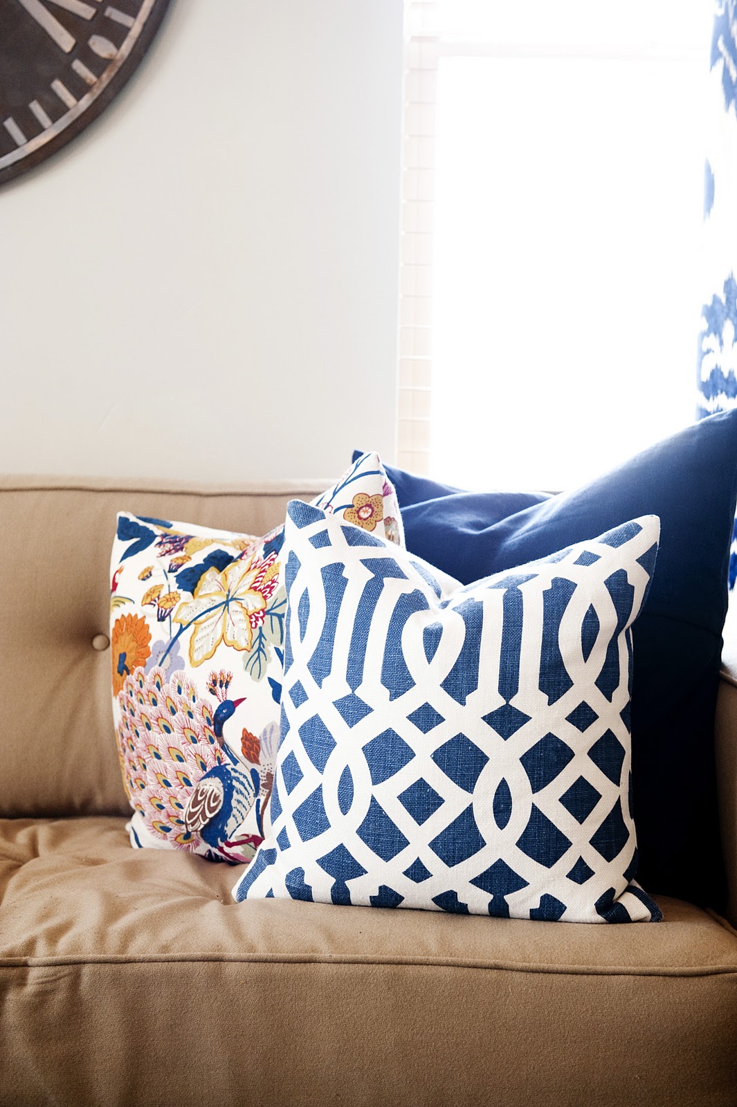
The blue trellis pillow was purchased on Etsy and is made from this fabric. Imperial Trellis is trendy, I know, but I love it. It is an amazing fabric and this pillow is one of my favorite things in my house. It was actually one of the first things I ever bought for our home. I didn’t know what our home was going to look like or be decorated like but I knew this pillow would find a way to fit in.
The peacock pillow is made from Pottery Barn’s Bettina fabric which has been discontinued. It’s an amazing pattern. I got emails about it all the time. You can still find Bettina items on Ebay every now and then. You could totally make some pillows out of old curtains or a duvet. So keep an eye out.
The large navy pillow is from Pottery Barn found at DownEast. I think it was like $10. I like having large blocks of color to break up all the pattern I have going on.
The small lumbar pillow is also from the Bettina Fabric.
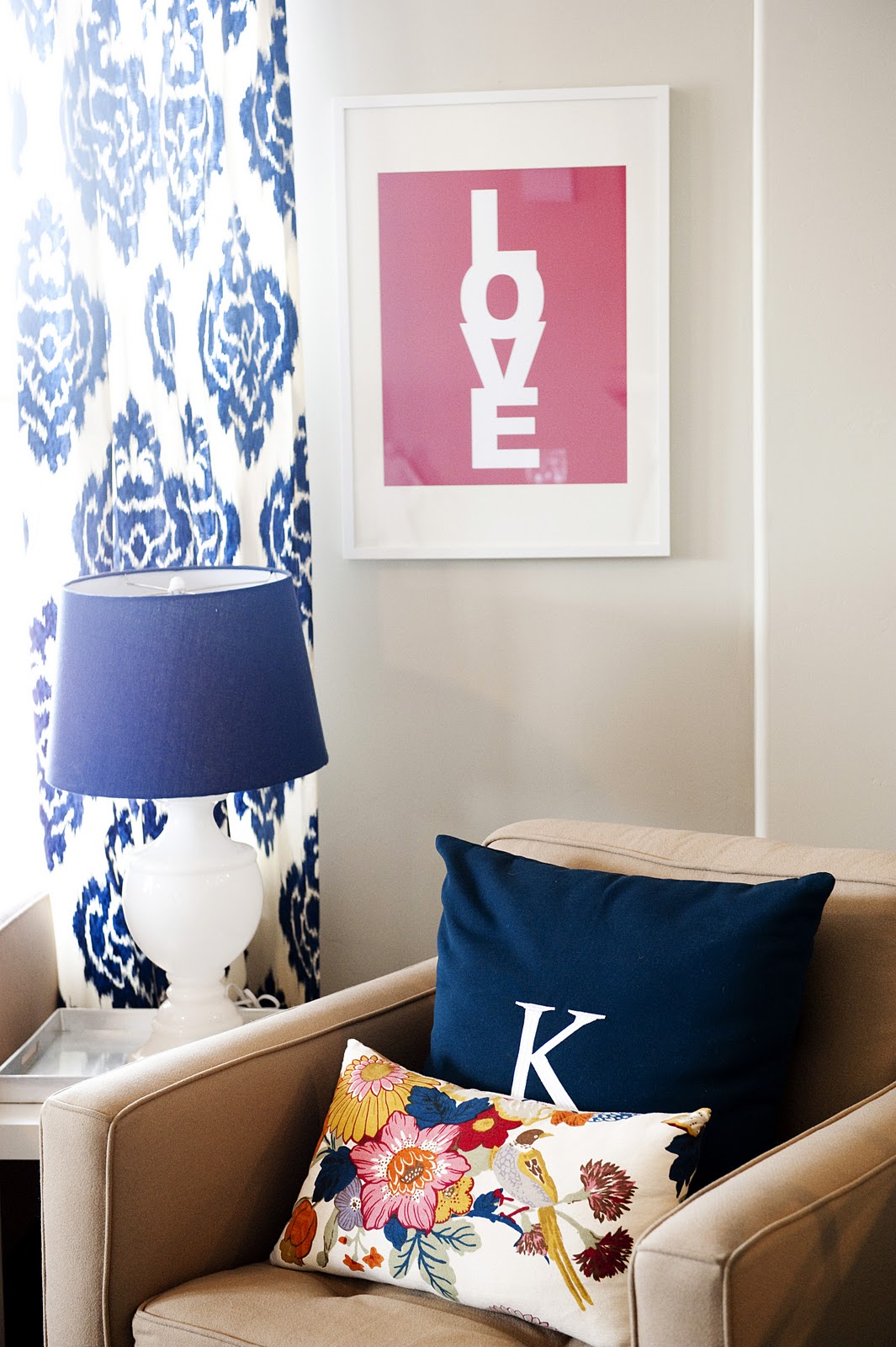
The large blue pillow is an outdoor pillow from Pottery Barn found at DownEast. It has a monogramed K on it. My name is Kirsten Krason so you’ll find a lot of K’s in my house. I love that letter.
The blue lamps were bought at Home Goods. I went back and forth on if I should get them or not. They are a little large scale for the small Lack side tables. But ultimately I love them. I think they are such a huge part of the room. I would be devastated if anything ever happened to them. Since they are from Home Goods they are pretty much irreplaceable.
The “love” print is from Made By Girl. I love her stuff! This shot of pink in the room is very “me” and it makes me so happy.

The loveseat was bought on Craigslist. It’s honestly not my ideal piece of furniture. The shape is nice but there isn’t really anything special about it. But it’s leather (or at least part leather) which makes it super easy to clean. The scale is also great and the price was right. Only $250! The garden stool was bought at a consignment shop for $10. I think it’s one of the best deals I have ever found on anything in my life.
The curtains were made with this fabric by my friend Erin. I was a little nervous about this pattern I’m not going to lie. I actually didn’t love it the first time I saw it. But sometimes the best pattern for a room is not your obvious choice. Step back and think how this fabric is going to work with all other elements of a room. You may not like it by itself but when it is combined with other elements it can become something special. That’s what happened with this fabric. Once I got it in the room I loved it. I go the fabric for a killer deal on Fabric.com. I’ve never seen it on there since. But you never know.
The red pillow is from this etsy shop. The chevron one is from this etsy shop. I love chevron. I’ll hang on to that trend as long as I can!

Coasters from Furbish. La Fiorentina is one of my favorite fabrics. These coasters are very unique and I get lots of complements on them.
Silver trays are from Target and side tables are from Ikea. I adhered the trays to the table so they actually appear to be a part of the table. This gives those little Lack tables an extra oomph!

My coffee table is from Alice Lane made by Shine. I am in love with it. My client bought it for her living room and when she got it in there we could both tell it wasn’t really “her”. The fun thing about it is that it’s 100% “me”! It’s bold and unique and white. I love this dose of white in the room to break up the pattern and color. One thing that never bothers me is the mixing of white and cream. I know to some people that is a deal breaker but to me it just makes things more interesting. You may notice the stripes in the rug are a little more off-white, the background in my curtains is a little more ivory and my garden stool is cream. But I mix it all with white and I think it’s great. Doesn’t bother me in the slightest.
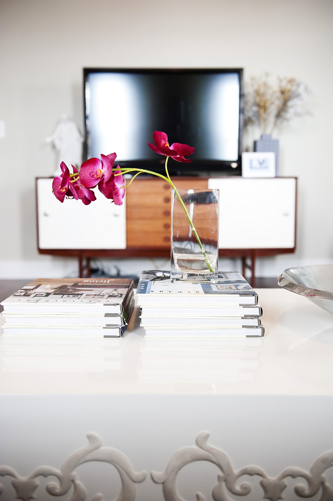
My credenza was bought at a garage sale for $100. I stained it, painted the sliding doors white and added some knobs from Home Depot. I don’t know what it is about two-tone furniture but I just love the look of the white mixed with the wood.

My subway sign was bought at Pottery Barn via DownEast and is no longer available. However, I’ve seen a lot of DIY projects on these so I’m sure you could make one yourself. I love NY so this is my way of bringing a little bit of the city to my home in the suburbs.
Side Tables from Ikea
Pottery Barn Books from Pottery Barn bought at T.J. Maxx
Red ikat pillow from Elegant Touch on Etsy
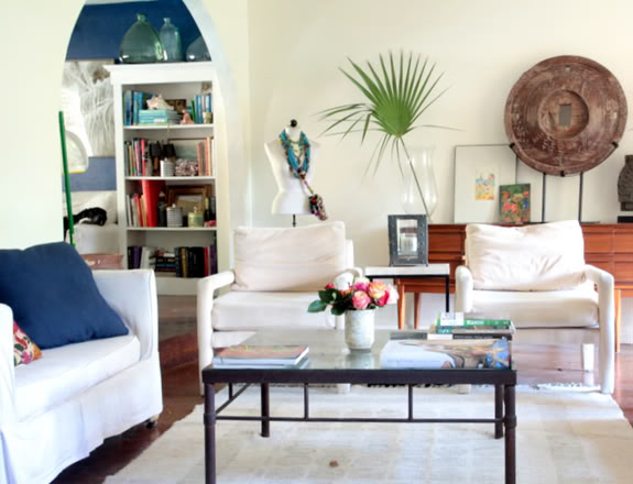
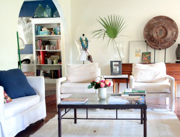
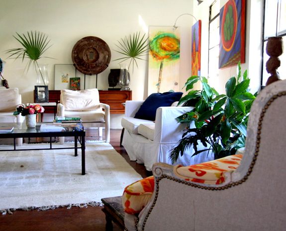
Today’s room tour comes from the lovely Linda at Lime in the Coconut. I love the earthy and ethnic vibe of this gorgeous room!! Enjoy! “When we bought the “hacienda” the first thing we did was rip out the red shag 1970’s carpet. We decided we liked the coolness underfoot, and chose to have the…

