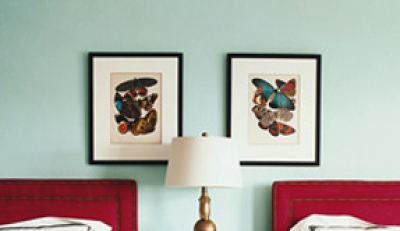
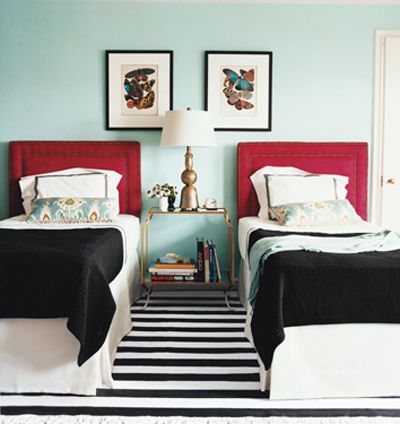
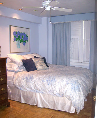
Heather contacted me about doing a copy cat design post on everyone’s favorite Domino guest room:
from Domino’s Mini Guide: Twin Beds (June/July 2008 issue), photo by Justin Bernhaut
I also love this room and was excited to accept her challenge!
Let’s start with the wall color. The inspiration room color is “Lost Oasis” (#21-4) by Pratt & Lambert.

It is a very pretty color indeed, but unless your room has an abundance of natural light, like the room in the photo, I would recommend going a shade lighter, like Benjamin Moore’s “Irish Spring” (#2038-70).

And here’s a little money-saving tip on paint, from me to you. I’m a big fan of the colors available through Benjamin Moore and Martha Stewart for Valspar (which I heard has been discontinued?! sad), but I really like Behr paints (for the cost and quality), available at Home Depot. Fortunately for me, Home Depot has many competitor formulas (like Benjamin Moore, Sherwin Williams and Valspar) in their paint computers. They don’t have Pratt & Lambert, but you can bring in a chip from P&L and Home Depot can easily color match for you.
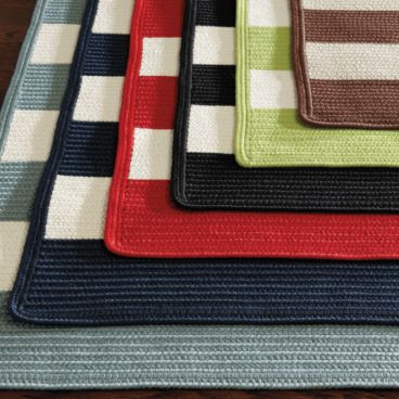
Next up, the rug. The 9×12 cotton dhurrie featured in the Domino image is available at Odegard for a cool $3240. Luckily, many black and white cotton flatweaves have hit the market in the past few years. Here are my favorite budget options:
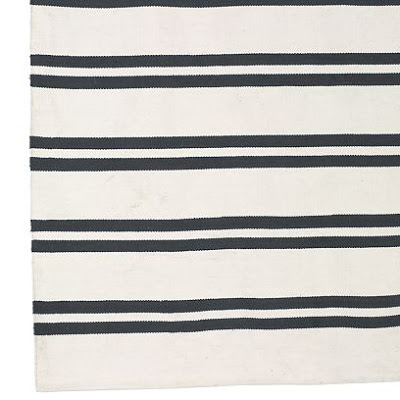
IKEA ($179 for approx. 8’x6′). I sort of like that the stripes aren’t perfectly horizontal in this rug. It helps to break things up a little.

image via Elle Decor
Ballard Outdoor Rug ($299 for 5’x8′). Outdoor rugs hold up really well to rowdy kids and pets.
IKEA Runner on eBay (3’x8′). If the room is smaller, this little rug might be just the right size for between the two twin beds.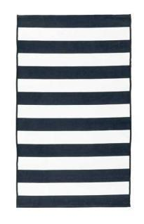
Image via Apartment Therapy
Overstock rug ($157 for 5’x8′). This rug is not a flatweave, but a plush wool pile might be a welcome addition in a bedroom.
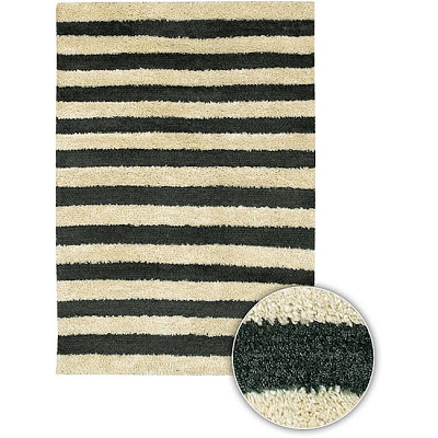 Nate Berkus for HSN ($160 for 8’x10′). It’s not a true black, more of a charcoal, which I think is nice and a little more subtle than the stark black and white.

Loving this black and white WS Home Dhurrie ($179 for 8’x10′)
Part of the reason the Domino room caused such a stir was because the red headboards were from Target. They are still available here for $249 each, though if you’re penny-pinching, this could be a place to DIY with a little plywood, batting, red linen and nail head trim.
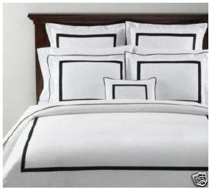
 The beautiful bedding is from one of my favorite luxury lines, Matouk. The “Bel Tempo” shams are $100 each and the Barcelona bedskirt is $205 each.

Pottery Barn’s black Morgan shams are a great substitute for the Matouk beauties and are only $40 each on eBay.
Or if you’re feeling crafty, you can sew 1/2″ black bias tape on standard white shams, like I did for my girl’s duvet covers.
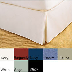
This bed skirt ($19.99 on Overstock) looks like it has a nice weight/drape and I like the tailored kick pleat.
The featured black quilted coverlet is by Looolo Textiles and is $495 each.

You can purchase a look-alike here for $89.99.

This version on Amazon is even less expensive, at $34.
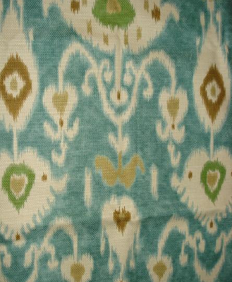
 The 12″x26″ turquoise ikat throw pillows are by Dransfield and Ross and cost a $240 each. Yikes!
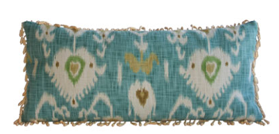
The best way to get these pillows on a budget is just to purchase the fabric, which is Laura Ashley for Kravet’s Tilbury in Lapis, and take it to your local dry cleaning/alterations shop where they usually make pillow covers for cheap. Or bust out your sewing machine and make the covers yourself.
There are lots of remnants of the ikat available here on eBay.
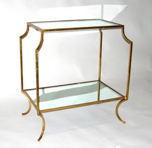
The side table seems like the trickiest item to match in the room. The original gold-leafed iron table in the inspiration spread is called the “Loren G” and is $1250 at Worlds Away.
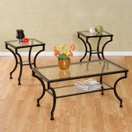
This table set is available for $299 at Target. The side tables look very similar to the inspiration table’s shape and would work well in a smaller room. You could sell the other two pieces on Craigslist to help cover the cost of the set.
When I was in Pier 1 the other day, I spotted this $129 table. It’s better looking in person. I thought the feet were really cool looking.
Walmart is selling a great lookalike for $159.
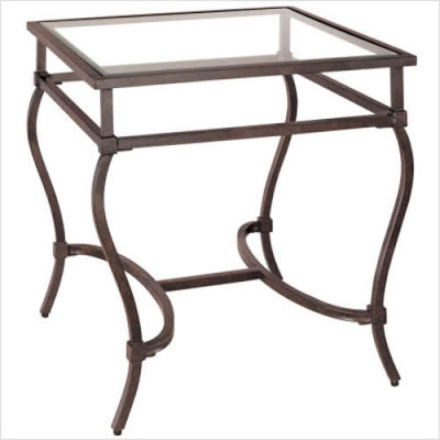
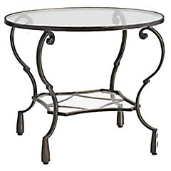
For something a little more streamlined, I like this Crate and Barrel table for $199.

All of these tables have a dark oxidized iron patina, but to make them look more like the inspiration table, just use a little bit of Rub ‘N Buff in Gold Leaf (the most yellow gold finish).
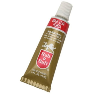
For a less subtle gold look, spray paint the metal base with Krylon’s Metallic spray paint first, and then layer on the Rub ‘N Buff.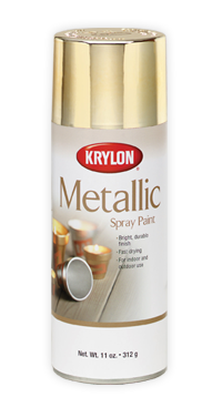
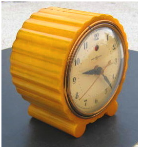
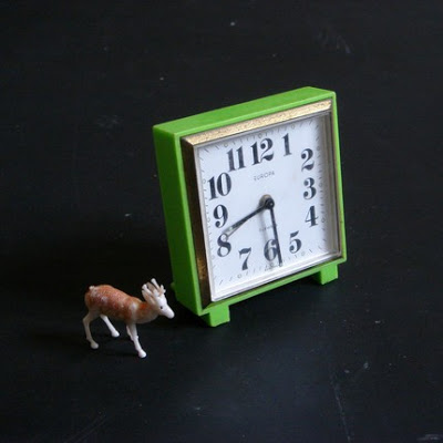
For styling the night stand, pick up some interesting reads with colorful covers at your local thrift shop or used books store. And don’t forget a vintage alarm clock. Ebay has some great options.
And so does etsy:
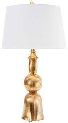
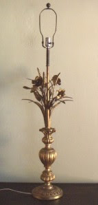
The featured table lamp is by Larry Laslo, available for $650 at frederickcooper.com. I think this lamp is pretty awesome. Too bad it’s so pricey.
The obvious cheap alternative here is to spray paint an inexpensive lamp gold. Home Goods always has cool and cheap lamps. You can see some of their past inventory here.
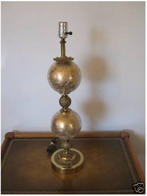
Check out this eBay beauty. I love vintage lamps!
Great tole lamp
Love this awesome lotus lamp

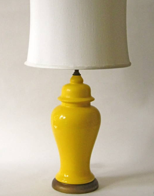
I know it’s not like the inspiration lamp, but I am DYING over this yellow ginger jar lamp. Someone please buy it!!
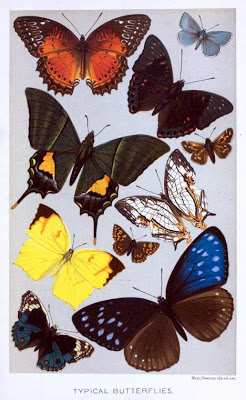
And finally (!), the artwork. The Domino feature included artwork by E.A. Seguy – “Butterfly Pocheoir” archival prints. They cost $625 each! Vintage prints are available here. New prints are available at Decorati and Art.com.
For a mere $31.50, you can purchase this gorgeous book on Amazon, chock full of beautiful and very VERY similar images. And don’t forget that $16.99 at Target buys you my favorite 8×10 frame and mat.
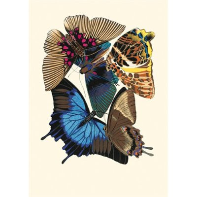
For a FREE alternative, check out all the butterfly images available at Vintage Printables:
And that’s it from me. Good luck with your guest room makeover, Heather! Please share the before and after pictures with us!
If you’re interested in requesting a Copy Cat Design, please email me for rates.


 I wanted the shades to have a little color and texture so I ordered some grasscloth wallpaper samples to use for covering the lamp shades. But, thankfully, the order got messed up, and I was able to find this grasscloth for $3/yd at a fabric store in Philadelphia (BTW, if you live anywhere near Philly, please go check out Fabric Row! It’s one amazing fabric store after another, with great deals to be had.)


