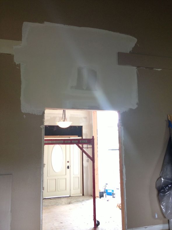
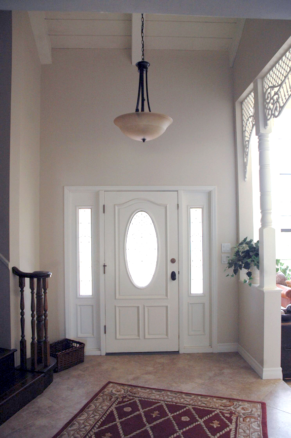
Remember how we pulled out the front door and bumped up the pass-through in the entry that goes into the living room? The new eight and a half feet tall entries felt great – so much more in proportion with the high beamed ceilings.
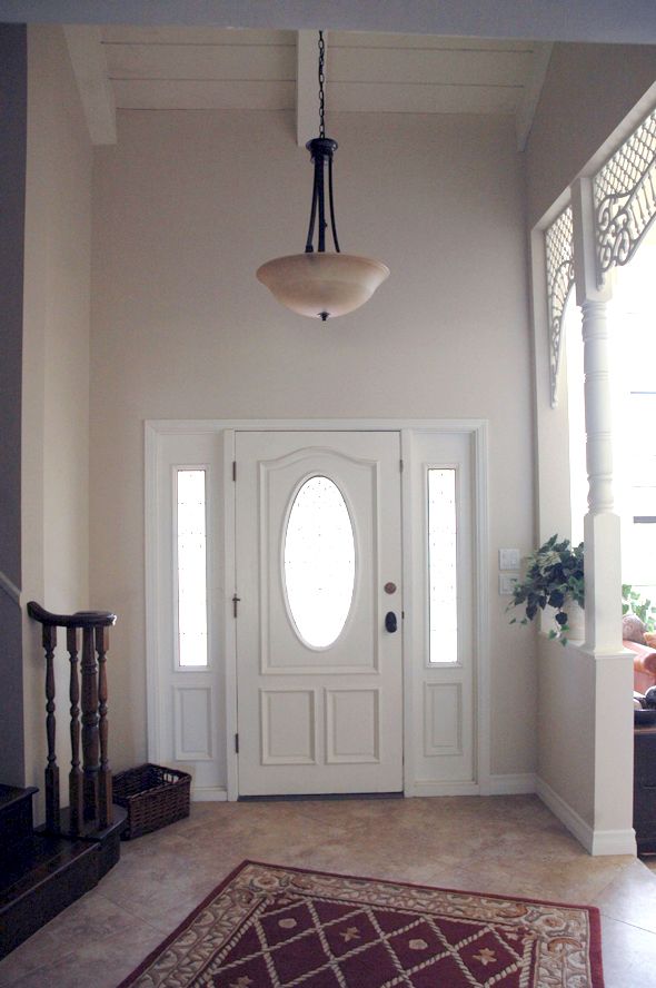
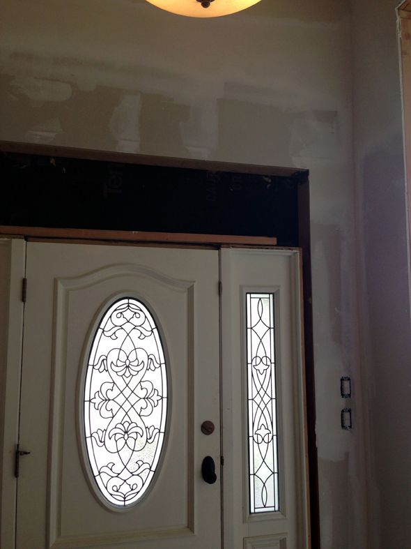
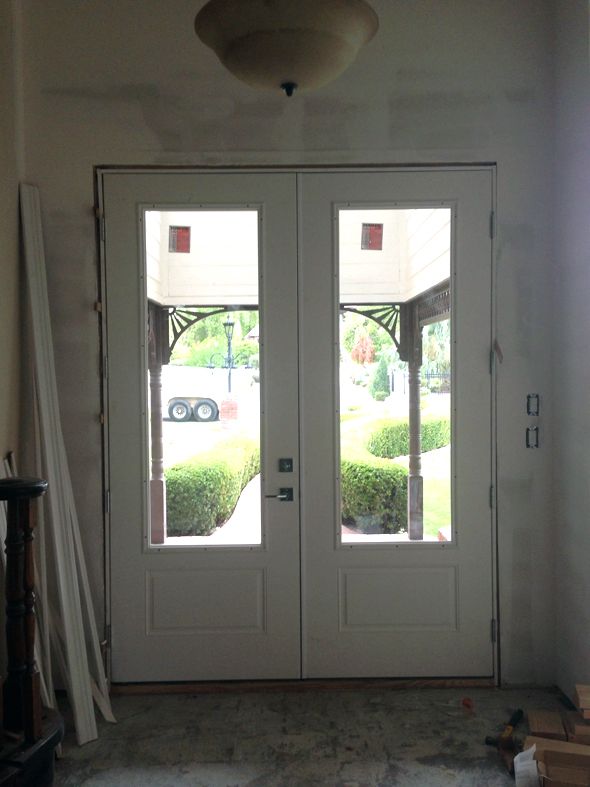
The challenge was to give the entries a little more horizontal presence, especially for the pass-through to the living room.
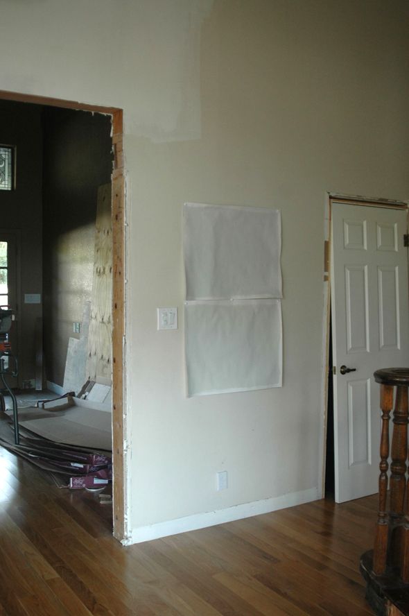
So I went to the hardware store and I played around a bit in the trim aisle of the lumber section and found a couple of combinations that I liked. I wanted something about eight inches wide.
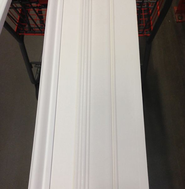
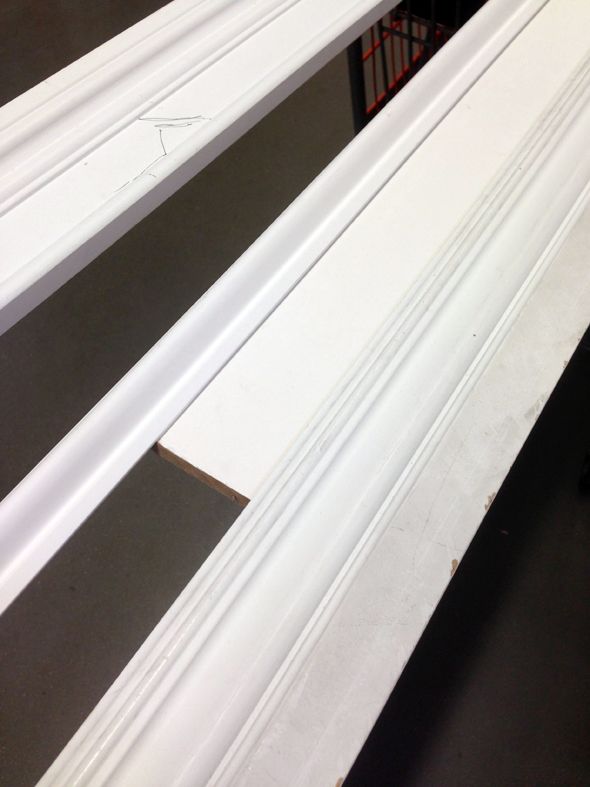
The piece of trim that I kept wanting to use over and over again was this casing moulding. I loved the profile and the chunky proportions.
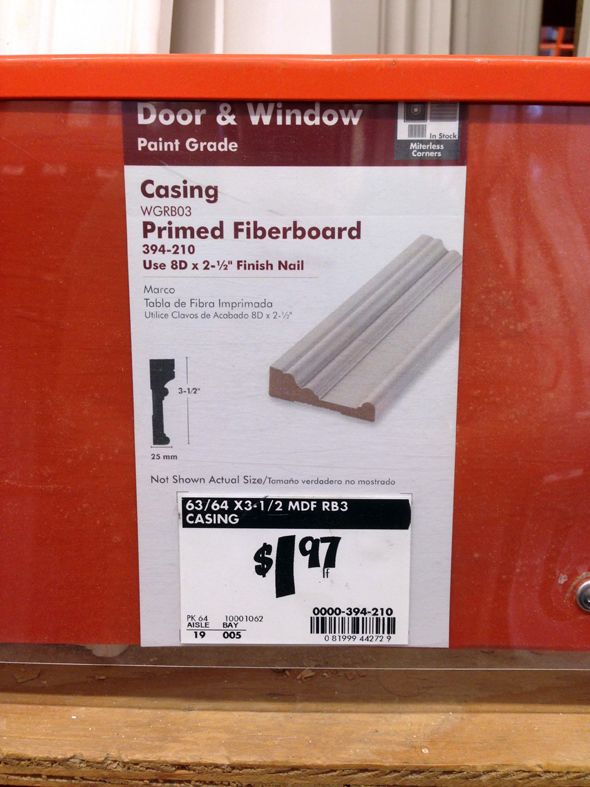
I ended up buying a handful of short sections of the pieces I liked best, so I could keep playing around at home.
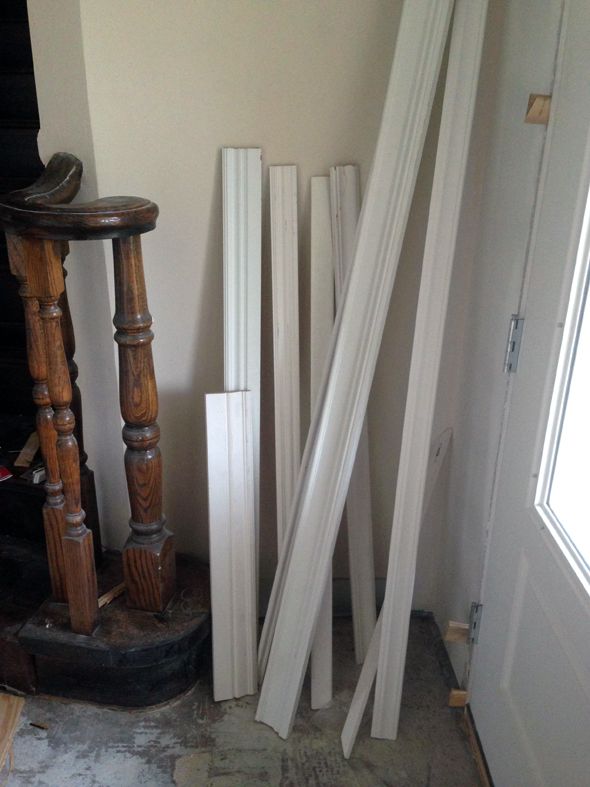
Then I saw this photo on Houzz while I was looking for kitchen cabinets inspiration and I remembered my Architecture 101 teacher talking about eared architraves and how they help visually widen and open up a passage surround.
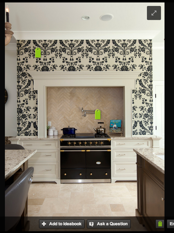
I wanted something a little slimmer than the kitchen inspiration photo, and I wanted to incorporate the casing trim I was liking.
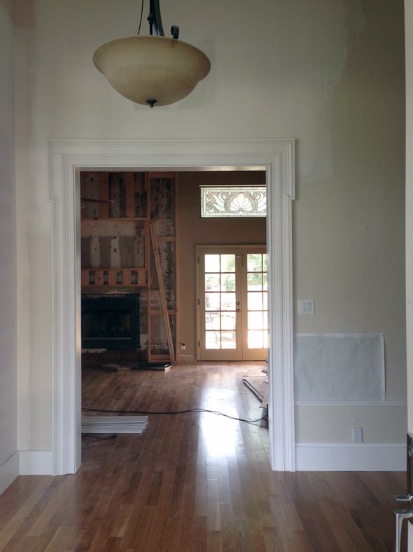
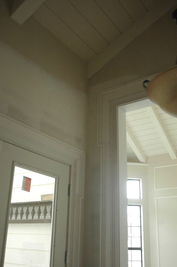
Jason helped me come up with this layered series. My favorite casing is on the very inside, layered on top of a primed pine plank, which we just made wider at the eared part, and capped off with a pine plank turned sideways with a smaller piece of trim set inside the elbow.
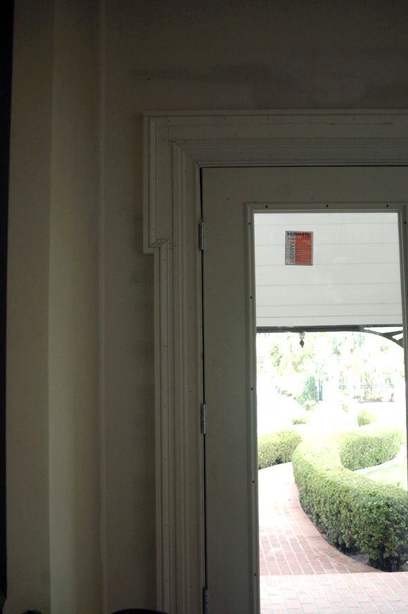
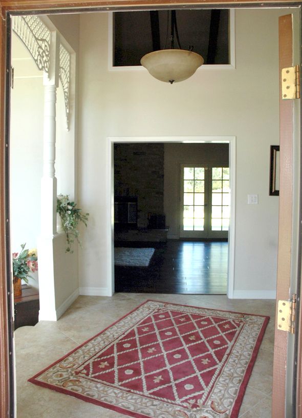
I love how the pass through and the front door look together now from this angle:
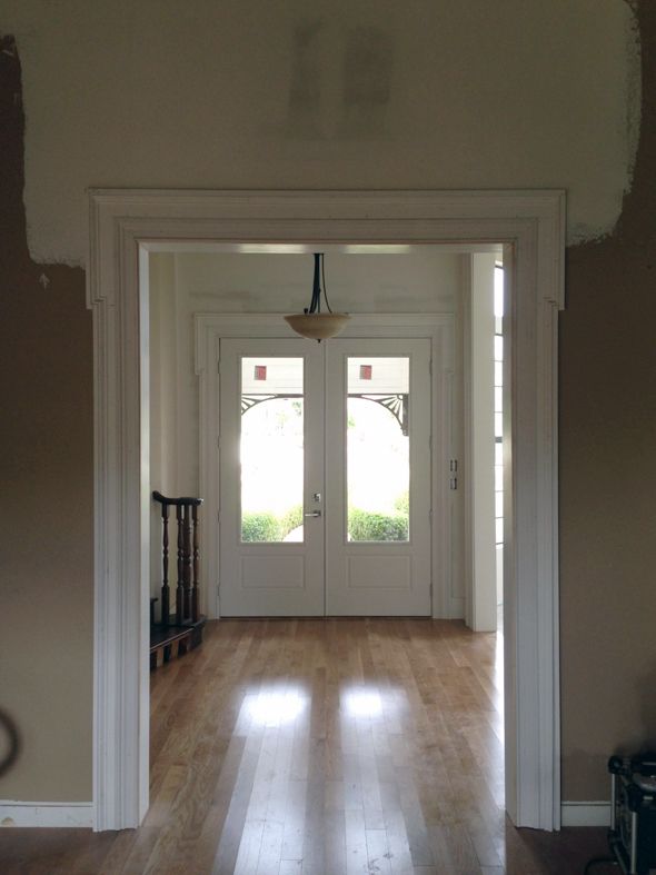
And what a pretty frame for the view into the new fireplace that will hopefully be finished this week!
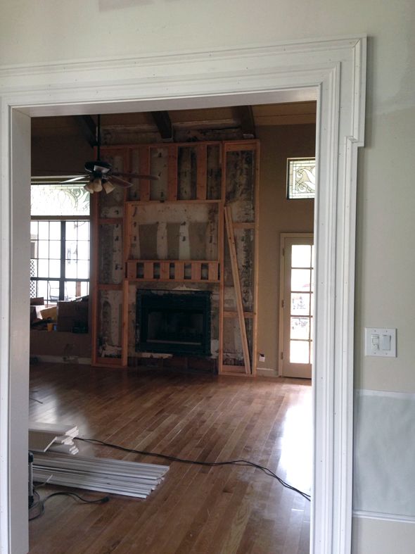
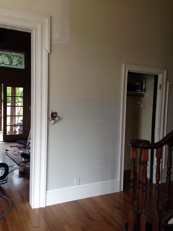
We did a taller version of the eared architrave for the big pass-throughs that go into the library and the music room.
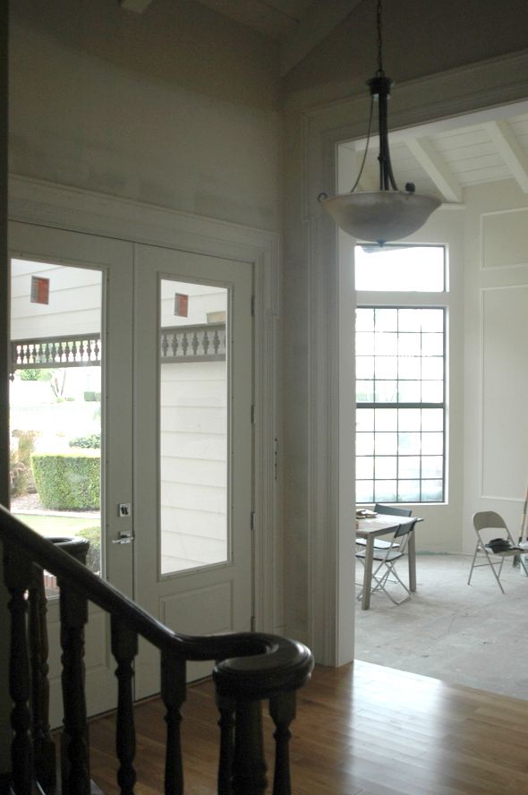
They are far from done – there are hours of prep work ahead of me (spackling, sanding, filling, sanding, repeat) before we can paint, but I’m actually pretty excited to start that work. I think it will be one of those completely satisfying before and afters that make it worth the prematurely arthritic hands. :)
We are using the casing by itself on all the regular doors too, so I think the moulding all around the house will really look cohesive and really pretty. Trim is not exactly cheap, but wow, what a difference it has made in the feel of our entry space, even now before it’s close to finished!



I'm such a huge fan of trim and I love what you did. I agree it will be a completely satisfying before and after like you said. I can't wait to see the fireplace too.
What a great idea. It really makes a huge difference in the proportions of the space. You're a superstar Jenny!
http://www.fullbellywornsoles.com
Love this trim Jenny. Looks extra special and even stands out more being on just the the larger entrance/passage ways. Thanks for all the updates on your new beautiful home!
LGN is one of my favorite blogs for inspiration! I never see design like this elsewhere and your ideas give me the courage to do things a little differently from what's considered normal around me; because I know if I do it right, it will look fantastic! Thank you!
Posts and ideas like this are the reason so many of us come back every single day to see what you come up with. You have such a vision, Jenny, and manage to see the possibility in every detail in a house. I never would have thought of reworking the casing, but it adds so much!
The trim does so much to banish all memory of the faux Victorian theme that used to live there.
I find that adding trim is becoming a common thread in my work for clients these days. Many of them live in newer homes where little or no trim was used. It instantly adds personality and substance to a space and works with any style. I love your "ears" on your doorways and may borrow that idea for one of my current projects. Thank you for the inspiration.
I've been in love with this type of trim since seeing it used in White Collar (Neal's apartment). Thanks so much for sharing!
I love adding trim in my clients homes. When a house is architecturally interesting it is so much easier to decorate! Love this look!
Jenny- you are amazing! Your ideas and execution are always spot-on.
Jenny, did you ever show us how you did the dentil trim in your last place?
So, so smart. You ALWAYS seem to come up with things no one else is thinking of! I especially love the thoughtfulness of the proportion in the architrave where the taller and shorter doors meet. Brava!
Brillant. It gives the house a whole new dimension. Will you be replacing the rails on the staircase? lol I hope so.
Jenny, I love it! So unique and adds so much more interest :) xo Kristin
Love eared trimming!!! Looking great!!!
http://reuschinteriordesign.blogspot.com
Wow that looks fantastic. Well done!!!
SO pretty. I wouldn't have thought of that! You make me excited to own my own home.
that looks amazing!! and the extra umph at the top is genius!! well done again!
that looks amazing!! and the extra umph at the top is genius!! well done again!
Wow! It really is in the details, isn't it?! That looks so beautiful, Jenny! What hard work, but a great pay off is ahead.
You continue to inspire me every day! Thank you so much!
It looks amazing! Wow, this is so creative. Great job!
Wow! What a fantastic detail! I'm so jealous you have a big, tall space like that to use trim design like this. I have a pokey, low-ceilinged house and I feel like my trim options are so limited.
Too bad because I love what clean, white trim does to a room.
I love your blog and also live in the valley. You do amazing stuff. I love seeing your transformations, though it does make me feel a little bad about how slow I get things done! :) If you still need more trim, I would suggest checking out the Door and Trim store (http://www.doorandtrimstore.com/). They are in west Mesa and are considerably cheaper than HD and Lowes, at least for what I was pricing out a couple of months ago.
Wow Jenny! This is quite something! You have managed to make it look modern, traditional and classic all at the same time. It's kind of perfect. We'll call it Komenda Trim. Like ionic or doric columns. :)
I can't wait to see it all painted! You really have a knack for this designing thing. ;)
Annie XO
You are an inspiration. Love, love, love the trim work!
its traditional, yet modern! i love it. thanks again for all the inspiration.
Spectacular, Jenny, k
The trim (along with everything else you've done) looks SO fantastic!
I have a technical question, because this is an extremely timely post for me. We are in the process of trimming out the windows in our house, and are debating the best way to fill the nail holes. From all of our online research, it seems there's a lot of disagreement about what to use – putty, caulk, dap, etc. What have you found to be best?
Thank you in advance!
You are so talented Jenny and you have great vision! Thanks so much for inspiring me every day. Your new home is progressing beautifully!
I'm so impressed! The molding is so perfect for the door and the pass throughs. I just can believe how you have transformed that house. It is really starting to look like you.
I'm so impressed! The molding is so perfect for the door and the pass throughs. I just can believe how you have transformed that house. It is really starting to look like you.
This is just perfect and will pick up the detail of the fireplace trim so well. Usually I detest the picture framing technique(especially on windows), but in this case it allowed the molding to really shine.
However what are people thinking with those pass-throughs? There are some details in new construct that baffle me.
Can't wait for your next post. CTD
Wow this looks so fantastic! Something so simple makes it look very custom and expensive. You made the perfect design choice for those doorways.
Exactly the trim used on the doors inside the Oval Office in the White House. Classic choice.
I've never seen trim like this but I'm in love! Your eye knows exactly what it's doing.
Looks amazing. I just finished a remodel and actually live in your stake. I used Discount Trim Store on Alma School and Broadway and they were much cheaper than Home Depot
It is amazing the difference the trim makes and the view through the front is wonderful…happy to be your newest follower!!
This looks so awesome! You're such an inspiration :)
very pretty! your floors look great too!
I never would have thought to do the trim this way. Eared architraves. I've learned something new today. Very inspired. Thanks!
So lovely! And the cohesiveness is refreshing.
I don't know what I'd do without your ideas and inspiration! I just redid my office space and every bit of it was inspired by you! I even tried your DIY Les Touches pegboard and your striped chair. I will be sure you email you pictures because I'm so dang proud of myself. Thank you again for your blog.
Loving every second of that trim. Very creative and cool!
Trim work is nice and it was good idea. Produced a very good looking way to enter a home.
What a great idea, that looks beautiful! Love eared trimming.cheap beds with mattress sale
Its really a awesome idea.. You have a great designing skill. Your door designs are fantastic.
interiors decoration | cheap interiors company
Its really a awesome idea.. You have a great designing skill. Your door designs are fantastic.
interiors decoration | cheap interiors company
It's like a new house, and the entry has such presence now, but in a completely livable, wonderful way. Just phenomenal.
Pure genuis! The use of eared architrave lends both architectural strength while solving a proportion issue. Nice job!
-Roxanne
http://www.roxannestellmacher.com
Stylin. Love it. Trim makes all the difference.