I recently stumbled across the work of John Loecke, a Brooklyn-based design firm – and I’m in LOVE!

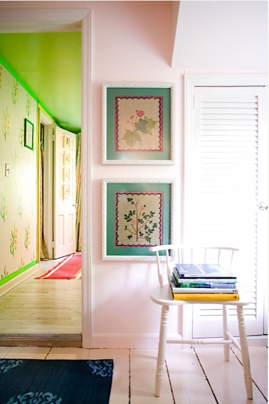
We all know I like to use color in decorating, but I also think there should be balance of neutral tones and also plenty of vintage/antique pieces. When everything is new and matchy-matchy, the color becomes garish and tacky. These guys nailed it. I mean, check out that pink door! Amazing.
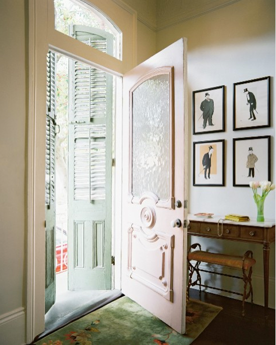
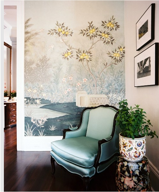
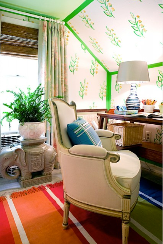
I love Zuber hand-painted wallpapers so much. And I wish I could copy the garden stool with ginger jar planter idea but that would get knocked over in about eight seconds in my house! :) Maybe I could epoxy them together??
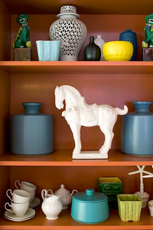
This shot is from an interior of an armoire. Love the orange.
One of the only times I’ve liked furniture on the diagonal! Purple perfection.
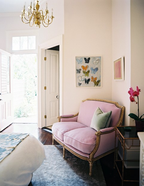
Who needs big box store decor when there are vintage beauties all around to be had? Let’s make our homes interesting and unique.
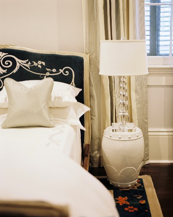
What is happening on this headboard here? Custom embroidery maybe? Or maybe a found textile made into a headboard? I looooove it!
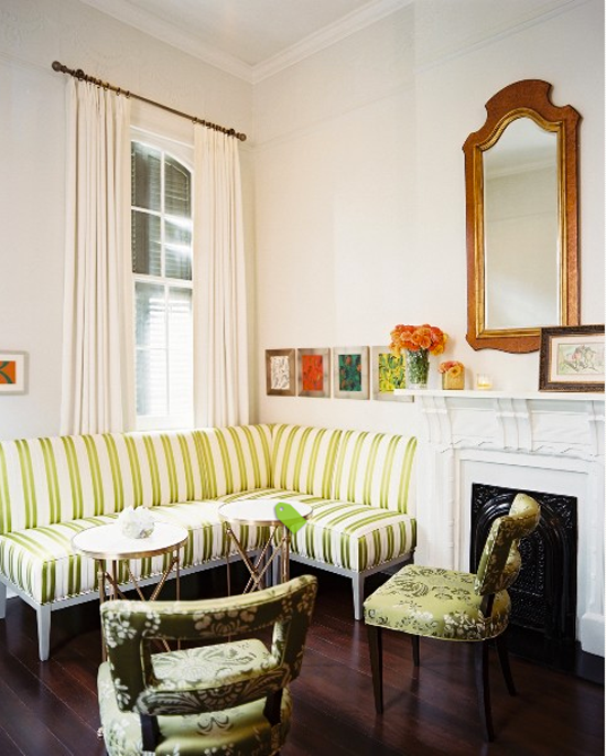
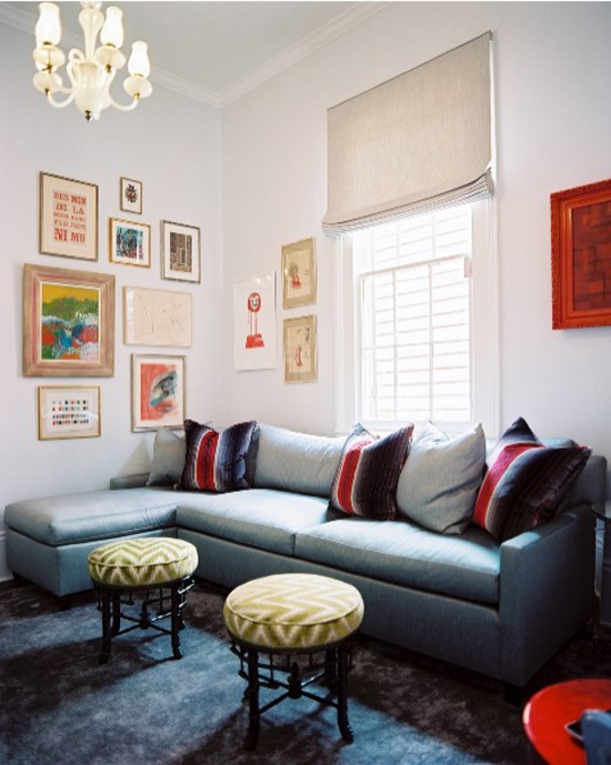
Custom banquettes verging on mini-sectionals are such a great solution for townhouses.
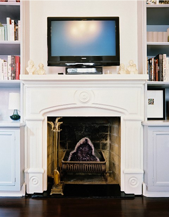
Holy geode in the fireplace! SO COOL! And I am definitely going to copy them and start a little collection of busts.
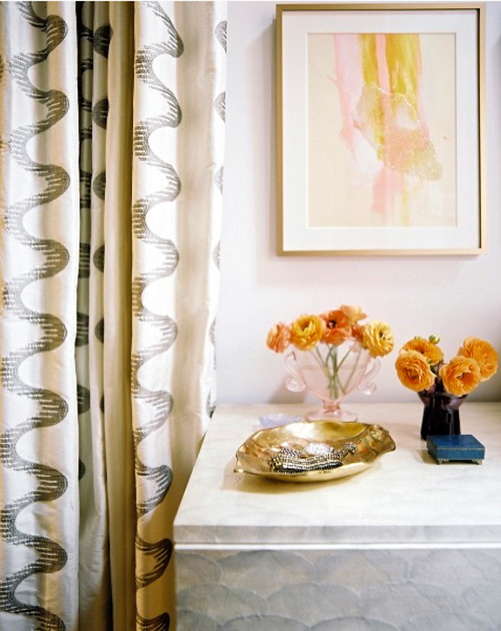
This shot gives me heart palpitations. Those DRAPES. The artwork!!! And whatever’s going on with that console table. The color and pattern play is genius.
I’m feeling like this room must be done with stencils and that the border is just paint. I really love it. That rug is really cool too. Such a good reminder that if every piece in a room is beautiful on it’s own, the whole look will be amazing together regardless if the colors match – it’s the collected look.



These rooms look like you, Jenny!
What amazing work! I love that orange rug in the last picture!
Great find and descriptions. :)
Wow – great style. Thanks
Wow! I love the mix of sweetness and sophistication. Beautiful colors and exuberant femininity. Have been a lurker for a couple of years, but HAD to comment.
I agree; they look like your style.
Thanks for posting.
A wide range of colors and textures, yet it feels so pulled together. Great find!
Fabulous – what fun, colorful, stylish interiors! John Loecke is obviously a genius at mixing styles and patterns. Thank you for sharing! Cynthia
I thought these photos looked familiar, then I remembered that Houzz had a tour of the New Orleans house along with an interview with Loecke a few months ago. You can read it here if interested:
http://www.houzz.com/ideabooks/591932/list/Houzz-Tour–New-Orleans-Glamour
Loooove the geode!
And I knew the New Orleans one looked familiar, it was in Lonny's May/June issue! Full spread here:
http://lonnymag.com/issues/28-may-june-2011-issue/pages/1#p80
i love love his work too!!!
http://portlandsunshine.blogspot.com/2011/06/office-hours.html
Also a blogger and loving his work. Check out their blog at http://www.dymistifyingdesign.com. Of course, I admire your blog as well. Keep up the good work.
What a lovely portfolio, thanks for the introduction Jenny! I will be hopping over to his site for more!!
Nancy xo
I loved their article in Country Living. I even emailed them for the name of a fabric and they got back to me – really nice guys!
WOw! I will definitely be checking more of his work out! Some of the things he does are truly genius! Love the green ceiling in the hallway.
Barbara
I totally agree that when everything in a room is new it lacks soul.
The rug in the last photo is from Ikea about 4(?) years ago. I don't see it on the web site, but you might still find it in one of the stores.
Gorge! So sophisticated and pretty!
I have seen a lot of things in fireplaces, but a huge amethyst rock! That's the best.
it's definitely unique! i like the mini busts on the mantle as well!
Thank you for the very kind words, gang! John and I love feedback. And check out our blog, http://www.demystifyingdesign.com. And thank you, Jenny! You rock.