
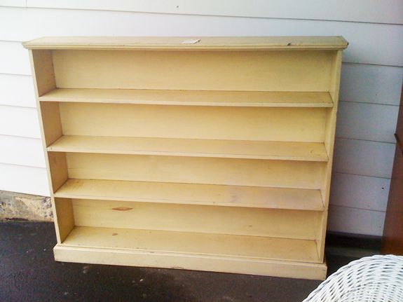
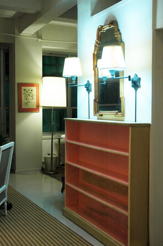
I thought you might enjoy some ‘during shots’ of the bookshelf project. As a reminder, here’s the before:
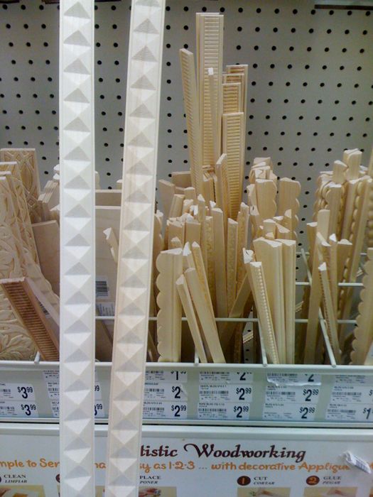
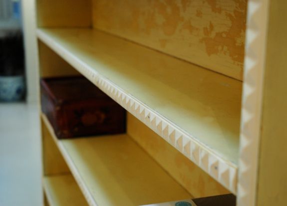
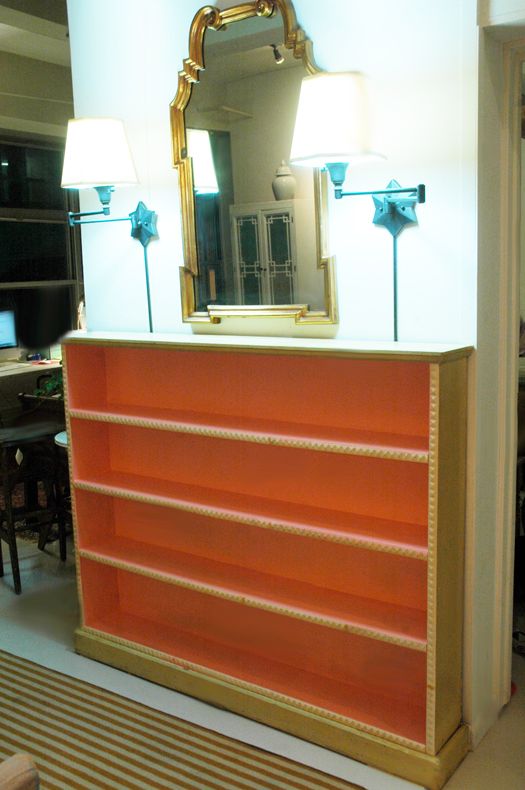
Then I added stud-shaped moulding from Michaels. Subtle, but a cool discovery if you’re looking close. (And isn’t that what home decor is all about? I love little surprises.)
So when it came to choosing a paint color for this piece, I went back and forth a lot. I almost did a soft blue gray color so it would be less of a presence in the space. But I decided to try the crazy color combo first and save the blue gray idea as a back up plan. I’m really glad I didn’t do the blue gray because I ended up painting the fretwork cabinets pale blue (they were white at the time) and I’m really happy with that color there.
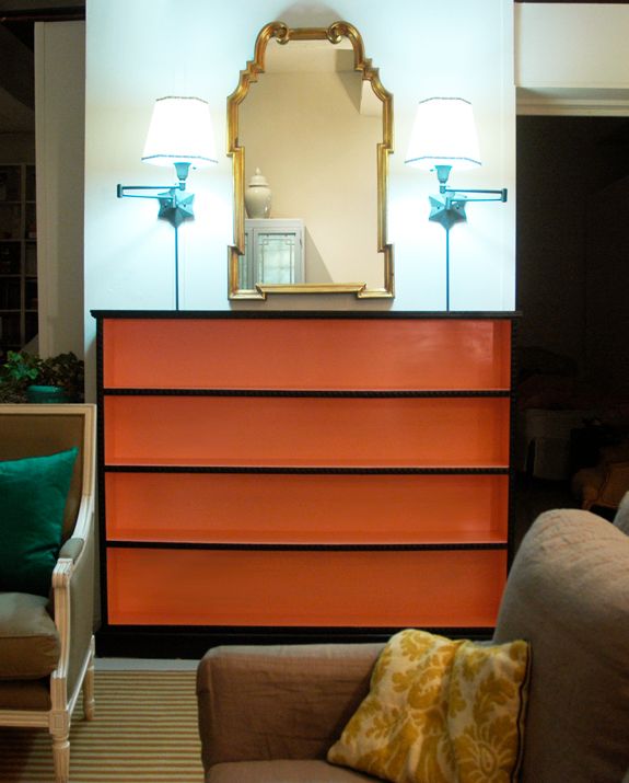
So what crazy colors did I go with? My mom was in town visiting at the time and she suggested coral pink for the inside (genius that she is).
I picked up a quart of Benjamin Moore’s Mixed Fruit (2011-50) in semi-gloss and my sweet mom did all the painting for me. Here’s the first coat:
And then the second coat. We’re thinking, okay, looking pretty good, but we’ll see…
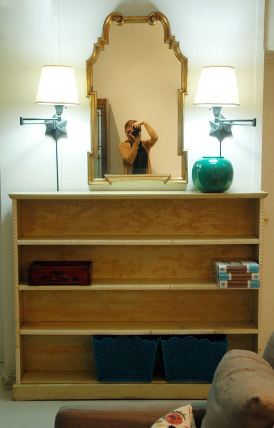
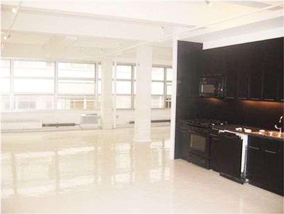
You can see in this real estate listing photo that our kitchen is all black, which I actually really like. When your kitchen is front and center, it’s best for the appliances and cabinets to sort of fade away. I wanted to carry some of that black over to the living room. We thought it would be nice to frame out the shelves in black and then do the coral on the inside.
In case you’re confused by this picture, we added temporary walls to split up the space into bedrooms. This is how the loft looked when we moved in. The door to the girls’ room and the bookshelf is directly to the left of the stove area, only set back a couple feet.
We put that first coat of hi gloss black paint on the shelves and we knew we had made a good choice.
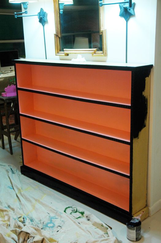
I love the contrast.

The orangey coral feels so Dorothy Draper/Greenbrier to me. You’ll die when you see how great it looks with the black kitchen (and my new persian rug!!). I’m wrapping up the kitchen island project and then I’ll share photos.
P.S. If you look close here you can see I added some little white and black mini-floral trim to the shades. Such an easy fix that made me like the shades 1000x more. Still moving them to make way for my GG sconces though! :)


Ooooh I LOVE it! Love your loft too.
It looks amazing, Jenny. And you're right- it does hint to the Dorothy Draper look.
May I marvel at how clean everything is while you're painting – and with black paint, no less?
xo,
Chedva
what a stunnning makeover!! it looks gorgeous..more so,paired with your wall lights..its a pity they'll have to go…thanks for sharing jenny..have a good day..do visit my blog when you have a moment! xx meenal
Great and inspired makeover!
love it – hope you paint the mirror next :)
pve
…and next, paint the town in a lbd. (little black dress)
pve
Yours isquickly becoming one of my very favorite blogs. While I am not handy at all, your DIY projects are the best on the Internet in my opinion!
All best,
Lynn from Decor Arts Now.
Jenny, I love them! Wow, you have such amazing taste and your loft is like a blank canvas for the artist that you are! I have been looking for a good coral color so thank you for mentioning the brand/color…I always enjoy seeing what you will come up with next!
I LOVE it Jenny! You are absolutely amazing! Love your blog!
xoxo,
Maggie
So amazing! I wish I had one tenth of your creativity!
VERY Dorothy Draper! The contrast is fantastic!!! So glad you went with the coral!
I've been thinking about your fretwork armoires for a few days!!
Also linked back to your papermojo posts yesterday.
the-bright-life.blogspot.com
Wonderful transformation! Amazing what Paint and Trim can do to plain old item.
Such a pretty color!
Love it! I was going to comment on the Dorothy Draper feel, and you beat me to the punch, Jenny!
Awesome color choices, it looks amazing!
I admire your choice to go bold with the color… it looks amazing. The black and coral is so bold and looks fantastic. job well done!!
LOVE the color! Love your blog. Thanks for sharing such great ideas. –deb
love your color combo jenny!! the glossy black looks amazing against the persimmon color! and the trim you added makes all the difference! awesome job!
oh my gosh i LOVE this coral/black combo. might have to steal that color combination idea soon :) good work!
Already crazy, can't imagine all the goodness we have coming our way!
Jenny, things are looking great in the Komenda household. I'm loving yours sneak peaks. On a side note check out the new Trad Home magazine, page 106 will look familiar :)
Wow, what a great standout piece you created! More pictures please!
wowsas!LOVE the coral/black combo! The contrast is ahmazing.
HOT!
what an unexpected surprise, the coral and black! bold really pays off. i'm wondering where you got your blue baskets shown in the before shot?
I love it! Everything looks so great. How nice that your mom was in town to help. I love when my mom helps me with projects too. Always nice to have a second opinion.
Hoenstly – it looks amazing. GREAT WORK!! Very Draper. Kudos.
Your teal pillow in one of the photos — HAVE BEEN LOOKING FOREVER, please let me know where I can find one!!! PLEEEEEEEAAAASE! :)
I LOVE YOUR BLOG SO MUCH!!!!!!!!
This is such a treat to get to see the inside of your amazing loft. Look at those freaking CEILING BEAMS! Dang, girl. You are living the dream.
hugs and kisses from SF,
Jenny (best name in the world)
You are seriously amazing. Really.
I love the black and coral. It adds such oomph to what could be a hohum piece.
I've been looking for similar molding to do my bookcase–you've inspired me!! But, no luck at our local Michaels. Any suggestions on where else to look?
L*O*V*E! What you did! Oh to have such talent. (sigh) Roxanne
jenny, i love your blog so much (how stroked is your ego today, right?). you really are so talented and i love getting a view into that genius little head of yours. thank you a million times for taking the time to share with us less talented followers. you are inspiring so many every day. we love you!
Wow what a color.we are so loving the high gloss flooring in your loft.
omg i'm in love. I immediately thought Draper before I saw your note about that!
That colour combination will forever remind me of the tile my Grandmother had in her bathroom–I believe it was installed into her house in the 20's. I love it in this shelf piece.
So chic! The colors are perfect, and I probably wouldn't have chose them. Brava!
It looks stunning! I love the coral and black combo- and i REALLY love the colors with the star lamps- just great!
Amazing! Love, love, love!
Looks like a million bucks to me!
the book shelf is perfect, what an inspiring idea!
I love it! I must say, when you said pink– I got excited. When you brought in the black I wasn't so sure. But once I saw the picture, it totally works. So creative! I love your blog… you've got waaay to many inspiring ideas :)
LOVE!! A few years ago I painted my formal living room and dining room salmon pink and added in gold and black accents and I haven't regretted it yet!
This is seriously AMAZING- I couldn't love it more.
I ADORE these shelves. They truly look great. Can't wait to see how the whole room fits together!
LOVE!!!!!! Such a great idea.
I love this! Cannot wait to see the complete reveal if this is any indication!!
Seriously, I cannot say enough how fabulous your (or your mom's!) choice of color is for this item….OMG!!! IT IS SOOOOOO FABULOUS!!! I am loving this corally pink color right now…even before I found out that it was the Pantone color of the year!!!! Kudos!
Oh my gosh what a difference! So hard to believe it's the same piece!