When I’m styling a bookshelf, I try to keep the tchotckies under control. I like books a lot and think they should be the star of the shelves normally. We’re going to have a wall of books in the office (no accessories at all probably) so for the bookshelf under the new sconces in the living room, I’m going to mix things up a little. Probably like half books, half accessories.
Here are some inspiration shots. Let’s play a little game of I Spy.
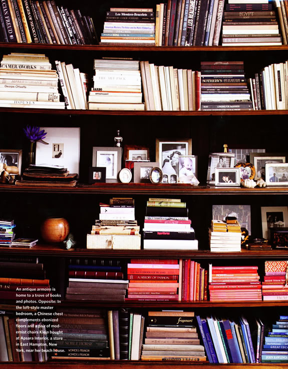
I spy with my little eye books arranged by color, but not in an annoying perfect sort of way. Sort of just stacked and piled by tone. Also, I like all the family photos grouped on the shelf. It’s a good idea to keep things that are meant to be examined at eye level.

Kelly Klein via
Habitually Chic
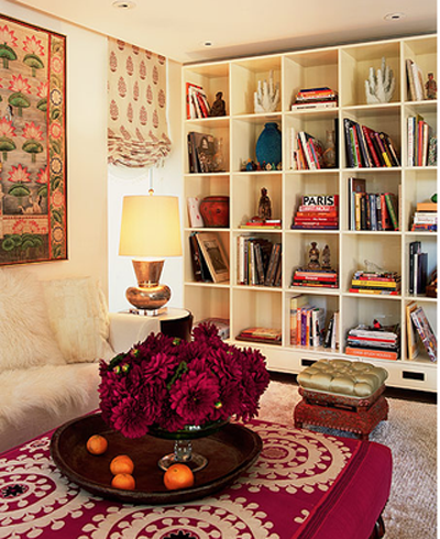
I love the square shape of these shelves. It makes it easier to display larger pieces like the coral and that big turquoise pottery. I would want to check out the contents of these shelves a little closer if I were a visitor here.
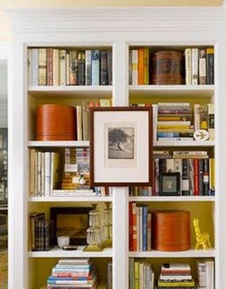
It’s a good idea to add some bigger pieces to break it up and add a little storage. Try hat boxes, shaker boxes, baskets, lacquered boxes, lidded candy dishes, etc. I also love the yellow on the back of the shelves here.
House Beautiful
This designer left out some of the shelves to make space for bigger artwork and taller accessories. What do you think of this look? I do like some of the bookends here a lot. Pieces like the brass rams are easy to find in thrift stores or on etsy.
M Designs via La Dolce Vita
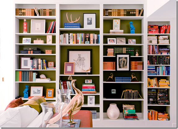
These shelves are really pretty. Not many books, and the ones here are covered in kraft paper, which is pretty for a more styled look. I love that ostrich egg and that cage/terrarium thing on the bottom shelf. So cool. Also, pretty obsessed with this color of gray.
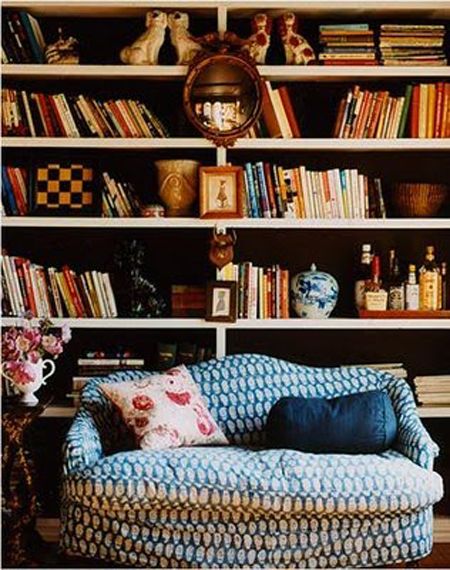
I looove the coziness of this photo. The slouchy couch. The laid back book arrangement. I also love the Staffordshire doggies, the ginger jar and the bullseye mirror. The little checkerboard is also awesome and a nice graphic touch. I’ve been wanting to incorporate some sort of game board in our house too. Checkerboard or maybe backgammon…
Look! A television!! I like this idea of incorporating a TV into your built-ins.
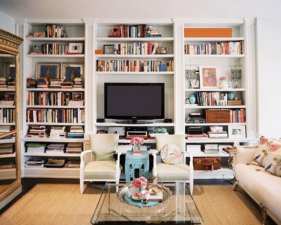
Lonny
Lots to love on these shelves. I think the designer did a good job of leaving just enough empty space on the shelves (though I would probably prefer more books in the mix here). I think it’s easy to overload the shelves and the layers, so be careful there. I think you’d want a maximum of five types of accessories on a single shelf (books count for one type of accessory here).
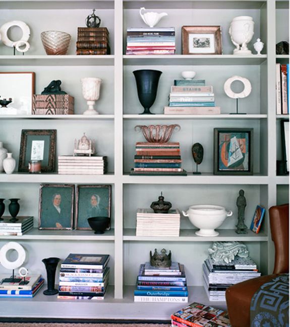
Martensen via Desire to Inspire
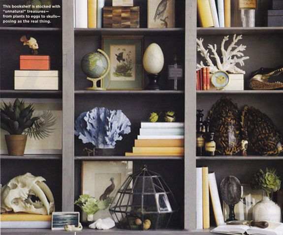
These shelves are more crowded, but I think the trick is the colors are all pretty muted. I love that these items all feel very purposeful and collected – like the owner probably has a cool adventure story behind each object.
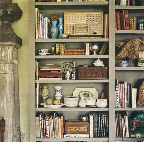
Jaime’s (I Suwanee) Bookcase of the Day
Another one with some shelves removed for art. Love that ladder!
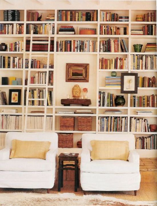
Martha Stewart Living
Fun and quirky for a teenager’s room…
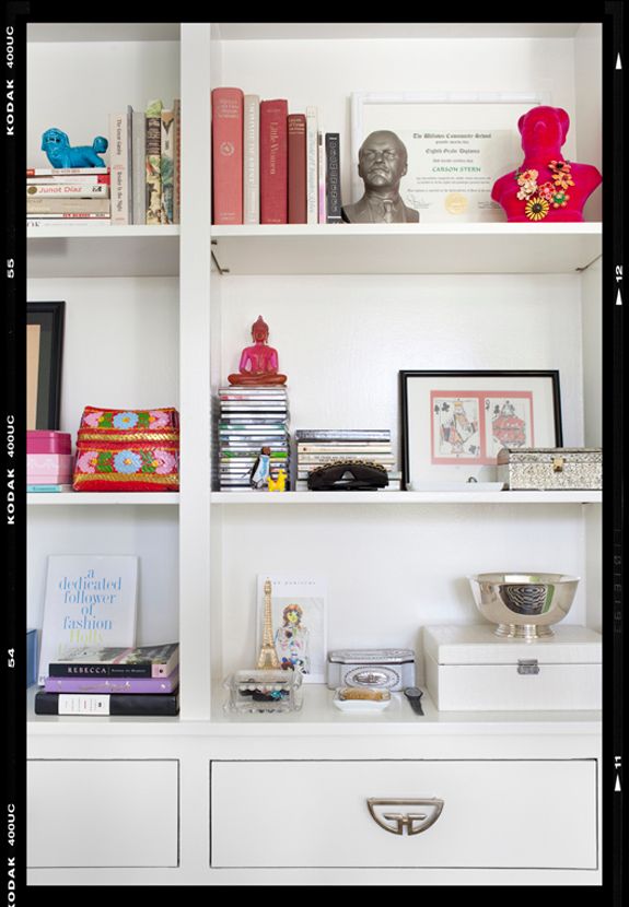
Betsy Burnham via Decor Demon
I love the burl wood frame here. And this is just the right mix of books to accessories for me.
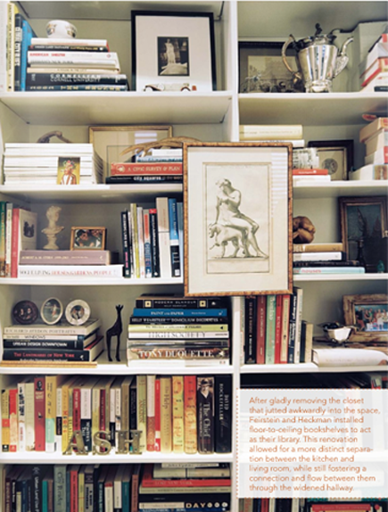
Summer Heckman in Lonny
More square shelves! Galvanized metal here maybe? I like how these are casually stacked. The color groupings flow nicely for a great overall composition.
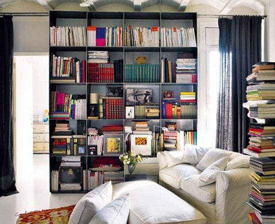
Nuevo Estilo
Colorful and pretty. Love the turquoise vase and the modern artwork up top especially. I also spy a pair of candlesticks, two different types of coral, a beautiful tortoise shell glass vase, a zinc letter and little framed pieces of art on easels.
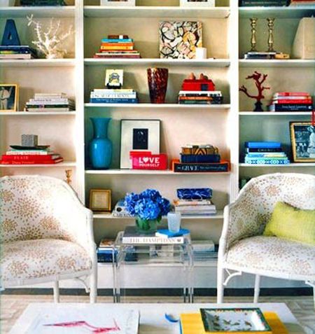
Ashley Mcaleer in Domino
Off to style my shelves which I’ll share soon. (P.S. You’re going to love the paint job!)
xx




thanks–I love this post. I'm always at a loss when attempting to style my bookshelves.
I can never arrange bookshelves thanks for the inspiration
I agree I really like this post! I love bookshelves but sometimes have a challenge with getting them organized correctly.
I love that there is actually a TV in one of those inspiration pics. I don't think I've ever seen a TV in any design blog post ever. And for most of us it's just unrealistic to plan a living space without one. Also, love your blog. I lurk a lot, but had to comment on this one.
Can't wait to see those cabinets when you're finished — good luck :) Julie
I tried to organize my DVDs like that once. It made finding things really hard. I would not recommend it. LOL!
I like the colorization but my life time dream is to have a library catalogued by the Dewey Decimal system. I'd trade that for chic looks!
–Courtney
Love this! Perfect timing as we're looking to put shelving units along a whole wall in our lounge, thanks!! I will give square shelves a longer look in now :)
I think the last one is my favorite. It's my dream to have a wall of books and accessories someday!
What a great compilation of photos! I'm taking notes! Your posts are the best.
Thank you so much for this lovely post! I have been feeling kind of lost about organizing my bookshelves so I kept postponing it, but after seeing your post I am looking forward to do it :-) Gaby
I love books and trinkets mixed together. There's so much personality with it.
Something I've done lately is buy wine glasses from the thrift store and snap the stems off. It makes for a really inexpensive small bell jar! I have one on my book shelf with some cotton we picked on a road trip through arkansas!
love it!
This is a timely post for me as I'm having yet another bookcase built soon. I just can't bring myself to thin my book collection out! What's the cure for that?
I don't have much room on the shelves for 'styling'.
Do you know how the artwork is hung on the bookshelf frame?..I'd like to try that.
Your blog just keeps getting better. I love it!
Great tips! I really want to hang some mirrors or frames on the front of my shelf…looks so great!
Why do books on other peoples book cases always look so smart whereas mine just look untidy!
Great post… my bookshelves look terrible.. this is on my nesting list- ha…. 4 weeks to go. So thank you for the inspiration!
xo Trina
I love bookshelves… could look at them all day.
I dont know why – but pictures hanging on book shelves tend to bother me..
It's my dream to have wall to wall bookshelves! Can't wait to see how you end up styling yours!
I like to call books in craft paper, books burkas or a book body bag. I get changing an objects aesthetic to make it yours. I paint, recover, re-arrange etc. By covering a book in paper so you have no idea what is inside, you have removed its intrinsic function and made it simply a form, its basically book murder. I dont get it.
With all that said, you are not killing puppies so no crime. However, I still think it is a shame.
Great inspiration photos! I take the dust jacket off most my books – the canvas cover is almost always prettier than the dust jacket!
Thanks! I really needed some bookshelf inspiration today! You read my mind!
Seriously, accessorizing is so tricky! I always wondered if designers took an entire course in this or if there was some kind of standardized rule/formula for how to add accessories to a room. I love this post! And I'd love to see the before and after shots of your bookshelf! Where do you find the time?!?! :) XO
Just wanted to thank you for the past few posts- I feel like I just took a mini-design course. These are the type of subjects I find interesting and helpful. So thank you. I truly appreciate your style. And as "a regular" woman who is just trying to make her home a stylish reflection of my family, I look forward to the next lesson. :)
What about using books only? My husband is a bibliophile, and believes that bookshelves are for books only. The designer in me longs to style them, yet this is the one area in the house where I let him have his say — even though they are front and center in the living room. As for arranging by color and covering them (or worse putting them in a shelf with pages facing out)? I say that's a shame. Let books be books — literary art trumps visual art, for me.
P.S. Meant to also say that I really enjoyed this post and every picture you posted of the styles shelves. They all look collected and not one bit contrived.
Camille
Ohh great inspiration post! We moved this weekend and I am in the process of re-styling my bookshelves right after I finish blog stalking.
I have to let you know how much I enjoy your lovely site, and I particularly have enjoyed your recent posts on your apartment and the little girl's room you decorated.
I am not sure how old your girls are, but I'd like to invite you to visit me at http://www.juliasbookbag.com/ — I write about children's books and it is a lot of fun! aloha, Melissa
Great inspiration here! I'm in the midst of painting the inside of my family room built-ins and then they'll be ready for a restyle. I'll be back to this post for super ideas. :0
This is an area that I could definiely use help with. I feel liek I haven't staged my etageres right…. Thanks for great inspiration!
oh, I feel my bookshelves are all sad and normal being just books and organized by category :( Luckily they are bright red, so at least they're snazzy!
great post… and so timely… i am working with a client on her bookshelves! thank you… wishing you a wonderful week… xx pam
These look great, but it is really bad for books to lay them on their side, books should always be stored vertically if they are going to be there for a long time.
That being said, it still looks nice to balance veritical books with a horizontal element, but you can do that by incorporating storage boxes. Or, your bookcase could be a long, low bookcase under a window so the bookcase itself looks like a horizontal element!
Awww I love the bunny little! Take care.
Happy Easter to all
from beautiful Banff on the banks of the Bow