Like I mentioned before, in the survey (which is still open for responses in case you haven’t had time yet) many of you asked me to share the process of decorating my apartment. I promise, there’s not much to share at this point. I sold almost everything that was in current rotation before we left Delaware. So our current apartment is pretty full (read: slightly overflowing) of vintage pieces that need major TLC and other sort of mismatched items. I’m SO ready to get moving on my own house though, that I’m committing myself to at least one home project a week. The plan is to share these with you every Friday. I know you’re just as happy to see the process as seeing the pretty ‘after’ images, so thanks for hanging in there with me while I show you my less-than-perfect spaces.
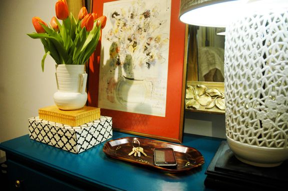
So, for our first project, why not start with the entry?
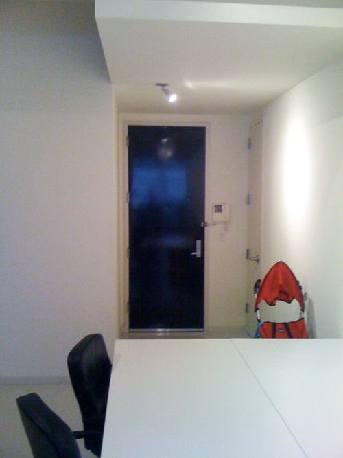
We live in a sort of industrial building that’s zoned for live/work (great for taxes and getting commercial address shipping rates!). It’s definitely not a luxury building with a fancy lobby (though I do like the art installation in our lobby). And we don’t have a doorman – that’s what that telecom thing is on the wall next to the door. It’s how we buzz visitors in.
The last tenant owned a real estate brokerage firm that had only five or six employees that worked here during the day and then he slept here at night. You can see the end of one of his conference tables in this shot. This is the beforest of before shots – from the first walk through.
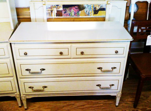
Remember this dresser that I’m using as a console? I found it right before we left Delaware. It was $20 at Canterbury Antiques. It was not cute in its before state – it was that nasty yellowy cream that they loved to use on bedroom sets in the 50’s and 60’s.
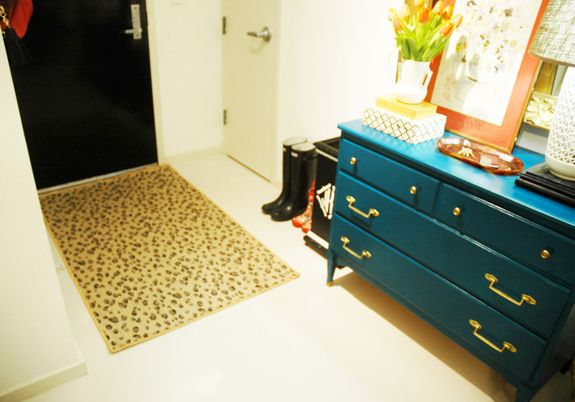
Sadly, it sat untouched in our entry for the first couple of months. Finally, at Christmas time, I busted out the paint quarts already in my stash and decided on this pretty emerald green color. I thought it was Ralph Lauren, but it’s actually a Behr color, called Billiards Table. It’s really pretty. One of my new favorite colors.
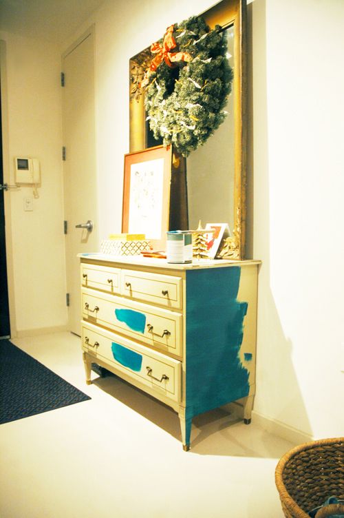
Some of you have asked about where I do my projects now that we live in an apartment. I do most of my painting in the office area on top of two canvas drop cloths with the windows open. I haven’t done any spray painting this winter, but when the weather is nicer, I can do painting projects up on our roof. It’s sort of a pain to move things around, but whatever, it’s not that big of a deal.
If you remember from my post about our floor plan, there is a wall of windows on one side of our apartment and that’s all we’ve got for natural light. So it’s pretty dark up here by the entry at most times of the day. It was really hard to get a shot of the newly painted console that reflects the true color. This one is the closest to real life.
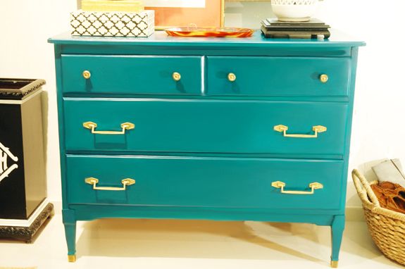
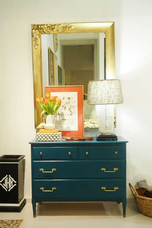
Do you know what I recently started using and loving? Ralph Lauren Regent Metallic paints. I had a quart of Parlor Gold (a really bright gold color) and used a damp rag to sort of wipe on a bit of the gold paint on the hardware, just to brighten things up. I also touched up the giant wall mirror, which I got at Brimfield a couple years ago for $50.
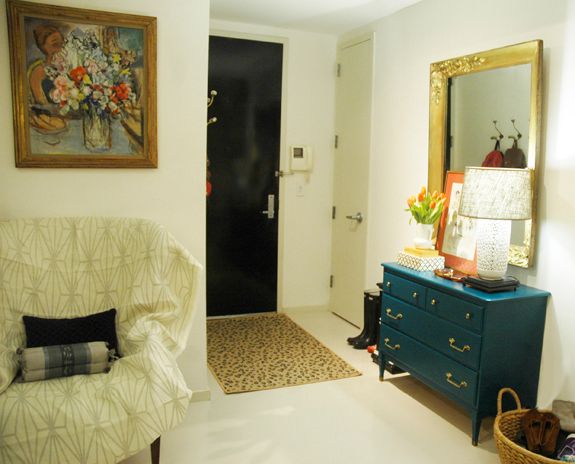
You can see one of my vintage pieces in need of help there to the left. It’s a really pretty wing back chair (it looks a lot like this one) that I need to reupholster. Today I was trying out Kelly Wearstler’s Katana and I think I like it.
My favorite painting is hung above the chair. Around the corner I put up a couple of these Anthropologie hooks that I got on sale.
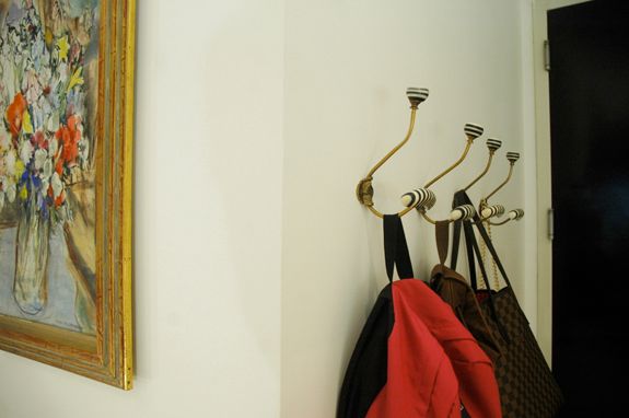
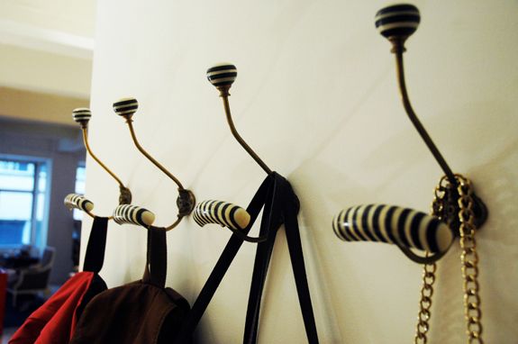
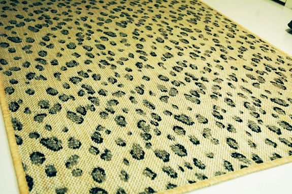
The leopard rug is the newest addition to the space. I LOVE it. It’s from Ballard and its indoor/outdoor.
Things about the entry that need to change:
– The lamp needs a new harp so that the shade fits right. It’s too low right now. (PS I got this Blanc de Chine lamp for $1 at Spence’s Flea Market in Dover! The shade is a pretty gray burlap, I got it at Target a couple months ago)
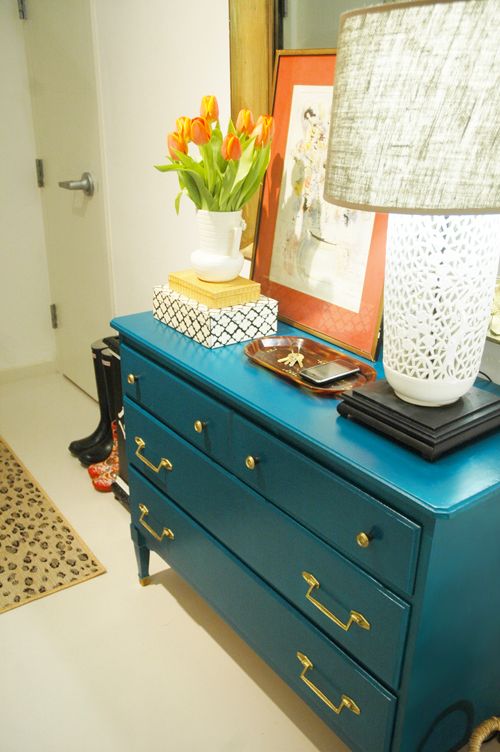
– I bought that artwork with the coral matting at a great store in Williamsburg called Junk. That store needs it’s own post. It’s really amazing. Back to the artwork though, I mostly bought it for the mat and the frame. It was like $8 or something so I didn’t feel guilty. I think I’m going to take the watercolor out and replace it with something more modern and with different colors.
– Maybe switch up the boxes on the tabletop for something different. At the very least I might paint the woven box.
– Tomorrow I’m going to Target and hope to pick up one of these great copper boot trays in the Smith and Hawken aisle.
– All of our tall umbrellas broke. I need to get a couple more for our monogrammed umbrella stand.
– We need a fun overhead light fixture. Probably a flush mount, since the huge dining room chandelier will be less than 10 feet from the entry. (ah, city living!) I wish my budget could expand to fit this Visual Comfort star light.
– I’m considering wallpaper. I’d have to get creative about how and where to stop the paper, since I wouldn’t want to do the entire north wall, which runs the length of the apartment.


First time reader on your blog and I love it. I think this entryway is a great use of color. Love the arrangement on the dresser. Well done! And animal print looks so chic paired with color and gold accents!
Thank you, Jenny! I put the hooks up this weekend and they look great. Thanks also for the tip to use black screws.
The Behr Billards Table is so gorgeous! Beautiful entry!
Jenny! This is amazing! I'm going to grab that color chip and file it away! :)
I absolutely love this. I love the colour and the fact you remodelled it from something that was so inexpensive and dull. Now it looks really exclusive and expensive. I have an old three drawer console that I found in a second hand store. I painted it white but it looks quite dull, however I think this colour would suit it better as it's a similar shape and size. Thank you for sharing.