Like I mentioned before, in the survey (which is still open for responses in case you haven’t had time yet) many of you asked me to share the process of decorating my apartment. I promise, there’s not much to share at this point. I sold almost everything that was in current rotation before we left Delaware. So our current apartment is pretty full (read: slightly overflowing) of vintage pieces that need major TLC and other sort of mismatched items. I’m SO ready to get moving on my own house though, that I’m committing myself to at least one home project a week. The plan is to share these with you every Friday. I know you’re just as happy to see the process as seeing the pretty ‘after’ images, so thanks for hanging in there with me while I show you my less-than-perfect spaces.
So, for our first project, why not start with the entry?
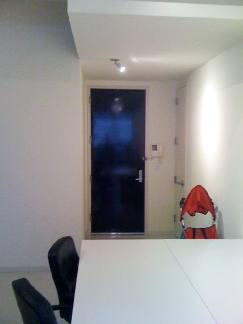
We live in a sort of industrial building that’s zoned for live/work (great for taxes and getting commercial address shipping rates!). It’s definitely not a luxury building with a fancy lobby (though I do like the art installation in our lobby). And we don’t have a doorman – that’s what that telecom thing is on the wall next to the door. It’s how we buzz visitors in.
The last tenant owned a real estate brokerage firm that had only five or six employees that worked here during the day and then he slept here at night. You can see the end of one of his conference tables in this shot. This is the beforest of before shots – from the first walk through.
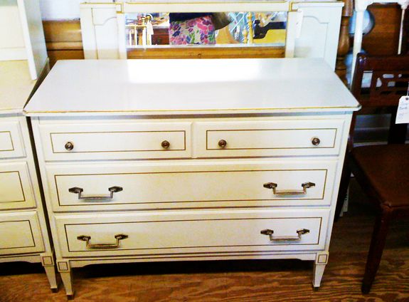
Remember this dresser that I’m using as a console? I found it right before we left Delaware. It was $20 at Canterbury Antiques. It was not cute in its before state – it was that nasty yellowy cream that they loved to use on bedroom sets in the 50’s and 60’s.
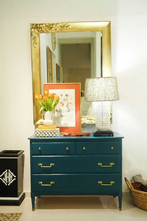
Sadly, it sat untouched in our entry for the first couple of months. Finally, at Christmas time, I busted out the paint quarts already in my stash and decided on this pretty emerald green color. I thought it was Ralph Lauren, but it’s actually a Behr color, called Billiards Table. It’s really pretty. One of my new favorite colors.
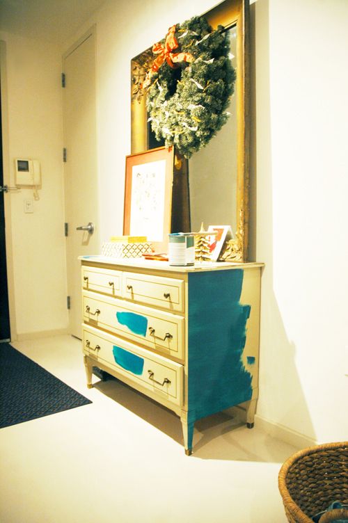
Some of you have asked about where I do my projects now that we live in an apartment. I do most of my painting in the office area on top of two canvas drop cloths with the windows open. I haven’t done any spray painting this winter, but when the weather is nicer, I can do painting projects up on our roof. It’s sort of a pain to move things around, but whatever, it’s not that big of a deal.
If you remember from my post about our floor plan, there is a wall of windows on one side of our apartment and that’s all we’ve got for natural light. So it’s pretty dark up here by the entry at most times of the day. It was really hard to get a shot of the newly painted console that reflects the true color. This one is the closest to real life.
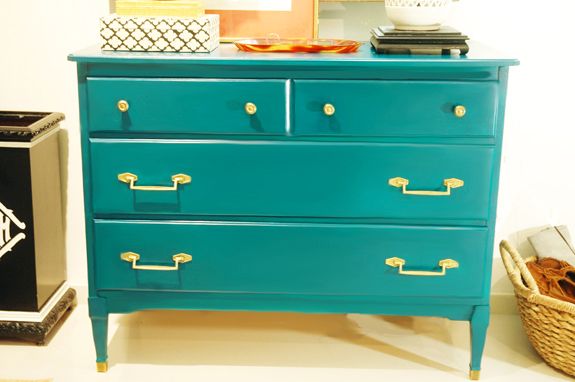
Do you know what I recently started using and loving? Ralph Lauren Regent Metallic paints. I had a quart of Parlor Gold (a really bright gold color) and used a damp rag to sort of wipe on a bit of the gold paint on the hardware, just to brighten things up. I also touched up the giant wall mirror, which I got at Brimfield a couple years ago for $50.
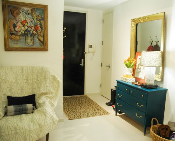
You can see one of my vintage pieces in need of help there to the left. It’s a really pretty wing back chair (it looks a lot like this one) that I need to reupholster. Today I was trying out Kelly Wearstler’s Katana and I think I like it.
My favorite painting is hung above the chair. Around the corner I put up a couple of these Anthropologie hooks that I got on sale.
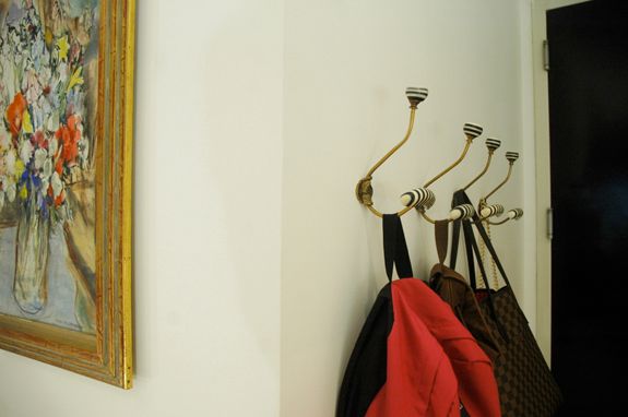
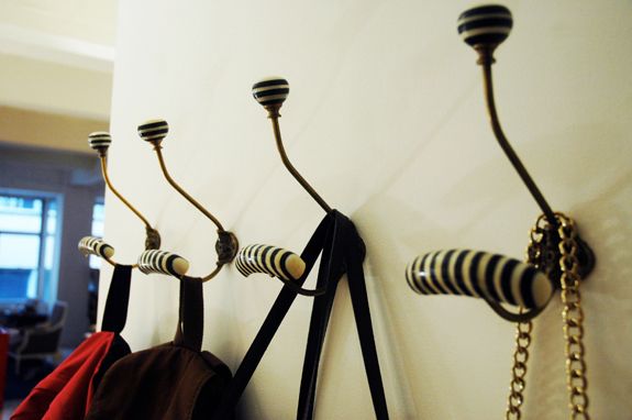
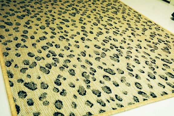
The leopard rug is the newest addition to the space. I LOVE it. It’s from Ballard and its indoor/outdoor.
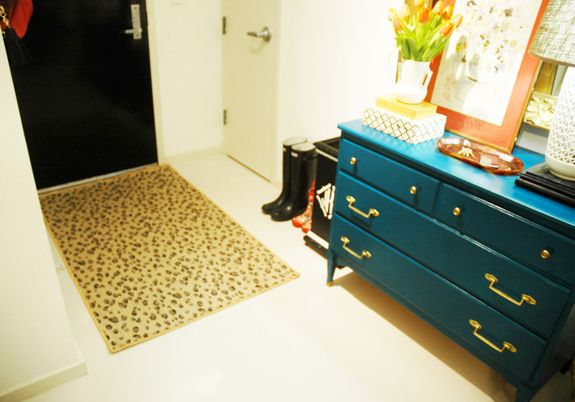
Things about the entry that need to change:
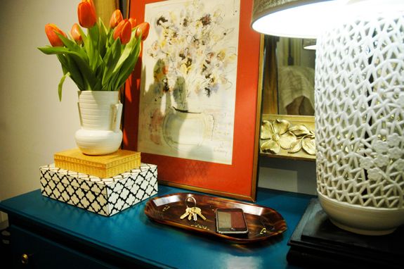
– The lamp needs a new harp so that the shade fits right. It’s too low right now. (PS I got this Blanc de Chine lamp for $1 at Spence’s Flea Market in Dover! The shade is a pretty gray burlap, I got it at Target a couple months ago)
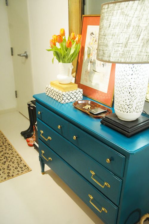
– I bought that artwork with the coral matting at a great store in Williamsburg called Junk. That store needs it’s own post. It’s really amazing. Back to the artwork though, I mostly bought it for the mat and the frame. It was like $8 or something so I didn’t feel guilty. I think I’m going to take the watercolor out and replace it with something more modern and with different colors.
– Maybe switch up the boxes on the tabletop for something different. At the very least I might paint the woven box.
– Tomorrow I’m going to Target and hope to pick up one of these great copper boot trays in the Smith and Hawken aisle.
– All of our tall umbrellas broke. I need to get a couple more for our monogrammed umbrella stand.
– We need a fun overhead light fixture. Probably a flush mount, since the huge dining room chandelier will be less than 10 feet from the entry. (ah, city living!) I wish my budget could expand to fit this Visual Comfort star light.
– I’m considering wallpaper. I’d have to get creative about how and where to stop the paper, since I wouldn’t want to do the entire north wall, which runs the length of the apartment.


Jenny,
Your entry looks great! Loving the colors and textures. Great job!
Julia
Oh my goodness, this is so simple and really beautiful. I wish this was my entry! I'm sure guests get so excited when they come in!!!
Great job, Jenny!
Where is that black and white box from??? I love it!
I almost never comment, but what a fab entry way! So chic! I love the chest color!
Love to see how adding color can make the whole spot look "finished". Also liked hearing your ideas to "tweak". We move around alot as well and am in the process of our own interior facelift. Time to update and upgrade!!! I feel like my friends think I'm nuts because I'm unloading furniture and accessories because they "just don't work" for our new space.
Hi Terese!!! I miss you guys! Up for another photography project? This one's in Hingham.
Gabriella, the black and white box is from HomeGoods! I bought it last year for about $15, I think. I love it. Would you believe it is real bone inlay? That box would be a couple hundred in a shop. I wish I would have bought more to sell to clients!
Kim, I totally know what you mean about wanting to offload every time you move. It feels so good to have a fresh look in a new space! Also, though, there's something really nice about a few special pieces making their way into my home every single move and new chapter. Happy weekend!!
xx
Yay, this is just what we needed! I just love the way you use color and patterns, so inspiring. It's already looking beautiful so it's going to be AMAZING when it's finished. I'm particularly loving the dresser color with the mirror.
I've been waiting for an apt. update! thank you!! Looks great!!
nice job. i love that you're not going so modern in your modern space. it warms things up.
quick question. i read what paint you use, but do you use a roller or paint brush. i seem to spray paint everything because i like the smooth finish. since it's winter that can be difficult. any suggestions on getting a smooth finish with regular latex paint. thx.
Hi Alison! Thanks for your comment. I agree about the idea of not going to modern in this space. It would be really cold with all the white. I'm happy how the color looks on all that white though!
I always, always paint the same way: cut in on all the corners and awkward parts first with a (very important!) HIGH quality 2 inch, angled brush (I like Purdy brushes) and then I use white foam mini rollers for all the flat surfaces. Makes for a smooth, professional looking finish every time!
Hope that helps
xx
welcoming & beautiful, jenny!
i'm so glad that you used my recommendation to go to JUNK! i walk by it everyday to/from work and so i definitely agree… it needs it's own post entirely. a treasure trove of many possibilities!
remember seleta's quote "progress over perfection." your progress sure looks amazing though! xo
Fabulous Jenny! I love it as always! I can't wait to see more… I see a teenie tiny peek of furniture in the back that I'm swooning over.
Wowsa! I'm SO impressed. The space looks awesome!
Wow! I love the color you chose with the chest and the gold on the hardware is the perfect touch. Great work!
Looks great! I love the color you painted the dresser. I have those same hooks (but they keep coming out of the wall when we hang book bags, etc – maybe need to figure out how to anchor them better) and the same bag :-)
The indoor/outdoor rug is a great idea!
xo Trina
Oh My Jenny! So happy to have stumbled across your blog! Oh this is looking wonderful, beautiful! Thank you for sharing!!
xo Jessica Rae
{Lovely Ugly Design}
http://lovelyuglydesign.blogspot.com/
I AM IN LOVE!!! Thank you thank you thank you for this post. Your finds almost seem unbelievable. How did you find that lamp for a buck? Dresser for $20?
Do you think you will be able to find that great stuff for so cheap in NYC? Know any good shopping tips for San Francisco area?
Great post!!! *Thank you* for showing us your home and your projects again!!!
Wow- love the color you chose for your entry table. I have one of the boot holders in gold from Ballard and they are great for catching dirt, etc. Thanks for all your great ideas!
love this! i am struggling with our entry- i was scared that a BIG mirror (even tho its a mirror) would make the ceilings feel lower or smaller- this looks great- and the gold and turquoise are very fresh together.
Wow! Your entry looks AMAZING! I love everything about it. Can't wait to see more.
Absolutely gorgeous!! Wow I love it! It makes me want to add more colour to my entry way.
LOVE it alllllll!!! I totall have those anthropology hooks and I L-O-V-E them too and I've def wanted tha stupid leopard rug for my dining room for years (not kidding). Did you get a new camera? Pics look great!!!
Xoxo
I'm an interior designer from Melbourne, Australia – I loved your blog, I found it very inspiring. This is all new to me but I have just set up my own blog
scrapbook-melissah.blogspot.com
You may like to check it out because I had so much fun doing it.
Thanks for providing me with such great entertainment!
Cheers
Melissah
looks gorgeous jenny. don't wear yourself out ;)
Yay! So glad you're "back in the saddle"! LOVE the color on the console and I'm so jealous of your lamp!
I painted my desk almost the exact same color…it was BM in North Sea Green! It's a lovely color, but I made the mistake of painted my bathroom it and it is way to dark for a small bathroom…at least for my taste! Looking forward to seeing all of your projects…I'm in the same boat over here with dressers, a desk and tons of chairs that need some serious TLC! I think I have a serious addiction to fixing up furniture!! Hope you have had a lovely weekend!
You have an eye for pretty and a talent for bringing things together, plus a knack for finding deals! Can't wait to see more!
yeah, you posted it!! I just LOVE how your entry looks, its giving me inspiration to get moving on mine and start jazzing it up a bit.
The green is perfect, love the color so much!!
You are so incredibly talented! You always inspire me with the things you have created and the looks you pull together flawlessly. Keep it up and thank you!!!
Beautiful! I live in NYC and feel like it is void of inexpensive antique/flea market/junky-type stores. Everything is fancy and overpriced or else way too modern if you have somewhat traditional taste. Thank you for the recommendation of Junk in Williamsburg. Love hearing where you shop! And I've painted plenty of furniture in my living room…
Beautiful combinations in your entry! I am going to check out that color and find "some" way to use it! The copper boot tray is "a find," just when I was looking for one for our entry. artfully crafted and so much happiness radiates. Obviously, to all of us, too, your readers.
Thanks for the great post – reminiscent of vintage Little Green Notebook! :) It's actually strangely comforting to hear that designing is also a process for you too. Things are looking great though! Thanks for sharing.
Love the color of the dresser! Its so rich, and I can't wait to see the rest of the house!!
http://olivesanddaisies.blogspot.com/
Wow! I love it. Can't wait to see more…
Looks beautiful! The color on that console is really gorgeous. I love the combo of colors you used!
Wow… Cantebury and Spence's in one post! When I go to those places all I see is crap, crap, crap. But now I'm going to try to look at it through your eyes. You know – kind of a "what would Jenny do?" Everything looks amazing!
Love the console! And all of your fun finds…it's looking so good!
love. the. color!!
LOVE this post. It is fun to read something personal. Entry looks fantastic. I have been eyeing the Anthro hooks, but wish I cold score them on sale and am jealous of your umbrella stand.
love it! that rug is great…love the turquoise
There's the Jenny we love! Thank you for sharing that wonderful, inspiring update. Love the blue paint on the chest. Hope you and your family are enjoying your new chapter so far.
i love that color on the dresser. funny thing….i have about 5 paint chips taped to my desk (i will be painting it soon) and i just so happened to accidentally find your blog, and this particular post!
anyhow, i think i might be a copycat and use your color!! LOVE it.
and i also LOVE the black door (i think its black??) great contrast with the wall, and the hooks from anthro!! have you thought about painting the closet door to match???
cant wait to see more of you makeovers!!
-jessica
Hi Jenny,
Your blog is my favorite! Is the Ballard rug the black or brown leopard?
Anon – I bought the leopard Ballard rug in black. I'm still loving it, even after two snowstorms!
xx
It looks really great!! Check out this light on Living Livelier today. I think it would look great in your space. And it's on sale!!
http://livinglivelier.blogspot.com/2011/01/capiz.html
(there is a link to the light in the post)
Looks amazing! I just bought the same hooks on your inspiration. Question though – did you use anchors in the wall for the hooks? It looks like you have dry wall, which is what I have. Thanks!
This looks great! Question – did you need to use anchors in the wall for the hooks?
We did use anchors. My friend has these hooks and the screws fall out all the time. So far so good with the anchors.
Oh, and we also used black drywall screws. The black color matches the antiqued brass really well! Much better than bright chrome or shiny brass.