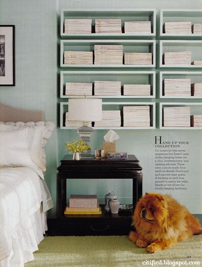
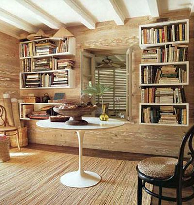
About these boxy bookshelves?

via This is Glamourous from Martha Stewart Living

via Domino, design by Tom Scheerer
About these boxy bookshelves? via This is Glamourous from Martha Stewart Living via Domino, design by Tom Scheerer
About these boxy bookshelves?


via Domino, design by Tom Scheerer
Love the first image…very cute! Tracey xx
look! http://myfavoriteandmybest.blogspot.com/2009/06/black-is-beautiful.html
last pic in the post.
One of my favorite designers, Frank Roop, uses same types of shelves with great success:
http://www.frankroop.com/
Nice blog. Feel free to visit mine sometime at http://www.ConcordGreen.blogspot.com. Starting to work on all of the interiors of an eco-friendly farmhouse. I welcome my fellow bloggers ideas and suggestions.
i LOVE them! along with the rain gutter bookshelves, I think they are great. I'll be moving in a little over 6 months, and probably won't be able to take my large bookcases from home with me, so these ideas could be great alternatives!
Here's my thought– looks great in Martha with the completely uniform (and white) stacks. Looks a little amputated with the real collection of books from the Domino photo. So probably in real life it would look a little off, unless you were planning to use the shelves more like sculpture and less for function.
I just stumbled on your blog and LOVE it!
I especially love the first image of block bookshelves. Right up my alley.
In the right space, they look great.
How much weight would you be comfortable putting on a shelf mounted on the wall?
I think that they look great in the first picture because they're sort of set back from the main wall–I don't feel like I'm losing any space with them. In the second picture, they would bother me because they jut out too far from the wall (and in this picture, they're far too sloppy for my taste!).
I love these! They would be perfect for an office space I am working on! I am trying to find a good resource for them.
Check out my blog sometime if you have a chance! http://timelessstyleblog.blogspot.com/
-Sarah
Love, love, love your blog! These bookshelves are great but look best organized.
I've been looking for something like this for record storage, and to use as a divider between the living room and an open staircase…any idea if they're sold pre-fab anywhere, or were these built to fit?
i like the fluffy dog in the picture :)
Thanks for the inspiration pics!
I dig the boxy shelves.
I like the Martha Stewart picture. The shelves are really cool, not something you would see everywhere, and seem like they would be perfect for a bedroom without a lot of closet storage.
I love Martha's shelves. They look so clean to me. I really don't like the other shelves though. They look messy. They look like he was lazy, and only wanted to put up half the shelves, but wanted to use all the shelf space. Hope that made sense.
I like the first one!
the bookshelves are great but what i REALLY want is that teddy bear dog in the corner.
I love them. They are kind of like functional art.
i love them, especially the SECOND (messier!) pic. the martha one is way too freakishly ocd for me, but i still like the shelves in both pics! doesn't IKEA sell something like this off-the-shelf?? i've been thinking of these for some spaces where i really can't put anything on the floor (baseboard heater & a/c unit below.)
Trust Martha's team to make something that has the potential to look very cheap and ugly look absolutely genius.
I say No unless you can do them absolutely perfectly, like Martha. I agree with the above posters who say the uniformity of them is what makes them. For me, the second is an illustration of something I'd see in a house I was going to buy and think "That is coming down the minute I close on this house."
Not a big fan because I think it's exceedingly hard to pull it off well. You'd have to plan the boxes so that they line up well with the studs for mounting. And I agree with other posters that unless you have a very matchy-matchy collection, it's going to look disorderly.
If I had these in my house they would look more like the 2nd picture (by domino) and less like Martha.
Love, love, love!
They are quite foxy!
I LOVE the first image, but the second one makes my head hurt.
I love em. I would totally do that.
I actually like the second image more than the first – which seems a little cold to me for a bedroom!
I would like them in an office better.
love them! my grandparents mounted floor bookshelves (the hald height) in their den and it looks amazing.
Eh. I prefer a bookshelf.
Love, love, love. Functional + work of art…
I just looooove them. In the first picture mostly.
love the wall color in the 1st pic.
I say… AMAZING!! what a brilliant idea i have magazines coming out of every room, ok well not that many, but i have LOTS i just don't want to throw away, esp my dominio ones!
I'm not a fan. Mainly because I need bookshelves to be functional, and these just don't seem like they would work as bookshelves. I think they could be nice display shelves/shadowboxes.
I love them in the first image, but not the second.
like! I have liked that look since West Elm did the L-shaped one many, many years ago. I couldn't afford them ( in college) so I made them.
I say LOVE.
love the first image as well. especially the cute little guy!
I'm not a fan of the boxy shelves. They look like something I'd put in my basement or garage for storage. I'm a fan of modern and plain but these are too plain for me.
I just love the dog in the first picture–looks like a HUGE stuffed animal. So cute! I like these shelves, especially the fact that I could have my husband whip some up with all of his left over wood pieces from various projects.
Like it a lot!
I say yes, especially as they are in the top. they must hold a lot because those magazines look HEAVY!
Love them for an office, not so much in a bedroom. They look a bit too overwhelming. In the office they look great loaded up.
Love them!
OK. I'm a nerd and this sounds braggy, but I really, REALLY don't mean it that way (what a lead in): I was on "Trading Spaces" a few years ago and worked with Edward and Faber. They designed very similar boxes, and at the time, I thought they were icky and awkward (orange on the wall part/stained wood everywhere else), but I really like these in these pictures. You have totally changed my mind. Have you tried them somewhere?