Nothing gets me going like a trad room with a little punch of modern.
Check out these kitchens from my favorites file…
{PS I’d love help on sourcing some of these unknown images…}
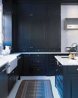
design by Daryl Carter
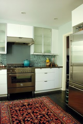
source unknown
Dying over these pebbled floors…
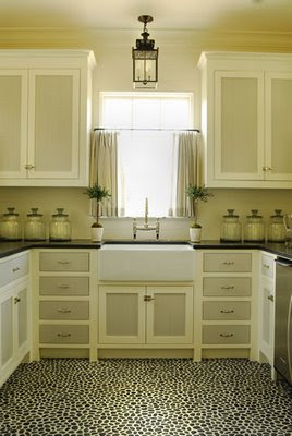
Design by Phoebe Howard
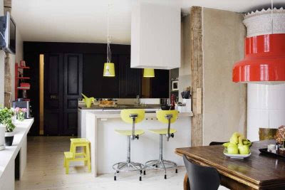
source unknown
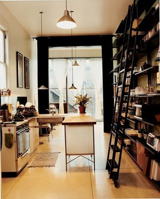
source unknown
Holy pendant light!
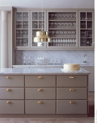
via Martha Stewart
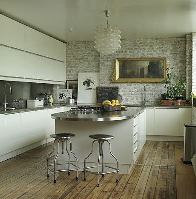
via Desire to Inspire
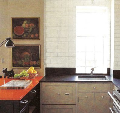
via Brown Turtleneck Sweater
Such a great look – floor to ceiling patterned tile. It looks like wallpaper, but it’s so much more durable/appropriate for a kitchen.
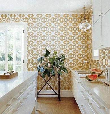
Design by Tom Scheerer
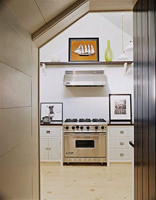
via House Beautiful
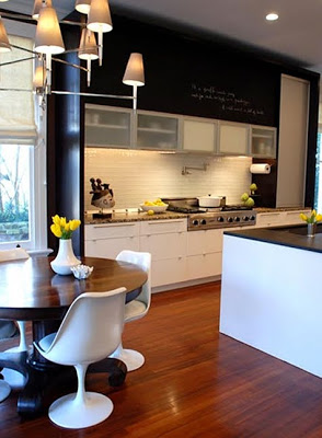
via Design Sponge
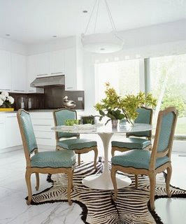
via Blueprint Magazine
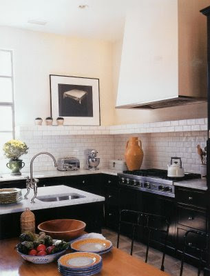
Design by Gray Crawford
I never would have thought to put stick straight legs on an island like this. Love it.
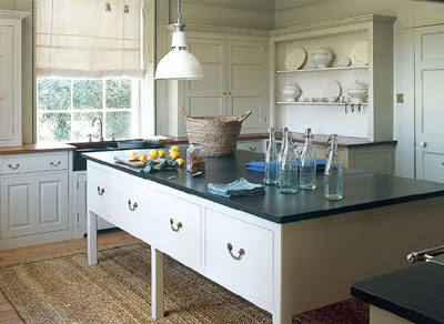
Design by Plain English
Love the rug and the red.
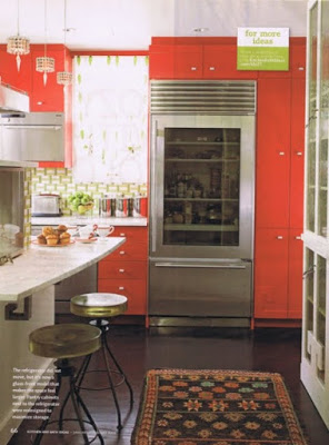
image via (blog?) Kitchen and Bath Magazine
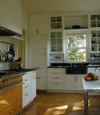
Design by Asfour Guzy Architects
via Southern Accents
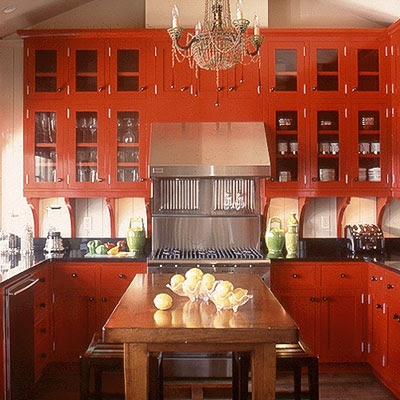
via Southern Accents
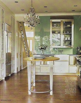
Mark Olsen Photography
What you’re favorite way to add a twist of mod into your kitchen/home?

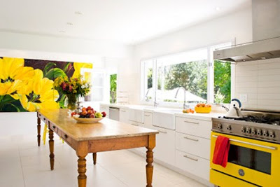


I definately agree on having a kitchen island – fantastic for cooking and someone who can sit opposite and keep you company! Plain English is my all time favourite. Great post!
I love the last picture. I have always wanted a ladder like that in my kitchen. Beautiful pictures!
Those pebbled floors are a-mazing! I never would have thought of that. I actually love everything about that room. Please let us know if you figure out the source!
I love, love, love the one with pebbled floors. I really like what they did with the paint on the cabinets. Filing that one away….thanks for the inspiration!
The one with the massive pendant light looks very Martha Stewart-ish.
WOW!! those are beautiful! i can't pick a fave but i DID save at least 5 of them for my own files.
id say those red cabinets def will stick in my head for a while.
I like the mix. Probably keeps a look instyle longer. I'm looking at my kitchen, and thinking I need to add something modern. I guess the closest I get is my big stainless vent hood?
Good Lord – can't answer your question – too busy wiping the drool from my chin!
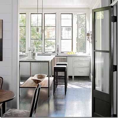
The top photo is from artist Bobbie Burgers home – featured in Canadian House and Home.
Love your blog!
Wow- pebbled floors, exposed brick, white subway tiles, farm sinks, just gorgeous!
The kitchen with the red cabinets was a Southern Accents cover a few years back.
I am swooning away! Such a perfect mix.
Absolutely gorgeous images…-carlee
what a great collection. I love the bright yellow colors on that top kitchen. I have it saved as "BobbieBurger via DesignSponge"
Too much to say about these pictures b/c I love them all! I think the colors you choose can bring in some modern to a traditional kitchen.
Lovely inspiration pics! The one with the paisley backsplash and persian rug is my favorite.
love the oriential rugs in the kitchen. lovely and unexpected.
the gray kitchen with brass bin pulls is Martha's old kitchen, I believe, and the red one is Southern Accents.
lots of good eye candy!
i hate oprah, but she had some makeovers on her show and they installed zinc counter tops. do you know much about them? Durable? The designer said that they will get a nice patina, but can I roll out bread dough and beat them up real good?
I know it has already been answered but the top photo is from Bobbie Burgers' vacation home in the BC Okanagan. Her full time home in the city is two houses away from mine!! I love her artwork and am always thrilled to see her featured in House and Home!
I love them all but the one with the library ladder is my favorite one.
Kitchen island = must! Love that white kitchen with the yellow stove! Fantastic. Thanks for the posts!
That Tom Sheerer kitchen is absolutely breathtaking!
The red cabinet kitchen was in Southern Accents a few years ago, it's by Susan Massey, http://www.bohlertmassey.com/#, who's work I love
Jenny that was a great roundup, I can't decide which one is my favorite. I'm pretty drawn to the Southern Accents kitchen. I just can't stop loving white kitchens.
HI Jenny! I posted about Kilims in Kitchens today and gave you a shout out for inspiring me. LOVE that "cheap" wallpaper too, btw. What a great resource… I would have never thought to look at Sherwin Williams. :)
FYI the yellow range in the first photo is a bertazzoni.
Water clocks did not depend on the observation of the sky or the thomas sabo sun. The earliest water clock was discovered in the tomb of Amenhotep I who was buried around thomas sabo online shop deutschland 1500 B.C. Greeks called them clepsydras ; they were stone boxes with sloped sides that allowed water to drip thomas sabo anhänger at an almost unceasing rate from a small hole in the bottom.Other clepsydras were cylinders or thomas sabo charm club anhänger bowl formed engineered to slowly fill up with water coming in at a near sustained pace. Markings on the thomas sabo anhänger günstigangebote thomas sabo anhänger at night, it is thought they were utilized in the day hours too. A metal bowl with a hole the bottom was placed in a bigger bowl crammed thomas sabo charm with water.It would fill and then sink in a certain quantity of time.Since water flow was not exactly predictable sabo charms and difficult to control the flow accurately, timepieces that depended on water were very inadequate. People sabo charm were drawn to develop more accurate ways of measuring and telling time.The development of quartz crystal clocks and timepiecesthomas sabo anhänger sale depended on the crystal size, shape, and temperature to create a frequency.